INVITE-ONLY SCRIPT
CH-I: Trend - Multi-Timeframe Watchlist
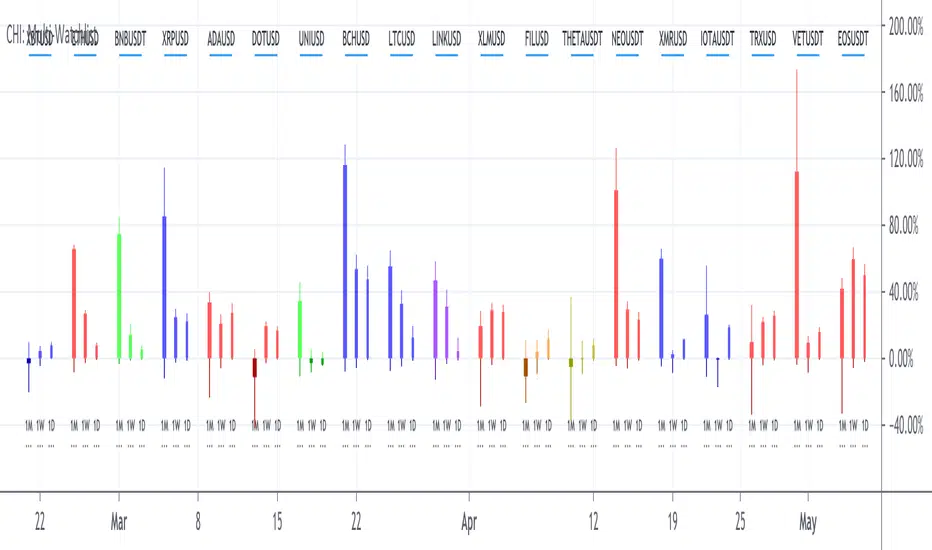
Watchlists give only a flat perspective on changes in the market, as they show only the daily change of underlyings and give no comprehensible context to other underlyings and other timeframes to show the bigger picture.
With a cockpit showing price changes of different underlyings over several timeframes at the same time, a real understanding can be developed about shorter term momentum embedded into a longer term trend.
Look how major commodity currencies (in purple) have outrun other major currencies in recent months, but where the biggest losers in the last days as seen below. When now looking at the also displayed chart of the Norwegian Krone against the US Dollar, this gives more context, as the indication clearly shows, that commodity currencies in general have been rising for the last months and startet dropping recently.

By grouping related underlyings with the same kind of representation, it also becomes clear, in which of these sectors the action is gaining or losing momentum.
Here you can see how the major european markets (in green) are currently outperforming most other major markets with the major asian markets (in purple) being the laggards.

Another important benefit is the clear visibility of a shift in focus from one underlying or class of underlyings to another over time, which gives valuable insights into mode changes of differing markets to increase understanding of the current state of the relationships between different markets.
For more than half a year, mid and small caps have outperformed large caps in US equities, as much as Value caps have outperformed Growth caps. Here you see, how the outperformance of Value stocks has been maintained, but the focus shifted from smaller to bigger caps.

With a cockpit showing price changes of different underlyings over several timeframes at the same time, a real understanding can be developed about shorter term momentum embedded into a longer term trend.
Look how major commodity currencies (in purple) have outrun other major currencies in recent months, but where the biggest losers in the last days as seen below. When now looking at the also displayed chart of the Norwegian Krone against the US Dollar, this gives more context, as the indication clearly shows, that commodity currencies in general have been rising for the last months and startet dropping recently.
By grouping related underlyings with the same kind of representation, it also becomes clear, in which of these sectors the action is gaining or losing momentum.
Here you can see how the major european markets (in green) are currently outperforming most other major markets with the major asian markets (in purple) being the laggards.
Another important benefit is the clear visibility of a shift in focus from one underlying or class of underlyings to another over time, which gives valuable insights into mode changes of differing markets to increase understanding of the current state of the relationships between different markets.
For more than half a year, mid and small caps have outperformed large caps in US equities, as much as Value caps have outperformed Growth caps. Here you see, how the outperformance of Value stocks has been maintained, but the focus shifted from smaller to bigger caps.
- The indicator allows up to 20 individually selected ticker symbols classifiable into up to 6 separate groups with up to 12 different selectable time periods (including a custom time period) to be displayed.
- The results can be displayed either only as a percentage change from start to end of the corresponding time period as well as additionally with highs and lows in the interval in a candlestick representation.
- The output can be ordered by symbols as individually entered as well as by performance for a selectable time period.
- For further convenience, a range of predefined sets of symbol is preconfigured to give insights into the development of markets for bonds, commodities, currencies, cryptos, equity markets and the economy without having to manually configure the corresponding symbols into the list of selectable symbols.
- Additional details about Open, High, Low and Close values and the exact percentage changes as displayed as well as about selected symbols and allocated groups can be displayed by hovering the mouse over any time period or any symbol.
招待専用スクリプト
このスクリプトは作者が承認したユーザーのみアクセス可能です。使用するにはアクセス申請をして許可を得る必要があります。通常は支払い後に承認されます。詳細は下記の作者の指示に従うか、Coffeehouse-Analyticsに直接お問い合わせください。
TradingViewは、作者を完全に信頼し、スクリプトの動作を理解していない限り、有料スクリプトの購入・使用を推奨しません。コミュニティスクリプトには無料のオープンソースの代替が多数あります。
作者の指示
Request prices and access via private message:
https://www.tradingview.com/u/Coffeehouse-Analytics/
免責事項
この情報および投稿は、TradingViewが提供または推奨する金融、投資、トレード、その他のアドバイスや推奨を意図するものではなく、それらを構成するものでもありません。詳細は利用規約をご覧ください。