Relative Performance Areas [LuxAlgo]The Relative Performance Areas tool enables traders to analyze the relative performance of any asset against a user-selected benchmark directly on the chart, session by session.
The tool features three display modes for rescaled benchmark prices, as well as a statistics panel providing relevant information about overperforming and underperforming streaks.
🔶 USAGE
Usage is straightforward. Each session is highlighted with an area displaying the asset price range. By default, a green background is displayed when the asset outperforms the benchmark for the session. A red background is displayed if the asset underperforms the benchmark.
The benchmark is displayed as a green or red line. An extended price area is displayed when the benchmark exceeds the asset price and is set to SPX by default, but traders can choose any ticker from the settings panel.
Using benchmarks to compare performance is a common practice in trading and investing. Using indexes such as the S&P 500 (SPX) or the NASDAQ 100 (NDX) to measure our portfolio's performance provides a clear indication of whether our returns are above or below the broad market.
As the previous chart shows, if we have a long position in the NASDAQ 100 and buy an ETF like QQQ, we can clearly see how this position performs against BTSUSD and GOLD in each session.
Over the last 15 sessions, the NASDAQ 100 outperformed the BTSUSD in eight sessions and the GOLD in six sessions. Conversely, it underperformed the BTCUSD in seven sessions and the GOLD in nine sessions.
🔹 Display Mode
The display mode options in the Settings panel determine how benchmark performance is calculated. There are three display modes for the benchmark:
Net Returns: Uses the raw net returns of the benchmark from the start of the session.
Rescaled Returns: Uses the benchmark net returns multiplied by the ratio of the benchmark net returns standard deviation to the asset net returns standard deviation.
Standardized Returns: Uses the z-score of the benchmark returns multiplied by the standard deviation of the asset returns.
Comparing net returns between an asset and a benchmark provides traders with a broad view of relative performance and is straightforward.
When traders want a better comparison, they can use rescaled returns. This option scales the benchmark performance using the asset's volatility, providing a fairer comparison.
Standardized returns are the most sophisticated approach. They calculate the z-score of the benchmark returns to determine how many standard deviations they are from the mean. Then, they scale that number using the asset volatility, which is measured by the asset returns standard deviation.
As the chart above shows, different display modes produce different results. All of these methods are useful for making comparisons and accounting for different factors.
🔹 Dashboard
The statistics dashboard is a great addition that allows traders to gain a deep understanding of the relationship between assets and benchmarks.
First, we have raw data on overperforming and underperforming sessions. This shows how many sessions the asset performance at the end of the session was above or below the benchmark.
Next, we have the streaks statistics. We define a streak as two or more consecutive sessions where the asset overperformed or underperformed the benchmark.
Here, we have the number of winning and losing streaks (winning means overperforming and losing means underperforming), the median duration of each streak in sessions, the mode (the number of sessions that occurs most frequently), and the percentages of streaks with durations equal to or greater than three, four, five, and six sessions.
As the image shows, these statistics are useful for traders to better understand the relative behavior of different assets.
🔶 SETTINGS
Benchmark: Benchmark for comparison
Display Mode: Choose how to display the benchmark; Net Returns: Uses the raw net returns of the benchmark. Rescaled Returns: Uses the benchmark net returns multiplied by the ratio of the benchmark and asset standard deviations. Standardized Returns: Uses the benchmark z-score multiplied by the asset standard deviation.
🔹 Dashboard
Dashboard: Enable or disable the dashboard.
Position: Select the location of the dashboard.
Size: Select the dashboard size.
🔹 Style
Overperforming: Enable or disable displaying overperforming sessions and choose a color.
Underperforming: Enable or disable displaying underperforming sessions and choose a color.
Benchmark: Enable or disable displaying the benchmark and choose colors.
インジケーターとストラテジー

Swing Traces [BigBeluga]🔵 OVERVIEW
The Swing Traces indicator identifies significant swing points in the market and extends them forward as fading traces. These traces represent the memory of recent highs and lows, showing how price interacts with past turning points over time. Traders can use the fading intensity and breakout signals to gauge when a swing has lost influence or when price reacts to it again.
🔵 CONCEPTS
Swing Detection – Detects recent upper and lower swing points using sensitivity-based highs and lows.
Trace Longevity – Each swing projects a “trace” forward in time, gradually fading with age until it expires.
Trace Size – Each trace is drawn with both a main level and a size extension (half of the bar range) to highlight swing influence.
Longevity Counters – Swings remain active for a customizable number of bars before fading out or being crossed by price.
Swing Retest – Labels appear when price retest above/below an active trace extension levels, confirming potential reversal.
🔵 FEATURES
Adjustable sensitivity length for swing detection.
Separate longevity controls for upper and lower swing traces.
Fading gradient coloring for visualizing how long a trace has been active.
Double-trace plotting: one at the swing level and one offset by trace size.
Clear BUY/SELL signals when price crosses a swing trace after it has matured.
🔵 HOW TO USE
Use blue (upper) traces as resistance zones; lime (lower) traces as support zones.
Watch for fading traces: the longer they persist, the weaker their influence becomes.
Retest dots (●) confirm when price retest a trace, signaling a potential reversal.
Shorter sensitivity values detect faster, smaller swings; longer values capture major swing structures.
Combine with trend indicators or volume to filter false breakout signals.
🔵 CONCLUSION
The Swing Traces indicator is a powerful tool for mapping price memory. By projecting recent swing highs and lows forward and fading them over time, it helps traders see where price may react, consolidate, or break through with strength. Its dynamic traces and breakout labels make it especially useful for swing traders, breakout traders, and liquidity hunters.

Forever ModelForever Model is a comprehensive trading framework that visualizes market structure through Fair Value Gaps (FVGs), Smart Money Technique (SMT) divergences, and order block confirmations. The indicator identifies potential price rotations by tracking internal liquidity zones, correlation breaks between assets, and confirmation signals across multiple timeframes.
Designed for clarity and repeatability, the model presents a structured visual logic that supports manual analysis while maintaining flexibility across different assets and timeframes. All components are non-repainting, ensuring historical accuracy and reliable backtesting.
Description
The model operates through a three-part sequence that forms the visual foundation for identifying potential market rotations:
Fair Value Gaps (FVGs)
FVGs are price imbalances detected on higher timeframes—areas where price moved rapidly between candles, leaving an inefficiency that may be revisited. The indicator identifies both bullish and bearish FVGs, displaying them with color-coded levels that extend until mitigated.
: Chart showing FVG detection with colored lines indicating bullish (green) and bearish (red) gaps
Smart Money Technique (SMT)
SMT detects divergence between the current chart asset and a correlated pair. When one asset makes a higher high while the other forms a lower high (or vice versa), it indicates a potential shift in delivery. The indicator draws visual lines connecting these divergence points and can filter SMTs to only display those occurring within FVG ranges.
: Chart showing SMT divergence lines between two correlated assets with labels indicating the pair name]
Order Block Confirmations (OB)
When price confirms a signal by crossing a pivot level, an Order Block is created. The confirmation line extends from the pivot point, labeled as "OB+" for bullish signals or "OB-" for bearish signals. The latest OB extends to the current bar, while previous OBs remain fixed at their confirmation points.
: Chart showing OB confirmation lines with OB+ and OB- labels at confirmation points]
Key Features
Higher Timeframe (HTF) Detection
FVGs are detected on a higher timeframe than the current chart, with automatic HTF selection based on the current timeframe or manual override options. This ensures that internal liquidity zones are identified from the appropriate structural context.
External Range Liquidity (ERL)
Tracks the latest higher timeframe pivot highs and lows, marking external liquidity levels that may be revisited. ERL levels are displayed as horizontal lines with optional labels, providing context for potential continuation targets.
: Chart showing ERL lines at recent HTF pivot points
Signal Creation and Confirmation System
The model creates pending signals when FVG levels are mitigated. Signals confirm when price closes beyond a pivot level, creating the OB confirmation line. Stop levels are automatically calculated from the maximum (bearish) or minimum (bullish) price between signal creation and confirmation.
SMT Filtering Options
Display all SMTs or only those within FVG ranges
Require SMT for signal confirmation (optional filter)
Automatic or manual SMT pair selection
Support for both correlated and inverse correlated pairs
Directional Bias Filter
Filter FVG detection to show only bullish bias, bearish bias, or both. This allows analysts to align with higher timeframe structure or focus on unidirectional setups.
Confirmation Line Management
Toggle to extend only the latest confirmation line or all confirmation lines
Transparent label backgrounds with colored text (red for bearish, green for bullish)
Automatic cleanup of old confirmation lines (keeps last 50)
Labels positioned at line end (latest) or middle (older lines)
Position Sizing Calculator
Optional position sizing based on account balance, risk percentage or fixed amount, and instrument-specific contract sizes. Supports prop firm calculations and can display position size, entry, and stop levels in the dashboard.
Information Dashboard
A customizable floating table displays:
Current timeframe and HTF
Remaining time in current bar
Current bias direction
Latest confirmed signal details (type, size, entry, stop)
Pending signal status
The dashboard can be repositioned, resized, and styled to match your preferences.
Special Range Creation
When signals confirm, the model can automatically create special range levels from stop prices. These levels persist on the chart as important reference points, even after mitigation, serving as potential reversal zones for future signals.
Label and Visualization Controls
Toggle FVG labels on/off
Toggle confirmation lines on/off
Customizable colors for bullish and bearish FVGs
ERL color customization
SMT line width adjustment
Order Flow Integration (Optional)
The indicator includes optional Open Interest (OI) based special range detection, allowing integration with order flow analysis for enhanced context.
Technical Notes
All components are non-repainting—once formed, they remain on the chart
FVGs cannot be mitigated on their creation bar
Signal-based special ranges persist even after mitigation (important stop levels)
SMT detection supports both HTF and chart timeframe modes
Maximum 50 confirmation lines are maintained for performance
The model is designed to work across all asset classes and timeframes, providing a consistent framework for identifying potential market rotations through the interaction of internal liquidity, correlation breaks, and confirmation signals, this does not constitute as trading advice, past performance is no indication of future performance , this is entirely done for entertainment and educational purposes

OSOM TrendHow to Use the OSOM Breakers Indicator
The OSOM Breakers indicator is a customizable overlay tool for TradingView (Pine Script v5) that identifies market structure patterns, breakouts, breakers (order blocks), and price targets based on pivots, higher highs/lows (HH/LL), and breaks of structure (BoS/MSB). It helps visualize bullish/bearish trends, potential reversals, and target levels, with a focus on institutional "order blocks" (OB) for support/resistance. The indicator supports alerts indirectly through plotted events and is optimized for volatile markets like forex, crypto, or indices.
1. Adding the Indicator to Your Chart
Open TradingView (tradingview.com) and load a chart for your desired asset.
Click the "Indicators" button at the top.
Search for "OSOM Breakers" (if community-shared) or add via Pine Editor:
Open the Pine Editor tab at the bottom.
Paste the provided code (from //@version=5 to the end).
Click "Save" and name it (e.g., "OSOM Breakers").
Click "Add to Chart".
The indicator overlays on your chart with defaults like dashed zigzag lines, HH/LL labels, and green/red colors for bull/bear elements.
2. Configuring Inputs
Click the gear icon next to the indicator name in the legend to access settings.
Inputs are grouped:
Nephew_Sam Market Structure Settings: Pivot strength (default 5; higher for smoother, lower for sensitivity). Toggles for zigzag lines, BoS lines, HH/LL labels, and pattern matches.
Nephew_Sam Bull/Bear Patterns: Pre-defined sequences (e.g., "LL,LH,LL,HH,HL" for bull patterns) with text labels (e.g., "BOS HL 1") and toggles. Customize up to 7 per direction for specific setups like BOS (break of structure) or MSS (market structure shift).
Nephew_Sam Styles: Colors for HH/LL (green up, red down), labels, zigzag style (dashed/dotted), and width (1-4).
Market Structure Break Targets Settings: Max duration (250 bars), calculation method (Percent or ATR), ATR multiplier (2.0). Enable/disable bull/bear MSB/BoS, set colors (green/red), and % targets (100% default).
Breakers Settings: Max breaks (1; increase for stricter breaker confirmation), max duration (1000 bars). Colors for bullish MS (green), bull breaker (red), bearish MS (red), bear breaker (green).
Defaults suit 15m-1h charts; reduce pivot strength for scalping (1m-5m) or increase for daily+. Test patterns on historical data to match your strategy.
3. Interpreting the Visuals and Signals
Zigzag and HH/LL Labels:
Dashed/dotted lines connect pivots; green for upswings, red for downswings (if enabled).
Labels like "HH" (higher high), "LH" (lower high), "LL" (lower low), "HL" (higher low) appear at pivots. Green for bullish, red for bearish.
Pattern Matches:
Labels (e.g., "BOS HL 1") at pivots when sequences match user-defined bull/bear conditions. Up arrows for bull, down for bear.
Use for spotting reversals or continuations (e.g., bull pattern after downtrend signals potential long).
Market Structure Breaks (MSB/BoS):
Solid lines: Green for bullish MSB/BoS (break above prior high), red for bearish (break below prior low).
Labels: "MSB" or "MSS" (shift) at breaks, "BoS" for breaks of structure.
Boxes: Translucent green/red "OB" (order block) boxes highlight ranges before breaks – potential support (post-bull break) or resistance (post-bear).
Targets:
Dotted horizontal/vertical lines extend from breaks to projected targets (percent of range or ATR-based).
Active until hit or expired (after max duration). Green for bull targets (above), red for bear (below).
Breakers:
Dotted lines: Recent MSB/BoS levels that act as breakers (e.g., red dotted for bull breaker).
Plotted shapes: "▲" (green below bar) for bull MSB breakout, "▼" (red above) for bear.
Candle borders: Green for support events (price tests breaker from above), red for resistance (from below).
Overall Direction: Tracks bullish (1) or bearish (-1) based on recent breaks; use for trend bias.
4. Trading Strategies
Breakout Trading: Enter long on green "▲" (bull breakout) above MSB/BoS lines; short on red "▼" below. Target dotted lines (e.g., 100% of prior range).
Order Block (OB) Plays: Buy at green OB boxes (support after bull break), sell at red (resistance after bear). Confirm with support/resistance events.
Pattern-Based Reversals: Long on bull patterns (e.g., "BOS HL") after bearish structure; short on bear patterns. Filter with HH/LL (e.g., HH after LL signals uptrend).
Trend Continuation: In bullish direction, stack longs on BoS breaks; use breakers as trailing stops.
Risk Management: Stops below recent LL (longs) or above HH (shorts). Position size based on ATR (from targets). Avoid choppy markets by disabling patterns.
Timeframes: Scalping (1m-15m with low pivot strength), swing (1h-4h), position (daily with higher strength). Combine with volume indicators for confirmation.
5. Alerts and Automation
No built-in alertcondition(); set manual alerts in TradingView:
Right-click chart > Add Alert > Condition (e.g., "OSOM Breakers - Bull MSB Breakout" crosses 1 for "▲").
Or alert on close crossing MSB/BoS lines (use indicator plots as conditions).
For strategies: Convert to a strategy script by adding strategy() entries/exits based on breaks/patterns.
6. Tips and Best Practices
Asset Suitability: Ideal for trending markets (e.g., BTC/USD, EUR/USD). Less effective in ranging; toggle off zigzag/boxes to reduce clutter.
Performance: Limits (500 lines/boxes/labels) prevent overload; delete oldest automatically. Backtest on replay mode.
Customization: Add custom patterns (e.g., for ICT/SMC concepts like fair value gaps). Match colors to your theme.
Limitations: Relies on pivots – false signals in low-volatility; no volume integration (pair with another indicator). Targets are projections, not guarantees.
Enhancements: Combine with OSOM Trend for volume confirmation. Practice on demo charts.
This indicator provides a structured view of price action, emphasizing breaks and targets for systematic trading. Always validate with multiple timeframes and risk controls.

Dresteghamat-Multi timeframe Regime & Exhaustion**Dresteghamat-Multi timeframe Regime & Exhaustion**
This script is a custom decision-support dashboard that aggregates volatility, momentum, and structural data across multiple timeframes to filter market noise. It addresses the problem of "Analysis Paralysis" by automating the correlation between lower timeframe momentum and higher timeframe structure using a weighted scoring algorithm.
### 🔧 Methodology & Calculation Logic
The core engine does not simply overlay indicators; it normalizes their outputs into a unified score (-100 to +100). The logic is hidden (Protected) to preserve the proprietary weighting algorithm, but the underlying concepts are as follows:
**1. Adaptive Timeframe Selection (Context Engine)**
Instead of static monitoring, the script detects the user's current chart timeframe (`timeframe.multiplier`) and dynamically assigns two relevant Higher Timeframes (HTF) as anchors.
* *Logic:* If Current TF < 5min, the script analyzes 15m and 1H data. If Current TF < 1H, it shifts to 4H and Daily data. This ensures the analysis is contextually relevant.
**2. Regime & Volatility Filter (ATR Based)**
We use the Average True Range (ATR) to determine the market regime (Trend vs. Range).
* **Calculation:** We compare the current Swing Range (High-Low lookback) against a smoothed ATR. A high Ratio (> 2.0) indicates a Trend Regime, activating Trend-Following logic. A low ratio dampens the signals.
**3. Directional Bias (Structure + Flow)**
Direction is not determined by a single crossover. It is a fusion of:
* **Swing Structure:** Using `ta.pivothigh/low` to identify Higher Highs/Lower Lows.
* **Volume Flow:** Calculating the cumulative delta of candle bodies over a lookback period.
* **Micro-Bias:** A short-term (default 5-bar) momentum filter to detect immediate order flow changes.
**4. Exhaustion Logic (Mean Reversion Warning)**
To prevent buying at tops, the script calculates an "Exhaustion Score" based on:
* **RSI Divergence:** Detecting discrepancies between price peaks and momentum.
* **Volatility Extension:** Identifying when price has deviated significantly from its volatility mean (VRSD logic).
* **Volume Anomalies:** Detecting low volume on new highs (Supply absorption).
### 📊 How to Read the Dashboard
The table displays the raw status of each timeframe. The **"MODE"** row is the output of the algorithmic decision tree:
* **BUY/SELL ONLY:** Generated when the Current TF momentum aligns with the dynamically selected HTF structure AND the Exhaustion Score is below the threshold (default 70).
* **PULLBACK:** Triggered when the HTF Structure is bullish, but Current Momentum is bearish (indicating a corrective phase).
* **HTF EXHAUST:** A safety warning triggered when the HTF Volatility or RSI metrics hit extreme levels, overriding any entry signals.
* **WAIT:** Default state when volatility is low (Range Regime) or signals conflict.
### ⚠️ Disclaimer
This tool provides algorithmic analysis based on historical price action and volatility metrics. It does not guarantee future results.

ahmdeew- gold scalpingbuy-sell golg scalping with take profit 1 and take profit 2 and take profit and stop loss

MAVW Trend Angle StrategyThis strategy is developed using the Mavilim indicator. It was chosen specifically because its smooth nature makes it ideal for trend angle analysis. However, this angle logic can also be applied to raw price action or other moving averages.
Overview This script is a Long-Only strategy designed specifically for spot markets (Stocks, Crypto) where short selling is not desired. It utilizes a highly smoothed custom moving average (MAVW - Weighted Moving Average of WMAs) and calculates the geometric angle (slope) of the trend to identify strong momentum and filter out market noise.
Unlike traditional Moving Average crossovers which often lag, this strategy focuses on the steepness of the trend. It aims to enter positions when the trend accelerates upward and exit when the momentum fades or turns downward.
How It Works
MAVW Calculation: The script calculates a complex chain of Weighted Moving Averages (WMAs) to create the "MAVW". This results in a curve that is extremely smooth and resistant to fake-outs compared to a standard SMA or EMA.
Trend Angle (The Core Logic): Instead of looking at raw price action, the script calculates the angle (in degrees) of the MAVW line over a specific lookback period.
Buy Signal: Triggered when the MAVW angle exceeds the Buy Threshold (e.g., > 0.2°). This indicates a strong upward impulse.
Sell (Exit) Signal: Triggered when the MAVW angle drops below the Sell Threshold (e.g., < -0.2°). This indicates a strong downward impulse.
Weak Trend / Flat Market Filter: A unique feature of this strategy is the "Close on Weak Trend" option. If enabled, the strategy will exit the position and go to CASH (Flat) if the trend angle falls between the Buy and Sell thresholds (e.g., between -0.2° and 0.2°). This protects capital during choppy, sideways markets.
Key Features
Long Only: No short selling. Ideal for spot trading and investors.
Angle Filtering: filters out insignificant price movements by measuring the trend's slope.
Sideways Market Protection: Optional setting to exit positions when the market loses direction (Trend Strength becomes "Weak").
Visuals: The MAVW line changes color based on your position status (Green = In Position, Gray = Cash).
Info Panel: Displays the current trend angle and position status in real-time on the chart.
Backtest Range: Includes a date filter to test specific time periods.
Settings & Configuration
MAVW Lengths: Adjust the First and Second lengths to change the sensitivity of the base curve.
Buy Angle Threshold: Minimum angle required to enter a Long position (Default: 0.2). Increase this value to wait for stronger trends.
Sell Angle Threshold: Angle required to hard-exit a position (Default: -0.2).
Close on Weak Trend: If checked (True), the strategy exits to cash when the angle is near zero (sideways market). If unchecked, it holds until a negative trend angle occurs.
Disclaimer This strategy is for educational purposes only. Past performance does not guarantee future results. Always perform your own backtesting before live trading.

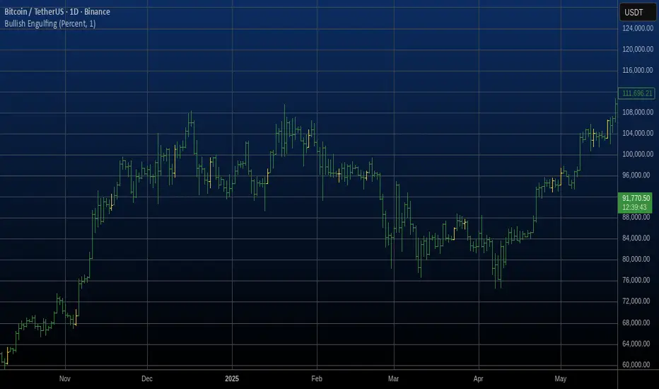
Bullish Engulfing Automatic Finding Script This is a bullish pattern formed by three candlesticks.
The pattern is based on the fact that the last candlestick must
completely engulf the previous two and be upward. The two preceding
candlesticks must also be downward. Candlestick wicks are not taken
into account.
EMA+SuperThis indicator integrates multiple trend-following components into a unified, clean, and easy-to-interpret chart overlay. Its purpose is to help traders observe short-term and long-term trend direction, momentum shifts, and potential areas of interest using established moving-average and volatility-based techniques.
🔹 Features
1. Multi-EMA Framework
Plots the 9, 21, 50, 100, and 200 EMAs to provide a structured view of short, medium, and long-term market trends.
2. Supertrend Overlay
Applies an ATR-based Supertrend to visualize potential directional shifts.
Both uptrend and downtrend zones are lightly shaded for improved clarity.
3. NovaWave-Style Trend Cloud
A dynamic cloud formed from:
Fast EMA
Slow EMA
Signal MA
The cloud automatically adapts its color based on the relationship between the fast and slow EMAs, offering a quick visual read of momentum bias.
4. Displaced Moving Averages (20 / 50 / 200 DMA)
Includes optional forward displacement to replicate commonly used DMA models in trend-following systems.
5. Crossover Buy/Sell Signals
Buy and sell markers appear when the fast EMA crosses above or below the slow EMA.
Users may create custom alerts via the TradingView alerts panel.
🔹 Alerts
This indicator supports built-in EMA crossover alerts:
Buy Alert – triggered when the fast EMA crosses above the slow EMA
Sell Alert – triggered when the fast EMA crosses below the slow EMA
Users can enable these alerts through the “Add Alert” panel and select the corresponding alert condition.
Alerts are evaluated on bar close for consistency and do not repaint.
🔹 How to Use
EMA structure helps define directional bias and market phase.
The Supertrend and Trend Cloud offer contextual confirmation.
EMA crossovers can help highlight momentum changes.
DMAs provide an additional perspective on smoothed trend levels.
This tool is intended for visual analysis and can complement other approaches such as volume studies, higher-timeframe trend analysis, or support/resistance mapping.
⚠️ Disclaimer
This script is for educational and informational purposes only. It does not constitute financial advice or guarantee any outcome. Always perform independent analysis and apply proper risk management.


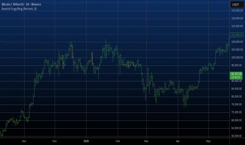
Bearish Engulfing Automatic Finding Script This is a bearish pattern formed by three candlesticks.
The pattern is based on the fact that the last candlestick must
completely engulf the previous two and be downward. The two preceding
candlesticks must also be upward. Candlestick wicks are not taken
into account.
Match Finder [theUltimator5]Match Finder is the dating app of indicators. It takes your current ticker and finds the most compatible match over a recent time period. The match may not be Mr. right, but it is Mr. right now. It doesn't forecast future connection, but it tells you current compatibility for today.
Jokes aside, it is a pattern–comparison tool that was designed to find the ticker that tracks most closely to the one you are currently looking at. It scans a user-defined list of 40 tickers (pre-set to a bunch of liquid ETFs) and finds which one most closely matches the recent price action of the current chart over a fixed lookback window.
LOGIC BEHIND THE SCENES
For each bar, the script:
Takes the last N bars (Correlation Window Length) of the current symbol.
Takes the last N bars of each selected comparison ticker.
Calculates the Pearson correlation between the current symbol and each comparison ticker.
Identifies the single best-matching ticker (highest positive correlation, excluding the current symbol itself).
Rescales and overlays that matched segment on the chart so you can visually compare shapes.
Optionally shows a correlation table with all tickers and their correlation values.
The use case of this indicator is to help you see which symbol has recently moved most similarly to your current chart, and how that shape looks when overlaid in the same panel. It helps you see which sectors it may be following most closely to.
Here is an image with arrows showing the elements of this indicator that will be mostly explained later.
USER INPUTS
1. Correlation Window Length
Default: 30
Range: 10–500
This is the number of bars used to compare the current symbol against each ticker.
Important - Larger values produce more “global” shape comparison but increase computational load and may cause the indicator to timeout if the length is too long
2. Drawing Mode
Options:
Scale Only - Adjusts min and max of the plotted line segment to match the chart over the range
Scale & Rotate - Scales as above, but matches the first and last point to the close of the chart over the range. This effectively rotates the pattern to force it to track the chart to an extent.
3. Show Correlation Table
When enabled (disabled by default), shows a table in the bottom-right of the chart that displays the correlation values over the lookback range for all 40 tickers. The best fit ticker is highlighted.
4. Best Fit Line Color
Color used to draw the overlaid best-match segment (yellow by default).
5. Ticker inputs (1–40)
Default set to a broad universe of major ETFs (e.g., SPY, QQQ, IWM, sector and bond ETFs, commodities, etc.).
You can replace these with any symbols supported by your data feed (stocks, ETFs, indexes, etc.).
The script always excludes the current chart’s symbol from being considered as its own best match.
NOTE: THIS INDICATOR IS EXTREMELY MEMORY INTENSIVE AND MAY TAKE SEVERAL SECONDS TO LOAD. PLEASE BE PATIENT AND GIVE THE INDICATOR UP TO 20 SECONDS FOR THE DATA TO DISPLAY

Trend Following Volatility Trail*Script was previously removed by Moderators at 1.8k boosts* - This was out of my control. This script was very popular and seemed to help a lot of traders. I am re uploading to help the community!
Trend Following Volatility Trail
The Trend Following Volatility Trail is a dynamic trend-following tool that adapts its stop, bias, and zones to real-time volatility and trend strength. Instead of using static ATR multiples like a normal Supertrend or Chandelier Stop, it continuously adjusts itself based on how stretched the market is and how persistent the trend has been. This indicator is based on volatility weighted EMAC
This makes the system far more reactive during momentum phases and more conservative during consolidation, helping avoid fake flips and late entries.
How It Works
The indicator builds an adaptive trail around a smoothed price basis:
– It starts with a short EMA as the “core trend line.”
– It measures volatility expansion versus normal volatility.
– It measures trend persistence by reading whether price has been rising or falling consistently.
– These two components combine to adjust the ATR multiplier dynamically.
As volatility expands or the trend becomes more persistent, the bands widen.
When volatility compresses or the trend weakens, the bands tighten.
These adaptive bands form the foundation of the trailing system.
Bull & Bear State Logic
The tool constantly tracks whether price is above or below the adaptive trail:
Price above the upper trail → Bullish regime
Price below the lower trail → Bearish regime
But instead of flipping immediately, it waits for confirmation bars to avoid noise.
This greatly reduces whipsaws and keeps the focus on sustained moves.
Once a new regime is confirmed:
– A coloured cloud appears (bull or bear)
– A label marks the flip point
– Alerts can be triggered automatically
Best Uses
Identifying regime shifts early
Riding sustained trends with confidence
Avoiding choppy markets by requiring confirmation
Using the adaptive cloud as a directional bias layer

9 Count Setup - Price Exhaustion DetectionThis indicator implements a counter-trend technical analysis tool designed to identify potential trend exhaustion points and reversal zones using a systematic counting methodology.
How It Works:
The indicator uses a specific 4-bar look-back comparison to detect price momentum:
For bearish signals (red triangles above bars): The indicator counts consecutive bars where each close is HIGHER than the close from 4 bars earlier. When this condition is met 9 times in a row, it signals potential uptrend exhaustion.
For bullish signals (green triangles below bars): The indicator counts consecutive bars where each close is LOWER than the close from 4 bars earlier. When this condition is met 9 times in a row, it signals potential downtrend exhaustion.
The 4-bar comparison (rather than comparing consecutive closes) helps filter out short-term noise and focuses on sustained directional momentum. The count resets to zero whenever the comparison condition fails.
Key Features:
Configurable Display: Toggle between showing all counts (1-9) for educational purposes, or only the critical warning levels (7-8-9) for cleaner charts
Real-time Counting: Numbers appear as the sequence builds, with 7 and 8 serving as early warnings
9-Count Signal: The number "9" indicates the Setup completion - a zone where price reversals statistically occur approximately 70% of the time according to some backtesting studies
How to Use:
A red "9" above a bar suggests the uptrend may be exhausted - potential short entry or long exit zone
A green "9" below a bar suggests the downtrend may be exhausted - potential long entry or short exit zone
The 7 and 8 counts provide advance warning that a potential reversal zone is approaching
Best used in combination with other confirmation indicators and proper risk management
Settings:
"Show All Counts (1-9)": Enable this to display the complete count sequence for learning purposes. Disable to show only counts 7, 8, and 9 for a cleaner chart focused on actionable signals.
Note: This indicator implements the Setup counting phase only. The complete methodology includes an additional phase (to 13), which is not implemented here. This standalone Setup indicator is effective for identifying potential reversal zones in trending markets.

Market Structure: The Money Leg Pattern - open sourceBased on this stragegy by Aaron
www.youtube.com
Open sourced it.

wolf_bos_detectimport andrei_keenvent/wolf_bos_detect/1 as wolfBos
import andrei_keenvent/wolf_swings/2 as wolfSwings
showBOS = input.bool(true, "Show BOS / CHoCH")
bosColor = color.rgb(112,114,119)
sw = wolfSwings.get(swingLen)
bos = wolfBos.detect(sw.lastLH, sw.lastLHIndex, sw.lastHL, sw.lastHLIndex, sw.hh, sw.lh, sw.hl, sw.ll)
// draw BOS & CHoCH exactly like Leviathan:
wolfBos.draw(bos, showBOS, bosColor)

Supertrend no repaint v6,GIM“It is a Supertrend which, with wicks enabled, triggers alerts only once per candle and no longer removes the alerts from the chart. It is recommended to use it with signal robots. Test it carefully before using it.”

fully auto advance SMC concept totally free for everyone, it has lots of stuff to use with your mind, follow the signals is the 1st rule, keep SL for your safety.

Fat Tony's Composite Momentum Histogram (v01)# Fat Tony's Composite Momentum Histogram
## What It Does
This indicator combines four momentum oscillators into a single composite signal that ranges approximately from -100 to +100. It identifies potential overbought and oversold conditions while weighting signals by volume activity to filter out weak moves.
The histogram shows momentum strength with color-coded bars:
- **Red bars** indicate extreme overbought conditions (above +100)
- **Green bars** indicate extreme oversold conditions (below -100)
- **Blue bars** show positive momentum in normal range
- **Orange bars** show negative momentum in normal range
## Core Components
The indicator blends these four momentum measures:
1. **Williams %R** - Measures where price closed relative to the high-low range
2. **Stochastic %K** - Compares closing price to the recent price range
3. **MACD Histogram** - Shows momentum changes via moving average convergence/divergence
4. **ROC (Rate of Change)** - Measures percentage price change, normalized by volatility
Each component is scaled to a -50 to +50 range, then averaged together. The MACD component uses adaptive scaling based on its historical volatility to remain relevant across different market conditions.
## Volume Weighting
The indicator amplifies signals when volume is elevated and dampens them when volume is low. It uses a logarithmic scaling approach to smooth extreme volume spikes. There's also a minimum volume filter that prevents signals from triggering during very low-volume periods.
## Settings Explained
**Momentum Settings:**
- **Length (14)** - Lookback period for Williams %R and Stochastic calculations
- **MACD Fast/Slow/Signal (12/26/9)** - Standard MACD parameters
- **ROC Length (10)** - Lookback for rate of change calculation
- **MACD StDev Length (200)** - Historical window for normalizing MACD values
**Levels:**
- **Overbought Level (+100)** - Threshold for extreme upside momentum
- **Oversold Level (-100)** - Threshold for extreme downside momentum
**Volume Settings:**
- **Enable Volume Weighting** - Toggle volume amplification on/off
- **Volume Sensitivity (1.5)** - Controls how much volume impacts the signal (higher = stronger impact)
- **Min Avg Volume (50,000)** - Filters out signals when 5-bar average volume is too low
**Components:**
- **Include ROC Component** - Toggle to add/remove ROC from the calculation
- **Enable Trend Filter** - Only allows signals aligned with the 200-period EMA trend
- **Show Component Plots** - Displays individual oscillator values for tuning purposes
## Trading Signals
**Entry Signals:**
- **Long (green triangle)** - Composite crosses above the oversold level with adequate volume
- **Short (red triangle)** - Composite crosses below the overbought level with adequate volume
**Exit Signals (when trend filter enabled):**
- **Long Exit** - Composite crosses below zero from positive territory
- **Short Exit** - Composite crosses above zero from negative territory
The indicator also provides alert conditions for automated notifications on these signal events.

SR Strategy (Short) to my deer 📌 **SR Smart Strategy — Short Only**
This strategy detects high-probability short setups based on supply/resistance zones confirmed by volume weakness.
---
### 🔍 **How it works**
1. The script automatically detects potential resistance levels using pivot highs.
2. A valid resistance level requires **low buying volume**, which reduces the probability of breakout continuation.
3. When price rejects the resistance zone or breaks below a support turned resistance, the strategy enters a short position.
4. Stop loss is placed dynamically below/above the detected zone to maintain realistic risk control.
5. Take profit is calculated by a configurable risk-to-reward ratio.
---
### 🎯 **Best Use Cases**
- Works best on trending markets.
- Recommended timeframe: **4H or 1H**
- Suggested markets: Crypto futures, FX, and commodities.
---
### 🛡 **Why this strategy is different**
✔ Filters false breakouts using **volume logic**
✔ Automatically updates **dynamic S/R zones**
✔ Smart stop-loss selection when structures are too far
✔ No repaint in historical backtest
---
### ⚠ Notes
- The script focuses on **short entries only**.
- Always combine with macro trend context or moving averages if trading manually.
---
💡 This strategy can be used for live alerts or fully automated execution via WebHook APIs.

OSOM TrendHow to Use the OSOM Trend Indicator
The OSOM Trend indicator is designed for use on TradingView charts. It provides trend identification, entry/exit signals, breakout detection, volume analysis, and market state insights. Below is a step-by-step guide to setting it up and using it effectively.
1. Adding the Indicator to Your Chart
Open TradingView (tradingview.com) and load a chart for your desired asset (e.g., stock, crypto, forex).
Click the "Indicators" button at the top of the chart.
Search for "OSOM Trend" (if it's a community script, you may need to paste the Pine Script code into the Pine Editor).
To add via Pine Editor:
Click the Pine Editor tab at the bottom.
Paste the provided code (from //@version=6 to the end).
Click "Save" and name it (e.g., "OSOM Trend").
Click "Add to Chart".
The indicator will overlay on your chart with default settings.
2. Configuring Inputs
Once added, click the gear icon next to the indicator name in the chart legend to open settings.
Inputs are grouped for ease:
OSOM WV Settings: Adjust trend length (default 14 for sensitivity), smoothing (7), band width (0.8 ATR multiplier), ATR length (10). Toggle fast mode for minimal lag, signals, forecast, take-profits, and re-entries.
Breakout Boxes Settings: Set pivot length (5), box widths (0.5 upper/lower via sliders), and colors.
MMB Settings: Volume lookback (200), EMA smoothing (10).
PVSRA Settings: Length (10), multipliers for climax/rising volumes (2.0/1.5). Optional symbol override (e.g., for aggregated BTC data).
Vector Candle Zones: Toggle on/off, max zones (500), zone type (body/wicks), transparency (90).
CVD Settings: Toggle long/short MAs (55/34 EMA), multipliers (1.5), lengths (40). Enable higher TF, volume integration, dynamic clouds, bar coloring, and status table.
Start with defaults for most assets; reduce lengths for lower timeframes (e.g., 1m-15m) to increase responsiveness, or increase for higher TFs (e.g., daily) for smoother trends.
Visual tweaks: Choose label size (small to reduce clutter), colors, and mode (Cloud for channels, Line Only for simplicity).
3. Interpreting the Visuals and Signals
Trend Line and Bands/Cloud:
Green (bullish) when price > upper band; red (bearish) when < lower band; gray (neutral).
Cloud mode shows a filled channel; use for range visualization. Single Band highlights the active support/resistance.
Buy/Sell Signals:
Up arrow (↑) labels for buys (price crosses over upper band); down arrow (↓) for sells (crosses under lower band).
If forecast enabled, labels show "count/avg" (e.g., "↑ 5/10") – current trend bars vs. smoothed historical average.
Take-profit: "✖" labels when overextended (Z-score > threshold, RSI EMA slope reversal).
Re-entries: "↻" labels on wick touches during trends (with cooldown to avoid spam).
Breakout Boxes:
Pink upper boxes (resistance) and green lower boxes (support) around pivots.
Boxes display total volume and buy/sell % breakdown.
Breakout signals: "BreakUp ⯁" or "BreakDn ⯁" labels/alerts when price crosses box edges – use for momentum trades.
MMB (Market Maker Build):
Green crosses below bars: Building long (accumulation).
Red crosses above: Building short.
Green X above: Closing long (distribution).
Red X below: Closing short.
Watch for clusters near support/resistance for institutional activity.
PVSRA Candle Coloring:
Overrides bar colors: Green/lime (bull climax), red (bear climax), blue (bull rising), violet/fuchsia (bear rising), gray (normal).
Vector zones (translucent boxes) highlight high-volume areas as potential S/R.
CVD (Cumulative Volume Delta):
Bar colors: Blue (uptrend), red (downtrend) based on CVD vs. MAs.
Status table (top-right): Checkmarks for Long/Short/Test/Sideways states.
Long: CVD above both MAs (bullish confirmation).
Short: Below both (bearish).
Test: Near clouds (potential reversal).
Sideways: Within parallels (range-bound).
4. Trading Strategies
Trend Following: Enter long on buy signals in green trends; short on sell in red. Exit on opposite signals or take-profits. Use forecast for expected duration.
Breakouts: Trade breakups from upper boxes (long) or breakdowns from lower (short). Confirm with volume % (e.g., high buy volume in upper box suggests strong breakout).
Volume Confirmation: Align with MMB builds/closes and PVSRA climaxes for high-conviction entries. Avoid trades in sideways CVD states.
Filters: Use RSI EMA slope in take-profits for overbought/oversold avoidance. Higher TF CVD for broader context.
Timeframes: Versatile – scalping (1m-5m with fast mode), swing (1h-4h), position (daily+). Test on historical data.
Risk Management: Set stops below lower band (longs) or above upper (shorts). Size positions based on ATR.
5. Alerts and Automation
Set alerts via TradingView: Right-click chart > Add Alert > Condition (e.g., "Buy Signal" or "BreakUp").
Supported alerts: Buy/Sell, Take-Profit, BreakUp/Dn, MMB crosses, Vector patterns, CVD Long/Short entries.
For scripting: Use alertcondition() calls in the code for custom notifications.
6. Tips and Best Practices
Asset Suitability: Best on volume-rich assets (e.g., BTC/USD, stocks). For low-volume, disable CVD/MMB or use overrides.
Performance: On busy charts, reduce max counts (labels/boxes) to avoid lag. Test fast mode for real-time trading.
Backtesting: Use TradingView's replay or strategy tester (convert to strategy script by adding strategy() functions).
Limitations: Not a standalone system – combine with fundamentals/news. Higher TF data may delay updates.
Customization: Experiment with inputs; e.g., tighten bands (lower multiplier) for volatile markets.
This indicator excels in providing multi-layered confirmation, reducing false signals through volume integration. Always practice on demo accounts before live trading.

Trend Line Methods (TLM)Trend Line Methods (TLM)
Overview
Trend Line Methods (TLM) is a visual study designed to help traders explore trend structure using two complementary, auto-drawn trend channels. The script focuses on how price interacts with rising or falling boundaries over time. It does not generate trade signals or manage risk; its purpose is to support discretionary chart analysis.
Method 1 – Pivot Span Trendline
The Pivot Span Trendline method builds a dynamic channel from major swing points detected by pivot highs and pivot lows.
• The script tracks a configurable number of recent pivot highs and lows.
• From the oldest and most recent stored pivot highs, it draws an upper trend line.
• From the oldest and most recent stored pivot lows, it draws a lower trend line.
• An optional filled area can be drawn between the two lines to highlight the active trend span.
As new pivots form, the lines are recalculated so that the channel evolves with market structure. This method is useful for visualising how price respects a trend corridor defined directly by swing points.
Method 2 – 5-Point Straight Channel
The 5-Point Straight Channel method approximates a straight trend channel using five key points extracted from a fixed lookback window.
Within the selected window:
• The window is divided into five segments of similar length.
• In each segment, the highest high is used as a representative high point.
• In each segment, the lowest low is used as a representative low point.
• A straight regression-style line is fitted through the five high points to form the upper boundary.
• A second straight line is fitted through the five low points to form the lower boundary.
The result is a pair of straight lines that describe the overall directional channel of price over the chosen window. Compared to Method 1, this approach is less focused on the very latest swings and more on the broader slope of the market.
Inputs & Menus
Pivot Span Trendline group (Method 1)
• Enable Pivot Span Trendline – Turns Method 1 on or off.
• High trend line color / Low trend line color – Colors of the upper and lower trend lines.
• Fill color between trend lines – Base color used to shade the area between the two lines. Transparency is controlled internally.
• Trend line thickness – Line width for both high and low trend lines.
• Trend line style – Line style (solid, dashed, or dotted).
• Pivot Left / Pivot Right – Number of bars to the left and right used to confirm pivot highs and lows. Larger values produce fewer but more significant swing points.
• Pivot Count – How many historical pivot points are kept for constructing the trend lines.
• Lookback Length – Number of bars used to keep pivots in range and to extend the trend lines across the chart.
5-Point Straight Channel group (Method 2)
• Enable 5-Point Straight Channel – Turns Method 2 on or off.
• High channel line color / Low channel line color – Colors of the upper and lower channel lines.
• Channel line thickness – Line width for both channel lines.
• Channel line style – Line style (solid, dashed, or dotted).
• Channel Length (bars) – Lookback window used to divide price into five segments and build the straight high/low channel.
Using Both Methods Together
Both methods are designed to visualise the same underlying idea: price tends to move inside rising or falling channels. Method 1 emphasises the most recent swing structure via pivot points, while Method 2 summarises the broader channel over a fixed window.
When the Pivot Span Trendline corridor and the 5-Point Straight Channel boundaries align or intersect, they can highlight zones where multiple ways of drawing trend lines point to similar support or resistance areas. Traders can use these confluence zones as a visual reference when planning their own entries, exits, or risk levels, according to their personal trading plan.
Notes
• This script is meant as an educational and analytical tool for studying trend lines and channels.
• It does not generate trading signals and does not replace independent analysis or risk management.
• The behaviour of both methods is timeframe- and symbol-agnostic; they will adapt to whichever chart you apply them to.

Pro Scalper AI Strategy [Advanced]💎 Pro Scalper AI Strategy - Institutional-Grade Day Trading System
Cutting-edge algorithmic strategy combining AI-inspired composite oscillators with military-grade risk management for volatile market domination.
⚡ Quick Overview
A sophisticated multi-timeframe strategy that blends trend, momentum, volatility, and volume into a unified signal system. Designed for aggressive day traders seeking consistent profits in crypto, forex, and indices with full automation capability.
🎯 Core Features
Composite AI Oscillator - Dynamically weighted signals from 4 market dimensions
Smart Filters - 6 toggleable filters including MACD, volume surge, RSI divergence
ATR-Based Positioning - Automatic position sizing based on volatility
Leverage Control - Support for 1:1 to 1:100 leverage with safety protocols
Risk Guardian - Daily loss limits, consecutive loss protection, session controls
📊 Performance Targets
Win Rate: 55-65% • Risk/Reward: 1:1.67+ • Max Drawdown: <15%
🚀 Best For
Volatile assets (BTC, ETH, Gold, US30)
5M-1H timeframes
$1,000+ accounts
Traders seeking 5-15% monthly returns
⚠️ Risk Level: MEDIUM-HIGH
Professional strategy with aggressive options. Start conservative (1% risk) and scale gradually. Includes partial profits, trailing stops, and panic button features.
Ready to trade like the pros? Load, backtest, optimize, profit! 🔥
