Neural Fusion ProNeural Fusion Pro
Overview
Neural Fusion Pro is a multi-factor scoring system that combines numerous technical analysis methods into a single unified score. Rather than requiring traders to monitor multiple indicators separately, this system synthesizes trend strength, momentum oscillators, volume confirmation, price structure, and price action quality into one composite reading that adapts to current market conditions.
The Scoring System
At the heart of this indicator is a weighted scoring algorithm that produces a value between -1.0 and +1.0. Positive scores indicate bullish conditions across the measured factors, while negative scores suggest bearish conditions. The magnitude of the score reflects the strength of conviction across indicators.
The score is calculated from five distinct components, each capturing a different aspect of market behavior. Users can adjust the weight given to each component based on their trading style and market preferences.
Component 1: Trend Strength and Direction
This component uses the Average Directional Index to measure trend strength and the Directional Movement indicators to determine trend direction. When ADX exceeds the trending threshold, indicating a directional market, the component contributes a positive score if the positive directional indicator leads, or a negative score if the negative directional indicator leads. In ranging markets where ADX is low, this component contributes minimally to avoid false trend signals.
Component 2: Multi-Factor Momentum
Rather than relying on a single oscillator, this component synthesizes readings from RSI, MACD histogram, Stochastic, CCI, and Rate of Change. Each oscillator is normalized to a common scale and weighted according to its reliability characteristics. RSI readings are compared against dynamic thresholds that adjust based on trend state, making the indicator more forgiving in uptrends and more demanding in downtrends.
The component also includes divergence detection. When price makes a higher high but RSI makes a lower high (bearish divergence), or when price makes a lower low but RSI makes a higher low (bullish divergence), the divergence score adjusts the momentum component accordingly.
Component 3: Volume Confirmation
Volume provides crucial confirmation of price movements. This component analyzes On-Balance Volume relative to its moving average and measures the slope of OBV to determine whether volume is supporting the price trend. Additionally, it monitors relative volume by comparing current volume to its recent average, adding confirmation when volume spikes accompany price movements.
Component 4: Price Structure and Volatility
This component evaluates where price sits within the dynamic bands and considers the current volatility regime. When price is near the lower band, the component contributes a bullish score, suggesting potential support. When price is near the upper band, it contributes a bearish score, suggesting potential resistance.
The volatility regime assessment uses ATR percentile ranking. Low volatility periods often precede significant moves, while extremely high volatility may indicate unsustainable conditions.
Component 5: Price Action Quality
This component examines the character of recent candles by tracking the ratio of bullish to bearish candles over a lookback period. Consistent bullish price action contributes a positive score, while consistent bearish action contributes negatively. This helps filter signals by confirming that price behavior aligns with other factors.
Dynamic Bands
The indicator plots adaptive bands around a central basis line. The basis can be configured as either a simple or exponential moving average. Band width is determined by ATR multiplied by a dynamic factor that incorporates both ADX (expanding bands in trending markets) and the Chaikin Oscillator (expanding bands during strong accumulation or distribution).
These bands serve multiple purposes: they provide visual context for price position, they define signal trigger zones, and they help identify overextended conditions.
Trend State Detection
The indicator classifies market conditions into three states that affect signal generation and threshold levels.
Strong Uptrend is identified when ADX is rising, ADX exceeds the strong trend threshold, and the positive directional indicator exceeds the negative. This state triggers the most aggressive buy settings, allowing entries on shallow pullbacks.
Downtrend is identified when the negative directional indicator exceeds positive DI and ADX confirms directional movement. This state applies the most conservative buy settings, requiring deep oversold conditions before generating buy signals.
Neutral applies when neither trend condition is met, using moderate threshold settings appropriate for range-bound or transitional markets.
Dynamic RSI Thresholds
A key innovation is the automatic adjustment of RSI thresholds based on trend state. In a strong uptrend, the buy RSI threshold might be set to 50, allowing entries when RSI merely pulls back to neutral rather than requiring oversold conditions. The sell threshold rises to 72, keeping traders in positions longer during favorable conditions.
In downtrends, the buy RSI threshold drops to 25, ensuring buys only trigger on genuine capitulation. The sell threshold drops to 64, making exits easier to trigger.
In neutral markets, traditional oversold and overbought levels apply, with buy triggers around RSI 30 and sell triggers around RSI 68.
This adaptive approach prevents the common problem of indicators that work well in one market environment but fail in others.
Dynamic Cooldown
The signal cooldown period adjusts based on trend strength. During normal conditions, a standard cooldown prevents signal clustering. When ADX exceeds the strong trend threshold and is rising, indicating a powerful trend, the cooldown period extends. This helps traders stay in winning positions longer by reducing the frequency of counter-trend signals.
Cascade Protection
The indicator includes protection mechanisms to prevent overtrading and averaging down into losing positions.
The BBWP (Bollinger Band Width Percentile) monitor tracks current volatility relative to historical levels. When BBWP exceeds a threshold, indicating a volatility spike often associated with sharp moves, all buy signals are frozen. This protects against entering during panic selloffs or blow-off tops.
The consecutive buy counter tracks how many buy signals have occurred without an intervening sell. After reaching the maximum (default 3), no additional buy signals are generated until a sell occurs. This prevents the destructive pattern of repeatedly buying a declining asset.
Both protection mechanisms are displayed in the information panel, allowing traders to understand why signals may or may not be firing.
Signal Generation
Buy signals require price to touch or penetrate the lower band, RSI to be below the dynamic threshold, and the market to be in a trending state (when that filter is enabled). Additionally, the cooldown period must have elapsed and cascade protection must not be blocking buys.
Sell signals require price to touch or penetrate the upper band, RSI to be above the dynamic threshold, and the cooldown to have elapsed.
Signal labels display the entry price, signal type (shallow dip, capitulation, extended, bounce sell, or neutral), and the current position in the consecutive buy count.
Visual Components
The indicator provides multiple layers of visual feedback.
Cloud shading between the bands changes based on whether the composite score is in a buy zone or sell zone. Green clouds indicate bullish score readings, while red clouds indicate bearish readings.
Background coloring reflects the overall market regime. Green background indicates a bullish regime (positive DI leadership with volume confirmation), red indicates bearish regime, and white indicates neutral conditions.
An ADX bar at the bottom of the chart uses color coding: white for ranging (very low ADX), orange for flat, and blue for trending conditions.
The information panel displays the composite score with color coding, current trend state, active RSI thresholds, divergence status, BBWP freeze status, buy counter, market regime, ADX value with trend indicator, current cooldown setting, and live RSI reading color-coded against the active thresholds.
A debug panel can be enabled to show the individual component scores, helping users understand what is driving the composite reading.
How to Use
Monitor the composite score in the information panel. Readings above the buy threshold combined with price near the lower band represent potential long entries. Readings below the sell threshold with price near the upper band suggest exit opportunities.
Pay attention to the trend state. In strong uptrends, be more willing to buy dips and more patient with holding positions. In downtrends, require stronger confirmation before entering and be quicker to take profits on bounces.
Watch the cascade protection status. If BBWP shows frozen or the buy counter is approaching maximum, exercise additional caution regardless of other signals.
Use the dynamic RSI thresholds as context. When the panel shows buy RSI threshold at 50 (strong uptrend), even a pullback to RSI 45 is a potential entry. When the threshold shows 25 (downtrend), wait for genuine capitulation conditions.
Component Weight Adjustment
The relative importance of each scoring component can be adjusted through the settings. The default weights emphasize trend strength (30%) and momentum (25%), with volume (20%), price structure (15%), and price action (10%) providing confirmation.
For trend-following strategies, consider increasing trend and momentum weights. For mean-reversion approaches, increase the price structure weight to emphasize band position. The weights should sum to approximately 1.0 for proper score scaling.
Settings Guidance
The default settings are calibrated for cryptocurrency markets on lower timeframes. For traditional markets or longer timeframes, consider adjusting the ADX trending threshold (lower values for less volatile assets), the dynamic RSI levels for each trend state, and the cascade protection parameters.
The Heikin Ashi option for band calculation can provide smoother bands but may introduce slight lag. The default setting uses standard price data for better real-time accuracy.
バンドとチャネル

Helix Protocol 7Helix Protocol 7
Overview
Helix Protocol 7 is a trend-adaptive signal engine that automatically adjusts its buy and sell criteria based on current market conditions. Rather than using fixed thresholds that work well in some environments but fail in others, Helix detects whether the market is in a strong uptrend, neutral consolidation, or downtrend, then applies the appropriate signal parameters for each state. This adaptive approach helps traders buy dips aggressively in confirmed uptrends while requiring much stricter conditions before buying in downtrends.
Core Philosophy
The fundamental insight behind Helix is that the same indicator readings mean different things in different market contexts. An RSI of 45 during a strong uptrend represents a healthy pullback and buying opportunity. That same RSI of 45 during a confirmed downtrend might just be a brief pause before further decline. Helix encodes this context-awareness directly into its signal logic.
The Money Line
At the center of the indicator is the Money Line, which can be configured as either a linear regression line or a weighted combination of exponential moving averages. Linear regression provides a mathematically optimal fit through recent price data, while the weighted EMA option offers more responsiveness to recent price action. The slope of the Money Line determines whether the immediate price trend is bullish, bearish, or neutral, which affects the color of the bands and cloud shading.
Dynamic Envelope Bands
Upper and lower bands are calculated using Average True Range multiplied by a dynamic factor. When ADX indicates trending conditions, the bands automatically widen to accommodate larger price swings. The Chaikin Accumulation/Distribution indicator also influences band width, with strong accumulation or distribution causing additional band expansion. This dual adaptation helps the bands remain relevant across different volatility regimes.
Trend State Detection
Helix classifies market conditions into four distinct states using a combination of ADX behavior and Directional Movement analysis.
Strong Uptrend requires ADX to be rising (gaining momentum), ADX value above a threshold (default 25), and the positive directional indicator exceeding the negative. This combination confirms not just that price is rising, but that the trend is strengthening.
Strong Downtrend uses the same ADX requirements but with the negative directional indicator dominant. This identifies accelerating downward momentum.
Weak Downtrend is detected when ADX is falling (trend losing steam) but negative DI still exceeds positive DI. This often represents the exhaustion phase of a decline.
Neutral applies when none of the above conditions are met, typically during consolidation or when directional indicators are close together.
Adaptive Signal Thresholds
The indicator uses Fisher Transform and RSI as its primary oscillators, but the trigger levels change based on trend state.
During Strong Uptrend, buy conditions are relaxed significantly. The Fisher threshold might be set to 1.0 (only slightly below neutral) and RSI to 50, allowing entries on minor pullbacks within the established trend. Sell conditions are tightened, requiring Fisher above 2.5 and RSI above 70, letting winning positions run longer.
During Neutral conditions, both buy and sell thresholds return to traditional oversold and overbought levels. Fisher must reach -2.0 for buys and +2.0 for sells, with RSI requirements around 30 and 65 respectively.
During Downtrend, buy conditions become very strict. Fisher must reach extreme oversold levels like -2.5 and RSI must drop below 25, ensuring buys only trigger on genuine capitulation. Sell conditions are loosened, allowing exits on any meaningful bounce.
This asymmetric approach embodies the trading principle of being aggressive when conditions favor you and defensive when they do not.
Band Touch Signals
In addition to oscillator-based signals, Helix generates signals when price touches the dynamic bands. A touch of the lower band indicates potential support and generates a buy signal. A touch of the upper band suggests potential resistance and generates a sell signal. These band-based signals work alongside the oscillator signals, providing entries even when Fisher and RSI have not reached their thresholds.
Extreme Move Detection
Sometimes price moves so violently that it penetrates the bands by an unusual amount. Helix measures this penetration depth as a percentage of ATR and can flag these as "extreme" signals. Extreme signals have special properties: they can fire intra-bar (before the candle closes) to catch wick entries, they can bypass normal cooldown periods, and they can optionally bypass volatility freezes. This allows the indicator to capture panic selling events that might be missed by waiting for candle closes.
Cascade Protection System
A critical feature for risk management is the built-in cascade protection that prevents averaging down into oblivion. The system has two components.
First, it tracks Bollinger Band Width Percentile, which measures current volatility relative to its historical range. When BBWP exceeds a threshold (default 92%), indicating a volatility spike often associated with sharp directional moves, all buy signals are temporarily frozen. This prevents entries during the most dangerous market conditions.
Second, it counts consecutive buy signals without an intervening sell. After reaching the maximum (default 3), no additional buy signals are generated until a sell occurs. This absolute limit prevents the common mistake of repeatedly buying a falling asset.
The protection status is displayed in the information panel, showing current BBWP level and the consecutive buy count.
RSI Divergence Detection
Helix includes automatic detection of RSI divergences, which often precede trend reversals. Regular bullish divergence occurs when price makes a lower low but RSI makes a higher low, suggesting weakening downside momentum. Regular bearish divergence is the opposite pattern at tops. Hidden divergences, which suggest trend continuation rather than reversal, are also detected and can be displayed optionally. Divergence lines are drawn directly on the price chart connecting the relevant pivot points.
Signal Cooldown
To prevent signal clustering and overtrading, a configurable cooldown period prevents new signals for a set number of bars after each signal. This ensures each signal represents a distinct trading opportunity.
Visual Components
The indicator provides comprehensive visual feedback. The Money Line changes color based on slope direction. The cloud shading between bands reflects trend bias. An ADX bar at the bottom of the chart uses color coding to show trend state at a glance: lime for strong uptrend, red for downtrend, white for ranging (very low ADX), orange for flat, and blue for trending but not yet strong.
Price labels appear at signal locations showing the entry or exit price, the trigger type (band touch, uptrend dip, capitulation, etc.), and the current position in the consecutive buy count.
The information panel displays current trend state, divergence status, BBWP freeze status, buy counter, ADX with direction arrow, DI spread, Fisher and RSI values, and the current active thresholds for buy and sell signals. A compact mode is available for mobile devices.
How to Use
In strong uptrends, look for buy signals on pullbacks to the Money Line or lower band. The relaxed thresholds will generate more frequent entries, which is appropriate when trend momentum is confirmed. Consider letting sell signals pass if the trend remains strong.
In neutral markets, treat signals more selectively. Both buy and sell signals require significant oscillator extremes, making them higher-probability but less frequent.
In downtrends, exercise extreme caution with buy signals. The strict requirements mean buys only trigger on major oversold conditions. Respect sell signals promptly, as the loosened thresholds are designed to protect capital.
Always monitor the cascade protection status. If BBWP shows frozen or the buy counter is at maximum, the indicator is warning you that conditions are dangerous for new long entries.
Settings Guidance
The default settings are calibrated for cryptocurrency markets on 5-minute timeframes. For other assets or timeframes, consider adjusting the ADX threshold for strong trend detection (lower for less volatile assets), the Fisher and RSI thresholds for each trend state, and the BBWP freeze level based on the asset's typical volatility profile.
The indicator includes a debug panel that can be enabled to show the detailed state of all conditions, useful for understanding why signals are or are not firing.

MoneyLine CipherMoneyLine Cipher
Overview
MoneyLine Cipher is a trend-following indicator designed to identify high-probability entry and exit points by combining multiple technical analysis methods into a unified signal system. The indicator adapts its behavior based on current market conditions, becoming more aggressive in strong trends and more conservative in choppy or uncertain markets.
Core Concept: The Money Line
At the heart of this indicator is the Money Line, a linear regression line that acts as a dynamic center of price action. Unlike a simple moving average, linear regression fits a straight line through recent prices using least-squares methodology, providing a smoother representation of the underlying trend direction. The slope of this line determines whether the market is in a bullish, bearish, or neutral state.
Dynamic Envelope Bands
The indicator plots upper and lower bands around the Money Line using Average True Range (ATR) as the volatility measure. What makes these bands unique is their adaptive multiplier system. When the ADX (Average Directional Index) indicates a strong trend, the bands automatically widen to accommodate larger price swings and avoid premature exits. In ranging or weak trend conditions, the bands contract to provide tighter entry and exit zones. This dynamic adjustment helps the indicator perform consistently across different market environments.
Trend State Detection
The indicator classifies market conditions into five distinct states: Strong Uptrend, Uptrend, Neutral, Downtrend, and Strong Downtrend. This classification uses three complementary methods working together.
First, the Directional Movement Index (DMI) measures the spread between positive and negative directional indicators. A large positive spread suggests bullish momentum, while a large negative spread indicates bearish pressure.
Second, On-Balance Volume (OBV) confirms whether volume supports the indicated trend direction. For a Strong Uptrend classification, OBV must be rising above its moving average, confirming that buying pressure backs the price movement.
Third, ADX must exceed a minimum threshold for Strong trend classifications, ensuring that only genuinely trending markets receive the Strong designation.
Signal Generation
Buy and sell signals are generated using Fisher Transform and Aroon indicators, but with a crucial enhancement: the trigger thresholds adjust dynamically based on the current trend state.
The Fisher Transform converts price data into a Gaussian normal distribution, making turning points easier to identify. In a Strong Uptrend, the buy threshold relaxes (making buys easier to trigger) while the sell threshold tightens (making sells harder to trigger). This allows traders to stay in winning positions longer during favorable conditions. The opposite applies in downtrends, where the system becomes quick to exit and reluctant to enter long positions.
The Aroon indicator measures how recently price made a new high or low within the lookback period. Combined with Fisher Transform, this dual-confirmation approach reduces false signals that might occur when using either indicator alone.
Band touches also generate signals. When price reaches the lower band, a potential buy zone is identified. When price reaches the upper band, a potential sell zone is flagged.
Cascade Protection System
A key feature is the built-in protection against averaging down into a losing position. The system tracks consecutive buy signals and limits them to a configurable maximum (default: 3). After reaching this limit, no additional buy signals are generated until a sell signal resets the counter. This prevents the common mistake of repeatedly buying during a sustained decline.
Additionally, the indicator monitors Bollinger Band Width Percentile (BBWP), which measures current volatility relative to historical volatility. When BBWP exceeds a threshold (indicating a volatility spike often associated with sharp moves), buy signals are temporarily frozen. This protects against entering during panic selloffs or blow-off tops.
Extreme Move Detection
Sometimes price moves so aggressively that it penetrates the bands by an unusual amount. The indicator detects these extreme moves and can generate signals even during normal cooldown periods. The logic is that an extreme band penetration represents a significant overextension that warrants attention regardless of recent signal history. These extreme signals are visually distinguished from regular signals.
RSI Divergence
The indicator includes RSI divergence detection as an additional confirmation tool. When price makes a lower low but RSI makes a higher low (bullish divergence), it suggests weakening downside momentum and a potential reversal. Bearish divergence (price higher high, RSI lower high) warns of potential tops. Both regular and hidden divergences are detected and marked on the chart.
Signal Cooldown
To prevent overtrading and signal clustering, a configurable cooldown period prevents new signals for a set number of bars after each signal. This spacing ensures that each signal represents a distinct trading opportunity rather than repeated triggers on the same price movement.
Visual Display
The indicator provides a comprehensive information panel showing current trend state, BBWP status, consecutive buy count, ADX reading, Fisher and Aroon values, cooldown status, and current dynamic thresholds. An ADX bar at the bottom of the chart provides quick visual reference for trend strength and direction using color coding.
Signal labels display the entry or exit price along with the current buy count (for buy signals), helping traders track their position sizing.
How to Use
In uptrending markets, look for buy signals near the lower band, particularly when the trend state shows Uptrend or Strong Uptrend. These represent pullback opportunities within an established trend.
In downtrending markets, the indicator naturally reduces buy signals and increases sell sensitivity, helping traders avoid catching falling knives.
In neutral or ranging conditions, signals from both directions are generated with moderate thresholds, suitable for mean-reversion trading within the bands.
Monitor the BBWP and consecutive buy counter in the info panel. If BBWP shows "FROZEN" or the buy counter approaches the maximum, exercise additional caution with new long entries.
Settings Guidance
The default settings are optimized for 5-minute cryptocurrency charts but can be adjusted for other timeframes and assets. Key parameters to consider adjusting include the Money Line length (shorter for more responsive, longer for smoother), ATR multiplier range (wider bands reduce signals but improve accuracy), and the various threshold values for trend classification.

TrendStrike: The Pullback EngineTrendStrike: The Pullback Engine - The Ultimate Pullback entry System
ApexFlow: Sniper Pro is a complete day-trading system designed to filter out market noise and identify high-probability entries. It combines institutional trend filters, structural support & resistance, and volatility checks to ensure you only trade when the odds are stacked in your favor.
🎯 How It Works:
The "King" Filter (EMA 200):
White Line: The script forces you to trade with the major trend.
Rule: If price is Above the White Line, it only looks for LONGS. If Below, it only looks for SHORTS.
The Trend Cloud (SMA 50 vs SMA 100):
🔵 Blue Cloud: Bullish Trend. Look for buys on dips.
🟠 Orange Cloud: Bearish Trend. Look for sells on rallies.
⛔ The "Chop" Safety (ADX Filter):
The system includes an ADX volatility filter. If the market is chopping sideways (ADX < 20), the dashboard will go gray and ALL signals are blocked to save you from fake-outs.
🌊 Structural Support & Resistance:
Purple Lines: Major Resistance zones.
Blue Lines: Major Support zones.
Use these to take profits.
🚀 The Signals (Entry Guide):
The script waits for a Pullback to the trend line (SMA 50) and only fires if the price bounces with strong momentum and volume.
🚀 LONG SIGNAL (Green Rocket):
Trend is UP, Price dipped to the 50 SMA, then bounced with a Green Candle + High Volume.
Exit: A red Stop Loss line is drawn automatically below the candle.
🩸 SHORT SIGNAL (Red Drop):
Trend is DOWN, Price rallied to the 50 SMA, then rejected with a Red Candle + High Volume.
Exit: A green Stop Loss line is drawn automatically above the candle.
📊 The Dashboard:
Located on the left, it gives you a live readout of the market health:
MAJOR TREND: Tells you if you are in an UPTREND or DOWNTREND.
VOLUME: Shows the current candle's volume. It lights up Green for buying pressure and Red for selling pressure.

Kernel EnvelopeKernel Envelope is a non-repainting dynamic band system designed to identify price overextension, trend exhaustion, volatility expansion, and high-probability reversal points.
Using a kernel-based smoothing technique, the indicator builds adaptive upper and lower envelopes that respond fluidly to market structure while maintaining exceptional stability for systematic trading.
These envelopes form the core of the system and allow traders to:
Detect bullish rebounds from the lower band
Detect bearish rejections from the upper band
Filter trend-following entries using volatility context
Identify zones where price is statistically stretched
Highlight exhaustion points during impulsive moves
The indicator also includes an integrated pivot-based trendline engine, which draws dynamic support and resistance levels derived from structural highs and lows.
These lines auto-extend forward and include breakout alerts, making them ideal for breakout traders, liquidity hunters, and structure-based strategies.
Key Features
Fully non-repainting envelope calculation
Adaptive smoothing responsive to market volatility
Clean gold/silver visual theme for maximum clarity
Glow-style rendering for enhanced band visibility
Automatic trendline generation using pivot points
Breakout alerts for upper and lower trendlines
Rebound and rejection alerts on envelope interaction
Works on all markets and timeframes
Whether you trade reversals, breakouts, or trend continuation setups, Kernel Envelope provides a reliable, low-noise framework for identifying high-quality trade signals.
Acknowledgment
This indicator is inspired by the original Nadaraya-Watson Envelope by LuxAlgo, whose work served as the foundation for further research and development.
Follow Me on X
For more indicators, updates, automated strategies, and educational content, you can follow me here:
X (Twitter): x.com

Shannon Entropy (Quant Lab)🟦 Shannon Entropy = The level of "order" or "chaos" in the market.
This indicator gives you the answer to the question:
"Is the market currently orderly and understandable, or is it random and chaotic?"
No other classical indicator can accurately show this.
The value of Entropy is between 0 and 1:
⸻
🟩 1) Entropy = 0.0 – 0.3 → Structured, orderly, readable market
During these periods, the price:
• A trend forms • Ranges work clearly • Patterns (head & shoulders, flag, triangle) form smoothly • Systems like Z-score, VWAP, EMA work very cleanly • Data for modeling (algorithmic strategies, ML) is high quality
Think of this region as follows:
The market "works according to rules," it's easy to trade.
⸻
🟧 2) Entropy = 0.3 – 0.7 → Normal behavior region
In this region:
• Neither too orderly nor too chaotic
• Most systems operate at an average rate • We can say the market is healthy
It is tradable; however, the conditions are not perfect.
⸻
🟥 3) Entropy = 0.7 – 1.0 → Chaos / Noise / Manipulation region
This is the MOST DANGEROUS REGION OF THE MARKET.
What happens?
• Prices jump randomly left and right. • Wicks increase excessively. • Fake breakouts multiply. • The win rate of strategies decreases. • Trend-following systems constantly generate "false signals." • Even mean-reversion systems are caught off guard. • ML models learn junk data during these periods. • Generally, news, liquidation cascades, and manipulation periods increase entropy.
This period perfectly illustrates:
"There is no logic in this market right now — it's moving randomly."
Therefore, it's a period where you need to be very careful:
Reduce position size. • Trade less. • Avoid unnecessary risks. • Tighten stop losses. • Don't use leverage.
This is your risk alert panel.
⸻
🔥 The real superpower Entropy gives you: Trend selection and system selection
Entropy → Determines which strategy you will use.
✔ Low Entropy → Trend following or mean-reversion that works like a toy
✔ High Entropy → Even opening a trade is risky
✔ Normal Entropy → Most strategies work
Building a strategy without this information is unprofessional.
⸻
🧠 Critical summary (you can even copy and paste it as a description in TradingView):
Low entropy → market is structured, patterns & trends are reliable
High entropy → market is chaotic, noisy, unpredictable; avoid aggressive trading
Entropy tells you if your strategy has a high chance or low chance of working
⸻
🟦 Signals Entropy gives in practice:
🔹 Entropy is falling →
The market is stabilizing → A major trend or strong move is approaching.
🔹 Entropy is rising →
The market is becoming chaotic → Sudden spike, a period of trading in prayer mode, extra risk.
🔹 Low Entropy + VR > 1 + High ER → FULL TREND MARKET
A true “trend paradise” period.
🔹 Low Entropy + VR < 1 + High FDI → RANGE MARKET
A paradise of mean reversion.
🔹 High Entropy + High VoV → DANGEROUS PERIOD
Big explosions, news, and liquidations happen here.
⸻
⭐ IN SHORT:
Entropy = an indicator of how randomly the market behaves.
• 0–0.3 → regular, good, reliable market
• 0.3–0.7 → normal market
• 0.7–1.0 → chaotic, dangerous market
It tells you at a glance whether you should trade during this period or not.

Lead/Lag Correlation (Quant Lab)How to use it? (Briefly)
• otherSymbol: The asset you think could be the leader
• Example: If you are on a BTC chart → BINANCE:ETHUSDT, TOTAL3, USDT.D etc.
• lagBars:
• If you say 5: You are looking to see if there is a correlation between the movement of the other instrument 5 bars ago and your current movement. • In other words, is the other one leading?
• corr (green/red line):
• Close to +1 → strong positive correlation
• Close to -1 → strong negative correlation
• Close to 0 → no correlation
Lead/Lag interpretation:
• If the correlation is high for a specific lagBars (e.g., 0.7+):
➜ The otherSymbol you chose could be a strong "leader" for your current chart. In other words, its movement 5 bars ago is now explaining yours.

Rolling Skewness & Kurtosis (Quant Lab)🔹 Skewness (Asymmetric Risk)
• Skew > 0 (green) → Right tail heavier:
• More frequent positive extreme movements
• Higher probability of pump/sharp rally
• Skew < 0 (red) → Left tail heavier:
• Higher risk of crash, dump, liquidation
• Skew ≈ 0 → Distribution is symmetrical, neither right nor left side is dominant
🔹 Excess Kurtosis (Intensity of Extreme Movements)
• Kurt > 0 → Fat tails:
• More extreme movements compared to a normal distribution
• Increased risk of unexpected large spikes, flash moves
• Kurt < 0 → Thin tail:
• More “calm” distribution, fewer extreme movements
This pair tells you:
“Which direction could this instrument explode in right now?
and has the intensity of extreme movements increased?”

Fractal Dimension (Katz, Quant Lab)This indicator estimates the Katz Fractal Dimension of the price series over a rolling window.
It computes:
• L = sum of absolute price changes within the window
• d = maximum distance between any point and the first point in the window
• n = window length
Then applies Katz’s formula:
FDI = ln(n) / (ln(n) + ln(d / L))
The resulting Fractal Dimension typically lies between 1.0 and 2.0:
• FDI ≈ 1.0–1.3 → Strong, directional trend (low randomness)
• FDI ≈ 1.3–1.5 → Mixed / transitional behavior
• FDI ≈ 1.5–2.0 → Noisy, choppy, mean-reverting / range market

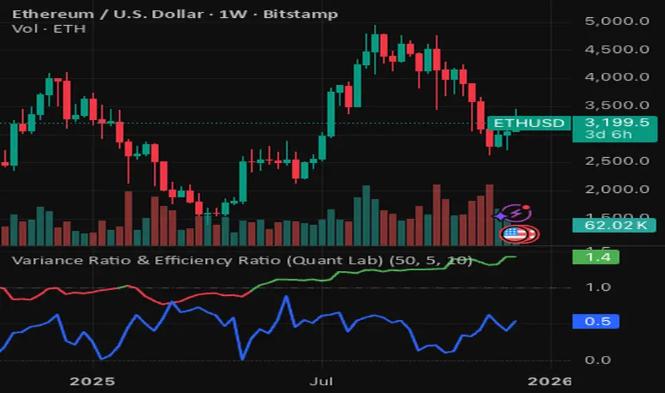
Variance Ratio & Efficiency Ratio (Quant Lab)1️⃣ Variance Ratio (VR)
Formula:
VR ≈ Var(q-step returns) / (q × Var(1-step returns))
Interpretation:
• VR ≈ 1 → The market is like a random walk; neither trend nor mean-reversion is dominant.
• VR > 1 → Trend behavior is dominant.
• Trend-following systems (EMA, Supertrend, breakout) work better.
• VR < 1 → Mean-reversion is dominant.
• Range/reversal strategies (Z-score, Bollinger fade, RSI reversal) work better.
In short:
• VR > 1 → Trending market
• VR < 1 → Mean-reverting market
This tells you:
“Should I build a trend system or a mean-reversion system for this instrument?”
⸻
2️⃣ Efficiency Ratio (ER)
Formula logic:
ER = |Close_now – Close_n-bars-ago| / Σ|Close_i – Close_{i+1}|
In other words:
• Numerator → Net movement over N bars
• Denominator → Total noise over N bars
Interpretation:
• ER ≈ 1 → The price has moved in almost a straight line in one direction.
→ The trend is very efficient, noise is low.
• ER ≈ 0 → The price has fluctuated a lot but hasn't gone anywhere definitively.
→ A complete noise/range market.
This tells you:
“How clear is the trend in this last N bars, and how much noise is there?”
⸻
🔥 The intelligence provided by both together:
• VR > 1 and ER is high (0.6–1.0) →
➜ Strong, high-quality trend. Golden age for trend-following.
• VR > 1 but ER is low (0.2–0.4) →
➜ Trend exists but there is a lot of noise, many fake movements. • VR < 1 and ER is low →
➜ Net range / sideways market. Ideal for mean-reversion.
Rolling Z-Score (Quant Lab)What does this Z-Score measure?
• src (default = close) → the value of the series you selected
• len → the window you are measuring based on the average of the last few bars
• Z ≈ 0 → price close to the average
• Z > 2 → price 2 standard deviations above the average (extremely positive deviation)
• Z < -2 → 2 standard deviations below the average (extremely negative deviation)
In modern mean-reversion strategies:
• Z > +2 → short / take profit candidate
• Z < –2 → long / dip buy candidate

DR/IDR, fractals, break + EMA Clouds + VWAPThis indicator is a powerful, multi-layered trading tool that combines three distinct forms of market analysis—volume, trend, and opening volatility—onto a single chart.
1. Opening Range Breakout (ORB) System
This is the foundation of the indicator, designed to capture the initial volatility and set key price boundaries for the trading day.
Time Focus: The indicator's primary analysis is centered on a specific, user-defined time period (default is 9:30 AM to 10:30 AM New York Time). Nothing related to the ORB drawing will appear on the chart before this session starts.
Wick High/Low (The Trigger): These lines track the absolute highest and lowest prices reached during the time window. They define the full extent of the initial range and are used to determine when a genuine breakout occurs.
Body High/Low (The Range & Targets): These lines track the highest and lowest open/close prices of the candles within the session. This area forms the central, shaded zone, representing the core consolidation area.
Range Shading: The background between the Body High and Body Low is shaded, but this visual feature only appears during the active forming time window (e.g., 9:30 AM to 10:30 AM) to maintain chart clarity.
Fractals: While the range is forming, the indicator detects 5-bar Williams Fractal patterns that occur inside the range. These small triangles (▲ or ▼) highlight minor reversal points established by the early trading action.
Breakout Signal: After the user-defined time window closes, the indicator waits. If a subsequent candle's price moves above the Wick High or below the Wick Low, a "BREAK" label is displayed on that candle. It is programmed to label only the first decisive break in each direction per day.
Extension Targets: When a breakout occurs, target lines are automatically projected above the Body High (for a bullish break) or below the Body Low (for a bearish break). The distance between these targets is calculated based on a user-defined fraction (e.g., 0.5 steps) of the total height of the Body Range.
Line Cutoff: For tidiness, you can set a "Stop Time" (e.g., 4:00 PM) after which the ORB lines will automatically disappear.
2. EMA Clouds (Trend and Momentum)
Four distinct Exponential Moving Average (EMA) clouds are plotted to provide a dynamic, multi-speed view of the market's trend and momentum.
Structure: Each "Cloud" is the shaded area between two EMAs (one shorter length and one longer length). The indicator includes four customizable pairs (defaulting to common settings like 8/9, 8/14, 34/50, and 14/21).
Trend Coloring: The clouds are color-coded:
Bullish (Greenish): The shorter EMA is trading above the longer EMA, signaling upward momentum.
Bearish (Reddish): The shorter EMA is trading below the longer EMA, signaling downward momentum.
Application: These clouds are used to confirm the overall market direction or identify potential zones of support and resistance.
3. Volume-Weighted Average Price (VWAP)
The VWAP is a crucial anchor for measuring the market's efficiency throughout the trading day.
Function: It calculates the average price of the asset, giving more weight to prices where higher volume was traded.
Context: It helps traders quickly determine if the current price is trading at a premium (above VWAP) or a discount (below VWAP) relative to the day's volume.
Reset: The VWAP line automatically resets at the beginning of each trading day.
Customization: The VWAP line can be toggled on or off, and its color and width are fully adjustable.

ICT Key Levels Suite |MC|Parts of this script were created by TheTickMagnet, Bankulov, and others. Many thanks to them; credit is due to all of you. I simply compiled them into a suite...
🌟 Overview 🌟
This tool highlights key price levels, such as highs, lows, and session opens, that can influence market movements. Based on ICT concepts, these levels help traders spot potential areas for market reversals or trend continuations.
🌟 Key Levels 🌟
🔹 Week Open (at Sunday 6:00pm EST for Futures)
Marks the start of the trading week. This level helps track price direction and is useful for framing the weekly candle formation using ICT’s Power of 3.
🔹 (Trading) Day Open: 6:00pm EST for Futures or 5:00pm EST for Forex.
🔹 Midnight Open (True Day Open) (00:00 EST)
The Midnight Open (MNOP) marks the start of the new trading day. Price often retraces to this level for liquidity grabs, setting up larger moves in the daily trend. It's also key for framing the Daily Power of 3 and spotting possible market manipulation.
🔹 Previous Day High/Low (customizable)
These levels show where liquidity remains, often serving as targets for price revisits, ideal for reversals or continuation trades.
🔹 Daily divider lines with Weekday label (customizable)
🌟 Overview 🌟
The ICT Sessions & Ranges Indicator helps traders identify key intraday price levels by marking custom session highs/lows and opening ranges.
It helps traders spot potential liquidity grabs, reversals, and breakout zones by tracking price behavior around these key areas
🌟 Session Highs & Lows – Liquidity Zones 🌟
Session highs and lows often attract price due to stop orders resting above or below them. These levels are frequently targeted during high-volatility moves.
🔹 Asia session
- Usually ranges in low volatility.
- Highs/lows often get swept during early London.
- Price may raid these levels, then reverse.
🔹 London session
- First major volatility of the day.
- Highs/lows often tested or swept in New York.
- Commonly forms the day's true high or low.
🔹 NY AM, Lunch & PM Session
🌟 Customizable Settings 🌟
The indicator includes 5 configurable ranges, each with:
Start & End Time – Set any custom time window.
Display Type – Choose Box (highlight range) or Lines (mark high/low) or both (Box and extended Lines).
Color Settings – Set custom colors for boxes and lines.
🌟 Default Settings (according to ICT) 🌟
Range 1: 6:00pm - 2:00am (Asia Session)
Range 2: 02:00 - 07:00 (London Session)
Range 3: 07:00 - 12:00 (NY AM Session)
Range 4: 12:00 - 1:30pm (NY Lunch Session)
Range 5: 1:30pm - 5:00pm (NY PM Session)
Happy trading!
Volatility of Volatility (Quant Lab)• VOV (white line)
• Around 0 → Volatility fluctuates normally
• Upward spike → Volatility changes very rapidly
• Often occurs during periods of breakouts, collapses, liquidations, and sharp trends
• When it stays low downwards → Volatility is stable, the market is moving at its “usual pace” • Regime histogram (columns)
• +1 (reddish) → Volatility Expanding
• Risk is increasing, “storm mode”
• Trend burst, flash move, news, liquidation effect
• 0 (orange) → Neutral
• Volatility behavior is normal
• -1 (turquoise) → Volatility Contracting
• Volatility is decreasing, movements are becoming smaller
• This may be a period before a big move after a squeeze
Keep this in mind:
• Volatility Regime → “What is the volatility level?”
• Volatility of Volatility → “How much is that volatility changing?”
When VoV spikes:
“Not only is market movement increasing, but the structure of the movement is also deteriorating; risk mode has been activated.”
This is crucial for identifying crash/pump periods.

Volatility Regime (Quant Lab)The Volatility Regime Indicator measures the current volatility environment of the market by combining two independent volatility metrics:
1. ATR-based volatility (how large price bars are)
2. Return standard deviation (how noisy or unstable returns are)
Both components are normalized (Z-score), averaged, and smoothed to produce a single Volatility Score, which identifies the market’s volatility regime.
The indicator classifies volatility into three distinct regimes:
Low Volatility (score < threshold)
• The market is calm and compressed.
• Price ranges are tight and movement is limited.
• Breakouts typically originate from this regime.
• Mean-reversion strategies perform best here.
Normal Volatility (within thresholds)
• The market is behaving normally.
• Trend-following and swing trades are stable.
• Risk is moderate.
High Volatility (score > threshold)
• The market is aggressive and unstable.
• Large price swings, news shocks, liquidations, manipulation possible.
• Risk and opportunity are both high.
• Leverage should be reduced or avoided.
A background color and regime histogram help visualize regime transitions instantly.
⸻
⭐ What this indicator tells you (Short Summary):
This indicator answers the question:
“Is the market calm, normal, or dangerous right now?”
You should interpret it as:
• Low Volatility → market is quiet, accumulation/squeeze phase, breakout likely soon.
• Normal Volatility → ideal trading conditions; trends behave cleanly.
• High Volatility → chaotic market; big moves coming; manage risk carefully.
The Volatility Regime Indicator helps you choose:
• Which strategy type to use (trend vs mean reversion)
• What stop size is appropriate
• Whether a breakout is real or likely to fail
• When to reduce position size due to risk expansion
It is a core tool used by quantitative traders to understand market conditions before applying any strategy.

Log Returns (Quant Lab)Log Returns Indicator
This indicator calculates the logarithmic return of each bar using the formula:
logReturn = ln(Close / Close )
It then visualizes:
• A log-return histogram (green for positive, red for negative returns)
• A rolling mean of log returns (yellow line)
• ±1 standard deviation bands around the mean (orange lines)
This indicator is used to:
• Measure the true statistical return behavior of the asset
• Detect volatility expansions and contractions
• Identify abnormal return spikes (news, liquidation cascades, manipulation)
• Evaluate market efficiency and momentum strength
• Prepare quantitative features for machine learning models
In simple terms, the Log Returns indicator shows whether the asset’s recent price behavior is normal or statistically unusual.

Standard Deviation Levels with Settlement Price and VolatilityStandard Deviation Levels with Settlement Price and Volatility.
This indicator plots the standard deviation levels based on the settlement price and the implied volatility. It works for all Equity Stocks and Futures.
For Futures
Symbol Volatility Symbol (Implied Volatility)
NQ VXN
ES VIX
YM VXD
RTY RVX
CL OVX
GC GVZ
BTC DVOL
The plot gives you an ideas that the price has what probability staying in the range of 1SD,2SD,3SD ( In normal distribution method)
Please provide the feedback or comments if you find any improvements

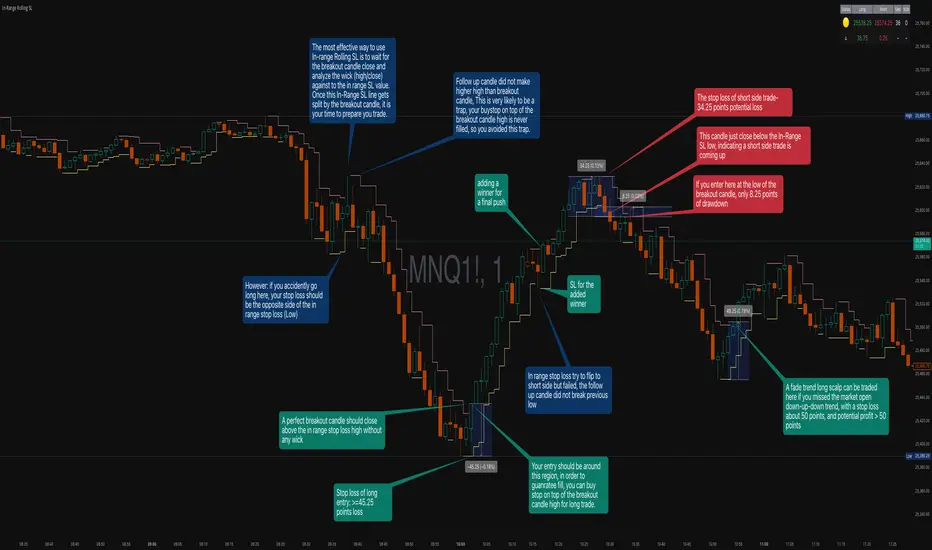
In-Range Rolling SL
In-Range Rolling SL Indicator Guide
The In-Range Rolling SL indicator is a dynamic stop-loss system designed for intraday trading that identifies squeeze conditions and trade entry opportunities based on rolling price windows.
Core Concept
The indicator analyzes the highest high and lowest low over a defined lookback period (default: 2 candles) to establish an "in-range" zone. When price stays within this range without breaking either boundary, it creates a squeeze condition—signaling potential breakout opportunities.
Trading Strategy
Wait for the Squeeze Setup
The most effective approach is to wait for the in-range stop-loss squeeze to form. This occurs when both the long SL (green line) and short SL (red line) are active simultaneously, indicated by the yellow status dot (🟡) in the indicator table. Analyze the wick high/close relationship against the in-range SL while price remains compressed—this setup identifies which side is more likely to break first.
Entry Timing and Risk Management
Long Entry: Enter when a candle closes above the in-range short SL (red line) without any wick above it. This "perfect breakout candle" confirms bullish momentum. Your entry should be around the region, with your stop-loss placed just below the top of the breakout candle's high.
Short Entry: Enter when a candle closes below the in-range long SL (green line). The stop-loss for short trades should be set 34.26 points above your entry for appropriate risk protection.
Risk-Reward Considerations
If you enter at the low of a breakout candle, expect only 8.26 points of drawdown potential. However, if you accidentally go long and your stop gets hit, you'll experience the full in-range stop-loss distance as your loss.
Advanced Techniques
Failed Breakout Trap: If a follow-up candle doesn't make a higher high after the initial breakout, consider adding a "winner" for compensation rather than holding for a trap. When your buy-stop sits on top of the breakout candle high, this isn't a valid long trade setup.
Flip Trade Opportunity: In-range stop-loss attempts to flip often provide ideal entry points. If the up candle doesn't break the previous low, this validates the long continuation.
Long Scalp Trading: A failed long scalp can be traded if you missed the initial market open down-up-down trend. With a stop-loss of 34 points and potential profit exceeding 50 points, this provides favorable risk-reward ratios.
Sustained Loss Management: Stop-loss for long positions should target 26 points maximum loss. The indicator automatically invalidates stop-losses when price violates them, keeping your chart clean for the next setup.
-------------------------
In-Range Rolling SL Indicator Guide
The In-Range Rolling SL indicator is a dynamic stop-loss system designed for intraday trading that identifies squeeze conditions and breakout opportunities based on rolling price windows.
How the Indicator Works
The indicator tracks the highest high and lowest low over your selected lookback period (default: 2 candles) to establish dynamic support and resistance levels. These levels create an "in-range" zone that adapts as new price action develops.
Visual Components
Green Line (Long SL): The rolling window's lowest low - your stop-loss level for long positions
Red Line (Short SL): The rolling window's highest high - your stop-loss level for short positions
Status Indicators:
🟡 Yellow: Squeeze condition (both SLs active)
🟢 Green: Long-only setup
🔴 Red: Short-only setup
⚪ White: Neutral (no active SLs)
The Squeeze Setup Strategy
Step 1: Wait for the Squeeze
The most effective way to use the In-Range Rolling SL is to wait for the in-range stop-loss squeeze to form. During the squeeze, both the green and red lines are active, meaning price has stayed within the rolling window without breaking either boundary. This compression phase indicates that it's "go time" to prepare your trade.
While in the squeeze, analyze the wick high/close relationship against the in-range SL levels. This analysis helps you determine which side is more likely to split when the breakout occurs.
Step 2: Identify the Perfect Breakout
Long Breakout: A perfect breakout candle should close above the in-range stop-loss high (red line) without any wick above it. This clean breakout demonstrates strong momentum and reduces the risk of a false breakout.
Short Breakout: Look for a candle that closes below the in-range SL low (green line), indicating a short-side trade is coming up.
Step 3: Entry Execution
Long Entry: Your entry should be around the region of the breakout. Position your stop-loss just below the top of the breakout candle's high. This placement protects you from failed breakouts while giving the trade room to develop.
Short Entry: Enter as the candle closes below the in-range SL low. The stop-loss for short-side trades is typically 34.26 points of potential loss based on the indicator's measurements.
Risk-Reward Analysis
Entry at Breakout Low
If you enter here at the low of the breakout candle, you're looking at only 8.26 points of drawdown potential. This represents your best-case entry scenario.
Accidental Wrong-Side Entry
However, if you accidentally go long here and your stop gets hit, you'll experience the full in-range stop-loss distance as your loss. This emphasizes the importance of waiting for clear breakout confirmation.
Long Scalp Opportunity
A failed long scalp can be traded here if you missed the market open down-up-down trend. With a stop-loss of 34 points and potential profit greater than 50 points, this setup offers a favorable risk-reward ratio of approximately 1:1.5.
Advanced Trade Management
Failed Breakout Recognition
Follow-Up Candle Validation: If a follow-up candle did not make a higher high than the breakout candle, this could be a trap. Your buy-stop on top of the breakout candle high is not a valid long trade setup in this scenario. Consider adding a "winner" for compensation rather than holding through the potential reversal.
Flip Trade Opportunities
In-range stop-loss tries to flip to the other side often provide excellent entries. If the up candle did not break the previous low, this validates the long continuation and suggests the squeeze is resolving to the upside.
Sustained Position Management
Stop-Loss Guidelines: Stop-loss for long positions should be 26 points of maximum loss. The indicator table displays the delta (Δ) showing your real-time distance to the active stop-loss, helping you manage risk dynamically.
Entry Timing: Your entry should be around the region where the breakout confirms, rather than chasing price after a large move. In order to prepare your trade, position your stop-loss on top of the breakout candle's high for long trades.
Practical Example from the Chart
Looking at the MNQ1! chart, you can see multiple squeeze formations throughout the session. The most notable sequence shows:
An initial downtrend creating a squeeze setup
A perfect breakout candle closing above the red line without upper wick
The subsequent candle validating the move
Later, a failed breakout attempt that created a short opportunity
Multiple flip attempts that provided re-entry points for scalpers
The indicator's table in the top-right continuously updates with the current SL levels, gap size, candle size, and delta values - giving you all the information needed to assess each trade's risk-reward profile in real-time.
SWING [DEMAK]SWING
EMA 5, 25, 50, 200, 250
SMA 10
Indicator for finding swing trades and reading direction
STOCKS / CRYPTO / FUTURES


SCOTTGO Advanced MACD🌟 Custom MACD: Enhanced Visuals & Crossover Signals
This indicator is a highly customized version of the traditional Moving Average Convergence Divergence (MACD) oscillator, designed to provide clear, immediate visual confirmation of signal line crossovers and zero-line crossings.
Core Features:
MACD Crossover Shadow Fill: The area between the MACD line and the Signal line is filled with a customizable shadow. This instantly visualizes whether the MACD is above (bullish crossover) or below (bearish crossover) the Signal line.
Signal Crossover Markers (Arrows & Dots):
Crossover Dot: A small, configurable solid dot is plotted exactly at the point where the MACD and Signal lines intersect, providing pinpoint accuracy for the crossover event.
Crossover Arrows: Customizable up (green) and down (red) arrows are plotted using a small numerical offset from the crossover point, ensuring visibility without cluttering the indicator lines.
Zero-Line Crossing Markers: Distinct, small markers (circles/diamonds) are used to signal when the MACD line crosses the zero line, indicating a shift in momentum relative to the baseline.
Customizable MA Type: The user can select either Exponential Moving Average (EMA) or Simple Moving Average (SMA) for both the MACD oscillator calculation and the signal line calculation.
This indicator is ideal for traders who rely on MACD crossovers and require precise, configurable visual feedback directly on the chart.

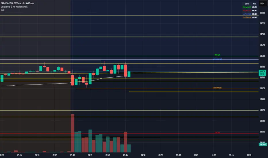
1HR Pivots & Pre-Market Levels1HR Pivots & Pre-Market Levels Indicator
Overview
This indicator is designed for intraday traders who want to identify key price levels that often act as support and resistance throughout the trading day. It combines multiple timeframe analysis into a single, clean overlay on your chart.
Key Features
1-Hour Pivot Levels
The indicator automatically detects significant swing highs and lows from the 1-hour timeframe and displays them as horizontal levels on your chart, regardless of what timeframe you're viewing. These pivots are calculated using closing prices (line chart style) rather than wicks, which provides cleaner, more reliable levels. You can display up to 20 pivot levels and customize how sensitive the detection is.
Pre-Market High & Low
Before the regular session opens, price action in the pre-market often establishes important boundaries for the day. This indicator tracks and displays the pre-market high (green) and low (red) from 4:00 AM to 9:30 AM Eastern Time. These levels are derived from 1 min prices including wicks.
First 15-Minute Range
The opening 15 minutes of the regular session (9:30-9:45 AM ET) frequently sets the tone for the rest of the day. The indicator marks the high (blue) and low (orange) of this critical period, including wicks, giving you clear reference points for potential breakout or reversal trades.
Session VWAP
Volume Weighted Average Price is included as a white line that resets daily. VWAP represents the average price weighted by volume and is widely used by institutional traders. Price trading above VWAP suggests bullish sentiment, while price below suggests bearish sentiment.
Why It's Useful
Multi-timeframe context on any chart - View 1-hour levels while trading on a 1-minute or 5-minute chart
Key session-based levels - Pre-market range and opening range are proven reference points for day traders
Clean visualization - All levels draw from their origin point so you can see exactly where each level was established
Fully customizable - Adjust colors, line thickness, and number of levels to match your preferences
Information table - Quick reference panel showing exact prices for all key levels
Best Used For
Identifying potential support and resistance zones
Planning entries and exits around key levels
Gauging whether price is extended or at value (using VWAP)
Understanding the day's structure at a glance