ma+ko Arrowsma+ko ARROWS is a clean Supertrend-based indicator that generates precise BUY and SELL arrows without repainting after candle close.
市場センチメントを測るインジケーター

Multi MA Tools Pro**📈 MT MA Pro - Multi Moving Average Tools Pro**
**🔧 HOW TO USE:**
**🎯 BASIC SETUP:**
1. **Apply indicator** to any chart
2. **Enable/Disable** each MA type using toggle switches
3. **Customize lengths** (5, 10, 20, 50, 100, etc.)
4. **Set colors** for better visual distinction
5. **Choose timeframes** for multi-timeframe analysis
**📊 MOVING AVERAGE TYPES:**
- **SMA** - Simple Moving Average (Trend direction)
- **EMA** - Exponential Moving Average (Faster signals)
- **WMA** - Weighted Moving Average (Recent price emphasis)
- **ZLEMA** - Zero Lag EMA (Reduced lag)
- **RMA** - Running Moving Average (Smoother trends)
- **VWMA** - Volume Weighted MA (Price-volume correlation)
**🚨 5-8-13 STRATEGY ALERT SYSTEM:**
- **Real-time status** for SMA & EMA separately
- **Color-coded signals** for quick decision making
- **Action recommendations** based on price position
**🎨 CUSTOMIZATION OPTIONS:**
- Adjustable line widths and styles
- Multiple color schemes
- Flexible timeframe settings
- Individual MA visibility control
**⚡ TRADING STRATEGIES:**
- **Trend Identification** - Multiple MA crossovers
- **Support/Resistance** - MA clusters as dynamic levels
- **Multi-timeframe Analysis** - Higher timeframe context
- **Volume Confirmation** - VWMA for validation
**📱 IDEAL FOR:**
- Swing traders (4H, Daily timeframes)
- Day traders (15M, 1H timeframes)
- Position traders (Weekly, Monthly)
- All market types (Stocks, Crypto, Forex)
**🔍 PRO TIPS:**
- Combine with other indicators for confirmation
- Use alerts for key crossovers
- Adjust lengths based on market volatility
- Test different MA combinations
**⚠️ RISK DISCLAIMER:**
This indicator is for educational purposes only. Always use proper risk management and combine with other analysis tools. Past performance doesn't guarantee future results.
**📞 SUPPORT:**
For questions or suggestions, please refer to the indicator documentation or contact the developer.
---
*Master your trends with MT MA Pro!* 🚀

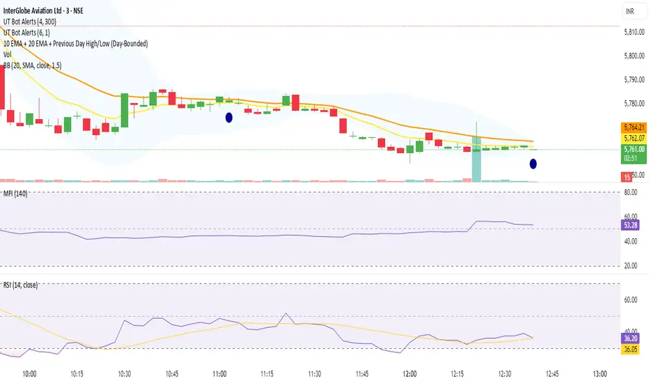
10 EMA + 20 EMA + Previous Day High/Low (Day-Bounded)it gives the reand and also plot the day's lowest volume.it is very helpful in reversals

XAUUSD Multi-Timeframe Supertrend Alert v2**Indicator Overview: XAUUSD Multi-Timeframe Supertrend Alert v2**
**Core Components:**
1. **Multi-Timeframe Supertrend System**
- Two Supertrend indicators (ST1 & ST2) with customizable timeframes
- ST1 typically set to Daily, ST2 to Weekly as main trend
- Visualized with distinct colors and background fills
2. **Customizable SMA**
- Adjustable period and timeframe
- Plotted as blue line for additional trend reference
3. **Neutral Zone System**
- Creates a neutral line offset from ST1 by customizable tick distance
- Yellow dashed line that adjusts based on ST1 trend direction
- **Alert Conditions:**
- **Test Buy Zone**: Both ST1 & ST2 in uptrend AND price enters neutral zone above ST1
- **Test Sell Zone**: Both ST1 & ST2 in downtrend AND price enters neutral zone below ST1
4. **Distance Lines from ST2**
- Upper/lower lines at customizable tick distance from ST2
- Purple dashed lines with touch alerts
**Trading Signals:**
- **Bullish Signal**: Price above ST2 but below ST1 (potential buy)
- **Bearish Signal**: Price below ST2 but above ST1 (potential sell)
- **Neutral Zone Alerts**: Price enters defined zone when both trends align
- **Line Touch Alerts**: Price touches distance lines from ST2
**Alert System:**
- Limited to 3 consecutive alerts per signal type
- Visual markers (triangles, diamonds, circles)
- Background coloring for signal zones
- Separate alert conditions for each signal type
**Visual Features:**
- Candles colored green/red based on signals
- Clear trend visualization with colored backgrounds
- Real-time alert markers without information table clutter
This indicator provides multi-timeframe trend analysis with precise entry zone detection and comprehensive alert system for XAUUSD trading. SAM89 M15, ST1 (5:10) M5, ST2 ( 1,5:20) H1, Test Buy Sell 7000, Line 15000

EMA6 or SMA6 Touch AlertThis script monitors the market and notifies you whenever the price touches either the 6-period EMA or the 6-period SMA.
It helps identify potential pullbacks, reaction points, or entry zones, as price interaction with these moving averages often signals short-term market shifts.
What the script does:
Calculates the EMA 6 and SMA 6
Detects if price touches either moving average within the candle
Plots both lines on the chart for visibility
Allows you to set alerts to receive automatic notifications
Best suited for:
Scalping
Day Trading
Pullback Entries
Short-term trend reactions
CHN-Super AnalizAutomatically determines support and resistance levels. Performs trend analysis. Determines stop level. Gives buy and sell signals.

VietNguyen Buy/Sell VIPThis is indicator of VietNammes, it is very good for trade Gold and Crypto.
VietNguyen DN

ASTER Key Levels & Alerts (Improved)TradingView Script Description
Title: ASTER Key Levels & Alerts (Improved)
Description:
Enhance your trading strategy with the "ASTER Key Levels & Alerts" indicator, designed for precision and decision-making on the Aster chart (e.g., ASTS). This Pine Script v6 tool overlays customizable key levels and zones to identify optimal entry, exit, and stop-loss points, complete with real-time alerts.Key Features:
Customizable Levels: Adjust add zones (Light & Main), breakout, stop, and take-profit (TP1-TP3

ATRThis script displays the Average True Range (ATR) value and the ATR as a percentage of the current closing price directly on the main chart as a clean table, with no lines or plots. It allows users to easily monitor both absolute volatility and its relative magnitude, making comparisons across different assets intuitive. The display position is customizable, offering flexibility for personal chart layouts. Ideal for traders seeking quick volatility insights, risk management guidance, or portfolio-wide comparisons.
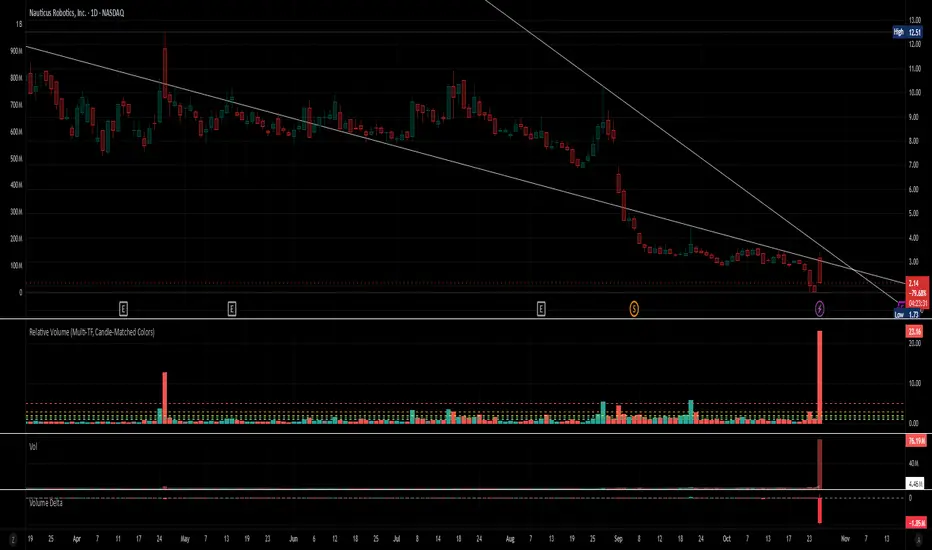
Relative Volume (Multi-TF, D, W, M)Relative Volume (Multi-TF, Candle-Matched Colors)
This indicator measures Relative Volume (RVOL) — the ratio of current volume to average historical volume — across any higher timeframe (Daily, Weekly, or Monthly) and displays it as color-coded columns that match the candle colors of the chart you’re viewing.
RVOL reveals how active today’s market participation is compared to its typical rhythm.
RVOL = 1.0 → normal volume
>1.5 → rising interest
>2.0–3.0 → strong institutional participation
>5.0 → climax or exhaustion levels
Features
Works on any chart timeframe while computing RVOL from your chosen higher timeframe (e.g., show Daily RVOL while trading on a 5-minute chart).
Column colors automatically match your chart’s candle colors (green/red/neutral).
Adjustable lookback period (len) and selectable source timeframe (D, W, or M).
Pre-drawn horizontal guide levels at 1.0, 1.2, 1.5, 2, 3, and 5 for quick interpretation.
Compatible with all chart types, including Heikin Ashi or custom color schemes.
Typical Use
Swing trading:
Look for quiet bases where RVOL stays 0.4–0.9, then expansion ≥2 on breakout days.
Confirm follow-through when green days keep RVOL ≥1.2–1.5 and red pullbacks stay below 1.0.
Day trading:
Watch intraday RVOL (on 1–5m charts) for bursts ≥2 that sustain for several bars — this signals crowd engagement and valid momentum.
Interpretation Summary
RVOL Value Meaning Typical Action
0.4–0.9 Quiet base / low interest Watch for setup
1.0 Normal activity Neutral
1.2–1.5 Valid participation Early confirmation
2–3 Strong expansion Momentum / breakout
≥5 Climax / exhaustion Take profits or avoid new entries
Author’s note:
RVOL isn’t directional; it tells how many players are active, not who’s winning. Combine it with structure (levels, VWAP, or trend) to see when the market crowd truly commits.
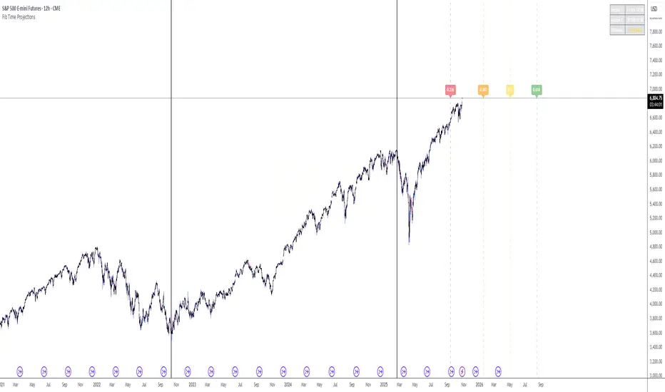
Fib Time Projections aFib Time Projections aFib Time Projections aFib Time Projections aFib Time Projections a
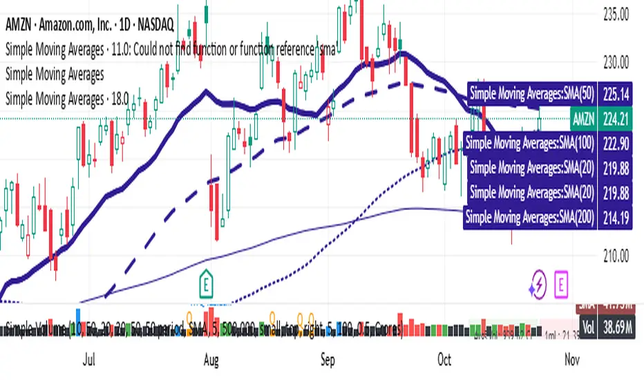
Simple Moving AveragesIn Pine Script v6, the standard method for plotting indicators is still the plot function, and it should be recognized. However, if you are getting an "Undeclared identifier 'plot'" error, double-check these points:
Make sure your script is still using indicator() (not study()) at the top.
The script must not use indentation or syntax errors that break context.
Confirm Pine Script version is set correctly with //@version=6.
Here is a fully corrected Pine Script v6 template for your moving averages scenario using
PDH & PDL Levels This indicator mark previous day high and low lines on current day. Lines will start at opening of the market and will remain there till end of the day. Lines are marked with PDH and PDL labels

1800 Standart Deviation1800 Standard Deviation
This script automatically plots standard deviation levels calculated from the 18:00 open price (based on your selected timezone). It provides a clear visual framework to analyze market volatility and key price zones around the session open.
How it works
At 18:00 (configurable timezone), the script records the open price and calculates multiple standard deviation levels above and below it.
Each level is expressed in points (or pips) relative to the open.
Horizontal lines are drawn and extended automatically as new bars appear.
Labels display the corresponding deviation value.
Colored boxes highlight important ranges between levels, such as neutral or high-volatility zones.
Customization
Adjustable timezone (GMT, Paris, or others).
Option to enable or disable the 18:00 deviation drawing.
Automatic daily refresh at the specified time.
Use cases
Identify volatility zones and price deviation ranges around 18:00.
Determine potential reversal or entry zones based on standard deviations.
Use as a technical reference for intraday or swing trading setups.
Notes
The calculations are purely statistical and price-based — no indicators or moving averages are used.
This script is visual only and does not generate buy/sell signals.


SECTOR ROTATION Sector Rotation Indicator with Auto Chart Symbol
This indicator helps traders track relative performance across multiple indices/sectors simultaneously, making it easy to identify sector rotation and market leadership.
Key Features:
✅ 21 Symbols Tracking: Monitor 20 customizable symbols + your current chart symbol automatically(DIVIDEND SYMBOL)
✅ Percentage Performance: All moving averages show percentage gain/loss from 1 timeframe period ago
✅ Color-Coded Visualization: Heat map coloring (red to green) based on relative performance ranking
✅ Flexible Timeframes: Works on any timeframe from 1-minute to 12-month charts
✅ Performance Table: Quick-view table showing candle performance with inside/outside bar detection
✅ Indian Market Ready: Pre-configured with NSE indices (NIFTY, BANKNIFTY, and sectoral indices)
Default Symbols (Customizable):
NIFTY, CNXSMALLCAP, CNXMIDCAP, BANKNIFTY
Sector indices: IT, AUTO, PHARMA, METAL, ENERGY, FMCG, etc.
Plus your current chart symbol (automatically added)
How It Works:
Select your preferred timeframe (1D, 1W, 1M, etc.)
The indicator calculates percentage performance from given period ago
Moving averages show smoothed performance trends
Colors indicate relative strength: Green = outperformers, Red = underperformers
Perfect For:
Sector rotation analysis
Relative strength comparison
Market breadth assessment
Index/ETF traders
Swing and position traders
Settings:
Adjustable MA length (default: 20)
Customizable colors and table position
Show/hide percentage labels
Horizontal or vertical table layout
This is not any buy or sell signal or recommendation, consult with your advisor first.

OBV (Delta or regular)This is a quite simple script to apply some choices to OBV.
You can choose to use regular OBV values or you can choose to use delta OBV values.
Delta OBV values calculates the delta between selling volume and buying volume per bar to find discrepancies.
You can make the OBV a smoothed line or just keep the normal rigid line. Rigid line is default.
A secondary smoothed OBV line is added automatically with color change if the OBV is above or below the smoothed line.
You can set your desired MA from SMA, EMA, VWMA and WMA, The same will be applied to both lines if chosen to smooth them both.
Both lines are editable from the styles tab (visibility, color and line type)
If you for some reason don't want color change on the secondary line, chose the same color for both color 1 and 2.
Simple delta OBV example:
If a red bar has a long lower wick, OBV will calculate the entire bar towards bearish volume, while the delta will check if there's more buying or selling happening in total. Some times you'll be able to catch divergences in the volume which implies a reversal might be in the making.
For instance more selling on a green candle making the OBV drop instead of increasing or vise versa.
Hopefully someone finds is useful.


Mohit-Fixed 4H & 15M Basesbase concept script
taught by Team ATM
A Trading Monk
-Nitin Makhija
-Akhilesh Pandey

Fibonacci levels MTF 2WEEK KKKKA Fibonacci arc trading strategy uses circular arcs drawn at Fibonacci retracement levels (38.2%, 50%, 61.8%) to identify potential support and resistance zones, often intersecting with a trend line. This strategy helps traders anticipate price reversals or pullbacks, and it should be used in conjunction with other indicators

Fibonacci Retracement MTF/LOG 3 WEEK KKKKA Fibonacci arc trading strategy uses circular arcs drawn at Fibonacci retracement levels (38.2%, 50%, 61.8%) to identify potential support and resistance zones, often intersecting with a trend line. This strategy helps traders anticipate price reversals or pullbacks, and it should be used in conjunction with other indicators
