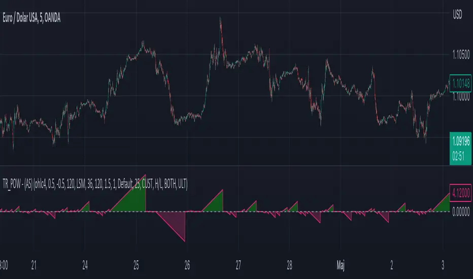
Moving Average - TREND POWER v1.1- (AS)0)NOTE:
This is first version of this indicator. It's way more complicated than it should be. Check out Moving Average-TREND POWER v2.1-(AS), its waaaaay less complicated and might be better.Enjoy...
1)INTRODUCTION/MAIN IDEA:
In simpliest form this script is a trend indicator that rises if Moving average if below price or falling if above and going back to zero if there is a crossover with a price. To use this indicator you will have to adjust settings of MAs and choose conditions for calculation.
While using the indicator we might have to define CROSS types or which MAs to use. List of what cross types are defined in the script and Conditiones to choose from.The list will be below.
2) COMPOSITION:
-MA1 can be defined by user in settings, possible types: SMA, EMA, RMA, HMA, TEMA, DEMA, LSMA, WMA.
-MA2 is always ALMA
3) OVERLAY:
Default is false but if you want to see MA1/2 on chart you can change code to true and then turn on overlay in settings. Most plot settings are avalible only in OV=false.
if OV=true possible plots ->MA1/2, plotshape when choosen cross type
if OV=false -> main indicator,TSHs,Cross counter
4)PRESETS :
Indicator has three modes that can be selected in settings. First two are presets and do not require selecting conditions as they set be default.
-SIMPLE - most basic
-ABSOLUTE - shows only positive values when market is trending or zero when in range
-CUSTOM - main and the most advanced form that will require setting conditions to use in calculating trend
4.1)SIMPLE – this is the most basic form of conditions that uses only First MA. If MA1 is below selected source (High/Low(High for Uptrend and Low for DNtrend or OHLC4) on every bar value rises by 0.02. if it above Low or OHLC4 it falls by 0.02 with every bar. If there is a cross of MA with price value is zero. This preset uses CROSS_1_ULT(list of all cross types below)
4.2) ABSOLUTE – does not show direction of the trend unlike others and uses both MA1 and MA2. Uses CROSS type 123_ULT
4.3) CUSTOM – here we define conditions manually. This mode is defined in parts (5-8 of description)
5)SETTINGS:
SOURCE/OVERLAY(line1) – select source of calculation form MA1/MA2, select for overlay true (look point 3)
TRESHOLDS(line2). – set upper and lower THS, turn TSHs on/off
MA1(line3) – Length/type of MA/Offset(only if MA type is LSM)
MA2(line4) – length/offset/sigma -(remember to set ma in the way that in Uptrend MA2MA1 in DNtrend)
Use faster MA types for short term trends and slower types / bigger periods for longer term trends, defval MA1/2 settings
are pretty much random so using them is not recomended.
CROSSshape(line5) – choose which cross type you want to plot on chart(only in OV=true) or what type you want to use in counting via for loops,
CROSScount(line6) – set lookback for type of cross choosen above
BOOLs in lines 5 and 6 - plotshape if OV=true/plot CROSScount histogram (if OV=false)
Lines 7 and 8 – PRESET we want to use /SRC for calculation of indicator/are conditions described below/which MAs to use/Condition for
reducing value t 0 - (if PRESET is ABSOLUTE or SIMPLE only SRC should be set(Line 8 does not matter if not CUSTOM))
5)SOURCE for CONDS:
Here you can choose between H/L and OHLC. If H/L value grow when MAlow. If OHLC MAOHLC. H/L is set by default and recommended. This can be selected for all presets not only CUSTOM
6)CROSS types LIST:
“1 means MA1, 2 is MA2 and 3 I cross of MA1/MA2. L stands for low and H for high so for example 2H means cross of MA2 and high”
NAME -DEFINITION Number of possible crosses
1L - cross of MA1 and low 1
1H - cross of MA1 and high 1
1HL - cross of MA1 and low or MA1 and high 2 -1L/1H
2L - cross of MA2 and low 1
2H - cross of MA2 and high 1
2HL - cross of MA2 and low or MA1 and high 2 -2L/2H
12L - cross of MA1 and low or MA2 and low 2 -1L/2L
12H - cross of MA1 and high or MA2 and high 2 -1H/2H
12HL - MA1/2 and high/low 4 -1H/1L/2H/2L
3 -cross of MA1 and MA2 1
123HL -crosses from 12HL or 3 5 -12HL/3
1_ULT - cross of MA1 with any of price sources(close,low,high,ohlc4 etc…)
2_ULT - cross of MA2 with any of price sources(close,low,high,ohlc4 etc…)
123_ULT – all crosses possible of MA1/2 (all of the above so a lot)
7)CRS CONDS:
“conditions to reduce value back to zero”
>/< - 0 if indicator shows Uptrend and there’s a cross with high of selected MA or 0 if in DNtrend and cross with low. Better for UP/DN trend detection
ALL – 0 if cross of MA with high or low no matter the trend, better for detecting consolidation
ULT – if any cross of selected MA, most crosses so goes to 0 most often
8)MA selection and CONDS:
-MA1: only MA1 is used,if MA1 below price value grows and the other way around
MA1price =-0.02
-MA2 – only MA2 is used, same conditions as MA1 but using MA2
MA2price =-0.02
-BOTH – MA1 and MA2 used, grows when MA1 if below, grows faster if MA1 and MA2 are below and fastest when MA1 and MA2 are below and MA2price=-0.02
-MA1 and MA2 >price=-0.03
-MA1 and MA2 ?price and MA2>MA1=-0.04
9)CONDITIONS SELECTION SUMMARRY:
So when CUSTOM we choose :
1)SOURCE – H/L or OHLC
2)MAs – MA1/MA2/BOTH
3)CRS CONDS (>/<,ALL,ULT)
So for example...
if we take MA1 and ALL value will go to zero if 1HL
if MA1 and >/< - 0 if 1L or 1H (depending if value is positive or negative).(1L or 1H)
If ALL and BOTH zero when 12HL
If BOTH and ULT value goes back to zero if Theres any cross of MA1/MA2 with price or cross of MA1 and MA2.(123_ULT)
If >/< and BOTH – 0 if 12L in DNtrend or 12H if UPtrend
10) OTHERS
-script was created on EURUSD 5M and wasn't tested on different markets
-default values of MA1/MA2 aren't optimalized so do not
-There might be a logical error in the script so let me know if you find it (most probably in 'BOTH')
-thanks to @AlifeToMake for help
-if you have any ideas to improve let me know
-there are also tooltips to help
Consolidation
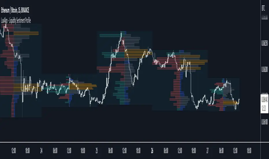
Liquidity Sentiment Profile [LuxAlgo]The Liquidity Sentiment Profile is an advanced charting tool that measures by combining PRICE and VOLUME data over specified anchored periods and highlights within a sequence of profiles the distribution of the liquidity and the market sentiment at specific price levels.
The Liquidity Sentiment Profile allows traders to reveal significant price levels, dominant market sentiment, support and resistance levels, supply and demand zones, liquidity availability levels, liquidity gaps, consolidation zones, and more based on price and volume data.
Liquidity refers to the availability of orders at specific price levels in the market, allowing transactions to occur smoothly.
🔶 USAGE
A Liquidity Sentiment Profile is a combination of a liquidity and a sentiment profile, where the right part of the profile displays the distribution of the traded activity at different price levels and the left part displays the market sentiment at those price levels.
The Liquidity Sentiment Profiles are visualized with different colors, where each color has a different meaning.
The Liquidity Sentiment Profiles aim to present Value Areas based on the significance of price levels, thus allowing users to identify value areas that can be formed more than once within the range of a single profile.
Level of Significance Line - displays the changes in the price levels with the highest traded activity (developing POC)
🔶 SETTINGS
The script takes into account user-defined parameters and plots the profiles, where detailed usage for each user-defined input parameter in indicator settings is provided with the related input's tooltip.
🔹 Liquidity Sentiment Profiles
Anchor Period: The indicator resolution is set by the input of the Anchor Period, the default option is AUTO.
🔹 Liquidity Profile Settings
Liquidity Profile: Toggles the visibility of the Liquidity Profiles
High Traded Nodes: Threshold and Color option for High Traded Nodes
Average Traded Nodes: Color option for Average Traded Nodes
Low Traded Nodes: Threshold and Color option for Low Traded Nodes
🔹 Sentiment Profile Settings
Sentiment Profile: Toggles the visibility of the Sentiment Profiles
Bullish Nodes: Color option for Bullish Nodes
Bearish Nodes: Color option for Bearish Nodes
🔹 Other Settings
Level of Significance: Toggles the visibility of the Level of Significance Line
Profile Price Levels: Toggles the visibility of the Profile Price Levels
Number of Rows: Specify how many rows each profile histogram will have. Caution, having it set to high values will quickly hit Pine Script™ drawing objects limit and fewer historical profiles will be displayed
Profile Width %: Alters the width of the rows in the histogram, relative to the profile length
Profile Range Background Fill: Toggles the visibility of the Profiles Range
🔶 LIMITATIONS
The amount of drawing objects that can be used is limited, as such using a high number of rows can display fewer historical profiles and occasionally incomplete profiles.
🔶 RELATED SCRIPTS
🔹 Buyside-Sellside-Liquidity
🔹 ICT-Concepts
🔹 Swing-Volume-Profiles
Moving Average Contrarian IndicatorThis indicator is designed to identify potential turning points in the market. By measuring the distance between the price and a moving average, and normalizing it, the MACI provides valuable insights into market sentiment and potential reversals. In this article, we will explore the calculation, interpretation, and practical applications of the MACI, along with its potential limitations.
The MACI is calculated in several steps. First, a moving average is computed using a user-defined length, representing the average price over the specified period. The distance between the current price and the moving average is then determined. This distance is normalized using the highest and lowest distances observed within the chosen length, resulting in a value between 0 and 100. Higher MACI values indicate that the price is relatively far from the moving average, potentially signaling an overextension, while lower values suggest price consolidation or convergence with the moving average.
Altering the parameters of the Moving Average Contrarian Indicator can provide traders with additional flexibility and adaptability to suit different market conditions and trading styles. By adjusting the length parameter, traders can customize the sensitivity of the indicator to price movements. A shorter length may result in more frequent and responsive signals, which can be useful for short-term traders aiming to capture quick price reversals. On the other hand, a longer length may provide smoother signals, suited for traders who prefer to focus on longer-term trends and are less concerned with minor fluctuations. Experimenting with different parameter values allows traders to fine-tune the indicator to align with their preferred trading timeframes and risk tolerance. However, it is essential to strike a balance and avoid excessive parameter adjustments that may lead to over-optimization or curve fitting. Regular evaluation and optimization based on historical data and real-time market observations can help identify the most suitable parameter values for optimal performance.
The coloration of the Moving Average Contrarian Indicator provides visual cues that assist traders in interpreting its signals. The background color, set based on the indicator's values, adds an additional layer of context to the chart. When the indicator is indicating bullish conditions, the background color is set to lime, suggesting a favorable environment for long positions. Conversely, when the indicator signals bearish conditions, the background color is set to fuchsia, indicating a potential advantage for short positions. In neutral or transitional periods, the background color is set to yellow, indicating caution and the absence of a clear bias.
The bar color complements the histogram and provides additional visual clarity. When the MACI value is greater than the MACI SMA value and exceeds the threshold of 30, the bars are colored lime, signaling potential bullish conditions. Conversely, when the MACI value is below the MACI SMA value and falls below the threshold of 70, the bars are colored fuchsia, indicating potential bearish conditions. For values that fall between these thresholds, the bars are colored yellow, highlighting a neutral or transitional state.
Practical Uses and Strategies:
The MACI offers traders and analysts valuable insights into market dynamics and potential reversal points. When the MACI is above its moving average and above a predefined threshold (e.g., 30), it suggests that prices have deviated significantly from the average and may be overbought. This could serve as an early indication for potential short-selling opportunities or taking profits on existing long positions. Conversely, when the MACI is below its moving average and below a predefined threshold (e.g., 70), it suggests oversold conditions, potentially signaling a buying opportunity. Traders can combine MACI with other technical indicators or price patterns to further refine their trading strategies.
The MACI can be a powerful tool for identifying potential market reversals. When the MACI reaches extreme levels, such as above 70 or below 30, it indicates overbought or oversold conditions, respectively. Traders can use these signals to anticipate price reversals and adjust their trading strategies accordingly. For example, when the MACI enters the overbought zone, traders may consider initiating short positions or tightening stop-loss levels on existing long positions. Conversely, when the MACI enters the oversold zone, it may indicate a buying opportunity, prompting traders to consider initiating long positions or loosening stop-loss levels.
The MACI can also be used in conjunction with price action to identify potential divergence patterns. Divergence occurs when the MACI and price move in opposite directions. For instance, if the price is making higher highs while the MACI is making lower highs, it suggests a bearish divergence, indicating a potential trend reversal. Conversely, if the price is making lower lows while the MACI is making higher lows, it suggests a bullish divergence, signaling a potential trend reversal to the upside. Traders can use these divergence patterns as additional confirmation signals when making trading decisions.
Limitations:
-- Sideways and Choppy Markets : The MACI performs best in trending markets where price movements are more pronounced. In sideways or choppy markets with limited directional bias, the MACI may generate false signals or provide less reliable indications. Traders should exercise caution when relying solely on the MACI in such market conditions and consider incorporating additional analysis techniques or filters to confirm potential signals.
-- Lagging Indicator : The MACI is a lagging indicator, as it relies on moving averages and historical price data. It may not provide timely signals for very short-term trading or capturing rapid price movements. Traders should be aware that there may be a delay between the occurrence of a signal and its confirmation by the MACI.
-- False Signals : Like any technical indicator, the MACI is not immune to false signals. It is essential to use the MACI in conjunction with other technical indicators, chart patterns, or fundamental analysis to increase the probability of accurate predictions. Combining multiple confirmation signals can help filter out false signals and enhance the overall reliability of trading decisions.
-- Market Conditions : It's important to consider that the effectiveness of the MACI may vary across different markets and asset classes. Each market has its own characteristics, and what works well in one market may not work as effectively in another. Traders should evaluate the performance of the MACI within their specific trading environment and adapt their strategies accordingly.
This indicator can be a valuable addition to a trader's toolkit, offering insights into potential entry and exit points. However, it should be used in conjunction with other analysis techniques and should not be relied upon as a standalone trading signal. Understanding its calculation, interpreting its values, and considering its limitations will empower traders to make more informed decisions in their pursuit of trading success.

Braid Filter+OVERVIEW
The Braid Filter indicator was initially made by Robert Hill and published in the Stocks and Commodities Magazine in 2006. This version of the Braid Filter expands upon Hill's original one by adding much more customization and tweaking abilities. Instead of using a simple moving average to calculate the Braid Filter, this version allows you to choose between 43 different moving average calculation types to suit your needs. The original also just used the close price for calculating its moving averages, however, this version allows you to specify different source prices, including the close, median (hl2), typical (hlc3), mean (ohlc4), and weighted (hlcc4) prices. This version also allows you to edit the lookback period for the average true range calculation. It also renamed some arbitrarily named input fields to make them more readable and understandable. Finally, it includes multi-timeframe support and the ability to color bars based on signals.
The Braid Filter calculates 3 average prices:
A short-term average close price
A medium-term average open price
A long-term average close price
It then finds the minimum and maximum of these three average prices. Then it calculates the difference between the highest and lowest average price. This difference is what the histogram shows. Then the filter line is calculated based on the ATR.
CONCEPTS
This indicator can be used to determine the start of trends. It can also be used to determine when the market is consolidating.
When the bar turns green, the average close price is greater than the average open price, indicating bullish momentum. In addition, if the histogram is green, the difference between the highest average price and the lowest average price is high enough to surpass the filter line. This means that not only is there bullish momentum, but there is stronger than average bullish momentum. Therefore, it is safe to assume that the market will trend higher. When the histogram turns red, this situation plays out except in reverse, indicating that the market will trend lower.
If the histogram color is gray, the difference between the highest average price and the lowest average price used to calculate the Braid Filter is meager. Since the highest and lowest average is close together, the price is unlikely to travel far in one direction. Therefore, it is safe to assume that the market is consolidating when this happens.
HOW DO I READ THIS INDICATOR
The signals between the histogram and filter are calculated as follows:
If the histogram is above the filter line and the fast average close price is greater than the average open price, the histogram is colored green, indicating bullish conditions.
If the histogram is above the filter line and the fast average close price is less than the average open price, the histogram is colored red, indicating bearish conditions.
If the histogram is below the filter line, the histogram is colored gray, indicating neutral conditions.

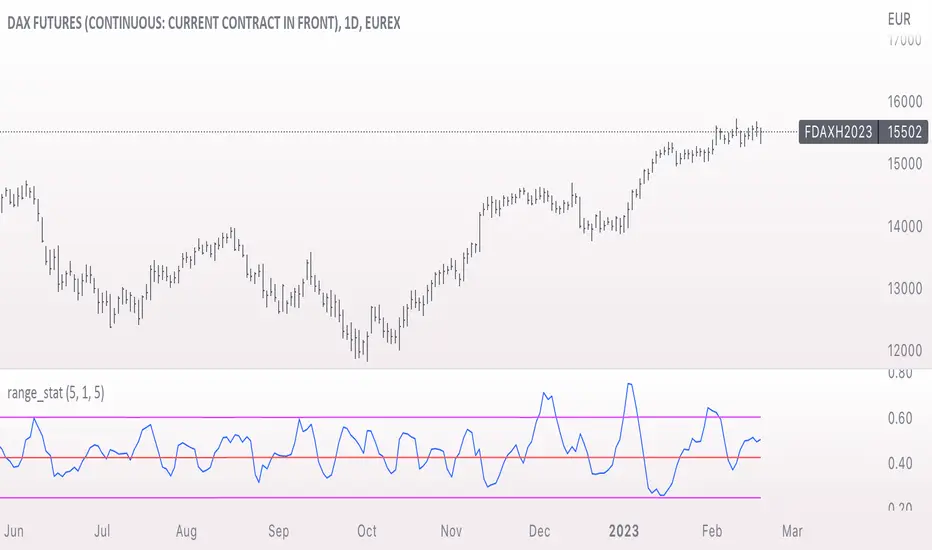
range_statA basic statistic to describe "ranges". There are three inputs:
- short range
- long range
- moving average length
The output is a ratio of the short range to the long range. In the screenshot example, the short range is a single day (bar) and the long range is five days. A value near "1" would mean that every day entirely fills the five day range, and that a consolidation is likely present. A value near 0 would mean that each day fills only a small portion of the five day range, and price is probably "trending".
The moving average length is for smoothing the result (which also lags it of course).
The mean, and +- 2 standard deviations are plotted as fuchsia colored lines.
Average HL Range - SATThis indicator dynamically display consolidation range base on three series ( high, low and close). it also display range breakout when a close occurs outside of the range. HeikinAshi and Diffrent Timeframe data can be requested to reduce the noise from the market. All setting are configurable : entryprice, takeprofits, Risk: REward, Dark Mode

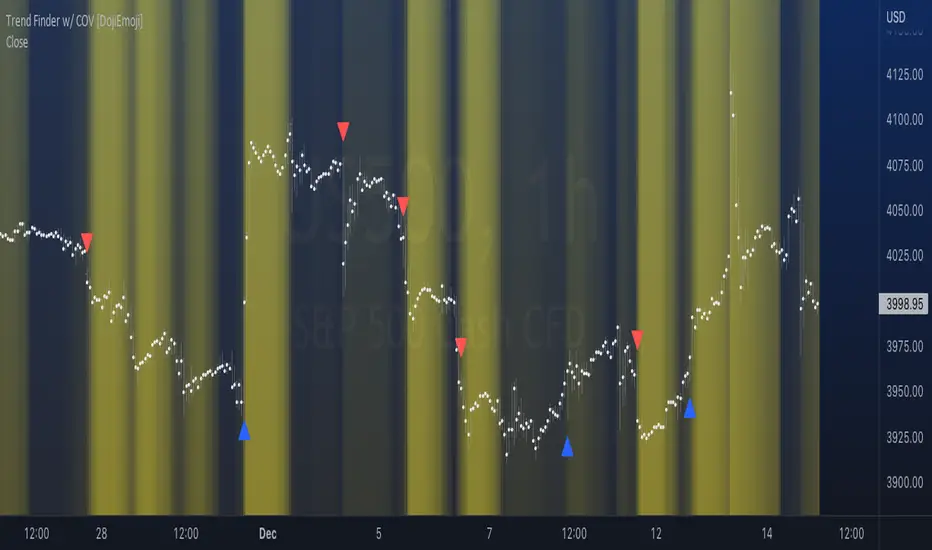
Trend Finder with Coefficient of VariationCoefficient of variation (“COV”) is a statistical measure used to describe the variability of values within a data set, it’s calculated by taking the standard deviation divided by the mean.
Traditionally, COV is applied to the expected returns of competing investment portfolios. A risk adverse investor prefers to accept a portfolio with a relatively lower COV value.
On the other hand, when applying COV to price charts, the difference is that instead of looking at expected returns, we now treat price as the source of data. We look at price from a moving average perspective. This script purely focuses on price.
What this indicator does:
Firstly, to go over the parameters:
Let ‘n’ be the lookback period for computing COV, and ‘m’ be the period for comparing the ranking of COVs.
Logics in a nutshell:
This program will (A) calculate the COV by dividing the moving standard deviation by moving average over ‘n’ bars, and then (B) illustrate the relationship of how COV at each bar ranks compared to COVs over past ‘m’ bars. We use a color scale (default black and yellow) for visualizing ranking in terms of percentiles. If COV is below its median value, then we assume that price is consolidating.
Hypothesis:
Using COV on top of regular SMA signals should reduce a lot of unwanted noise such as consecutive crossovers during ranging-periods. Traders want volatility, but not too much of it when sniping for entry opportunities (speaking of initial position; need to add to winning positions after, but this is for another topic). For this reason, the median value of COV is suitable as a metric for signals.
Applications:
We use the median value of COV to form a decision rule. A signal is generated when COV > median(COV,m), and the direction of trend is determined based on relative position of price with respect to sma(price,n). When the value of COV is increasing, it can also be thought of seeing Bollinger Bands beginning to bulge. When trends begin, this program will plot triangles to signify entry opportunities.
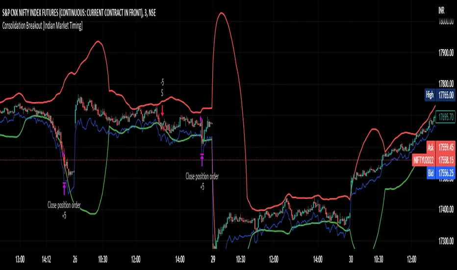
Consolidation Breakout [Indian Market Timing]OK let's get started ,
A Day Trading (Intraday) Consolidation Breakout Indication Strategy that explains time condition for Indian Markets .
The commission is also included in the strategy .
The basic idea is ,
1) Price crosses above upper band , indicated by a color change (green) is the Long condition .
2) Price crosses below lower band , indicated by a color change (red) is the Short condition .
3) ATR is used for trailing after entry
// ═══════════════════════════════//
// ————————> TIME CONDITION <————————— //
// ═══════════════════════════════//
The Indian Markets open at 9:15am and closes at 3:30pm.
The time_condition specifies the time at which Entries should happen .
"Close All" function closes all the trades at 2:57pm.
All open trades get closed at 2:57pm , because some brokers dont allow you to place fresh intraday orders after 3pm.
NSE:NIFTY1!
// ═══════════════════════════════════════════════ //
// ————————> BACKTEST RESULTS ( 114 CLOSED TRADES )<————————— //
// ═══════════════════════════════════════════════ //
LENGTH , MULT (factor) and ATR can be changed for better backtest results.
The strategy applied to NIFTY (3 min Time-Frame and contract size 5) gives us 60% profitability , as shown below
It was tested for a period a 8 months with a Profit Factor of 2.2 , avg Trade of 6000Rs profit and Sharpe Ratio : 0.67
The graph has a Linear Curve with consistent profits.
NSE:NIFTY1!
Save it favorites.
Apply it to your charts Now !!
Thank me later ;)
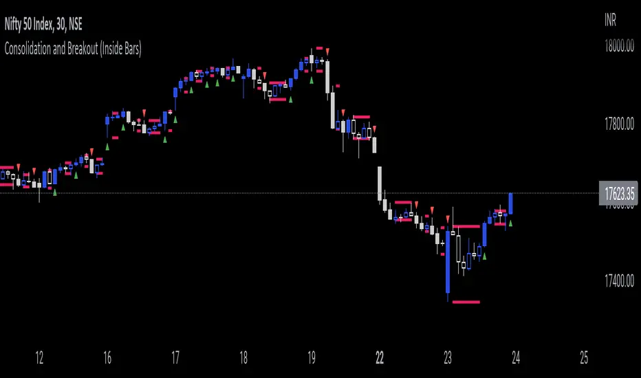
Consolidation and Breakout (Inside Bars)Consolidation indicates moments of market indecision when there is no shift in price. It is neither positive nor negative. Usually, after a price burst or strong trend movement that market falls back into a phase when traders are cautious about possible overbought or oversold positions. During this period, market reconciles before another breakout or trend emerges. Once you have identified consolidation, the next step is to keep an eye on a possible breakout.
This indicator would be useful for Breakout traders.
A candle's high and low is marked and if consequent candle fails to close above or below the marked candle, it's considered as an inside bar.
This can help breakout traders in tackling fakeouts since the wick above or below the initial candle are neglected and only the candle close above or below the range are considered as breakout.
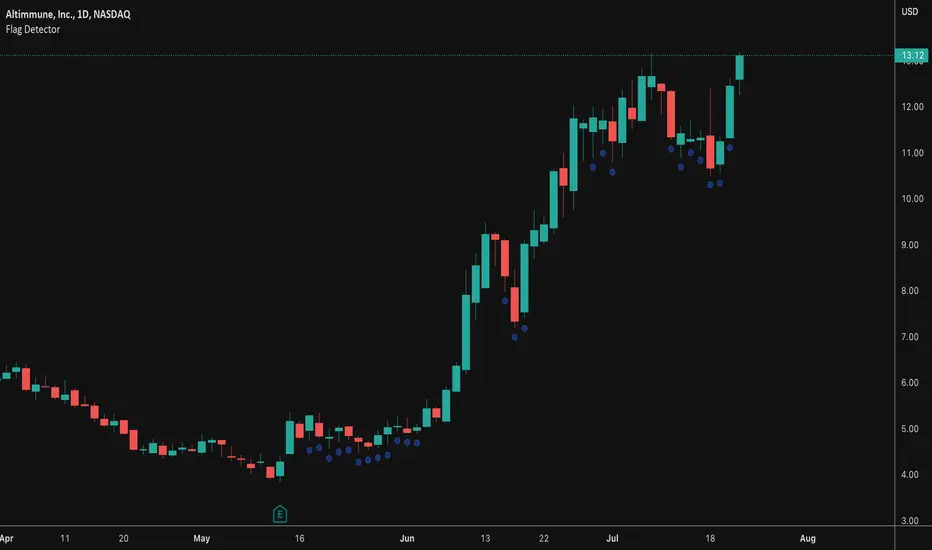
Flag DetectorThis script attempts to find consolidations or retracements within the context of a previous uptrend - basically looking for flag type patterns. It first measures an initial move (referred to as the flag pole in this script) and then looks for consolidation after that move within a certain range. If the consolidation is within the rage, it plots a dot under the candle to show you the consolidation areas. It's not fool proof, but seems to do a decent job of identifying pullbacks and sideways consolidations reasonably well.
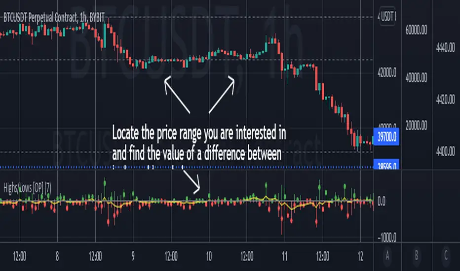
Highs/Lows difference [OrganicPunch]Highs/Lows difference indicator
To visually evaluate the difference between highs and lows of a price range.
This handsome indicator shows:
difference between highs of 2 candles by displaying it in green histogram
difference between lows of 2 candles by displaying it in red histogram
difference between both highs and lows by displaying a circle at the level of the difference
To read the numerical value, point at the circle of the relevant bar you are interested in, and see the scale.
Indicator is useful in creating strategies where you want to filter out consolidations/ranges (or to locate them), e.g. "Open trade when H/L difference is larger than 200", or "Look for candles with H/L difference lesser than 50".
The exact value of needed H/L difference can be found using this indicator.
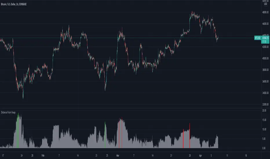
Distance from Vwap// How it Works \\
Measuring the distance of the close price from a higher timeframe VWAP - Volume Weighted Average Price
There is a threshold which is calculated by looking back at the previous x amount of bars and storing the highest/lowest values
If the distance from the vwap stretches above that threshold, the histogram will go green if price is above VWAP and red if its below the vwap
If the distance from the vwap reaches below the low threshold you will see the histogram flashes orange
// Settings \\
In the settings you have the ability to change what timeframe the indicator is calculated on, as well as this you can change the timeframe the VWAP is calculated on.
I always recommend using a higher timeframe vwap as they tend to me more respected
e.g on the hourly timeframe, I use the weekly VWAP, on 1 minute timeframe you may want to use 4 hour timeframe but obviously feel free to experiment
// Use Case \\
When histogram is flashing green, prices is pulling far away from the vwap, obviously you don't want to be buying a falling knife but if you have levels of confluence this can help spot reversals.
I personally wait until the first candle after its been green to get confirmation of the fall weakening. Vica versa for reds and shorts/sells.
When you see orange flashes, this shows that price has been consolidating and the price is very close to the higher time frame VWAP which could be considered a safe entry point as they tend to lead to a big move to follow
// Suggestions \\
Happy for anyone to make any suggestions on changes which could improve the script,
// Terms \\
Feel free to use the script, If you do use the script could you please just tag me as I am interested to see how people are using it. Good Luck!
MM Chop FilterBased On the "Chop and explode Indicator by fhenry0331
We Updated to Pine 5
- Added break out alerts and Signals
-Customize thresholds
How To use
when the line is blue confirmed Buy
Line is Red confirmed Sell
ALWAYS use in confirmation with your strategy and Trade with the trend.
Match with the on chart version for best results

Ex's DMI DivergenceThis indicator I am posting open for everyone to see and use.
This is a modified DMI indicator, It has a DMI+ and DMI- and a 3rd line that is the average divergance/convergance of the two.
This indicator is used to recognize periods of consolidation, directional strength and retracements/reversal
There are some key things to watch for:
-When the Div/Conv line is yellow it means that the DMI+/- average distance is moving closer together(converging)
-When the Div/Conv line is aqua it means that the DMI+/- average distance is moving further apart(diverging)
-One DMI must be below the top threshold and other DMI must be below at least the Top threshold(or bottom if you prefer) to be considered valid
Signs of condolidation/possible reversal/weak strength:
-When the DMI+/- are crossing at any location stay mindful of entries
-If both DMI's are above the threshold there is no clear direction
-When the DMI Div/Conv is yellow it means trend is slowing down and aqua means it is picking up

Price Action: Inside Bar BoxesThis script automatically draws rectangles around bars inside IB pattern.
Note :: because Pinescript does not allow changes to already drawn charts on historical bars, checkbox "show only last box" doesn't work for arrows

Three Week Tight Pattern IndicatorThree Week Tight Pattern is a consolidation indicator which give extra buy point on strong fundamental stocks. You can read about it from IBD here: www.investors.com

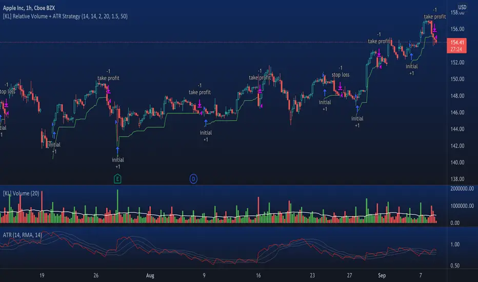
[KL] Relative Volume + ATR StrategyThis strategy will enter into long position when (a) current volume is above the average volume, and when (b) volatility of prices (based on ATR) is relatively low.
Backtested on hourly timeframes, win rates range between 35% to 50% on stocks with positive drifts (i.e. tendency to move upwards). Default setups are as follows:
- Average volume is computed using simple moving average (sma) of 14 periods. By default, 1.4x ratio seems to work well on most large cap stocks. If it's too high, then amount of potential points for entry will decrease. But if it's too low, then this indicator becomes meaningless.
- ATR (for determining volatility), look back period is 14 (following conventions). I have noticed that the profits could change drastically when changed to different values for each individually security. Feel free to experiment around with this parameter.
Other information: This strategy is based off of one of my previous scripts; a script called "Relatively Volume Strategy". The objective of this new script is to simplify the process of determining periods of low volatility. In this new script, we assume prices are consolidating when current ATR is within its moving average value by +/- one standard deviation.
Av3Based on the ANNE EA v3 for MT4. For use on FOREX.
if ATR is greater than ATR average taken from last 5 candles, then market considered as trending, and so Open(0)>Close(1)=buy Open(0)Close(1)=sell Open(0)

[KL] Relative Volume StrategyThis strategy will Long when:
Confirmation #1: when volume is relatively high
Confirmation #2: during periods of price consolidation (See )
It exits when either (a) stop loss limit is reached, or when (b) price actions suggest trend is bearish.
Measuring price volatility to assume consolidation:
For each candlestick, we quantify price volatility by referring to the value of standard deviations (2x) of closing prices over a look-back period of 20 candles. This is exactly what the Bollinger Band (“BOLL”) indicates by default.
Knowing the value of standard deviation (2x) of prices (aka the width of lower/upper BOLL bands), we then compare it with ATR (x2) over a user-defined length (can be configured in settings). Volatility is considered to be low, relatively, when the standard deviation (x2) of prices is less than ATR (2x).

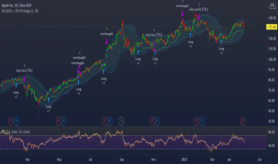
[KL] Bollinger bands + RSI StrategyThis strategy is based on two of my previous scripts, one called “RSI14 + 10”; the other one called “Bollinger Bands Consolidation”. At its core, it combines the main setups from each of those two scripts but excludes the auxiliary features that were considered as experimental. This strategy will identify periods of squeeze, and then enter long during consolidation with a trailing stop loss set.
Primary indicator will be the Bollinger Bands. By comparing the width of the BBs with the ATR of the same lookback period (i.e. 2 standard deviations of the 20 recent closing prices vs ATR(20) x2), we begin to look for confirmation for entry whenever the standard deviation of prices is less than the ATR. This can be seen visually in the plots (i.e. default gray lines representing ATRx2 relative to BB center line).
Confirmation for entry will be the RSIs (slow-14, and fast-10). If both are upward sloping, then we assume prices are in an uptrend and may eventually break above upper band. RSIs are typically in mid-range when prices are consolidating, therefore no need to measure it.
Exits will happen in two cases, (1) when trailing stop loss hits, or (2) when RSIs signal that the instrument is overbought. No. 1 is self-explanatory. No. 2 happens, when RSI14 reaches above 70 (can be changed), followed by RSI10 catching up and surpassing RSI14.
Trend Type Indicator by BobRivera990Usage:
The purpose of this indicator is to programmatically determine the type of price trend using technical analysis tools.
You can do a quick check on the asset’s higher and lower time frames. For example, if you are trading on an H1 chart, you can check the m5 chart to ensure that the trend is in the same direction and similarly check the H4 chart to ensure that the higher time frame price is also moving in the same direction.
If multiple time frame charts confirm a similar trend, then it is considered a very strong trend and ideal for Trend trading.
Remarks:
By default, the last status is related to 8 periods before the latest closing price.
Related definitions:
The three basic types of trends are up, down, and sideways.
1. Uptrend
An uptrend describes the price movement of a financial asset when the overall direction is upward. The uptrend is composed of higher swing lows and higher swing highs.
Some market participants ("long" trend traders) only choose to trade during uptrends.
2. Downtrend
A downtrend refers to the price action of a security that moves lower in price as it fluctuates over time.
The downtrend is composed of lower swing lows and lower swing highs.
3. Sideways
A sideways trend is the horizontal price movement that occurs when the forces of supply and demand are nearly equal. This typically occurs during a period of consolidation before the price continues a prior trend or reverses into a new trend.
How it works:
Step 1: Sideways Trend Detection
In this step we want to distinguish the sideways trend from uptrend and downtrend. For this purpose, we use two common technical analysis tools: ATR and ADX
1. Average True Range (ATR)
The average true range (ATR) is a technical analysis indicator that measures market volatility.
We also use a 20-period moving average of the ATR.
When the ATR is below the average of its last 20-periods, it means that the rate of price volatility has decreased and we conclude that the current trend is sideways
2. Average Directional Index (ADX)
The average directional index (ADX) is a technical analysis indicator used by some traders to determine the strength of a trend.
The trend has strength when ADX is above 25.
So when the ADX is less than or equal to 25, there is no strong trend, and we conclude that the current type of trend is sideways.
Step 2: Detect uptrend from downtrend
If it turns out that the current price trend is not sideways, then it is either uptrend or downtrend.
For this purpose, we use plus and minus directional Indicators (+ DI & -DI).
A general interpretation would be that during a strong trend, when +DI is higher than -DI, it is an uptrend. When -DI is higher than +DI, it is a downtrend.
Parameters:
"Use ATR …" ________________________// Use Average True Range (ATR) to detect Sideways Movements
"ATR Length"_______________________ // length of the Average True Range (ATR) used to detect Sideways Movements
"ATR Moving Average Type" ___________// Type of the moving average of the ATR used to detect Sideways Movements
"ATR MA Length" ____________________// length of the moving average of the ATR used to detect Sideways Movements
"Use ADX ..."_______________________ // Use Average Directional Index (ADX) to detect Sideways Movements
"ADX Smoothing”____________________// length of the Average Directional Index (ADX) used to detect Sideways Movements
"DI Length"_________________________// length of the Plus and Minus Directional Indicators (+DI & -DI) used to determine the direction of the trend
"ADX Limit" ________________________// A level of ADX used as the boundary between Trend Market and Sideways Market
"Smoothing Factor"__________________// Factor used for smoothing the oscillator
"Lag"______________________________// lag used to match indicator and chart
Resources:
www.investopedia.com

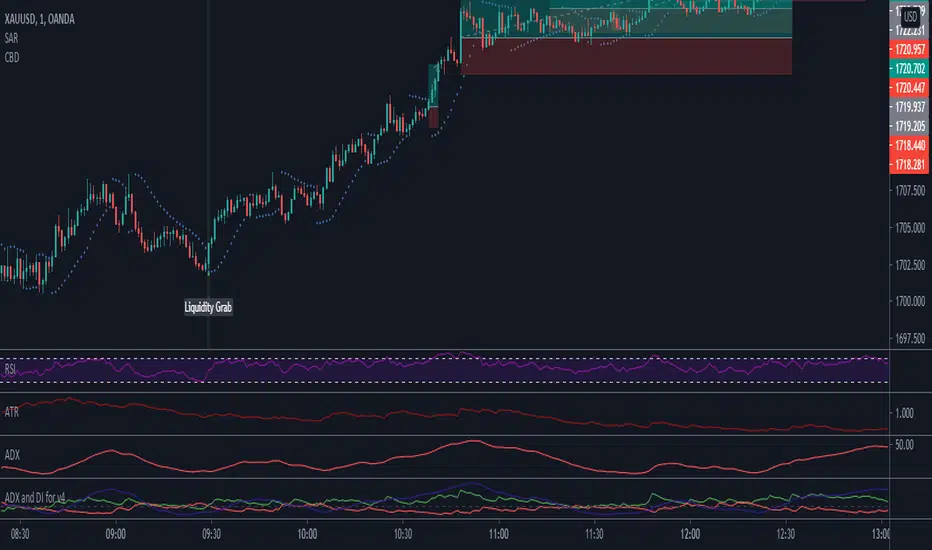
Combo Breaker DetectionA method I'm playing with to detect liquidity grabs and breaks from consolidation.
Consolidation Ranges [kingthies] Consolidation Range Analysis
Published by Eric Thies, January 2021
█ Indicator Summary
This tool calculates, analyzes and plots the visualization of a relative range over a given period of time
By adding to charts, users are enabled to see the impulsive nature of market cycles, along with their efforts to consolidate thereafter
The default period is 30, and should be adjusted to users preference
The default input is the current close price, on the chosen timeframe of the chart
█ Script Source
//
//@version=4
//© kingthies || This source code is subject to the terms of the Mozilla Public License 2.0 at mozilla.org
study("Consolidation Ranges ", shorttitle="CR ", overlay=true)
// !<------ User Inputs ----->
src = input(close, title='Range Input (Default set to Close'), lengthEMA=input(30,title='Length'),zoneToggle = input(true, title="Toggle Zone Highlights"), iCol = color.new(#FFFFFF, 100),
// !<---- Declarations & Calculations ---- >
trndUp = float(na),trndDwn = float(na), mid = float(na), e = ema(src, lengthEMA)
trndUp := src < nz(trndUp ) and src > trndDwn ? nz(trndUp ) : high, trndDwn := src < nz(trndUp ) and src > trndDwn ? nz(trndDwn ) : low, mid := avg(trndUp, trndDwn)
// !< ---- Plotting ----->
highRange = plot(trndUp == nz(trndUp ) ? trndUp : na, color=color.white, linewidth=2, style=plot.style_linebr, title="Top of Period Range")
lowRange = plot(trndDwn == nz(trndDwn ) ? trndDwn : na, color=color.white, linewidth=2, style=plot.style_linebr, title="Bottom of Period Range")
xzone = plot(zoneToggle ? src > e ? trndDwn : trndUp : na, color=iCol, style=plot.style_circles, linewidth=0, editable=false)
fill(highRange, xzone, color=color.lime,transp=70), fill(xzone, lowRange, color=color.red,transp=70)
//
