SVEA - Smart Valuation & Analysis [Gabremoku]SVEA is a smart overbought/oversold map that paints dynamic price zones and reversal signals directly on the chart using RSI and ATR‑based volatility bands.📈✨
🧠 Smart context: Automatically adapts OB/OS levels to asset type and timeframe (equities, crypto, forex, 15m) for more realistic signals.
🎯 Actionable zones: Highlights continuous OB/OS price areas as dynamic support/resistance, helping to spot stretched moves and potential reversals at a glance.
🌡️ Volatility‑aware: Uses ATR‑driven padding so zones expand in high volatility and contract in calm markets, keeping signals relevant across regimes.
🛠️ Fully customizable: Fine‑tune OB/OS levels, lookback, padding, and visibility to match your strategy and preferred signal frequency.
サイクル

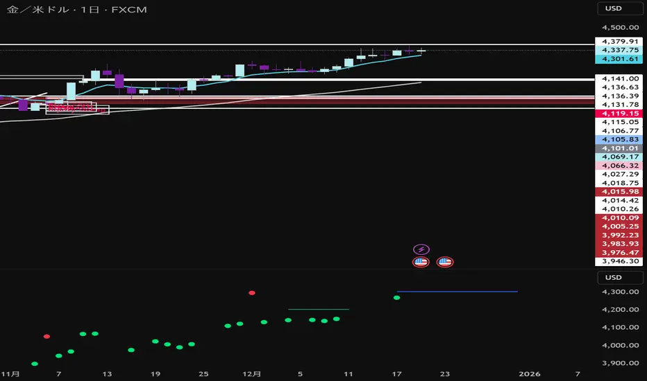
Sigma Levels😎 How to Use Sigma Levels (Gold & Crude Only)
Sigma Levels are not magic buttons.
If you click Buy or Sell the moment price touches a line…
Congratulations — you’ve just donated liquidity to the market.
⚠️ Works ONLY for Gold (XAUUSD) and Crude Oil (WTI / USOIL / CL)
🧠 The Right Way (Sigma Way)
These levels are waiting zones, not entry alarms.
When price reaches a Sigma Level:
Sit on your hands
Watch the candles
Wait for price to speak first
Only consider an entry AFTER you see proper confirmation, such as:
Hammer or Inverted Hammer saying “nope, not going further”
Bullish or Bearish Engulfing that actually engulfs (not politely taps)
Morning Star / Evening Star waking the market up
Strong rejection wicks screaming “wrong direction”
❌ What NOT to Do
No blind entries
No guessing
No “it feels like it will reverse”
No revenge trades because the last one hurt your feelings
✅ Sigma Rule
Levels tell you where to look
Candles tell you when to act
No pattern = no trade
Patience = profit potential
Trade calm. Trade disciplined.
Let Sigma Levels do the waiting — not your stop-loss.

AMD Phases + Dashboard📊 AMD (Accumulation–Manipulation–Distribution) Indicator – How It Works
This indicator is a rule-based market phase classifier inspired by Wyckoff / Smart Money Concepts.
It does not predict the future, but instead interprets current market behavior using price range, volume, and volatility to identify where we are in the market cycle.
🔁 The AMD Market Cycle (Big Picture)
Markets tend to repeat this cycle:
Accumulation → Smart money buys quietly
Manipulation → Liquidity grab / false breakout
Distribution → Smart money sells to the public
Expansion / Decline → Strong directional move
Your script focuses on detecting phases 1–3, which occur before large moves.
🧠 What Data the Script Uses
The script analyzes three core variables:
1️⃣ Price Range (Structure)
Highest high vs lowest low over a lookback window
Tight range = consolidation
Expanding range = distribution or breakout
2️⃣ Volume Behavior
Low volume = lack of interest (accumulation)
Sudden volume spike = manipulation or distribution
3️⃣ Volatility Expansion
Small candles → compression
Large impulsive candles → transition or distribution
🟥 Phase 1 — Accumulation (Red Bubble, White Text)
What it means
Smart money is building positions
Price moves sideways
Public interest is low
Volume is below average
Volatility is compressed
How the script detects it
Narrow price range
Volume below its moving average
No strong trend direction
How traders use it
Look for long setups
Mark support and resistance
Prepare for a future breakout
Do NOT chase trades here
🟧 Phase 2 — Manipulation (Dark Orange Bubble, White Text)
What it means
Liquidity grab
False breakout above or below the range
Designed to trigger stop-losses
Often very emotional price action
How the script detects it
Sudden range expansion
Volume spike relative to recent average
Break outside the accumulation range
Candle closes back inside or shows rejection
How traders use it
Avoid entering breakouts immediately
Look for reversal confirmation
This is often the best risk-to-reward phase
🟦 Phase 3 — Distribution (Dark Blue Bubble, White Text)
What it means
Smart money is exiting positions
Public traders are buying late
Volatility increases
Trend starts to weaken or reverse
How the script detects it
Larger candles
Sustained high volume
Expanding range
Signs of exhaustion
How traders use it
Take profits on longs
Look for short setups
Watch for trend reversals
Stops should be tighter
🧭 Dashboard & On-Chart Bubbles
🔹 Dashboard
Shows the current detected phase
Updates in real time
Helps with context, not entries
🔹 Locked Bubbles
Labels are anchored to the candle
Each bubble appears only when a phase is active
Color-coded for instant recognition
Phase Color Text
Accumulation Red White
Manipulation Dark Orange White
Distribution Dark Blue White
⚠️ Important Notes
This is a context tool, not a signal generator
Best used with:
Support & resistance
Liquidity levels
Market structure (HH / HL / LH / LL)
Works best on:
15m – 4H
Crypto, Forex, Indices
🧩 How to Trade With It (Simple Framework)
Identify phase
Wait for confirmation
Enter on structure
Manage risk tightly
Exit when phase changes
🧠 Final Thought
Think of this indicator as:
“A market story teller, not a fortune teller.”
It helps you understand who is in control — buyers or sellers — and when NOT to trade, which is just as important.
WARNING , TRADE AT YOUR OWN RISK, THIS INFORMATION IS TO HELP , THE INFORMATION PROVIDED BY THE INDICATOR IS SPECULATIVE

BTC Valuation ZonesBTC Valuation – Distance From 200 MA
This indicator provides a simple but powerful Bitcoin valuation framework based on how far price is from the 200-period Moving Average, a level that has historically acted as Bitcoin’s long-term equilibrium.
Instead of predicting tops or bottoms, this tool focuses on mean-reversion behavior:
When price deviates too far above the 200 MA → risk increases
When price deviates deeply below the 200 MA → long-term opportunity increases

The Apex01This is a proprietary technical indicator developed by The Apex Trading Firm. It utilizes a custom trend-following logic based on momentum filtering. This script is strictly for internal use by authorized firm personnel only. Unauthorized distribution is prohibited."

Pressure Windows [Lite]PRESSURE WINDOWS — Lite is a stripped-down time-cycle instrument based on Jim Hurst’s Time-Cycles method. It lets you define a primary cycle using two major lows and project basic harmonic subdivisions forward in time. The Lite version is designed to expose coarse timing pressure, not full cycle resolution. This is a structural timing tool — not a prediction engine.
What the Lite Version Shows :
A primary time cycle defined by two anchor points
Single-level harmonic subdivision only:
-1/2 (halves)
-1/3 (thirds)
Forward projection of the cycle into the future
Internal verification lines inside the base cycle to check fit
What it does not do (by design):
No chained subdivisions (no 1/2→1/2 or 1/3→1/2)
No higher-resolution nesting
No regime logic or shaded “windows”
Those belong to the full instrument.
How to Use (Lite Workflow) :
1. Define the Cycle :
Add the indicator to your chart
Select Time 1 at a major low
Select Time 2 at the next major low
(You can fine-tune both in the settings)
2. Choose a Subdivision :
In settings:
None → only the primary cycle
1/2 → midpoint timing pressure
1/3 → third-based rhythm
3. Verify Before Trusting :
Look at the subdivisions inside the base cycle:
Do intermediate lows align with halves or thirds?
If they don’t, don’t force it
The Lite version is intentionally coarse — its job is to answer:
“Is the market vibrating in 2s or 3s?”
Not to overfit timing.
Best Practices :
Works best on higher timeframes (Daily / Weekly)
Use Log scale for long-term structure (time remains linear)
Treat projections as zones of pressure, not turning points
Important Note :
Pressure Windows — Lite limits subdivision depth on purpose, if you need nested timing resolution and finer pressure mapping, that’s what the full version is built for.
*This script doesn't constitute investment advice and isn't created solely for qualified investors.

S.EQ - Macro TrackerMacro Tracker Indicator - Description
This TradingView indicator visualizes macro time windows throughout the trading day, marking specific 33-minute periods that occur hourly (from XX:42 to XX:15 of the next hour) in the America/New_York timezone.
Core Functionality
Time Windows Tracked:
The indicator monitors 24 hourly macro periods (e.g., 00:42-01:15, 01:42-02:15, etc.)
Each period spans 33 minutes, starting at 42 minutes past the hour and ending at 15 minutes past the next hour
Special periods for the last trading hour (14:42-15:15, 15:42-16:15) with an optional 15:15-15:45 window
---------------------------------------------------------------------------------
Visual Display Modes
1. On Chart Mode (Default)
Draws vertical lines at the start and end of each macro period
Displays a horizontal line at the top connecting the boundaries
Shows optional labels with time stamps at the midpoint
Midline Feature: Adds a dotted vertical line at XX:00 (the hour mark) within each macro period
Projects dotted extension lines toward current price action when enabled
Dynamically adjusts line heights based on price movement within the period
2. New Pane Mode
Displays macro periods as colored boxes in a separate indicator pane
Useful for cleaner chart visualization when tracking multiple periods
---------------------------------------------------------------------------------
Key Features
Customizable Display: Toggle individual macro periods on/off, choose colors, and control label visibility
Time Labels: Optional display of exact time ranges on each macro period
Projections: Extension lines that project from macro boundaries toward current price
Midline Markers: Dotted lines showing the hour mark (XX:00) within each macro period
Weekend Handling: Automatically adjusts for Friday closes and weekend gaps (non-crypto markets)
Memory Management: Automatically cleans up old drawing objects to maintain performance

New York Sessions High/Low with Liquidity Purge CriteriaDisplays horizontal lines at the highest high and lowest low of the NY AM (09:30–12:00) and NY PM (13:30–16:00) sessions in New York time.
Lines extend forward until price strongly breaks them by a user-defined threshold (N points), at which point they cease extending - liquidity purged.
Option to show only active lines (unpurged liquidity) - toggle to hide old liquidity pools for a cleaner chart.
Customizable colors, line styles, width, lookback days and purge threshold.

Intraday Sessions Ranges with Time SegmentationSession Ranges indicator overlays customizable range boxes on major trading sessions (e.g. London, Premarket, NY AM and NY PM) using New York time.
Toggle visibility, add evenly spaced vertical segment lines, and highlight key time zones. Perfect for traders marking price action and levels across multiple historical days.

Sessions + Daily Quarters by (Pecurtoo)Killzones Background (UTC+1):
Highlights the main Forex and global market sessions with configurable background colors.
Sessions included:
Asian Session
London Session
New York AM Session
New York PM Session
Each session can be individually enabled or disabled.
Background colors are customizable.
Daily Quarters (Vertical Lines):
Divides the day into four quarters with vertical lines at configurable hours.
Each quarter’s line color, style (solid, dashed, dotted), and width can be customized.
Hour offsets can be applied for timezone adjustments.
Perfect for visualizing intraday market structure and timing.
Master Switches:
Enable or disable Killzones background and Daily Quarters lines globally.
Fully Compatible:
Written in Pine Script v6, fully compatible with TradingView.
Works on all timeframes.

Daily Quarters by (Pecurtoo)This indicator divides each trading day into four configurable time blocks using vertical lines plotted directly on the chart. Each session boundary is fully customizable, allowing traders to adapt the schedule to any market, strategy, or timezone.
Key Features
Four independent session start times (editable from settings)
Optional global hour offset (+/−) for timezone or DST adjustments
Individual color control for each session line
Adjustable line style (solid, dashed, dotted) and line width
Automatically updates every day
Designed for intraday trading and session-based analysis
Cases use
Market session visualization (Asia, London, New York, custom sessions)
Time-based trading strategies
Killzone and liquidity window tracking
Day structure and rhythm analysis
Notes
Uses the chart’s exchange timezone by default
Best suited for intraday timeframes

Gann Levels by Acharya JiThis Pine Script indicator is designed to help traders quickly identify **key intraday levels** based on the **first candle of the trading day**. It performs three main functions:
1. **Marks the First Candle’s High and Low**
- Blue circles are plotted at the high and low of the first candle each day.
- These serve as the baseline reference points for calculating targets.
2. **Plots Upside Targets (Green Lines)**
- Six horizontal green lines are drawn above the first candle’s high.
- Each line represents a percentage increment: **+0.09%, +0.18%, +0.36%, +0.72%, +1.44%, +2.88%**.
- These levels act as potential resistance or profit-taking zones.
3. **Plots Downside Targets (Red Lines)**
- Six horizontal red lines are drawn below the first candle’s low.
- Each line represents a percentage decrement: **-0.09%, -0.18%, -0.36%, -0.72%, -1.44%, -2.88%**.
- These levels act as potential support or stop-loss zones.
---
Purpose
- Provides a **structured intraday roadmap** based on the first candle.
- Helps traders visualize **target ladders** both above and below the market.
- Useful for scalpers, intraday traders, and strategy testing around **breakouts or reversals**.
---
👉 Rahul, would you like me to also add **labels (like +0.09%, -0.18%)** directly on the chart next to each line so you can instantly recognize which target level is which without checking the legend?

Previous Day Week High Low EQ Extensions FIB BoxPDH / PDL EQ 25–75 Indicator
PDH / PDL EQ 25–75 is a comprehensive market-structure and range-analysis indicator designed to visualize key daily and weekly reference levels directly on the chart. The script automatically plots prior highs and lows, equilibrium levels, range-based extensions, Fibonacci zones, and session opens, providing traders with a structured framework for directional bias, mean reversion, and liquidity-based analysis.
Core Features
Daily Range Framework
Previous Day High (PDH) and Previous Day Low (PDL)
Daily Equilibrium (50%) of the prior day’s range
25% and 75% Quartile Levels for range segmentation
Range Extensions at ±25% and ±50% beyond PDH/PDL
Daily Open (DO) plotted and extended forward
Fibonacci Discount/Premium Zone (61.8%–78.6%) highlighted with a shaded box
These levels are recalculated at the start of each trading day and extended forward for clear intraday reference.
Weekly Range Framework
Previous Week High (PWH) and Previous Week Low (PWL)
Weekly Equilibrium (50%)
Weekly Fibonacci Discount/Premium Zone (61.8%–78.6%)
Weekly Open (WO) plotted and extended
Weekly levels reset automatically at the start of each new trading week and are maintained independently from daily levels.
Visual & Customization Options
Fully configurable colors, line widths, and line styles for every plotted level
Adjustable forward extensions for range and open levels
Optional labels with customizable size and optional price display
Distinct separator lines marking daily and weekly ranges
Independent toggles for:
Extension levels
Fibonacci zones
Labels
The indicator is optimized for clarity while maintaining flexibility for different trading styles and chart layouts.
Technical Implementation Highlights
Uses higher-timeframe data via request.security() to ensure accurate daily and weekly calculations
Automatically anchors PDH, PDL, PWH, and PWL to their true originating bars
Efficient object management using arrays to prevent clutter and maintain platform performance
Designed for overlay use on any intraday or higher-timeframe chart
Use Cases
Identifying premium and discount zones
Mapping mean-reversion and continuation areas
Tracking institutional reference levels
Intraday trading with higher-timeframe context
Futures, forex, crypto, and equity markets

SekakitaMoneyZone本インジケーターは、製作者Sekakitaが実際のトレードで使用している
「相場の波形(Wave Structure)」に基づき、利確候補(TP)を見極めることを目的として開発されました。
相場の流れを視覚的に捉えることで、無駄なエントリーや早すぎる決済を防ぎ、再現性の高いトレード判断を可能にします。
This indicator is developed based on the wave patterns essential to Sekakita’s trading strategy, with the primary goal of identifying potential take-profit (TP) areas.
By visualizing market wave structures in real time, it enables more consistent and disciplined trade management.
Gann Octave Pro - Angles & Time Cycles 🎯 Gann Octave Pro - Angles & Time Cycles
## Complete Gann Trading System - Price, Angles & Time in One Indicator
A professional-grade Gann analysis tool combining **Octave Price Levels**, **Gann Angles (1x1, 2x1, 1x2)**, and **Advanced Time Cycle Projections**. Perfect for traders seeking precision market timing through geometric confluence.
---
## 🌟 Key Features
### 📐 Octave Price Levels
- **5 Key Levels**: 0%, 25%, 50%, 75%, 100%
- **Color-Coded**: Green (support) → Blue (50% pivot) → Red (resistance) → Black (boundaries)
- **Dynamic Updates**: Auto-adjusts to swing structure
- **Trading Edge**: 50% level is the most powerful reversal zone
### 📏 Gann Angles
- **1x1 Angle** (Black) - Natural 45° trend line
- **2x1 Angle** (Red) - Steep acceleration zone
- **1x2 Angle** (Red) - Gradual support/resistance
- **Customizable Extension**: Fixed bars or % of swing length
### ⏰ Advanced Time Cycles
**Three Calculation Methods:**
1. **Angle-Level Confluence** ⭐ (Recommended)
- Calculates intersections of Gann angles with octave levels
- Most sophisticated timing system
- Based on price-time geometry
2. **Swing Duration** - Uses actual swing bar length
3. **Harmonic (Swing/8)** - Classic Gann harmonic division
**Cycle Visualization:**
- **Full Cycles** (Purple, solid) - Major turning points, labeled "◆ FC1 (176 bars) "
- **Sub-Cycles** (Blue, dotted) - Minor pivots, labeled "S1 "
- **Mid-Cycles** (Orange, dashed) - Half-cycle inflection points
- **Past Display**: Shows 4 complete past cycles for validation
- **Future Projection**: Projects 8 future cycles for anticipation
---
## 🎯 How to Use
### Quick Start
1. Apply to chart (works all timeframes/instruments)
2. Select period: Default 44 bars (adjust based on timeframe)
3. Choose cycle method: "Angle-Level Confluence" for best results
4. Observe past cycles to validate timing accuracy
### Trading Strategies
**Triple Confluence Setup** (Highest Probability)
- Price at octave level (especially 50%)
- Price touches Gann angle (1x1 most reliable)
- Time cycle arrives (full cycle preferred)
- **Entry**: On confluence | **Stop**: Below/above octave level | **Target**: Next level
**Cycle Anticipation**
- Enter 1-2 bars before cycle line if price at octave level
- Exit at next cycle or target octave level
- **Edge**: Anticipate cycles instead of reacting
**Angle Breakout + Cycle**
- Price breaks 1x1 angle + next cycle within 20 bars
- Hold through cycle, exit at 2x1 angle or next major level
---
## ⚙️ Customization
### Period Selection (88-Based)
11 harmonic options: 3, 6, 11, 22, **44**, 88, 176, 352, 704, 1408, 2816 bars
- **Intraday** (15m-1h): Period 3-4
- **Swing Trading** (4h-Daily): Period 4-5
- **Position Trading** (Daily-Weekly): Period 5-6
### Visual Controls
- **Colors**: Independent for all elements
- **Line Widths**: Separate controls (1-5) for levels, angles, cycles
- **Label Size**: Tiny/Small/Normal/Large (unified)
- **Label Position**: Top/Middle/Bottom
- **Show/Hide**: Toggle any component
### Alerts
- 50% octave level breakouts
- Customizable messages
---
## 💡 Pro Tips
1. **Validate First**: Observe 2-3 past cycles before trading
2. **Adjust to Volatility**: High volatility = lower period (22-44), Low = higher (88-176)
3. **Multiple Timeframes**: Apply on different timeframes for confirmation
4. **Respect 50% Level**: Most powerful reversal zone in Gann theory
5. **Focus on Full Cycles**: Highest probability setups (◆ FC markers)
6. **Combine with Price Action**: Indicator shows WHERE/WHEN, price action shows HOW
---
## 🚀 What Makes It Unique
✅ **Intelligent Confluence Cycles** - Unique angle-level intersection calculation
✅ **Historical Validation** - See past cycles to trust future projections
✅ **Professional Design** - Color-coded hierarchy, clean labels, no clutter
✅ **Complete Automation** - Everything updates in real-time
✅ **Three-Dimensional Analysis** - Price + Angles + Time = complete picture
---
## 📊 Best Markets
- Stock indices (S&P 500, NASDAQ, Dow)
- Forex majors (EUR/USD, GBP/USD, USD/JPY)
- Commodities (Gold, Silver, Oil)
- Crypto (BTC, ETH)
- Liquid stocks
✅ Complete Gann system (price + angles + time)
✅ 3 time cycle methods
✅ Auto swing detection
✅ 4 past + 8 future cycle projections
✅ Professional visualization
✅ Extensive customization
✅ Real-time alerts
✅ Works all markets/timeframes
---
## ⚠️ Disclaimer
This indicator is for educational purposes and applies W.D. Gann methodology principles. Not financial advice. Always use proper risk management, position sizing, and stop losses. Practice on paper before live trading. Past performance doesn't guarantee future results.
---
**The market moves in patterns of price and time. This indicator helps you see them.**
Trade with geometry. Trade with time. Trade with confidence.
