Hinton Map█ HINTON MAP
This script displays a Hinton Map visualization of market data for user-defined tickers and timeframes. It uses color gradients to represent the magnitude and direction of price change, RSI, and a combination of both.
This is one example. You can modify and try other values as you wish, but do keep the incoming values between -1 and 1.
In the Example Usage:
Users can input up to 5 symbols and 5 timeframes. For each ticker/timeframe combination:
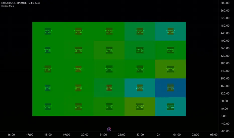
The box size represents the relative magnitude of the 2-bar percentage change.
The box fill color represents the direction and magnitude of the 2-bar percentage change.
The box border color and thickness represent the RSI deviation from 50.
The inner box color represents a combination of price change magnitude and RSI deviation from 50.
Hovering over each box displays a tooltip with the ticker, timeframe, percentage change, and RSI.
Inputs:
• Unit Size (bars):
The size of each Hinton unit in bars.
Type: int
Default Value: 10
• Border Width:
The base width of the inner box border.
Type: int
Default Value: 3
• Negative Hue (0-360):
The hue value for negative price changes (0-360).
Type: float
Default Value: 100
• Positive Hue (0-360):
The hue value for positive price changes (0-360).
Type: float
Default Value: 180
• Ticker 1-5:
The tickers to display on the Hinton map.
Type: string
Default Value: AAPL
• Timeframes (comma separated):
The timeframes to display on the Hinton map (comma-separated).
Type: string
Default Value: 1, 5, 60, 1D, 1W
(Fun Note: My Home town is named `Hinton`)
Pine Script® インジケーター