Regression Slope Oscillator [BigBeluga]🔵 OVERVIEW
The Regression Slope Oscillator is a trend–momentum tool that applies multiple linear regression slope calculations over different lookback ranges, then averages them into a single oscillator line. This design helps traders visualize when price is extending beyond typical regression behavior, as well as when momentum is shifting up or down.
🔵 CONCEPTS
Regression Slope – Measures the steepness and direction of price trends over a selected length.
f_log_regression(src, length) =>
float sumX = 0.0
float sumY = 0.0
float sumXSqr = 0.0
float sumXY = 0.0
for i = 0 to length - 1
val = math.log(src )
per = i + 1.0
sumX += per
sumY += val
sumXSqr += per * per
sumXY += val * per
slope = (length * sumXY - sumX * sumY) / (length * sumXSqr - sumX * sumX)
slope*-1
Multi–Sample Averaging – Instead of relying on one regression slope, the indicator loops through many lengths (from Min Range to Max Range with Step increments) and averages their slopes.
multiSlope(length)=>
// Get regression slope
slope = f_log_regression(close, length)
slopAvg.push(slope)
for i = minRange to maxRange by step
multiSlope(i)
Color Gradient – The oscillator and candles are colored dynamically from oversold (orange) to overbought (aqua), based on slope extremes observed within the user–defined Color Range.
Trend Oscillation – When the oscillator rises, price trend is strengthening; when it falls, momentum weakens.
🔵 FEATURES
Calculates regression slopes across a user–defined range (e.g., 10–100 with steps of 5).
Averages all sampled slopes into a single oscillator line.
Dynamic coloring of oscillator and chart candles based on slope values.
User–controlled Color Range :
High values (e.g., 50–100) → interpret as overbought vs oversold zones.
Low values (e.g., 2–5) → interpret as slope rising vs falling momentum shifts.
Dashboard table (top–right) displaying number of slope samples and current averaged slope value.
Candle coloring mode (optional) – candles take on the oscillator gradient color for at–a–glance reading of trend bias.
Signal Line (SMA) – A moving average of the slope oscillator used to identify momentum reversals.
Bullish Reversal Signal – Triggered when the oscillator crosses above the signal line while below zero, indicating downside momentum exhaustion and potential trend recovery.
Bearish Reversal Signal – Triggered when the oscillator crosses below the signal line while above zero, indicating upside momentum exhaustion and potential trend rollover.
Dual Placement Signals – Reversal signals are plotted both:
On the oscillator pane (for momentum context)
On the price chart (for execution alignment)
Confirmation Logic – Signals are only printed on confirmed bars to reduce repainting and false triggers.
🔵 HOW TO USE
Watch the oscillator cross above/below zero: signals shifts in regression slope direction.
Use the signal line crossovers near zero to identify early trend reversals.
Use high Color Range settings to identify potential overbought/oversold extremes in trend slope.
Use low Color Range settings for a faster, momentum–driven color change that tracks slope rising/falling.
Candle coloring highlights short–term trend pressure in sync with the oscillator.
Combine reversal signals with structure, support/resistance, or volume for higher–probability entries.
🔵 CONCLUSION
The Regression Slope Oscillator transforms raw regression slope data into a smooth, color–coded oscillator. By averaging across multiple regression lengths, it avoids the noise of single–range analysis while still capturing trend extensions and momentum shifts.
With the addition of signal line crossovers and confirmed reversal markers, the indicator now provides both trend context and actionable momentum signals within a single regression-based framework.
Lineregression

LRCLRC (Linear Regression Candle)
Overview
The LRC (Linear Regression Candle) indicator applies linear regression to the open, high, low, and close prices, creating smoothed "candles" that help filter market noise. It provides trend-confirmation signals and highlights potential reversal points based on regression crossovers.
Key Features
Smoothed Candles: Uses linear regression to calculate synthetic OHLC values, reducing noise.
Multi-Timeframe Support: Optional higher timeframe analysis for better trend confirmation.
Visual Signals: Color-coded candles and labels highlight bullish/bearish control zones.
Customizable Settings: Adjustable regression length, colors, and timeframe options.
How to Use
Signals & Interpretation
🟢 Bullish Signal (BUY): When the regression open crosses above the regression close (green candle).
🔴 Bearish Signal (SELL): When the regression open crosses below the regression close (red candle).
Control Zones:
Strong Bullish (Controlbull): Confirmed uptrend (bright green).
Bullish (Bull): Regular uptrend (light green).
Strong Bearish (Controlbear): Confirmed downtrend (dark red).
Bearish (Bear): Regular downtrend (orange).
Neutral (Gray): No clear trend.
Recommended Settings
Linear Regression Length: Default 8 (adjust for sensitivity).
Timeframe: Default current chart, but can switch to higher timeframes (e.g., 1D, 1W).
Bar Colors: Toggle on/off for visual clarity.
Labels: Displays "Control" markers at key reversal points.
Example Use Cases
Trend Confirmation: Use higher timeframe LRC to validate the primary trend.
Reversal Signals: Watch for BUY/SELL crossovers with strong color confirmation.
Noise Reduction: Helps avoid false breakouts in choppy markets.

Heat Map SeasonsHeat Map Seasons indicator
Indicator offers traders a unique perspective on market dynamics by visualizing seasonal trends and deviations from typical price behavior. By blending regression analysis with a color-coded heat map, this indicator highlights periods of heightened volatility and helps identify potential shifts in market sentiment.
Summer:
In the context of the indicator, "summer" represents a period of heightened volatility and upward price momentum in the market. This is analogous to the warmer months of the year when activities are typically more vibrant and energetic. During the "summer" phase indicated by the indicator, traders may observe strong bullish trends, increased trading volumes, and larger price movements. It suggests a favorable environment for bullish strategies, such as trend following or momentum trading. However, traders should exercise caution as heightened volatility can also lead to increased risk and potential drawdowns.
Winter:
Conversely, "winter" signifies a period of decreased volatility and potentially sideways or bearish price action in the market. Similar to the colder months of the year when activities tend to slow down, the "winter" phase in the indicator suggests a quieter market environment with subdued price movements and lower trading volumes. During this phase, traders may encounter choppy price action, consolidation patterns, or even downtrends. It indicates a challenging environment for trend-following strategies and may require a more cautious approach, such as range-bound or mean-reversion trading strategies.
In summary, the "summer" and "winter" phases in the "Heat Map Seasons" indicator provide traders with valuable insights into the prevailing market sentiment and can help inform their trading decisions based on the observed levels of volatility and price momentum.
How to Use:
Watch for price bars that deviate significantly from the regression line , as these may signal potential trading opportunities.
Use the seasonal gauge to gauge the current market sentiment and adjust trading strategies accordingly.
Experiment with different settings for Length and Heat Sensitivity to customize the indicator to your trading style and preferences.
The "Heat Map Seasons" indicator can potentially identify overheated market tops and bottoms on a weekly timeframe by detecting significant deviations from the regression line and observing extreme color gradients in the heat map. Here's how it can be used for this purpose:
Observing Extreme Color Gradients:
When the market is overheated and reaches a potential top, you may observe extremely warm colors (e.g., deep red) in the heat map section of the indicator.
Traders can interpret this as a warning sign of a potential market top, indicating that bullish momentum may be reaching unsustainable levels.
Conversely, when prices deviate too far below the regression line, it may indicate oversold conditions and a potential bottom.
Potential Tops and Bottoms:
User Inputs:
Length: Determines the length of the regression analysis period.
Heat Sensitivity: Controls the sensitivity of the heat map to deviations from the regression line.
Show Regression Line: Option to display or hide the regression line on the chart
Note: This indicator is best used in conjunction with other technical analysis tools and should not be relied upon as the sole basis for trading decisions.

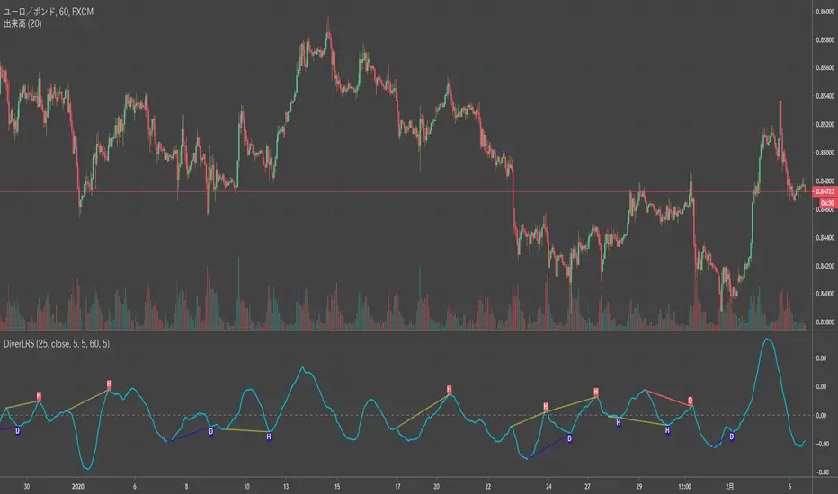
Divergence LinerRegressionSlope[mado]Divergence screener for LinerRegressionSlope
Regular Bullish: "D" navy label
Hidden Bullish: "H" navy label
Regular Bearish: "D" red label
Hidden Bearish: "H" red label
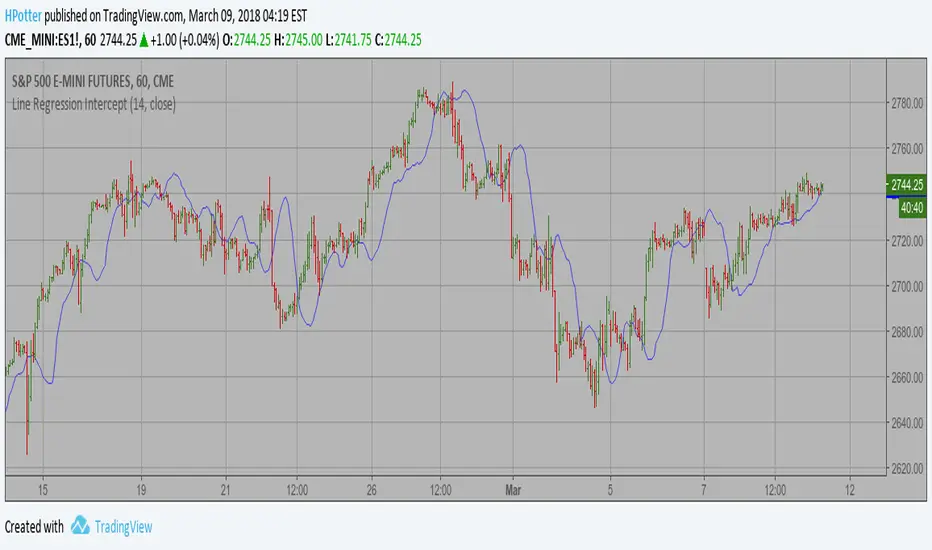
Line Regression Intercept Backtest Linear Regression Intercept is one of the indicators calculated by using the
Linear Regression technique. Linear regression indicates the value of the Y
(generally the price) when the value of X (the time series) is 0. Linear
Regression Intercept is used along with the Linear Regression Slope to create
the Linear Regression Line. The Linear Regression Intercept along with the Slope
creates the Regression line.
You can change long to short in the Input Settings
WARNING:
- For purpose educate only
- This script to change bars colors.

Line Regression Intercept Linear Regression Intercept is one of the indicators calculated by using the
Linear Regression technique. Linear regression indicates the value of the Y
(generally the price) when the value of X (the time series) is 0. Linear
Regression Intercept is used along with the Linear Regression Slope to create
the Linear Regression Line. The Linear Regression Intercept along with the Slope
creates the Regression line.