GC High-Prob 3-Touch + RVOLWhen publishing your script to TradingView, the description is your "sales pitch" to the community. TradingView’s moderators and users look for three things: What it does, Why it’s useful, and How to interpret it.
Here is a structured, professional description you can copy and paste into the publishing field.
Title Suggestion: GC High-Prob Liquidity Zones: 3-Touch + RVOL Surge
Description:
Overview
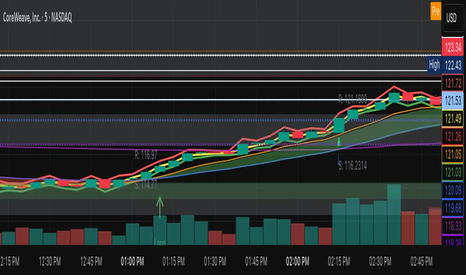
This indicator is designed specifically for Gold (GC) and other highly liquid futures, focusing on identifying high-probability support and resistance zones. Rather than plotting every minor pivot, this script filters market noise by requiring a "clustering" of price action and institutional volume confirmation.
It identifies levels where the price has been rejected at least three times within a narrow range and validates the strength of these zones using Relative Volume (RVOL).
Key Features
3-Touch Requirement: The script only plots a zone once it detects 3 separate rejections at a specific price level. This identifies "battlegrounds" where supply and demand are truly established.
RVOL Surge Filter: To prevent "lazy" or low-liquidity fake-outs, the zone is only highlighted if the most recent touch occurred with a volume spike (Relative Volume > 1.5x average).
Dynamic Price Anchoring: Built using Pine Script v6 force_overlay, these zones are physically anchored to the price candles. They scale and move perfectly with the chart as you zoom or scroll, avoiding the "floating" issues common in standard drawing scripts.
Smart Proximity: Includes a proximity filter (default $0.50 for Gold) that groups nearby wicks into a single unified zone of interest.
How to Use
Identify the Zone: When a Red (Resistance) or Green (Support) box appears with a thick yellow border, it indicates a high-probability institutional level.
Wait for the Sweep: Look for price to "hunt" the liquidity inside the box.
The Rejection: A successful trade setup often occurs when a candle wicks into the zone but closes back outside of it on high volume.
Risk Management: The edges of these boxes provide clear, objective levels for stop-loss placement.
Settings
Pivot Strength: Adjusts how "significant" a peak must be to be recorded. (10 is recommended for 1m/5m charts).
RVOL Threshold: Sets the multiplier for volume spikes. 1.5 means 150% of the recent average volume.
Touch Proximity: Defines how close rejections must be to each other to be considered part of the same "cluster."
Pine Script® インジケーター