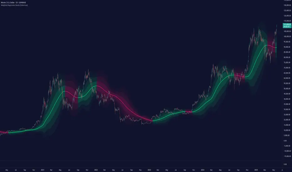
Weighted Regression Bands (Zeiierman)█ Overview
Weighted Regression Bands is a precision-engineered trend and volatility tool designed to adapt to the real market structure instead of reacting to price noise.
This indicator analyzes Weighted High/Low medians and applies user-selectable smoothing methods — including Kalman Filtering, ALMA, and custom Linear Regression — to generate a Fair Value line. Around this, it constructs dynamic standard deviation bands that adapt in real-time to market volatility.
The result is a visually clean and structurally intelligent trend framework suitable for breakout traders, mean reversion strategies, and trend-driven analysis.
█ How It Works
⚪ Structural High/Low Analysis
At the heart of this indicator is a custom high/low weighting system. Instead of using just the raw high or low values, it calculates a midline = (high + low) / 2, then applies one of three weighting methods to determine which price zones matter most.
Users can select the method using the “Weighted HL Method” setting:
Simple
Selects the single most dominant median (highest or lowest) in the lookback window. Ideal for fast, reactive signals.
Advanced
Ranks each bar based on a composite score: median × range × recency. This method highlights structurally meaningful bars that had both volatility and recency. A built-in Kalman filter is applied for extra stability.
Smooth
Blends multiple bars into a single weighted average using smoothed decay and range. This provides the softest and most stable structural response.
⚪ Smoothing Methods (ALMA / Linear Regression)
ALMA provides responsive, low-lag smoothing for fast trend reading.
Linear Regression projects the Fair Value forward, ideal for trend modeling.
⚪ Kalman Smoothing Filter
Before trend calculations, the indicator applies an optional Kalman-style smoothing filter. This helps:
Reduce choppy false shifts in trend,
Retain signal clarity during volatile periods,
Provide stability for long-term setups.
⚪ Deviation Bands (Dynamic Volatility Envelopes)
The indicator builds ±1, ±2, and ±3 standard deviation bands around the fair value line:
Calculated from the standard deviation of price,
Bands expand and contract based on recent volatility,
Visualizes potential overbought/oversold or trending conditions.
█ How to Use
⚪ Trend Trading & Filtering
Use the Fair Value line to identify the dominant direction.
Only trade in the direction of the slope for higher probability setups.
⚪ Volatility-Based Entries
Watch for price reaching outer bands (+2σ, +3σ) for possible exhaustion.
Mean reversion entries become higher quality when far from Fair Value.
█ Settings
Length – Lookback for Weighted HL and trend smoothing
Deviation Multiplier – Controls how wide the bands are from the fair value line
Method – Choose between ALMA or Linear Regression smoothing
Smoothing – Strength of Kalman Filter (1 = none, <1 = stronger smoothing)
-----------------
Disclaimer
The content provided in my scripts, indicators, ideas, algorithms, and systems is for educational and informational purposes only. It does not constitute financial advice, investment recommendations, or a solicitation to buy or sell any financial instruments. I will not accept liability for any loss or damage, including without limitation any loss of profit, which may arise directly or indirectly from the use of or reliance on such information.
All investments involve risk, and the past performance of a security, industry, sector, market, financial product, trading strategy, backtest, or individual's trading does not guarantee future results or returns. Investors are fully responsible for any investment decisions they make. Such decisions should be based solely on an evaluation of their financial circumstances, investment objectives, risk tolerance, and liquidity needs.
Regressions
Grid Trade Helper📌 Grid Trade Helper – Range-Based Grid Planning Tool
This tool is designed for range-based traders and manual grid strategy operators, providing a framework to balance execution efficiency and risk exposure.
By referencing historical weekly volatility, it helps estimate a reasonable grid width, visualizes key levels, and supports position management with quantitative guidance.
🧭 Design Philosophy:
In multi-entry systems like grid trading, there's always a tradeoff:
"Tighter grids improve opportunity density but increase risk; wider grids reduce risk but lower efficiency."
This tool seeks to provide a dynamic equilibrium between the two, using past volatility to determine practical grid intervals and suggest safe leverage thresholds.
✨ Core Features:
Weekly open level tracking (custom time + time zone support)
Volatility-based suggestions for grid width and safe grid count
Visual range plotting with optional stop-line overlay
Compact live table showing key metrics: average range, grid width, grid count, leverage cap
🔧 Customizable Parameters:
Time zone and custom weekly open hour
Max number of visual elements (lines, boxes)
Color and line style options
📈 Suggested Use Cases:
Planning manual grid structures with volatility-adjusted intervals
Visual support for range-bound or sideways market strategies
Estimating leverage exposure and grid density for better position control
⚠️ This indicator is intended as a strategic support tool and does not constitute financial advice. Use according to your own risk framework and market understanding.

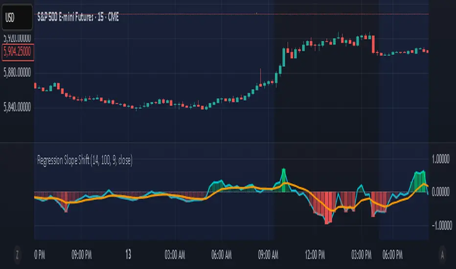
Regression Slope ShiftNormalized Regression Slope Shift + Dynamic Histogram
This indicator detects subtle shifts in price momentum using a rolling linear regression approach. It calculates the slope of a linear regression line for each bar over a specified lookback period, then measures how that slope changes from bar to bar.
Both the slope and its change (delta) are normalized to a -1 to 1 scale for consistent visual interpretation across assets and timeframes. A signal line (EMA) is applied to the slope delta to help identify turning points and crossovers.
Key features:
- Normalized slope and slope change lines
- Dynamic histogram of slope delta with transparency based on magnitude
- Customizable colors for all visual elements
- Signal line for crossover-based momentum shifts
This tool helps traders anticipate trend acceleration or weakening before traditional momentum indicators react, making it useful for early trend detection, divergence spotting, and confirmation signals.
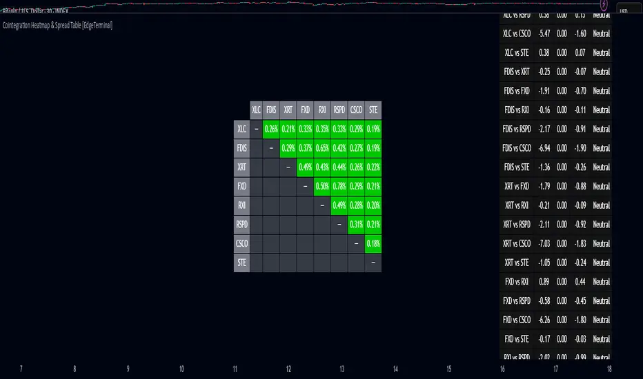
Cointegration Heatmap & Spread Table [EdgeTerminal]The Cointegration Heatmap is a powerful visual and quantitative tool designed to uncover deep, statistically meaningful relationships between assets.
Unlike traditional indicators that react to price movement, this tool analyzes the underlying statistical relationship between two time series and tracks when they diverge from their long-term equilibrium — offering actionable signals for mean-reversion trades .
What Is Cointegration?
Most traders are familiar with correlation, which measures how two assets move together in the short term. But correlation is shallow — it doesn’t imply a stable or predictable relationship over time.
Cointegration, however, is a deeper statistical concept: Two assets are cointegrated if a linear combination of their prices or returns is stationary , even if the individual series themselves are non-stationary.
Cointegration is a foundational concept in time series analysis, widely used by hedge funds, proprietary trading firms, and quantitative researchers. This indicator brings that institutional-grade concept into an easy-to-use and fully visual TradingView indicator.
This tool helps answer key questions like:
“Which stocks tend to move in sync over the long term?”
“When are two assets diverging beyond statistical norms?”
“Is now the right time to short one and long the other?”
Using a combination of regression analysis, residual modeling, and Z-score evaluation, this indicator surfaces opportunities where price relationships are stretched and likely to snap back — making it ideal for building low-risk, high-probability trade setups.
In simple terms:
Cointegrated assets drift apart temporarily, but always come back together over time. This behavior is the foundation of successful pairs trading.
How the Indicator Works
Cointegration Heatmap indicator works across any market supported on TradingView — from stocks and ETFs to cryptocurrencies and forex pairs.
You enter your list of symbols, choose a timeframe, and the indicator updates every bar with live cointegration scores, spread signals, and trade-ready insights.
Indicator Settings:
Symbol list: a customizable list of symbols separated by commas
Returns timeframe: time frame selection for return sampling (Weekly or Monthly)
Max periods: max periods to limit the data to a certain time and to control indicator performance
This indicator accomplishes three major goals in one streamlined package:
Identifies stable long-term relationships (cointegration) between assets, using a heatmap visualization.
Tracks the spread — the difference between actual prices and the predicted linear relationship — between each pair.
Generates trade signals based on Z-score deviations from the mean spread, helping traders know when a pair is statistically overextended and likely to mean revert.
The math:
Returns are calculated using spread tickers to ensure alignment in time and adjust for dividends, splits, and other inconsistencies.
For each unique pair of symbols, we perform a linear regression
Yt=α+βXt+ε
Then we compute the residuals (errors from the regression):
Spreadt=Yt−(α+βXt)
Calculate the standard deviation of the spread over a moving window (default: 100 samples) and finally, define the Cointegration Score:
S=1/Standard Deviation of Residuals
This means, the lower the deviation, the tighter the relationship, so higher scores indicate stronger cointegration.
Always remember that cointegration can break down so monitor the asset over time and over multiple different timeframes before making a decision.
How to use the indicator
The heatmap table:
The indicator displays 2 very important tables, one in the middle and one on the right side. After entering your symbols, the first table to pay attention to is the middle heatmap table.
Any assets with a cointegration value of 25% is something to pay attention to and have a strong and stable relationship. Anything below is weak and not tradable.
Additionally, the 40% level is another important line to cross. Assets that have a cointegration score of over 40% will most likely have an extremely strong relationship.
Think about it this way, the higher the percentage, the tighter and more statistically reliable the relationship is.
The spread table:
After finding a good asset pair using heatmap, locate the same pair in the spread table (right side).
Here’s what you’ll see on the table:
Spread: Current difference between the two symbols based on the regression fit
Mean: Historical average of that spread
Z-score: How far current spread is from the mean in standard deviations
Signal: Trade suggestion: Short, Long, or Neutral
Since you’re expecting mean reversion, the idea is that the spread will return to the average. You want to take a trade when the z-score is either over +2 or below -2 and exit when z-score returns to near 0.
You will usually see the trade suggestion on the spread chart but you can make your own decision based on your risk level.
Keep in mind that the Z-score for each pair refers to how off the first asset is from the mean compared to the second one, so for example if you see STOCKA vs STOCKB with a Z-score of -1.55, we are regressing STOCKB (Y) on STOCKA (X).
In this case, STOCKB is the quoted asset and STOCKA is the base asset.
In this case, this means that STOCKB is much lower than expected relative to STOCKA, so the trade would be a long position on stock B and short position on stock A.
Index Futures vs Cash ArbitrageThis indicator measures the statistical spread between major stock index futures and their corresponding cash indices (e.g., ES vs SPX, NQ vs NDX) using Z-score normalization. It automatically detects commonly traded index pairs (S&P 500, Nasdaq, Dow Jones, Russell 2000) and calculates a smoothed spread between futures and spot prices. A Z-score is then derived from this spread to highlight potential overpricing or underpricing conditions.
Traders can use customizable thresholds to identify mean-reversion opportunities where the futures contract may be temporarily overvalued or undervalued relative to the index. The histogram highlights the direction of the Z-score (green = futures > index, red = futures < index), while built-in alerts notify users of key threshold breaches or zero-line crosses.
This tool is designed for discretionary traders, pairs traders, or anyone exploring statistical arbitrage strategies between futures and spot markets. It is not a buy/sell signal by itself and should be used with additional confluence or risk management techniques.

Asia Session Range @mrxautrades🗺️ Asia Session Range by @mrxautrades
🚨 This script is closed-source because it implements a custom logic for session range visualization, deviation projections, and adaptive display based on chart timeframe. No other public script offers this exact functionality.
✅ What does this script do?
This indicator highlights the Asian session range and calculates dynamic extensions during the New York session open. It's designed for traders who rely on price action around key market sessions.
🔧 Unique Features (compared to existing scripts):
Timeframe-aware visibility: The script includes conditional logic to show or hide elements based on the chart timeframe (e.g., only visible on 60-minute or lower charts).
Automatic deviation levels: Calculates and plots extensions above/below the Asian range based on its size, offering projected support/resistance levels in real time.
Adaptive labels: Labels adjust dynamically to chart styling, with options for background, color, and visibility control.
⚙️ Customizable Inputs:
Asian and New York session times
Box, line, and label colors
Number and spacing of deviation levels
Line extension duration (in hours)
Label style: plain text or with background
🧠 Best suited for:
Breakout strategies based on the Asian session range
Using prior session levels as support/resistance
Intraday traders in Forex, indices, or crypto markets
PolyBand Convergence System (PBCS)PolyBand Convergence System (PBCS)
The PolyBand Convergence System (PBCS) is an advanced technical analysis indicator that combines multiple polynomial regressions with statistical bands to identify trend strength and potential reversal zones.
Key Features
Multi-Degree Polynomial Analysis: Combines 1st, 2nd, 3rd, and 4th degree polynomial regressions into a composite regression line
Adaptive Statistical Bands: Uses percentile-based bands enhanced with standard deviation multipliers
Asymmetric Volatility Measurement: Separately calculates upside and downside volatility for more accurate band placement
Smart Trend Detection: Identifies bullish, bearish, or neutral market conditions based on price position relative to bands
How It Works
PBCS creates a composite regression line from multiple polynomial fits to better capture the underlying price structure. This line is then surrounded by adaptive bands that represent statistical thresholds for price movement. When price breaks above the upper band, a bullish trend is signaled; when it breaks below the lower band, a bearish trend is indicated.
Customization Options
Regression Settings: Adjust source data, lookback period, and smoothing parameters
Percentile Controls: Fine-tune the statistical thresholds for upper and lower bands
Volatility Sensitivity: Modify standard deviation multipliers to control band width
Visual Preferences: Choose from multiple color schemes to match your trading platform
Disclaimer
This indicator is provided for educational and informational purposes only and does not constitute investment advice. Trading involves risk and may result in financial loss. Always perform your own research and consult with a qualified financial advisor before making any trading decisions.

Kernel Regression Bands SuiteMulti-Kernel Regression Bands
A versatile indicator that applies kernel regression smoothing to price data, then dynamically calculates upper and lower bands using a wide variety of deviation methods. This tool is designed to help traders identify trend direction, volatility, and potential reversal zones with customizable visual styles.
Key Features
Multiple Kernel Types: Choose from 17+ kernel regression styles (Gaussian, Laplace, Epanechnikov, etc.) for smoothing.
Flexible Band Calculation: Select from 12+ deviation types including Standard Deviation, Mean/Median Absolute Deviation, Exponential, True Range, Hull, Parabolic SAR, Quantile, and more.
Adaptive Bands: Bands are calculated around the kernel regression line, with a user-defined multiplier.
Signal Logic: Trend state is determined by crossovers/crossunders of price and bands, coloring the regression line and band fills accordingly.
Custom Color Modes: Six unique color palettes for visual clarity and personal preference.
Highly Customizable Inputs: Adjust kernel type, lookback, deviation method, band source, and more.
How to Use
Trend Identification: The regression line changes color based on the detected trend (up/down)
Volatility Zones: Bands expand/contract with volatility, helping spot breakouts or mean-reversion opportunities.
Visual Styling: Use color modes to match your chart theme or highlight specific market states.
Credits:
Kernel regression logic adapted from:
ChartPrime | Multi-Kernel-Regression-ChartPrime (Link in the script)
Disclaimer
This script is for educational and informational purposes only. Not financial advice. Use at your own risk.

Open-Close / High-Low RibbonThis indicator visualizes smoothed Open, Close, High, and Low price levels as continuous lines, helping users observe underlying price structure with reduced noise. The Open and Close values are shaded to highlight bullish (green) or bearish (red) zones based on their relationship. Smoothing is applied using a simple moving average (SMA) over a user-defined length to make trends easier to interpret. This tool can be useful for identifying directional bias, trend shifts, or areas of support and resistance on any timeframe.
Linear Regression Volume | Lyro RSLinear Regression Volume | Lyro RS
⚠️Disclaimer⚠️
Always combine this indicator with other forms of analysis and risk management. Please do your own research before making any trading decisions.
The LR Volume | 𝓛𝔂𝓻𝓸 𝓡𝓢 indicator blends linear regression with volume-adjusted moving average s to dynamically outline price equilibrium and trend intensity. By integrating volume into its regression model, it highlights meaningful price movement relative to trading activity.
📌 How It Works:
Volume-Weighted Regression Baseline
Price is filtered through one of four volume-adjusted moving averages (SMA, RMA, HMA, ALMA) before being passed through a linear regression model, forming a dynamic fair value line.
Deviation Bands
The indicator plots 1x, 2x, and 3x standard deviation zones above and below the baseline, helping identify potential extremes, volatility spikes, and mean reversion areas.
Slope-Based Color Logic
The baseline and fill areas are dynamically colored:
- 🟢 Green for positive slope (uptrend)
- 🔴 Red for negative slope (downtrend)
- ⚪ Gray for neutral movement
⚙️ Inputs & Options:
Regression Length – Controls how many bars are used in the moving average and regression calculation.
Deviation Multiplier – Adjusts the width of the bands surrounding the regression baseline.
MA Type – Choose from 4 types:
SMA (Simple Moving Average)
RMA (Relative Moving Average)
HMA (Hull Moving Average)
ALMA (Arnaud Legoux Moving Average)
Band Colors – Customizable upper/lower band colors to match your visual style.
🔔 Alerts:
Long Signal – Triggers when the regression slope turns positive.
Short Signal – Triggers when the regression slope turns negative.

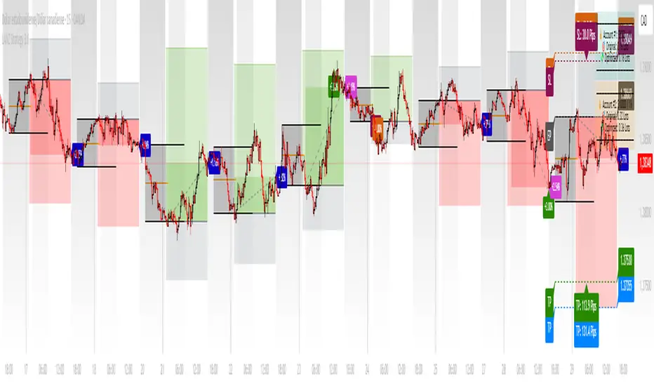
LANZ Strategy 3.0🔷 LANZ Strategy 3.0 — Asian Range Fibonacci Strategy with Execution Window Logic
LANZ Strategy 3.0 is a rule-based trading system that utilizes the Asian session range to project Fibonacci levels and manage entries during a defined execution window. Designed for Forex and index traders, this strategy focuses on structured price behavior around key levels before the New York session.
🧠 Core Components:
Asian Session Range Mapping: Automatically detects the high, low, and midpoint during the Asian session.
Fibonacci Level Projection: Projects configurable Fibonacci retracement and extension levels based on the Asian range.
Execution Window Logic: Uses the 01:15 NY candle as a reference to validate potential reversals or continuation setups.
Conditional Entry System: Includes logic for limit order entries (buy or sell) at specific Fib levels, with reversal logic if price breaks structure before execution.
Risk Management: Entry orders are paired with dynamic SL and TP based on Fibonacci-based distances, maintaining a risk-reward ratio consistent with intraday strategies.
📊 Visual Features:
Asian session high/low/mid lines.
Fibonacci levels: Original (based on raw range) and Optimized (user-adjustable).
Session background coloring for Asia, Execution Window, and NY session.
Labels and lines for entry, SL, and TP targets.
Dynamic deletion of untriggered orders after execution window expires.
⚙️ How It Works:
The script calculates the Asian session range.
Projects Fibonacci levels from the range.
Waits for the 01:15 NY candle to close to validate a signal.
If valid, a limit entry order (BUY or SELL) is plotted at the selected level.
If price structure changes (e.g., breaks the high/low), reversal logic may activate.
If no trade is triggered, orders are cleared before the NY session.
🔔 Alerts:
Alerts trigger when a valid setup appears after 01:15 NY candle.
Optional alerts for order activation, SL/TP hit, or trade cancellation.
📝 Notes:
Intended for semi-automated or discretionary trading.
Best used on highly liquid markets like Forex majors or indices.
Script parameters include session times, Fib ratios, SL/TP settings, and reversal logic toggle.
Credits:
Developed by LANZ, this script merges traditional session-based analysis with Fibonacci tools and structured execution timing, offering a unique framework for morning volatility plays.
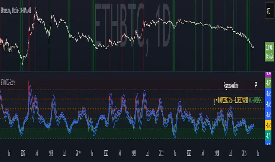
ETHBTC Z-ScoreETHBTC Z-Score Indicator
Key Features
Z-Score Calculation: Measures how far ETHBTC deviates from its mean over a user-defined period.
Linear Regression Line: Tracks the trend of the Z-score using least squares regression.
Standard Deviation Bands: Plots ±N standard deviations around the regression line to show expected Z-score range.
Dynamic Thresholds: Highlights overbought (e.g. Z > 1) and oversold (e.g. Z < -2) zones using color and background fill.
Visual & Table Display: Color-coded bars, horizontal level fills, and optional table showing regression formula and R².
Usage
Spot overbought/oversold extremes when Z-score crosses defined thresholds.
Use the regression line as a dynamic baseline and its bands as range boundaries.
Monitor R² to gauge how well the regression line fits the recent Z-score trend.
Example
Z > 1: ETHBTC may be overbought — potential caution or mean-reversion.
Z < -2: ETHBTC may be oversold — possible buying opportunity.
Z near regression line: Price is in line with recent trend.
Machine Learning: ARIMA + SARIMADescription
The ARIMA (Autoregressive Integrated Moving Average) and SARIMA (Seasonal ARIMA) are advanced statistical models that use machine learning to forecast future price movements. It uses autoregression to find the relationship between observed data and its lagged observations. The data is differenced to make it more predictable. The MA component creates a dependency between observations and residual errors. The parameters are automatically adjusted to market conditions.
Differences
ARIMA - This excels at identifying trends in the form of directions
SARIMA - Incorporates seasonality. It's better at capturing patterns previously seen
How To Use
1. Model: Determine if you want to use ARIMA (better for direction) or SARIMA (better for overall prediction). You can click on the 'Show Historic Prediction' to see the direction of the previous candles. Green = forecast ending up, red = forecast ending down
2. Metrics: The RMSE% and MAPE are 10 day moving averages of the first 10 predictions made at candle close. They're error metrics that compare the observed data with the predicted data. It is better to use them when they're below 8%. Higher timeframes will be higher, as these models are partly mean-reverting and higher TFs tend to trend more. Better to compare RMSE% and MAPE with similar timeframes. They naturally lag as data is being collected
3. Parameter selection: The simpler, the better. Both are used for ARIMA(1,1,1) and SARIMA(1,1,1)(1,1,1)5. Increasing may cause overfitting
4. Training period: Keep at 50. Because of limitations in pine, higher values do not make for more powerful forecasts. They will only criminally lag. So best to keep between 20 and 80

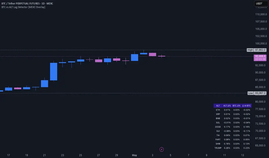
BTC vs ALT Lag Detector [MEXC Overlay]This indicator monitors the price movement of Bitcoin (BTC) and compares it in real time to a customizable list of major altcoins on the MEXC exchange.
It helps you identify lagging altcoins — tokens that are underperforming or overperforming BTC’s price action over a selected timeframe. These temporary deviations can offer profitable entry or rotation opportunities, especially for scalpers, day traders, and arbitrage-style strategies.
Key Features:
- Real-time deviation detection between BTC and altcoins
- Customizable comparison timeframe: 1m, 6m, 12m, 30m, 1h, 4h, or 1d
- Deviation threshold alert: Highlights coins that lag BTC by more than 0.5%, 1%, 2%, or 3%
- Compact stats table embedded in the price chart
- Fully adjustable layout: Table position (Top/Bottom/Center + Left/Right), Font size (Tiny, Small, Medium)
- Built-in alert system when deviation exceeds your chosen threshold
How to Use It:
Set your desired timeframe for comparison (e.g., 1 hour).
Select a deviation threshold (e.g., 1.0%).
The table will show:
Each altcoin’s % change
BTC’s % change
The delta (deviation) vs BTC
Red highlights indicate alts whose deviation exceeded the threshold.
When at least one alt lags beyond your threshold, the indicator can trigger an alert — helping you capitalize on potential catch-up trades.
Please provide any feedback on it.
[Tradevietstock] Fair Value Channel – Premium/Discount ZonesThe Ultimate Tool for Value Traders
Fair Value Channel – Premium/Discount Zones (Polynomial Regression)
Hello again, it’s Tradevietstock ,
This time, we’re introducing a powerful long-term tool for value investors and swing traders — a visual framework that answers one key question:
i. Overview
1. 🧠 Logic Behind the Script
This script creates a Fair Value Channel using polynomial regression to model the upper and lower bounds of a stock's expected price range. The core idea is to estimate "fair value" zones that indicate whether the current price is at a premium (overvalued) or discount (undervalued) relative to its historical range.
The script uses fixed coefficients for third-degree (cubic) polynomial equations to define a top channel and bottom channel, then scales and shifts these curves to match the actual price data. Intermediate levels (25%, 50%, 75%) are calculated using geometric interpolation, offering a graded assessment of price positioning within the channel.
2. The Trading Theory
This indicator is based on the idea that markets move in repeatable cycles of overvaluation and undervaluation. Rather than relying on instinct to judge whether an asset is “cheap” or “expensive,” it uses mathematical modeling — specifically, a fixed third-degree polynomial regression — to identify structured price patterns over time. This regression captures the natural wave-like behavior of prices and defines a fair value channel, with upper and lower bounds representing premium and discount zones.
The lower zone signals undervalued conditions, ideal for accumulating positions, while the upper zone reflects overvalued areas, where it may be time to reduce exposure. These zones are scaled to align with the asset’s real price range, making them practical and adaptive.
Ultimately, the indicator brings logic and discipline to value investing. It helps traders recognize favorable buying opportunities within a cycle — and hold until the next major uptrend, instead of reacting emotionally. The strategy: buy low, hold smart, sell high — driven by data, not guesswork.
ii. How to use
1. Key terms
Lookback_period : Sets the historical period used to calculate the highest and lowest prices. Determines whether the analysis is short-term, mid-term, or long-term.
Timeframe_input : Specifies the timeframe used for polynomial regression calculations. Higher timeframes smooth out noise.
Extrapolation_bars : Defines how many bars into the future the fair value channel should be projected (forecasted). Helps visualize future zones.
Show_forecast : Enables or disables the display of forecasted (future) evaluation zones based on extrapolated regression curves.
🎯 Evaluation Zones Based on Fair Value Range
Each of these zones represents a valuation level relative to a stock's or asset's estimated fair value. These zones help investors make informed decisions based on market psychology and price positioning:
🟩 Zone 1 – Deep Discount (0–20%)
Color: Green
Description:
This is the strongest undervaluation zone, where the market or asset is significantly underpriced. It typically reflects extreme fear and pessimism among investors.
A great opportunity for long-term investors to accumulate high-potential assets at bargain prices.
For example, Tesla (TSLA) stock dropped into the Deep Discount Zone in 2019, offering an exceptional entry point. By 2020, the stock had surged approximately 430%, illustrating how powerful the recovery can be from this zone.
The Deep Discount Zone often appears only during recessionary periods or times of extreme market fear, making it one of the best opportunities to accumulate high-quality stocks.
However, due to the elevated risks and uncertainty in such conditions, it’s crucial to prioritize risk management and approach this zone with a mid- to long-term investment mindset, rather than seeking short-term gains.
🟩 Zone 2 – Undervalued (20–40%)
Color: Lime
Description:
Still considered a strong buying opportunity, this zone offers assets at meaningful discounts. While not as deeply undervalued as Zone 1, it remains attractive for value-seeking investors.
For example, Netflix (NFLX) stock experienced a sharp decline of nearly 80% in 2011, pushing it into the Undervalued Zone. This presented a prime buying opportunity for long-term investors.
After a period of consolidation, NFLX surged over 500% by 2013, demonstrating how deeply discounted zones can signal powerful reversal and growth potential when backed by strong fundamentals.
🟨 Zone 3 – Fair Value (40–60%)
Color: Yellow
Description:
This zone represents the true fair value range. Many high-growth or in-demand assets may only dip this low due to market optimism. Buying in this zone can still be wise—especially for fundamentally strong stocks or tokens—depending on broader conditions and expectations.
For example, Apple stock has historically never fallen below the Fair Value Zone, largely due to the company’s strong core values, resilient business model, and consistent performance. Whether a stock dips further into undervalued zones often depends on its intrinsic fundamentals and long-term growth potential.
Likewise, NVDA stock has only dipped into the Fair Value Zone, but not deeper, due to the company’s strong fundamentals and high growth potential.
🟧 Zone 4 – Overvalued (60–80%)
Color: Orange
Description:
In this range, prices are becoming expensive. This is generally a time to pause further buying and begin looking for potential exit or profit-taking opportunities.
Despite potential continued upside, staying disciplined here is key, as price increases may be driven more by speculation than fundamentals.
🟥 Zone 5 – Extended Premium (80–100%)
Color: Red
Description:
This is the extreme overvaluation zone, often driven by market euphoria, FOMO (Fear of Missing Out), and greed.
Avoid buying in this range. Instead, focus on exiting positions and securing profits. Risk of a reversal is high.
2. How to Use?
This indicator is not designed for short-term trading. Instead, it supports a value investing mindset, applicable across various financial instruments—including stocks, indices, tokens, and CFDs.
Investing based on fair value means focusing on the intrinsic worth of an asset and holding through market cycles—from fear to euphoria.
The goal is to accumulate positions during Deep Discount Zones (often during extreme fear or recession) and hold them patiently until the market reaches the FOMO and Extreme Greed stages.
At that point, those who bought during deep discounts become the true winners, having captured both value and long-term upside.
Trading Tutorial
The strategy is simple: Buy cheap, sell high.
Note:
Discount zones are based on the historical price behavior of each asset.
A strong stock may never drop into the lowest zones, while some tokens/indices/stocks might reach the Deep Discount Zone and still dip further before recovering.
Always analyze the asset’s history—does it usually bounce from the Fair Value Zone, or does it often fall deeper before reversing?
Your strategy should adapt to the specific behavior of the stock, token, or index you're trading.
This indicator works with stocks, crypto, indices, and CFDs.
You can adjust any input settings to match your own strategy and risk tolerance, as long as you understand what you're doing.

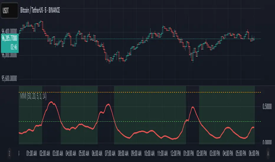
Market Manipulation Index (MMI)The Composite Manipulation Index (CMI) is a structural integrity tool that quantifies how chaotic or orderly current market conditions are, with the aim of detecting potentially manipulated or unstable environments. It blends two distinct mathematical models that assess price behavior in terms of both structural rhythm and predictability.
1. Sine-Fit Deviation Model:
This component assumes that ideal, low-manipulation price behavior resembles a smooth oscillation, such as a sine wave. It generates a synthetic sine wave using a user-defined period and compares it to actual price movement over an adaptive window. The error between the real price and this synthetic wave—normalized by price variance—forms the Sine-Based Manipulation Index. A high error indicates deviation from natural rhythm, suggesting structural disorder.
2. Predictability-Based Model:
The second component estimates how well current price can be predicted using recent price lags. A two-variable rolling linear regression is computed between the current price and two lagged inputs (close and close ). If the predicted price diverges from the actual price, this error—also normalized by price variance—reflects unpredictability. High prediction error implies a more manipulated or erratic environment.
3. Adaptive Mechanism:
Both components are calculated using an adaptive smoothing window based on the Average True Range (ATR). This allows the indicator to respond proportionally to market volatility. During high volatility, the analysis window expands to avoid over-sensitivity; during calm periods, it contracts for better responsiveness.
4. Composite Output:
The two normalized metrics are averaged to form the final CMI value, which is then optionally smoothed further. The output is scaled between 0 and 1:
0 indicates a highly structured, orderly market.
1 indicates complete structural breakdown or randomness.
Suggested Interpretation:
CMI < 0.3: Market is clean and structured. Trend-following or breakout strategies may perform better.
CMI > 0.7: Market is structurally unstable. Choppy price action, fakeouts, or manipulative behavior may dominate.
CMI 0.3–0.7: Transitional zone. Caution or reduced risk may be warranted.
This indicator is designed to serve as a contextual filter, helping traders assess whether current market conditions are conducive to structured strategies, or if discretion and defense are more appropriate.
Future Candle Reversal Projection (Mastersinnifty)Overview
This tool identifies potential future market reversal zones by dynamically projecting pivot-based swing patterns forward in time. Unlike traditional ZigZag indicators that only reflect past movements, this indicator anticipates probable future turning points based on historical swing periodicity.
---
Key Features
- Forward Projections: Calculates and projects future swing zones based on detected pivot distances.
- Customizable Detection: Adjust the ZigZag depth for different trading styles (scalping, swing, position).
- Dynamic Updates: Real-time recalibration as new pivots form.
- Clean Visual Markers: Projects reversal estimates as intuitive labels and dotted lines.
---
How it Works
The indicator identifies significant swing highs and lows using a user-defined ZigZag depth setting. It measures the time (bars) and price characteristics of the latest swing movement. Using this pattern, it projects forward estimated reversal points at consistent intervals. Midpoint price levels between the last high and low are used for each future projection.
---
Who Can Benefit
- Intraday and swing traders seeking advanced planning zones.
- Technical analysts relying on pattern periodicity.
- Traders who wish to combine projected reversal markers with their own risk management strategies.
---
Disclaimer
This tool is an analytical and educational utility. It does not predict markets with certainty. Always combine it with your own analysis and risk management. Past behavior does not guarantee future results.

Liquidity Trap Reversal Pro (Radar v2)Liquidity Trap Reversal Pro (Radar v2) is a non-repainting indicator designed to detect hidden liquidity traps at key swing highs and lows. It combines wick analysis, volume spike detection, and optional trend and exhaustion filters to identify high-probability reversal setups.
🔷 Features:
Non-Repainting: Pivots confirmed after lookback period, no future leaking.
Volume Spike Detection: Filters traps that occur during major liquidity events.
EMA Trend Filter (Optional): Focus on traps aligned with the prevailing trend.
Higher Timeframe Trend Filter (Optional): Confirm traps using a higher timeframe EMA bias.
Exhaustion Guard (Optional): Prevents traps after overextended moves based on ATR stretch.
Clean Visuals: Distinct plots for raw trap points vs confirmed traps.
Alerts Included: Set alerts for confirmed high/low liquidity traps.
📚 How to Use:
Watch for Trap Signals:
A Trap High signal suggests a potential bearish reversal.
A Trap Low signal suggests a potential bullish reversal.
Use Confirmed Signals for Best Entries:
Confirmed traps fire only after price moves opposite to the trap direction, adding reliability.
Use Trend Filters to Improve Accuracy:
In an uptrend (price above EMA), prefer Trap Lows (buy setups).
In a downtrend (price below EMA), prefer Trap Highs (sell setups).
Use the Exhaustion Guard to Avoid Bad Trades:
This filter blocks signals when price has moved too far from trend, helping avoid late entries.
Recommended Settings:
Best used on 15-minute, 1-hour, or 4-hour charts.
Trend filter ON for trending markets.
Exhaustion guard ON for volatile or stretched markets.
📈 Important Notes:
This script does not repaint once a pivot is confirmed.
Alerts trigger only on confirmed trap signals.
Always combine signals with sound risk management and trading strategy.
Disclaimer:
This script is for educational purposes only. It is not investment advice or a guarantee of results. Always do your own research before trading.

Auto Trend Channel + Buy/Sell AlertsThis indicator automatically detects trend channels using a linear regression line, and dynamically plots upper and lower channel boundaries based on standard deviation. It helps traders identify potential Buy and Sell zones with clear visual signals and customizable alerts.
💡 How It Works:
🧠 Regression-Based Channel: Calculates the central trend line using ta.linreg() over a user-defined length.
📏 Dynamic Boundaries: Upper and lower channel lines are offset by a multiplier of the standard deviation for precision volatility tracking.
✅ Buy Signals: Triggered when price crosses above the lower boundary — potential bounce entry.
❌ Sell Signals: Triggered when price crosses below the upper boundary — potential reversal exit.
🔔 Alerts Enabled: Get real-time alerts when price touches the channel lines.

TradeSmart Morning GloryThe Morning Glory Indicator by TradeSmart University is a pre-market volume visualization tool designed to help traders quickly assess the quality of a morning gap. By highlighting volume levels before the market opens, this indicator helps distinguish between a professional gap (likely to continue running) and a retail/news-driven gap (likely to fade or reverse).
💡 What It Does:
This indicator plots color-coded volume bars in the pre-market session and highlights when volume crosses two key thresholds:
Teal Bars – Low institutional interest
Yellow Bars – Medium institutional interest (100K+ volume)
Red Bars – High institutional interest (400K+ volume)
These thresholds are most effective on AMEX:SPY and other high-volume ETFs or stocks, but may be customized to fit your trading style. Consider using a 15-minute chart for the above settings.
🧠 How to Use It:
This indicator works best in conjunction with the Morning Glory Strategy and Qualified Trade Setup . On its own, the indicator gives a real-time read on pre-market strength , helping you:
Confirm gap-and-go setups (gap + high volume = likely continuation)
Fade the gap (gap + low volume = higher likelihood of reversal)
While the indicator focuses exclusively on volume, the full Morning Glory strategy adds an important price gap size filter to create powerful trade signals.
📊 Probabilities of Success (Based on Full Strategy):
When used as part of the Morning Glory Qualified Trade Setup, here are the historical win rates by day of the week:
Monday: 65%
Tuesday: 77%
Wednesday: 79%
Thursday: 82%
Friday: 78%
If used in conjunction with an artificial intelligence like the Deep Sky Trading Assistant™, win-loss ratios improve to 89% or better across all days of the week.
🔔 Note: For best results, activate premium ARCA data on your TradingView account. This ensures the most accurate and complete pre-market volume data.

NexAlgo AI with Dynamic TP/SLThe NexAlgo Indicator combines a Gaussian kernel regression engine with adaptive volatility thresholds to generate clear, data‑driven trade signals and built‑in risk levels. It predicts the next bar’s price relative to a simple moving average, then measures the average deviation between actual and forecasted values to form dynamic bands. Breakouts beyond these bands, aligned with the prediction’s direction, produce buy or sell signals directly on your chart.
How It Works & What You’ll See
Kernel Regression Forecast: A rolling “lookback” window builds a Gaussian similarity matrix of recent prices. This matrix is used to project the next price, smoothing around a moving average.
Adaptive Volatility Bands: The indicator computes the mean absolute error between actual and predicted prices, multiplies it by your chosen volatility factor, and plots upper and lower bands.
Signal Triggers: When price closes above the upper band while the prediction is rising, a green “BUY” label appears; when price closes below the lower band as the forecast falls, a red “SELL” label is shown.
Automatic SL/TP Levels: After each signal, the script scans recent swing highs/lows and applies an ATR buffer. Stop‑loss is set conservatively at the more protective of these levels, while take‑profit is calculated by your reward‑to‑risk ratio and capped near the opposite swing extreme.
Customizable Inputs
Lookback Period & Smoothing: Adjust how many bars the regression and volatility calculations use, and tune the noise regularization to suit fast or slow markets.
Volatility Multiplier: Widen or tighten the adaptive bands to control signal frequency and confidence.
Swing Lookback & ATR Options: Define how far back the indicator searches for swing points, and choose between ATR calculation methods.
Reward‑to‑Risk Ratio: Set your preferred multiple of stop‑loss distance for take‑profit targets.
What Makes NexAlgo Different
Hybrid Statistical Approach: Unlike fixed‑period moving averages or standard regression, the Gaussian kernel adapts locally to evolving price patterns and regimes.
Self‑Adjusting Thresholds: Volatility bands derive from prediction errors—so they expand in choppy markets and contract in trending conditions.
Integrated Risk Controls: Automatically calculated stop‑loss and take‑profit levels remove manual guesswork, yet remain grounded in both ATR and price structure.
Trader‑Driven Flexibility: Every parameter—from lookback length to risk ratio—can be dialed in for scalping, swing trading, or longer‑term strategies.
Getting Started
• Apply NexAlgo to your preferred timeframe (5–15 min for intraday scalps, 1 h–4 h for swings, daily for position plays).
• Begin with default settings and gradually adjust lookback and smoothing to balance responsiveness versus noise.
• Experiment with volatility multipliers: tighten in strong trends, widen when markets churn.
• Backtest different ATR buffers and reward ratios to discover your ideal risk‑reward profile.

Pullback SARPullback SAR - Parabolic SAR with Pullback Detection
Description: The "Pullback SAR" is an advanced indicator built on the classic Parabolic SAR but with additional functionality for detecting pullbacks. It helps identify moments when the price pulls back from the main trend, offering potential entry signals. Perfect for traders looking to enter the market after a correction.
Key Features:
SAR (Parabolic SAR): The Parabolic SAR indicator is used to determine potential trend reversal points. It marks levels where the price could reverse its direction.
Pullback Detection: The indicator catches periods when the price moves away from the main trend and then returns, which may suggest a re-entry opportunity.
Long and Short Signals: Once a pullback in the direction of the main trend is identified, the indicator generates signals that could be used to open positions.
Simple and Clear Construction: The indicator is based on the classic SAR, with added pullback detection logic to enhance the accuracy of the signals.
Parameters:
Start (SAR Step): Determines the initial step for the SAR calculation, which controls the rate of change in the indicator at the beginning.
Increment (SAR Increment): Defines the maximum step size for SAR, allowing traders to adjust the indicator’s sensitivity to market volatility.
Max Value (SAR Max): Sets the upper limit for the SAR value, controlling its volatility.
Usage:
Swing Trading: Ideal for swing strategies, aiming to capture larger price moves while maintaining a safe margin.
Scalping: Due to its precise pullback detection, it can also be used in scalping, especially when the price quickly returns to the main trend.
Risk Management: The combination of SAR and pullback detection allows traders to adjust their positions according to changing market conditions.
Special Notes:
Adjusting Parameters: Depending on the market and trading style, users can adjust the SAR parameters (Start, Increment, Max Value) to fit their needs.
Combination with Other Indicators: It's recommended to use the indicator alongside other technical analysis tools (e.g., EMA, RSI) to enhance the accuracy of the signals.
Link to the script: This open-source version of the indicator is available on TradingView, enabling full customization and adjustments to meet your personal trading strategy. Share your experiences and suggestions!

ML Deep Regression Pro (TechnoBlooms)ML Deep Regression Pro is a machine-learning-inspired trading indicator that integrates Polynomial Regression, Linear Regression and Statistical Deviation models to provide a powerful, data-driven approach to market trend analysis.
Designed for traders, quantitative analysts and developers, this tool transforms raw market data into predictive trend insights, allowing for better decision-making and trend validation.
By leveraging statistical regression techniques, ML Deep Regression Pro eliminates market noise and identifies key trend shifts, making it a valuable addition to both manual and algorithmic trading strategies.
REGRESSION ANALYSIS
Regression is a statistical modeling technique used in machine learning and data science to identify patterns and relationships between variables. In trading, it helps detect price trends, reversals and volatility changes by fitting price data into a predictive model.
1. Linear Regression -
The most widely used regression model in trading, providing a best-fit plotted line to track price trends.
2. Polynomial Regression -
A more advanced form of regression that fits curved price structures, capturing complex market cycles and improving trend forecasting accuracy.
3. Standard Deviation Bands -
Based on regression calculations, these bands measure price dispersion and identify overbought/ oversold conditions, similar to Bollinger Bands. By default, these lines are hidden and user can make it visible through Settings.
KEY FEATURES :-
✅ Hybrid Regression Engine – Combines Linear and Polynomial Regression to detect market trends with greater accuracy.
✅ Dynamic Trend Bias Analysis – Identifies bullish & bearish market conditions using real-time regression models.
✅ Standard Deviation Bands – Measures price volatility and potential reversals with an advanced deviation model.
✅ Adaptive EMA Crossover Signals – Generates buy/sell signals when price momentum shifts relative to the regression trend.
