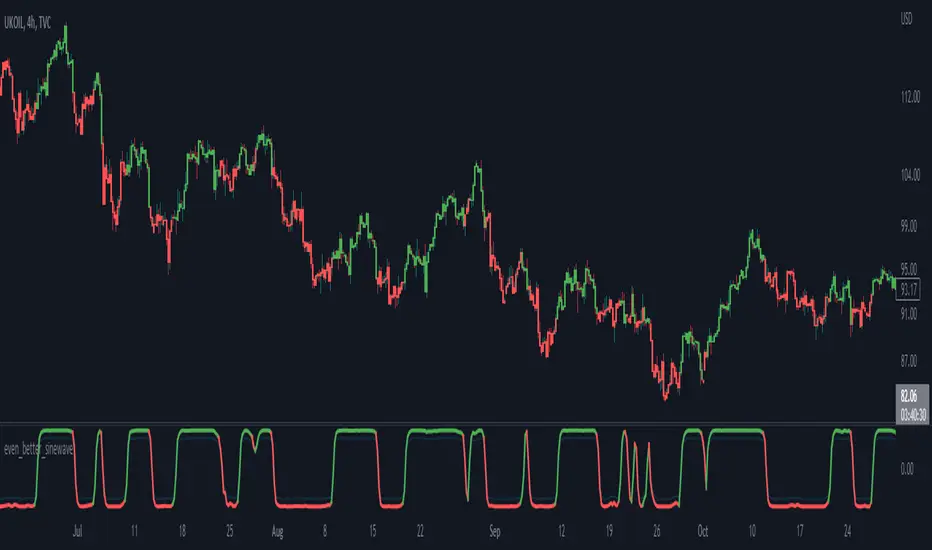
TASC 2025.02 Autocorrelation Indicator█ OVERVIEW
This script implements the Autocorrelation Indicator introduced by John Ehlers in the "Drunkard's Walk: Theory And Measurement By Autocorrelation" article from the February 2025 edition of TASC's Traders' Tips . The indicator calculates the autocorrelation of a price series across several lags to construct a periodogram , which traders can use to identify market cycles, trends, and potential reversal patterns.
█ CONCEPTS
Drunkard's walk
A drunkard's walk , formally known as a random walk , is a type of stochastic process that models the evolution of a system or variable through successive random steps.
In his article, John Ehlers relates this model to market data. He discusses two first- and second-order partial differential equations, modified for discrete (non-continuous) data, that can represent solutions to the discrete random walk problem: the diffusion equation and the wave equation. According to Ehlers, market data takes on a mixture of two "modes" described by these equations. He theorizes that when "diffusion mode" is dominant, trading success is almost a matter of luck, and when "wave mode" is dominant, indicators may have improved performance.
Pink spectrum
John Ehlers explains that many recent academic studies affirm that market data has a pink spectrum , meaning the power spectral density of the data is proportional to the wavelengths it contains, like pink noise . A random walk with a pink spectrum suggests that the states of the random variable are correlated and not independent. In other words, the random variable exhibits long-range dependence with respect to previous states.
Autocorrelation function (ACF)
Autocorrelation measures the correlation of a time series with a delayed copy, or lag , of itself. The autocorrelation function (ACF) is a method that evaluates autocorrelation across a range of lags , which can help to identify patterns, trends, and cycles in stochastic market data. Analysts often use ACF to detect and characterize long-range dependence in a time series.
The Autocorrelation Indicator evaluates the ACF of market prices over a fixed range of lags, expressing the results as a color-coded heatmap representing a dynamic periodogram. Ehlers suggests the information from the periodogram can help traders identify different market behaviors, including:
Cycles : Distinguishable as repeated patterns in the periodogram.
Reversals : Indicated by sharp vertical changes in the periodogram when the indicator uses a short data length .
Trends : Indicated by increasing correlation across lags, starting with the shortest, over time.
█ USAGE
This script calculates the Autocorrelation Indicator on an input "Source" series, smoothed by Ehlers' UltimateSmoother filter, and plots several color-coded lines to represent the periodogram's information. Each line corresponds to an analyzed lag, with the shortest lag's line at the bottom of the pane. Green hues in the line indicate a positive correlation for the lag, red hues indicate a negative correlation (anticorrelation), and orange or yellow hues mean the correlation is near zero.
Because Pine has a limit on the number of plots for a single indicator, this script divides the periodogram display into three distinct ranges that cover different lags. To see the full periodogram, add three instances of this script to the chart and set the "Lag range" input for each to a different value, as demonstrated in the chart above.
With a modest autocorrelation length, such as 20 on a "1D" chart, traders can identify seasonal patterns in the price series, which can help to pinpoint cycles and moderate trends. For instance, on the daily ES1! chart above, the indicator shows repetitive, similar patterns through fall 2023 and winter 2023-2024. The green "triangular" shape rising from the zero lag baseline over different time ranges corresponds to seasonal trends in the data.
To identify turning points in the price series, Ehlers recommends using a short autocorrelation length, such as 2. With this length, users can observe sharp, sudden shifts along the vertical axis, which suggest potential turning points from upward to downward or vice versa.
"Cycle"に関するスクリプトを検索
[iQ]PRO Engineering42+🔬 PRO Engineering42+ ⚙️
The Next Evolution in Signal Processing for Precision Market Analysis
Introducing PRO Engineering42+, a proprietary, cutting-edge technical analysis tool engineered to distill meaningful market structure from the inherent noise of price action. This indicator is built upon a sophisticated, multi-stage signal processing framework, leveraging advanced mathematics to provide traders with a uniquely clarified view of the underlying market trend and momentum.
Hybrid Composite Signal Generation
At its core, PRO Engineering42+ begins with a Hybrid Base Signal. This signal is not a mere average but a intelligently weighted composite, harmonizing the strengths of multiple distinct, adaptive moving average techniques. This fusion is designed to achieve a superior balance of responsiveness to trend shifts and smoothness for noise rejection, establishing a foundation of dynamic market memory.
Adaptive Volatility Clamping
The initial Hybrid Base is then subjected to an innovative process we term Adaptive Volatility Clamping. This critical step dynamically adjusts the signal's sensitivity in real-time based on the market's current volatility profile (measured using True Range), ensuring the signal remains tightly coupled with price action during quiet periods while minimizing whipsaws and overshoots during high-volatility events. This is achieved through a precise, weighted mechanism that prioritizes price context.
Proprietary Spectral Filtration and Gating
The hallmark of PRO Engineering42+ is its final stage: Advanced Frequency Domain Analysis using a proprietary Fast Fourier Transform (FFT) filter.
Frequency Isolation: The tool mathematically decomposes the pre-processed (clamped) signal into its constituent frequencies (or periodic cycles). Traders can isolate and focus on a specific, tunable bandwidth (FFT Low/High Freq) that represents the most relevant market cycles for their trading style, effectively filtering out disruptive high-frequency noise and irrelevant, extremely low-frequency components.
Intelligent Spectral Gating: This feature introduces a proprietary, volatility-aware thresholding mechanism (Spectral Gating Level). The filter actively assesses the power spectrum of the decomposed signal, only allowing frequencies with power exceeding a dynamically calculated standard deviation level to pass through. This unique "gate" intelligently suppresses less significant cycles, leaving only the statistically dominant, market-driving components to form the final output, resulting in an exceptionally clean and responsive oscillator.
The result is a powerful, low-lag Hybrid FFT Oscillator that provides an unparalleled measure of directional bias and momentum.
Key Features for Exclusive Members
Closed Source & Invite Only: The underlying Pine Script logic, including the proprietary spectral gating calculation and hybrid weighting methodology, is intentionally obscured and available exclusively to a select group of paying members.
Maximum Data Efficiency: Optimized with a low max_bars_back and robust dependency structure to ensure maximum calculation efficiency.
Precision Control: Fine-tune the system's performance using controls like Hybrid Base Length, FFT Window Size, and the Spectral Gating Level to perfectly match any asset, timeframe, and trading strategy.
Experience the future of analytical precision. This is not just an indicator; it is a proprietary engineering solution for market mastery.
Gann Seasonal Dates - CEGann Seasonal Dates - Community Edition
Welcome to the Gann Seasonal Dates V1.61 - Community Edition, a powerful tool designed to enhance time-based trading with W.D. Gann’s seasonal date methodology. This feature-complete indicator allows traders to plot critical seasonal dates on charts for equities, forex, commodities, and cryptocurrencies. It empowers traders to anticipate market turning points with precision.
Overview
The Gann Seasonal Dates plots Gann’s major and minor seasonal dates, which are rooted in the cyclical nature of solstices, equinoxes, and their midpoints. Major dates include the vernal equinox (March 21st), summer solstice (June 22nd), autumnal equinox (September 23rd), and winter solstice (December 22nd). Minor dates mark the halfway points between these events (February 4th, May 6th, July 23rd, August 8th, November 7th, and November 22nd). With customizable styling and historical data up to 50 years, this script helps traders identify key time-based market events.
Key Features
Major and Minor Seasonal Dates : Plot four major dates (solstices and equinoxes) and six minor dates (midpoints) to highlight potential market turning points.
Customizable Date Selection : Enable or disable individual major and minor dates to focus on specific cycles relevant to your analysis.
Historical Data Range : Adjust the lookback period up to 50 years, with recommendations for optimal performance based on your TradingView plan (5 years for Basic, 20 for Pro/Pro+/Premium).
Styling Options : Customize line styles (solid, dotted, dashed) and colors for major and minor dates to enhance chart clarity.
Labeled Visuals : Each plotted date includes a label with a tooltip (e.g., "Vernal equinox") for easy identification and context.
How It Works
Configure Settings : Enable major and/or minor dates and select specific dates (e.g., March 21st, February 4th) to display on your chart.
Set Historical Range : Adjust the years of data (up to 50) to plot historical seasonal dates, ensuring compatibility with your TradingView plan’s processing limits.
Customize Styling : Choose line styles and colors for major and minor dates to differentiate them visually.
Analyze and Trade : Use the plotted vertical lines and labels to identify potential market turning points, integrating Gann’s time-based cycles into your strategy.
Get Started
As a gift to the TradingView community and Gann traders, the Gann Seasonal Dates - Community Edition is provided free of charge. With no features locked, this tool offers full access to Gann’s seasonal date methodology for precise time-based analysis. Trade wisely and leverage the power of seasonal cycles!
Vibration BoxFirst Public release of the Vibration Box
WARNING - THESE CYCLES CANNOT PREDICT PERFECT "UP & DOWN" MOTION
There is absolutely no guarantee that these cycles will predict perfect "up & down" motion for the markets
Please be aware that this tool is to be used with a robust risk management system
These cycles are representative of "circle geometry within a square of price & time"
Slowly, I will build up some ideas to go along with this script so that you can learn to apply it to many different markets in many different ways
Those familiar with the work of W.D. Gann should be able to utilize this tool in many different ways
Instructions:
Place the box down with 2 mouse clicks (first is for bottom left corner & second is for top right corner)
NOTE: DUE TO TRADINGVIEW LIMITATIONS
-There is a maximum of 12 divisions for your box/vibration (I will work on increasing this number)
-You MUST choose a coordinate that is within the price action that has already occurred
-You CANNOT initially place the box BEFORE THE FIRST BAR of data
-You CANNOT initially place the box BEYOND THE LAST BAR of data
THEN, ONCE YOU HAVE PLACED THE BOX FOR THE FIRST TIME
YOU CAN MANUALLY ADJUST THE DATES WITHIN THE SETTINGS TO PLACE THE BOX IN ANYWAY YOU WOULD LIKE!
IPDA Time High/L🧭 IPDA Time Pivot High/Low (3•6•9)
Precision timing meets liquidity delivery.
🔹 Concept
This tool is built on the idea that price is delivered by time, not structure — a core belief in Zeussy/Smart Money–style analysis.
Certain time signatures, known as IPDA times (where the digits of hour and minute reduce to 3, 6, or 9), often align with reversals, traps, or accelerations in market delivery.
These times represent rhythmic energy cycles in algorithmic delivery, marking when liquidity is often redistributed.
🔹 What the Indicator Does
Scans your selected time window (default: 9:00–11:00, New York).
Identifies candles forming micro pivots — a candle that’s higher or lower than both its immediate neighbors.
Filters only those pivots that occur at IPDA times (digital roots of 3, 6, or 9).
Prints a clean, minimal time label (HH:MM) above or below each qualifying candle.
Labels dynamically adjust to your chart’s timezone and vertical spacing for clarity.
🔹 Why It’s Useful
These moments often align with:
Engineered traps during liquidity hunts.
Session transitions (e.g., London → NY Open).
Delivery shifts where price changes direction into the Draw on Liquidity (DOL).
By highlighting only precise, time-based pivots, this indicator helps traders:
Anticipate timing-based reversals,
Align narrative with smart-money delivery cycles,
And build refined entries within the NY AM session.
🔹 How to Use
Apply the indicator to your chart.
Set the timezone (default: America/New_York).
Focus on your session window (e.g., 09:00–11:00).
Observe when price reaches your POI or liquidity pool during an IPDA time — those candles are often where manipulation or delivery begins.
Combine with your own narrative tools (SMT, CISD, DOL, POI) for confirmation.
🔹 Features
Automatic timezone alignment
Adjustable session hours
Transparent, minimalistic time labels
Custom label size & offset for clean chart aesthetics
Works on all intraday timeframes
🔹 Philosophy
“Price is delivered by time, not structure.”
— Zeussy
This indicator was designed for traders who study timing as a function of delivery,
not just structure — allowing you to see when the algorithm intends to act.
Nancy's All-In-One [Private] [Institutional]A Private Institutional Tool by Design
PRIVATE ACCESS ONLY
This script is not for public usage or those casually scrolling through the indicator library. This is a private tool, built for precision, and extremely powerful in the wrong hands. Used properly, it can unlock financial freedom yes, it’s that potent.
“This is the closest you’ll get to peeking behind the curtain of institutional strategy without having a Bloomberg terminal or a Wall Street badge.”
– KC Research
What It Does
The Nancy All-In-One is the culmination of thousands of hours of backtesting, real-world application, and tactical insights drawn from elite strategies used at places like Renaissance Technologies, proprietary desks, and private equity firms.
This version fuses:
DTT Root Candles & Time-Zone Price Levels (including NY Judas, Kyoto, Osaka, etc.)
Intraday Sessions & Micro Box Models (Turncoat, Bishop, Knight, Big Ben, etc.)
Quarterly Micro Cycles — breaks down time into high-probability 90-minute blocks
Fib-Based Inner Intervals — ideal for sniper-level scalps or early entries
SMT Divergences, PD High/Low, NWOG/NDOG/EHPDA setups
Multi-Timeframe Visualization (with user control over display resolution)
Every line, label, and box drawn has a purpose, engineered to expose fractal imbalances, liquidity traps, and premium/discount zones with surgical accuracy.
How to Use It
Use the 1M or 5M chart — This script was optimized with lower-timeframe precision in mind. It works higher up, but that’s not its primary edge.
Turn on sessions you want under Turn Modules On group. Each session represents a model with its own behavior (e.g. Osaka Model = Asia liquidity expansion).
Price Lines — The "DTT Root Candles" levels are critical. These are not random timestamps—they represent algorithmic triggers derived from real volume and timing analysis.
Quarterly Cycles — Use these to trade from zone-to-zone with context. Each 90-minute block often contains a reversal, breakout, or liquidity sweep.
SMT, PDHL, NWOG, NDOG — These are best used with confluence. The more boxes and lines that agree, the higher your confidence.
Built for Traders Who Know the Game
This is not a magic button. It’s a complex system that assumes you're willing to study it, adapt it, and integrate it into your own strategy. It’s a tool—not a signal generator. It won't tell you when to buy or sell, but it will show you exactly where institutions are hunting.
Settings & Customization
You can toggle each element on/off to declutter your chart.
Change label sizes, opacity, and styles to suit your preferences.
Adjust session times if you're not in EST (UTC-5 default).
Works Best With:
1M to 15M charts (although elements scale up)
Liquid FX pairs, indices (SPX, NAS100), BTC, and ETH
Time-sensitive entries (news, killzones, session opens)
Final Note
This was developed internally by Nancy and private anon entities, and is still being actively expanded. Portions of the code are open-source, but most logic is proprietary and reverse-engineering resistant.
If you don’t know what NWOG, EQH/PDH, or SMT are—this isn’t for you. If you do... welcome to the other side.
Planetary Speed - CEPlanetary Speed - Community Edition
Welcome to the Planetary Speed - Community Edition , a specialized tool designed to enhance W.D. Gann-inspired trading by plotting the speed of selected planets. This indicator measures changes in planetary ecliptic longitudes, which may correlate with market timing and volatility, making it ideal for traders analyzing equities, forex, commodities, and cryptocurrencies.
Overview
The Planetary Speed - Community Edition calculates the speed of a chosen planet (Mercury, Venus, Mars, Jupiter, Saturn, Uranus, Neptune, or Pluto) by comparing its ecliptic longitude across time. Supporting heliocentric and geocentric modes, the script plots speed data with high precision across various chart timeframes, particularly for markets open 24/7 like cryptocurrencies. Traders can customize line colors and add multiple instances for multi-planet analysis, aligning with Gann’s belief that planetary cycles influence market trends.
Key Features
Plots the speed of eight planets (Mercury, Venus, Mars, Jupiter, Saturn, Uranus, Neptune, Pluto) based on ecliptic longitude changes
Supports heliocentric and geocentric modes for flexible analysis
Customizes line colors for clear visualization of planetary speed data
Projects future speed data up to 250 days with daily resolution
Works across default TradingView timeframes (except monthly) for continuous markets
Enables multiple script instances for tracking different planets on the same chart
How to Use
Access the script’s settings to configure preferences
Choose a planet from Mercury, Venus, Mars, Jupiter, Saturn, Uranus, Neptune, or Pluto
Select heliocentric or geocentric mode for calculations
Customize the line color for speed data visualization
Review plotted speed data to identify potential market timing or volatility shifts
Add multiple instances to track different planets simultaneously
Get Started
The Planetary Speed - Community Edition provides full functionality for astrological market analysis. Designed to highlight Gann’s planetary cycles, this tool empowers traders to explore celestial influences. Trade wisely and harness the power of planetary speed!
Time Block with Current K-Line TimeThis indicator divides the market into fixed time blocks (daily, three-day, weekly, monthly, and yearly) and displays 1/4, 1/2, and 3/4 dividing lines within each block, indicating key price positions within the block.
————————————
Description:
1. Generally speaking, the duration of a market period is one time block within the corresponding period.
2. Supports display of the current candlestick time, the dividing line for the next block, and a countdown.
3. Multi-time zone support: Shanghai, New York, London, Tokyo, and UTC. Time display automatically adapts to the selected time zone.
4. Time block visualization: Select the time block length based on the observation period and draw dividers at the time block boundaries.
5. Real-time time display: Detailed time of the current candlestick chart (year/month/day, hour:minute, day of the week).
6. Future time prediction: Displays the next time block's start position with a future divider. A countdown function displays the time until the next block, helping to determine the remaining duration of the current trend.
————————————
Use scenarios:
Day trading: Identify trading day boundaries (1-day blocks)
Swing trading: Optimize weekly/monthly time frame transitions (1-week/1-month blocks)
Long-term investment: Observe annual market cycles (1-year blocks)
Cross-time zone trading: Seamlessly switch between major global trading time zones.
————————————
Functions:
- Time block division to observe market cycles
- Draw 1/4, 1/2, and 3/4 dividers to assist in trading decisions
- Current K-line Time Display
- Future Block Divider and Countdown Indicator
————————————
How to Use:
Can be combined with trend lines or other trend-following tools to identify trend-following entry opportunities near the dividing line and follow the main trend.
——————————————————————————————————————————————————————————
本指标将行情划分为固定时间区块(日、三日、周、月、年),并在每个区块内显示1/4、1/2、3/4分割线,标示区块内关键价格位置
————————————
描述:
1. 通常而言,一段行情的持续时间为对应周期下的一个时间区块
2. 支持显示当前K线时间及下一个区块的分割线和倒计时。
3. 多时区支持,支持上海、纽约、伦敦、东京、UTC五大交易时区,自适应所选时区的时间显示
4. 时间区块可视化:根据观测周期选择时间区块长度,在时间区块边界绘制分隔线
5. 实时时间显示:当前K线详细时间(年/月/日 时:分 星期)
6. 未来时间预测,下一个时间区块开始位置显示未来分割线,倒计时功能显示距离下个区块的时间,用于辅助判断当前趋势的剩余持续时间
————————————
使用场景:
日内交易:识别交易日边界(1日区块)
波段交易:把握周/月时间框架转换(1周/1月区块)
长期投资:观察年度市场周期(1年区块)
跨时区交易:无缝切换全球主要交易时区
————————————
功能:
- 时间区块划分,观察行情周期
- 绘制1/4、1/2、3/4分割线,辅助交易判断
- 当前K线时间显示
- 未来区块分割线及倒计时提示
————————————
使用方法:
可结合趋势线或其他趋势跟随工具,在分割线附近寻找顺势进场机会,追随主趋势
CVDD Z-ScoreCumulative Value Days Destroyed (CVDD) - The CVDD was created by Willy Woo and is the ratio of the cumulative value of Coin Days Destroyed in USD and the market age (in days). While this indicator is used to detect bottoms normally, an extension is used to allow detection of BTC tops. When the BTC price goes above the CVDD extension, BTC is generally considered to be overvalued. Because the "strength" of the BTC tops has decreased over the cycles, a logarithmic function for the extension was created by fitting past cycles as log extension = slope * time + intercept. This indicator is triggered for a top when the BTC price is above the CVDD extension. For the bottoms, the CVDD is shifted upwards at a default value of 120%. The slope, intercept, and CVDD bottom shift can all be modified in the script.
Now with the automatic Z-Score calculation for ease of classification of Bitcoin's valuation according to this metric.
Created for TRW.
Risk On/Off Index [SwissAlgo]Risk On/Off Index - Sector Rotation Analysis
----------------------------------------------------
What it does:
This indicator estimates market risk appetite by comparing the weighted performance of growth/cyclical sectors (Risk-On) against defensive sectors (Risk-Off).
It provides a normalized oscillator that ranges from -1 (extreme risk-off) to +1 (extreme risk-on), which may help traders identify potential shifts in market sentiment and sector rotation patterns.
The analysis examines whether institutional money flows favor aggressive growth assets or seek safety in defensive positions, potentially offering insights into the underlying risk tolerance that drives market movements. When properly interpreted alongside other analyses, this information could assist in understanding broader market cycles and sentiment transitions.
----------------------------------------------------
How it works:
The indicator analyzes 11 major sector ETFs weighted by their actual market capitalization representation:
Risk-On sectors (70% weight) : Technology (28%), Financials (11%), Consumer Discretionary (10%), Communication (9%), Industrials (8%), Energy (4%), Materials (2.5%), Real Estate (2%)
Risk-Off sectors (30% weight) : Healthcare (13%), Consumer Staples (6%), Utilities (2.5%)
The algorithm calculates the weighted performance difference over your selected timeframe (7 days to 12 months) and normalizes it using three methods: Simple Difference, Tanh Normalized, or Historical Range. A 7-period EMA smooths the signal, while a longer signal line (default 50) provides trend context.
----------------------------------------------------
Visual Features:
Main curve (Risk Appetite Delta) : The primary line shows the smoothed (7-period EMA) risk appetite reading. When above zero, growth sectors are outperforming defensive sectors (risk-on sentiment). When below zero, defensive sectors are outperforming growth sectors (risk-off sentiment).
Signal line : A longer EMA (default 50-period) of the risk appetite data that represents the underlying trend. Crossovers between the main curve and signal line may indicate potential momentum shifts in market sentiment (potential long signal when the crossover happens in extreme risk-off zones, and potential short signal when the crossunder occurs in extreme risk-on zones)
Dynamic color coding : The main curve color reflects both position and momentum:
Red : Risk-on territory (>0) with strengthening momentum (above signal line)
Green : Risk-on territory (>0) but weakening momentum (below signal line) - potential reversal warning
Maroon : Risk-off territory (<0) but strengthening momentum (above signal line) - potential reversal warning
Lime : Risk-off territory (<0) with strengthening momentum (below signal line)
Gradient background zones : Subtle fills indicate risk appetite intensity levels from moderate (0 to ±0.25) through strong (±0.25 to ±0.5) to extreme (±0.5 to ±1.0)
Sector breakdown table : Shows individual sector performance with clear Risk-On/Risk-Off categorization
Reference levels : Horizontal lines mark neutral (0), strong (±0.5), and extreme (±1) risk appetite zones
This color system allows traders to quickly assess not just current sentiment (above/below zero) but also whether that sentiment is strengthening or potentially reversing based on the relationship with the signal line.
----------------------------------------------------
Who may benefit:
Portfolio managers rotating between growth and defensive allocations
Swing traders timing sector rotation plays
Risk managers monitoring overall market sentiment
Asset allocators adjusting exposure based on risk appetite cycles
----------------------------------------------------
Key applications:
Identify when markets transition from growth-seeking to risk-averse behavior
Time entries into cyclical sectors during risk-on phases
Rotate to defensive sectors when risk appetite weakens
Spot divergences between individual stocks and broader market sentiment
----------------------------------------------------
Limitations:
This indicator reflects US equity sector dynamics and may not capture risk sentiment in other asset classes or geographic regions. ETF-based analysis introduces slight tracking differences from underlying sector performance. Past performance patterns do not guarantee future results.
----------------------------------------------------
Disclaimer:
This indicator is for educational and analytical purposes only. It does not constitute financial advice or trading recommendations. Users should conduct their own analysis and risk assessment before making investment decisions. SwissAlgo assumes no responsibility for trading losses or investment outcomes based on this indicator's signals.
Goichi Hosoda TheoryGreetings to traders. I offer you an indicator for trading according to the Ichimoku Kinho Hyo trading system. This indicator determines possible time cycles of price reversal and expected asset price values based on the theory of waves and time cycles by Goichi Hosoda.
The indicator contains classic price levels N, V, E and NT, and is supplemented with intermediate levels V+E, V+N, N+NT and x2, x3, x4 for levels V and E, which are used in cases where the wave does not contain corrections and there is no possibility to update the impulse-corrective wave.
A function for counting bars from points A B and C has also been added.
US Presidential Elections (Names & Dates)US Presidential Elections (Names & Dates)
Description :
This indicator marks key dates in US presidential history, highlighting both election days and inauguration dates. It's designed to provide historical context to your charts, allowing you to see how major political events align with market movements.
Key Features:
• Displays US presidential elections from 1936 to 2052
• Shows inauguration dates for each president
• Customizable colors and styles for both election and inauguration markers
• Toggle visibility of election and inauguration labels separately
• Adapts to different timeframes (daily, weekly, monthly)
• Includes president names for historical context
The indicator uses yellow labels for election days and blue labels for inauguration dates. Election labels show the year and "Election", while inauguration labels display the name of the incoming president.
Customization options include:
• Colors for election and inauguration labels and text
• Line widths for both types of events
• Label placement styles
This tool is perfect for traders and analysts who want to correlate political events with market trends over long periods. It provides a unique perspective on how presidential cycles might influence financial markets.
Note: Future elections (2024 onwards) are marked with a placeholder (✅) as the presidents are not yet known.
Use this indicator to:
• Identify potential market patterns around election cycles
• Analyze historical market reactions to specific presidencies
• Add political context to your long-term chart analysis
Enhance your chart analysis with this comprehensive view of US presidential history!
CVDD - Coin Value Days Destroyed for Bitcoin (BTC) [Logue]Cumulative Value Days Destroyed (CVDD) - The CVDD was created by Willy Woo and is the ratio of the cumulative value of Coin Days Destroyed in USD and the market age (in days). While this indicator is used to detect bottoms normally, an extension is used to allow detection of BTC tops. When the BTC price goes above the CVDD extension, BTC is generally considered to be overvalued. Because the "strength" of the BTC tops has decreased over the cycles, a logarithmic function for the extension was created by fitting past cycles as log extension = slope * time + intercept. This indicator is triggered for a top when the BTC price is above the CVDD extension. For the bottoms, the CVDD is shifted upwards at a default value of 120%. The slope, intercept, and CVDD bottom shift can all be modified in the script.
Cycle Channel Oscillator [LazyBear]Here's an oscillator derived from my previous script, Cycle Channel Clone ().
There are 2 oscillator plots - fast & slow. Fast plot shows the price location with in the medium term channel, while slow plot shows the location of short term midline of cycle channel with respect to medium term channel.
Usage of this is similar to %b oscillator. The slow plot can be considered as the signal line.
Bar colors can be enabled via options page. When short plot is above 1.0 or below 0, they are marked purple (both histo and the bar color) to highlight the extreme condition.
This makes use of the default 10/30 values of Cycle Channel, but may need tuning for your instrument.
More info:
List of my free indicators: bit.ly
List of my app-store indicators: blog.tradingview.com (More info: bit.ly)
Momentum Structural AnalysisMomentum Structural Analysis (MSA‑style Oscillator)
This indicator implements a simple, MSA‑style momentum oscillator that measures how far price has moved above or below its own long‑term trend on the active timeframe, expressed in percentage terms. Instead of looking at raw price, it "oscillates" price around a timeframe‑appropriate simple moving average (SMA) and plots the percentage distance from that SMA as an orange line around a zero baseline. Zero means price is exactly at its structural trend; positive values mean price is extended above trend; negative values mean it is trading below trend.
The script automatically selects the SMA length based on the chart timeframe:
On daily charts it uses the configurable Daily SMA Length (default 252 trading days, roughly 1 year).
On weekly charts it uses Weekly SMA Length (default 208 weeks).
On monthly charts it uses Monthly SMA Length (default 120 months).
This approach is inspired by the ideas behind Momentum Structural Analysis (MSA), which studies where a market trades relative to long‑term moving averages and then treats the momentum line (the oscillator) as the primary object of analysis. The goal is to highlight structural overbought/oversold conditions and regime changes that are often clearer on momentum than on the raw price chart.
--------------------------------------------------
What the script computes and how it works
For each bar, the indicator:
Chooses an SMA length based on the current timeframe (daily/weekly/monthly).
Calculates the SMA of the close.
Computes the percentage distance:
\text{Diff %} = \frac{\text{Close} - \text{SMA}}{\text{SMA}} \times 100
Plots this Diff % as an orange line, with a dashed horizontal zero line as the base.
This produces a momentum oscillator that oscillates around zero and reflects the "structural" position of price versus its own long‑term mean.
--------------------------------------------------
How to use it on index charts (e.g., NIFTY50)
On indices like NIFTY50, use the indicator to see how stretched the index is versus its structural trend.
Typical uses:
Identify extremes: a). Historically high positive readings can signal euphoric, late‑stage conditions where risk is elevated. b). Deep negative readings can highlight panic/capitulation zones where downside may be exhausted.
Draw structural levels: a). Mark horizontal bands on the oscillator where past turns have occurred (e.g., +15%, −10%, etc. specific to NIFTY50). b). Watch how price behaves when the oscillator revisits these zones: repeated rejections can validate them as structural bounds; clean breaks can indicate a change of regime.
This is not a buy/sell signal generator by itself; it is a framework to understand where the index sits within its long‑term momentum structure and to support risk‑management decisions.
--------------------------------------------------
How to use it on ratio charts
Apply the same indicator to ratio symbols such as NIFTY50/GOLD, BANKNIFTY/NIFTY50, sector vs index, or any spread you plot as a ratio.
On a ratio chart:
The oscillator now measures relative momentum: how far that ratio is above or below its own long‑term mean.
High positive readings = strong outperformance of the numerator vs the denominator (e.g., equities strongly outperforming gold).
Deep negative readings = strong underperformance (e.g., equities structurally lagging gold).
This is very much in the spirit of MSA’s work on spreads between asset classes: it helps visualize major rotations (equities → gold, financials → commodities, etc.) and whether a relative‑performance trend is stretched, reverting, or breaking into a new phase.
--------------------------------------------------
Using multiple timeframes for better decisions
You can stack information across timeframes to get a more robust view:
Monthly : a). Use monthly charts to see secular/structural phases. b). Long multi‑year stretches above or below zero, and large bases or trendline breaks on the monthly oscillator, can mark major bull or bear cycles and big rotations between asset classes.
Weekly : a). Use weekly charts for the primary trend. b). Weekly structures (multi‑month highs/lows, channels, or trendlines on the oscillator) are useful for medium‑term positioning and for confirming or rejecting signals seen on the monthly view.
Daily : a). Use daily charts mainly for timing entries/exits once the higher‑timeframe direction is clear. b). Short‑term extremes on the daily oscillator that align with the larger weekly/monthly structure can offer better‑timed opportunities, while signals that contradict higher‑timeframe momentum are more likely to be noise.
--------------------------------------------------
LJ Parsons Adjustable expanding MRT Fibpapers.ssrn.com
Market Resonance Theory (MRT) reinterprets financial markets as structured multiplicative, recursive systems rather than linear, dollar-based constructs. By mapping price growth as a logarithmic lattice of intervals, MRT identifies the deep structural cycles underlying long-term market behaviour. The model draws inspiration from the proportional relationships found in musical resonance, specifically the equal temperament system, revealing that markets expand through recurring octaves of compounded growth. This framework reframes volatility, not as noise, but as part of a larger self-organising structure.
Extended SOPR Indicator - SSOPR Tops (A/B toggle)Extended SOPR Indicator — SSOPR Tops and Lows (A/B toggle)
Observation-only. Data: Glassnode SOPR.
Overview
This indicator extends the classical SOPR (Spent Output Profit Ratio) to improve readability and reduce noise on charts. SOPR measures whether coins moved on-chain were spent at a profit or at a loss. In brief: SOPR > 1 → spending at profit; SOPR < 1 → spending at loss. SSOPR (from "Smoothed SOPR") applies optional log transform (centers baseline at 0), smoothing (standard or adaptive), and adds structured signals: Z‑score lows (capitulation), buy zones , and top detection after prolonged elevation.
Why extend SOPR? (SSOPR vs classical SOPR)
• Noise reduction: Raw daily SOPR can whipsaw around its baseline. SSOPR uses smoothing and (optionally) adaptive smoothing so regimes are visible without overfitting.
• Better readability: The log transform shifts the break-even line to 0, making “profit territory” (above 0) and “loss territory” (below 0) visually intuitive on oscillators.
• Actionable context: Z‑score highlights extreme lows (capitulation risk), a simple buy-zone threshold marks potential accumulation, and a structured top pattern (with a time factor) helps frame distribution phases after sustained elevation.
What the script plots
• Smoothed SOPR (SSOPR): An orange line representing the smoothed SOPR (with optional log transform and optional adaptive smoothing).
• Top markers: A red triangle appears once at the onset of a confirmed top pattern.
• Background shading:
– Soft green: Buy zone when SSOPR falls below the “Buy Threshold.” (+ Z‑score capitulation zones (extreme lows)).
– Soft red: Top‑zone shading when the top criteria are met but before the single triangle fires.
Inputs & parameters
• Smoothing Length (default 14): Base window for smoothing SSOPR. Higher values = smoother, slower response.
• Apply Log Transform (default ON): Uses log(SOPR) so the baseline is 0 (log(1)=0). Above 0 → net profit regime; below 0 → net loss regime.
• Adaptive Smoothing (default OFF): Expands smoothing length as volatility rises using a standard deviation proxy; reduces whipsaws while preserving structure.
• Z‑score Threshold for Lows (default −2.5): Highlights capitulation zones when SSOPR deviates far below its rolling mean.
• SSOPR Buy Threshold (default −0.02): Simple rule-of-thumb level for potential accumulation context when below (log scale).
• SSOPR Top Threshold (default +0.005): Minimum elevation required for “profit territory” when assessing tops (log scale).
• Min Bars Above Threshold Before Top (default 50): Ensures prolonged elevation before calling a top.
• Lookback for Peak Detection (default 50): Window used to locate the recent high.
• Drop % from Peak to Confirm Top (default 5%): Confirms the start of distribution from a local high.
• Highlight Background : Toggles shaded zones.
Top detection (indicator-only)
A top fires when ALL of the following are true:
SSOPR spent at least Min Bars Above Threshold above the Top Threshold (sustained elevation).
The rising phase test passes (Option A or B; see below).
A drop from the local peak exceeds Drop % within the Lookback window.
The peak occurred in profit territory (SSOPR > Top Threshold).
To avoid repeated signals during the decline, the script emits the triangle once, at onset.
Rising‑phase switch: Option A vs Option B
• Option A — Up‑step ratio : Over the last A: Bars for Rising Check (default 50), it requires that at least A: Required Up‑Step Ratio (default 60%) of bars were rising (each bar compared to the previous). This favors gradual, persistent advances and filters out “choppy” lifts.
• Option B — Net slope : Compares current SSOPR to its value B: Bars Back for Net Slope ago (default 50). If higher, the series is considered rising. This is simpler and reacts faster in volatile phases but can admit brief pseudo‑trends.
Guidance : Prefer A for conservative confirmation in slow, persistent cycles; use B when trend moves are strong and you need timely detection.
Interpretation guide
• Regimes (log view): Above 0 → spending at profit; below 0 → spending at loss.
• Capitulation lows: When Z‑score < threshold, conditions often reflect forced/liquidity‑driven spending. Treat as context, not signals.
• Buy zone: SSOPR < Buy Threshold flags potential accumulation conditions (combine with price structure).
• Tops: After prolonged elevation, a confirmed top often coincides with profit‑taking/distribution phases.
Recommended timeframes
• Daily : Code optimized for daily timeframe.
Method summary
• SSOPR source: GLASSNODE:BTC_SOPR (via request.security ).
• Optional log transform: sopr → log(sopr) to normalize around 0.
• Smoothing: SMA over Smoothing Length , optionally adaptive using local volatility (std dev).
• Z‑score: (SSOPR − mean) / std dev, highlighting extreme lows.
• Top: Requires long elevation above Top Threshold , rising‑phase (A/B), and a subsequent drop > Drop % from recent high.
Limitations & notes
• SOPR reflects on‑chain movements; some activity occurs off‑chain (exchanges, internal transfers). Not all moves imply sale; aggregation makes it a usable proxy for profit/loss realization.
• Higher smoothing reduces noise but delays signals; adaptive smoothing can help but is still a trade‑off.
• Treat thresholds as context markers. They are not entry/exit signals by themselves.
• Use with price structure, volume, and other on‑chain indicators (e.g., realized price bands, dormancy/CDD) for confluence.
How to use (examples)
• Advance holding above 0 (log view): Retests of 0 from above that hold—while SSOPR remains elevated—often mark absorption; look for Top conditions only after sustained elevation and a confirmed drop from peak.
• Downtrend below 0: Rejections near 0 can align with continued loss realization; extreme Z‑score lows suggest capitulation risk—context for accumulation, not a blind buy.
Recommended settings
• Weekly: Log ON, Smoothing Length 14–30, Adaptive ON, Buy Threshold −0.02, Top Threshold +0.005, Rising Method A, Min Bars 50.
• Daily: Log ON, Smoothing Length 14–20, Adaptive OFF or ON (depending on noise), Rising Method B for timely slope checks.
Credits & references
• SOPR metric: Renato Shirakashi; documentation: Glassnode , CryptoQuant , overview: Bitbo .
Disclaimer
This script is for research/education on market behavior. It is not financial advice. Indicators provide context; decisions remain your responsibility.
Tags
bitcoin, btc, on‑chain, sopr, ssopr, glassnode, oscillator, regime, distribution, capitulation
Systemic Net Liquidity (Macro Fuel for Crypto & Stocks)This indicator tracks Systemic Net Liquidity, the single most important macro factor for determining the long-term trend of risk assets like Bitcoin (BTC) and major indices (S&P 500). It measures the amount of actual cash available in the financial system to chase speculative assets, distinguishing between money that is circulating and money that is locked up at the Federal Reserve.
Mechanism (What It Measures)
The script uses direct data from the FRED (Federal Reserve Economic Data) to calculate the true state of market funding:
\text{Net Liquidity} = \text{Fed Assets (WALCL)} - \text{Treasury General Account (TGA)} - \text{Reverse Repo (RRP)}
1. Fed Assets (WALCL): The total balance sheet of the Fed (The overall supply of money).
2. Treasury General Account (TGA): Funds the US Treasury collects via bond issuance. When the TGA rises, liquidity is actively drained from the banking system (A major bearish pressure).
3. Overnight Reverse Repo (RRP): Cash parked by banks and money market funds at the Fed, effectively frozen and not contributing to market activity.
How to Interpret Signals
Treat the Net Liquidity line as the market's "Fuel Gauge":
📈 BULLISH SIGNAL (Liquidity Injection): When the Net Liquidity line is rising, money is flowing back into the system, signalling a tailwind for risk assets.
📉 BEARISH SIGNAL (Liquidity Drain): When the line is falling (often due to high TGA balances), cash is being removed. This signals major friction and pressure on price action.
⚠️ DIVERGENCE WARNING: A strong signal is generated when Price (e.g., BTC) rises, but Net Liquidity falls. This macro divergence strongly suggests a major trend reversal or correction is imminent.
Important Notes
Data Source: Data is directly sourced from FRED and updates daily/weekly. This tool is best used for macro analysis and identifying high-level cycles, not short-term scalping.
Disclaimer: Use this indicator as a confirmation tool within your broader strategy. It is not a standalone trading signal.
RC: Optimist Wave 3.6.7Raikar Capital introduces : The Optimist WAVE indicator for TradingView is a dynamic tool designed to help traders analyze market cycles, trends, and price movements while providing clear BUY and SELL signals. Rooted in WAVE theory, this indicator visualizes the natural rhythm of the market, highlighting key areas of support, resistance, trend reversals, and momentum shifts. Integrated with TradingView's advanced charting platform, the Optimist WAVE indicator not only identifies potential entry and exit points but also generates real-time BUY and SELL signals to assist traders in making informed decisions. Whether you're a day trader seeking quick opportunities or a long-term investor tracking broader trends, this tool offers an intuitive approach to enhancing your trading strategy and boosting accuracy.
Neon Waves Oscillator [NinjADeviL]Neon Waves Oscillator
The Neon Waves Oscillator is inspired by modern neon-style visual design and displays four smooth waves representing normalized price movement using ATR. The waves highlight changes in momentum, volatility, and market rhythm in a clean, sharp, and visually appealing way, enhanced by a soft glow effect that adds depth and clarity.
Key Features:
🌈 Four smooth neon-colored waves
⚡ ATR-based normalization for consistent behavior across all assets
🎨 Dynamic glow background for a rich visual appearance
🔎 Helps identify momentum shifts, volatility cycles, and trend transitions
🧠 EMA-based smoothing for stability and high accuracy
Ideal for traders focused on Price Action, Momentum, or anyone who prefers a clean, intuitive, and modern visual oscillator.
Developed by NinjADeviL.
Quantura - Average Intraday Candle VolumeIntroduction
“Quantura – Average Intraday Candle Volume” is a quantitative visualization tool that calculates and displays the average traded volume for each intraday time position based on a user-defined historical lookback period. It allows traders to analyze recurring intraday volume patterns, identify high-activity sessions, and detect liquidity shifts throughout the trading day.
Originality & Value
This indicator goes beyond standard volume averages by normalizing and aligning volume data according to the time of day. Instead of simply smoothing recent bars, it builds an intraday volume profile based on historical daily averages, enabling users to understand when during the day volume typically peaks or drops.
Its originality and usefulness come from:
Converting standard volume data into time-aligned intraday averages.
Visualization of historical intraday liquidity behavior, not just total daily volume.
Dynamic scaling using normalization and transparency to emphasize active and quiet periods.
Optional day-separator lines for precise intraday structure recognition.
Gradient-based coloring for better visual interpretation of volume intensity.
Functionality & Core Logic
The indicator divides each day into discrete intraday time positions (based on chart timeframe).
For each position, it stores and updates historical volume values across the selected number of days.
It calculates an average volume per time position by aggregating all stored values and dividing them by the number of valid days.
The result is plotted as a continuous histogram showing typical intraday volume distribution.
The bar colors and transparency dynamically reflect the relative intensity of volume at each point in the day.
Parameters & Customization
Number of Days for Averaging: Defines how many past days are included in the volume average calculation (default: 365).
UTC Offset: Allows synchronization of intraday cycles with local or exchange time zones.
Base Color: Sets the main color for plotted volume columns.
Color Mode: Choose between “Gradient” (transparency dynamically adjusts by intensity) or “Normal” (fixed opacity).
Day Line: Toggles dashed vertical lines marking the start of each trading day.
Visualization & Display
Volume is plotted as a series of histogram bars, each representing the average volume for a specific intraday time position.
A gradient color mode enhances readability by fading lower-intensity areas and highlighting high-volume regions.
Optional day-separator lines visually segment historical sessions for easy reference.
Works seamlessly across all chart timeframes that divide the 24-hour day into regular bar intervals.
Use Cases
Identify when trading activity typically peaks (e.g., session opens, news windows, or overlapping markets).
Compare current intraday volume to historical averages for early anomaly detection.
Enhance algorithmic or discretionary strategies that depend on volume-timing alignment.
Combine with volatility or price structure indicators to confirm market activity zones.
Evaluate session consistency across different time zones using the UTC offset parameter.
Limitations & Recommendations
The indicator requires intraday data (below 1D resolution) to function properly.
Volume behavior may vary across brokers and assets; adjust averaging period accordingly.
Does not predict price movement — it provides volume-based context for analysis.
Works best when combined with structure or momentum-based indicators.
Markets & Timeframes
Compatible with all intraday markets — including crypto, Forex, equities, and futures — and all intraday timeframes (from 1 minute to 4 hours). It is particularly valuable for analyzing assets with continuous 24-hour trading activity.
Author & Access
Developed 100% by Quantura. Published as a Open-source script indicator. Access is free.
Important
This description complies with TradingView’s Script Publishing and House Rules. It provides a clear explanation of the indicator’s originality, logic, and purpose, without any unrealistic performance or predictive claims.
Seasonal Performance Analyzer | AlphaNatt📊 Seasonal Performance Analyzer | AlphaNatt
📈 Overview
Unlock the power of seasonality with this advanced visualization tool that reveals hidden patterns in market behavior. The Seasonal Performance Analyzer overlays multiple years of historical data for any selected month, allowing traders to identify recurring seasonal trends, anomalies, and potential trading opportunities.
━━━━━━━━━━━━━━━━━━━━━━━━━━━━━━━━━━━━━━━━━━━
✨ Key Features
🎯 Month-by-Month Analysis
- Isolate and analyze any single month across multiple years
- Compare up to 20 years of historical performance
- Instantly visualize seasonal patterns and trends
📊 Advanced Visualization
- Beautiful gradient coloring from oldest (light blue) to newest (dark blue) years
- Clean axis system with labeled days and months
- Professional grid layout for easy value reading
- Optional average line showing mean performance across all years
🔧 Flexible Display Options
- Normalize to 100: Start each year at a base value of 100 for easy percentage comparison
- Raw Price Mode: View actual price movements without normalization
- Customizable Colors: Adjust gradient colors and transparency to your preference
- Toggle Features: Show/hide year labels, average line, and day labels
━━━━━━━━━━━━━━━━━━━━━━━━━━━━━━━━━━━━━━━━━━━
⚙️ Input Parameters
📅 Time Settings
- Select Month: Choose any month (1-12) for analysis
- Years to Display: Show 1-20 years of historical data
- Include Current Year: Option to include incomplete current year data
🎨 Visual Settings
- Line Transparency: Adjust the opacity of year lines (0-100)
- Gradient Colors: Customize oldest and newest year colors
- Average Line: Color and width customization
- Legend Display: Toggle year labels on/off
━━━━━━━━━━━━━━━━━━━━━━━━━━━━━━━━━━━━━━━━━━━
💡 Use Cases
1. Seasonal Trading Strategies
Identify months with consistent directional bias for seasonal entry/exit timing
2. Risk Management
Spot historically volatile periods and adjust position sizes accordingly
3. Pattern Recognition
Discover recurring intra-month patterns like "first week strength" or "mid-month reversals"
4. Comparative Analysis
Compare current month's performance against historical averages to gauge relative strength
5. Anomaly Detection
Quickly identify years that deviated significantly from typical seasonal patterns
━━━━━━━━━━━━━━━━━━━━━━━━━━━━━━━━━━━━━━━━━━━
📖 How to Use
Step 1: Add the indicator to your chart
Step 2: Select the month you want to analyze (default: November)
Step 3: Choose how many years of history to display
Step 4: Toggle normalization based on your analysis needs
Step 5: Look for patterns:
• Consistent trends across multiple years
• Divergences from the average line
• Specific days with recurring movements
• Years that broke the seasonal pattern
━━━━━━━━━━━━━━━━━━━━━━━━━━━━━━━━━━━━━━━━━━━
🎯 Pro Tips
✅ For Swing Traders: Focus on months showing consistent multi-day trends
✅ For Day Traders: Identify specific days within a month that show repetitive behavior
✅ For Investors: Use normalized view to compare percentage gains across years
✅ For Risk Analysis: The wider the spread between years, the less reliable the seasonal pattern
━━━━━━━━━━━━━━━━━━━━━━━━━━━━━━━━━━━━━━━━━━━
📊 Example Insights
This indicator can reveal powerful insights such as:
- "November typically shows strength in the first two weeks"
- "Years above the average line tend to continue outperforming"
- "Day 15-20 historically shows consolidation patterns"
- "Election years show different patterns than non-election years"
━━━━━━━━━━━━━━━━━━━━━━━━━━━━━━━━━━━━━━━━━━━
⚠️ Important Notes
- Past performance does not guarantee future results
- Seasonality is one factor among many - combine with other analysis methods
- Major events can override seasonal patterns
- Works best on assets with long price history
- More years of data generally provides more reliable patterns
━━━━━━━━━━━━━━━━━━━━━━━━━━━━━━━━━━━━━━━━━━━
🏆 Perfect For:
- Seasonal traders
- Swing traders looking for optimal entry months
- Analysts studying market cycles
- Anyone interested in historical market patterns
- Risk managers assessing seasonal volatility
━━━━━━━━━━━━━━━━━━━━━━━━━━━━━━━━━━━━━━━━━━━
Created by AlphaNatt - Empowering traders with advanced seasonal analysis
Version: 1.0
Pine Script: v6
License: Mozilla Public License 2.0
DTCC RECAPS Dates 2020-2025This is a simple indicator which marks the RECAPS dates of the DTCC, during the periods of 2020 to 2025.
These dates have marked clear settlement squeezes in the past, such as GME's squeeze of January 2021.
------------------------------------------------------------------------------------------------------------------
The Depository Trust & Clearing Corporation (DTCC) has published the 2025 schedule for its Reconfirmation and Re-pricing Service (RECAPS) through the National Securities Clearing Corporation (NSCC). RECAPS is a monthly process for comparing and re-pricing eligible equities, municipals, corporate bonds, and Unit Investment Trusts (UITs) that have aged two business days or more .
At its core, the Reconfirmation and Re-pricing Service (RECAPS) is a risk management tool used by the National Securities Clearing Corporation (NSCC), a subsidiary of the DTCC. Its primary purpose is to reduce the risks associated with aged, unsettled trades in the U.S. securities market .
When a trade is executed, it is sent to the NSCC for clearing and settlement. However, for various reasons, some trades may not settle on their scheduled date and become "aged." These unsettled trades create risk for both the trading parties and the clearinghouse (NSCC) because the value of the underlying securities can change over time. If a trade fails to settle and one of the parties defaults, the NSCC may have to step in to complete the transaction at the current market price, which could result in a loss.
RECAPS mitigates this risk by systematically re-pricing these aged, open trading obligations to the current market value. This process ensures that the financial obligations of the clearing members accurately reflect the present value of the securities, preventing the accumulation of significant, unmanaged market risk .
Detailed Mechanics: How Does it Work?
The RECAPS process revolves around two key dates you asked about: the RECAPS Date and the Settlement Date .
The RECAPS Date: On this day, the NSCC runs a process to identify all eligible trades that have remained unsettled for two business days or more. These "aged" trades are then re-priced to the current market value. This re-pricing is not just a simple recalculation; it generates new settlement instructions. The original, unsettled trade is effectively cancelled and replaced with a new one at the current market price. This is done through the NSCC's Obligation Warehouse.
The Settlement Date: This is typically the business day following the RECAPS date. On this date, the financial settlement of the re-priced trades occurs. The difference in value between the original trade price and the new, re-priced value is settled between the two trading parties. This "mark-to-market" adjustment is processed through the members' settlement accounts at the DTCC.
Essentially, the process ensures that any gains or losses due to price changes in the underlying security are realized and settled periodically, rather than being deferred until the trade is ultimately settled or cancelled.
Are These Dates Used to Check Margin Requirements?
Yes, indirectly, this process is closely tied to managing margin and collateral requirements for NSCC members. Here’s how:
The NSCC requires its members to post collateral to a clearing fund, which acts as a mutualized guarantee against defaults. The amount of collateral each member must provide is calculated based on their potential risk exposure to the clearinghouse.
By re-pricing aged trades to current market values through RECAPS, the NSCC gets a more accurate picture of each member's outstanding obligations and, therefore, their current risk profile. If a member has a large number of unsettled trades that have moved against them in value, the re-pricing will crystallize that loss, which will be settled the next day.
This regular re-pricing and settlement of aged trades prevent the build-up of large, unrealized losses that could increase a member's risk profile beyond what their posted collateral can cover. While RECAPS is not the only mechanism for calculating margin (the NSCC has a complex system for daily margin calls based on overall portfolio risk), it is a crucial component for managing the specific risk posed by aged, unsettled transactions. It ensures that the value of these obligations is kept current, which in turn helps ensure that collateral levels remain adequate.
--------------------------------------------------------------------------------------------------------------
Future dates of 2025:
- November 12, 2025 (Wed)
- November 25, 2025 (Tue)
- December 11, 2025 (Thu)
- December 29, 2025 (Mon)
The dates for 2026 haven't been published yet at this time.
The RECAPS process is essentially the industry's way of retrying the settlement of all unresolved FTDs, netting outstanding obligations, and gradually forcing resolution (either delivery or buy-in). Monitoring RECAPS cycles is one way to track the lifecycle, accumulation, and eventual resolution (or persistence) of failures to deliver in the U.S. market.
The US Stock market has become a game of settlement dates and FTDs, therefore this can be useful to track.


