Multi-TimeCycle SMT Live DetectorThis indicator is a multi-asset, multi-timeframe SMT Live detector designed to work on any symbol (indices, futures, FX, crypto, stocks).
It compares your chart symbol against up to two custom comparison symbols and automatically detects bullish and bearish SMT divergences across:
90-minute session blocks (Asia, London, NY – with internal 90m sessions)
60-minute (hourly) cycles
30-minute cycles
10-minute cycles
3-minute cycles
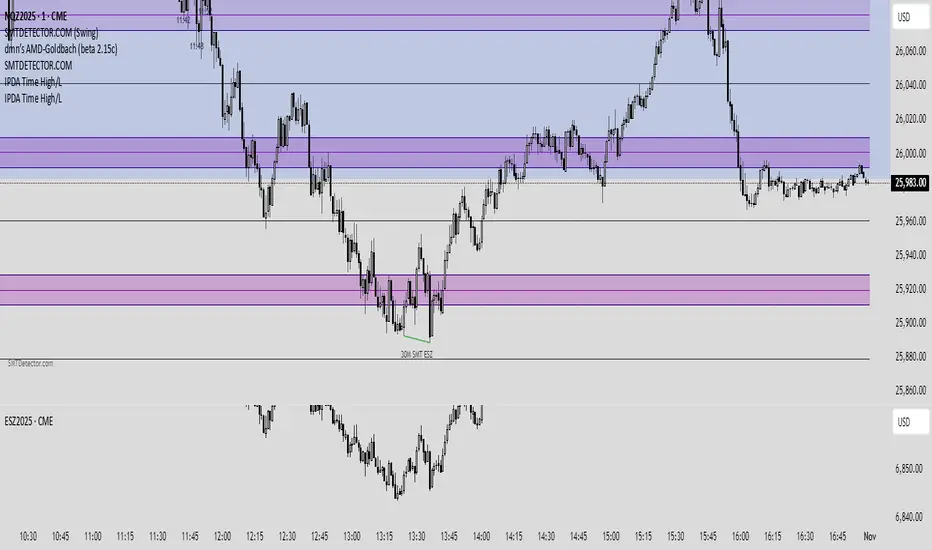
Each SMT is plotted as a line between the reference high/low and the current high/low, with a clear text label showing:
Timecycle (90m / 60m / 30m / 10m / 3m)
Which comparison asset(s) created the divergence (e.g., ES, YM, ES/YM or your custom labels)
The 90-minute SMT module is session-aware using New York time:
Asia: 18:00 – 02:29 NY time
London A/M/D
NY AM A/M/D
NY PM A/M/D
Pine Script® インジケーター