"GOLD"に関するスクリプトを検索
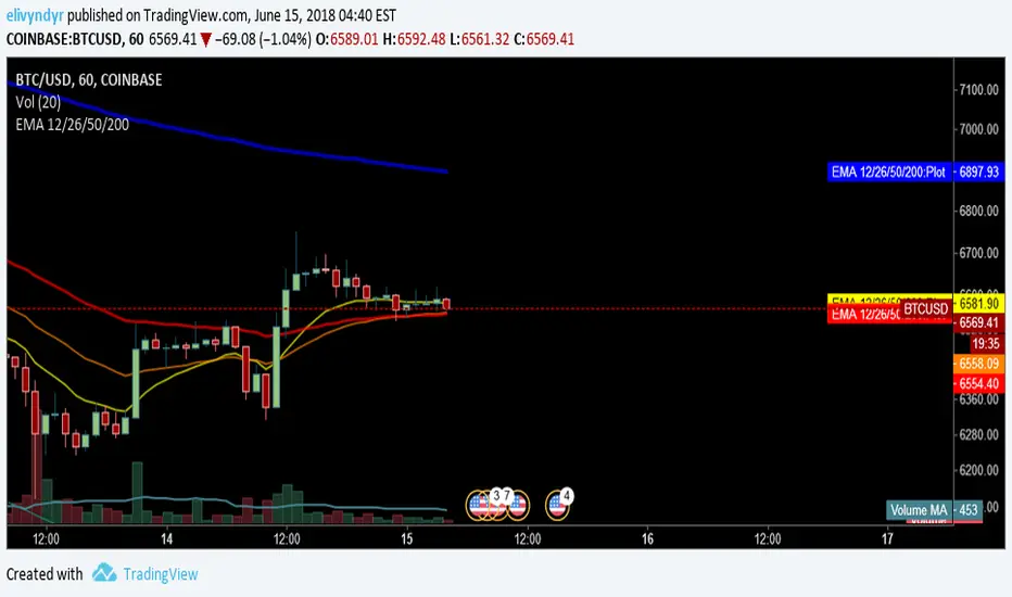
Macd_Reader_Signal_Moriceau_Thesis_indicatorThe idea is to create a MACD "Reader" that can tell you when you should buy (yellow candle sticks) and when to Sell (black one) you have also strong signal of with B and S write on graphic automatically. This indicator is set and back tested with BTCUSD and Gold. I used also for french equities and it works really good.
Let me know if you want any change or have comments.
Hugo Moriceau
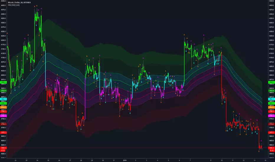
Fractal Regression Bands [DW]This study is an experimental regression curve built around fractal and ATR calculations.
First, Williams Fractals are calculated, and used as anchoring points.
Next, high anchor points are connected to negative sloping lines, and low anchor points to positive sloping lines. The slope is a specified percentage of the current ATR over the sampling period.
The median between the positive and negative sloping lines is then calculated, then the best fit line (linear regression) of the median is calculated to generate the basis line.
Lastly, a Golden Mean ATR is taken of price over the sampling period and multiplied by 1/2, 1, 2, and 3. The results are added and subtracted from the basis line to generate the bands.
Williams Fractals are included in the plots. The color scheme indicated whether each fractal is engulfing or non-engulfing.
Custom bar color scheme is included.
CME Gold Dynamic Circuit Breaker & Prop Firm Buffer (6%-8%-10%)
Overview This indicator is designed specifically for Gold Futures (GC) and other assets subject to CME's Dynamic Circuit Breaker rules. Unlike Equity Indices (e.g., NQ, ES) which have fixed price limits based on the previous day's close, Gold uses a "Dynamic" limit that moves with the market.
Many prop firm traders lose their accounts not because of the daily percentage drop, but because of sudden intraday volatility that triggers trailing drawdown rules. This indicator helps you visualize the invisible "kill zones" calculated from the highest/lowest prices of the last 60 minutes.
Key Features
Dynamic Logic: Calculates limits based on the previous day's settlement price (Variant) applied to the Highest/Lowest price of the last 60 minutes.
Prop Firm Safety Buffer:
🟠 6% (Warning): Early warning line. Volatility is expanding; consider reducing position size.
🔴 8% (Critical): Danger zone. If price touches this level, you are at high risk of hitting prop firm trailing drawdowns or maximum loss limits.
🔵 10% (Hard Limit): CME Official Circuit Breaker level (Market Halt).
Real-time Visualization:
Extended Lines: Horizontal lines extend to the right of the chart for immediate visibility.
Clear Labels: Displays the exact percentage and price level at the current moment.
Stepline History: Shows historical limit levels to help analyze past volatility spikes.
How to Use
Do not rely on "Daily % Change": Even if Gold is only down -3% on the day, a sudden drop from a recent high can trigger the dynamic limit.
Respect the Orange Line (6%): When the price approaches the orange line, avoid chasing the trend. The risk of a sudden reversal or liquidity gap increases significantly.
Stay away from the Red Line (8%): This is the "No-Trade Zone" for prop traders.
Disclaimer This tool is for educational and informational purposes only. Always verify official margin requirements and trading rules with your specific broker or prop firm.
개요 이 지표는 골드 선물(GC) 및 CME 동적 서킷브레이커(Dynamic Circuit Breaker) 룰이 적용되는 상품을 위해 설계되었습니다. 나스닥(NQ)과 같은 지수 선물이 전일 종가 기준 '고정된' 제한폭을 가지는 것과 달리, 골드는 시장 가격 움직임에 따라 제한폭이 계속 변하는 '동적' 룰을 따릅니다.
많은 프랍 트레이더들이 일일 등락률만 보고 안심하다가, 순간적인 급등락으로 인해 '트레일링 드로우다운(Trailing Drawdown)'에 걸려 계좌를 잃곤 합니다. 이 지표는 직전 60분간의 고점/저점을 기준으로 보이지 않는 "위험 구간"을 시각화해 줍니다.
주요 기능
동적 계산 로직: **전일 정산가(Settlement)**를 기준으로 변동폭(Variant)을 계산하여, 직전 60분간의 최고가/최저가에 실시간으로 적용합니다.
프랍펌 안전 버퍼 (3단계 경보):
🟠 6% (Warning): 조기 경보 라인입니다. 변동성이 확대되고 있으므로 비중 축소를 고려해야 합니다.
🔴 8% (Critical): 위험 구간입니다. 이 라인에 근접하면 프랍펌의 트레일링 드로우다운이나 허용 손실 한도에 도달할 확률이 매우 높습니다. 진입을 자제하십시오.
🔵 10% (Hard Limit): CME 공식 서킷브레이커(거래 중단) 라인입니다.
실시간 시각화:
우측 연장선: 차트 우측 여백까지 선을 길게 뻗어, 현재 가격과 위험선 사이의 거리를 직관적으로 보여줍니다.
명확한 라벨: 현재 시점의 정확한 %와 가격을 표시합니다.
과거 내역: 과거에 위험선이 어떻게 움직였는지 계단식 선(Stepline)으로 보여주어 복기할 수 있습니다.
사용 팁
"일일 등락률"을 믿지 마십시오: 하루에 -3%밖에 안 빠졌더라도, 고점에서 급격하게 떨어졌다면 동적 제한선은 바로 밑까지 쫓아와 있을 수 있습니다.
오렌지색 선(6%)을 존중하십시오: 가격이 이 선에 닿으면 추격 매매를 멈추십시오. 유동성이 부족해지거나 급반등이 나올 수 있는 구간입니다.
빨간색 선(8%)은 "매매 금지 구역"입니다: 이 구간은 프랍 트레이더에게 생존이 걸린 마지노선입니다.
면책 조항 이 지표는 교육 및 정보 제공의 목적으로만 사용되어야 합니다. 실제 매매 시에는 반드시 본인이 사용하는 증권사나 프랍펌의 공식 규정을 확인하시기 바랍니다.

Smart Money Sessions + Liquidity + FVGSmart Money Sessions + Liquidity + Fair Value Gap is a clean and professional price-action based indicator designed for Gold (XAUUSD) and Forex traders who follow Smart Money Concepts (SMC) and ICT methodology.
This indicator focuses on where liquidity is taken, when structure shifts, and where imbalance (FVG) is created, without cluttering the chart or repainting signals.
🔍 Key Features
🕒 Session High & Low (Killzones)
Automatically plots Asia, London, and New York session highs and lows
Helps identify:
Asia range manipulation
London fakeouts
New York continuations
💧 Liquidity Sweep Detection
Detects wick-based liquidity grabs
Highlights areas where stop-losses are likely taken
Ideal for spotting smart money entries
🔁 Market Structure Shift (MSS)
Simple and clean bullish & bearish structure shifts
Helps confirm trend continuation or reversal
Non-repainting logic
📦 Fair Value Gap (FVG)
Uses true 3-candle imbalance logic
Highlights bullish and bearish FVG zones
Clean visualization without over-plotting
✅ Why This Indicator?
❌ No repainting
❌ No lagging indicators
❌ No unnecessary colors
✅ Based purely on price action
✅ Beginner-friendly & professional-grade
✅ Optimized for Gold (XAUUSD)
🎯 Best Use Cases
Gold scalping & intraday trading
London & New York session trades
Liquidity-based entries
ICT / Smart Money strategies
⚠️ Disclaimer
This indicator is a visual analysis tool, not a buy/sell signal generator.
Always combine it with proper risk management and your own trading plan.

XAU CAPITAL Premium ZonesXAU CAPITAL • Premium Support & Supply Zones is a minimalist yet powerful TradingView indicator designed for traders who prefer clarity over clutter.
This indicator automatically detects key Support and Supply zones based on pivot structure and price behavior, helping traders identify high-probability reaction areas where price is likely to pause, reverse, or continue.
🔍 Key Features:
✔ Automatically plotted Support & Supply zones
✔ Clean, transparent zones for clear price visibility
✔ EMA-based trend structure for directional bias
✔ Works smoothly on XAUUSD (Gold) and other markets
✔ Ideal for SMC, price action & intraday trading
✔ Non-repainting structure logic
🎯 Best Used For:
Gold (XAUUSD) trading
Intraday & swing setups
Entry refinement at key zones
Market structure & trend alignment
⚠️ This indicator is a technical tool and should be used with proper risk management and confirmation.


Growth Comparison (Gold, Silver, Copper, Platinum & Crypto)
Data Sources
The symbols configured this time point to globally trusted data sources (providers).
・OANDA (XAUUSD, XAGUSD, XCUUSD, XPTUSD):
Data from OANDA, one of the world's largest FX and commodity providers. It reflects the “spot prices” for gold, silver, copper, and platinum in near real-time.
・BINANCE (BTCUSDT, ETHUSDT, XRPUSDT):
Data from Binance, the world's largest cryptocurrency exchange. It has the highest trading volume and is used as the global standard price indicator. Retrieves BTC, ETH, and XRP.
How the Script Works (Technical Explanation)
・Fixed Starting Price:
The script internally stores the price on the set “comparison start date” (e.g., January 1, 2025).
・Real-Time Calculation:
It constantly retrieves the latest current price and continuously calculates the percentage using the following formula.
Formula: (Current Price - January 1, 2025 Price) ÷ January 1, 2025 Price × 100
*Since January 1 is a global market holiday (New Year's Day) with no prices available, the script automatically adopts the next market opening price (e.g., January 2 morning's open price) as the baseline.
・Automatic label tracking:
The program displays labels like “GOLD” at the right edge of the graph. This ensures you never lose track of which line corresponds to which asset, even when lines overlap.
Translated with DeepL.com (free version)

Chart This in GoldProduces a historical line chart in the bottom pane to reflect how many units of spot gold (XAU) could be exchanged for one unite of the underlying asset.

XAUUSD Lot Size Calculator1. What This Indicator Does
This tool is a Visual Risk Management System. Instead of using a calculator on your phone or switching tabs, it allows you to calculate the exact lot size for your trade directly on the TradingView chart by dragging lines.
It automates the math for:
Lot Size: How big your position should be to risk exactly X% of your account.
Take Profit: Where your target should be based on your Risk-to-Reward ratio.
Safety Checks: It warns you if your stop loss is too tight for the minimum lot size (0.01).
2. Visual Features
🔴 The Red Line (Stop Loss): This is your interactive line. You can grab it with your mouse and drag it to your desired invalidation point (e.g., below a support wick).
🟢 The Green Line (Take Profit): This line moves automatically. You cannot drag it. It calculates where your Take Profit must be to satisfy your Risk:Reward ratio (Default 1:1) based on where you placed the Red line.
⚫ The Info Table: A high-contrast black box in the corner that displays your calculated Lot Size, Risk amount, and Trade direction (Long/Short).
3. How to Use It (Step-by-Step)
Step 1: Initial Setup
When you first add the indicator to the chart, you need to tell it about your account:
Double-click the Black Table (or the Red Line) to open Settings.
Inputs Tab:
Account Balance: Enter your current trading balance (e.g., 10,000).
Risk %: Enter how much you want to lose per trade (e.g., 1.0%).
Contract Size: Keep this at 100 for Gold (XAUUSD) or standard Forex pairs.
Risk : Reward Ratio: Set your target (e.g., 1.0 for 1:1, or 2.0 for 1:2).
Step 2: Planning a Trade
Look at the chart and identify where you want to enter (current price) and where you want your Stop Loss.
Find the Red Line on your chart. (If you don't see it, go to Settings and change "Stop Loss Level" to a price near the current candle).
Click and Drag the Red Line to your specific Stop Loss price.
Step 3: Reading the Signals
Direction: If you drag the Red Line below the price, the table shows LONG. If you drag it above, it shows SHORT.
Lot Size: Read the big green number in the table (e.g., 0.55). This is the exact lot size you should enter in your broker.
TP Target: Look at the Green Line on the chart. That is your exit price.
Step 4: The "Orange Warning"
If you place your Stop Loss very close to the entry, or if your account is small, the math might suggest a lot size smaller than is possible (e.g., 0.004).
The table text will turn ORANGE.
The Lot Size will stick to 0.01 (the minimum).
The "Risk ($)" row will show you the actual risk. (Example: Instead of risking your desired $100, you might be forced to risk $105 because you can't trade smaller than 0.01 lots).

Obsidians Gold RevengeMany traders (including institutional desks) track lunar cycles on Gold (XAUUSD) because of the psychological impact on market sentiment. The common theory—often attributed to methods like Gann analysis—is:
🌑 New Moon: Often correlates with Market Bottoms (Buy Signals) or "New Beginnings."
🌕 Full Moon: Often correlates with Market Tops (Sell Signals) or "Exhaustion."
Here is a script that mathematically calculates the Moon Phase based on the lunar synodic month (approx. 29.53 days). It will plot these events on your chart so you can visually backtest if Gold respects these cycles.
How to use this for testing
Add it to your Chart: Apply it to the XAUUSD (Gold) chart.
Timeframe: This works best on 4-Hour (4H) or Daily (1D) charts. (On 15m charts, the moon phase covers many candles, so the label will appear on the specific candle where the phase officially "switched").
What to look for:
Look at the Dark Blue (New Moon) areas. Did price form a bottom or start a rally there?
Look at the Yellow (Full Moon) areas. Did price peak and reverse downward there?
Note: Lunar cycles are considered a "timing tool" rather than a directional indicator. They often indicate when a reversal might happen, but you should combine this with your Institutional Candle zones to confirm the direction!

Multi-Indicator Trend-Following Strategy 1-minute Gold strategyTrend following using many indicators to provide accurate buy and sell signals on the 1-minute gold chart

Monthly Chart Gold/Silver Strategy - NDAThis a strategy for the Monthly Chart
It indicates Buy & Sell points for trading Gold/Silver or other Precious Metals commodities or ETFs.
Its a simple strategy based on the MACD and RSI indicators.
I hope that you like it and find it useful

TQ Silver / Gold (Weekly Macro)This indicator tracks the Silver / Gold ratio on a weekly basis to determine whether silver is leading gold (risk appetite returning inside metals) or gold is leading silver (a more defensive precious-metals posture).
Within the TQ Weekly Macro Framework, this indicator is designed to be used after confirming the broader macro environment using TQ Gold Trend (Weekly Macro), TQ Gold / DXY (Weekly Macro), and TQ Gold / SPY (Weekly Macro).
Why Silver / Gold matters
>When Silver / Gold rises, silver is outperforming gold — often associated with reflation, growth expectations, or broad risk appetite within precious metals.
>When Silver / Gold falls, gold is outperforming silver — often associated with defense, uncertainty, or tighter financial conditions.
>This ratio is not a timing tool — it is a regime and leadership indicator within the metals complex.
How it works (regime rules)
Using weekly data:
Compute Silver ÷ Gold
Apply a 30-week SMA
Regime definitions:
Bull: Ratio above a rising 30-week SMA (silver leading)
Bear: Ratio below a falling 30-week SMA (gold leading)
Neutral: Transition / range
A clear label marks the current regime.
How to use it in your system
Use after confirming:
TQ Gold Trend (Weekly Macro)
TQ Gold / DXY (Weekly Macro)
TQ Gold / SPY (Weekly Macro)
> If Silver / Gold is Bull, metals participation is broadening and silver often has more upside torque.
> If Silver / Gold is Bear, gold leadership is defensive and silver exposure may underperform.
> Neutral often signals rotation or consolidation.
Best timeframe
Designed for weekly macro regime analysis.

TQ Gold / SPY (Weekly Macro)What this indicator does
This indicator tracks the Gold/SPY ratio on a weekly basis to show whether gold is outperforming U.S. equities (risk assets). It helps you determine if the market is favoring hard money / defensive leadership vs risk-on equity leadership.
Within the TQ Weekly Macro Framework, this indicator is intended to be used after confirming gold’s primary trend using TQ Gold Trend (Weekly Macro) and its monetary backdrop using TQ Gold / DXY (Weekly Macro).
Why Gold/SPY matters
Gold can rise during equity booms and during equity stress.
The Gold/SPY ratio tells you which asset class is winning in relative terms.
Rising Gold/SPY often signals defensive leadership, shifting macro preferences, or risk repricing, especially when aligned with TQ Gold Trend (Weekly Macro).
How it works (regime rules)
Using weekly data:
Compute Gold ÷ SPY
Apply a 30-week SMA
Regime definitions:
Bull: Ratio above a rising 30-week SMA (gold leading equities)
Bear: Ratio below a falling 30-week SMA (equities leading gold)
Neutral: Transition / range
A clear label marks the current regime.
How to use it in your system
Use after TQ Gold Trend (Weekly Macro) and TQ Gold / DXY (Weekly Macro).
> If Gold/SPY is Bull, gold is leading risk assets — metals tend to behave stronger and more “macro-relevant.”
> If Gold/SPY is Bear, equities are winning — gold moves may be less dominant.
> Neutral usually means rotation or consolidation.
Best timeframe
Designed for weekly macro regime analysis, not short-term trading.

TQ Gold / DXY (Weekly Macro)What this indicator does
This indicator tracks the relative performance of gold versus the U.S. dollar using the Gold/DXY ratio. It helps determine whether gold’s strength is real (monetary) or merely nominal.
Why Gold/DXY matters
Gold rising with a rising dollar is not a strong signal.
Gold rising against a weakening dollar signals monetary outperformance.
This ratio filters out dollar noise and focuses on true purchasing-power strength.
How it works
The indicator calculates Gold ÷ DXY using weekly data.
A 30-week SMA is applied to the ratio.
Regimes are defined as:
Bull: Ratio above a rising 30-week SMA (gold beating the dollar)
Bear: Ratio below a falling 30-week SMA
Neutral: Transition or range-bound periods
A clear on-chart label shows the current regime.
How to use it
Use after confirming Gold Trend is Bull.
When Gold/DXY is Bull, gold has a true monetary tailwind.
When Gold/DXY is Bear, gold rallies are often fragile or dollar-driven.
Neutral readings signal consolidation or regime change.
Best timeframe
Designed for weekly charts and macro analysis.
Not intended for short-term trading signals.

Weekly macro ratio indicator tracking Silver/Gold with a 30-weekWhat this indicator does
This indicator tracks the Silver/Gold ratio on a weekly basis to determine whether silver is leading gold (risk appetite returning inside metals) or gold is leading silver (more defensive precious-metals posture).
Why Silver/Gold matters
When Silver/Gold rises, silver is outperforming gold — often associated with reflation, growth expectations, or broad risk appetite.
When Silver/Gold falls, gold is outperforming silver — often associated with defense, uncertainty, or tighter financial conditions.
This ratio is not a timing tool — it’s a regime/leadership indicator.
How it works (regime rules)
Using weekly data:
Compute Silver ÷ Gold
Apply a 30-week SMA
Regime definitions:
Bull: Ratio above a rising 30-week SMA (silver leading)
Bear: Ratio below a falling 30-week SMA (gold leading)
Neutral: Transition/range
A clear label marks the current regime.
How to use it in your system - This indicator is designed to be used as part of the broader TQ Weekly Macro Framework, alongside other TQ indicators such as TQ Gold Trend (Weekly Macro), TQ Gold / DXY (Weekly Macro), and TQ Gold / SPY (Weekly Macro).
Each indicator can also be used independently.
Use after confirming:
Pane 1: Gold Trend
Pane 2: Gold/DXY
Pane 3: Gold/SPY
If Silver/Gold is Bull, metals participation is broadening and silver often has more upside torque.
If Silver/Gold is Bear, gold leadership is defensive; silver exposure may underperform.
Neutral often signals rotation or consolidation.
Best timeframe
Designed for weekly macro regime analysis.

Weekly macro ratio indicator comparing gold vs SPY 30 SMAWhat this indicator does
This indicator tracks the Gold/SPY ratio on a weekly basis to show whether gold is outperforming U.S. equities (risk assets). It helps you determine if the market is favoring hard money / defensive leadership vs risk-on equity leadership.
Why Gold/SPY matters
Gold can rise during equity booms and during equity stress.
The Gold/SPY ratio tells you which asset class is winning in relative terms.
Rising Gold/SPY often signals defensive leadership, shifting macro preferences, or risk repricing.
How it works (regime rules)
Using weekly data:
Compute Gold ÷ SPY
Apply a 30-week SMA
Regime definitions:
Bull: Ratio above a rising 30-week SMA (gold leading equities)
Bear: Ratio below a falling 30-week SMA (equities leading gold)
Neutral: Transition/range
A clear label marks the current regime.
How to use it in your system
Use after Pane 1 (Gold Trend) and Pane 2 (Gold/DXY).
If Gold/SPY is Bull, gold is leading risk assets — metals tend to behave stronger and more “macro-relevant.”
If Gold/SPY is Bear, equities are winning — gold moves may be less dominant.
Neutral usually means rotation or consolidation.
Best timeframe
Designed for weekly macro regime analysis, not short-term trading.

Weekly macro trend indicator for gold using a 30-week SMAWhat this indicator does
This indicator identifies the macro trend regime of gold using a simple, time-tested framework: the weekly price of gold relative to its 30-week simple moving average.
It is designed to answer one question only:
Is gold currently in a monetary uptrend?
How it works
The indicator uses weekly data and applies a 30-week SMA regime filter:
Bullish (Monetary Uptrend):
Gold price is above a rising 30-week SMA.
Bearish (Monetary Downtrend):
Gold price is below a falling 30-week SMA.
Neutral (Transition):
All other conditions (range-bound or early trend change).
A clear on-chart label displays the current regime.
How to use it
Use this as the first filter before analyzing silver, miners, or relative-strength ratios.
When gold is Bull, precious metals deserve attention.
When gold is Bear, most precious-metal trades lose their edge.
When gold is Neutral, patience is usually rewarded.
Best timeframe
This indicator is designed for weekly charts and macro-level decision-making.
It is not intended for day trading or short-term signals.
Who this is for:
Investors and traders focused on macro trends
Those treating gold as a monetary asset, not a short-term trade
Anyone looking for a clean, objective regime filter.

GSS: Gold Swing Sniper [DoNotFollowMeGod]"Inspired by Mean Reversion Theory and Dynamic Volatility Bands (similar to Keltner/Bollinger concepts).
Gold (XAUUSD) tends to respect volatility extremes. This script was designed to capture those extremes by combining a Volatility Channel with an ADX Strength Filter. It’s basically a mathematical approach to 'Buying Low and Selling High' in a ranging market."
Most traders lose money when the market stops trending. This indicator fixes that by identifying "Range-Bound" conditions using a smart ADX Filter.
How it works:
Market State Detection: It checks the ADX. If the market is trending strong, it stays quiet. If the market is chopping/ranging, it activates.
Sniper Entries:
SWING LONG: When price hits the lower band + RSI Oversold + Rejection Candle.
SWING SHORT: When price hits the upper band + RSI Overbought + Rejection Candle.
Dashboard: A clean Multi-Timeframe table to see if higher timeframes are Trending or Sideways.
Disclaimer:
This tool is a "Shield" against chop. Do not use it during high-impact news.
Based on volatility band logic.

QUARTERS THEORY XAUUSDThe “Quarter Theory XAUUSD” indicator on TradingView is designed to automatically plot horizontal price levels in $25 increments on your chart, providing traders with a clear visual representation of key psychological and technical price points. These levels are particularly useful for instruments like XAU/USD, where price often reacts to round numbers, forming support and resistance zones that can be leveraged for both scalping and swing trading strategies. By showing all $25 increments as horizontal white lines, the indicator ensures that traders can quickly identify potential entry and exit points, without the need for manual drawing or repeated calculations.
The indicator works by calculating the nearest $25 multiple relative to the current market price and then drawing horizontal lines across the chart for all increments within a defined range. This range can be customized to suit the instrument being traded; for example, for gold (XAU/USD), a typical range might extend from 0 to 5000, covering all practical price levels that could be relevant in both high and low market conditions. By using Pine Script’s persistent variables, the indicator efficiently creates these lines only once at the start of the chart, avoiding unnecessary resource usage and preventing TradingView from slowing down, which can happen if lines are redrawn every bar.
From a trading perspective, these levels serve multiple purposes. For scalpers, the $25 increments act as micro support and resistance points, helping to determine short-term price reactions and potential breakout zones. Scalpers can use these levels to enter positions with tight stop-loss orders just beyond a level and take profits near the next $25 increment, which aligns with common price behavior patterns in highly liquid instruments. For swing traders, the same levels provide broader context, allowing them to identify areas where price might pause or reverse over several days. Swing traders can use these levels to align trades with the prevailing trend, particularly when combined with other indicators such as moving averages or trendlines.
Another key advantage of the Quarterly Levels indicator is its simplicity and visual clarity. By plotting lines in a uniform white color and extending them to the right, the chart remains clean and easy to read, allowing traders to focus on price action and market dynamics rather than cluttered technical drawings. This visual consistency also helps in backtesting and strategy development, as traders can quickly see how price interacts with each level over time. Additionally, the use of round-number increments leverages the psychological tendencies of market participants, as many traders place stop orders or entry points near these levels, making them natural zones of interest.
Overall, the Quarterly Levels indicator combines efficiency, clarity, and practical trading utility into a single tool. It streamlines chart analysis, highlights meaningful price zones, and supports both scalping and swing trading approaches, making it an essential addition to a trader’s toolkit. By understanding how to integrate these levels into trading strategies, traders can make more informed decisions, manage risk effectively, and identify high-probability trade setups across various market conditions.

OI Grid for Gold/Oil-Auto plot OI level
-For Gold and Crude Oil
-Price diff function between future/spot price

BTC vs GOLD Macro RotationBTC vs GOLD Macro Rotation Indicator
BTC vs GOLD Macro Rotation Model
This indicator is a macroeconomic rotation model that compares the relative attractiveness of Bitcoin (BTC) versus Gold (GOLD) based on multiple fundamental macro factors.
How does it work?
The model analyzes weekly data from various macroeconomic indicators and generates a score for each asset. The taller bar indicates the preferred asset to rotate capital into.
- Green bars (above zero): BTC strength
- Yellow bars (below zero):GOLD strength
- Info table:Shows exact percentages and rotation recommendation
Macroeconomic Factors Analyzed:
1. DXY (US Dollar Index)
- Strong dollar → Favors GOLD
- Weak dollar → Favors BTC
2. Oil (WTI Crude)
- Oil rising → Favors GOLD
- Oil falling → Favors BTC
3. Copper
- Copper rising → Favors BTC (risk-on)
- Copper falling → Favors GOLD (risk-off)
4. Real Rates (Fed Funds - YoY Inflation)
- Real rates falling → Favors GOLD
- Real rates rising → Favors BTC
5. Fertilizer/Natural Gas Regime (Urea, Ammonia, Natural Gas)**
- Specific combinations of movements in these commodities generate inflationary/deflationary regime signals
Fertilizer Rules:**
| Urea | Ammonia | Gas | Signal |
|------|---------|-----|--------|
| ↑ | ↑ | ↓ | GOLD +2 |
| ↑ | ↑ | ↑ | GOLD +3, BTC -1 |
| ↓ | ↓ | ↓ | BTC +3, GOLD -1 |
| ↑ | ↓ | ↓ | BTC +3 |
| ↓ | ↑ | ↑ | GOLD +3, BTC -1 |
Technical Features:
- Operates on weekly timeframe regardless of chart
- Normalized changes for signal stability
- Configurable EMA smoothing
- Safe handling of invalid symbols (won't break if a ticker doesn't exist)
- All tickers are user-editable
Configurable Inputs:
- Symbols for all assets (BTC, GOLD, DXY, Oil, Copper, CPI, Fed Funds, Gas, Urea, Ammonia)
- Individual weights for each macro component
- Normalization length
- EMA smoothing
Interpretation:**
- **BTC dominant (taller green):** Macro conditions favor risk/digital assets
- **GOLD dominant (taller yellow):** Macro conditions favor safe-haven/tangible assets
This indicator is for educational and informational purposes only. It does not constitute financial advice. Always do your own research before making investment decisions.
Recommended Timeframe: Weekly (W) or Daily (D)
