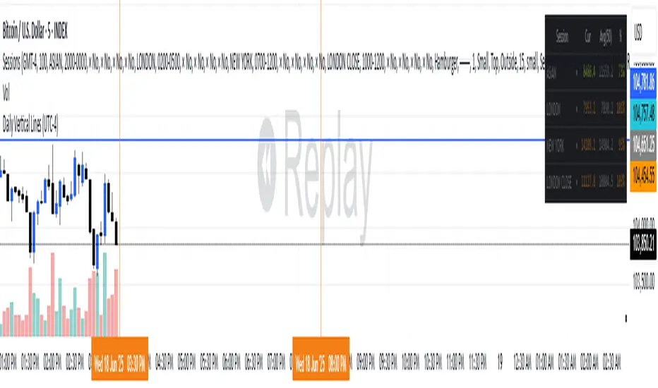
Daily Vertical Linesadjust the time hour and minute base on ur timeframe.
please note that for asian beijing time you will need to deduct 1 hour
"daily"に関するスクリプトを検索

Daily Range Box (RIC)This indicator draws a blue-bordered box for each trading day, visible across all timeframes without alteration. The box's upper boundary is the day's highest price, the lower boundary is the day's lowest price, starting from the first trade of the day and ending at the last trade (including extended trading hours). A dashed horizontal line is drawn at the midpoint between the high and low within the box.

Daily Dual Pivots (Std + Fib) Extended by Jackel
簡介: 這個指標旨在為日內交易者提供最強大的支撐與阻力參考。它將市場上最常用的兩種 Pivot Points 計算方式——標準 (Standard) 與 斐波那契 (Fibonacci)——結合在同一個圖表中,讓你一眼就能看出關鍵的價格匯聚點 (Confluence Areas)。
主要特色:
雙重系統並存:
標準 Pivot (Standard):以 實線 (Solid Lines) 顯示。這是機構與大部分交易者使用的傳統支撐阻力位。
斐波那契 Pivot (Fibonacci):以 圓點/虛線 (Dotted Lines) 顯示。利用 Fib 黃金比例 (0.382, 0.618) 計算出的潛在反轉位。
清晰的視覺區分:標準版使用暖色系 (紅/綠/橙),Fib 版使用冷色系 (藍/紫),互不干擾,清晰易讀。
可選擴展關卡 (S4-S5 / R4-R5):預設顯示 P, R1-R3, S1-S3。如果市場波動劇烈,你可以在設定中開啟 "Show Extra Levels" 來顯示 R4/R5 及 S4/S5。
自動隱藏歷史:預設只顯示「當日」的線條,保持圖表整潔。如需回測,可開啟「顯示歷史數據」選項。
如何使用:
當 實線 (Standard) 與 虛線 (Fib) 重疊或非常接近時,該區域通常具有更強的支撐或阻力效力。
適用於 15分鐘、1小時或 4小時圖表操作日內交易。
Introduction: This indicator is designed for intraday traders who need precise Support & Resistance levels. It combines the two most popular Pivot Point calculation methods—Standard (Traditional) and Fibonacci—into a single chart, allowing you to easily identify key areas of confluence.
Key Features:
Dual System Strategy:
Standard Pivots: Displayed as Solid Lines. These represent the traditional structural levels used by most traders and institutions.
Fibonacci Pivots: Displayed as Dotted/Circle Lines. These use key Fibonacci ratios (0.382, 0.618) to identify potential reversal zones.
Visual Clarity: Different line styles and color groups allow you to distinguish between Standard and Fib levels instantly without chart clutter.
Extended Levels (Optional): By default, it shows P, R1-R3, and S1-S3. In highly volatile markets, you can enable "Show Extra Levels" in the settings to reveal S4/S5 and R4/R5.
Clean Chart: By default, it only shows levels for the current day. You can enable "Show History" in the settings if you need to backtest.
How to Use:
Look for Confluence: When a Solid Line (Standard) and a Dotted Line (Fib) overlap or are very close to each other, it indicates a very strong Support or Resistance zone.
Best used on 15m, 1H, or 4H charts for intraday analysis.

Daily Anchored VWAPAnchors VWAP to whatever time you want instead of the usual start of session. I use it for BTC so that I can anchor around NY open instead of the night before.

Daily RDR (Prev Day H/L, Intraday)This indicator identifies intraday Range-Deviation Reversal (RDR) signals using the previous day’s high and low. At each new session, it stores yesterday’s levels and resets today’s range tracking. During the day, it detects when price first breaks above the prior high or below the prior low, then waits for a reversal: a bearish RDR triggers when price exceeds yesterday’s high and then closes back below it, while a bullish RDR triggers when price undercuts yesterday’s low and then closes back above it. The script plots the previous day’s levels and marks RDR reversals with small up/down triangles.

Daily Vertical LineToggle to draw a vertical line through the start of each day. E.g. a dotted vertical line appears through the first candle of the day on any candle scale (up to around 2months prior)


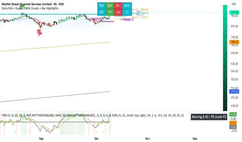
Daily MA + Guppy EMA Clouds + Bar HighlightsThis script is a modular strength dashboard combining:
- Multi-timeframe MAs
- Guppy clouds
- CPR pivots
- Momentum gauges
- Breakout flags
It’s ideal for traders who want layered confirmation across trend, volatility, and support/resistance zones.
Vol - Traded Value (₹ Cr)Daily Traded Volume in Crores.
To know how much of a Stock is trades in Value Terms

Daily Pivot Points - Fixed Until Next Day(GeorgeFutures)We have a pivot point s1,s2,s3 and r1,r2,r3 base on calcul matematics


Daily CMO + Volume Intraday Strategy v6 by Subirrmomentum strategy. buy on next hourly candle after signal. target 5%, sl 1%
Daily Vertical Lines (UTC-4)puts verical line for setup asian
🔎 How this works:
The script uses timestamp() with America/New_York (which corresponds to UTC-4 in summer and UTC-5 in winter — TradingView auto-adjusts with DST).
When the bar’s opening time equals 3:30 PM or 8:00 PM, it draws a vertical dotted line across the chart.
One line will be red (3:30 PM), the other blue (8:00 PM).
Daily High/Low (15m) + EMA Pre-Market H/L + ORBStraightforward:
I built a swing-trading indicator with ChatGPT that plots 15-minute highs and lows, draws pre-market high/low lines, and adds a 15-minute opening-range breakout feature.
Technical:
Using ChatGPT, I developed a swing-trade indicator that calculates 15-minute highs/lows, overlays pre-market high and low levels, and includes a 15-minute Opening Range Breakout (ORB) module.
Promotional:
I created a ChatGPT-powered swing-trading indicator that maps 15-minute highs/lows, marks pre-market levels, and features a 15-minute Opening Range Breakout for clearer entries.

Daily 6 AM & 8 AM CST Linesit help so you can figure out 6am and 8am on cst time in americas very fast.

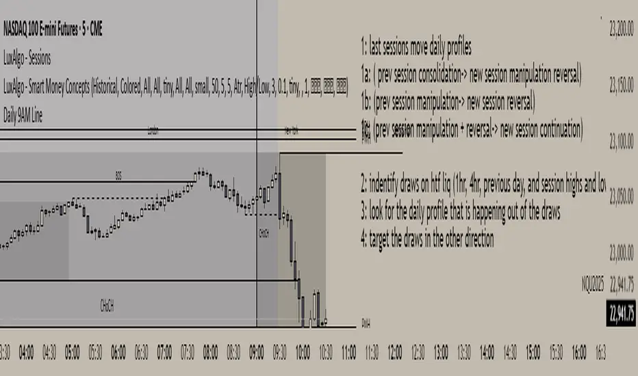
Daily 9AM Line
Draws a line at 9AM every day at market pre-open
Draws a line at 9AM every day at market pre-open
Draws a line at 9AM every day at market pre-open
Draws a line at 9AM every day at market pre-open
Daily Moving Average to Intraday ChartPlaces 200D, 100D, 50D SMAs as well as the 20D EMA onto intraday charts. (Script v6)

Daily Average 5m Candle SizeThis indicator measures the average size of each 5 min candle then works out the end of day average for you. Very important for profit targets and stops
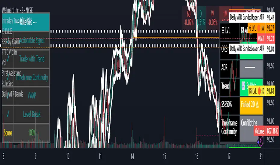
Daily ATR BandsATR Finder – Volatility Scanner for Smarter Trade Setups
The ATR Finder is a precision tool designed to help traders quickly identify high-volatility assets using the Average True Range (ATR) – a key metric in assessing market momentum and potential breakout zones. By automatically scanning and highlighting tickers or candles with elevated ATR values relative to their recent historical range, this indicator helps you filter for setups that are more likely to experience significant price moves.
Whether you're a day trader seeking intraday momentum or a swing trader looking for setups with strong follow-through potential, the ATR Finder cuts through the noise and visually signals which assets are "on the move." It can be paired with other indicators or price action tools to create a high-conviction trading strategy focused on volatility expansion.
Key Features:
Dynamic ATR Calculation over a user-defined period
Visual Alerts or Color-Coding for above-threshold volatility spikes
Supports Multiple Timeframes for both short- and long-term volatility analysis
Great for spotting breakout opportunities, gap continuations, or trend reversals
Use the ATR Finder to stay ahead of price action and build a watchlist that moves with purpose. Perfect for scalpers, breakout traders, and anyone who respects the power of volatility.
Anchor Buy Sell LevelsDaily Validity:
The indicator generates a single horizontal line (either a Buy Level or a Sell Level) that remains valid throughout the entire trading day.
Source of the Signal:
The level (buy or sell) is determined using candles that were generated before the day in question.
Selection Logic:
When determining the level, the indicator checks past candles in descending order (from the most recent backward).
The very first candle encountered that meets the respective logic (either the buy or sell condition) sets the level.
Buy and Sell Logic:
Buy Signal: Generated when a candle’s close is lower than both the previous candle’s close and the next candle’s close (i.e., a local minimum). The Buy Level is drawn at the low of that qualifying candle.
Sell Signal: Generated when a candle’s close is higher than both the previous candle’s close and the next candle’s close (i.e., a local maximum). The Sell Level is drawn at the high of that qualifying candle.
One Signal per Day:
For any given day, the indicator will display either a Buy Level or a Sell Level—not both. The decision is based on which qualifying candle (and its corresponding condition) is found first when scanning the historical data in descending order.

Daily Session Fibonacci LevelsPlots automatic Fibonacci retracement levels based on the current session high and low.
Levels for the prior and current session can be toggled on/off.
Optional: Toggle to show the Fibonacci Level labels.
Allows for customizable levels and colors; toggles for individual levels.

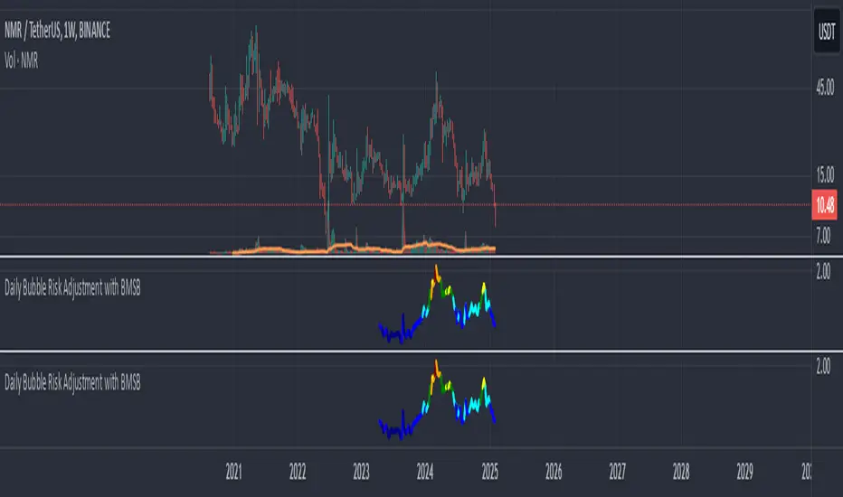
Daily Bubble Risk AdjustmentThis script calculates the ratio of the asset's closing price to its 20-week moving average (20W MA) and visualizes it as a color-coded line chart. The script also includes a customizable moving average (default: 111-day MA) to help smooth the ratio trend.
It identifies overbought and oversold conditions relative to the 20W MA, making it a valuable tool for long-term trend analysis.