Buffett Quality Score [Health Care]Evaluating Health Care Companies with the Buffett Quality Score "Health Care"
The health care sector presents unique challenges and opportunities, demanding a specialized approach to financial evaluation. The Buffett Quality Score is meticulously designed to assess the financial robustness and quality of companies within this dynamic industry. By focusing on industry-specific financial metrics, this scoring system provides valuable insights for investors and analysts navigating the complexities of the health care sector.
Scoring Methodology
Each selected financial metric contributes a point to the overall score if the specified condition is met. The combined score is a summation of points across all criteria, providing a comprehensive assessment of financial health and quality.
Selected Financial Metrics and Criteria
1. Altman Z-Score > 2.0
Relevance: The Altman Z-Score evaluates bankruptcy risk based on profitability, leverage, liquidity, solvency, and activity. In the health care sector, where regulatory changes and technological advancements can impact financial stability, a score above 2.0 signifies a lower risk of financial distress.
2. Piotroski F-Score > 6.0
Relevance: The Piotroski F-Score assesses fundamental strength, emphasizing profitability, leverage, liquidity, and operating efficiency. For health care companies, which often face regulatory challenges and R&D expenses, a score above 6.0 indicates strong financial health and operational efficiency.
3. Current Ratio > 1.5
Relevance: The Current Ratio evaluates short-term liquidity by comparing current assets to current liabilities. In the health care sector, where cash flow stability is essential for ongoing operations, a ratio above 1.5 ensures the company's ability to meet near-term obligations.
4. Debt to Equity Ratio < 1.0
Relevance: A lower Debt to Equity Ratio signifies prudent financial management and reduced reliance on debt financing. This is critical for health care companies, which require significant investments in research and development without overleveraging.
5. EBITDA Margin > 15.0%
Relevance: The EBITDA Margin measures operating profitability, excluding non-operating expenses. A margin above 15.0% indicates efficient operations and the ability to generate substantial earnings from core activities.
6. EPS One-Year Growth > 5.0%
Relevance: EPS growth reflects the company's ability to increase earnings per share over the past year. For health care companies, which often face pricing pressures and regulatory changes, growth exceeding 5.0% signals positive earnings momentum and potential market strength.
7. Net Margin > 10.0%
Relevance: Net Margin measures overall profitability after all expenses. A margin above 10.0% demonstrates strong financial performance and the ability to convert revenue into profit effectively.
8. Return on Equity (ROE) > 15.0%
Relevance: ROE indicates the company's ability to generate profits from shareholder equity. An ROE above 15.0% suggests efficient use of capital and strong returns for investors.
9. Revenue One-Year Growth > 5.0%
Relevance: Revenue growth reflects market demand and company expansion. In the health care sector, where innovation drives growth, revenue exceeding 5.0% indicates successful market penetration and product adoption.
10. Price/Earnings Ratio (Forward) < 20.0
Relevance: The Forward P/E Ratio reflects investor sentiment and earnings expectations. A ratio below 20.0 suggests reasonable valuation relative to earnings projections, which is important for investors seeking value and growth opportunities in the health care sector.
Interpreting the Buffett Quality Score
0-4 Points: Indicates potential weaknesses across multiple financial areas, warranting careful consideration and risk assessment.
5 Points: Suggests average performance based on sector-specific criteria, requiring further analysis to determine investment viability.
6-10 Points: Signifies strong financial health and quality, positioning the company favorably within the competitive health care industry.
Conclusion
The Buffett Quality Score offers a strategic framework for evaluating health care companies, emphasizing critical financial indicators tailored to industry dynamics. By leveraging these insights, stakeholders can make informed decisions and identify companies poised for sustainable growth and performance in the evolving health care landscape.
Disclaimer: The Buffett Quality Score serves as a tool for financial analysis and should not replace professional advice or comprehensive due diligence. Investors should conduct thorough research and consult with financial experts based on individual investment objectives.
"profit"に関するスクリプトを検索

Buffett Quality Score [Consumer Staples]Evaluating Consumer Staples Companies with the Buffett Quality Score
In the world of consumer staples, where stability and consistent performance are paramount, the Buffett Quality Score provides a comprehensive framework for assessing financial health and quality. This specialized scoring system is tailored to capture key aspects that are particularly relevant in the consumer staples sector, influencing investment decisions and strategic evaluations.
Selected Financial Metrics and Criteria
1. Gross Margin > 25.0%
Relevance: Consumer staples companies often operate in competitive markets. A Gross Margin exceeding 25.0% signifies efficient cost management and pricing strategies, critical for sustainable profitability amidst market pressures.
2. Net Margin > 5.0%
Relevance: Net Margin > 5.0% reflects the ability of consumer staples companies to generate bottom-line profits after accounting for all expenses, indicating operational efficiency and profitability.
3. Return on Assets (ROA) > 5.0%
Relevance: ROA > 5.0% measures how effectively consumer staples companies utilize their assets to generate earnings, reflecting operational efficiency and resource utilization.
4. Return on Equity (ROE) > 10.0%
Relevance: ROE > 10.0% indicates efficient capital deployment and shareholder value creation, fundamental for sustaining growth and competitiveness in the consumer staples industry.
5. Current Ratio > 1.5
Relevance: Consumer staples companies require strong liquidity to manage inventory and operational expenses. A Current Ratio > 1.5 ensures sufficient short-term liquidity to support ongoing operations.
6. Debt to Equity Ratio < 1.0
Relevance: With the need for stable finances, a Debt to Equity Ratio < 1.0 reflects prudent financial management and reduced reliance on debt financing, essential for long-term sustainability.
7. Interest Coverage Ratio > 3.0
Relevance: Consumer staples companies with an Interest Coverage Ratio > 3.0 demonstrate their ability to comfortably meet interest obligations, safeguarding against financial risks.
8. EPS One-Year Growth > 5.0%
Relevance: EPS growth > 5.0% indicates positive momentum and adaptability to changing market dynamics, crucial for consumer staples companies navigating evolving consumer preferences.
9. Revenue One-Year Growth > 5.0%
Relevance: Consistent revenue growth > 5.0% reflects market adaptability and consumer demand, highlighting operational resilience and strategic positioning.
10. EV/EBITDA Ratio < 15.0
Relevance: The EV/EBITDA Ratio < 15.0 reflects favorable valuation and earnings potential relative to enterprise value, offering insights into investment attractiveness and market competitiveness.
Interpreting the Buffett Quality Score
0-4 Points: Signals potential weaknesses across critical financial areas, warranting deeper analysis and risk assessment.
5 Points: Indicates average performance based on sector-specific criteria.
6-10 Points: Highlights strong financial health and quality, aligning with the stability and performance expectations of the consumer staples industry.
Conclusion
The Buffett Quality Score for consumer staples provides investors and analysts with a structured approach to evaluate and compare companies within this sector. By focusing on these essential financial metrics, stakeholders can make informed decisions and identify opportunities aligned with the stability and growth potential of consumer staples businesses.
Disclaimer: The Buffett Quality Score serves as a tool for financial evaluation and analysis. It is not a substitute for professional financial advice or investment recommendations. Investors should conduct thorough research and seek personalized guidance based on individual circumstances.

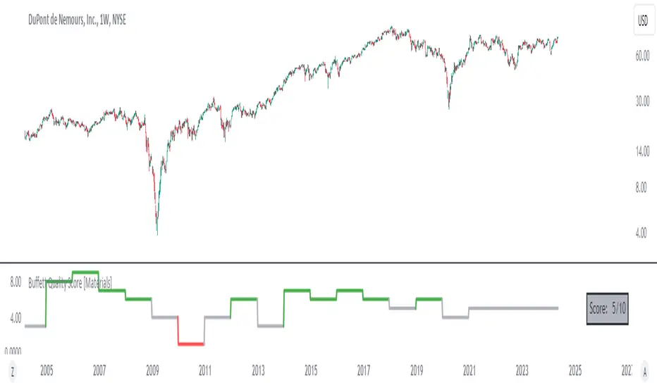
Buffett Quality Score [Materials]The Buffett Quality Score tailored for the Materials sector aims to assess the financial strength and quality of companies within this industry. Each selected financial ratio is strategically chosen to align with the unique characteristics and challenges prevalent in the Materials sector.
Selected Financial Ratios and Criteria:
1. Asset Turnover > 0.8
Relevance: In the Materials sector, efficient asset utilization is crucial for productivity and profitability. A high Asset Turnover (>0.8) indicates effective management of resources and operational efficiency.
2. Current Ratio > 1.5
Relevance: Materials companies often require adequate liquidity to manage inventory and operational expenses. A Current Ratio > 1.5 ensures sufficient short-term liquidity to support ongoing operations and investments.
3. Debt to Equity Ratio < 1.0
Relevance: Given the capital-intensive nature of Materials projects, maintaining a low Debt to Equity Ratio (<1.0) signifies prudent financial management with reduced reliance on debt financing, essential for stability amid industry fluctuations.
4. Gross Margin > 25.0%
Relevance: Materials companies deal with varying production costs and market pricing. A Gross Margin exceeding 25.0% reflects effective cost management and pricing strategies, critical for profitability in a competitive market.
5. EBITDA Margin > 15.0%
Relevance: Strong EBITDA margins (>15.0%) indicate robust operational performance and profitability, essential for sustaining growth and weathering industry-specific challenges.
6. Interest Coverage Ratio > 3.0
Relevance: The Materials sector is subject to market cyclicality and commodity price fluctuations. An Interest Coverage Ratio > 3.0 ensures the company's ability to service debt obligations, safeguarding against financial risks.
7. EPS One-Year Growth > 5.0%
Relevance: EPS growth > 5.0% demonstrates the company's ability to generate sustainable earnings amidst industry dynamics, reflecting positive investor sentiment and potential future prospects.
8. Revenue One-Year Growth > 5.0%
Relevance: Materials companies require consistent revenue growth (>5.0%) to support expansion initiatives and capitalize on market opportunities, indicative of operational resilience and adaptability.
9. Return on Assets (ROA) > 5.0%
Relevance: ROA > 5.0% showcases efficient asset utilization and profitability, essential metrics for evaluating performance and competitive positioning within the Materials industry.
10. Return on Equity (ROE) > 10.0%
Relevance: ROE > 10.0% reflects effective capital deployment and shareholder value creation, crucial for sustaining long-term growth and investor confidence in Materials sector investments.
Score Interpretation:
0-4 Points: Signals potential weaknesses across critical financial aspects, requiring in-depth analysis and risk assessment.
5 Points: Represents average performance based on sector-specific criteria.
6-10 Points: Indicates strong financial health and quality, demonstrating robustness and resilience within the demanding Materials industry landscape.
Development and Context:
The selection and weighting of these specific financial metrics underwent meticulous research and consideration to ensure relevance and applicability within the Materials sector. This scoring framework aims to provide actionable insights for stakeholders navigating investment decisions and evaluating company performance in the Materials industry.
Disclaimer: This information serves as an educational resource on financial evaluation methodology tailored for the Materials sector. It does not constitute financial advice or a guarantee of future performance. Consult qualified professionals for personalized financial guidance based on your specific circumstances and investment objectives.
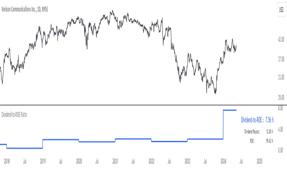
Dividend-to-ROE RatioDividend-to-ROE Ratio Indicator
The Dividend-to-ROE Ratio indicator offers valuable insights into a company's dividend distribution relative to its profitability, specifically comparing the Dividend Payout Ratio (proportion of earnings as dividends) to the Return on Equity (ROE), a measure of profitability from shareholder equity.
Interpretation:
1. Higher Ratio: A higher Dividend-to-ROE Ratio suggests a stable dividend policy, where a significant portion of earnings is returned to shareholders. This can indicate consistent dividend payments, often appealing to income-seeking investors.
2. Lower Ratio: Conversely, a lower ratio implies that the company retains more earnings for growth, potentially signaling a focus on reinvestment for future expansion rather than immediate dividend payouts.
3. Excessively High Ratio: An exceptionally high ratio may raise concerns. While it could reflect a generous dividend policy, excessively high ratios might indicate that a company is distributing more earnings than it can sustainably afford. This could potentially hinder the company's ability to reinvest in its operations, research, or navigate economic downturns effectively.
Utility and Applications:
The Dividend-to-ROE Ratio can be particularly useful in the following scenarios:
1. Income-Oriented Investors: For investors seeking consistent dividend income, a higher ratio signifies a company's commitment to distributing profits to shareholders, potentially aligning with income-oriented investment strategies.
2. Financial Health Assessment: Analysts and stakeholders can use this ratio to gauge a company's financial health and dividend sustainability. It provides insights into management's capital allocation decisions and strategic focus.
3. Comparative Analysis: When comparing companies within the same industry, this ratio helps in benchmarking dividend policies and identifying outliers with unusually high or low ratios.
Considerations:
1. Contextual Analysis: Interpretation should be contextualized within industry standards and the company's financial history. Comparing the ratio with peers in the same sector can provide meaningful insights.
2. Financial Health: It's crucial to evaluate this indicator alongside other financial metrics (like cash flow, debt levels, and profit margins) to grasp the company's overall financial health and sustainability of its dividend policy.
Disclaimer: This indicator is for informational purposes only and does not constitute financial advice. Investors should conduct thorough research and consult with financial professionals before making investment decisions based on this ratio.
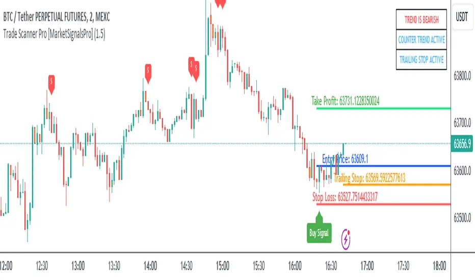
Trade Scanner Pro [MarketSignalsPro]
█ OVERVIEW
Trade Scanner Pro is a trade signal generator based on my trend following momentum reversal system. It identifies a pullback and then confirms momentum exhaustion which produces a signal appearing as a set of suggested orders (horizontal lines) on the chart. The goal is to help traders capitalize on price momentum while simplifying decision making and offering a way to gauge expectations. It can be used for any market, any time frame and configured for counter trend signals also.
█ CONCEPT
While markets are highly random, especially on smaller time frames, trends do exist.
Trade Scanner Pro offers a visually structured way to align the user
with price momentum that is relevant to the trend. It accomplishes this by incorporating a unique mix of standard technical formulas to identify a pullback followed by a momentum reversal. The process occurs in 3 steps:
1 — Identifying the trend of the current time frame.
2 — Evaluating the retrace in terms of how far it moves away from the typical price.
3 — Confirming price exhaustion by recognizing a reversal in price momentum.
Once the criteria are met, a signal appears as a blue horizontal line. This is the entry price suggestion (see label). Stop and take profit orders are also calculated simultaneously. These appear as a red line and green line respectively with price labels. The stop and take profit orders are based upon an average of previous price ranges and will be relative to the price action on the chosen time frame. The initial reward/risk ratio is set to 1.5:1, and can be changed in the settings menu.
This system can also be adjusted to cater to the experience level of the trader. For example, more advanced traders can select “counter trend” mode which will only show signals on the opposite side of the trend. A trailing stop can be activated to help stay in a trade after reaching the profit level. There is also a “heads up” mode which colors the candles orange which means a signal is more likely to appear over the next couple of candles. More on these features in the next section.
For best results, time frames of 1 minute and above should be considered. The smaller the time frame, the more signals, but also more noise and stop outs. Knowing your
market and the most active time of day is especially important for smaller time frames.
█ FEATURES
The following features can be found in the settings menu of Trade Scanner Pro.
Show Trend:
The initial setting is “on”. This shows the trend label on the upper right corner of the screen. Trend can be either bullish or bearish. At times there will be a “conflict” label that appears below the trend label. Conflict means the trend MAY be in the process of changing. This occurs when price persists against the prevailing trend for a prolonged amount of time.
Counter Trend:
When selected will ignore signals on the side of the trend and show counter trend signals only. If the “heads up” feature is selected, orange candles will only appear for potential counter trend signals.
Trailing Stop:
When selected, a trailing stop order suggestion (orange line) will appear beginning from the stop loss price (red line) after a few closed candles. The trailing stop line will follow the price upon each new close of the candles until it is touched. This serves as a point of reference to capture larger market movements and skew reward/risk favorably over time.
Heads Up:
When selected will paint orange candles when there is a greater chance a signal will appear. For example, in trend mode it will only evaluate signals on the side of the trend. In counter trend mode it will evaluate counter trend signals only. For advanced users, this “pre signal” can offer potential opportunities to enter a trade before the signal appears.
Reward Ratio:
This is the reward part of the reward/risk formula used to establish the take profit suggestion on the chart. Initially it is set at 1.5 which produces a line on the chart at a 1.5:1 ratio. The user can change this setting to better align with their expectations. For example, if a larger market movement is anticipated, 2 can be entered into the input field and will generate a take profit line 2X farther than the stop loss line (2:1 reward/risk).
█ LIMITATIONS
Markets are HIGHLY random, especially on smaller time frames. No system that is based on public domain formulas can be expected to be HIGHLY accurate. It is reasonable to expect a 50% win rate more often than not. Profitability in such systems depends on the reward/risk rather than win rate.
This is a system based on price momentum which means MOMENTUM must be present for best results especially on very short time frames.
While this system helps to reduce the burden of analysis, the user should have some basic familiarity with technical analysis. Basic knowledge can help to better determine a quality signal over noise.
█ RAMBLINGS
The stop loss orders MUST be respected otherwise the user puts their entire account at risk. Signals can appear at price locations where larger magnitude risk is extremely high. Respecting the stop loss suggestions can help to mitigate this risk.
For best results set up notifications to receive a message on your desktop, smart phone or tablet rather than sitting in front of a computer screen waiting for a signal to appear. Keep in mind a 1 minute chart in a single market can produce 5 or 6 signals throughout the entire daily session and NOT all will be profitable. A 1 hour time frame may produce 1 or 2 throughout the day. The larger the time frame the lower frequency of signals.
█ THANKS
Special thanks to Cryptosnagger for
helping me translate my concept into a pine script reality.
Market Structure (Range) & Internal Liquidity
This indicator will simplify the price-action reading of any trader/investor by decluttering his/her charts from un-important & confusing candles to highlight the true momentum candles which are usually formed by institutional buying/selling .
The indicator will be a good tool in the arsenal of the following styles of Trading/Investing
Smart Money / Liquidity Concepts
Price Action Concepts
Demand & Supply Concepts
Support & Resistance Concepts
UNIQUE FEATURES:
1. Market Structure - Range & Internal Liquidity:
Unlike other liquidity indicators, this indicator only highlights liquidity levels of significant importance. Not every intermediate high & low in a chart are worthy of noticing, hence by enabling the 'Swings' & 'Range (BoS)' feature in the indicator settings, the structure highs and lows (external liquidity) in a chart can be identified.
Any other liquidity levels within a market range (Range between structural High & Low) is known as internal liquidity which price targets to collect enough orders before heading towards the external liquidity levels.
2. Gaps (Fair Value Gaps / Imbalance):
Not every imbalance / gap between candles are important & trade-worthy. This feature of the indicator is different from the other widely available imbalance indicators & only highlights gaps formed by true momentum candles. Gaps between unimportant inside bars are not highlighted, as these bars occur in the absence of momentum.
3. True Price Action:
Looking at the two charts below, we can clearly observe the difference between price action of a confusing normal chart & the simplified price action highlighted by the indicator. This feature declutters the charts by only highlighting the candles a trader / investor should notice in a chart.
This feature when used in confluence with the liquidity levels feature & gap feature of the indicator, helps identify the true demand & supply zones (order blocks) in a chart.
Before
After
4. Zig Zag Lines:
This unique feature which is useful to Identify & Backtest different entry types taught by Smart Money Traders . This feature helps the trader understand the True Fractal Nature of price. This can also be seen as an alternate to the default line chart feature.
Examples of Entry Types taken by Smart Money Traders
ADDITIONAL FEATURES:
(These features are essential addons to trade liquidity. However, these are derived from publicly available indicators from the Tradingview library, but with a different interpretation for a better visualization of charts & or to time better trade entries without cluttering the charts)
a. Inside Bar & Outside Bars:
Identify not just a single Inside Bar as highlighted by other indicators, but to highlight a series of candles which are within a master candle range and are exhibiting unimportant sideways price action.
Outside Bars only relevant to momentum candles are highlighted, ignoring candles that occur within a master candle range. Highs & Lows of such Outside Bars are used by aggressive traders to identify liquidity levels in the charts.
b. Highs & Lows of previous Monthly / Weekly / Daily & Hourly Candles:
This feature draws Highs & Lows of previous Monthly / Weekly / Daily & Hourly Candles on the extreme right hand side of the chart to keep the charts clean.
Additionally for Hourly time frame, the indicator includes a setting to select the hourly candle time frame (60 min / 75 min / 240 min), which are personal and different for each trader.
UNDERLYING CONCEPT:
In the image below we see how a large majority of Traders / Investors incorrectly mark Structure markings, mistaking a raid of internal liquidity as a Break of Structure, thereby taking trades opposite to the broader trend of the markets
However, this indicator has a higher accuracy of identifying the correct price structure by only marking a structure high or low, when a subsequently opposite side liquidity is taken/raided. Further the broader trend of the markets can be easily identified by looking as to which side the Break of Structure has happened. (This is visible in the indicator in the form of 'Range' feature, so if a Range High is broken then it is understood to be in an uptrend & vice versa)
The underlying core functionality of the indicator is best displayed by the image below
USECASE OF THE INDICATOR:
Before taking any Buying/Selling position in the markets, a Trader / Investor must analyze the price action on the following parameters
HTF & LTF Trend Identification (To judge if trade is Pro-Trend or Counter-Trend)
Is Price at a High Probability Area of Interest?
Is Price satisfying the trade entry conditions?
Let us see how this indicator can be used as a complete trading system in itself and addresses each of the above parameters
Disclaimer: Illustrations shown below are just for understanding the features of the indicator & does not guarantee profitability. Every trader must back test their setups to arrive at a setup with an edge (positive expectancy) before they start actively trading the setup.
1. HTF & LTF Trend Identification (Pro-Trend / Counter-Trend) using 'Range (BoS)' feature of the indicator
Let's assume a Day Trader, uses hourly chart (75 min) to frame his Higher Time Frame (HTF) ideas & 15min charts (LTF) for trade entries
Looking at the chart below the Trader concludes that the HTF has most recently broken the structure to the downside and is considered Bearish till price action is below the range high of 48600 levels. It can also be concluded that the price is currently in a Bullish retracement.
The Trader can choose to take both Pro-Trend or Counter-Trend Trades, timing the trade entries using the LTF charts.
Looking at the LTF chart below, it is evident that price on LTF has also broken structure to the downside and is now aligned with the HTF Bearish Trend. The Trader will now look to get into short trades, to take trades both in line with HTF & LTF trend.
2. Let's identify if Price is at a High Probability Area of Interest, using either single or combination of the 'Swings' / 'Gaps' / 'Outside Bars' / 'HL of previous M,W,D, H candles' features of the indicator
Definition of High Probability Level / Area differs from each Traders perspective depending upon which of the Trading Styles (mentioned in the beginning) does one use.
Smart Money Traders
SMC Traders are known to get into trades early and their high R:R trades are taken mostly at a High Probability Area of Interest which are identified by them on HTF, by looking for candles with imbalance (gaps) & or candles which have taken out a previous liquidity and then having creating imbalance (gaps).
Also Turtle Soups is one of the favorite setups for SMC traders, where a trader enters a trade on LTF (typically 1 min/3min & 5min) after grabbing HTF liquidity lying at H/L of outside bar / previous monthly, weekly, daily or hourly candles.
Demand & Supply Traders
Some of the Best Demand & Supply Traders have the patience to wait for trades and take trades at the extreme Demand & Supply Zones within a market Range.
As illustrated below, the extreme hourly supply zone just below the structure high, which has the confluence of imbalance and Bearish HTF confirmation resulted in a good R:R trade.
Price Action Traders & Support & Resistance Traders
From the illustration below we can see how the 15 min Range breakdown confirms the breakdown of the Inverted Cup Pattern for Price Action Traders & Support & Resistance Traders using the same area of breakdown as the new Resistance to enter Short trades
3. Let's identify if Price is satisfying the Trade Entry Conditions using the 'Zig-Zag Lines' feature
Statistics say that majority (> 80%) of Traders blow up their accounts multiple times or completely give up and never achieve profitability.
One of the primary reasons for this is Traders punching trades randomly and without having proper Setup or rules for entering Trades.
Also in order to arrive at rules or execute the different entry models (couple of examples highlighted earlier) taught by different Trainers, a Trader needs to learn to visualize charts in a similar format to what the trainers are teaching.
The Zig-Zag lines feature is a form of line chart that joins the swing high points to the swing low points on the chart to represent the True Price action & a proper fractal nature of the markets, unlike the line chart which is formed by only by joining the closing value of each candle.
From the image below we can see that the Zig-Zag lines feature eliminates the randomness visible in the line chart and is a more smoother chart. Using this feature one can back test the various entry models widely available on the internet or arrive at a user specific model which he/she is comfortable with.
CONCLUSION:
Trading with a deeper understanding of Price Action allows a Trader/Investor to enter or exit trades with ease. Price Action trading allows individuals to keep their charts clean and stay away from the other lagging technical indicators and enter trades much earlier than other technical indicators.
This indicator attempts in simplifying the understanding of price action for every one and identify potential high probability areas / levels where one should enter / exit trades.
This indicator will be an important tool in the arsenal of any Trader / Investor to take better informed trades, however it does not guarantee profitability of a Trader, due to the randomness of the markets & external factors that influence each trader.
GET ACCESS:
Refer Author's instructions below to get access to the indicator

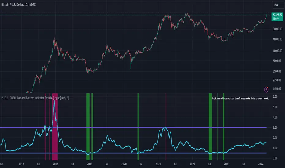
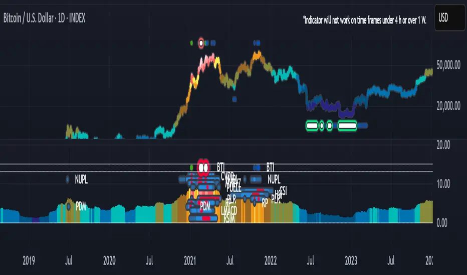
PUELL - PUELL Top and Bottom Indicator for BTC [Logue]Puell Multiple Indicator (PUELL) - The Puell multiple is the ratio between the daily coin issuance in USD and its 365-day moving average. This multiple helps to measure miner profitability. The PUELL indicator smooths the Puell multiple using a 14-day simple moving average. When the PUELL goes to high values relative to historical values, it indicates the profitability of the miners is high and a top may be near. When the PUELL is low relative to historical values, it indicates the profitability of the minors is low and a bottom may be near. The default trigger values are PUELL values above 3.0 for a "top" and below 0.5 for a "bottom".
BTI - Bitcoin (BTC) Top Indicator [Logue]Bitcoin top indicator. This indicator is a combination of multiple on-chain and seasonality BTC macro cycle top indicators, plus the Pi-Cycle top moving average. Because there is no magic single indicator to detect macro cycle tops in bitcoin, the BTI detects confluence of multiple indicators to select tops of each BTC macro cycle. The individual indicators used for the BTI are:
1) Cumulative Value Days Destroyed (CVDD) - The CVDD was created by Willy Woo and is the ratio of the cumulative value of Coin Days Destroyed in USD and the market age (in days). While this indicator is used to detect bottoms normally, an extension is used to allow detection of BTC tops. When the BTC price goes above the CVDD extension, BTC is generally considered to be overvalued. Because the "strength" of the BTC tops has decreased over the cycles, a logarithmic function for the extension was created by fitting past cycles as log extension = slope * time + intercept. This indicator is triggered when the BTC price is above the CVDD extension.
2) Net Unrealized Profit Loss (NUPL) - The NUPL measures the profit state of the bitcoin network to determine if past transfers of BTC are currently in an unrealized profit or loss state.
Values above zero indicate that the network is in overall profit, while values below zero indicate the network is in overall loss. Highly positive NUPL values indicate overvaluation of the BTC network. Based on decreasing "strength" of BTC tops, a decreasing linear function (trigger = slope * time + intercept) was fit to past cycle tops. Therefore, future trigger values can be calculated over time. This indicator is triggered when the NUPL is above the trigger value.
3) Market Value-Realized Value Z-score (MVRV-Z) - The MVRV-Z measures the value of the bitcoin network by comparing the market cap to the realized value and dividing by the standard deviation of the market cap (market cap – realized cap) / std(market cap)). When the market value is significantly higher than the realized value, the bitcoin network is "overvalued". Very high values have signaled cycle tops in the past. This indicator is triggered when the MVRVZ value is above 55.
4) Puell multiple (PUELL) - PUELL is the ratio between the daily coin issuance in USD and its 365-day moving average. This multiple helps to measure miner profitability. When the PUELL goes to extremely high values relative to historical values, it indicates the profitability of the miners is very high and a top may be near. This indicator triggers when the PUELL is above 3.33.
5) Calendar Seasonality Index (CSI) - The CSI takes advantage of the consistency of BTC cycles. Past cycles have formed macro tops every four years between October 21st and December 12th. Therefore, this indicator triggers at set times that are marked every four years between these two dates.
6) Halving Seasonality Index (HSI) - The HSI, as with the CSI, takes advantage of the consistency of BTC cycles following the major event that is the halving. Aside from the first halving cycle, cycles have formed macro tops approximately 538 days after each halving. Therefore, this indicator triggers at set times that are marked 528 to 548 days (i.e., 538 +- 10 days) after each halving.
7) Polylog Regression (PLR) - The BTC cycle tops and bottoms were separately fit using a polynomial regression for the PLR. The bottom band was fit on much more data than the top band, so is likely to be more reliable. The shape of the regression into the future was estimated, so may not be accurate into the future, but is the best fit of tops and bottoms to date. This indicator is used to estimate when tops and bottoms are near when the price goes into the top or bottom bands. This triggers when the BTC price is inside or above the upper polylog regression channel.
8) Realized Price (RP) - The RP is summation of the value of each BTC when it last moved divided by the total number of BTC in circulation. This gives an estimation of the average "purchase" price of BTC on the bitcoin network based on when it was last transacted. This indicator tells us if the average network participant is in a state of profit or loss. This indicator is normally used to detect BTC bottoms, but an extension can be used to detect when the bitcoin network is "highly" overvalued. Because the "strength" of the BTC tops has decreased over the cycles, a logarithmic function for the extension was created by fitting past cycles as log extension = slope * time + intercept. This indicator triggers when the BTC price is above the realized price extension.
9) Pi-cycle Top (PCT) - The PCT indicator is simply the cross of the 111-day moving average above a 2x multiple of the 350-day moving average of the BTC price. While there is no fundamental reasoning behind why this works, it has worked to indicate previous bitcoin tops by taking advantage of the cyclicality of the BTC price and measurement overextension of BTC price. This indicator triggers when the fast moving average (111-day) crosses above the 2x multiple of the slow moving average (350-day).
10) Transaction Fee Spike (TFS) - Transaction fees on the bitcoin network can signal a mania phase when they increase well above historical values. This mania phase may indicate we are near a top in the BTC price. The daily transaction fee total in USD is divided by the number of daily transactions to calculate the average transaction fee paid on the bitcoin network. The transaction fees increasing above $40 trigger this indicator.
The on-chain indicators (CVDD, NUPL, MVRV-Z, PUELL, RP, and TFS) work together to give a health check of the BTC price as compared to its network health. The seasonality indicators (CSI, HSI, and PLR) work together to map the macro cycles of BTC. The PCT gives a view of the overvaluation of the BTC price. Each of these indicators is weighted evenly when selected and if over 45% of the indicators are triggering on a candle (i.e., at least 5 of 10), the overall BTI indicator prints a clear signal -- a red dot with a white middle portion between the white horizontal lines at the top of the indicator. This signal is meant to indicate when the macro cycle top is likely already hit or is near. Each of the individual indicators used for the BTI are proven macro top indicators over multiple cycles.
Each of the individual indicators are shown in their own rows to visualize which indicators are triggering. You are able to deselect any indicator you do not wish to have considered and select it back again. To prepare you for indicators triggering, the BTI shows dark blue or dark green when the indicator is close to triggering (i.e., generally around 20% from the trigger value, a less intense background will appear, and 10% from the trigger value, a more intense background will appear). The color of the individual indicators turns pink when they are triggered. The background color of the BTI becomes blue when at least 30% of the indicators considered are triggering and it becomes purple/pink when the BTI fully triggers. See the BTC chart above the indicator showing the performance of the indicator in picking out macro top regions (red dots with white middle portion). Because not all daily data for BTC can be shown on one chart, ensure you also play with the indictor yourself. The BLX is most appropriate, but the indicator works on all BTC/USD charts. Because of the limits imposed by TradingView, the indicator doesn't work on time frames lower than 4 h or higher than the weekly.
You can use this indicator to help you understand when the BTC price is more likely topping based on past performance of these indicators. This indicator pairs with the BBI (Bitcoin (BTC) Bottom Indictor) and the BTB (Bitcoin Top and Bottom indicator).
Use this indicator at your own risk. I make no assertions that this indicator will work to detect any future top since we all know that past performance is no guarantee of future results.
BBI - Bitcoin (BTC) Bottom Indicator [Logue]This indicator is a combination of multiple on-chain and seasonality BTC macro cycle bottom indicators. Because there is no magic single indicator to detect macro cycle bottoms in bitcoin, the BBI detects confluence of multiple indicators to select bottoms of each BTC macro cycle. The individual indicators used for the BBI are:
1) Cumulative Value Days Destroyed (CVDD) - The CVDD was created by Willy Woo and is the ratio of the cumulative value of Coin Days Destroyed in USD and the market age (in days). When the BTC price goes below this value, BTC is generally considered to be undervalued. This indicator is triggered when the BTC price is below the CVDD.
2) Net Unrealized Profit Loss (NUPL) - The NUPL measures the profit state of the bitcoin network to determine if past transfers of BTC are currently in an unrealized profit or loss state.
Values above zero indicate that the network is in overall profit, while values below zero indicate the network is in overall loss. Highly negative NUPL values indicate an undervaluation of the BTC network. This indicator is triggered when the NUPL is below -15.
3) Market Value-Realized Value Z-score (MVRV-Z) - The MVRV-Z measures the value of the bitcoin network by comparing the market cap to the realized value and dividing by the standard deviation of the market cap (market cap – realized cap) / std(market cap)). When the market value is significantly lower than the realized value, the bitcoin network is "undervalued". Very low values have signaled cycle bottoms in the past. This indicator is triggered when the MVRVZ value is below 4.
4) Puell multiple (PUELL) - PUELL is the ratio between the daily coin issuance in USD and its 365-day moving average. This multiple helps to measure miner profitability. When the PUELL goes to extremely low values relative to historical values, it indicates the profitability of the miners is low and a bottom may be near. This indicator triggers when the PUELL is below 0.4.
5) Calendar Seasonality Index (CSI) - The CSI takes advantage of the consistency of BTC cycles. Past cycles have formed macro bottoms every four years between December and February. Therefore, this indicator triggers at set times that are marked every four years in December, January, or February.
6) Halving Seasonality Index (HSI) - The HSI, as with the CSI, takes advantage of the consistency of BTC cycles following the major event that is the halving. Past cycles have formed macro bottoms approximately 948 days after each halving. Therefore, this indicator triggers at set times that are marked 903-993 days (i.e., 948 +- 45 days) after each halving.
7) Polylog Regression (PLR) - The BTC cycle tops and bottoms were separately fit using a polynomial regression for the PLR. The bottom band was fit on much more data than the top band, so is likely to be more reliable. The shape of the regression into the future was estimated, so may not be accurate into the future, but is the best fit of tops and bottoms to date. This indicator is used to estimate when tops and bottoms are near when the price goes into the top or bottom bands. This triggers when the BTC price is inside or below the lower polylog regression channel.
8) Realized Price (RP) - The RP is summation of the value of each BTC when it last moved divided by the total number of BTC in circulation. This gives an estimation of the average "purchase" price of BTC on the bitcoin network based on when it was last transacted. This indicator tells us if the average network participant is in a state of profit or loss. This indicator triggers when the BTC price is below the realized price.
9) Hash Rate Capitulation (HRC) - The HRC indicator measures the rate of change of the hash rate. Steadily increasing hash rate is a sign of health of the bitcoin network. This indicator uses moving averages (20- and 100-day) of the hash rate to indicate when a decrease in the rate of change is has occurred (i.e., the 20-day MA goes below the 100-day MA). This indicator triggers when the 20-day moving average of the hash rate going below the 100-day moving average.
The on-chain indicators (CVDD, NUPL, MVRV-Z, PUELL, RP, and HRC) work together to give a health check of the BTC price as compared to its network health. The seasonality indicators (CSI, HSI, and PLR) work together to map the macro cycles of BTC. Each of these indicators is weighted evenly when selected and if over 40% of the indicators are triggering on a candle (i.e., at least 4 of 9), the overall BBI indicator prints a clear signal -- a green dot with a white middle portion between the white horizontal lines at the top of the indicator. This signal is meant to indicate when the macro cycle bottom is likely already hit or is near. Each of the individual indicators used for the BBI are proven macro bottom indicators over multiple cycles.
Each of the individual indicators are shown in their own rows to visualize which indicators are triggering. You are able to deselect any indicator you do not wish to have considered and select it back again. To prepare you for indicators triggering, the BBI shows dark blue or dark green when the indicator is close to triggering (i.e., generally around 20% from the trigger value, a less intense background will appear, and 10% from the trigger value, a more intense background will appear). The color of the individual indicators turns pink when they are triggered. The background color of the BBI becomes blue when at least 30% of the indicators considered are triggering and it becomes green when the BBI fully triggers. See the BTC chart above the indicator showing the performance of the indicator in picking out macro bottom regions (green dots with white middle portion). Because not all daily data for BTC can be shown on one chart, ensure you also play with the indictor yourself. The BLX is most appropriate, but the indicator works on all BTC/USD charts. Because of the limitations of moving averages in TradingView, the indicator doesn't work on time frames lower than 4 h.
You can use this indicator to help you understand when the BTC price is more likely bottoming based on past performance of these indicators. This indicator pairs with the BTI (Bitcoin (BTC) top indictor) and the BTB (Bitcoin top and bottom) indicators.
Use this indicator at your own risk. I make no assertions that this indicator will work to detect any future bottom since we all know that past performance is no guarantee of future results.

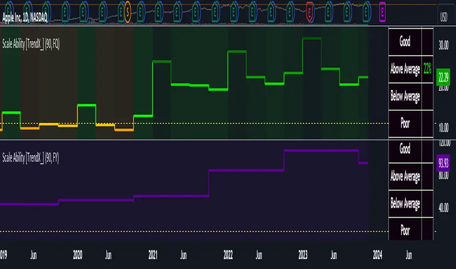
Scale Ability [TrendX_]Scale Ability indicator can indicate a company’s potential for future growth and profitability.
A scalable company is one that can increase its revenue and market share without increasing its costs proportionally, which can benefit from economies of scale. Therefore, the high-scale ability can generate more value for its shareholders - which is important for investment decisions.
Scale Ability indicator consists of 3 financial components:
Cash Flow from Investing Activities to Total Assets Ratio (CFIA / TA)
Net Income to Total Debt Ratio (NI / TD)
Earnings Before Interest, Taxes, Depreciation and Amortization to Equity Ratio (EBITDA / E)
These measures can help investors assess how efficiently and effectively a company uses its resources to generate revenue and profit.
Note:
This can be customizable between Fiscal Quarter (FQ) and Fiscal Year (Fy)
This is suitable for companies in fast-growing industries.
FUNCTION
CFIA / TA Ratio
A company with a net income to total debt of 9% could indicate that it is investing in its assets to keep up with the market demand and the technological changes which can create competitive advantages.
NI/ TD Ratio
A company with a net income to total debt of 9% could show that it is profitable and has a strong financial position, which can easily cover its debt payments.
EBITDA / E Ratio
A company with a net income to total debt of 14% illustrates that it is generating a high return on its equity.
USAGE
Scale index division:
> 43 : Excellent
32 - 43 : Good
12 - 31 : Above Average
= 11 : Average
8 - 10 : Below Average
5 - 7 : Poor
< 4 : Very Poor
DISCLAIMER
This is only a rough estimate, and the actual ratio may differ significantly depending on the stage of the business cycle and the company’s strategy, and the comparison of each company and its peers.
This indicator is not financial advice, it can only help traders make better decisions. There are many factors and uncertainties that can affect the outcome of any endeavor, and no one can guarantee or predict with certainty what will occur.
Therefore, one should always exercise caution and judgment when making decisions based on past performance.
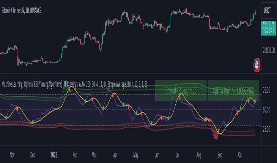
Machine Learning: Optimal RSI [YinYangAlgorithms]This Indicator, will rate multiple different lengths of RSIs to determine which RSI to RSI MA cross produced the highest profit within the lookback span. This ‘Optimal RSI’ is then passed back, and if toggled will then be thrown into a Machine Learning calculation. You have the option to Filter RSI and RSI MA’s within the Machine Learning calculation. What this does is, only other Optimal RSI’s which are in the same bullish or bearish direction (is the RSI above or below the RSI MA) will be added to the calculation.
You can either (by default) use a Simple Average; which is essentially just a Mean of all the Optimal RSI’s with a length of Machine Learning. Or, you can opt to use a k-Nearest Neighbour (KNN) calculation which takes a Fast and Slow Speed. We essentially turn the Optimal RSI into a MA with different lengths and then compare the distance between the two within our KNN Function.
RSI may very well be one of the most used Indicators for identifying crucial Overbought and Oversold locations. Not only that but when it crosses its Moving Average (MA) line it may also indicate good locations to Buy and Sell. Many traders simply use the RSI with the standard length (14), however, does that mean this is the best length?
By using the length of the top performing RSI and then applying some Machine Learning logic to it, we hope to create what may be a more accurate, smooth, optimal, RSI.
Tutorial:
This is a pretty zoomed out Perspective of what the Indicator looks like with its default settings (except with Bollinger Bands and Signals disabled). If you look at the Tables above, you’ll notice, currently the Top Performing RSI Length is 13 with an Optimal Profit % of: 1.00054973. On its default settings, what it does is Scan X amount of RSI Lengths and checks for when the RSI and RSI MA cross each other. It then records the profitability of each cross to identify which length produced the overall highest crossing profitability. Whichever length produces the highest profit is then the RSI length that is used in the plots, until another length takes its place. This may result in what we deem to be the ‘Optimal RSI’ as it is an adaptive RSI which changes based on performance.
In our next example, we changed the ‘Optimal RSI Type’ from ‘All Crossings’ to ‘Extremity Crossings’. If you compare the last two examples to each other, you’ll notice some similarities, but overall they’re quite different. The reason why is, the Optimal RSI is calculated differently. When using ‘All Crossings’ everytime the RSI and RSI MA cross, we evaluate it for profit (short and long). However, with ‘Extremity Crossings’, we only evaluate it when the RSI crosses over the RSI MA and RSI <= 40 or RSI crosses under the RSI MA and RSI >= 60. We conclude the crossing when it crosses back on its opposite of the extremity, and that is how it finds its Optimal RSI.
The way we determine the Optimal RSI is crucial to calculating which length is currently optimal.
In this next example we have zoomed in a bit, and have the full default settings on. Now we have signals (which you can set alerts for), for when the RSI and RSI MA cross (green is bullish and red is bearish). We also have our Optimal RSI Bollinger Bands enabled here too. These bands allow you to see where there may be Support and Resistance within the RSI at levels that aren’t static; such as 30 and 70. The length the RSI Bollinger Bands use is the Optimal RSI Length, allowing it to likewise change in correlation to the Optimal RSI.
In the example above, we’ve zoomed out as far as the Optimal RSI Bollinger Bands go. You’ll notice, the Bollinger Bands may act as Support and Resistance locations within and outside of the RSI Mid zone (30-70). In the next example we will highlight these areas so they may be easier to see.
Circled above, you may see how many times the Optimal RSI faced Support and Resistance locations on the Bollinger Bands. These Bollinger Bands may give a second location for Support and Resistance. The key Support and Resistance may still be the 30/50/70, however the Bollinger Bands allows us to have a more adaptive, moving form of Support and Resistance. This helps to show where it may ‘bounce’ if it surpasses any of the static levels (30/50/70).
Due to the fact that this Indicator may take a long time to execute and it can throw errors for such, we have added a Setting called: Adjust Optimal RSI Lookback and RSI Count. This settings will automatically modify the Optimal RSI Lookback Length and the RSI Count based on the Time Frame you are on and the Bar Indexes that are within. For instance, if we switch to the 1 Hour Time Frame, it will adjust the length from 200->90 and RSI Count from 30->20. If this wasn’t adjusted, the Indicator would Timeout.
You may however, change the Setting ‘Adjust Optimal RSI Lookback and RSI Count’ to ‘Manual’ from ‘Auto’. This will give you control over the ‘Optimal RSI Lookback Length’ and ‘RSI Count’ within the Settings. Please note, it will likely take some “fine tuning” to find working settings without the Indicator timing out, but there are definitely times you can find better settings than our ‘Auto’ will create; especially on higher Time Frames. The Minimum our ‘Auto’ will create is:
Optimal RSI Lookback Length: 90
RSI Count: 20
The Maximum it will create is:
Optimal RSI Lookback Length: 200
RSI Count: 30
If there isn’t much bar index history, for instance, if you’re on the 1 Day and the pair is BTC/USDT you’ll get < 4000 Bar Indexes worth of data. For this reason it is possible to manually increase the settings to say:
Optimal RSI Lookback Length: 500
RSI Count: 50
But, please note, if you make it too high, it may also lead to inaccuracies.
We will conclude our Tutorial here, hopefully this has given you some insight as to how calculating our Optimal RSI and then using it within Machine Learning may create a more adaptive RSI.
Settings:
Optimal RSI:
Show Crossing Signals: Display signals where the RSI and RSI Cross.
Show Tables: Display Information Tables to show information like, Optimal RSI Length, Best Profit, New Optimal RSI Lookback Length and New RSI Count.
Show Bollinger Bands: Show RSI Bollinger Bands. These bands work like the TDI Indicator, except its length changes as it uses the current RSI Optimal Length.
Optimal RSI Type: This is how we calculate our Optimal RSI. Do we use all RSI and RSI MA Crossings or just when it crosses within the Extremities.
Adjust Optimal RSI Lookback and RSI Count: Auto means the script will automatically adjust the Optimal RSI Lookback Length and RSI Count based on the current Time Frame and Bar Index's on chart. This will attempt to stop the script from 'Taking too long to Execute'. Manual means you have full control of the Optimal RSI Lookback Length and RSI Count.
Optimal RSI Lookback Length: How far back are we looking to see which RSI length is optimal? Please note the more bars the lower this needs to be. For instance with BTC/USDT you can use 500 here on 1D but only 200 for 15 Minutes; otherwise it will timeout.
RSI Count: How many lengths are we checking? For instance, if our 'RSI Minimum Length' is 4 and this is 30, the valid RSI lengths we check is 4-34.
RSI Minimum Length: What is the RSI length we start our scans at? We are capped with RSI Count otherwise it will cause the Indicator to timeout, so we don't want to waste any processing power on irrelevant lengths.
RSI MA Length: What length are we using to calculate the optimal RSI cross' and likewise plot our RSI MA with?
Extremity Crossings RSI Backup Length: When there is no Optimal RSI (if using Extremity Crossings), which RSI should we use instead?
Machine Learning:
Use Rational Quadratics: Rationalizing our Close may be beneficial for usage within ML calculations.
Filter RSI and RSI MA: Should we filter the RSI's before usage in ML calculations? Essentially should we only use RSI data that are of the same type as our Optimal RSI? For instance if our Optimal RSI is Bullish (RSI > RSI MA), should we only use ML RSI's that are likewise bullish?
Machine Learning Type: Are we using a Simple ML Average, KNN Mean Average, KNN Exponential Average or None?
KNN Distance Type: We need to check if distance is within the KNN Min/Max distance, which distance checks are we using.
Machine Learning Length: How far back is our Machine Learning going to keep data for.
k-Nearest Neighbour (KNN) Length: How many k-Nearest Neighbours will we account for?
Fast ML Data Length: What is our Fast ML Length? This is used with our Slow Length to create our KNN Distance.
Slow ML Data Length: What is our Slow ML Length? This is used with our Fast Length to create our KNN Distance.
If you have any questions, comments, ideas or concerns please don't hesitate to contact us.
HAPPY TRADING!
BearMetricsLooking at the financial health of a company is a critical aspect of stock analysis because it provides essential insights into the company's ability to generate profits, meet its financial obligations, and sustain its operations over the long term. Here are several reasons why assessing a company's financial health is important when evaluating a stock:
1. **Profitability and Earnings Growth**: A company's financial statements, particularly the income statement, provide information about its profitability. Analyzing earnings and revenue trends over time can help you assess whether the company is growing or declining. Investors generally prefer companies that show consistent earnings growth.
2. **Risk Assessment**: Financial statements, including the balance sheet and income statement, offer a comprehensive view of a company's assets, liabilities, and equity. By evaluating these components, you can gauge the level of financial risk associated with the stock. A healthy balance sheet typically includes a manageable debt load and strong equity.
3. **Cash Flow Analysis**: Cash flow statements reveal how effectively a company manages its cash, which is crucial for day-to-day operations, debt servicing, and future investments. Positive cash flow is essential for a company's stability and growth prospects.
4. **Debt Levels**: Examining a company's debt levels and debt-to-equity ratio can help you determine its leverage. High debt levels can be a cause for concern, as they may indicate that the company is at risk of financial distress, especially if it struggles to meet interest payments.
5. **Liquidity**: Liquidity is vital for a company's short-term survival. By assessing a company's current assets and current liabilities, you can gauge its ability to meet its short-term obligations. Companies with low liquidity may face difficulties during economic downturns or unexpected financial challenges.
6. **Dividend Sustainability**: If you're an income-oriented investor interested in dividend-paying stocks, you'll want to ensure that the company can sustain its dividend payments. A healthy balance sheet and consistent cash flow can provide confidence in dividend sustainability.
7. **Investment Confidence**: A company with a strong financial position is more likely to attract investor confidence and positive sentiment. This can lead to higher stock prices and a lower cost of capital for the company, which can be beneficial for its growth initiatives.
8. **Risk Mitigation**: By assessing a company's financial health, you can mitigate investment risk. Understanding a company's financial position allows you to make more informed decisions about the level of risk you are comfortable with and whether a particular stock aligns with your risk tolerance.
9. **Long-Term Viability**: Ultimately, investors are interested in companies that have the potential for long-term success. A company with a healthy financial foundation is more likely to weather economic downturns, adapt to industry changes, and thrive over the years.
In summary, examining a company's financial health is a fundamental aspect of stock analysis because it provides a comprehensive picture of the company's current state and its ability to navigate future challenges and capitalize on opportunities. It helps investors make informed decisions and assess the long-term prospects of a stock in their portfolio.

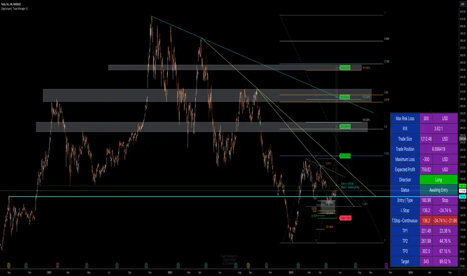
Trade Manager & Position Size Tool & PnL Tracker [AlgoScopes] V1Position size tool, leverage calculator, trade tracker, money management, trade presentation, risk reward management, margin position, live profit and loss, that's all in this one Trade Manager indicator.
The idea for this indicator comes from two years ago when I was helping a friend who, at the request of 15-20 members from our telegram group, wanted to create a paid group and share our ideas for trade with them (it started as an experiment for just a month or two and ended with 15 months with over 500 trading ideas and signals, with a complete TA chart). If I had time to create this indicator back then for members, it would have been much easier for them to be able to understand and follow the trade idea that was presented through a classic chart, with all the things that a TA must have:
Entry (as well as the reason for entry),
Stop (where the idea for the trade is no longer valid),
Target (with the reason why it is the target for that trade),
Take profits (taking part of the profit on the way to the target).
The majority of members still did not understand how much position to trade, what is the possible profit or loss, if the margin trade is how much leverage to use, in one word “money management”. The most important rule that every trader must follow is "Plan your trade and trade your plan". Learn money management and you are halfway there to becoming a successful trader. It is only after all that, you learn to use some of the "holy grail" indicators. When you have mastered those first two rules, find and master your favorite indicator or trading style (the most important thing is to stick to those two rules). The margin | leverage is also included in the script, for which there are so many dilemmas, arguments and discussions. (that many who still do not understand margin, would trade that it is not passionate if it is controlled). Too much for an introduction, especially since this indicator has so much to explain.
Most importantly, this is an invite-only indicator, and there are so many free indicators on tradingview that can also serve you very well. As far as I know, all exchanges have a calculator tool to calculate the possible profit and loss for each trade you plan to take.
*This indicator is not recommended for scalping on a 1min chart because the script, as you will see, is very complex, so the loading time is longer than with simpler indicators.
💠 ABOUT THE SCRIPT
This script is made to help manage trade. In this one indicator you have the possibility to do technical analysis, calculation for trade (four types: account size risk, trade investment, maximum to lose or position size), monitor 'PnL' (profit and loss in real time) do the calculation in the second, maybe local currency, and set an alert (from entry to any other change in trade). As the script is made for general use, some slight differences are possible for real time 'PnL' or 'ROI'. Always do a test before you start trading with larger amounts. The script is recommended for intra day trading and above. The script is not recommended for scalping on the 1min chart
💎 PROCESS TO ADD SCRIPT TO CHART
Possible trade on break example trade
As this script is invite-only, to add it to the chart you need to click on Indicators and find it under the 'Invite-Only' section. When you add the script to the chart (as it is interactive), you will be asked to do 4 steps.
🔸 'SET TRADE TIME'
Click on the chart where the last vertical bar is.
If you are already in the trade, then find the bar|time where the trade started
(you want to follow trade or trade presentation)
🔸 1) 'SET ENTRY'
Click on the horizontal level where you want to place the Entry
🔸 2) 'SET STOP'
Click on the horizontal level where you want to set the Stop
🔸 3) 'SET TARGET
Click on the horizontal level where you want to place the Target
💎 CONFIRM INPUTS
After you have done those 4 steps, a popup will appear with the relevant inputs for the trade.
You will see that some inputs are already filled (done in those 4 steps before, Entry, Stop and Target). You can correct them if you want (you will sometimes notice a longer 'space decimal' for the trade ticker, but this will not affect the calculator or other parts of the script). You can do the rest of the inputs for trade or finish it later when the script is loaded on the chart (it is recommended to fill in 'Trade Type' and 'Amount'. Don't forget to click on the "Apply" button to load the script on the chart.
💎 INDICATOR LOADED ON CHART
• When the indicator is loaded on the chart (regardless of whether it is a new trade or a trade that has already started), the following items are displayed by default:
🔸 ' Trade Table ' shows all relevant information for the trade
🔸 ' Trade Box ' with lines for Entry, Stop and Target (Take Profits if enabled)
🔸 ' Trade Box Labels ' with relevant data
• The Entry label is also the trade status label, and if the trade is not active, by default it is the Entry color
If the trade is active or when a new trade reached Entry, several new things are noticeable:
• Entry|Status label as well as status row in table will change color as well as 'Entry Reached' text
• Several extra columns relative to trade will be added to the Entry|Status label
• 3 new columns will also appear on the Trade Table (Live PnL, Live min PnL and Live ROI)
• If Trail Stop is enabled, the label will change the text to T.Stop and change color depending on whether it is in loss or profit.
• If Trail Stop is enabled, inside Trade Box trail line it will follow price action inside the box, while the label will always be fixed at the initial level
• A vertical colored line will appear on the right side of the Trade Box (depending on whether the trade is in profit or loss) which shows as in the Trade Table like Live PnL
⚪ SETTINGS
💎 Trade Account Setup
🔸 ‘Trade Type’
• 'Account Capital' or portfolio (with combination '% Capital Risk')
• 'Investment' (how much you want to invest in the trade)
• 'Risk To Lose' (how much you want to risk losing)
• 'Position Size' (exact position size, units|share for trade)
🔸 ‘Account Type’
• If the account is in another currency or you want to see possible profit | loss in local currency
• Around 150 world and local currencies supported by ICE exchange
🔸 ‘Amount’
• Amount for ‘Trade Type’
🔸 ‘% Capital Risk’
• Only for ‘Account Capital’ trade type
(i.e. 10.000 account capital with ‘% Capital Risk’ 4 is 10.000 x 4% = maximum loss 400)
🔸 ‘Leverage’
• Enable|Disable for margin trade i size of leverage (maximum 125x)
(be sure to study how and when to use margin trade through the tutorial, because margin trade can be very dangerous. If you have not perfected margin trade, there is a great possibility of losing most or even all of your account capital).
💎 TRADE ENTRY & TARGET & STOP & T.STOP & DATE | TIME
🔸 ‘Trade Date & Time’
🔸 ‘Entry’
🔸 ‘Stop’
🔸 ‘Target’
• (all was set in the previous step but can be correct/adjusted if needed)
🔸 ‘Market Entry’
• Enabled will move Entry on that bar close
🔸 ‘Liquidation’ (enabled by default)
• Show ‘Warning’ if trade Stop is close or invalid (trade will hit liquidation before reached Stop level)
🔸 ‘Trailing Type’ (4 trailing stop type)
• ‘Disabled’ (Stop will stay the entire time at the initial stop level)
• ‘Continuous’ (I.Stop follow price by distance or percent when price reached Trail start level)
• ‘Stepped’ (I.Stop moves to previous level when price reached Trail start level)
• ‘Breakeven’ (I.Stop moves to Entry when price reached Trail start level)*
* (least one Take Profit enabled)
🔸 ‘Trailing Active’ (Entry, TP1, TP2 and TP3)
• Trailing stop starts level if ‘Trailing Type’ is enabled
🔸 ‘Trailing by’ (distance or percent)
• ‘Distance’ (T.Stop will follow price action by distance)
• ‘Percent’ (T.Stop will follow price action by percent)
(this is a good example to see the difference between trailing by initial distance and initial percentage)
🔸 ‘T.Stop Distance & Percent’ (initial distance and percent for table trade only)
• Useful for bot or exchange
🔸 ‘Stop, T.Stop, Target and TP’s in PIP’s’
• Distance in PIP’s
💎 TAKE PROFIT
🔸 ‘Split Target’ (enabled by default to three take profits (TP) with auto split)
🔸 ‘Number of Take Profits’ (up to three take profits)
🔸 ‘Type’ (auto or manual)
• For manual type fill all prices to preferred level. TP percent (TP1%, TP2% and TP3% ) and Target% is how much profit you want to take on a specific level.
• PLEASE NOTE sum of all enabled ‘TP’ and targets = 100 (e.g. two TP and sets TP1% to 25 and TP2% to 35, then Target% should be 40% i.e. 25 + 35 + 40 = 100)
💎 TRADE BOX & LINES
🔸 ‘Target Line’ (color for target line and trade table ‘direction’)
🔸 ‘Stop Line’ (color for initial line and trail line)
🔸 ‘Entry Line’ (color for entry line and label & table status)
🔸 ‘To Trade Time’ (‘trade box’ left vertical line)
• By default is set to trade date and time
• Unchecked will be moved to the last bar (live time)
🔸 ‘Extended Left’ (extend Entry, Stop, Target and TP’s lines to left)
• To check for possible support|resistance
🔸 ‘Size’ (Entry, Stop, Target and TP’s lines size)
🔸 ‘PnL Box Size’ (line size for vertical box lines)
🔸 ‘Offset’ (right vertical line offset from last bar)
🔸 ‘PnL Box Color’ (right vertical line and trail fill color)
• Color changes for profit & loss
🔸 ‘Box Line Color’ (box base color)
💎 LABELS
🔸 ‘Stop & Target Labels’ (enable|disable stop and target labels)
• By default is set to small (tiny, small, normal, large, huge and auto option)
• Disabled will move all information on Entry|Status label
🔸 ‘Offset’ (label offset from trade box)
🔸 ‘Target Label’ (label color for target and all enabled tp’s)
🔸 ‘Stop Label’ (label color for initial stop and enabled trailing stop)
🔸 ‘Label Text’ (color for label text)
🔸 ‘Status Label Color’ (label table entry|status color when trade is not active)
🔸 ‘PnL’ (entry|status color for profit and loss)
🔸 ‘Size’ (by default set to normal, option tiny, small, normal, large, huge and auto)
🔸 ‘Risk to Reward’ (show risk to reward on labels)
🔸 ‘Extra Info’ (by default disabled, show extra related info for trade on labels)
• Useful if Trade Table disabled
🔸 ‘Close Trade Stats’ (by default disabled, show all info when trade is closed)
• By default is white text color for close trade stats label
💎 ALERTS
🔸 ‘Failed Trade’ (alert if price reached Stop before is active, reached Entry)
• Useful if trade need adjustment but it can also be left as it is
and alert is just warning
🔸 ‘New & Update Alert’ (alert when price reached Entry or change status to enabled Take Profits)
🔸 ‘Trade Closure Alert’ (alert when trade closed, reached Stop, Target or enabled Trail Stop)
• Alert can be in modified or default preset jSon format as well as in plain text format
• Place holders for creating alerts are :
{type}, {symbol}, {exchange}, {ticker}, {base}, {quote}, {timeframe}, {price}, {direction}, {entry}, {stop}, {tstop}, {tp1}, {tp2}, {tp3}, {target}, {tstopstatus}, {status}, {result}
* {type} placeholder is set to ‘Trade Active’, ‘Trade Update’ and ‘Trade Closed’
💎 TABLE DISPLAY
🔸 ‘Trade Table’ (enable|disable trade table)
🔸 ‘Position’ (by default set to bottom right with option bottom, middle and top with left, center and right)
🔸 ‘Size’ (by default set to normal, option tiny, small, normal, large, huge and auto)
🔸 ‘Full Table’ (by default enabled, disabled show small table without some info*)
* check picture for reference
🔸 ‘Presentation’ (by default disabled, hide all info related to PnL in trade currency)
• Useful if trade shared for presentation, hidden trade fiat|currency info)
🔸 ‘Header’ (color for trade table first row)
🔸 ‘Stats’ (color for trade table statistics row)
🔸 ‘Text’ (color for trade table text)
🔸 ‘Error’ (color for all errors if is made when trade is setup)
• Color for errors is for trade table and trade labels
🔸 ‘Fiat Price’ (by default enabled, show info for second fiat*
* if trade is in crypto and ‘quoted’ currency is not stable coin, like ETHBTC, or ‘Account Type’ is set to different currency
🔸 ‘Live Fiat Price’ (if ‘quoted’ currency enabled will show live exchange conversion)
🔸 ‘All Errors’ (enabled by default, show all error if trade setup is wrong)
• When error shows on trade, disabled this to see what|where is error
• Check below for more details
🔸 ‘Tool Tip (chart)’ (enabled show all tooltip on chart)
• Check below for more details
• When you are familiar with indicator, disable popup tooltip
💎 TOOLTIP
All possible tooltips have been added for easier understanding, especially for traders who are just learning how to place a trade. (when you perfect this indicator, you can turn off the tooltip in settings, and you can also normally use the lite version of this indicator, which does not contain all these futures)
🔸 ' Settings Tooltips’
🔸 ‘Chart Tooltips’
🔸 ‘Table Tooltips’
🔴 ERRORS
When you setup trade, not only a novice in trading, but also experienced traders can make a mistake and for this reason all possible errors are included in the indicator which will be shown on the chart by changing the color of the labels as well as on the trade table and in most of the cases and error text.
If the tooltip is enabled in the settings, you can see the reason for the error as well as the solution.
Here are some examples of possible errors.
Stay safe
PLAN YOUR TRADE AND TRADE YOUR PLAN
TradeMaster ProTrading effectively requires a range of techniques, experience, and expertise. From technical analysis to market fundamentals, traders must navigate multiple factors, including market sentiment and economic conditions. However, traders often find themselves overwhelmed by market noise, making it challenging to filter out distractions and make informed decisions. To address this, we present a powerful indicator package designed to assist traders on their journey to success.
The TradeMaster indicator package encompasses a variety of trading strategies, including the SMC (Supply, Demand, and Price Action) approach, along with many other techniques. By leveraging concepts such as price action trading, support and resistance analysis, supply and demand dynamics, these indicators can empower traders to analyze entry and exit positions with precision. Unlike other forms of technical analysis that produce values or plots based on historical price data, Price Action brings you the facts straight from the source - the current price movements.
The indicator package consists of three powerful indicators that can be used individually or together to maximize trading effectiveness.
⭐ About the Pro Indicator
The Pro indicator is the cornerstone of the package, offering a comprehensive range of functions. It's strength lies in our unique structure calculation, which is based on real price action data, capturing every ticks from small intraday fluctuations to the significant high timeframe movements. The Pro Indicator reflects our personal use and deep comprehension of Smart Money Concepts. It provides streamlined tools for tracking algorithmic trends with modern visualizations, without unnecessary clutter.
In the ever-evolving trading landscape, mainstream methods and strategies can quickly become outdated as they are widely adopted. Liquidity is constantly sought after, and the best source for this is exploring and exploiting trading strategies that are widely accepted and applied. Currently, one of these strategies is the SMC (Supply, Demand, and Price Action).
It's no coincidence that our educational materials incorporate concepts such as liquidity grabs (LG) and Smart Money Traps (SMT). As the application of SMC gains popularity among retail traders, trading with this approach becomes more challenging. Therefore, the recent focus has been on reforming the SMC methodology, as it is the only method that relies on real price movements and will always work when applied correctly.
▸ What does proper application of SMC entail?
Many SMC traders associate their key areas of interest with the market structure, which is generally considered acceptable. However, depending solely on a single foundation can lead to significant deviations, which may cause notable impacts on trading results. Moreover, if the basis for the market structure calculation is inaccurate, the consequences can be even more severe. It's akin to risking money on a lottery ticket, believing it will be a winner.
Our methodology is different, and it may ensure longevity in the financial markets. The structure remains crucial, but it is not the sole foundation of everything; instead, it serves as a validation tool. Each calculation, such as order blocks (OB), Fair Value Gaps (FVG), liquidity grabs (LG), range analysis, and more, is independent and unique, separate from the structure. However, validation must ultimately come from the structure itself.
We employ individual and high-quality filters: before a function calculation is validated by the structure, it must undergo rigorous testing based on its own set of validation conditions. This approach aims to enhance robustness and accuracy, providing traders with a reliable framework for making informed trading decisions.
▸ An example for structure validation: Order Block with "Swing Sensitivity"
These order blocks will only be displayed and utilized by the script if there is a swing structure validation with a valid break. In other words, the presence of a confirmed swing Change of Character (ChoCh) or Break of Structure (BoS) is essential for the Order Block to be considered valid and relevant.
This approach ensures that the order blocks are aligned with the overall market structure and are not based on isolated or unreliable price movements. Whether it's Fair Value Gaps (FVG), Liquidity Grabs (LG), Range calculations, or other functionalities, the same underlying principle holds true. The background structure calculation serves as a validation mechanism for the data and insights generated by these functions, ensuring they adhere to the specific criteria and rules established within our methodology. By incorporating this robust validation process, traders can have confidence in the reliability and accuracy of the information provided by the indicator, allowing them to make informed trading decisions based on validated data and analysis.
👉 Usage - the general approach:
Determine your trading style using the Pro Indicator and build your basic strategy. This indicator helps you understand your trading style, whether it's swing trading, scalping or another approach. By analyzing the Pro Indicator, you gain valuable information about potential market trends, entry and exit points, and overall market sentiment.
👉 Example of usage:
In the following chart, you'll notice how we've utilized the indicator to formulate a strategic trading approach. We've employed Order Blocks equipped with volume parameters to identify crucial market zones. Simultaneously, we've leveraged swing/internal market structures to gain insights into potential long and short-term market turnarounds. Lastly, we've examined trend line liquidity zones to pinpoint probable impulses and breakouts within ongoing trends.
Now we can see how the price descended to the order block with the highest volume, which we had previously marked as our point of interest for an entry. As the price closed below the median Order Block, we noted its mitigation. After an internal CHoCH, it's directing us towards the main Order Block as a target.
👉 Smart Money Concepts Functions
Market Structure: identifies and marks key structural changes in the market, in order to visually highlight shifts in market trends and patterns. This feature is designed to alert you of significant changes in the market's behavior, signaling a potential shift from accumulation to distribution phase, or vice versa. It helps traders adapt their strategies based on evolving market dynamics.
Order Blocks: pinpoints crucial zones where large institutional investors ("smart money") have shown strong buying or selling interest recently. Order blocks can serve as a tool for identifying key levels for potential trade entries or exits.
FVGs (Fair Value Gaps): detects discrepancies between the perceived market value and actual market price, revealing potential areas for price correction. With its mitigation settings, you can fine-tune the FVG detection according to the magnitude of value misalignment you consider significant.
Liquidity Grabs: helps track "smart money" footprints by identifying levels where large institutional traders may have induced liquidity traps. Understanding these traps can aid in avoiding false market moves and optimizing trade entries.
Automatic Fibonacci Tool: Simplifying the task of identifying key Fibonacci retracement and extension levels, this tool ties Fibonacci levels to the structure for you. It aids in recognizing significant support and resistance levels, providing a clearer understanding of potential price movements.
The Smart Money Concepts trading strategy - combined with these dynamic features - becomes a powerful analytical asset for any trader, providing in-depth insights into market dynamics, trends, and potential opportunities.
👉 Algorithmic trend and dynamic support and resistance
Trend Rainbow: This proprietary feature uses our unique TRMA** method to define short-term, medium-term, and long-term market trends. It incorporates state-of-the-art visualization techniques to render the trend information in an intuitive, easily interpretable manner. It's a 21st-century tool designed for the modern trader who values both precision and simplicity.
Multi-Timeframe Moving Averages: This feature allows traders to simultaneously monitor moving averages across multiple timeframes, providing a comprehensive perspective on market trends. It helps identify dynamic support and resistance zones, key levels where price movements are likely to slow down or reverse. This function not only aids in planning potential trade entries and exits, but also calculates the precise percentage distance to these levels. Can be as well crucial for risk management, enabling traders to set stop losses and profit targets based on solid, data-driven analysis. The Multi-Timeframe Moving Averages function is a versatile tool that combines strategic planning and risk control into a single, easy-to-use feature.
👉 Unlock the Hidden Market Dynamics
Market Sessions: This feature - by default - provides a clear representation of the four major global trading sessions. Each session is distinctly marked on your trading chart, helping you visualize the specific time periods when these markets are most active. Recognizing these sessions is critical for understanding market dynamics, as the opening and closing of major markets can lead to significant price movements. Whether you're a day trader looking to exploit intra-day volatility or a long-term investor wanting to understand broader market trends, the Market Sessions feature can be a useful tool in your trading toolkit.
Divergence Functions: allow the use of unique indicators along with our proprietary ones to detect potential price reversals. As each asset has a different market maker, divergences can vary greatly across different charts and timeframes. With our Divergence Ranking Table, you can quickly determine which divergences have the highest success rates and which are the least successful on a given chart. This feature allows you to adapt your strategies to the most effective signals, enhancing your trading decisions and boosting your potential profits.
Volume Profile with delta: This feature may give traders an edge by providing an in-depth view of market activity. It illustrates the amount of trading volume at different price levels, combined with the 'delta', which is the difference between buying and selling volume. This information allows you to see areas of high trading activity and understand whether the volume is pushing the price up or down. This real-time insight into the market's supply and demand can be instrumental in identifying key support and resistance levels, predicting potential reversals, and recognizing where the market is likely to move. Similarly to Fibonacci tool, Volume Profile can be tied to the current market structure.
👉 Improve Trading Decisions
Range: This innovative feature assists traders in determining discount, premium, and equilibrium zones. It provides a unique way of visualizing price areas where a security could be overbought or oversold (premium or discount zones), and where the price is expected to be fair and balanced (equilibrium zone). Distance from current price is displayed in percentage terms, which can assist traders with crucial data for risk management and strategic planning. The Range function helps you identify the most favorable price zones for entries and set your stop-loss and take-profit levels more accurately.
Previous OHLC: This functionality offers the capability to display the previous Open, High, Low, Close values. It is primarily set on the daily timeframe and serves as an important reference for traders. Having an overview of these key levels from the previous day gives you a solid foundation on which to base today's trading decisions. Recognizing these levels can help you predict potential turning points in the market, providing an advantage in your trading strategy.
Smart Money Zones: our secret weapon for swing traders. Similarly to order blocks, these zones can accurately identify crucial areas of strong buying or selling interest by large institutional investors. However while Order Blocks focus on recent price action, Smart Money Zones take the whole chart into consideration, resulting in more established support and demand zones.
The summary graph combines six unique indicators (Momentum, Trend Strength, Volume, Volatility, Asset Strength, and Sentiment) along with Structure and Sessions. These indicators use our TRMA** method to provide a comprehensive overview of market dynamics. By consolidating these indicators into a single graph, traders can gain valuable insights into the overall market landscape.
** TRMA (Trend Rainbow Moving Averages) is a complex but customizable moving average matrix calculation that is designed to measure market trend direction, strength and shifting.
⭐ Conclusion
We hold the view that the true path to success is the synergy between the trader and the tool, contrary to the common belief that the tool itself is the sole determinant of profitability. The actual scenario is more nuanced than such an oversimplification. Our aim is to offer useful features that meet the needs of the 21st century and that we actually use.
🛑 Risk Notice:
Everything provided by trademasterindicator – from scripts, tools, and articles to educational materials – is intended solely for educational and informational purposes. Past performance does not assure future returns.

Stocashi + CaffeineCrush Momentum Indicator by CoffeeShopCryptoThis is just a fun script to give a different representation to the ever popular Stochastic RSI
Even for me over the years the stochastic has been a difficult one to use in trading merely because of its choppy look.
Since Heikin-Ashi Candles do such a powerful job in smoothing out the look of choppy markets,
I decided to test it out on the look of the Stochastic RSI.
From an initial visual standpoint it worked out WAY better than I thought but it seemed to need something more.
I decided to use the PineScript "Color.From_Gradient" feature to give the Stochastic a more 3 dimensional look, which really brought the "old-school" indicator to life.
Description:
The CaffeineCrush Momentum Indicator is your ultimate trading companion, blending the invigorating world of coffee with the excitement of market momentum. Just like a finely brewed cup of joe,
This indicator provides you with a powerful insight into market dynamics, helping you stay in the trading groove.
As you sip on this caffeinated delight, CaffeineCrush monitors the velocity and strength of price movements,
measuring the momentum of the market. But here's where it gets even more enticing – it goes a step further by incorporating a pressure indication, adding a stimulating twist to your trading experience.
Imagine yourself in a bustling coffee shop, surrounded by the aroma of freshly roasted beans and the energetic buzz of conversations.
CaffeineCrush mimics that atmosphere, keeping you on your toes, always aware of market forces at play.
With CaffeineCrush, you'll never miss a beat. It identifies and highlights moments of heightened momentum and increased pressure,
giving you an edge in capturing profitable opportunities. Just like a perfectly extracted espresso shot, this indicator helps you maintain your trading momentum and navigate the market with confidence.
So, grab your favorite cup of joe, fire up your trading charts, and let CaffeineCrush awaken your trading prowess.
Stay in the groove, embrace the buzz, and master the momentum with this flavorful indicator by your side.
Divergence -
Regular Divergence shows when there is a conflict between the strength of the trend and the swing of the price movement.
Hidden Divergence -
Are to be traded using the same methods as hidden divergences of the MACD or the RSI. A hidden divergence is commonly a trend CONTINUATION move.
Pink Pause -
This shows a ranging area where price is taking a pause. It can be a single candle or a string of candles. But histogram with continue with its RED / GREEN colors once the pause is over.
Stocashi + CaffeineCrush is not an entry / exit indicator. It's designed to help you understand:
1. Weather your trend is continuing
2. When it pauses
3. Has your pullback started / ended
Its best used near area of conflict. For example:
1. If you have a breakout to the low side of support zone, and you get a BULLISH divergence, this can be viewed as a false breakout.
2. If you trading towards the opposite area of a range or key level and you get conflicting movement in the Stocashi + CaffeineCrush, then you should take ur profits and wait for the next move.
3. If you are following through with example 2 above, but get NO conflicts, you can immediately look for a secondary take profit area and split / hedge your take profits.

Bullish and Bearish Candlestick Patterns StrategyThe strategy is a combination of candlestick pattern analysis and Fibonacci retracement levels to identify potential buy and sell signals in the market. Here's how the strategy works and how you can trade accordingly:
Candlestick Pattern Analysis:
The strategy looks for specific bullish and bearish candlestick patterns to identify potential trend reversals or continuations. The bullish patterns include:
Bullish Engulfing: This pattern occurs when a bullish candle fully engulfs the previous bearish candle.
Hammer: It is a single candlestick pattern with a small body and a long lower wick, indicating a potential bullish reversal.
Morning Star: This pattern consists of three candles, with the middle one being a small-bodied candle that gaps down and the other two being bullish candles.
The bearish patterns include:
Bearish Engulfing: Similar to the bullish engulfing, but this time, a bearish candle fully engulfs the previous bullish candle.
Shooting Star: A single candlestick pattern with a small body and a long upper wick, suggesting a potential bearish reversal.
Evening Star: This pattern is the opposite of the morning star, with a small-bodied candle that gaps up between two bearish candles.
Fibonacci Retracement Levels:
The strategy uses Fibonacci retracement levels to determine potential support and resistance levels in the market. The main level considered in this strategy is the Fibonacci 0.5 level, which is the midpoint of the previous swing move.
Trading Accordingly:
To trade using this strategy, follow these steps:
a. Observe the Chart: Apply the indicator to your preferred chart, and observe the candlestick patterns and the plotted support, resistance, and Fibonacci 0.5 levels.
b. Buy Signal: A buy signal is generated when any of the bullish candlestick patterns (Bullish Engulfing, Hammer, Morning Star) occur, and the low price of the current candle is above or equal to the Fibonacci 0.5 level. This suggests a potential bullish reversal or continuation of an existing uptrend.
c. Sell Signal: A sell signal is generated when any of the bearish candlestick patterns (Bearish Engulfing, Shooting Star, Evening Star) occur, and the high price of the current candle is below or equal to the Fibonacci 0.5 level. This indicates a potential bearish reversal or continuation of an existing downtrend.
d. Risk Management: Place stop-loss orders to protect your position in case the market moves against your trade. Consider setting the stop-loss below the recent swing low for buy trades and above the recent swing high for sell trades.
e. Take Profit: Set a target for taking profits based on your risk-reward ratio. You can use the recent swing high for buy trades as a potential target and the recent swing low for sell trades.
f. Filter Signals: Keep in mind that not all signals will result in profitable trades. It's essential to filter signals with other technical analysis tools and consider the overall market context.
Remember that no trading strategy guarantees profits, and trading always carries inherent risks. It's crucial to practice proper risk management, use appropriate position sizing, and test the strategy thoroughly in a demo environment before applying it to live trading. Additionally, consider combining this strategy with other indicators or analysis methods to make more informed .

ProfitAlgoOverview
ProfitAlgo is a powerful and intuitive trading tool specifically developed to cater to the requirements of both beginners and experienced traders. It is designed to function in every timeframe and on all cryptocurrencies, stocks, indices, forex, futures, currencies, ETF's, energy and commodities. This innovative tool provides real-time signals, comprehensive trend analysis, and advanced risk management features, making it an indispensable asset for traders of all levels. This cutting-edge tool generates 'BUY' and 'SELL' signals, complemented by an array of robust analytical tools. Empower your trading analysis with this all-in-one solution and add to your arsenal of indicators to make well-informed decisions.
This algorithm incorporates a sophisticated Fourier smoothing technique to effectively filter price data, reduce noise and reveal underlying patterns and trends. By utilizing multiple price series data and incorporating Price Volume Trend, it leverages volume analysis and price movement patterns. Furthermore, the algorithm employs relative and simple moving average calculations to enhance signal clarity and filter out outliers, resulting in a more refined and robust indicator.
Features
Buy/Sell signals: Visually illustrated by 'BUY' and 'SELL' labels, these signals provide indications to traders about optimal times to enter or exit positions in the market based on the particular asset they are trading. Traders may want to enter long positions when buy signals appear, and enter short positions when 'SELL' signals appear.
Stop Loss/Take Profit Levels: Stop loss and take profit levels are predefined price thresholds that allow traders to automatically exit trades to limit losses or secure profits, respectively. Stop loss and take profit levels are visually depicted through three dotted lines on the trading chart, including the entry price, take profit (TP), and stop loss (SL). Additionally, a table displays the corresponding price entries for all three levels, providing a comprehensive overview of the trade. Traders can effectively manage their risk and optimize their trading by implementing predefined threshold settings and establishing take profit levels, thus safeguarding their profits using a strategic approach.
Support and Resistance Levels: Support and resistance levels are key price levels in the market that act as barriers or turning points for the price movement of an asset. Traders utilize these levels to identify potential areas of buying and selling opportunities. These can be depicted as red (resistance) and green (support) horizontal lines. These levels can serve as valuable complements to stop/loss and take profit levels, providing confirmation for profit-taking opportunities and facilitating effective risk management. Moreover, they can synergistically work alongside the price lines to identify potential reversal zones by visualizing market highs/lows in conjunction with areas of supply & demand.
Moving Average Bands: Moving average bands, plotted alongside the price data, dynamically change color based on the prevailing trend, with red indicating a downtrend and green representing an uptrend. This visual tool provides valuable insights to users, allowing them to quickly identify and interpret market trends. Integrating Moving Average bands with our buy/sell signals offers added confidence in identifying market trends, enabling traders to seek validation and enhance their decision-making process.
Trend Table: The trend table provides real-time information on the current trend of an asset, displaying three distinct outputs: "Uptrend," "Downtrend," and "Ranging Trend." This valuable tool enables users to assess the live trend of an asset, which may differ from the buy/sell signals. The primary objective of this feature is to analyze real-time trends in both ranging and trending market conditions. While the current signal may indicate a 'BUY' signal, the table can present an alternative output, providing valuable insights for traders and investors.
Price Lines: Price lines are depicted as two parallel grey lines running alongside the price data, representing the highs and lows of the market. This visual tool is utilized to identify patterns of higher highs and lower lows, enabling traders to gain insights into the overall trend and potential reversals in the market. When used in conjunction with our signals, MA bands and trend table, it may reinforce your interpretation of the underlying trend as well as provide insights into the trend strength.
*Note: These features are customizable via the settings menu in TradingView.
Calculations
How are buy/sell signals calculated?
The buy and sell signals are generated through a comprehensive calculation process that encompasses various types of analysis techniques. With permission from the author, wbburgin's Fourier transform is utilized to filter and extract relevant information from the price data, removing noise from the signals (filter is only applied in this feature). The buy and sell conditions are calculated based on a combination of volume-based analysis, and price movement patterns, employed to assess the direction and strength of market trends. The combination aims to produce a comprehensive view of both volume-based and price-based market dynamics. By integrating these analysis techniques, traders can gain insights into the relationship between volume, price, and market trends. This combined approach, as well as Fourier smoothing, can help identify potential market reversals, confirm trend strength, produce less noisy data and provide additional confirmation signals for trading decisions. By considering the insights provided by this analysis, the algorithm determines the appropriate actions, signaling the opportunities to enter or exit positions in the market. In summary, these calculations aim to identify favorable trading opportunities by considering factors such as trend strength, volume dynamics, and price patterns, ultimately assisting traders in making well-informed decisions in the market.
How are stop/loss and take/profit levels calculated?
The stop loss and take profit levels are calculated using a combination of technical factors, including the Average True Range (ATR) and Exponential Moving Average (EMA). The rationale for this combination is to enable dynamic risk management and align profit targets with the prevailing market conditions; ATR provides a measure of volatility and risk, while EMA helps identify the underlying trend, allowing for effective stop-loss and take-profit placement. These indicators are utilized to gauge market volatility and determine suitable levels for managing risk and securing potential profits. By incorporating ATR and EMA calculations, the algorithm generates dynamic stop loss and take profit levels that adapt to market conditions.
Calculating support and resistance levels
These levels help identify areas where the price tends to find support (support levels) or encounter resistance (resistance levels). This script utilizes pivot point calculations to determine these significant price levels, which can assist traders in trading decisions regarding potential price reversals, trend continuations, and entry/exit points in their strategies.
What are the moving average bands based on?
The moving average bands, based on VWMA (Volume Weighted Moving Average) calculations using OHLC4 price data, are visualized as unique bands on the chart. VWMA bands are chosen to find trends because they effectively combine volume-weighted calculations with moving averages, providing valuable insights into the strength and direction of price movements. These bands dynamically change color to reflect the prevailing trend. In an uptrend, the bands are represented by a green color, while in a downtrend, they appear in red. The VWMA bands utilize a unique counting method to capture trend movements and potential reversals.
How is the Trend Table calculated?
The underlying trends in the trend table are calculated based on counting methods applied to the VWMA bands. It utilizes specific thresholds to determine different trends, such as "Up Trend," "Down Trend," and "Ranging Trend." These thresholds are used to assess the current trend of the asset and provide valuable insights for traders.
Price Lines Calculation
The price lines are calculated based on the price data. They represent the range of prices, with one line plotted above the closing price and another line plotted below it. The space between these lines is filled to visualize the price volatility. Traders can utilize these lines to identify significant price levels and observe the overall price movement.
Disclaimer:
The information provided in my indicators/strategies/systems is not intended as financial advice. I assume no responsibility for any losses or damages, including loss of profits, resulting from the use of or reliance on such information.
All investments carry risks, and past performance of a security, industry, sector, market, financial product, trading strategy, backtest, or individual's trading does not guarantee future results or returns. Investors bear full responsibility for their investment decisions, which should be based on their own evaluation of financial circumstances, investment objectives, risk tolerance, and liquidity requirements.
Please note that my indicators/strategies/systems are solely for educational purposes! DO NOT request access in the comment's section.

Standard Deviation Buy Sell Signals [UOI]The "Standard Deviation Buy Sell Signals" which is a Mean and VWAP Deviation Super Pack that includes many additional features is an advanced technical analysis tool designed to assist traders in making well-informed decisions in the financial markets. It incorporates various functions and calculations to provide a comprehensive analysis of price movements, trends, and potential trading opportunities in different timeframes. The Super Pack combines elements of volume-weighted average price (VWAP), mean calculation on multiple time frames, standard deviation signals and bands, overbought and oversold signals, measures of central tendency, and multiple time frame calculations of mean reversion. A truly unique indicator.
Here is the details of the supper pack and what is included:
1. VWAP (Volume-Weighted Average Price): The Mean and VWAP Deviation Super Pack includes VWAP, which calculates the average price of a security weighted by its trading volume. This helps traders identify the average price at which a significant amount of trading activity has occurred and can serve as a reference point for determining whether the current price is overvalued or undervalued.
2. Standard Deviation Signals and Bands: The Super Pack incorporates standard deviation signals and bands to measure the volatility of price movements. By calculating the standard deviation of price data, it identifies price levels that deviate significantly from the average, indicating potential overbought or oversold conditions. The standard deviation bands provide visual boundaries that help traders assess the likelihood of a price reversal or continuation. The bands are hidden to avoid too many lines but you can enable them in the setting. See image below:
3. Overbought and Oversold Signals: Using the standard deviation calculations, the Mean and VWAP Deviation Super Pack generates overbought and oversold signals. These signals indicate when a security's price has moved to an extreme level, suggesting a potential reversal or correction in the near future. Traders can use these signals to time their entries or exits in the market. You can change the RSI number in the setting to get more or less signals.
4. Measures of Central Tendency: The Super Pack incorporates measures of central tendency, such as the mean, median, or mode, to provide a sense of the average or typical price behavior. These measures help traders identify the prevailing trend or price direction and assess the likelihood of a trend continuation or reversal. This provide reassurance of whether price is too far from center in multiple time frames.
5. Multiple Time Frame Calculation of Mean Reversion: The Mean and VWAP Deviation Super Pack employs multiple time frame calculations to identify mean reversion opportunities. It compares the current price with the historical average price over different time periods, allowing traders to identify situations where the price has deviated significantly from its mean and is likely to revert back to its average value. This can be useful for swing trading or short-term trading strategies.
By combining these various functions, the Mean and VWAP Deviation Super Pack provides traders with a comprehensive analysis of price dynamics, trend strength, potential reversals, and mean reversion opportunities. It aids in making more informed trading decisions and improving overall trading performance.
Why is this super pack indicator an essential trading strategy for every trader:
Standard deviation and mean reversion are valuable tools for traders, especially when the market is in a ranging phase. A ranging market is characterized by price movements that oscillate between defined support and resistance levels, with no clear trend in either direction. In such market conditions, standard deviation and mean reversion strategies can be particularly effective. Here's why:
1. Standard Deviation: Standard deviation is a statistical measure that quantifies the volatility or dispersion of price data around its average. In a ranging market, where prices tend to fluctuate within a certain range, standard deviation can help identify overbought and oversold levels. When the price reaches the upper end of the range, the standard deviation bands widen, indicating higher volatility and a potential selling opportunity. Conversely, when the price reaches the lower end of the range, the bands narrow, suggesting lower volatility and a potential buying opportunity. Traders can use these signals to anticipate price reversals and take advantage of the predictable nature of ranging markets.
2. Mean Reversion: Mean reversion is a concept that suggests prices tend to move back toward their average or mean over time. In a ranging market, where prices repeatedly move between support and resistance levels, mean reversion strategies can be highly effective. By identifying when the price has deviated significantly from its mean, traders can anticipate a potential reversal back toward the average. When the price reaches extreme levels, indicating overbought or oversold conditions, traders can enter positions in the opposite direction, expecting the price to revert to its mean. Mean reversion strategies can be implemented using various indicators, including Bollinger Bands, moving averages, or standard deviation bands.
3. Range Boundaries: In a ranging market, the upper and lower boundaries of the price range serve as reliable reference points for traders. Standard deviation and mean reversion strategies capitalize on the repetitive nature of price movements within these boundaries. Traders can set their entry and exit points based on the standard deviation bands or mean reversion signals to take advantage of price reversals near the range boundaries. By properly identifying and reacting to these levels, traders can profit from the price oscillations within the range.
4. Risk Management: Standard deviation and mean reversion strategies provide traders with clear entry and exit points, allowing for effective risk management. By placing stop-loss orders beyond the range boundaries or the standard deviation bands, traders can limit their potential losses if the price continues to move against their positions. Additionally, by taking profits near the opposite range boundary or when the price reverts back to the mean, traders can secure their gains and maintain a disciplined approach to trading.
Standard deviation and mean reversion strategies offer traders a systematic approach to capitalize on ranging markets. But the cherry on top is the overbought and oversold signals:
The concept of overbought and oversold levels is widely used in technical analysis to identify potential reversals in price trends. Typically, indicators like the Relative Strength Index (RSI) are employed to determine when an asset may be overbought or oversold. However, you have developed a unique approach by incorporating an interactive variable with RSI and Average True Range (ATR) to create a distinct overbought and oversold signal. Here's why this approach stands out:
1. Divergence: Your approach introduces a divergence concept by combining RSI and ATR. Traditionally, overbought and oversold signals rely solely on RSI readings. However, by considering the interaction between RSI and ATR, you bring a new dimension to these signals. The divergence occurs when the RSI indicates overbought conditions while simultaneously ATR crosses over into bearish territory, or when the RSI signals oversold conditions along with ATR crossing over into bullish territory. This divergence adds an extra layer of confirmation to the overbought and oversold signals.
2. Reduced False Signals: The incorporation of ATR in conjunction with RSI helps filter out false signals that may occur during trending market conditions or short squeezes. Trend days or periods of increased volatility can cause RSI to remain in overbought or oversold territory for an extended period, generating numerous signals that may not be reliable. By considering the crossing of ATR into bearish or bullish territory, your approach adds a dynamic element to the signal generation process. This interactive variable helps ensure that the overbought and oversold signals are not solely based on RSI getting hot, reducing the likelihood of false signals during trending or volatile periods.
3. Improved Timing: The interaction between RSI and ATR provides a more nuanced approach to timing overbought and oversold signals. By waiting for the ATR to confirm the RSI signal, you introduce an additional condition that enhances the precision of the timing. The bearish or bullish crossover of ATR serves as a confirmation that market conditions align with the overbought or oversold signal indicated by RSI. This combined approach allows for more accurate entry or exit points, increasing the potential profitability of trades.
4. Customization and Adaptability: By creating this interactive variable with RSI and ATR, you have developed a customizable approach that can be adapted to different trading styles and preferences. Traders can adjust the sensitivity of the signals by modifying the parameters of the RSI and ATR. This flexibility allows for a personalized trading experience and enables traders to align the signals with their specific risk tolerance and market conditions.
This approach to overbought and oversold signals utilizing RSI and ATR introduces a unique perspective to technical analysis. By incorporating divergence and interactive variables, you enhance the reliability of these signals while reducing false readings. This approach provides improved timing and adaptability, making it a valuable tool for traders seeking to identify potential reversals in price trends with greater accuracy and confidence.
HOW to avoid fake signals?
When it comes to trading with standard deviation as a strategy, it's important to note that on extreme trend days, this indicator may generate false signals. This occurs because standard deviation is primarily designed to measure volatility and deviations from the mean in a range-bound market. During strong trending periods, the price tends to move in one direction with minimal deviations, rendering the standard deviation less effective.
To avoid trading based solely on standard deviation during extreme trend days, it is advisable to incorporate additional indicators that can provide insights into the stock's trend or squeeze conditions. These indicators can help determine whether the market is experiencing a strong trend or a squeeze, allowing you to avoid false signals generated by standard deviation.
By utilizing complementary indicators such as trend-following indicators (e.g., moving averages, trendlines) or volatility indicators (e.g., Bollinger Bands), you can gain a more comprehensive understanding of the market environment. These indicators can help confirm whether the stock is in a trending phase or experiencing a squeeze, helping you avoid entering trades solely based on standard deviation during these extreme trend days.
In summary, while standard deviation is a valuable tool in range-bound markets, it may produce unreliable signals on extreme trend days. By incorporating other indicators that provide insights into the stock's trend or squeeze conditions, traders can better assess the market environment and avoid false signals generated by standard deviation during these periods. This approach enhances the overall effectiveness and accuracy of trading strategies, leading to more informed and profitable decision-making.
Rainbow IndicatorName of the indicator: Rainbow indicator
A brief description of the indicator:
Using this indicator, you can see the "margin of safety" for opening a position in shares of fundamentally strong companies with an acceptable P/E level, as well as the price range for closing a position.
The background to the creation of the indicator:
I got the idea to create this indicator thanks to the concept of the "margin of safety", which was invented by the father of value investing - Benjamin Graham. According to his idea, it is reasonable to buy shares of a company only when the price offered by the market is lower than the "intrinsic value" calculated on the basis of financial statements. The value of this difference is the "margin of safety”. At the same time, the indicator does not copy Graham's idea but develops it relying on my own methodology.
So, according to Graham, the "margin of safety" is a good discount to the intrinsic value of the company. That is, if a company's stock is trading at prices that are well below the company's intrinsic value (on a per-share basis), it's a good opportunity to consider buying it. In this case, you will have a certain margin of safety in case the company is in financial distress and its stock price goes down. Accordingly, the greater the discount, the better.
When it comes to the intrinsic value of a company, there are many approaches to determining it - from calculating the Price-to-book value financial ratio to the discounted cash flow method. As for my approach, I am not trying to find the cherished intrinsic value, but I am trying to understand how fundamentally strong the company is in front of me, and in how many years the investment in it will pay off. To determine fundamental strength, I use the appropriate Fundamental Strength Indicator . To estimate the payback period, I use the P/E ratio (*). If I am satisfied with both of these indicators, I move on to the Rainbow Indicator.
(*) If you want to learn more about the P/E ratio, I suggest reading my two articles on TradingView:
Price / Earnings: Interpretation #1
Price/Earnings: amazing interpretation #2
Indicator calculation methodology:
The Rainbow indicator starts with a simple moving average of one year (this is the thick red line in the center). Hereinafter a year will mean the last 252 trading days.
Applying a moving average of this length - is a good way to smooth out sharp price fluctuations which can happen during a year as much as possible, keeping the trend direction as much as possible. Thus, the moving average becomes for me the center of fluctuations of the imaginary pendulum of the market price.
Then the deviations are calculated from the center of fluctuations. To do this, a certain amount of earnings per share is subtracted from and added to the moving average. This is the diluted EPS of the last year.
Deviations with a "-" sign form the Lower Rainbow of four colors:
- The blue spectrum of the lower rainbow begins with a deflection of -4 EPS and ends with a deflection of -8 EPS.
- Green spectrum of the lower rainbow begins with a deflection of -8 EPS and ends with a deflection of -16 EPS.
- The orange spectrum of the lower rainbow begins with a deflection of -16 EPS and ends with a deflection of -32 EPS.
- Red spectrum of the lower rainbow begins with a deflection of -32 EPS and goes to infinity.
The Lower Rainbow is used to determine the price ranges that can be considered for buying stocks. It is in the spectra of the Lower Rainbow that the very "margin of safety" according to my methodology is located. The Lower Rainbow has the boundaries between the spectra as a solid line . And only the red spectrum of the Lower Rainbow has only one boundary.
Deviations with a "+" sign form the Upper Rainbow of four similar colors:
- The red spectrum of the upper rainbow begins with a deflection of 0 EPS and ends with a deflection of +4 EPS.
- The orange spectrum of the upper rainbow begins with a deflection of +4 EPS and ends with a deflection of +8 EPS.
- Green spectrum top rainbow begins with a deflection of +8 EPS and ends with a deflection of +16 EPS.
- The blue spectrum of the upper rainbow begins with a deflection of +16 EPS and goes to infinity.
The Upper Rainbow is used to determine the price ranges that can be considered for selling stocks already purchased. The top rainbow has boundaries between the spectra in the form of crosses . And only the blue spectrum of the upper rainbow has only one boundary.
The presence of the Empty Area (the size of 4 EPS) above the Lower Rainbow creates some asymmetry between the two rainbows - the Lower Rainbow looks wider than the Upper Rainbow. This asymmetry is deliberate because the market tends to fall much faster and deeper than it grows . Therefore, a wider Lower Rainbow is conducive to buying stocks at a good discount during a period of massive "sell-offs.
The situation, when the Lower Rainbow is below the center of fluctuations (the thick red line) and the Upper Rainbow, is above the center of fluctuations is called an Obverse . It is only possible to buy a stock in an Obverse situation .
The situation when the Lower Rainbow is above the center of fluctuations and the Upper Rainbow is below the center of fluctuations is called Reverse . In this situation, the stock cannot be considered for purchase , according to my approach.
Selling a previously purchased stock is possible in both situations: Reverse and Obverse. After loading the indicator, you can see a hint next to the closing price - Reverse or Obverse now.
Due to the fact that the size of the deviation from the center of fluctuation depends on the size of the diluted EPS, several important conclusions can be made:
- The Obverse situation is characteristic of companies that show a profit over the last year.
- The Reverse situation is typical for companies that show a loss over the last year.
- An increase in the width of both rainbows in the Obverse situation tells us about an increase in profits for the company.
- A decrease in the width of both rainbows in the Obverse situation tells us about a decrease in the company's profits.
- An increase in the width of both rainbows in the Reverse situation tells us about an increase in the company's losses.
- A decrease in the width of both rainbows in the Reverse situation tells us about a decrease in the company's losses.
- The higher the profit level of the company, the greater your "margin of safety" should be. This will provide the necessary margin of safety in case you go into a cycle of declining financial results. The appropriate width of the Lower Rainbow will just create this "margin".
- Increased profits in the company (after buying its stock) will allow you to stay in position longer by widening the Upper Rainbow.
- A decrease in profits in the company (after buying its stock) will allow you to close your position more quickly by narrowing the Upper Rainbow.
Conditions for opening and closing positions:
So, the Lower Rainbow has four differently colored spectra: blue, green, orange, and red. Each one highlights the desired range of prices acceptable for buying in an Obverse situation. The blue spectrum is upper with respect to the green spectrum, and the green spectrum is lower with respect to the blue spectrum, etc.
- If the current price is in the Blue Spectrum of the Lower Rainbow, that is a reason to consider that company for buying the first portion (*) of the stock.
- If the current price has fallen below (into the Green Spectrum of the Lower Rainbow), that is a reason to consider this company to buy a second portion of the stock.
- If the current price has fallen below (into the Orange Spectrum of the Lower Rainbow), it is a reason to consider this company to buy a third portion of the stock.
- If the current price has fallen below (into the Red Spectrum of the Lower Rainbow), that is a reason to consider that company to buy a fourth portion of the stock.
(*) The logic of the Rainbow Indicator implies that no more than 4 portions of one company's stock can be purchased. One portion refers to the number of shares you can consider buying at the current price (depending on your account size and personal diversification ratio - see information below).
The Upper Rainbow also has four differently colored spectra: blue, green, orange, and red. Each of them highlights the appropriate range of prices acceptable for closing an open position.
- If the current price is in the red spectrum of the Upper Rainbow, I close one portion of an open position bought in the red spectrum of the Lower Rainbow.
- If the current price is in the orange spectrum of the Upper Rainbow, I close one portion of an open position bought in the orange spectrum of the Lower Rainbow.
- If the current price is in the green spectrum of the Upper Rainbow, I close one portion of an open position bought in the green spectrum of the Lower Rainbow.
- If the current price is in the blue spectrum of the Upper Rainbow, I close one portion of an open position bought in the blue spectrum of the Lower Rainbow.
This position-closing logic applies to both the Obverse and Reverse situations. In both cases, the position is closed in portions in four steps. However, there are 3 exceptions to this rule when it is possible to close an entire position in whole rather than in parts:
- If there is a Reverse situation and the current price is above the thick red line.
- If I decide to invest in another company and I do not have enough available cash to purchase the necessary number of portions.
- If I find out about events that pose a real threat to the further existence of the company (for example, a bankruptcy filing), I can close the position earlier, without waiting for the price to hit the corresponding Upper Rainbow spectrum.
So, the basic scenario of opening and closing a position assumes the gradual purchase of shares in 4 stages and their gradual sale in 4 stages. However, there is a situation where one of the stages is skipped in the case of buying shares and in the case of selling them. For example, because the Fundamental Strength Indicator and the P/E ratio became acceptable for me only at a certain stage (spectrum) or the moment was missed for a transaction due to technical reasons. In such cases, I buy or sell more than one portion of a stock in the spectrum I am in. The number of additional portions will depend on the number of missed spectra. For example, if I have no position in the stock of the company in question, all conditions for buying the stock have been met, and the current price is in the orange spectrum of the Lower Rainbow, I can buy three portions of the stock at once (for the blue, green, and orange spectrum). I will sell these three portions in the corresponding Upper Rainbow spectra (orange, green, and blue). However, if for some reason the orange spectrum of the Upper Rainbow was missed, and the current price is in the green spectrum - I will sell two portions of the three (in the green spectrum). I will sell the last, third portion only when the price reaches the blue spectrum of the Upper Rainbow.
The Rainbow Indicator also helps calculate the number of shares that can be considered for purchase at the current price position in the Lower Rainbow spectra. To do this, you need to go to the indicator settings.
+ Cash in - Cash out +/- Closed profit/loss + Dividends - Fees - Taxes
Here I indicate the amount of funds deposited to my account, withdrawn from it, profit/loss on closed positions, dividends credited to the account, and taxes deducted from the account.
Diversification coefficient
The diversification coefficient determines how diversified I want my portfolio to be. For example, a diversification coefficient of 20 means that I plan to buy 20 share portions of different companies, but no more than 4 portions per company (based on the number of Lower Rainbow spectra).
The cost of purchased shares of this company (fees excluded)
Here I specify the amount of already purchased shares of the company in question in the currency of my portfolio. For example, if at this point in time, I have purchased 1000 shares at $300 per share, and my portfolio is expressed in $, I enter - $300,000.
The cost of all purchased shares in the portfolio (fees excluded)
Here I enter the amount of all purchased shares for all companies in the currency of my portfolio (without commissions spent on the purchase). This is necessary to determine the amount of available funds available to purchase shares.
After entering all the necessary data, I go to the checkbox, by checking it I confirm that the company in question has been studied with the Fundamental Strength Indicator and the P/E ratio, and their values are satisfactory to me. No calculation is performed without the checkbox checked. This is done intentionally because the application of the Rainbow Indicator for stock acquisition purposes is possible only after studying the Fundamental Strength of the company and an acceptable P/E value.
Next, I click "Ok" and get the calculation in the form of a table on the left.
Free cash in the portfolio
This is the amount of free cash available to purchase stocks. Please note that the price of the stock and the funds in your portfolio must be denominated in the same currency. On TradingView, you can choose which currency to display the stock price in.
Cash amount for one portion
The amount of cash needed to buy one portion of a stock. Depends on the diversification ratio entered.
Potential portions amount
Number of portions, available for purchase at the current price. Can be a fractional number.
Cash amount to buy
The amount of cash needed to buy portions available for purchase at the current price.
Shares amount to buy
Number of shares in portions available for purchase at the current price.
The table also contains additional information in the form of the current value of the company's market capitalization and P/E ratio.
Mandatory requirements for using the indicator:
- works only on a daily timeframe;
- the indicator is only applicable to shares of public companies;
- quarterly income statements for the last year are required;
- an acceptable for you P/E ratio is required to consider the company's stock for purchase;
- the Rainbow Indicator only applies in tandem with the Fundamental Strength Indicator. To consider a company's stock for purchase, you need confirmation that the company is fundamentally strong.
What is the value of the Rainbow Indicator?
- clearly demonstrates a company's profit and loss dynamics;
- shows the price ranges that can be used to open and close a position;
- takes into account the principle of gradual increase and decrease of a position;
- allows calculating the number of shares to be purchased;
- shows the current value of the P/E ratio;
- shows the current capitalization of the company.
Example:
As an example, consider the situation with NVIDIA Corporation stock (ticker - NVDA).
September 02, 2022:
Fundamental Strength Indicator - 11.46 (fundamentally strong company).
P/E - 39.58 (acceptable to me).
Current Price - $136.47 (is in the Orange Spectrum of the Lower Rainbow).
Situation - Obverse.
The basic conditions for buying this company's stock are met. The Rainbow Indicator settings are filled out as follows:
The table to the left of the Rainbow Indicator shows how many shares are possible to buy in the Orange Spectrum of Lower Rainbow at the current price = 10 shares. This corresponds to 2.73 portions.
To give you an example, I buy 10 shares of NVDA at $136.47 per share.
October 14, 2022:
NVDA's stock price has moved into the red spectrum of the Lower Rainbow.
The Fundamental Strength Indicator is 10.81 (fundamentally strong company).
P/E is 35.80 (an acceptable level for me).
Current Price - $112.27 (is in the Red Spectrum of the Lower Rainbow).
Situation - Obverse.
The basic conditions for buying this company's stock are still met. The Rainbow Indicator settings are populated as follows:
The table to the left of the Rainbow Indicator shows how many shares are possible to buy in the Lower Rainbow Red Spectrum at the current price (5 shares). This corresponds to 1.12 portions.
To give you an example, I buy 5 shares of NVDA at $112.27 per share. A total of 3.85 portions were purchased, which is the maximum possible number of portions at the current price level. The remainder in the form of 0.15 portions can be purchased only at a price level below $75 per share.
January 23, 2023:
The price of NVDA stock passes through the red spectrum of the Upper Rainbow and stops in the orange spectrum. As an example, I sell 5 shares bought in the red spectrum of the Lower Rainbow, for example at $180 per share (+60%). And also a third of the shares bought in the orange spectrum, 3 shares out of 10, for example at $190 a share (+39%). That leaves me with 7 shares.
January 27, 2023:
NVDA's stock price has continued to rise and has moved into the green spectrum of the Upper Rainbow. This is a reason to close some of the remaining 7 shares. I divide the 7 shares by 2 and round up to a whole number - that's 4 shares. For my example, I sell 4 shares at $199 a share (+46%). Now I am left with 3 shares of stock.
February 02, 2023:
The price of NVDA stock moves into the blue spectrum of the Upper Rainbow, and I close the remaining 3 shares, for example, at $216 per share (+58%). The entire position in NVDA stock is closed.
As you can see, the Fundamental Strength Indicator and the P/E ratio were not used in the process of closing the position. Decisions were made only on the basis of the Rainbow Indicator.
As another example, let's look at the situation with the shares of Papa Johns International, Inc. (ticker PZZA).
November 01, 2017:
Fundamental Strength Indicator - 13.22 points (fundamentally strong company).
P/E - 21.64 (acceptable to me).
Current Price - $62.26 (is in the blue spectrum of the Lower Rainbow).
Situation - Obverse.
The basic conditions for buying shares of this company are met. The settings of the Rainbow Indicator are filled as follows:
The table to the left of the Rainbow Indicator shows how many shares are possible to buy in the Lower Rainbow Blue Spectrum at the current price - 8 shares. This corresponds to 1 portion.
To give you an example, I buy 8 shares of PZZA at a price of $62.26.
August 8, 2018:
PZZA's share price has moved into the green spectrum of the Lower Rainbow.
The Fundamental Strength Indicator is a 9.83 (fundamentally strong company).
P/E is 16.07 (an acceptable level for me).
Current Price - $38.94 (is in the green spectrum of the Lower Rainbow).
Situation - Obverse.
The basic conditions for buying shares of this company are still met. The Rainbow Indicator settings are populated as follows:
The table to the left of the Rainbow Indicator shows how many shares are possible to buy in the Lower Rainbow Green Spectrum at the current price - 12 shares. This corresponds to 0.93 portions.
To give you an example, I buy 12 shares of PZZA at a price of $38.94. A total of 1.93 portions were purchased.
October 31, 2018:
PZZA's stock price moves into the Upper Rainbow red spectrum and is $54.54 per share. Since I did not have any portions purchased in the Lower Rainbow red spectrum, there is no closing part of the position.
February 01, 2019:
After a significant decline, PZZA's stock price moves into the orange spectrum of the Lower Rainbow at $38.51 per share. However, I am not taking any action because the company's Fundamental Strength on this day is 5.02 (a fundamentally mediocre company).
March 27, 2019:
PZZA's stock price passes the green and blue spectrum of the Upper Rainbow. This allowed to close the previously purchased 12 shares, for example, at $50 a share (+28%) and 8 shares at $50.38 a share (-19%).
Closing the entire position at once was facilitated by a significant narrowing in both rainbows. As we now know, this indicates a decline in earnings at the company.
Risk disclaimer:
When working with the Rainbow Indicator, keep in mind that the release of the Income statement (from which diluted EPS is derived) occurs some time after the end of the fiscal quarter. This means that the new relevant data for the calculation will only appear after the publication of the new statement. In this regard, there may be a significant change in the Rainbow Indicator after the publication of the new statement. The magnitude of this change will depend on both the content of the new statement and the number of days between the end of the financial quarter and the publication date of the statement. Prior to the publication date of the new statement, the latest actual data will be used for the calculations. Also, once again, please note that the Rainbow Indicator can only be used in tandem with the Fundamental Strength Indicator and the P/E ratio. Without these additional filters, the Rainbow Indicator loses its intended meaning.
The Rainbow Indicator allows you to determine the price ranges for opening and closing a position gradually, based on available data and the methodology I created. You can also use it to calculate the number of shares you can consider buying taking into account the position you already have. However, this Indicator and/or its description and examples cannot be used as the sole reason for buying or selling stocks or for any other action or inaction related to stocks.

LuBotINTRODUCTION
This indicator was born from a personal need to have everything needed in one place and to allow any trader to see the market as I see it, so that everyone, even the novice trader, immediately feels at ease as I do me when I look at the graphs.
Over time I have also developed other indicators which I associate with the LuBot, however it is designed to be used as a standalone indicator which can suit any trading style.
Of course, no indicator or strategy can predict the future. Only a good mindset and good money management can lead you to be a consistently profitable trader in the long run. Which is why together with the indicator I will provide further examples of use with personal insights and thoughts about my way of seeing the market.
Below you will find everything you need to understand what you will get with this indicator and how to use it, but there are so many configurations that you can do that could make you find a better setup than mine as each of us has different needs and different timing.
Some of us don't mind keeping positions open overnight and others want to close everything by the end of the day. There are those who look at charts with very low timeframes and those like me who prefer to look at higher timeframes like the Daily for reasons of practicality and more "relaxed" timing.
Because of this I don't want to limit the use of the indicator to what is my way of using it. Each of us has different needs, and this indicator is used to show you the way forward and satisfy your needs.
WHAT IS LuBot?
LuBot is a multi-piece indicator that provides any trader with everything they need to trade in one place.
The idea is to make it easier to see the market and give everyone the opportunity to start trading with a simple method that is within everyone's reach.
The LuBot indicator works on any TradingView chart and timeframe and includes several basic components including:
- Long and Short signals: distinguishable in SwingSignals and MultiSignals.
SwingSignals have an alternating Long-Short sequence. The logic of these signals is to indicate the trend to follow which, if supported by the other components, allows inputs in favor of swings. MultiSignals signals add intermediate signals to favor entry even on a single signal and could be used both to add further confirmation to the trend-following trade and for scalping, thus exiting the trade as soon as possible.
- Reversal Bands : placed at the ends of the chart, they indicate an area of probable price reversal (overbought and oversold areas). They are divided into colored bands each of which increases its repelling force as the intensity of the color increases. If the price crosses an extreme we expect an even stronger reversal.
- Customizable Moving Averages : 3 in total which can be modified in length, source and type of moving average (ema, sma, wma, etc.). By default I have entered the settings that I use personally.
- Trend Cloud : colored band according to the trend. By default the colors are green for bullish trend, red for bearish trend and gray for sideways/neutral phase. Coupled with moving averages they are a perfect tool to better follow the trend.
- Swings : shows swings on the chart so you can better understand their structure and refine trend tracking. Excellent as reference points for new trades.
- Reversal Signals : small signals shown as arrows above and below the chart. Those above appear when the price is overbought, conversely those below appear when the price is oversold. They are not entry inputs but they help for both entry and exit of the trade.
- Trend Candles : the candles are colored according to the trend defined in the code. Additional support to avoid entering against the trend or to exit the market when the trend reverses.
- Supports and Resistances : supply and demand levels will appear automatically and will update over time. They take the pivot points as references and it is possible to modify their period. A higher value will show wider levels, a lower value will show levels based on the latest price movements.
- Trend Channel : Show an automatic trend channel based on the period entered in the settings. A value of 100 will show a channel based on the price average of the last 100 candles.
- Alerts : finally we find the alerts both for Long and Short signals and for the appearance of a new swing. Before activating alerts, make sure you have chosen the signal settings you prefer so that you only receive that type of alert. The alert will adapt to the parameters you have chosen and will notify you whenever a new signal or swing appears. The "Any function alert" will alert you whenever a Long or Short SwingSignals appear.
SIGNAL SETTINGS
These are the signal setting modes.
First we open the indicator settings by clicking on the gear in the upper left next to the indicator name, or by double clicking on one of the indicator components in the chart.
At this point a menu will open in which the various components appear in an orderly manner.
The first group concerns the signal settings.
The first item indicates the Signal Type in which we can choose whether to display the SwingSignals or MultiSignals signals.
The second item indicates the Signal Style in which we can choose a value from 0 to 3.
Value 0 will show all signals not filtered by the trend. The value 1 will add a first trend filter and increase the restriction on the trend by increasing the value.
Next we find 3 selectable boxes called Limit Signals.
Each of these boxes will add further filters to the signals in order to limit the signals in periods of laterality and to avoid an excess of signals shown on the chart.
By acting on these settings we could find the right setup that best suits our needs.
Finally, the last modifiable parameter concerns the display of the last signals which by default is set to 3000. This means that all the signals in the last 3000 candles will be displayed on the chart.
HOW I USE IT
As I wrote above my favorite timeframe is the Daily. This timeframe allows me to study the market very calmly and gives me all the time necessary to decide how to behave on the market. Furthermore, the Daily timeframe fits perfectly with my vision of trading, which is the one that allows you to have time for yourself instead of working all day and not being able to devote yourself to family or other businesses.
In this way I observe the market only in the morning or in the evening and thanks to this indicator I can make decisions very quickly unlike when I had to analyze chart by chart with other manual tools. Moreover, thanks to this configuration I can easily do everything from my smartphone. You don't know what satisfaction it feels like to sit comfortably on your sofa in the evening and observe the markets from your mobile phone and open and close trades thanks to this indicator.
Now let's move on to the practical part and see the main actions I take when I look at a graph from scratch. The examples will cover the Long position but the reverse applies for the Short position.
HOW TO ENTER THE MARKET
1- First I set the signals with the Limit Signals type 3 option and use the SwingSignals signals. In this way I avoid too much confusion in the graph and consider the last signal
that points me in the main direction to follow.
2- In the image above we see a Long signal as the last. So from then on I will only look for Long entries.
3- I wait for the TrendCloud to turn green and thus favor the direction bullish.
4- I wait for the price to rise above the ema21 (orange moving average set by default) and the TrendCloud.
5- If the TrendCloud is above the ema100 (blue moving average) and the ema200 (yellow moving average) this increases the idea of bullish strength.
6- I expect a retracement and then a return of prices towards the zone ema21 or TrendCloud.
7- At this point, as we can see from the image below, I start looking at the Swing.
Swings determine the structure and trend of the market.
Increasing highs and lows = Uptrend
Lower highs and lower lows = Bearish trend
If in this case the swing low is positive then HL (HigherLow) we are more likely to enter in favor of a positive trend and be able to bring home a profit.
8- The break of the high of the swing candle (the one where we find the label HL) is already an entry trigger in itself, but to improve the probability of success and avoid
entering false movements we add MultiSignals signals to have input patterns specific.
In this case we have a Long entry pattern so the entry on the break of the maximum is confirmed.
9- A further confirmation is given by the TrendCandles that we can activate from the settings. If the last candles are green and the candle of ours probable trade is also
green, we have a further confirmation of possible rise.
TRADE MANAGEMENT AND EXIT
1- The moment we decide to open the position we need to know in advance where you mainly enter the stop loss and then the take profit.
2- To enter the stop loss we can use the last swing low as reference, or the TrendCloud. Based on the risk you want to get on that trade.
If the conditions are particularly positive you can place the stop loss a few pips below the swing low. The take profit instead it depends on how long you want to hold the
trade. Personally I prefer to exit trades as soon as possible to avoid staying too long exposed to reversal risks. This is about a trading approach short term.
So it could be placed on the level of the previous high as in the following example.
In this case the trade lasts only 4 candles and the overnight costs and the risk of closing the trade with a loss are limited.
3- To view the exit levels for TP and SL you can also use the automatic Support and Resistance tool.
In this example we see that the closest support level coincided with the low of the swing so inserting the stop loss below the low of the swing would have had greater validity. The Take Profit, on the other hand, could be placed on the closest Resistance level.
4- A more conservative approach would lead us to place the stop loss below the TrendCloud or below the previous swing low (more recommended approach). In this way we
will avoid the risk of being stopped and subsequently seeing the market continue in our direction as often happens.
In this example we see a Long trade on a subsequent MultiSignals signal which is stopped when the price makes a retracement on the TrendCloud. In this case we see that if we had placed the stop below the previous swing low or below the TrendCloud we would still have remained in the market and would be positive.
5- In the example above, it must also be considered that the market had already made several positive swings without making a more important retracement on the
TrendCloud, so after making 1 or 2 trades I would avoid forcing too much by chasing all the signals because it is the most correct approach.
After 3-4 consecutive swings without retracements, I recommend waiting.
When the market has made a major retracement then the swing count can start over and we could enter on the next swing high mark or break.
CONCLUSIONS
As you will have understood, the main approach is Trend is Your Friend, the trend is our main friend in trading and insisting on counter-trend operations is not profitable and sustainable in the long run. Even with LuBot you can do countertrend trades but they are not the ones I recommend so I won't talk about them here.
Last but not least it must be said that the indicator does not repaint, this means that the signals will not disappear over time and the alerts are reliable.
Each of these components has been inserted on the basis of a personal need and on the basis of studies done directly by me in the field. This is the first official release after 3 years of developments.
This indicator is not a strategy, does not show backtest results and does not show Take Profit or Stop Loss levels. The purpose of this indicator is to give everyone an idea of price behavior and to implement a discretionary strategy. Signals are not always a reason to enter and TP and SL levels vary depending on the type of trade, which is why an automated backtest could show different results than you might have.
This indicator is intended to help the trader (beginner or not) to find the trades to make more easily and to allow anyone to follow a strategy. Since this is an indicator for discretionary trading, I don't invite you to follow all the signals, but to reason with all the tools available within it. When there are more elements that match, the chances of success are higher. You have to be patient and avoid getting caught up in haste and emotions. Considering that the market is unpredictable and there can be no certainties about its future movement, I take no responsibility for your use of this indicator.

Round Numbers Breakouts Smart Formula Signals and AlertsThis indicator uses Round Numbers breakouts and then uses smart formula with the near Round Numbers to determine best TP (take profit)/SL (stop loss) areas. Furthermore, it calculates win percentage, shows in-profit/in-loss peaks and the price amount result over a customizable date range, which when combined well with the smart formula provides decent profitable outcome. I have decided to write my own backtesting engine as the integrated TradingView strategy one has limitations and has shown inconsistencies when compared to manual backtesting…
There are many settings you can manually change to trade any instrument, any style, any approach and there are presets included for Bitcoin(BTCUSD), FOREX(EURUSD), SPY(S&P500), so you can start trading immediately! Alerts correspond to indicator settings and are turned on with a few clicks. There are 3 tables (each can be shown/hidden) showing everything you need to see/know to calibrate the indicator as you wish.
Labels, lines, tables explanations (everything can be hidden/shown):
- LONG Labels: medium-green: position open, dark-green: SL, bright-green: TP, blue: TP2
- SHORT Labels: medium-red: position open, dark-red: SL, bright-red: TP, purple: TP2
- Gray circles: position entry area | Yellow crosses: SL area
- Green line: Long TP1, Blue line: Long TP2 | Red Line: Short TP1, Purple line: Short TP2
- Grey lines: Round Numbers (customized via “Round Number up/down measure unit” input)
- Yellow labels at end of each week: end of week OVERALL total results
- Red colored background: power segment
- 3 tables: 1) INFO | STATS, 2) SPY Options Calculator, 3) Indicator Settings
If you decide to fully customize the indicator yourself, on the very top - under “PRESETS” select “MANUAL”! NOTE: If you select any of the pre-set presets, only GLOBAL settings can be changed, the rest of the settings will be “frozen” until you switch it to “MANUAL”!
- Global Settings are self-explanatory and mainly observational, show/hide, etc.
- Manual TP2 (Multi-Take-Profit) Settings:
>>>>> Include TP2 System? Turn on/off multi-profit system, with this unchecked, every trade will either end with SL or with TP1.
>>>>> TP2 System: NEAREST/FORMULA, NEAREST – after TP1 is taken > next TP2 will be a round number price target nearest to where TP1 was taken (sometimes it can be very near, sometimes further away…), FORMULA – 2nd round number price target will be optimally selected based on the distance behind and ahead of TP1 area. For TP2 – FORMULA would be the most logical choice as with multi-take-profit setting turned on – you’d want to ride it out as far as possible.
>>>>> TP1/TP2 division type: 1) Each price target (TP1, TP2) will be ½ of the position 2) TP1 will be 2/3 of the position and TP2 will be the remaining 1/3.
>>>>> TP2 hit type: “close” > candle has to close on top/crossing the price target line, “touch” > once candle touches the price target – you will be immediately alerted to take the partial profit (if you will use such setting – you will need to take the partial profits as soon as you receive the alert.
>>>>> TP1 > Back to Entry hit type: similar to TP2, “close” > candle close, “touch” > candle touch. Please note: this is a very tricky setting as if you use “close” option – your profitable trade may become a loss if a huge candle will close against your position eliminating your TP1 profit, however often the price will touch and cross the entry area to only bounce and continue with your position direction for even bigger profits… so experiment with the date range results to see what works best for your instrument/setting/strategy.
>>>>> TP2 count towards trades count: this can be a bit confusing, but it is simply how should TP2 be treated towards trades count. The indicator will show you Win Percentage and Win % is obtained from winning trades count divided by total trades count. While TP2 is not “a new trade”, it expands the profit of the trade. This is an experimental setting to count TP2 as the whole winning trade, ½ of a trade, or not count it at all.
- Manual Signals/TP1 Settings:
>>>>> TP1/TP2 offset: this one is really cool, with this feature you can hunt these conditions when the price comes very near the profit target area, but never touches it. With this setting turned on and with a good offset amount – you will be able to catch these for TP1 and TP2!
>>>>> TP1/TP2 offset amount: just what the title says, please be careful with this as this number varies significantly depending on the instrument you will be trading. Examples: 1) For SPY 0.1 would be $0.10 offset - if TP1 is $400 and price hits $399.90 > TP1 considered taken/signal shown/alert) | 2) For EURUSD, it is very different and if wrong will show TP1 immediately at position open, typical good offset for EURUSD is: 0.0005 | 3) For BTCUSD, 10 - $10 offset, if TP is $15,000 > $14,990, etc.
>>>>> Round Number up/down measure unit (in dollars $): this one is very important if you will be using “MANUAL” selection to build your own setup as it is very different for every instrument. For SPY, round numbers are single dollars or even half-dollar 50 cent numbers: 1 or 0.5 (350, 351, 352, etc. or 350.50, 351, 351.50, 352, etc.), while for Bitcoin (BTCUSD) a single unit ($1) is too small to be a round number as Bitoin moves much faster and wider every second and it would have to be at least 50 ($50) to make sense. Similar for FOREX (EUR/USD) a single 1 unit ($1) will be too big as EURUSD will never move a whole $1 in 15 minutes or even a day.. and would have to be something like 1.05500. You can easily determine if this number makes sense for your instrument by observing the grey Round Number lines which will correspond based on this setting. You can also visually observer if the price of the instrument appreciates these round numbers.
>>>>> Close Position Before Market Closes: just what the title says. Indicator will close the position 15 minutes before market closes (US session), update backtesting stats, alert you.
>>>>> Close Position Before Power Hour: 3PM – 4PM ET is the last hour of US trading session, where sudden move in any direction can happen with huge volatility, while sometimes nothing will happen at all… Many try to avoid it, so if you wish to avoid it as well - turn this on and it will alert you to close your positions 15 minutes before Power Hour starts, backtesting/stats will be adjusted accordingly.
>>>>> Skip OVERSIZED candles in signals: turn on this setting to skip signals, which happen to fall on big candles. This is basically a protection from huge volatility moves, which usually happen during financial news/events and if you are not a fan of these – you can set this option for indicator to not open anything based on the candle size.
>>>>> Color OVERSIZED candles: this will help you calibrate the size of the OVERSIZED candles if you decide to use this setting and overall visually see them.
>>>>> OVERSIZED candle size: OVERSIZED candle size must be input as it varies significantly. Please note: for each instrument – the size number is completely different, as for SPY: 2 would mean any candle bigger than $2 distance will be considered OVERSIZED, for Bitcoin it would have to be several hundred dollars, like 400-500. For FOREX, this would have to be a decimal, for EURUSD something like 0.0005. It’s best to experiment visually with this setting depending on the instrument you will be trading while setting up the size. To see a typical huge unusual candle – look up financial calendar for something like FOMC meeting, then measure the candle input it into this setting.
>>>>> OVERSIZED candle size calculation type: this is just more flexibility for your preference. If you wish to calculate the size of the candle based on the open/close – select “BODY”, if you wish to use high/low – select “STICKS (from tip to tip)”. Hard to say which one is better, so it is up to you to decide.
>>>>> Include EMA in signal formula: LONG signals will only be shown only if above EMA, SHORT if below EMA. EMA length is of course customizable in below.
>>>>> Skip opposite candle types in signals: signals where the candle color confirms the direction of the trade, but the candle type is opposite (like a green colored bearish hammer for example) will be avoided (such candles can be very uncertain/deceptive).
>>>>> Skip doji: signals where the signal candle is doji (uncertain) will be avoided.
>>>>> TP1 hit type/system: same thing as TP2 hit type/system.
>>>>> SL hit type/system: same as TP1 and TP2 types/systems.
>>>>> Intraday Session Signals Active Time in ET: time range during the day when indicator will show signals (open trades, alert you, etc.). This is specifically for intraday trading. You can turn it off completely by selecting a BLANK option.
>>>>> Intraday TP/SL Active Time in ET: same as above, but for taking profits/stop losses.
*** To add the alerts
-Right-click anywhere on the TradingView chart
-Click on Add alert
-Condition: Select this indicator by it’s name
-Alert name: Whatever you want
-Hit “Create”
-Note: If you change ANY Settings within the indicator – you must DELETE the current alert and create a new one per steps above, otherwise it will continue triggering alerts per old Settings!
If you wish to try this out for a week or so – please write me directly and I will give you access.

CFB-Adaptive Velocity Histogram [Loxx]CFB-Adaptive Velocity Histogram is a velocity indicator with One-More-Moving-Average Adaptive Smoothing of input source value and Jurik's Composite-Fractal-Behavior-Adaptive Price-Trend-Period input with Dynamic Zones. All Juirk smoothing allows for both single and double Jurik smoothing passes. Velocity is adjusted to pips but there is no input value for the user. This indicator is tuned for Forex but can be used on any time series data.
What is Composite Fractal Behavior ( CFB )?
All around you mechanisms adjust themselves to their environment. From simple thermostats that react to air temperature to computer chips in modern cars that respond to changes in engine temperature, r.p.m.'s, torque, and throttle position. It was only a matter of time before fast desktop computers applied the mathematics of self-adjustment to systems that trade the financial markets.
Unlike basic systems with fixed formulas, an adaptive system adjusts its own equations. For example, start with a basic channel breakout system that uses the highest closing price of the last N bars as a threshold for detecting breakouts on the up side. An adaptive and improved version of this system would adjust N according to market conditions, such as momentum, price volatility or acceleration.
Since many systems are based directly or indirectly on cycles, another useful measure of market condition is the periodic length of a price chart's dominant cycle, (DC), that cycle with the greatest influence on price action.
The utility of this new DC measure was noted by author Murray Ruggiero in the January '96 issue of Futures Magazine. In it. Mr. Ruggiero used it to adaptive adjust the value of N in a channel breakout system. He then simulated trading 15 years of D-Mark futures in order to compare its performance to a similar system that had a fixed optimal value of N. The adaptive version produced 20% more profit!
This DC index utilized the popular MESA algorithm (a formulation by John Ehlers adapted from Burg's maximum entropy algorithm, MEM). Unfortunately, the DC approach is problematic when the market has no real dominant cycle momentum, because the mathematics will produce a value whether or not one actually exists! Therefore, we developed a proprietary indicator that does not presuppose the presence of market cycles. It's called CFB (Composite Fractal Behavior) and it works well whether or not the market is cyclic.
CFB examines price action for a particular fractal pattern, categorizes them by size, and then outputs a composite fractal size index. This index is smooth, timely and accurate
Essentially, CFB reveals the length of the market's trending action time frame. Long trending activity produces a large CFB index and short choppy action produces a small index value. Investors have found many applications for CFB which involve scaling other existing technical indicators adaptively, on a bar-to-bar basis.
What is Jurik Volty used in the Juirk Filter?
One of the lesser known qualities of Juirk smoothing is that the Jurik smoothing process is adaptive. "Jurik Volty" (a sort of market volatility ) is what makes Jurik smoothing adaptive. The Jurik Volty calculation can be used as both a standalone indicator and to smooth other indicators that you wish to make adaptive.
What is the Jurik Moving Average?
Have you noticed how moving averages add some lag (delay) to your signals? ... especially when price gaps up or down in a big move, and you are waiting for your moving average to catch up? Wait no more! JMA eliminates this problem forever and gives you the best of both worlds: low lag and smooth lines.
Ideally, you would like a filtered signal to be both smooth and lag-free. Lag causes delays in your trades, and increasing lag in your indicators typically result in lower profits. In other words, late comers get what's left on the table after the feast has already begun.
What are Dynamic Zones?
As explained in "Stocks & Commodities V15:7 (306-310): Dynamic Zones by Leo Zamansky, Ph .D., and David Stendahl"
Most indicators use a fixed zone for buy and sell signals. Here’ s a concept based on zones that are responsive to past levels of the indicator.
One approach to active investing employs the use of oscillators to exploit tradable market trends. This investing style follows a very simple form of logic: Enter the market only when an oscillator has moved far above or below traditional trading lev- els. However, these oscillator- driven systems lack the ability to evolve with the market because they use fixed buy and sell zones. Traders typically use one set of buy and sell zones for a bull market and substantially different zones for a bear market. And therein lies the problem.
Once traders begin introducing their market opinions into trading equations, by changing the zones, they negate the system’s mechanical nature. The objective is to have a system automatically define its own buy and sell zones and thereby profitably trade in any market — bull or bear. Dynamic zones offer a solution to the problem of fixed buy and sell zones for any oscillator-driven system.
An indicator’s extreme levels can be quantified using statistical methods. These extreme levels are calculated for a certain period and serve as the buy and sell zones for a trading system. The repetition of this statistical process for every value of the indicator creates values that become the dynamic zones. The zones are calculated in such a way that the probability of the indicator value rising above, or falling below, the dynamic zones is equal to a given probability input set by the trader.
To better understand dynamic zones, let's first describe them mathematically and then explain their use. The dynamic zones definition:
Find V such that:
For dynamic zone buy: P{X <= V}=P1
For dynamic zone sell: P{X >= V}=P2
where P1 and P2 are the probabilities set by the trader, X is the value of the indicator for the selected period and V represents the value of the dynamic zone.
The probability input P1 and P2 can be adjusted by the trader to encompass as much or as little data as the trader would like. The smaller the probability, the fewer data values above and below the dynamic zones. This translates into a wider range between the buy and sell zones. If a 10% probability is used for P1 and P2, only those data values that make up the top 10% and bottom 10% for an indicator are used in the construction of the zones. Of the values, 80% will fall between the two extreme levels. Because dynamic zone levels are penetrated so infrequently, when this happens, traders know that the market has truly moved into overbought or oversold territory.
Calculating the Dynamic Zones
The algorithm for the dynamic zones is a series of steps. First, decide the value of the lookback period t. Next, decide the value of the probability Pbuy for buy zone and value of the probability Psell for the sell zone.
For i=1, to the last lookback period, build the distribution f(x) of the price during the lookback period i. Then find the value Vi1 such that the probability of the price less than or equal to Vi1 during the lookback period i is equal to Pbuy. Find the value Vi2 such that the probability of the price greater or equal to Vi2 during the lookback period i is equal to Psell. The sequence of Vi1 for all periods gives the buy zone. The sequence of Vi2 for all periods gives the sell zone.
In the algorithm description, we have: Build the distribution f(x) of the price during the lookback period i. The distribution here is empirical namely, how many times a given value of x appeared during the lookback period. The problem is to find such x that the probability of a price being greater or equal to x will be equal to a probability selected by the user. Probability is the area under the distribution curve. The task is to find such value of x that the area under the distribution curve to the right of x will be equal to the probability selected by the user. That x is the dynamic zone.
Included:
Bar coloring
3 signal variations w/ alerts
Divergences w/ alerts
Loxx's Expanded Source Types
CFB-Adaptive, Williams %R w/ Dynamic Zones [Loxx]CFB-Adaptive, Williams %R w/ Dynamic Zones is a Jurik-Composite-Fractal-Behavior-Adaptive Williams % Range indicator with Dynamic Zones. These additions to the WPR calculation reduce noise and return a signal that is more viable than WPR alone.
What is Williams %R?
Williams %R , also known as the Williams Percent Range, is a type of momentum indicator that moves between 0 and -100 and measures overbought and oversold levels. The Williams %R may be used to find entry and exit points in the market. The indicator is very similar to the Stochastic oscillator and is used in the same way. It was developed by Larry Williams and it compares a stock’s closing price to the high-low range over a specific period, typically 14 days or periods.
What is Composite Fractal Behavior ( CFB )?
All around you mechanisms adjust themselves to their environment. From simple thermostats that react to air temperature to computer chips in modern cars that respond to changes in engine temperature, r.p.m.'s, torque, and throttle position. It was only a matter of time before fast desktop computers applied the mathematics of self-adjustment to systems that trade the financial markets.
Unlike basic systems with fixed formulas, an adaptive system adjusts its own equations. For example, start with a basic channel breakout system that uses the highest closing price of the last N bars as a threshold for detecting breakouts on the up side. An adaptive and improved version of this system would adjust N according to market conditions, such as momentum, price volatility or acceleration.
Since many systems are based directly or indirectly on cycles, another useful measure of market condition is the periodic length of a price chart's dominant cycle, (DC), that cycle with the greatest influence on price action.
The utility of this new DC measure was noted by author Murray Ruggiero in the January '96 issue of Futures Magazine. In it. Mr. Ruggiero used it to adaptive adjust the value of N in a channel breakout system. He then simulated trading 15 years of D-Mark futures in order to compare its performance to a similar system that had a fixed optimal value of N. The adaptive version produced 20% more profit!
This DC index utilized the popular MESA algorithm (a formulation by John Ehlers adapted from Burg's maximum entropy algorithm, MEM). Unfortunately, the DC approach is problematic when the market has no real dominant cycle momentum, because the mathematics will produce a value whether or not one actually exists! Therefore, we developed a proprietary indicator that does not presuppose the presence of market cycles. It's called CFB (Composite Fractal Behavior) and it works well whether or not the market is cyclic.
CFB examines price action for a particular fractal pattern, categorizes them by size, and then outputs a composite fractal size index. This index is smooth, timely and accurate
Essentially, CFB reveals the length of the market's trending action time frame. Long trending activity produces a large CFB index and short choppy action produces a small index value. Investors have found many applications for CFB which involve scaling other existing technical indicators adaptively, on a bar-to-bar basis.
What is Jurik Volty used in the Juirk Filter?
One of the lesser known qualities of Juirk smoothing is that the Jurik smoothing process is adaptive. "Jurik Volty" (a sort of market volatility ) is what makes Jurik smoothing adaptive. The Jurik Volty calculation can be used as both a standalone indicator and to smooth other indicators that you wish to make adaptive.
What is the Jurik Moving Average?
Have you noticed how moving averages add some lag (delay) to your signals? ... especially when price gaps up or down in a big move, and you are waiting for your moving average to catch up? Wait no more! JMA eliminates this problem forever and gives you the best of both worlds: low lag and smooth lines.
Ideally, you would like a filtered signal to be both smooth and lag-free. Lag causes delays in your trades, and increasing lag in your indicators typically result in lower profits. In other words, late comers get what's left on the table after the feast has already begun.
What are Dynamic Zones?
As explained in "Stocks & Commodities V15:7 (306-310): Dynamic Zones by Leo Zamansky, Ph .D., and David Stendahl"
Most indicators use a fixed zone for buy and sell signals. Here’ s a concept based on zones that are responsive to past levels of the indicator.
One approach to active investing employs the use of oscillators to exploit tradable market trends. This investing style follows a very simple form of logic: Enter the market only when an oscillator has moved far above or below traditional trading lev- els. However, these oscillator- driven systems lack the ability to evolve with the market because they use fixed buy and sell zones. Traders typically use one set of buy and sell zones for a bull market and substantially different zones for a bear market. And therein lies the problem.
Once traders begin introducing their market opinions into trading equations, by changing the zones, they negate the system’s mechanical nature. The objective is to have a system automatically define its own buy and sell zones and thereby profitably trade in any market — bull or bear. Dynamic zones offer a solution to the problem of fixed buy and sell zones for any oscillator-driven system.
An indicator’s extreme levels can be quantified using statistical methods. These extreme levels are calculated for a certain period and serve as the buy and sell zones for a trading system. The repetition of this statistical process for every value of the indicator creates values that become the dynamic zones. The zones are calculated in such a way that the probability of the indicator value rising above, or falling below, the dynamic zones is equal to a given probability input set by the trader.
To better understand dynamic zones, let's first describe them mathematically and then explain their use. The dynamic zones definition:
Find V such that:
For dynamic zone buy: P{X <= V}=P1
For dynamic zone sell: P{X >= V}=P2
where P1 and P2 are the probabilities set by the trader, X is the value of the indicator for the selected period and V represents the value of the dynamic zone.
The probability input P1 and P2 can be adjusted by the trader to encompass as much or as little data as the trader would like. The smaller the probability, the fewer data values above and below the dynamic zones. This translates into a wider range between the buy and sell zones. If a 10% probability is used for P1 and P2, only those data values that make up the top 10% and bottom 10% for an indicator are used in the construction of the zones. Of the values, 80% will fall between the two extreme levels. Because dynamic zone levels are penetrated so infrequently, when this happens, traders know that the market has truly moved into overbought or oversold territory.
Calculating the Dynamic Zones
The algorithm for the dynamic zones is a series of steps. First, decide the value of the lookback period t. Next, decide the value of the probability Pbuy for buy zone and value of the probability Psell for the sell zone.
For i=1, to the last lookback period, build the distribution f(x) of the price during the lookback period i. Then find the value Vi1 such that the probability of the price less than or equal to Vi1 during the lookback period i is equal to Pbuy. Find the value Vi2 such that the probability of the price greater or equal to Vi2 during the lookback period i is equal to Psell. The sequence of Vi1 for all periods gives the buy zone. The sequence of Vi2 for all periods gives the sell zone.
In the algorithm description, we have: Build the distribution f(x) of the price during the lookback period i. The distribution here is empirical namely, how many times a given value of x appeared during the lookback period. The problem is to find such x that the probability of a price being greater or equal to x will be equal to a probability selected by the user. Probability is the area under the distribution curve. The task is to find such value of x that the area under the distribution curve to the right of x will be equal to the probability selected by the user. That x is the dynamic zone.
Included:
Bar coloring
3 signal variations w/ alerts
Divergences w/ alerts
Loxx's Expanded Source Types
