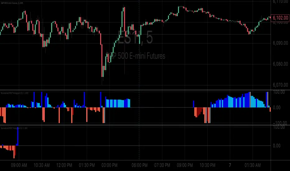
Rate of Change HistogramExplanation of Modifications
Converting ROC to Histogram:
Original ROC: The ROC is calculated as roc = 100 * (source - source ) / source , plotted as a line oscillating around zero.
Modification: Instead of plotting roc as a line, it’s now plotted as a histogram using style=plot.style_columns. This makes the ROC values visually resemble the MACD histogram, with bars extending above or below the zero line based on momentum.
Applying MACD’s Four-Color Scheme:
Logic: The histogram’s color is determined by:
Above Zero (roc >= 0): Bright green (#26A69A) if ROC is rising (roc > roc ), light green (#B2DFDB) if falling (roc < roc ).
Below Zero (roc < 0): Bright red (#FF5252) if ROC is falling (roc < roc ), light red (#FFCDD2) if rising (roc > roc ).
Implementation: Used the exact color logic and hex codes from the MACD code, applied to the ROC histogram. This highlights momentum ebbs (falling ROC, fading waves) and flows (rising ROC, strengthening waves).
Removing Signal Line:
Unlike the previous attempt, no signal line is added. The histogram is purely the ROC value, ensuring it directly reflects price change momentum without additional smoothing, making it faster and more responsive to pulse waves, as you indicated ROC performs better than other oscillators.
Alert Conditions:
Added alerts to match the MACD’s logic, triggering when the ROC histogram crosses the zero line:
Rising to Falling: When roc >= 0 and roc < 0, signaling a potential wave peak (e.g., end of Wave 3 or C).
Falling to Rising: When roc <= 0 and roc > 0, indicating a potential wave bottom (e.g., start of Wave 1 or rebound).
These alerts help identify transitions in 3-4 wave pulse patterns.
Plotting:
Histogram: Plotted as columns (plot.style_columns) with the four-color scheme, directly representing ROC momentum.
Zero Line: Kept the gray zero line (#787B86) for reference, consistent with the MACD.
Removed ROC Line/Signal Line: Since you want the ROC to act as the histogram itself, no additional lines are plotted.
Inputs:
Retained the original length (default 9) and source (default close) inputs for consistency.
Removed signal-related inputs (e.g., signal_length, sma_signal) as they’re not needed for a pure ROC histogram.
How This ROC Histogram Works for Wave Pulses
Wave Alignment:
Above Zero (Bullish Momentum): Positive ROC bars indicate flows (e.g., impulse Waves 1, 3, or rebounds in Wave B/C). Bright green bars show accelerating momentum (strong pulses), while light green bars suggest fading momentum (potential wave tops).
Below Zero (Bearish Momentum): Negative ROC bars indicate ebbs (e.g., corrective Waves 2, 4, A, or C). Bright red bars show increasing bearish momentum (strong pullbacks), while light red bars suggest slowing declines (potential wave bottoms).
3-4 Wave Pulses:
In a 3-wave A-B-C correction: Wave A (down) shows bright red bars (falling ROC), Wave B (up) shows bright/light green bars (rising ROC), and Wave C (down) shifts back to red bars.
In a 4-wave consolidation: Alternating green/red bars highlight the rhythmic ebbs and flows as momentum oscillates.
Timing:
Zero-line crossovers mark wave transitions (e.g., from Wave 2 to Wave 3).
Color changes (e.g., bright to light green) signal momentum shifts within waves, helping identify pulse peaks/troughs.
Advantages Over MACD:
The ROC histogram is more responsive than the MACD histogram because ROC directly measures price change percentage, while MACD relies on moving average differences, which introduce lag. This makes the ROC histogram better for capturing rapid 3-4 wave pulses, as you noted.
Example Usage
For a stock with 3-4 wave pulses on a 5-minute chart:
Wave 1 (Flow): ROC rises above zero, histogram turns bright green (rising momentum), indicating a strong bullish pulse.
Wave 2 (Ebb): ROC falls below zero, histogram shifts to bright red (falling momentum), signaling a corrective pullback.
Wave 3 (Flow): ROC crosses back above zero, histogram becomes bright green again, confirming a powerful pulse.
Wave 4 (Ebb): ROC dips slightly, histogram turns light green (falling momentum above zero) or light red (rising momentum below zero), indicating consolidation.
Alerts trigger on zero-line crosses (e.g., from Wave 2 to Wave 3), helping time trades.
Settings Recommendations
Default (length=9): Works well for most time frames, balancing sensitivity and smoothness.
Intraday Pulses: Use length=5 or length=7 for faster signals on 5-minute or 15-minute charts.
Daily Charts: Try length=12 or length=14 for broader wave cycles.
Testing: Apply to a stock with clear wave patterns (e.g., tech stocks like AAPL or TSLA) and adjust length to match the pulse frequency you observe.
Notes
Confirmation: Pair the ROC histogram with price action (e.g., Fibonacci retracements, support/resistance) to validate wave counts, as momentum oscillators can be noisy in choppy markets.
Divergences: Watch for divergences (e.g., price makes a higher high, but ROC histogram bars are lower) to spot wave reversals, especially at Wave 3 or C ends.
Comparison to MACD: The ROC histogram is faster and more direct, making it ideal for short-term pulse waves, but it may be more volatile, so use with technical levels for precision.
"roc"に関するスクリプトを検索

RSI ROC Signals with Price Action# RSI ROC Signals with Price Action
## Overview
The RSI ROC (Rate of Change) Signals indicator is an advanced momentum-based trading system that combines RSI velocity analysis with price action confirmation to generate high-probability buy and sell signals. This indicator goes beyond traditional RSI analysis by measuring the speed of RSI changes and requiring price confirmation before triggering signals.
## Core Concept: RSI Rate of Change (ROC)
### What is RSI ROC?
RSI ROC measures the **velocity** or **acceleration** of the RSI indicator, providing insights into momentum shifts before they become apparent in traditional RSI readings.
**Formula**: `RSI ROC = ((Current RSI - Previous RSI) / Previous RSI) × 100`
### Why RSI ROC is Superior to Standard RSI:
1. **Early Momentum Detection**: Identifies momentum shifts before RSI reaches traditional overbought/oversold levels
2. **Velocity Analysis**: Measures the speed of momentum changes, not just absolute levels
3. **Reduced False Signals**: Filters out weak momentum moves that don't sustain
4. **Dynamic Thresholds**: Adapts to market volatility rather than using fixed RSI levels
5. **Leading Indicator**: Provides earlier signals compared to traditional RSI crossovers
## Signal Generation Logic
### 🟢 Buy Signal Process (3-Stage System):
#### Stage 1: Trigger Activation
- **RSI ROC** > threshold (default 7%) - RSI accelerating upward
- **Price ROC** > 0 - Price moving higher
- Records the **trigger high** (highest point during trigger)
#### Stage 2: Invalidation Check
- Signal invalidated if **RSI ROC** drops below negative threshold
- Prevents false signals during momentum reversals
#### Stage 3: Confirmation
- **Price breaks above trigger high** - Price action confirmation
- **Current candle is green** (close > open) - Bullish price action
- **State alternation** - Ensures no consecutive duplicate signals
### 🔴 Sell Signal Process (3-Stage System):
#### Stage 1: Trigger Activation
- **RSI ROC** < negative threshold (default -7%) - RSI accelerating downward
- **Price ROC** < 0 - Price moving lower
- Records the **trigger low** (lowest point during trigger)
#### Stage 2: Invalidation Check
- Signal invalidated if **RSI ROC** rises above positive threshold
- Prevents false signals during momentum reversals
#### Stage 3: Confirmation
- **Price breaks below trigger low** - Price action confirmation
- **Current candle is red** (close < open) - Bearish price action
- **State alternation** - Ensures no consecutive duplicate signals
## Key Features
### 🎯 **Smart Signal Management**
- **State Alternation**: Prevents signal clustering by alternating between buy/sell states
- **Trigger Invalidation**: Automatically cancels weak signals that lose momentum
- **Price Confirmation**: Requires actual price breakouts, not just momentum shifts
- **No Repainting**: Signals are confirmed and won't disappear or change
### ⚙️ **Customizable Parameters**
#### **RSI Length (Default: 14)**
- Standard RSI calculation period
- Shorter periods = more sensitive to price changes
- Longer periods = smoother, less noisy signals
#### **Lookback Period (Default: 1)**
- Period for ROC calculations
- 1 = compares to previous bar (most responsive)
- Higher values = smoother momentum detection
#### **RSI ROC Threshold (Default: 7%)**
- Minimum RSI velocity required for signal trigger
- Lower values = more signals, potentially more noise
- Higher values = fewer but higher-quality signals
### 📊 **Visual Signals**
- **Green Arrow Up**: Buy signal below price bar
- **Red Arrow Down**: Sell signal above price bar
- **Clean Chart**: No additional lines or oscillators cluttering the view
- **Size Options**: Customizable arrow sizes for visibility preferences
## Advantages Over Traditional Indicators
### vs. Standard RSI:
✅ **Earlier Signals**: Detects momentum changes before RSI reaches extremes
✅ **Dynamic Thresholds**: Adapts to market conditions vs. fixed 30/70 levels
✅ **Velocity Focus**: Measures momentum speed, not just position
✅ **Better Timing**: Combines momentum with price action confirmation
### vs. Moving Average Crossovers:
✅ **Leading vs. Lagging**: RSI ROC is forward-looking vs. backward-looking MAs
✅ **Volatility Adaptive**: Automatically adjusts to market volatility
✅ **Fewer Whipsaws**: Built-in invalidation logic reduces false signals
✅ **Momentum Focus**: Captures acceleration, not just direction changes
### vs. MACD:
✅ **Price-Normalized**: RSI ROC works consistently across different price ranges
✅ **Simpler Logic**: Clear trigger/confirmation process vs. complex crossovers
✅ **Built-in Filters**: Automatic signal quality control
✅ **State Management**: Prevents over-trading through alternation logic
## Trading Applications
### 📈 **Trend Following**
- Use in trending markets to catch momentum continuations
- Combine with trend filters for directional bias
- Excellent for breakout strategies
### 🔄 **Swing Trading**
- Ideal timeframes: 4H, Daily, Weekly
- Captures major momentum shifts
- Perfect for position entries/exits
### ⚡ **Scalping (Advanced Users)**
- Lower timeframes: 1m, 5m, 15m
- Reduce threshold for more frequent signals
- Combine with volume confirmation
### 🎯 **Momentum Strategies**
- Perfect for momentum-based trading systems
- Identifies acceleration phases in trends
- Complements breakout and continuation patterns
## Optimization Guidelines
### **Conservative Settings (Lower Risk)**
- RSI Length: 21
- ROC Threshold: 10%
- Lookback: 2
### **Standard Settings (Balanced)**
- RSI Length: 14 (default)
- ROC Threshold: 7% (default)
- Lookback: 1 (default)
### **Aggressive Settings (Higher Frequency)**
- RSI Length: 7
- ROC Threshold: 5%
- Lookback: 1
## Best Practices
### 🎯 **Entry Strategy**
1. Wait for signal arrow confirmation
2. Consider market context (trend, support/resistance)
3. Use proper position sizing based on volatility
4. Set stop-loss below/above trigger levels
### 🛡️ **Risk Management**
1. **Stop Loss**: Place beyond trigger high/low levels
2. **Position Sizing**: Use 1-2% risk per trade
3. **Market Context**: Avoid counter-trend signals in strong trends
4. **Time Filters**: Consider avoiding signals near major news events
### 📊 **Backtesting Recommendations**
1. Test on multiple timeframes and instruments
2. Analyze win rate vs. average win/loss ratio
3. Consider transaction costs in backtesting
4. Optimize threshold values for different market conditions
## Technical Specifications
- **Pine Script Version**: v6
- **Signal Type**: Non-repainting, confirmed signals
- **Calculation Basis**: RSI velocity with price action confirmation
- **Update Frequency**: Real-time on bar close
- **Memory Management**: Efficient state tracking with minimal resource usage
## Ideal For:
- **Momentum Traders**: Captures acceleration phases
- **Swing Traders**: Medium-term position entries/exits
- **Breakout Traders**: Confirms momentum behind breakouts
- **System Traders**: Mechanical signal generation with clear rules
This indicator represents a significant evolution in momentum analysis, combining the reliability of RSI with the precision of rate-of-change analysis and the confirmation of price action. It's designed for traders who want sophisticated momentum detection with built-in quality controls.

RedK_Relative (Dual) Rate Of Change v1 - RROC v1Quick Summary
==============
The Relative Rate of Change (RRoC) is an expanded version of the classic Rate of Change (RoC) indicator - we apply couple of changes to bring additional insights and signals from that classic Technical Analysis concept - which can help us better visualize the "relative speed of change" of a stock (or whatever we trade), and can work specifically as a "breakout finder" .. please read on if this can be valuable to your trading.
First, a quick review of what is the classic Rate of Change (RoC) - The below part is from Investopedia definition of RoC
-----------------------------------------------------------------------------------
www.investopedia.com
What is Rate of Change (ROC)
The rate of change (ROC) is the speed at which a variable changes over a specific period of time.
ROC is often used when speaking about momentum, and it can generally be expressed as a ratio between a change in one variable relative to a corresponding change in another; graphically, the rate of change is represented by the slope of a line.
Understanding Rate of Change (ROC)
Rate of change is used to mathematically describe the percentage change in value over a defined period of time, and it represents the momentum of a variable .
The calculation for ROC is simple in that it takes the current value of a stock or index and divides it by the value from an earlier period.
Subtract one and multiply the resulting number by 100 to give it a percentage representation.
ROC = (current value / previous value - 1) * 100
-------------------------------------------------------------------------------------------------
What changes did we make to the RoC?
====================================
(1) - Per the official definition, the original RoC should provide a "rate of change" - i.e., we should say "the 5-bar average price change for AAPL is x% per bar" - now norice that the formula doesn't divide by the number of bars (length) -- so the reality is, the results is more of "the 5-bar price change for apple is x% for the full 5 bar length"
- what is wrong with that ? nothing really, but it's harder to use that number to set my trade target or exit. i need the indicator to give me a number that represents the "average change per bar" so i can use it to "design my trade target and my exit loss" -- so in the RRoC, we divide the change by the number of bars used in the settings
The updated formula would be : RoC = (current value / previous value -1 ) * 100 / length
(2) - Dual Length: we make the RoC relative, by adding a longer (or slow) RoC
- the idea here is simple - imagine you're driving your car beside a moving train, your car will not "breakout" from the train until your speed (= distance gain per unit of time) is faster than the train - so in reality, your baseline is not 0 speed, it's the speed of that train your racing against -- makes sense?
- so we add a second length that can act as a baseline - when the Fast RoC exceeds the Slow RoC (your car is faster than the train), a breakout would possibly occur - that breakout may fail (if something interrupts it - my car may breakdown if it can't handle the faster speed :) ) or it can fully materialize if the "context" is favorable.
as we can see on the above chart, we can use the RRoC to identify an incoming possible breakout using that simple "relative speed" concept - and that setup happened not once but twice in our example
the interpretation of this for AAPL would be (for example): "AAPL has been making an average change of 0.22% in the past 20 days, but for the last 5 days, the average change was 0.35% - so it looks like AAPL is gaining short term momentum and may break-out soon"
(3) this is another strong feature: Use for broader context:
- we can set the RRoC for a resolution of - for example - a day, while we look at the 1 hour chart - giving us the ability to trade on a smaller timeframe in the context of a larger timeframe .. this is more of an advanced feature but i hope some will be able to leverage it.
Here's a side-by-side comparison of RRoC vs the classic (built-in) RoC indicator
Conclusion:
============
- The (Relative Rate of Change) RRoC expands on the concepts presented by the classic Rate of Change (RoC) indicator and enables additional insights - especially around the discovery of potential price breakout
- leverage the RRoC indicator settings to tweak it to how your trade (fast length, slow length, resolution, smoothing). the defaults should work for any instrument but may not necessarily be the optimal settings
- use in conjunction with other indicators that can show trend and prevailing sentiment / context - to ensure you get proper confirmation and please get very familiar with how the RRoC works before you use it for live trading.
Comments are welcome - Best of luck
-

Nasan Rate of Change (ROC)**NOTE: FOR COMPARISON TRADITIONAL ROC IS PLOTTED WITH THE SAME ROC LENGTH OF 9. IT IS NOT PART OF THE INDICATOR"
The Nasan ROC indicator is smoothed version of the of the traditional ROC indicator. The Nasna ROC uses a triple pass moving average differencing strategy. A cumulative sum of the deviations obtained from the moving average differencing provides a smooth "noise free" trend and this cumulative sum of deviations is used for calculating ROC.
Let's break down the components and understand the indicator we discussed earlier:
Sequential Triple Pass Filter:
Three filters with lengths specified by length1, length2, and length3 are applied to the closing prices (close).
The filters involve calculating the cumulative sum of the differences between the closing prices and their respective moving averages.
The idea is to detrend the data and accumulate the deviations from the average over time, emphasizing longer-term trends.
Calculation of Rate of Change (ROC) of Cumulative Sum:
The Rate of Change (ROC) of the cumulative sum (rocCumulativeSum) is calculated using the ta.roc function with a specified length (rocLength).
ROC measures the percentage change in the cumulative sum over a specified period.
The ROC histogram provides insights into the momentum of the detrended series. Positive values suggest increasing momentum, while negative values suggest decreasing momentum.
Pay attention to the color of the histogram bars.
The histogram bars are colored green if the current ROC value is greater than or equal to the previous ROC value, and red otherwise.
This coloring is based on the concept that a positive ROC suggests upward momentum, while a negative ROC suggests downward momentum.
Volatility - Volume Impact:
The Average True Range (ATR) is calculated with a period of 14.
Volume strength is calculated as a factor (VCF) that considers the ratio of the simple moving average (SMA) of the current volume to the SMA of the volume over a longer period (144).
This volume factor (VCF) is then multiplied by ATR, creating a synergy with volatility and volume.
Visualization with Background Color Gradient:
A background color gradient is applied to the chart based on the calculated volume strength (f1).
The gradient color ranges from black (indicating low ATR and volume strength) to purple (indicating high ATR and volume strength). A low value indicates a ranging market with no significant price movements and it is safter to avoid signals generated from ROC histogram in these region.
Synergy of ROC and Volume Strength:
Observe how the ROC signals align with the background color gradient. For example, confirm whether positive ROC aligns with periods of high ATR and volume strength.
This synergy can provide confirmation or divergence signals, adding another layer of analysis.

Volume ROC (smoothed)Description
The Volume ROC (Rate of Change) indicator is designed to measure the momentum of trading volume over a user-defined period, adjusted for the trading session length of the symbol (e.g., 8.5 hours for the FTSEMIB index). This makes it particularly useful for intraday charts where standard daily calculations might not align with actual trading days.
By focusing on volume changes rather than price, it helps identify potential shifts in market participation, such as accumulation, distribution, or unusual activity that could precede price movements.
How It Works:
Session Adjustment:
The indicator calculates the number of candles per trading day based on the input session duration (in hours) and the chart's timeframe. This ensures that the ROC and other calculations are based on "trading days" rather than calendar days, making it adaptable to markets with non-standard hours like European indices (e.g., FTSEMIB).
Daily Data Fetch:
It retrieves daily high, low, close, and volume data using "request.security" to ensure consistency across timeframes.
ROC Calculation:
The Rate of Change (ROC) is computed on volume using "ta.change" over the specified length (in days), multiplied by the candles-per-day factor for timeframe independence. By chosing the subtraction method instead of the division method we avoid distortions of the ROC below the zero line (method ok for timespans inferior to two years).
Smoothing with SMA:
A Simple Moving Average (SMA) is applied to the ROC to reduce noise and highlight trends in volume momentum.
Standard Deviation Bands:
The standard deviation of the smoothed ROC is calculated over a lookback period. Bands are plotted at +2σ (overbought) and -2σ (oversold) to provide context for extreme volume changes, similar to Bollinger Bands but applied to volume ROC.
Key Plots:
SMA Line (Orange): The smoothed ROC value. Positive values indicate increasing volume momentum; negative values suggest decreasing momentum.
Zero Line (Black Dotted): A reference line at 0, separating positive and negative ROC territories.
+2σ Band (Red Dotted): Upper overbought threshold. Crossings above this may signal excessive buying volume.
-2σ Band (Green Dotted): Lower oversold threshold. Dips below this could indicate capitulation or low interest.
Usage and Interpretation:
Trend Confirmation:
Use the SMA crossing above/below zero to confirm price trends with volume backing. For example, a rising price with positive Volume ROC suggests strong conviction.
Divergences:
Look for divergences between price and Volume ROC (e.g., price making new highs but ROC weakening), which can signal reversals.
Overbought/Oversold Signals:
The ±2σ bands act as dynamic levels. Volume ROC spiking above +2σ might precede pullbacks, while below -2σ could indicate buying opportunities.
Best Applied To:
European indices (like FTSEMIB or DAX), stocks, or futures with defined session hours. Test on intraday (e.g., 2h) and combine with price-based indicators like RSI or MACD for confluence.
Customization:
Adjust the ROC/SMA lengths for sensitivity (shorter for scalping, longer for swings). The STDEV lookback affects band width—longer periods create smoother bands.
Limitations:
Volume data can be noisy in low-liquidity symbols. This indicator assumes consistent session lengths; irregular holidays may affect accuracy. Always backtest and use with risk management.
This indicator is original and built for educational/trading purposes.

RSI Rate of Change (ROC of RSI)The RSI Rate of Change (ROC of RSI) indicator measures the speed and momentum of changes in the RSI, helping traders identify early trend shifts, strength of price moves, and potential reversals before they appear on the standard RSI.
While RSI shows overbought and oversold conditions, the ROC of RSI reveals how fast RSI itself is rising or falling, offering a deeper view of market momentum.
How the Indicator Works
1. RSI Calculation
The indicator first calculates the classic Relative Strength Index (RSI) using the selected length (default 14). This measures the strength of recent price movements.
2. Rate of Change (ROC) of RSI
Next, it computes the Rate of Change (ROC) of the RSI over a user-defined period.
This shows:
Positive ROC → RSI increasing quickly → strong bullish momentum
Negative ROC → RSI decreasing quickly → strong bearish momentum
ROC crossing above/below 0 → potential early trend shift
What You See on the Chart
Blue Line: RSI
Red Line: ROC of RSI
Grey dotted Zero Line: Momentum reference
Why Traders Use It
The RSI ROC helps you:
Detect momentum reversals early
Spot bullish and bearish accelerations not visible on RSI alone
Identify exhaustion points before RSI reaches extremes
Improve entry/exit precision in trend and swing trading
Validate price breakouts or breakdowns with momentum confirmation
Best For
Swing traders
Momentum traders
Reversal traders
Trend-following systems needing early confirmation signals
Heikin Ashi ROC Percentile Strategy**User Guide for the "Heikin Ashi ROC Percentile Strategy"**
This strategy, "Heikin Ashi ROC Percentile Strategy", is designed to provide an easy-to-use framework for trading based on the Heikin Ashi Rate of Change (ROC) and its percentiles.
Here's how you can use it:
1. **Setting the Start Date**: You can set the start date for the strategy in the user inputs at the top of the script. The variable `startDate` defines the point from which the script begins executing trades. Simply input the desired date in the format "YYYY MM DD". For example, to start the strategy from March 3, 2023, you would enter `startDate = timestamp("2023 03 03")`.
2. **Adjusting the Midline, Lookback Period, and Stop Loss Level**: The `zerohLine`, `rocLength`, and `stopLossLevel` inputs allow you to adjust the baseline for ROC, the lookback period for the SMA and ROC, and the level at which the strategy stops the loss, respectively. By tweaking these parameters, you can fine-tune the strategy to better suit your trading style or the particular characteristics of the asset you are trading.
3. **Understanding the Trade Conditions**: The script defines conditions for entering and exiting long and short positions based on crossovers and crossunders of the ROC and the upper and lower "kill lines". These lines are defined as certain percentiles of the ROC's highest and lowest values over a specified lookback period. When the ROC crosses above the lower kill line, the script enters a long position; when it crosses below the upper kill line, it exits the position. Similarly, when the ROC crosses below the upper kill line, the script enters a short position; when it crosses above the lower kill line, it exits the position.
In my testing, this strategy performed best on a day and hour basis. However, I encourage you to experiment with different timeframes and settings to see how the strategy performs under various conditions. Remember, there's no one-size-fits-all approach to trading; what works best will depend on your specific circumstances, goals, and risk tolerance.
If you find other useful applications for this strategy, please let me know in the comments. Your feedback is invaluable in helping to refine and improve this tool. Happy trading!
Multi Rate of Change (ROC) - 3 LinesMulti Rate of Change (ROC) - 3 Lines
This custom indicator displays three Rate of Change (ROC) lines, each with independently adjustable lookback periods (default: 7, 30, and 100 days). It allows you to quickly compare short-, mid-, and long-term price momentum on the same chart.
All ROC lines show the percent change of the close price compared to N bars ago.
The color, thickness, and style (solid, dotted, dashed) of each ROC line can be customized in the settings.
A zero reference line is included and can also be customized.
Suitable for momentum analysis and identifying trend acceleration or deceleration at multiple timeframes.
Designed for easy use: simply add the indicator to your chart and adjust the settings as needed.
How to use:
Add the indicator to your chart.
Set each ROC period (e.g., 7, 30, 100 days) as desired.
Adjust colors, line widths, and styles for better visibility.
Interpret positive ROC values as upward momentum, negative values as downward momentum.
No repainting. All calculations use close prices only.
If you need more ROC lines or additional features, let me know!

Weighted US Liquidity ROC Indicator with FED RatesThe Weighted US Liquidity ROC Indicator is a technical indicator that measures the Rate of Change (ROC) of a weighted liquidity index. This index aggregates multiple monetary and liquidity measures to provide a comprehensive view of liquidity in the economy. The ROC of the liquidity index indicates the relative change in this index over a specified period, helping to identify trend changes and market movements.
1. Liquidity Components:
The indicator incorporates various monetary and liquidity measures, including M1, M2, the monetary base, total reserves of depository institutions, money market funds, commercial paper, and repurchase agreements (repos). Each of these components is assigned a weight that reflects its relative importance to overall liquidity.
2. ROC Calculation:
The Rate of Change (ROC) of the weighted liquidity index is calculated by finding the difference between the current value of the index and its value from a previous period (ROC period), then dividing this difference by the value from the previous period. This gives the percentage increase or decrease in the index.
3. Visualization:
The ROC value is plotted as a histogram, with positive and negative changes indicated by different colors. The Federal Funds Rate is also plotted separately to show the impact of central bank policy on liquidity.
Discussion of the Relationship Between Liquidity and Stock Market Returns
The relationship between liquidity and stock market returns has been extensively studied in financial economics. Here are some key insights supported by scientific research:
Liquidity and Stock Returns:
Liquidity Premium Theory: One of the primary theories is the liquidity premium theory, which suggests that assets with higher liquidity typically offer lower returns because investors are willing to accept lower yields for more liquid assets. Conversely, assets with lower liquidity may offer higher returns to compensate for the increased risk associated with their illiquidity (Amihud & Mendelson, 1986).
Empirical Evidence: Research by Fama and French (1992) has shown that liquidity is an important factor in explaining stock returns. Their studies suggest that stocks with lower liquidity tend to have higher expected returns, aligning with the liquidity premium theory.
Market Impact of Liquidity Changes:
Liquidity Shocks: Changes in liquidity can impact stock returns significantly. For example, an increase in liquidity is often associated with higher stock prices, as it reduces the cost of trading and enhances market efficiency (Chordia, Roll, & Subrahmanyam, 2000). Conversely, a liquidity shock, such as a sudden decrease in market liquidity, can lead to higher volatility and lower stock prices.
Financial Crises: During financial crises, liquidity tends to dry up, leading to sharp declines in stock market returns. For instance, studies on the 2008 financial crisis illustrate how a reduction in market liquidity exacerbated the decline in stock prices (Brunnermeier & Pedersen, 2009).
Central Bank Policies and Liquidity:
Monetary Policy Impact: Central bank policies, such as changes in the Federal Funds Rate, directly influence market liquidity. Lower interest rates generally increase liquidity by making borrowing cheaper, which can lead to higher stock market returns. On the other hand, higher rates can reduce liquidity and negatively impact stock prices (Bernanke & Gertler, 1999).
Policy Expectations: The anticipation of changes in monetary policy can also affect stock market returns. For example, expectations of rate cuts can lead to a rise in stock prices even before the actual policy change occurs (Kuttner, 2001).
Key References:
Amihud, Y., & Mendelson, H. (1986). "Asset Pricing and the Bid-Ask Spread." Journal of Financial Economics, 17(2), 223-249.
Fama, E. F., & French, K. R. (1992). "The Cross-Section of Expected Stock Returns." Journal of Finance, 47(2), 427-465.
Chordia, T., Roll, R., & Subrahmanyam, A. (2000). "Market Liquidity and Trading Activity." Journal of Finance, 55(2), 265-289.
Brunnermeier, M. K., & Pedersen, L. H. (2009). "Market Liquidity and Funding Liquidity." Review of Financial Studies, 22(6), 2201-2238.
Bernanke, B. S., & Gertler, M. (1999). "Monetary Policy and Asset Prices." NBER Working Paper No. 7559.
Kuttner, K. N. (2001). "Monetary Policy Surprises and Interest Rates: Evidence from the Fed Funds Futures Market." Journal of Monetary Economics, 47(3), 523-544.
These studies collectively highlight how liquidity influences stock market returns and how changes in liquidity conditions, influenced by monetary policy and other factors, can significantly impact stock prices and market stability.

Global Liquidity - Impulse (ROC & Z-score) [GMI-style]What it is:
Liquidity is a faucet. When central banks add money, the faucet opens (risk-on). When they pull money out, it closes (risk-off). This indicator builds a global net-liquidity proxy and shows its impulse :
- ROC (green/red histogram): % change vs N weeks ago.
- Z-score (cyan line): how unusually strong the latest weekly move is.
Why it matters:
Liquidity impulse often leads risk assets (equities/crypto) by weeks to a few months.
- Green bars > 0 + positive Z → friendlier risk-on backdrop.
- Red bars < 0 + negative Z → tightening conditions; caution.
Data used (TV Economics / FRED):
USA (FRED, millions USD):
- FRED:WALCL (Fed assets)
- FRED:RRPONTSYD (Reverse Repo – subtract)
- FRED:WTREGEN (Treasury General Account – subtract)
Other CBs (Economics, units vary):
- ECONOMICS:EUCBBS (ECB)
- ECONOMICS:JPCBBS (BoJ)
- ECONOMICS:CNCBBS (PBoC)
Optional:
- ECONOMICS:GBCBBS (BoE, UK)
- ECONOMICS:CACBBS (BoC, Canada)
- ECONOMICS:CHCBBS (SNB, Switzerland)
- ECONOMICS:AUCBBS (RBA, Australia)
Proxy (scaled to billions):
(Fed − RRP − TGA) + ECB + BoJ + PBoC +
How to read:
- Green bars above 0 = faucet opening → money in → risk-on.
- Red bars below 0 = faucet closing → money out → risk-off.
- Taller bar = stronger push.
- Cyan Z > +1 = unusually strong positive impulse; Z < −1 = unusually strong negative impulse.
- Background : green when ROC>0 & Z>0 , red when ROC<0 & Z<0 .
Quick reading guide (TL;DR):
- Early risk-on: ROC crosses > 0 and Z > 0 (ideally Z ≥ +1 ).
- Early risk-off: ROC crosses < 0 and Z < 0 (ideally Z ≤ −1 ).
- Use weekly timeframe; price often reacts with a 0–12 week lag.
- Combine with PMIs/New Orders, real yields (down), and credit spreads (narrowing).
Notes:
Symbols may differ by provider; leave optional banks OFF if missing. Currencies/units differ across CBs; this is a pragmatic proxy, not a perfect macro model. Educational use only; not financial advice.

Institutional Momentum Zones (ADX+ROC+DI+MACD+Filters)Institutional Momentum Zones (ADX + ROC + DI + MACD + Filters)
This indicator is designed to help traders visually identify Bullish, Neutral, and Bearish momentum zones on Nifty, indices, or any liquid asset, using a rules-based, institutional-style approach.
It combines multiple professional-grade momentum and trend filters into a single framework:
ADX (Average Directional Index) – Measures trend strength, filters out choppy conditions.
Directional Indicators (+DI / –DI) – Confirms whether bulls or bears are in control.
ROC (Rate of Change) – Quantifies momentum speed and direction.
MACD (optional) – Adds confirmation by checking multi-timeframe momentum alignment.
EMA Filters (optional) – Ensures price is in alignment with long-term trend bias.
Supertrend (optional) – Can be enabled for additional trend confirmation.
How it works:
Bullish Zone (Green) → Strong trend (ADX > threshold) + upward momentum (ROC > 0, +DI > –DI) + optional EMA/MACD/Supertrend confirmation.
Bearish Zone (Red) → Strong trend (ADX > threshold) + downward momentum (ROC < 0, –DI > +DI) + optional EMA/MACD/Supertrend confirmation.
Neutral Zone (Yellow) → Low trend strength (ADX < threshold) or mixed momentum signals.
Features:
Automatic background coloring for zone detection.
On-chart labels marking new zone changes.
EMA50 / EMA200 and Supertrend overlay options.
Signal markers for bullish/bearish entries.
Info panel with live ADX, ROC, DI values, and MACD histogram.
Alert conditions for zone changes (Bull, Bear, Neutral).
Best used for:
Index momentum tracking (e.g., Nifty, Bank Nifty, Dow, S&P500)
Swing trading & positional trading strategies
Filtering trades to avoid entering during low-momentum chop
Tip: For Nifty positional trading, use Daily or 4H charts with EMA & MACD filters enabled for cleaner, high-confidence signals.

Smoothed ROC Z-Score with TableSmoothed ROC Z-Score with Table
This indicator calculates the Rate of Change (ROC) of a chosen price source and transforms it into a smoothed Z-Score oscillator, allowing you to identify market cycle tops and bottoms with reduced noise.
How it works:
The ROC is calculated over a user-defined length.
A moving average and standard deviation over a separate window are used to standardize the ROC into a Z-Score.
This Z-Score is further smoothed using an exponential moving average (EMA) to filter noise and highlight clearer cycle signals.
The smoothed Z-Score oscillates around zero, with upper and lower bands defined by user inputs (default ±2 standard deviations).
When the Z-Score reaches or exceeds ±3 (customizable), the value shown in the table is clamped at ±2 for clearer interpretation.
The indicator plots the smoothed Z-Score line with zero and band lines, and displays a colored Z-Score table on the right for quick reference.
How to read it:
Values near zero indicate neutral momentum.
Rising Z-Scores towards the upper band suggest increasing positive momentum, possible market tops or strength.
Falling Z-Scores towards the lower band indicate negative momentum, potential bottoms or weakness.
The color-coded table gives an easy visual cue: red/orange for strong positive signals, green/teal for strong negative signals, and gray for neutral zones.
Use cases:
Identify turning points in trending markets.
Filter noisy ROC data for cleaner signals.
Combine with other indicators to time entries and exits more effectively.

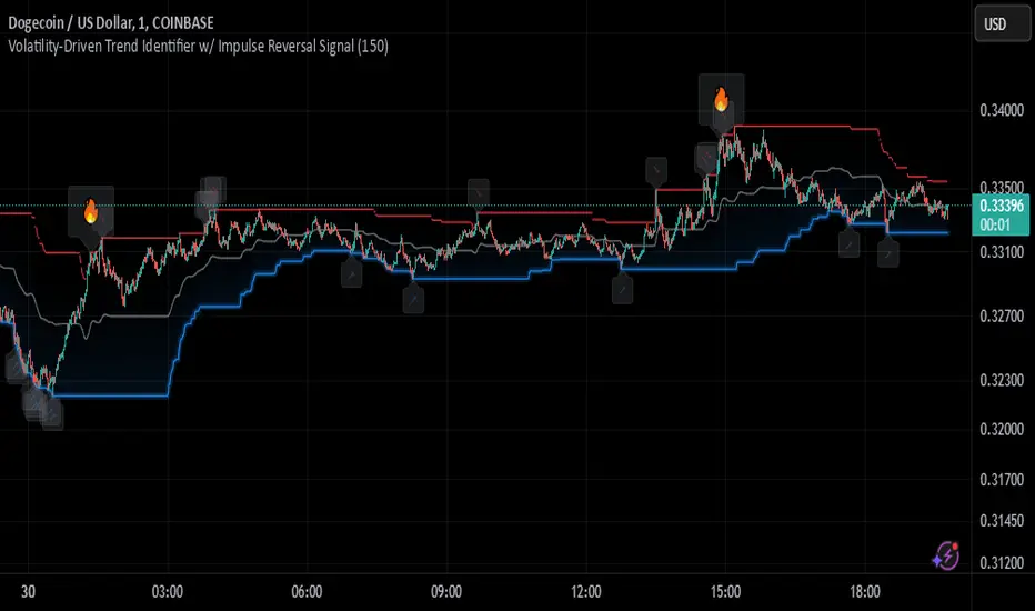
Johnny's Volatility-Driven Trend Identifier w/ Reversal SignalsJohnny's Volatility-Driven Trend Identifier w/ Reversal Signals is designed to identify high-probability trend shifts and reversals by incorporating volatility, momentum, and impulse-based filtering. It is specifically built for traders who want to capture strong trend movements while minimizing false signals caused by low volatility noise.
By leveraging Rate of Change (ROC), Relative Strength Index (RSI), and Average True Range (ATR)-based volatility detection, the indicator dynamically adapts to market conditions. It highlights breakout trends, reversals, and early signs of momentum shifts using strategically placed labels and color-coded trend visualization.
Inspiration taken from Top G indicator .
What This Indicator Does
The Volatility-Driven Trend Identifier works by:
Measuring Market Extremes & Momentum:
Uses ROC normalization with standard deviation to identify impulse moves in price action.
Implements RSI filtering to determine overbought/oversold conditions that validate trend strength.
Utilizes ATR-based volatility tracking to ensure signals only appear when meaningful market movements are occurring.
Identifying Key Trend Events:
Power Peak (🔥): Marks a confirmed strong downtrend, ideal for shorting opportunities.
Surge (🚀): Indicates a confirmed strong uptrend, signaling a potential long entry.
Soft Surge (↗): Highlights a mild bullish reentry or early uptrend formation.
Soft Peak (↘): Shows a mild bearish reentry or early downtrend formation.
Providing Adaptive Filtering for Reliable Signals:
Filters out weak trends with a volatility check, ensuring signals appear only in strong market conditions.
Implements multi-level confirmation by combining trend strength metrics, preventing false breakouts.
Uses gradient-based visualization to color-code market sentiment for quick interpretation.
What This Indicator Signals
Breakouts & Impulse Moves: 🚀🔥
The Surge (🚀) and Power Peak (🔥) labels indicate confirmed momentum breakouts, where the trend has been validated by a combination of ROC impulse, RSI confirmation, and ATR volatility filtering.
These signals suggest that the market is entering a strong trend, and traders can align their entries accordingly.
Early Trend Formation & Reentries: ↗ ↘
The Soft Surge (↗) and Soft Peak (↘) labels indicate areas where a trend might be forming, but is not yet fully confirmed.
These signals help traders anticipate potential entries before the trend gains full strength.
Volatility-Adaptive Trend Filtering: 📊
Since the indicator only activates in volatile conditions, it avoids the pitfalls of low-range choppy markets where false signals frequently occur.
ATR-driven adaptive windowing allows the indicator to dynamically adjust its sensitivity based on real-time volatility conditions.
How to Use This Indicator
1. Identifying High-Probability Entries
Bullish Entries (Long Trades)
Look for 🚀 Surge signals in an uptrend.
Confirm with RSI (should be above 50 for momentum).
Ensure volatility is increasing to validate the breakout.
Use ↗ Soft Surge signals for early entries before the trend fully confirms.
Bearish Entries (Short Trades)
Look for 🔥 Power Peak signals in a downtrend.
RSI should be below 50, indicating downward momentum.
Volatility should be rising, ensuring market momentum is strong.
Use ↘ Soft Peak signals for early entries before a full bearish confirmation.
2. Avoiding False Signals
Ignore signals when the market is ranging (low ATR).
Check RSI and ROC alignment to ensure trend confirmation.
Use additional confluences (e.g., price action, support/resistance levels, moving averages) for enhanced accuracy.
3. Trend Confirmation & Filtering
The stronger the trend, the higher the likelihood that Surge (🚀) and Power Peak (🔥) signals will continue in their direction.
Soft Surge (↗) and Soft Peak (↘) act as early warning signals before major breakouts occur.
What Makes This a Machine Learning-Inspired Moving Average?
While this indicator is not a direct implementation of machine learning (as Pine Script lacks AI/ML capabilities), it mimics machine learning principles by adapting dynamically to market conditions using the following techniques:
Adaptive Trend Selection:
It does not rely on fixed moving averages but instead adapts dynamically based on volatility expansion and momentum detection.
ATR-based filtering adjusts the indicator’s sensitivity to real-time conditions.
Multi-Factor Confirmation (Feature Engineering Equivalent in ML):
Combines ROC, RSI, and ATR in a structured way, similar to how ML models use multiple inputs to filter and classify data.
Implements conditional trend recognition, ensuring that only valid signals pass through the filter.
Noise Reduction with Data Smoothing:
The algorithm avoids false signals by incorporating trend intensity thresholds, much like how ML models remove outliers to refine predictions.
Adaptive filtering ensures that low-volatility environments do not produce misleading signals.
Why Use This Indicator?
✔ Reduces False Signals: Multi-factor validation ensures only high-confidence signals are triggered.
✔ Works in All Market Conditions: Volatility-adaptive nature allows the indicator to perform well in both trending and ranging markets.
✔ Great for Swing & Intraday Trading: It helps spot momentum shifts early and allows traders to catch major market moves before they fully develop.
✔ Visually Intuitive: Color-coded trends and clear signal markers make it easy to interpret.
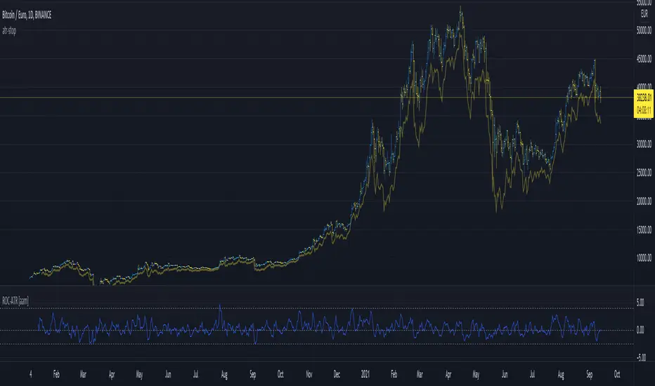
Rate Of Change ATRThis is a very basic, but powerful script.
It gives you the ratio between the rate of change of the last x days and the average true range of the last y days.
---> ROC-ATR Ratio = ROC/ATR
Therefore, you can see how much the price has moved relative to the prices in the past.
This is important because (in my opinion) the basic ROC indicator is not very meaningful if you don't look at the average volatility of recent history.
For example, a ROC of 5% over the last 3 days might be very high for Forex but very small for some crypto.
Consequently, this indicator makes it possible to compare (and be used on) every instrument in every industry the same way.
Generally speaking, it makes more sense if the ATR length is larger than the ROC length.
SMH_DualMomentum (ROC + Volume Trend)SMH Dual Momentum (ROC + Volume Confirmation)
This indicator identifies high-quality bullish trends by combining price momentum (Rate of Change) with volume confirmation, and exits when momentum structurally fails.
Core Logic
BUY signal
Rate of Change (ROC) over N periods is above a positive threshold (strong upside momentum)
Current volume is above its moving average (rising market participation)
SELL signal
ROC crosses below zero, indicating loss of bullish momentum
Why It Works
ROC measures the speed and strength of price movement, filtering out weak or drifting trends
Volume confirmation ensures momentum is supported by real capital flow, reducing false breakouts
Momentum-based exit avoids prolonged drawdowns and capital stagnation
Key Advantages
Focuses on trend continuation, not prediction
Filters out low-quality price moves and range-bound markets
Captures long, high-conviction trends with relatively few trades
Simple, robust rules using only price and volume
Best Use Cases
Designed for trend-driven ETFs such as SMH (Semiconductors)
Suitable for swing to position trading on daily charts
Works best in markets with strong sector rotation and institutional participation
Notes
This is a trend-following momentum tool, not a mean-reversion indicator
No stop-loss is built in; risk management should be handled externally if required
Parameters can be adjusted to match different timeframes or assets

SMH DualMomentum Signals (ROC + Volume)SMH Dual Momentum (ROC + Volume Confirmation)
This indicator identifies high-quality bullish trends by combining price momentum (Rate of Change) with volume confirmation, and exits when momentum structurally fails.
Core Logic
BUY signal
Rate of Change (ROC) over N periods is above a positive threshold (strong upside momentum)
Current volume is above its moving average (rising market participation)
SELL signal
ROC crosses below zero, indicating loss of bullish momentum
Why It Works
ROC measures the speed and strength of price movement, filtering out weak or drifting trends
Volume confirmation ensures momentum is supported by real capital flow, reducing false breakouts
Momentum-based exit avoids prolonged drawdowns and capital stagnation
Key Advantages
Focuses on trend continuation, not prediction
Filters out low-quality price moves and range-bound markets
Captures long, high-conviction trends with relatively few trades
Simple, robust rules using only price and volume
Best Use Cases
Designed for trend-driven ETFs such as SMH (Semiconductors)
Suitable for swing to position trading on daily charts
Works best in markets with strong sector rotation and institutional participation
Notes
This is a trend-following momentum tool, not a mean-reversion indicator
No stop-loss is built in; risk management should be handled externally if required
Parameters can be adjusted to match different timeframes or assets

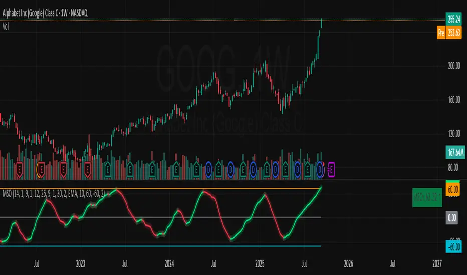
Momentum Shift Oscillator (MSO) [SharpStrat]Momentum Shift Oscillator (MSO)
The Momentum Shift Oscillator (MSO) is a custom-built oscillator that combines the best parts of RSI, ROC, and MACD into one clean, powerful indicator. Its goal is to identify when momentum shifts are happening in the market, filtering out noise that a single momentum tool might miss.
Why MSO?
Most traders rely on just one momentum indicator like RSI, MACD, or ROC. Each has strengths, but also weaknesses:
RSI → great for overbought/oversold, but often lags in strong trends.
ROC (Rate of Change) → captures price velocity, but can be too noisy.
MACD Histogram → shows trend strength shifts, but reacts slowly at times.
By blending all three (with adjustable weights), MSO gives a balanced view of momentum. It captures trend strength, velocity, and exhaustion in one oscillator.
How MSO Works
Inputs:
RSI, ROC, and MACD Histogram are calculated with user-defined lengths.
Each is normalized (so they share the same scale of -100 to +100).
You can set weights for RSI, ROC, and MACD to emphasize different components.
The components are blended into a single oscillator value.
Smoothing (SMA, EMA, or WMA) is applied.
MSO plots as a smooth line, color-coded by slope (green rising, red falling).
Overbought and oversold levels are plotted (default: +60 / -60).
A zero line helps identify bullish vs bearish momentum shifts.
How to trade with MSO
Zero line crossovers → crossing above zero suggests bullish momentum; crossing below zero suggests bearish momentum.
Overbought and oversold zones → values above +60 may indicate exhaustion in bullish moves; values below -60 may signal exhaustion in bearish moves.
Slope of the line → a rising line shows strengthening momentum, while a falling line signals fading momentum.
Divergences → if price makes new highs or lows but MSO does not, it can point to a possible reversal.
Why MSO is Unique
Combines trend + momentum + velocity into one view.
Filters noise better than standalone RSI/MACD.
Adapts to both trend-following and mean-reversion styles.
Can be used across any timeframe for confirmation.
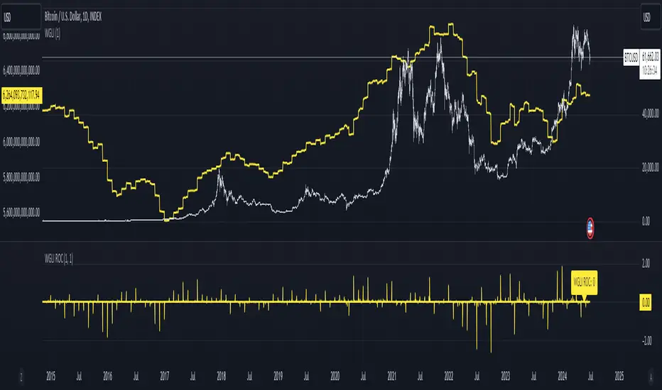
Weighted Global Liquidity Index (WGLI) ROCThe Weighted Global Liquidity Index (WGLI) ROC indicator calculates the rate of change (ROC) of the WGLI, providing valuable insights into the dynamics of global liquidity. The WGLI consolidates major central bank balance sheets and key financial indicators, such as Foreign Exchange Reserves, Interbank Rates, and Interest Rates, converted to USD and expressed in trillions. Specific US accounts like the Treasury General Account (TGA) and Reverse Repurchase Agreements (RRP) are subtracted from the Federal Reserve's balance sheet for a more detailed view of US liquidity.
Using both the WGLI and the WGLI ROC together allows users to track changes in global liquidity and understand policy trajectories and economic conditions. This dual approach offers insights into asset pricing and helps investors make informed decisions about capital allocation.
Feel free to explore and customize the WGLI ROC script to suit your analysis needs!
Normalized Global Net Liquidity + HMA Smoothed RoCThis script calculates "Global Net Liquidity" using various financial data sources, and integrates Rate of Change (RoC) visualization alongside an Equity Hull Moving Average (HMA) plot. It also features an additional "Global Liquidity" metric that is subsequently scaled and plotted.
First, several financial indicators are requested and combined to form the "Global Net Liquidity Indicator." A Rate of Change (RoC) is then calculated, and this RoC, alongside the Equity Hull Moving Average (HMA), is plotted. Next, a "Global Liquidity" measure is formed by combining various financial data.
In summary, this script involves achieving a comprehensive visualization of liquidity-related indicators and measures, providing an inclusive outlook into the nature of global liquidity trends.
The main plot is the 3 liquidity metrics averaged together and normalized then scaled between -1 and 1 for TPI scoring.
You can customize the weighting for each metric, as well as the lookback period for all 3 metrics.
-1 = Negative Trend
1 = Positive Trend
Yellow = Global Net Liquidity
Blue = RoC
Red = Equity HMA
This is insight into global liquidity, and not to be taken in anyway as trading signals. This is an analysis tool to be combined with further research.

[RESEARCH] Rate of ChangeHello traders and developers!
I was wondering how built-in "roc" function in Pine is defined and calculated so I made a little research.
I examined 4 samples:
1) "roc" function itself
2) "roc" according to its description
3) price change ratio
4) price percent change ratio
The results of the first and fourth samples are identical.
So, TV built-in roc(source, length) = 100 * change(source, length) / source .
And it's description is incorrect.
If you didnt know it - now you know it.
Good luck!

Delta ROC (acceleration) + GuideStan Druckenmiller often stresses that markets are driven not by absolute numbers but by their rate of change. He says the key is to “focus on the central banks and the movement of liquidity,” and notes that “because it used second-derivative rate of change, these things will often bottom a year to a year and a half before the fundamentals.” In essence, he looks for inflection points—moments when momentum itself begins to turn—well before the data or headlines confirm it.
The ΔROC (Delta Rate of Change) indicator applies that same philosophy. It measures both the first derivative of price (ROC: speed or momentum) and the second derivative (ΔROC: acceleration or deceleration of that momentum). Green bars signal that momentum is accelerating—buyers gaining control—while red bars show slowing momentum or exhaustion. Combine this with trend filters like the 30- and 50-day moving averages to spot early shifts in sentiment and liquidity—the kind of turning points Druckenmiller calls the “second-derivative moments” that often lead the real economy by months.

Smoothed RoC Z-Score IndicatorThis indicator calculates the rate of change (RoC) of price over a user-defined lookback period, then applies a double exponential smoothing (DEMA) and standardizes the result using a Z-Score. The output quantifies how extreme recent price momentum is compared to historical norms.
Key Features:
🔄 RoC Calculation: Measures momentum over the past n bars.
🧮 Z-Score Normalization: Detects statistical extremes and anomalies.
📉 Threshold Signals: Visual markers appear when Z-Score crosses user-defined upper or lower thresholds.
🎨 Elegant Visuals: Uses a clean purple/teal theme for enhanced clarity and style.
🔔 Alerts Included: Get notified when thresholds are crossed.
Use Cases:
Identify potential trend reversals or momentum spikes.
Spot overbought/oversold zones with greater sensitivity than traditional oscillators.
Combine with other indicators or strategies for confirmation.
Customizable Inputs:
RoC Lookback: Controls the momentum period.
Smooth Length: Applies double EMA smoothing.
Z-Score Length: Sets the statistical baseline.
Long/Short Thresholds: Define entry/exit sensitivity.

Normalized ROC²Normalized Rate of Change of Rate of Change (ROC²) Histogram
Overview
The Normalized ROC² Histogram is a momentum-based indicator designed to detect potential trend reversals by measuring the rate of change of the rate of change of price (the second derivative of price movement). This provides insight into when momentum is slowing down, signaling that a price reversal may be approaching.
The indicator also dynamically changes color to highlight shifts in momentum strength, allowing traders to visualize when price acceleration is increasing or decreasing.
How It Works
🔹 Zero Line Crossovers → Potential Direction Change
• When the histogram approaches zero and crosses over, it suggests that price momentum is shifting and a reversal may be imminent.
• Positive to Negative Crossover: Bearish momentum shift.
• Negative to Positive Crossover: Bullish momentum shift.
🔹 Momentum Strength Visualization → Color Shift
• Dark Blue (⬆️ Increasing Positive Momentum) → Price is accelerating upward.
• Light Blue (🔽 Decreasing Positive Momentum) → Uptrend is weakening.
• Dark Red (⬇️ Increasing Negative Momentum) → Price is accelerating downward.
• Light Red (🔼 Decreasing Negative Momentum) → Downtrend is weakening.
🔹 Normalization for Cleaner Visualization
• Prevents extreme volatility spikes from distorting the histogram.
• Normalizes values on a 0 to 100 scale, ensuring consistent bar height.
How to Use It
✅ Watch for Crossovers Near Zero → These can indicate a trend reversal is forming.
✅ Observe Color Changes → A shift from dark to light signals a deceleration, which often precedes price turning points.
✅ Combine with Other Indicators → Works well with Volume Profile, Moving Averages, and Market Structure analysis.
Why This Indicator is Unique
🚀 Second-derivative momentum detection → Provides early insight into potential price shifts.
📊 Normalized bars prevent distortion → No more extreme spikes ruining the scale.
🎯 Color-coded visual cues → Instantly see when momentum is gaining or fading.
📌 Add the Normalized ROC² Histogram to your charts today to detect potential reversals and momentum shifts in real-time! 🚀