Stochastic + MACD Alignment Signals//@version=5
indicator("Stochastic + MACD Alignment Signals", overlay=true)
// ————— INPUTS —————
stochLength = input.int(14, "Stoch Length")
k = input.int(3, "K Smoothing")
d = input.int(3, "D Smoothing")
macdFast = input.int(12, "MACD Fast Length")
macdSlow = input.int(26, "MACD Slow Length")
macdSignal = input.int(9, "MACD Signal Length")
emaLen = input.int(21, "EMA Filter Length")
// ————— CALCULATIONS —————
// Stochastic
kRaw = ta.stoch(close, high, low, stochLength)
kSmooth = ta.sma(kRaw, k)
dSmooth = ta.sma(kSmooth, d)
// MACD
macd = ta.ema(close, macdFast) - ta.ema(close, macdSlow)
signal = ta.ema(macd, macdSignal)
hist = macd - signal
// EMA Filter
ema = ta.ema(close, emaLen)
// ————— SIGNAL CONDITIONS —————
// BUY CONDITIONS
stochBull = ta.crossover(kSmooth, dSmooth) and kSmooth < 20
macdBull = ta.crossover(macd, signal) or (hist > 0)
emaBull = close > ema
buySignal = stochBull and macdBull and emaBull
// SELL CONDITIONS
stochBear = ta.crossunder(kSmooth, dSmooth) and kSmooth > 80
macdBear = ta.crossunder(macd, signal) or (hist < 0)
emaBear = close < ema
sellSignal = stochBear and macdBear and emaBear
// ————— PLOTTING SIGNALS —————
plotshape(buySignal, title="BUY", style=shape.labelup,
color=color.new(color.green, 0), size=size.large, text="BUY")
plotshape(sellSignal, title="SELL", style=shape.labeldown,
color=color.new(color.red, 0), size=size.large, text="SELL")
// ————— OPTIONAL ALERTS —————
alertcondition(buySignal, title="Buy Signal", message="Stoch + MACD Alignment BUY")
alertcondition(sellSignal, title="Sell Signal", message="Stoch + MACD Alignment SELL")
"signal"に関するスクリプトを検索
Setup Keltner Banda 3 e 5 - MMS + RSI + Distância Tabela
📊 Indicator Overview: Keltner Bands + RSI + Distance Table
This custom TradingView indicator combines three powerful tools into a single, visually intuitive setup:
Keltner Channels (Bands 3x and 5x ATR)
Relative Strength Index (RSI)
Dynamic Table Displaying RSI and Price Distance from Moving Average (MMS)
🔧 Components and Functions
1. Keltner Channels (3x and 5x ATR)
Based on a Simple Moving Average (MMS) and Average True Range (ATR).
Two sets of bands are plotted:
3x ATR Bands: Used for moderate volatility signals.
5x ATR Bands: Used for high volatility extremes.
Visual fills between bands help identify overextended price zones.
2. RSI (Relative Strength Index)
Measures momentum and potential reversal zones.
Customizable overbought (default 70) and oversold (default 30) levels.
RSI values are color-coded in the table:
Green for RSI ≤ 30 (oversold)
Blue for 30 < RSI ≤ 70 (neutral)
Red for RSI > 70 (overbought)
3. Distance Table (Price vs. MMS)
Displays the real-time distance between the current price and the MMS:
In points (absolute difference)
In percentage (relative to MMS)
Helps traders assess how far price has deviated from its mean.
📈 How to Use
Trend Reversal Signals
Look for price crossing back inside the 3x or 5x Keltner Bands.
Confirm with RSI:
RSI > 70 + price re-entering from above = potential short
RSI < 30 + price re-entering from below = potential long
Volatility Zones
Price outside the 5x band indicates extreme movement.
Use this to anticipate mean reversion or breakout continuation.
Table Insights
Monitor RSI and price distance in real time.
Use color cues to quickly assess momentum and stretch.
⚙️ Customization
Adjustable parameters for:
MMS period
ATR multipliers
RSI period and thresholds
Table position on chart
Fill colors between bands
This indicator is ideal for traders who want a clean, data-rich visual tool to track volatility, momentum, and price deviation in one place.

Structure Breakout - Buy Sell IndicatorStructure Breakout - Buy Sell Indicator
📈 OVERVIEW:
A minimalist indicator that identifies market structure breakouts using swing point analysis.
Displays clear blue buy arrows and red sell arrows when price breaks key swing levels.
🔧 HOW IT WORKS:
1. Identifies swing highs and lows using configurable lookback period
2. Triggers BUY signal (blue arrow) when price closes above previous swing high
3. Triggers SELL signal (red arrow) when price closes below previous swing low
4. Uses clean visual arrows without cluttering the chart
⚙️ KEY FEATURES:
• Clean, uncluttered visual signals
• Customizable sensitivity period
• Blue arrows for buy signals (below bars)
• Red arrows for sell signals (above bars)
• No lagging repainting
• Works on all timeframes
🎯 TRADING APPLICATIONS:
• Swing trading entries
• Breakout confirmation
• Trend continuation signals
• Support/resistance breaks
⚡ SETTINGS:
• Structure Detection Period (default: 20) - Adjust sensitivity of swing detection
⚠️ RISK DISCLAIMER:
This is an educational tool. Always use proper risk management.
Past performance does not guarantee future results.

Stage 2 Trend Signals (10/21/50/200) *Trend-following indicator designed to focus on **strong Stage 2 uptrends**, not bottom-fishing or chop.
* Plots **10 EMA, 21 EMA, 50 SMA, and 200 SMA** as core moving averages.
* Uses a **trend filter** so buy signals only occur when:
* Price is above the **50 SMA** (and optionally above the **200 SMA**), and
* The **50 SMA is above the 200 SMA**, reflecting classic Stage 2 alignment.
* Prints a **green “BUY” label** when the **10 EMA crosses above the 21 EMA** within this bullish environment, signaling momentum turning up in an established uptrend.
* Prints a **red “SELL” label** when the **10 EMA crosses below the 21 EMA** or when price is in a bearish context and closes below the 21 EMA, prompting risk reduction as trend/momentum weaken.
* Light **green background shading** highlights periods where the bullish Stage 2 conditions are active (“trend-on” zones).
* Works on **any timeframe**; commonly used on:
* **Weekly charts** for big-picture trend confirmation.
* **Daily charts** for swing entries, exits, and active trade management.

Stoch RSI Buy/Sell Signals with AlertsThis color code helps a novice know when to buy and when to sell
What Each Section Does
Header: //@version=5 tells TradingView which Pine Script version to use.
Indicator setup: indicator("Stoch RSI Buy/Sell Signals with Alerts", overlay=false) names your script and sets it to plot in a separate panel.
Inputs: Adjustable parameters for RSI length, Stoch length, and smoothing. You can tweak these in the settings panel.
Calculations: Builds RSI, then Stoch RSI, then smooths into %K and %D lines.
Signals: Defines buy (green) and sell (red) conditions based on crossovers and thresholds.
Color logic: Dynamically changes the %K line color (green/red/gray).
Plots: Draws %K (colored) and %D (blue) lines.
Background shading: Adds light green/red shading when signals fire for easy visual scanning.
Alerts: Pops up TradingView alerts when buy/sell conditions trigger, so you don’t miss them.
✅ Publishing Notes
Paste this into a new blank Pine Script editor starting at line 1.
Save and add it to your chart.
You’ll see the %K line flip colors, background shading, and alerts firing when conditions are met.

EMA Signals + HTF S/R + Diagonal (5-15m)Описание на русском
Скрипт строит две экспоненциальные скользящие средние (быструю и медленную EMA), а также SMA20 и SMA50, и использует их для генерации пошаговых сигналов входа. При пересечении EMA9 и EMA12 вверх выше SMA20 под свечой появляется зелёный круг, а когда после этого обе EMA оказываются выше SMA50, под ценой появляется плашка LONG; аналогично при пересечении вниз ниже SMA20 рисуется красный круг над свечой, и после ухода EMA под SMA50 формируется плашка SHORT.
Горизонтальные зоны поддержки и сопротивления вычисляются по пивотам старшего таймфрейма (по умолчанию 1 час) через request.security, каждая зона рисуется прямоугольником на графике и сопровождается подписью с ценой уровня и текущим количеством касаний ценой (Touches: N), которое считается на активном ТФ. Дополнительно скрипт строит одну диагональную линию поддержки: она протягивается от последнего ключевого минимума (pivot low с заданной «силой») к текущей цене и динамически обновляется при появлении нового важного минимума, рядом с линией отображается подпись Trend.
Description in English
This script combines EMA‑based signals, dynamic higher‑timeframe support/resistance zones, and a diagonal trendline from the latest key swing low. It plots two exponential moving averages (fast and slow EMA) along with SMA20 and SMA50, and uses them to create step‑by‑step entry signals: when EMA9 crosses above EMA12 while both are above SMA20, a green circle is shown below the bar, and once both EMAs move above SMA50 after that, a LONG label is printed below price; conversely, when EMA9 crosses below EMA12 while both are below SMA20, a red circle appears above the bar, and after both EMAs move below SMA50, a SHORT label is displayed above price.
Horizontal support and resistance zones are derived from pivot highs and lows on a higher timeframe (1‑hour by default) using request.security; each zone is drawn as a rectangle on the chart and annotated with the level price and the current number of touches by price (Touches: N), counted on the active timeframe. In addition, the script plots a single diagonal support line from the most recent key swing low (pivot low with configurable strength) towards the current price, updating it whenever a new important low appears, and shows a small “Trend” label near this line

Easy Crypto Signal FREE🆓 FREE Bitcoin & Crypto Trading Indicator
Easy Crypto Signal FREE helps you make better trading decisions with real-time BUY/SELL signals based on multiple technical indicators.
✅ What you get in FREE version:
• Real-time BUY/SELL signals (green/red arrows)
• Trading SCORE (0-100%) - market strength indicator
• Works on BTC, ETH, and all major altcoins
• Optimized for 4h timeframe (works on all timeframes)
• Simple visual interface
• Basic alert system
📊 How it works:
The indicator combines RSI, MACD, EMA trends, and volume analysis to generate a composite SCORE (0-100%).
• SCORE > 65% = BUY signal 🟢
• SCORE < 35% = SELL signal 🔴
• SCORE 35-65% = WAIT (neutral zone) 🟡
⚠️ FREE Version Limitations:
• No detailed RSI values
• No MACD trend details
• No trend strength indicators
• Fixed sensitivity (65%)
• Limited customization
💎 Want the FULL PRO version?
🚀 PRO includes:
• Full RSI + MACD + Trend analysis displayed
• Customizable sensitivity (40-80%)
• Advanced alert customization
• Professional clean interface
• Volume strength indicator
• NO watermarks
• Premium support
📊 Proven Backtest Results:
• 57.1% Win Rate
• 3.36 Profit Factor (Excellent)
• +9.55% return in 3 months
• Only -2.69% Max Drawdown (Low Risk)
🔗 Get PRO version:
📈 Best practices:
1. Use on 4h timeframe for best results
2. Combine with your own analysis
3. Always set Stop Loss (5-10%)
4. Test on demo account first
5. Don't trade based on signals alone
⚠️ Risk Disclaimer:
Cryptocurrency trading involves substantial risk. This indicator is for educational purposes only and does not guarantee profits. Past performance does not indicate future results. Always do your own research and never invest more than you can afford to lose.
📧 Questions or Feedback?
Comment below or message me directly!
🌟 If you find this helpful, please give it a like and share!
v1.0 - Initial FREE release
• Basic BUY/SELL signal system
• Score indicator 0-100%
• Optimized for 4h timeframe
• Works on all crypto pairs

Viprasol Elite Advanced Pattern Scanner# 🚀 Viprasol Elite Advanced Pattern Scanner
## Overview
The **Viprasol Elite Advanced Pattern Scanner** is a sophisticated technical analysis tool designed to identify high-probability double bottom (DISCOUNT) and double top (PREMIUM) patterns with unprecedented accuracy. Unlike basic pattern detectors, this elite scanner employs an AI-powered quality scoring system to filter out false signals and highlight only the most reliable trading opportunities.
## 🎯 Key Features
### Advanced Pattern Detection
- **DISCOUNT Patterns** (Double Bottoms): Identifies bullish reversal zones where price may bounce
- **PREMIUM Patterns** (Double Tops): Detects bearish reversal zones where price may decline
- Multi-point validation system (5-point structure)
- Symmetry analysis with customizable tolerance
### 🤖 AI Quality Scoring System
Each pattern receives a quality score (0-100) based on:
- **Symmetry Analysis** (32% weight): How closely the two bottoms/tops match
- **Trend Context** (22% weight): Strength of the preceding trend using ADX
- **Volume Profile** (22% weight): Volume confirmation at key points
- **Pattern Depth** (16% weight): Significance of the pattern's price range
- **Structure Quality** (16% weight): Overall pattern formation quality
Quality Grades:
- ⭐ **ELITE** (88-100): Highest probability setups
- ✨ **VERY STRONG** (77-87): Strong trade opportunities
- ✓ **STRONG** (67-76): Valid patterns with good potential
- ○ **VALID** (65-66): Acceptable patterns meeting minimum criteria
### 🎯 Intelligent Target System
Three target modes per pattern direction:
- **Conservative**: 0.618 Fibonacci extension (safer, closer targets)
- **Balanced**: 1.0 extension (moderate risk/reward)
- **Aggressive**: 1.618 extension (higher risk/reward)
Targets automatically adjust based on pattern quality score.
### 🔧 Advanced Filtering Options
- **Volatility Filter (ATR)**: Excludes patterns during extreme volatility
- **Momentum Filter (ADX)**: Ensures sufficient trend strength
- **Liquidity Filter (Volume)**: Confirms adequate trading volume
### 📊 Pattern Lifecycle Management
- Real-time neckline tracking with extension multiplier
- Pattern invalidation after extended wait period
- Breakout/breakdown confirmation
- Reversal detection (pattern failure scenarios)
- Target achievement tracking
### 🌈 Premium Visual System
- Color-coded quality levels
- Cyber-themed color scheme (Neon Green/Hot Pink/Purple/Cyan)
- Transparent fills for pattern zones
- Dynamic labels with pattern information
- Elite dashboard showing live pattern stats
## 📈 How To Use
### Basic Setup
1. Add indicator to your chart
2. Enable desired patterns (DISCOUNT and/or PREMIUM)
3. Adjust quality threshold (default: 65) - higher = fewer but better signals
4. Set your preferred target mode
### Trading DISCOUNT Patterns (Bullish)
1. Wait for pattern detection (labeled points 1-4)
2. Check quality score on dashboard
3. Entry on breakout above neckline (point 5)
4. Stop loss below the lowest bottom
5. Target shown automatically based on your mode
6. ⚠️ Watch for pattern failure (break below bottoms = SHORT signal)
### Trading PREMIUM Patterns (Bearish)
1. Wait for pattern detection (labeled points 1-4)
2. Check quality score on dashboard
3. Entry on breakdown below neckline (point 5)
4. Stop loss above the highest top
5. Target shown automatically based on your mode
6. ⚠️ Watch for pattern failure (break above tops = LONG signal)
## ⚙️ Input Settings Guide
### 🔍 Detection Engine
- **Left/Right Pivots**: Higher = fewer but cleaner patterns (default: 6/4)
- **Min Pattern Width**: Minimum bars between bottoms/tops (default: 12)
- **Symmetry Tolerance**: Max % difference allowed between levels (default: 1.8%)
- **Extension Multiplier**: How long to wait for breakout (default: 2.2x pattern width)
### ⭐ Quality AI
- **Min Quality Score**: Only show patterns above this score (default: 65)
- **Weight Distribution**: Customize what matters most (symmetry/trend/volume/depth/structure)
### 🔧 Filters
- **Volatility Filter**: Avoid choppy markets (recommended: ON)
- **Momentum Filter**: Ensure trend strength (recommended: ON)
- **Liquidity Filter**: Volume confirmation (recommended: ON)
### 💎 Target System
- Choose target aggression for each pattern type and direction
- Higher quality patterns get adjusted targets automatically
## 🎨 Visual Customization
- Adjust colors for DISCOUNT/PREMIUM patterns
- Set quality-based color coding
- Customize label sizes
- Toggle dashboard visibility and position
- Show/hide historical patterns
## 🚨 Alert System
Set up TradingView alerts for:
- 🚀 **LONG Signals**: DISCOUNT breakout, PREMIUM failure
- 📉 **SHORT Signals**: PREMIUM breakdown, DISCOUNT failure
- ✅ **Target Achievement**: When price hits your target
## 💡 Pro Tips
1. **Higher Timeframes = Better Signals**: Patterns on 4H, Daily, Weekly are more reliable
2. **Quality Over Quantity**: Focus on ELITE and VERY STRONG grades
3. **Combine with Trend**: DISCOUNT in uptrend, PREMIUM in downtrend = best results
4. **Watch Pattern Failures**: Failed patterns often provide strong counter-trend signals
5. **Adjust for Your Style**: Intraday traders use Conservative, swing traders use Aggressive
## 🔒 Pattern Invalidation
Patterns become invalid if:
- No breakout/breakdown within extension period
- Support/resistance levels are broken prematurely
- Pattern shown in faded colors = no longer active
## ⚠️ Risk Disclaimer
This indicator is a tool for technical analysis and does not guarantee profitable trades. Always:
- Use proper risk management
- Combine with other analysis methods
- Never risk more than you can afford to lose
- Past performance does not indicate future results

Dimagi72 Trend Suite (EMA/SMA + 52W + Cross Signals)Dimagi72 Trend Suite is an advanced trend analysis tool designed to give traders a clear picture of market direction, momentum, and major structural turning points.
It combines the most reliable long-term and short-term signals into one clean, easy-to-read indicator.
Features
• EMA9 & EMA21 for short-term momentum
• SMA50, SMA100, SMA200 for medium & long-term trend structure
• 52-Week High & Low levels for institutional support/resistance
• Golden Cross / Death Cross signals (SMA50 vs SMA200)
• Trend Strength Meter, shown directly on the chart
• Clean labels without clutter
• Designed for crypto, stocks, and forex on all timeframes (best on Daily)
How it works
The indicator measures alignment between EMAs and SMAs, tracks long-term institutional levels, and highlights major trend reversals through cross signals.
The Trend Strength Meter calculates a score from -4 to +4, making trend direction instantly visible.
Why use this indicator
This suite brings together the most widely used trend-following tools into one unified system.
It helps traders quickly determine when the market is bullish, bearish, or neutral — and when major reversals may be forming.
Best for:
Swing traders, long-term trend followers, crypto traders, and anyone who wants a clean visual overview of the trend without using multiple separate indicators.
Tags (use these to show up in search)
trend
ema
sma
trend-following
golden cross
death cross
momentum
trend strength
52 week high
crypto
stocks
market structure

Tactical Deviation🎯 TACTICAL DEVIATION - Volume-Backed VWAP Deviation Analysis
What Makes This Different?
Unlike basic VWAP indicators, Tactical Deviation combines:
• Multi-timeframe VWAP deviation bands (Daily/Weekly/Monthly)
• Volume spike intelligence - signals only appear with volume confirmation
• Pivot reversal detection at deviation extremes
• Optional multi-VWAP confluence system
• Smart defaults for quality over quantity
This unique combination filters weak setups and identifies high-probability entries at extreme price deviations from fair value.
📊 DEFAULT SETTINGS (Ready to Use)
✅ Daily VWAP with ±2σ deviation bands
✅ Volume spike detection (1.5x average required)
✅ 2σ minimum deviation for signals
❌ Weekly/Monthly VWAPs (enable for multi-timeframe)
❌ Pivot reversal requirement (enable for stronger signals)
❌ Fill zones (optional visual enhancement)
Why: Daily VWAP is most relevant for intraday trading. 2σ bands catch meaningful moves. Volume spikes ensure conviction. Clean chart focuses on what matters.
🚀 HOW TO USE
BASIC USAGE:
• Green triangles (below bars) = Long signals at oversold deviations
• Red triangles (above bars) = Short signals at overbought deviations
SIGNAL QUALITY:
• Normal size, bright colors = Volume spike (best quality)
• Small size, lighter colors = Volume momentum
• Tiny size = No volume confirmation
DEVIATION ZONES:
• ±2σ = Extreme deviation (signals appear here)
• ±1σ to ±2σ = Extended but not extreme
• Within ±1σ = Normal range
TRADING APPROACHES:
Mean Reversion:
→ Enter when price reaches ±2σ with volume spike
→ Target: Return to VWAP or opposite band
→ Stop: Beyond extreme deviation
Trend Continuation:
→ Use bands to identify pullbacks
→ Enter pullback to VWAP in trending market
→ Volume confirms continuation
Reversal Trading:
→ Enable "Require Pivot Reversal" for stronger signals
→ Signals only when deviation + pivot reversal occur
→ Higher probability, fewer signals
⚙️ EXPLORE SETTINGS FOR FULL USE
VWAP SETTINGS:
• Show Weekly/Monthly VWAP = Multi-timeframe context
• Show ±1σ Bands = Normal deviation range
• Show ±3σ Bands = Extreme extremes (rare but powerful)
SIGNAL SETTINGS:
• Min Deviation: 1σ (more signals) | 2σ (default) | 3σ (fewer, extreme only)
• Require Pivot Reversal: OFF (default) | ON (stronger but fewer)
• Volume Spike Threshold: 1.5x (default) | 2.0x+ (major spikes) | 1.2x (more signals)
CONFLUENCE SETTINGS:
• Require Multi-VWAP Confluence: OFF (default) | ON (2+ VWAPs must agree)
• Min VWAPs: 2 (Daily + Weekly/Monthly) | 3 (all must agree)
VISUAL SETTINGS:
• Show Fill Zones = Shaded areas between bands
• Fill Opacity = Transparency adjustment
• Line Widths = Customize thickness
💡 PRO TIPS
1. Start with defaults, then enable features as you learn
2. Volume spike requirement filters weak moves - keep it enabled
3. Enable Weekly/Monthly VWAPs for higher timeframe context
4. Enable confluence for swing trading setups
5. Pivot reversals: ON for reversals, OFF for continuations
6. Check top-right info table for current deviation levels
🎨 VISUAL GUIDE
• Cyan Line = Daily VWAP (fair value)
• Cyan Bands = Daily deviation zones
• Orange Line = Weekly VWAP (if enabled)
• Purple Line = Monthly VWAP (if enabled)
• Green Triangle = Long signal (oversold)
• Red Triangle = Short signal (overbought)
⚠️ IMPORTANT
Educational purposes only. Always use proper risk management. Signals are based on statistical deviation, not guarantees. Volume confirmation improves quality but doesn't guarantee outcomes. Combine with your own analysis.
The unique combination of VWAP deviation analysis, volume profile confirmation, pivot identification, and multi-timeframe confluence in a single clean interface makes Tactical Deviation different from basic VWAP indicators.
Happy Trading! 📈

Multiple Cross Signals (Predictive)The indicator calculates and displays the Golden/Death Cross signals and the buy/sell signals from the following oscillators on the chart:
MACD (Moving Average Convergence Divergence)
RSI (Relative Strength Index)
Stochastic (Stochastic Oscillator)
In addition to the actual cross signals (shown with arrows), it incorporates two key features:
Cross Prediction (Predictive): Identifies when the oscillator lines (MACD, RSI, Stochastic) are very close and converging towards a cross, suggesting that a real signal might occur soon.
False Signal Detection: Attempts to identify when an initial buy/sell signal fails when the low/high of the signal candle is broken within a confirmation period.

Two Supertrend Crossover SignalThis indicator is designed to visualize trend shifts using two Supertrend lines and a crossover-based signal system.
It also colors the area between the two Supertrend lines based on the current trend direction, making trend changes easy to identify at a glance.
How It Works
The indicator plots:
Fast Supertrend (shorter ATR length, lower factor)
Slow Supertrend (longer ATR length, higher factor)
A crossover between these two Supertrend lines indicates a possible trend shift.
Buy Signal
A BUY signal occurs when: Fast Supertrend crosses ABOVE Slow Supertrend
This suggests bullish momentum strengthening.
Sell Signal
A SELL signal occurs when: Fast Supertrend crosses BELOW Slow Supertrend
This suggests bearish momentum increasing.
Buy/Sell Signal Labels
The chart displays clear BUY (green) and SELL (red) labels at every crossover.
These signals help traders quickly pinpoint potential entries or exits.
This indicator is ideal for:
✓ Trend trading
✓ Swing trading
✓ Identifying momentum shifts
✓ Visual confirmation of market direction
✓ Combining with price action or EMA filters
You may adjust ATR length and multiplier depending on the timeframe:
For Scalping (1–5 min):
Fast ATR: 5–7
Slow ATR: 10–14
For Intraday (5–15 min):
Fast ATR: 7
Slow ATR: 10–14
For Swing Trading (1h–4h):
Fast ATR: 10
Slow ATR: 20
Important Notes
This indicator does not repaint the Supertrend values.
Signals are based on confirmed crossovers.
Use stop-loss and risk management appropriate for your strategy.
Always combine with market context (support/resistance, volume, etc.)

Diodato 'All Stars Align' Signal (Trend Filtered)This indicator implements the Diodato "All Stars Align" strategy, a breadth-based system designed to identify high-probability reversal points by analyzing internal market strength rather than just price action. It works by monitoring Advancing versus Declining issues and volume across the exchange to detect moments of extreme market panic. When these internal breadth metrics hit specific oversold thresholds and align simultaneously with a standard Stochastic oscillator, the script signals a potential bottom.
I have modified this version to strictly enforce trend alignment. The signals are now filtered so that they will only appear if the 50 SMA is trading above the 200 SMA. This ensures that the indicator only highlights buying opportunities during established uptrends while completely filtering out signals during bearish market regimes.
You should use this tool to time entries during market pullbacks. A green cross indicates that one of the major breadth components has aligned with oversold Stochastics, while a purple cross indicates a stronger signal where both volume and issue-based breadth metrics have triggered together.

RSI BREAKOUT SIGNALSThis BB + RSI Breakout indicator is designed to help traders identify potential buy and sell opportunities based on price movements relative to the Donchian channel (or Bollinger-type channel) and momentum conditions. It calculates the highest high and lowest low over a user-defined length to form a dynamic channel, and then it checks whether the current price breaks above the upper band (for a buy signal) or below the lower band (for a sell signal). To avoid repeated signals in a row, the indicator uses a state system: after a buy signal occurs, it will not generate another buy until a sell occurs, and vice versa. When a buy signal is triggered, it automatically calculates a take-profit price a certain percentage above the buy candle and displays this price below the candle as a “TP” label. Sell signals are displayed above the candle, and any previous TP label is cleared. The indicator updates in real time, so the signals move with the chart, giving a clear and lag-free visualization of entry points and potential profit targets.

Buy/Sell Hull Crossover Signals (Fast & Slow)This indicator generates buy and sell signals using fast- and slow-period Hull Moving Averages (HMAs). A bullish signal occurs when the fast HMA crosses above the slow HMA, while a bearish signal triggers when it crosses below. To reduce repainting, you can optionally require confirmation on bar close.
The script includes visual tools such as a color-shifting ribbon between HMAs, optional background shading to show market regime, and lightweight buy/sell labels for quick signal recognition. Alerts are built in so you can automate notifications when crossover conditions occur.
Designed to be simple, responsive, and easy to layer into existing strategies, this indicator helps traders spot momentum shifts and trend transitions with clarity.

2 EMA Cross Signals – AL / SATIt gives signals at EMA crossovers. It gives buy and sell signals. You can change the EMA settings. It is very good for trend following.

Smart Trail Signals NO CONDITIONSSmart Trail Signals Indicator
Overview
This is a trend-following indicator that uses a dynamic trailing stop system to identify bullish and bearish trends. It adapts to market volatility using ATR (Average True Range) and provides visual signals when the trend direction changes.
Core Components
Smart Trail System:
Calculates dynamic support (trail_up) and resistance (trail_down) levels
Adjusts trail levels based on price movement and volatility
Maintains trend direction until price crosses the opposite trail level
Key Parameters:
Length (14): Period for ATR calculation
Multiplier (2.0): Distance of trail from price relative to ATR
Sensitivity (1-5): Fine-tunes how quickly the trail adapts to price changes
How It Works
Trend Detection: Monitors whether price is above the support trail (bullish) or below the resistance trail (bearish)
Trail Movement:
In uptrends: Support trail rises with price but never decreases
In downtrends: Resistance trail falls with price but never increases
Signals: Diamond shapes appear when trend flips:
Green diamond below bar = bullish trend change
Red diamond above bar = bearish trend change
Visual Aids:
Trail line changes color (lime for uptrend, red for downtrend)
Candles colored green (bullish), red (bearish), or gray (neutral)
Best Use Cases
Identifying trend reversals on any timeframe
Following strong directional moves
Setting dynamic stop-loss levels
Works 24/7 on all instruments (stocks, crypto, forex)
RetryClaude can make mistakes. Please double-check responses. Sonnet 4.5

Weekly Fibonacci Pivot Signals (4H) - S1/R1 & S3/R3 rulesThis Indicator used weekly price range to calculate the pivot R1,R3,S1 and S3 ,when price crossed and closed below R3 in 4H timeframe the indicator gives sell signal, when the price crossed and close above the S3 the indicator gives buy signal. This indicator can give approximately 50% win Rate .

Liquidity Void Detector + Pro SignalsWhat This Indicator Does
This indicator detects “liquidity voids”—large displacement candles with very high body-to-wick ratios and size significantly above recent ATR—where price moved rapidly and left untested areas.
It automatically draws shaded boxes for new, non-overlapping voids, shows a moveable dashboard (void fill probabilities), and provides one clean, actionable long/short signal per void when price action and momentum confirm.
How It Works
Void Detection: Candles with a body/wick ratio and size above user threshold trigger a potential liquidity void.
Box Drawing: Each new void is drawn as a shaded box (yellow/orange) that never overlaps other active voids.
Signal Confirmation: A “LONG” or “SHORT” label appears at the first bar within each valid void if momentum and candlestick structure align.
Dashboard: User-selectable dashboard shows up-to-date stats on remaining unfilled, partially filled, and fully filled voids.
Alerts: Built-in alerts fire when a new high-probability long/short signal is detected (user must add alerts manually).
Key Features
No overlap, no clutter: Only the latest set of boxes and a single signal per event are drawn. Oldest boxes are pruned automatically.
Momentum filter: Signals combine void and trend strength for higher conviction, filtering out weak/fake moves.
Non-repainting: Signals, boxes, and logic only use confirmed bar data—no repaint or future leaks.
Adjustable settings: Every threshold (body/wick ratio, ATR size, maximum boxes, dashboard location, signal label size) is user-configurable.
Efficient for all timeframes and asset classes.
How to Use
Add to your chart:
Click "Add to Chart" or search “Liquidity Void Detector” in the indicator search panel.
Tune your inputs:
Adjust the Body/Wick Ratio and Min Size vs ATR for your market or timeframe.
Set the Void Box Length (how many bars the box displays), signal sensitivity, and maximum concurrent voids.
Move the dashboard as needed for your chart layout.
What to look for:
Yellow/orange boxes highlight recent liquidity voids—untested price gaps where future reactions may occur.
LONG/SHORT signals appear only where a fresh void coincides with confirmed momentum in that direction.
Dashboard tracks probability of voids remaining unfilled, being partially filled, or fully refilled by price.
Trading logic and best use:
Traders may use void boxes to anticipate where price might react, reverse, or trend continuation can resume.
Combine signals with additional price action confirmation such as S/R levels, order blocks, wick rejections, volume spikes, or patterns (e.g., pin bars, engulfing).
Use signal alerts in conjunction with order flow, session profile, or support/resistance tools for increased confluence.
Always backtest and demo trade before live use.
Important Compliance & Disclaimer
No advice: This tool provides visual context only. All trading and risk decisions are the user’s responsibility.
No repainting, original source: The code is fully open-source, uses only native Pine Script, and never repaints.
No spam, no links, no 3rd-party promotion: 100% TradingView House Rules compliant.
If you find this useful, please consider leaving a positive review, and remember to always confirm with your own analysis.

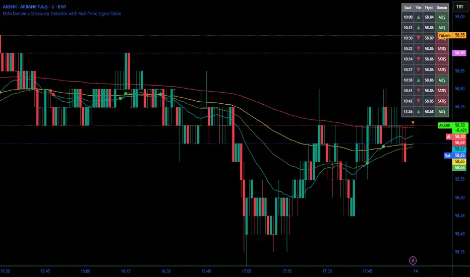
EMA Dynamic Crossover Detector with Real-Time Signal TableDescriptionWhat This Indicator Does:This indicator monitors all possible crossovers between four key exponential moving averages (20, 50, 100, and 200 periods) and displays them both visually on the chart and in an organized data table. Unlike standard EMA indicators that only plot the lines, this tool actively detects every crossover event, marks the exact crossover point with a circle, records the precise price level, and maintains a running log of all crossovers during the trading session. It's designed for traders who want comprehensive EMA crossover analysis without manually watching multiple moving average pairs.Key Features:
Four Essential EMAs: Plots 20, 50, 100, and 200-period exponential moving averages with color-coded thin lines for clean chart presentation
Complete Crossover Detection: Monitors all 6 possible EMA pair combinations (20×50, 20×100, 20×200, 50×100, 50×200, 100×200) in both directions
Precise Price Marking: Places colored circles at the exact average price where crossovers occur (not just at candle close)
Real-Time Signal Table: Displays up to 10 most recent crossovers with timestamp, direction, exact price, and signal type
Session Filtering: Only records crossovers during active trading hours (10:00-18:00 Istanbul time) to avoid noise from low-liquidity periods
Automatic Daily Reset: Clears the signal table at the start of each new trading day for fresh analysis
Built-In Alerts: Two alert conditions (bullish and bearish crossovers) that can be configured to send notifications
How It Works:The indicator calculates four exponential moving averages using the standard EMA formula, then continuously monitors for crossover events using Pine Script's ta.crossover() and ta.crossunder() functions:Bullish Crossovers (Green ▲):
When a faster EMA crosses above a slower EMA, indicating potential upward momentum:
20 crosses above 50, 100, or 200
50 crosses above 100 or 200
100 crosses above 200 (Golden Cross when it's the 50×200)
Bearish Crossovers (Red ▼):
When a faster EMA crosses below a slower EMA, indicating potential downward momentum:
20 crosses below 50, 100, or 200
50 crosses below 100 or 200
100 crosses below 200 (Death Cross when it's the 50×200)
Price Calculation:
Instead of marking crossovers at the candle's close price (which might not be where the actual cross occurred), the indicator calculates the average price between the two crossing EMAs, providing a more accurate representation of the crossover point.Signal Table Structure:The table in the top-right corner displays four columns:
Saat (Time): Exact time of crossover in HH:MM format
Yön (Direction): Arrow indicator (▲ green for bullish, ▼ red for bearish)
Fiyat (Price): Calculated average price at the crossover point
Durum (Status): Signal classification ("ALIŞ" for buy signals, "SATIŞ" for sell signals) with color-coded background
The table shows up to 10 most recent crossovers, automatically updating as new signals appear. If no crossovers have occurred during the session within the time filter, it displays "Henüz kesişim yok" (No crossovers yet).EMA Color Coding:
EMA 20 (Aqua/Turquoise): Fastest-reacting, most sensitive to recent price changes
EMA 50 (Green): Short-term trend indicator
EMA 100 (Yellow): Medium-term trend indicator
EMA 200 (Red): Long-term trend baseline, key support/resistance level
How to Use:For Day Traders:
Monitor 20×50 crossovers for quick entry/exit signals within the day
Use the time filter (10:00-18:00) to focus on high-volume trading hours
Check the signal table throughout the session to track momentum shifts
Look for confirmation: if 20 crosses above 50 and price is above EMA 200, bullish bias is stronger
For Swing Traders:
Focus on 50×200 crossovers (Golden Cross/Death Cross) for major trend changes
Use higher timeframes (4H, Daily) for more reliable signals
Wait for price to close above/below the crossover point before entering
Combine with support/resistance levels for better entry timing
For Position Traders:
Monitor 100×200 crossovers on daily/weekly charts for long-term trend changes
Use as confirmation of major market shifts
Don't react to every crossover—wait for sustained movement after the cross
Consider multiple timeframe analysis (if crossovers align on weekly and daily, signal is stronger)
Understanding EMA Hierarchies:The indicator becomes most powerful when you understand EMA relationships:Bullish Hierarchy (Strongest to Weakest):
All EMAs ascending (20 > 50 > 100 > 200): Strong uptrend
20 crosses above 50 while both are above 200: Pullback ending in uptrend
50 crosses above 200 while 20/50 below: Early trend reversal signal
Bearish Hierarchy (Strongest to Weakest):
All EMAs descending (20 < 50 < 100 < 200): Strong downtrend
20 crosses below 50 while both are below 200: Rally ending in downtrend
50 crosses below 200 while 20/50 above: Early trend reversal signal
Trading Strategy Examples:Pullback Entry Strategy:
Identify major trend using EMA 200 (price above = uptrend, below = downtrend)
Wait for pullback (20 crosses below 50 in uptrend, or above 50 in downtrend)
Enter when 20 re-crosses 50 in the trend direction
Place stop below/above the recent swing point
Exit when 20 crosses 50 against the trend again
Golden Cross/Death Cross Strategy:
Wait for 50×200 crossover (appears in the signal table)
Verify: Check if crossover occurs with increasing volume
Entry: Enter in the direction of the cross after a pullback
Stop: Place stop below/above the 200 EMA
Target: Swing high/low or when opposite crossover occurs
Multi-Crossover Confirmation:
Watch for multiple crossovers in the same direction within a short period
Example: 20×50 crossover followed by 20×100 = strengthening momentum
Enter after the second confirmation crossover
More crossovers = stronger signal but also means you're entering later
Time Filter Benefits:The 10:00-18:00 Istanbul time filter prevents recording crossovers during:
Pre-market volatility and gaps
Low-volume overnight sessions (for 24-hour markets)
After-hours erratic movements
Trendy Bands + Reversal SignalsTrendy Bands + Reversal Signals
This is a versatile and powerful TradingView indicator that combines a dual Bollinger Bands system with momentum-based reversal signals. It's designed to help traders identify the prevailing trend, potential volatility expansions/contractions, and key reversal points in the market.
Core Concept: The indicator uses two sets of Bollinger Bands with different standard deviation settings to create a "band within a band" structure. This visual setup makes it easier to gauge trend strength and spot potential breakouts or breakdowns. Additionally, it calculates a custom momentum oscillator to generate early warnings for potential trend reversals.

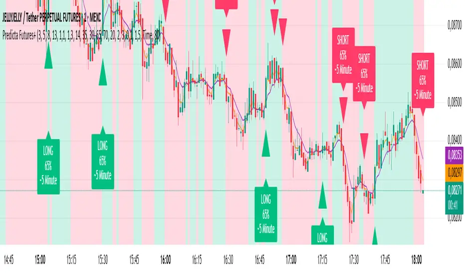
Predicta Futures – Scalping Predictor with Confidence FilterPredicta Futures is an advanced short-term forecasting indicator that combines historical pattern similarity analysis with weighted technical signals to predict price movements 1–10 minutes ahead.
**Core Functionality**
The script scans up to 5,000 historical bars to identify structurally similar price patterns. It aggregates forward outcomes from matched patterns and integrates real-time signals from RSI, MACD, Bollinger Bands, volume momentum, and volatility. A composite confidence score filters signals, displaying only those meeting the user-defined threshold (default ≥68%).
**Key Outputs**
- Buy/sell triangles with text labels
- Dashed projection line to predicted price
- Dotted target and ATR-based stop lines
- Info panel showing forecast direction, confidence %, expected move %, pattern count, order book status, and data access details
**Customization & Performance**
- Execution modes: Fast, Balanced, Accurate
- Adaptive sampling with recency bias option
- Filters for volatility and market hours
- Adjustable weights, lookback period, and prediction horizon
**Use Cases**
Scalping, intraday trading, futures, cryptocurrencies, equities.
*Order book metrics are simulated (platform limitation). Technical analysis tool; not financial advice.*
Premium/Discount Zones with Confirmation Signals📌 Indicator Description: Premium/Discount Zones with Confirmed Signals
This indicator identifies dynamic Premium, Discount, and Equilibrium zones based on recent swing highs and lows, helping traders visualize where price is considered expensive, cheap, or fair value. It’s designed for Smart Money Concepts (SMC), ICT-style trading, and anyone who values precision in zone-based analysis.
🔍 Key Features
Swing-Based Zones: Automatically detects swing highs/lows over a customizable lookback period (default: 48 bars — equivalent to 2 days on a 1-hour chart).
Premium & Discount Levels: Define overbought and oversold zones using percentage inputs (default: 25%).
Equilibrium Band (middle): Highlights the no-trade value zone with adjustable width (default: 5%).
Signal Engine: Generates trade signals based on two styles:
Bounce: Reversal signals when price reacts to a zone and confirms direction.
Breakout: Continuation signals when price breaks through a zone with momentum.
Trade Type Selector: Choose between Bounce, Breakout, or Both from the input menu.
Signal Filtering: Limits signals to one per direction at a time to reduce noise.
Visual Styling: Toggle between colored or monochrome themes for clean charting.
🧠 How It Works
Buy signals appear when price confirms strength from the discount zone or breaks above the premium zone.
Sell signals appear when price confirms weakness from the premium zone or breaks below the discount zone.
All signals include a built-in 3-bar confirmation delay to reduce false triggers.
🎯 Ideal For
Traders using SMC, ICT, or price action strategies
Zone-based scalping, swing trading, or intraday setups
Visualizing market structure and value areas with clarity
I hope you find this useful — and wish you Happy Trades!
