Pi Cycle bitcoin bottomFull credits go to the owner, but for reasons i cannot diclose.
Introduction
With the adoption of cryptographic assets reaching new heights, it is undeniably important to continuously expand and improve current indicators just like how these assets update with new lines of code over time.
Philip Swift’s Pi-Cycle Top Indicator has effectively signaled market and local tops to within 3 days, with the most recent occurrence being on May 12th 2021.
If it were possible to find the cycle/local top of each cycle, a similar analogy could be used to pinpoint the bottom of Bitcoin’s price.
These Pi-Cycle indicators are merely just two moving averages which, when divided by each other, are equal to the value of π.
π = Long MA / Short MA
350/111 = 3.153; as per the existing Bitcoin Pi-Cycle Top indicator.
Pi-Cycle Bottom for Bitcoin
At first, the existing “Pi moving average” pair (350/111) was realigned to see whether they cross at the bottom of the Bitcoin price.
They did not, only to be a lagging indicator in both 2015 and 2018 cycle bottoms.
A possible pair was discovered when the short MA was set to 150:
π = Long MA / 150
Long MA = π * 150
Long MA = 471 (rounded to the nearest whole number)
This resulted in a Pi MA pair of 471/150.
Using the multiple x0.745 of the 471-day SMA and the 150-day EMA (exponential average to take into account of short term volatility ), the price of Bitcoin bottoms at where they two moving averages cross:
When the 150-day EMA crossed below the 471 SMA *0.475, Bitcoin’s price had bottomed for the market cycle.
Over the last two market cycles, this indicator has been accurate to within 3 days also.
"top"に関するスクリプトを検索

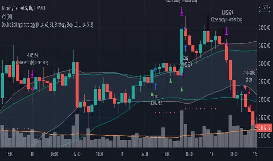
Double Bollinger StrategyFrom "Bitcoin Trading Strategies: Algorithmic Trading Strategies For Bitcoin And Cryptocurrency That Work" by David Hanson.
*Works better with 1hr time frame and some input optimisations.
"Double Bollinger Band Scalping System
Recommended Timeframe: 1 minute or 5 minute *
Required Indicators:
// - RSI with a length of 14 (default settings)
// - Bollinger band #1 settings: Length = 50, stDev = 1 Hide the basis/middle line (basis line not needed for this strategy)
Note: This is the slower bollinger band in the directions
// - Bollinger band #2 settings: Length 20, stDev = 1 Hide the basis/middle line (basis line not needed for this strategy)
Note: This is the faster bollinger band in the directions
Enter Long/Buy Trade When:
// - RSI is above the level 50
// - A candle closes above the top of the faster bollinger band
Enter a long when a candle then closes above the top of the slower bollinger band, and price is above the top of both bands
Place a stop loss under the low of the entry candle Example of a long trade using this strategy
Exit Long Trade When: A candle closes below the top band of the fast bollinger band
Enter Short/Sell Trade When:
// - RSI is below the level 50
// - A candle closes below the bottom of the faster bollinger band
Enter a short when a candle then closes below the bottom of the slower bollinger band, and price is below both bands
Place a stop loss above the high of the entry candle Example of a short trade using this strategy
Exit Short Trade When: Price closes inside the bottom of the faster bollinger band"
RSI band with Signal alert//th/en
//th
สวัสดีครับท่านสมาชิก
ก่อนอื่นต้องขอเกริ่นก่อนเลยว่า Indicator ตัวนี้ถูกสร้างขึ้นมาบนพื้นฐานของ RSI จริง เพียงแต่ใช้ค่า EMA27 ในการสร้าง เนื่องจากผมยังไม่สามารถเขียน RSI band ที่โยงกับราคาได้ในส่วนนี้เองได้
แต่ทั้งนี้ขอให้ท่านใจเย็น ๆ และฟังผมสักหน่อย เนื่องจากก่อนหน้านี้ผมได้สังเกตเห็นว่า EMA27 นั้นมีค่าเท่ากับ RSI14 ที่ค่า 50 พอดี ดังนั้นผมจึงเลือกที่จะสร้างมันขึ้นมาด้วย EMA27 เพราะง่ายต่อการเขียน
วิธีการใช้งานมีดังต่อไปนี้
Indicator ตัวนี้ใช้งานเหมือน RSI14 วิธีการอ่านคือให้นับเส้น EMA27 เป็นค่า 50 ของ RSI14 ดังนั้นให้เราพิจารณาการซื้อขายดังต่อไปนี้ (โดยหลังจากนี้ผมจะเรียก EMA27 ที่สร้างขึ้นว่า RSI band)
พิจารณาเข้าซื้อ : เมื่อราคาทะลุ RSI band ขึ้นไปและย่อตัวทำ Higher Low เหนือเส้น RSI band
พิจารณาขายออก : เมื่อราคาทะลุ RSI band ลงมาและรีบาวน์ทำ Lower High ใต้เส้น RSI band
# ทั้งนี้ผมได้ทำสีแท่งเทียนไว้เพื่อให้ง่ายต่อการสังเกต โดยการนำไปใช้อาจนำสีของเส้นขอบแท่งเทียนออก แล้วในส่วนของไส้แท่งเทียนให้ใช้สีที่ไม่เจาะจงราคาบวกลบอย่างสี #434651
โดยเราสามารถดู Divergence โดยการเทียบความต่างระหว่างราคาและ RSI band ได้ดังนี้
ในแนวโน้มขาลง : ให้เปรียบเทียบความต่างระหว่างราคากับ RSI band ของ Lower Low ปัจจุบันกับ Low ก่อนหน้า โดยถ้าความต่างของ Low ลดลงเรื่อย ๆ จนราคาเข้าใกล้เส้น RSI band ให้พิจารณาเข้าซื้อ
ในแนวโน้มขาขึ้น : ให้เปรียบเทียบความต่างระหว่างราคากับ RSI band ของ Higher High ปัจจุบันกับ High ก่อนหน้า โดยถ้าความต่างของ High ดลงเรื่อย ๆ จนราคาเข้าใกล้เส้น RSI band ให้พิจารณาขายออก
ทั้งนี้ผมได้สร้าง Signal alert ไว้เพื่อให้ง่ายต่อการสังเกต โดยสร้างมาจากเงื่อนไขดังนี้ (ห้ามทำการซื้อขายตาม Signal alert เด็ดขาด เพราะเค้าแค่บอกจุดตามเงื่อนไขที่ตั้งไว้ บางทีอาจมีสัญญาณซื้อแล้วให้ซื้อต่อโดยไม่มีสัญญาณขายเลยก็ได้)
Buy : เมื่อ RSI14 ตัดขึ้นที่ค่า 50 พร้อมกับ RSI14 ตัดขึ้น Signal ที่ผมตั้งไว้ (ผมใช้ EMA7 ของ RSI14)
Prepare to Sell : เมื่อ RSI14 ตัดลง Signal ในขณะที่ RSI14 นั้น มีค่ามากกว่า 70
Sell/Short Top : เมื่อ RSI14 ตัดลงที่ค่า 70 พร้อมกับ RSI14 ตัดลง Signal (จะมีขึ้นแสดงว่า Peak ในกราฟ)
Buy : เมื่อ RSI14 ตัดลงที่ค่า 50 พร้อมกับ RSI14 ตัดลง Signal
Prepare to Buy : เมื่อ RSI14 ตัดขึ้น Signal ในขณะที่ RSI14 นั้น มีค่าน้อยกว่า 30
TP Short/Buy Bottom : เมื่อ RSI14 ตัดขึ้นที่ค่า 30 พร้อมกับ RSI14 ตัดขึ้น Signal (จะมีขึ้นแสดงว่า Deep ในกราฟ)
# สาเหตุที่ใส่ข้อความใน Signal alert เพียงแค่ตอน Sell/Short Top และ TP Short/Buy Bottom เพื่อลดโอกาสเกิดการแพนิคที่เกิดจากการสังเกตได้ โดยในสัญญาณตัวอื่นจะมีแค่เครื่องหมาย * เพียงอย่างเดียว
ขอให้โชคดีครับ
Firstssk
////////////////////////////////////////////////////////////////////////////////////////////////////////////////////////////////////////////////////////////////////////////////////
//en (Google Translate)
Hello, Trader
First of all, I have to say that this indicator is built on the basis of a real RSI, just using the EMA27 value to create it, since I still can't write an RSI band that is tied to the price in this section.
But please be patient and listen to me a bit. Since I previously noticed that EMA27 is exactly equal to RSI14 at 50, so I chose to build it with EMA27 because it's easier to write.
Here's how to use it:
This indicator works like RSI14. The reading method is to count the EMA27 line as the 50 value of RSI14, so let's consider the following trading. (After this I will call the created EMA27 RSI band)
Consider buying : When the price breaks the RSI band up and makes a Higher low above the RSI band.
Consider selling : When the price breaks the RSI band down and rebounds to make a Lower high below the RSI band.
# However, I have colored the candlesticks to make them easier to spot. By applying it may remove the color of the candlestick border. Then for the wick part, use a color that does not specify the price plus and minus color #434651
We can see the divergence by comparing the difference between the price and the RSI band as follows.
In a downtrend : Compare the difference between the price and the RSI band of the current Lower Low and the previous Low. If the divergence of the Low continues to decrease until the price approaches the RSI band, consider buying.
In an uptrend : Compare the price difference between the RSI band of the current Higher High and the previous high. If the divergence of the High continues to decrease until the price approaches the RSI band, consider selling.
I have created a Signal alert for easy observation. It was created from the following conditions: (Do not trade according to Signal alert strictly because they just tell the point according to the conditions set There may be a buy signal and then buy again without a sell signal.)
Buy : When RSI14 crosses above 50 with RSI14 crosses up the signal I set (I use EMA7 of RSI14).
Prepare to Sell : When RSI14 crosses signal while RSI14 is greater than 70.
Sell/Short Top : When RSI14 crosses down at 70 with RSI14 crosses down Signal (it will show "Peak" on the chart)
Buy : When RSI14 crosses down to 50 with RSI14 crosses down signal.
Prepare to Buy : When RSI14 crosses signal while RSI14 is less than 30.
TP Short/Buy Bottom : When RSI14 crosses above 30 with RSI14 crosses up signal (it will show "Deep" in the chart).
# The reason why I put the message in Signal alert only at Sell/Short Top and TP Short/Buy Bottom to reduce the chance of panic occurring from observation. In other signals, there will only be a * sign.
Good luck.
Firstssk

Momentum Trader + Trinity LinesThis is an updated version of the 'Momentum Trader' by user ProfitProgrammers + the 'Bollinger Bands %b & RSI & Stochastic Smoothed Indicator & Alert' by the user Zamboniman.
Links to those original scripts are below:
script/7S49kLWh-Bollinger-Bands-b-RSI-Stochastic-Smoothed-Indicator-Alert/
script/OMULR9es-Momentum-Trader/
The only real updates are so that it works on Version 4 of pinescript and some color and visual updates that makes these two scripts work well together. This must be used on normal candles and not HA or any other types or you can get misleading entry / exit points.
Here is some info about this indicator and the moving parts within it:
Chande Momentum Oscillator:
-Measures trend strength, with higher absolute values meaning greater strength.
-Also tracks divergence. When price increases, but is not accompanied by an increase in Chande Momentum Oscillator values, it signifies bearish divergence and a reversal is likely to follow.
-Shown as the teal and pink histogram.
Percentage Price Oscillator:
-Similar to the MACD , except that it expresses the difference between the two moving averages in terms of a percentage. This makes it a little easier to visualize.
-PPO values greater than zero indicate an uptrend, as that means the fast EMA is greater than the slow (and vice versa).
Trinity Lines:
-These 3 colored lines at the top are RSI + normalized Bollinger Band &b + normalized smoothed Stochastic.
-A confirmation entry for a long is when the lines are in the order from top to bottom of Green Yellow Red.
Entry and Exit Conditions:
Enter When:
1) Chande Momentum crosses over zero from negative to positive territory. AND
2) Chande Momentum is rising(positive slope). AND
3) Trinity lines are Green, Yellow, Red (Top to bottom)
Exit When:
1) Chande Momentum is greater than the upper line. AND
2) PPO has a negative slope. AND
3) Trinity lines are Red, Yellow, Green (Top to bottom)

Hilega-MilegaPublishing this script on special request.
script siulates the strategy given by very polite and veteran trader from Patna ( NK Stock Talk ) . according to him, one can predict the market movement in any timeframe by applying some correlations of volume and price on top of strength.
He recommends to apply weighted moving avergage ( to predict volume factor ) on top of RSI and EMA to predict price ( on top of RSI again ) along with VWAP . i could not include VWAP here in script but it can be added separatly by just striking "/" on chart.
for more information and understanding on the strategy, one can refer the channel of NK Stock talk
search "Hilega To Milega (Hilbe_milbe ) Trading & Investing super System" on youtube.
Hopefully this will be usefull for all those who are using basic serverice of trading view and could not do indicator on top of indicator.
Disclaimer : I am just publishing for public use and nothing is recommendation. please understand it first before applying to trading. purpose of this script is solely on giving example how pine can be used to solved indicator on indicator problems. all credit to person who created this strategy.
Thanks
-daytraderph

Vix SpikeThis script calculates spikes Vix tops and bottoms. The Vix Market Bottom is calculated using CM_Williams_Vix_Fix Finds Market Bottoms (Chris Moody). The Vix Market Top is calculated as the inverse of CM Williams’ formula.
The highest Vix Bottom and the highest Vix Top are averaged (over the Highest Vix Lookback period).
Buys are signaled when the Vix Bottom line crosses below the Highest Vix Average.
Sells are signaled when the Vix Top line crosses below Highest Vix Average.
BINANCE:ETHUSDT 5 min
BYBIT:XRPUSD 5 min

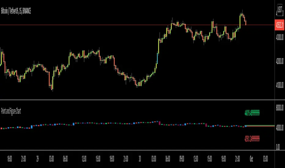
Point and Figure Chart - LiveHello Traders,
This is "Point and Figure Chart (PnF)" script that run in separated window in real time. The separated PnF chart window is timeless, so no relation with the time on the chart. PnF chart consist of "X" and "O" columns. While "X" columns represents rising prices, "O" column represents a falling price. If you have no idea about what PnF charting is then you should search for "Point and Figure Charting" on the net and get some info before using this script.
Now lets talk about details. PnF Chart requires at least two variables to be set => Box size and Reversal. Box size represents the size of each X/O in PnF chart and the reversal is used to calculate new X/O or reversal. for example if currrent column is X column then for new "X", "box size * 1" move is needed and for new "O" column or reversal, "box size * revelsal" move is needed. in the script I use lines as X/O columns.
In the options you can set "Box Size Assingment Method". you have 3 options Traditional, ATR, Percentage . what are they?
Traditional: user-defined box size, means you can set the box size as you wish, using the option . if you use this option then you should set it accordingly.
ATR : that's dynamic box size scaling and on each columns it's calculated once, you can set length for ATR
Percentage: that's also dynamic box size scaling according to closing price when new column appeared. if you use this option then you should set it accordingly.
Reversal: The reversal is typically 3 but you can change it as you wish
"Change Bar Color by PnF Trend": if you enable this option then bar color changes by PnF columns, by default it's not enabled
"Change Column Color When Breakout Occurs": PnF color changes if Double Top/Bottom breakout accours. enabled by default and you can set the colors as you wish using the options
"Change Bar Color When Breakout Occurs": bar colors changed if Double Top/Bottom breakout accours. enabled by default and you can set the colors as you wish using the options
the script checks only Double Top/Bottom breakouts at the moment. there are many other breakouts such Triple/Quadruple, Ascending/Descending Triple Top/Bottom breakouts, Catapult etc.
Also the script shows new X/O level and reversal Levels in PnF window. An example:
If you enable "Change Bar Color by PnF Trend" option:
An example if you disable the option "Change Column Color When Breakout Occurs
You may want to see my another/older "Point and Point Chart" script as well. you can find it in my profile/published scripts and in the Public Library. I use same PnF calculation algorithm in both scripts.
Enjoy!
Cyclic Smoothed RSI with Motive-Corrective Wave Indicator
This indicator uses the cyclic smoothed Relative Strength Index (cRSI) instead of the traditional Relative Strength Index (RSI). See below for more info on the benefits to the cRSI.
My key contributions
1) A Weighted Moving Average (WMA) to track the general trend of the cRSI signal. This is very helpful in determining when the equity switches from bullish to bearish, which can be used to determine buy/sell points. This is then is used to color the region between the upper and lower cRSI bands (green above, red below).
2) An attempt to detect the motive (impulse) and corrective and waves. Corrective waves are indicated A, B, C, D, E, F, G. F and G waves are not technically Elliot Waves, but the way I detect waves it is really hard to always get it right. Once and a while you could actually see G and F a second time. Motive waves are identified as s (strong) and w (weak). Strong waves have a peak above the cRSI upper band and weak waves have a peak below the upper band.
3) My own divergence indicator for bull, hidden bull, bear, and hidden bear. I was not able to replicate the TradingView style of drawing a line from peak to peak, but for this indicator I think in the end it makes the chart cleaner.
There is a latency issue with an indicator that is based on moving averages. That means they tend to trigger right after key events. Perfect timing is not possible strictly with these indicators, but they do work very well "on average." However, my implementation has minimal latency as peaks (tops/bottoms) only require one bar to detect.
As a bit of an Easter Egg, this code can be tweaked and run as a strategy to get buy/sell signals. I use this code for both my indicator and for trading strategy. Just copy and past it into a new strategy script and just change it from study to a strategy, something like this:
strategy("cRSI + Waves Strategy with VWMA overlay", overlay=overlay)
The buy/sell code is at the end and just needs to be uncommented. I make no promises or guarantees about how good it is as a strategy, but it gives you some code and ideas to work with.
Tuning
1) Volume Weighted Moving Average (VWMA): This is a “hidden strategy” feature implemented that will display the high-low bands of the VWMA on the price chart if run the code using “overlay = true”.
- If the equity does not have volume, then the VWMA will not show up. Uncheck this box and it will use the regular WMA (no volume).
- defines how far back the WMA averages price.
2) cRSI (Black line in the indicator)
- Increase to length that amount of time a band (upper/lower) stays high/low after a peak. Reduce the value to shorten the time. Just increment it up/down to see the effect.
- defines how far back the SMA averages the cRSI. This affects the purple line in the indicator.
- defines how many bars back the peak detector looks to determine if a peak has occurred. For example, a top is detected like this: current-bar down relative to the 1-bar-back, 1-bar-back up relative to 2-bars-back (look back = 1), c) 2-bars-back up relative to 3-bars-back (lookback = 2), and d) 3-bars-back up relative to 4-bars-back (lookback = 3). I hope that makes sense. There are only 2 options for this setting: 2 or 3 bars. 2 bars will be able to detect small peaks but create more “false” peaks that may not be meaningful. 3 bars will be more robust but can miss short duration peaks.
3) Waves
- The check boxes are self explanatory for which labels they turn on and off on the plot.
4) Divergence Indicators
- The check boxes are self explanatory for which labels they turn on and off on the plot.
Hints
- The most common parameter to change is the . Different stocks will have different levels of strength in their peaks. A setting of 2 may generate too many corrective waves.
- Different times scales will give you different wave counts. This is to be expected. A counter impulse wave inside a corrective wave may actually go above the cRSI WMA on a smaller time frame. You may need to increase it one or two levels to see large waves.
- Just because you see divergence (bear or hidden bear) does not mean a price is going to go down. Often price continues to rise through bears, so take note and that is normal. Bulls are usually pretty good indicators especially if you see them on C,E,G waves.
----------------------------------------------------------------------------------------------------------------------------
cyclic smoothed RSI (cRSI) indicator
----------------------------------------------------------------------------------------------------------------------------
The “core” code for the cyclic smoothed RSI (cRSI) indicator was written by Lars von Theinen and is subject to the terms of the Mozilla Public License 2.0 at mozilla.org Copyright (C) 2017 CC BY, whentotrade / Lars von Thienen. For more details on the cRSI Indicator:
The cyclic smoothed RSI indicator is an enhancement of the classic RSI, adding
1) additional smoothing according to the market vibration,
2) adaptive upper and lower bands according to the cyclic memory and
3) using the current dominant cycle length as input for the indicator.
It is much more responsive to market moves than the basic RSI. The indicator uses the dominant cycle as input to optimize signal, smoothing, and cyclic memory. To get more in-depth information on the cyclic-smoothed RSI indicator, please read Decoding The Hidden Market Rhythm - Part 1: Dynamic Cycles (2017), Chapter 4: "Fine-tuning technical indicators." You need to derive the dominant cycle as input parameter for the cycle length as described in chapter 4.
Hope this helps and good luck.

Bitcoin Logarithmic Growth CurvesThis plots logarithmic curves fitted to major Bitcoin bear market tops & bottoms. Top line is fitted to bull tops, bottom line is fitted to lower areas of the logarithmic price trend (which is not always the same as bear market bottoms). Middle line is the median of the top & bottom, and the faded solid lines are fibonacci levels in between.
Inspired by & based on a Medium post by Harold Christopher Burger, which shows how linear Bitcoin's long-term price growth is when plotted on a double-log chart (log scaling on the price AND time axis).
These curves will only make sense for tickers representing Bitcoin vs. USD (such as BITSTAMP:BTCUSD, BITMEX:XBTUSD, BLX index). Plotting on other assets will probably end up with lines that shoot off into space without any relationship to the underlying price action.
The upper, middle & lower curves can be projected into the future, which can be turned on or off in the indicator settings. The fibonacci levels can also be switched on/off. And the upper & lower curve intercepts & slopes can be tweaked.
I'm releasing this open-source, if you end up making something cool based off of this code, I don't need attribution but please hit me up on here or on twitter (same username) so I can check out what ya made. Thanks, hope y'all enjoy it.

Volume Profile Free Ultra SLI (100 Levels Value Area VWAP) - RRBVolume Profile Free Ultra SLI by RagingRocketBull 2019
Version 1.0
This indicator calculates Volume Profile for a given range and shows it as a histogram consisting of 100 horizontal bars.
This is basically the MAX SLI version with +50 more Pinescript v4 line objects added as levels.
It can also show Point of Control (POC), Developing POC, Value Area/VWAP StdDev High/Low as dynamically moving levels.
Free accounts can't access Standard TradingView Volume Profile, hence this indicator.
There are several versions: Free Pro, Free MAX SLI, Free Ultra SLI, Free History. This is the Free Ultra SLI version. The Differences are listed below:
- Free Pro: 25 levels, +Developing POC, Value Area/VWAP High/Low Levels, Above/Below Area Dimming
- Free MAX SLI: 50 levels, 2x SLI modes for Buy/Sell or even higher res 150 levels
- Free Ultra SLI: 100 levels, packed to the limit, 2x SLI modes for Buy/Sell or even higher res 300 levels
- Free History: auto highest/lowest, historic poc/va levels for each session
Features:
- High-Res Volume Profile with up to 100 levels (line implementation)
- 2x SLI modes for even higher res: 300 levels with 3x vertical SLI, 100 buy/sell levels with 2x horiz SLI
- Calculate Volume Profile on full history
- POC, Developing POC Levels
- Buy/Sell/Total volume modes
- Side Cover
- Value Area, VAH/VAL dynamic levels
- VWAP High/Low dynamic levels with Source, Length, StdDev as params
- Show/Hide all levels
- Dim Non Value Area Zones
- Custom Range with Highlighting
- 3 Anchor points for Volume Profile
- Flip Levels Horizontally
- Adjustable width, offset and spacing of levels
- Custom Color for POC/VA/VWAP levels, Transparency for buy/sell levels
WARNING:
- Compilation Time: 1 min 20 sec
Usage:
- specify max_level/min_level/spacing (required)
- select range (start_bar, range length), confirm with range highlighting
- select volume type: Buy/Sell/Total
- select mode Value Area/VWAP to show corresponding levels
- flip/select anchor point to position the buy/sell levels
- use Horiz Buy/Sell SLI mode with 100 or Vertical SLI with 300 levels if needed
- use POC/Developing POC/VA/VWAP High/Low as S/R levels. Usually daily values from 1-3 days back are used as levels for the current day.
SLI:
use SLI modes to extend the functionality of the indicator:
- Horiz Buy/Sell 2x SLI lets you view 100 Buy/Sell Levels at the same time
- Vertical Max_Vol 3x SLI lets you increase the resolution to 300 levels
- you need at least 2 instances of the indicator attached to the same chart for SLI to work
1) Enable Horiz SLI:
- attach 2 indicator instances to the chart
- make sure all instances have the same min_level/max_level/range/spacing settings
- select volume type for each instance: you can have a buy/sell or buy/total or sell/total SLI. Make sure your buy volume instance is the last attached to be displayed on top of sell/total instances without overlapping.
- set buy_sell_sli_mode to true for indicator instances with volume_type = buy/sell, for type total this is optional.
- this basically tells the script to calculate % lengths based on total volume instead of individual buy/sell volumes and use ext offset for sell levels
- Sell Offset is calculated relative to Buy Offset to stack/extend sell after buy. Buy Offset = Zero - Buy Length. Sell Offset = Buy Offset - Sell Length = Zero - Buy Length - Sell Length
- there are no master/slave instances in this mode, all indicators are equal, poc/va levels are not affected and can work independently, i.e. one instance can show va levels, another - vwap.
2) Enable Vertical SLI:
- attach the first instance and evaluate the full range to roughly determine where is the highest max_vol/poc level i.e. 0..20000, poc is in the bottom half (third, middle etc) or
- add more instances and split the full vertical range between them, i.e. set min_level/max_level of each corresponding instance to 0..10000, 10000..20000 etc
- make sure all instances have the same range/spacing settings
- an instance with a subrange containing the poc level of the full range is now your master instance (bottom half). All other instances are slaves, their levels will be calculated based on the max_vol/poc of the master instance instead of local values
- set show_max_vol_sli to true for the master instance. for slave instances this is optional and can be used to check if master/slave max_vol values match and slave can read the master's value. This simply plots the max_vol value
- you can also attach all instances and set show_max_vol_sli to true in all of them - the instance with the largest max_vol should become the master
Auto/Manual Ext Max_Vol Modes:
- for auto vertical max_vol SLI mode set max_vol_sli_src in all slave instances to the max_vol of the master indicator: "VolumeProfileFree_MAX_RRB: Max Volume for Vertical SLI Mode". It can be tricky with 2+ instances
- in case auto SLI mode doesn't work - assign max_vol_sli_ext in all slave instances the max_vol value of the master indicator manually and repeat on each change
- manual override max_vol_sli_ext has higher priority than auto max_vol_sli_src when both values are assigned, when they are 0 and close respectively - SLI is disabled
- master/slave max_vol values must match on each bar at all times to maintain proper level scale, otherwise slave's levels will look larger than they should relative to the master's levels.
- Max_vol (red) is the last param in the long list of indicator outputs
- the only true max_vol/poc in this SLI mode is the master's max_vol/poc. All poc/va levels in slaves will be irrelevant and are disabled automatically. Slaves can only show VWAP levels.
- VA Levels of the master instance in this SLI mode are calculated based on the subrange, not the whole range and may be inaccurate. Cross check with the full range.
WARNING!
- auto mode max_vol_sli_src is experimental and may not work as expected
- you can only assign auto mode max_vol_sli_src = max_vol once due to some bug with unhandled exception/buffer overflow in Tradingview. Seems that you can clear the value only by removing the indicator instance
- sometimes you may see a "study in error state" error when attempting to set it back to close. Remove indicator/Reload chart and start from scratch
- volume profile may not finish to redraw and freeze in an ugly shape after an UI parameter change when max_vol_sli_src is assigned a max_vol value. Assign it to close - VP should redraw properly, but it may not clear the assigned max_vol value
- you can't seem to be able to assign a proper auto max_vol value to the 3rd slave instance
- 2x Vertical SLI works and tested in both auto/manual, 3x SLI - only manual seems to work (you can have a mixed mode: 2nd instance - auto, 3rd - manual)
Notes:
- This code uses Pinescript v3 compatibility framework
- This code is 20x-30x faster (main for cycle is removed) especially on lower tfs with long history - only 4-5 sec load/redraw time vs 30-60 sec of the old Pro versions
- Instead of repeatedly calculating the total sum of volumes for the whole range on each bar, vol sums are now increased on each bar and passed to the next in the range making it a per range vs per bar calculation that reduces time dramatically
- 100 levels consist of 50 main plot levels and 50 line objects used as alternate levels, differences are:
- line objects are always shown on top of other objects, such as plot levels, zero line and side cover, it's not possible to cover/move them below.
- all line objects have variable lengths, use actual x,y coords and don't need side cover, while all plot levels have a fixed length of 100 bars, use offset and require cover.
- all key properties of line objects, such as x,y coords, color can be modified, objects can be moved/deleted, while this is not possible for static plot levels.
- large width values cause line objects to expand only up/down from center while their length remains the same and stays within the level's start/end points similar to an area style.
- large width values make plot levels expand in all directions (both h/v), beyond level start/end points, sometimes overlapping zero line, making them an inaccurate % length representation, as opposed to line objects/plot levels with area style.
- large width values translate into different widths on screen for line objects and plot levels.
- you can't compensate for this unwanted horiz width expansion of plot levels because width uses its own units, that don't translate into bars/pixels.
- line objects are visible only when num_levels > 50, plot levels are used otherwise
- Since line objects are lines, plot levels also use style line because other style implementations will break the symmetry/spacing between levels.
- if you don't see a volume profile check range settings: min_level/max_level and spacing, set spacing to 0 (or adjust accordingly based on the symbol's precision, i.e. 0.00001)
- you can view either of Buy/Sell/Total volumes, but you can't display Buy/Sell levels at the same time using a single instance (this would 2x reduce the number of levels). Use 2 indicator instances in horiz buy/sell sli mode for that.
- Volume Profile/Value Area are calculated for a given range and updated on each bar. Each level has a fixed length. Offsets control visible level parts. Side Cover hides the invisible parts.
- Custom Color for POC/VA/VWAP levels - UI Style color/transparency can only change shape's color and doesn't affect textcolor, hence this additional option
- Custom Width - UI Style supports only width <= 4, hence this additional option
- POC is visible in both modes. In VWAP mode Developing POC becomes VWAP, VA High and Low => VWAP High and Low correspondingly to minimize the number of plot outputs
- You can't change buy/sell level colors from input (only transparency) - this requires 2x plot outputs => 2x reduces the number of levels to fit the max 64 limit. That's why 2 additional plots are used to dim the non Value Area zones
- You can change level transparency of line objects. Due to Pinescript limitations, only discrete values are supported.
- Inverse transp correlation creates the necessary illusion of "covered" line objects, although they are shown on top of the cover all the time
- If custom lines_transp is set the illusion will break because transp range can't be skewed easily (i.e. transp 0..100 is always mapped to 100..0 and can't be mapped to 50..0)
- transparency can applied to lines dynamically but nva top zone can't be completely removed because plot/mixed type of levels are still used when num_levels < 50 and require cover
- transparency can't be applied to plot levels dynamically from script this can be done only once from UI, and you can't change plot color for the past length bars
- All buy/sell volume lengths are calculated as % of a fixed base width = 100 bars (100%). You can't set show_last from input to change it
- Range selection/Anchoring is not accurate on charts with time gaps since you can only anchor from a point in the future and measure distance in time periods, not actual bars, and there's no way of knowing the number of future gaps in advance.
- Adjust Width for Log Scale mode now also works on high precision charts with small prices (i.e. 0.00001)
- in Adjust Width for Log Scale mode Level1 width extremes can be capped using max deviation (when level1 = 0, shift = 0 width becomes infinite)
- There's no such thing as buy/sell volume, there's just volume, but for the purposes of the Volume Profile method, assume: bull candle = buy volume, bear candle = sell volume
P.S. I am your grandfather, Luke! Now, join the Dark Side in your father's steps or be destroyed! Once more the Sith will rule the Galaxy, and we shall have peace...
Volume Profile Free Pro (25 Levels Value Area VWAP) by RRBVolume Profile Free Pro by RagingRocketBull 2019
Version 1.0
All available Volume Profile Free Pro versions are listed below (They are very similar and I don't want to publish them as separate indicators):
ver 1.0: style columns implementation
ver 2.0: style histogram implementation
ver 3.0: style line implementation
This indicator calculates Volume Profile for a given range and shows it as a histogram consisting of 25 horizontal bars.
It can also show Point of Control (POC), Developing POC, Value Area/VWAP StdDev High/Low as dynamically moving levels.
Free accounts can't access Standard TradingView Volume Profile, hence this indicator.
There are 3 basic methods to calculate the Value Area for a session.
- original method developed by Steidlmayr (calculated around POC)
- classical method using StdDev (calculated around the mean VWAP)
- another method based on the mean absolute deviation (calculated around the median)
POC is a high volume node and can be used as support/resistance. But when far from the day's average price it may not be as good a trend filter as the other methods.
The 80% Rule: When the market opens above/below the Value Area and then returns/stays back inside for 2 consecutive 30min periods it has 80% chance of filling VA (like a gap).
There are several versions: Free, Free Pro, Free MAX. This is the Free Pro version. The Differences are listed below:
- Free: 30 levels, Buy/Sell/Total Volume Profile views, POC
- Free Pro: 25 levels, +Developing POC, Value Area/VWAP High/Low Levels, Above/Below Area Dimming
- Free MAX: 50 levels, packed to the limit
Features:
- Volume Profile with up to 25 levels (3 implementations)
- POC, Developing POC Levels
- Buy/Sell/Total/Side by Side View modes
- Side Cover
- Value Area, VAH/VAL dynamic levels
- VWAP High/Low dynamic levels with Source, Length, StdDev as params
- Show/Hide all levels
- Dim Non Value Area Zones
- Custom Range with Highlighting
- 3 Anchor points for Volume Profile
- Flip Levels Horizontally
- Adjustable width, offset and spacing of levels
- Custom Color for POC/VA/VWAP levels and Transparency for buy/sell levels
Usage:
- specify max_level/min_level for a range (required in ver 1.0/2.0, auto/optional in ver 3.0 = set to highest/lowest)
- select range (start_bar, range length), confirm with range highlighting
- select mode Value Area or VWAP to show corresponding levels.
- flip/select anchor point to position the buy/sell levels, adjust width and spacing as needed
- select Buy/Sell/Total/Side by Side view mode
- use POC/Developing POC/VA/VWAP High/Low as S/R levels. Usually daily values from 1-3 days back are used as levels for the current day.
- Green - buy volume of a specific price level in a range, Red - sell volume. Green + Red = Total volume of a price level in a range
There's no native support for vertical histograms in Pinescript (with price axis as base)
Basically, there are 4 ways to plot a series of horizontal bars stacked on top of each other:
1. plotshape style labeldown (ver 0 prototype discarded)
- you can have a set of fixed width/height text labels consisting of a series of underscores and moving dynamically as levels. Level offset controls visible length.
- you can move levels and scale the base width of the volume profile histogram dynamically
- you can calculate the highest/lowest range values automatically. max_level/min_level inputs are optional
- you can't fill the gaps between levels/adjust/extend width, height - this results in a half baked volume profile and looks ugly
- fixed text level height doesn't adjust and looks bad on a log scale
- fixed font width also doesn't scale and can't be properly aligned with bars when zooming
2. plot style columns + hist_base (ver 1.0)
- you can plot long horizontal bars using a series of small adjacent vertical columns with level offsets controlling visible length.
- you can't hide/move levels of the volume profile histogram dynamically on each bar, they must be plotted at all times regardless - you can't delete the history of a plot.
- you can't scale the base width of the volume profile histogram dynamically, can't set show_last from input, must use a preset fixed width for each level
- hist_base can only be a static const expression, can't be assigned highest/lowest range values automatically - you have to specify max_level/min_level manually from input
- you can't control spacing between columns - there's an equalizer bar effect when you zoom in, and solid bars when you zoom out
- using hist_base for levels results in ugly load/redraw times - give it 3-5 sec to finalize its shape after each UI param change
- level top can be properly aligned with another level's bottom producing a clean good looking histogram
- columns are properly aligned with bars automatically
3. plot style histogram + hist_base (ver 2.0)
- you can plot long horizontal bars using a series of small vertical bars (horizontal histogram) instead of columns.
- you can control the width of each histogram bar comprising a level (spacing/horiz density). Large enough width will cause bar overlapping and give level a "solid" look regardless of zoom
- you can only set width <= 4 in UI Style - custom textbox input is provided for larger values. You can set width and plot transparency from input
- this method still uses hist_base and inherits other limitations of ver 2.0
4. plot style lines (ver 3.0)
- you can also plot long horizontal bars using lines with level offsets controlling visible length.
- lines don't need hist_base - fast and smooth redraw times
- you can calculate the highest/lowest range values automatically. max_level/min_level inputs are optional
- level top can't be properly aligned with another level's bottom and have a proper spacing because line width uses its own units and doesn't scale
- fixed line width of a level (vertical thickness) doesn't scale and looks bad on log (level overlapping)
- you can only set width <= 4 in UI Style, a custom textbox input is provided for larger values. You can set width and plot transparency from input
Notes:
- hist_base for levels results in ugly load/redraw times - give it 3-5 sec to finalize its shape after each UI param change
- indicator is slow on TFs with long history 10000+ bars
- Volume Profile/Value Area are calculated for a given range and updated on each bar. Each level has a fixed width. Offsets control visible level parts. Side Cover hides the invisible parts.
- Custom Color for POC/VA/VWAP levels - UI Style color/transparency can only change shape's color and doesn't affect textcolor, hence this additional option
- Custom Widh for levels - UI Style supports only width <= 4, hence this additional option
- POC is visible in both modes. In VWAP mode Developing POC becomes VWAP, VA High and Low => VWAP High and Low correspondingly to minimize the number of plot outputs
- You can't change buy/sell level colors (only plot transparency) - this requires 2x plot outputs exceeding max 64 limit. That's why 2 additional plots are used to dim the non Value Area zones
- Use Side by Side view to compare buy and sell volumes between each other: base width = max(total_buy_vol, total_sell_vol)
- All buy/sell volume lengths are calculated as % of a fixed base width = 100 bars (100%). You can't set show_last from input
- Sell Offset is calculated relative to Buy Offset to stack/extend sell on top of buy. Buy Offset = Zero - Buy Length. Sell Offset = Buy Offset - Sell Length = Zero - Buy Length - Sell Length
- If you see "loop too long error" - change some values in UI and it will recalculate - no need to refresh the chart
- There's no such thing as buy/sell volume, there's just volume, but for the purposes of the Volume Profile method, assume: bull candle = buy volume, bear candle = sell volume
- Volume Profile Range is limited to 5000 bars for free accounts
P.S. Cantaloupia Will be Free!
Links on Volume Profile and Value Area calculation and usage:
www.tradingview.com
stockcharts.com
onlinelibrary.wiley.com

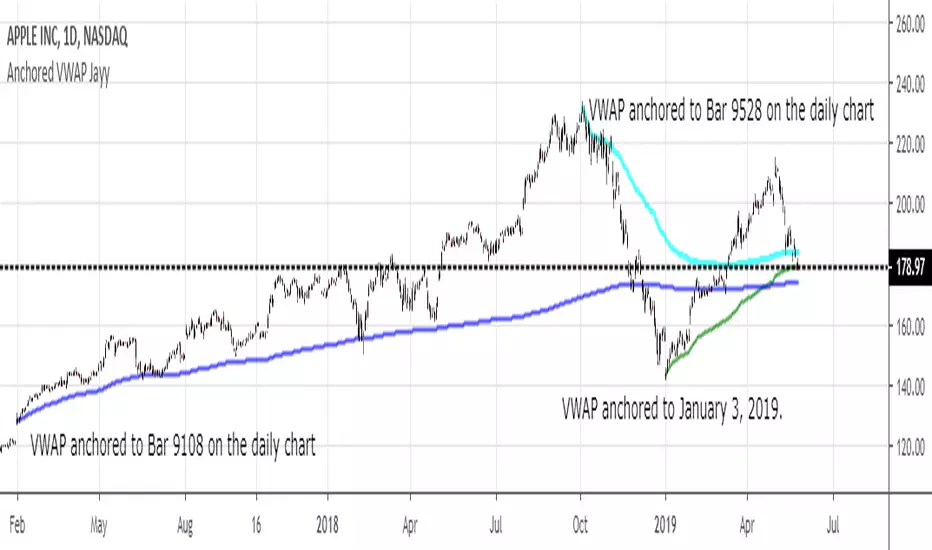
MIDAS VWAP Jayy his is just a bash together of two MIDAS VWAP scripts particularly AkifTokuz and drshoe.
I added the ability to show more MIDAS curves from the same script.
The algorithm primarily uses the "n" number but the date can be used for the 8th VWAP
I have not converted the script to version 3.
To find bar number go into "Chart Properties" select " "background" then select Indicator Titles and "Indicator values". When you place your cursor over a bar the first number you see adjacent to the script title is the bar number. Put that in the dialogue box midline is MIDAS VWAP . The resistance is a MIDAS VWAP using bar highs. The resistance is MIDAS VWAP using bar lows.
In most case using N will suffice. However, if you are flipping around charts inputting a specific date can be handy. In this way, you can compare the same point in time across multiple instruments eg first trading day of the year or an election date.
Adding dates into the dialogue box is a bit cumbersome so in this version, it is enabled for only one curve. I have called it VWAP and it follows the typical VWAP algorithm. (Does that make a difference? Read below re my opinion on the Difference between MIDAS VWAP and VWAP ).
I have added the ability to start from the bottom or top of the initiating bar.
In theory in a probable uptrend pick a low of a bar for a low pivot and start the MIDAS VWAP there using the support.
For a downtrend use the high pivot bar and select resistance. The way to see is to play with these values.
Difference between MIDAS VWAP and the regular VWAP
MIDAS itself as described by Levine uses a time anchored On-Balance Volume (OBV) plotted on a graph where the horizontal (abscissa) arm of the graph is cumulative volume not time. He called his VWAP curves Support/Resistance VWAP or S/R curves. These S/R curves are often referred to as "MIDAS curves".
These are the main components of the MIDAS chart. A third algorithm called the Top-Bottom Finder was also described. (Separate script).
Additional tools have been described in "MIDAS_Technical_Analysis"
Midas Technical Analysis: A VWAP Approach to Trading and Investing in Today’s Markets by Andrew Coles, David G. Hawkins
Copyright © 2011 by Andrew Coles and David G. Hawkins.
Denoting the different way in which Levine approached the calculation.
The difference between "MIDAS" VWAP and VWAP is, in my opinion, much ado about nothing. The algorithms generate identical curves albeit the MIDAS algorithm launches the curve one bar later than the VWAP algorithm which can be a pain in the neck. All of the algorithms that I looked at on Tradingview step back one bar in time to initiate the MIDAS curve. As such the plotted curves are identical to traditional VWAP assuming the initiation is from the candle/bar midpoint.
How did Levine intend the curves to be drawn?
On a reversal, he suggested the initiation of the Support and Resistance VVWAP (S/R curve) to be started after a reversal.
It is clear in his examples this happens occasionally but in many cases he initiates the so-called MIDAS S/R VWAP right at the reversal point. In any case, the algorithm is problematic if you wish to start a curve on the first bar of an IPO .
You will get nothing. That is a pain. Also in Levine's writings, he describes simply clicking on the point where a
S/R VWAP is to be drawn from. As such, the generally accepted method of initiating the curve at N-1 is a practical and sensible method. The only issue is that you cannot draw the curve from the first bar on any security, as mentioned without resorting to the typical VWAP algorithm. There is another difference. VWAP is launched from the middle of the bar (as per AlphaTrends), You can also launch from the top of the bar or the bottom (or anywhere for that matter). The calculation proceeds using the top or bottom for each new bar.
The potential applications are discussed in the MIDAS Technical Analysis book.
Pump_Doctor Trends**You must enable bar colors in the options for the script if you wish to see them**
This indicator is very useful for spotting trends / tops / bottoms.
This is the ultimate altcoin pump spotting tool. Use on higher timeframes for greatest accuracy. If altcoin is newish (ZEC for example), try 4h rather than 1D or 3D.
Green = Uptrend
Red = Downtrend
Gray = Top/local top, bottom/local bottom, or continuation. You will need some knowledge of price action to determine which condition applies.
You can use the oscillator at the bottom as a measure of momentum / trend strength. You can draw trendlines on the oscillator on the top/bottom or the interior.
Full VZ-Score (price & Volume)Z score is an Indicator really close to CCI, only difference is that CCI use a 1.5 factor of standard deviation, and Z score use only 1 deviation. This difference make CCI to have a range wider then Z score, but also less sharpe. Here I had use a light filter to smooth both price and volume. So we have same indicator with different source: Histogram is VOLUME Z score, and LINE is PRICE (hlc3). Remember that top volume is not always top price, it could be button one. Volume help to see how strong is the move of the Z score. Inversion could happen when top/high volume and top/bottom price. Low buttom volume with low/high price usualy means end of trend.

Price Action Doji Harami v0.2 by JustUncleLThis is an updated and final version of this indicator. This version distinguishes between the true Harami and the other Doji candlestick patterns as used with the Heikin Ashi candle charts. These candle patterns indicate a potential trend reversal or pullback.
The patterns identified are:
- Bearish Harami (Red Highlight above Bar):
One to three (default 3) large body Bull (green) candles followed by a small (red)
or no body candle (less than 0.5pip) with wicks top and bottom that are at least 60% of candle.
- Bullish Harami (Green Highlight below Bar):
One to three (default 3) large body Bear (red) candles followed by a small (green)
or no body candle (less than 0.5pip) with wicks top and bottom that are at least 60% of candle.
- Bearish Doji (Fuchsia Highlight above Bar):
One to three (default 3) large body Bull (green) candles followed by a small (green)
with wicks top and bottom that are at least 60% of candle.
- Bullish Doji (Aqua Highlight below Bar):
One to three (default 3) large body Bear (red) candles followed by a small (red)
with wicks top and bottom that are at least 60% of candle.
You can optionally specify how large the candles prior to Harami/Doji are in pips, default is 0 pip.
If you set this to zero then it will have no candle size consideration. You can also specify how many look back candles (1-3) are used in Harami/Doji calculations (default 3).
Included option to perform Calculations purely on Heikin Ashi candles, this helps when you want to see the HA Doji/Harami bars with the normal candle stick chart.
Also can optionally set an alert condition for when Harami/Doji found, this also displays a circle on the bottom of the screen when alert is triggered.

Sniper Stochastics Sniper Stochastics is a triple stochastic system.
Basically, watch the 20 and 80 crossovers. However, the settings of the three stochastics correspond to Fibonacci numbers 55, 89, and 144.
Since we have a fast, medium and slow speed stochastics; we can also watch the crossovers.
I have found that When the Red (144) is on top, it usually signals a turn upwards; conversely, a blue (89) on top of the others means that the market is going to go down.
So red on top = bullish and blue on top= bearish.
You can also think of them in terms of efficiency. If they all display the same and are overlapping in a single line; crossing an 80 or 20 line, this is a strong signal - bullish or bearish.
If on the other hand, you see them splayed out and moving away from eachother but the same direction; it signals a more inefficient process and thus a weaker signal.
I really enjoy using these and I hope you will too.
On the settings, I have turned off the %D so that they display only %K's. The Default is 55, 89 ,144.

Asset Liquidity Meter by Funded RelayAsset Liquidity Meter by Funded Relay
This indicator estimates the liquidity of any asset by calculating the volume traded per unit of price movement (volume / (high - low)).
Higher values generally indicate better liquidity (more volume in a smaller price range → easier to enter/exit positions with less slippage).
Lower values suggest thinner liquidity (higher risk of price impact and volatility).
The indicator displays:
• Histogram: raw liquidity per bar (green = above SMA, red = below SMA)
• SMA line: smoothed liquidity trend
• Real-time info table in the top-right corner
• Built-in alert conditions
How to Use – Step by Step
1. Adding the Indicator
- Open any chart on TradingView
- Click the "Indicators" button at the top
- Search for "Asset Liquidity Meter v6" (or find it in Community Scripts / My Scripts)
- Click to add it to the chart
- It will appear in a separate pane below the price chart
2. Customizing Settings
Double-click the indicator name in the pane (or right-click → Settings):
• SMA Length (default: 14)
- Controls the smoothing period of the liquidity trend line
- Smaller values (5–10) → more responsive, good for intraday/scalping
- Larger values (20–50) → smoother trend, better for swing/position trading
• Epsilon (default: 0.00000001)
- Tiny value that prevents division-by-zero errors on flat bars (high = low)
- Almost never needs to be changed
• Colors
- High Liquidity Color: histogram bars when liquidity > SMA
- Low Liquidity Color: histogram bars when liquidity < SMA
- SMA Line Color: color of the smoothed trend line
• Show Alert Conditions in Menu
- Keep enabled (true) to see the built-in alert options when creating alerts
3. Reading & Interpreting the Indicator
• Histogram Bars (Raw Liquidity)
- Height = amount of volume per unit of price range
- Tall bars = high liquidity (market is "thick")
- Short bars = low liquidity (market is "thin")
- Green = current liquidity is stronger than the average (SMA)
- Red = current liquidity is weaker than the average
• Blue SMA Line
- Shows the average liquidity over the selected period
- Rising line → liquidity improving (more participants, easier trading)
- Falling line → liquidity decreasing (thinner market, caution advised)
• Info Table (top-right corner)
- Displays current raw liquidity, SMA value, and status ("High Liquidity" / "Low Liquidity")
- Updates in real-time on the last bar
• Zero Line (dotted gray)
- Visual reference — everything above zero is positive liquidity
4. Practical Trading Applications
• High Liquidity Zones (green bars + rising SMA)
- Favorable conditions for entering or scaling into positions
- Lower expected slippage
- Better for large orders
• Low Liquidity Zones (red bars + falling SMA)
- Higher risk of slippage and exaggerated price moves
- Consider smaller position sizes or waiting for better conditions
- Common during session opens/closes, holidays, or low-volume periods
• Crossovers
- Liquidity crossing above SMA → potential increase in market participation
- Liquidity crossing below SMA → potential drying up of interest
5. Setting Up Alerts
1. Right-click on the chart → "Add Alert"
2. In "Condition", select "Asset Liquidity Meter v6"
3. Choose one of the available alert conditions:
- Liquidity ↑ Crosses Above SMA
- Liquidity ↓ Crosses Below SMA
- Very High Liquidity (2× SMA)
- Very Low Liquidity (<30% SMA)
4. Set frequency (Once Per Bar Close is usually best)
5. Configure notification (email, popup, sound, webhook, etc.)
6. Create the alert
6. Tips for Best Results
• Works on all markets: stocks, forex, crypto, futures, indices
• Best on timeframes with meaningful volume data (5 min and higher usually give clearest signals)
• Compare liquidity across different assets or timeframes using multiple charts
• Combine with support/resistance, volume profile or order flow tools for confirmation
• Not a standalone signal — use in context with your overall strategy
Limitations & Notes
• This is an estimation based on OHLCV data — it does not show real order book depth
• Results vary significantly between centralized exchanges, brokers and instruments
• Zero-volume bars will show zero liquidity (expected behavior)
Enjoy safer and more informed trading!
Questions or suggestions? Feel free to comment below.

Market Internals SPY[TP]# Market Internals SPY Dashboard - TradingView Publication
## 📊 Overview
**Market Internals SPY ** is a comprehensive multi-factor market sentiment dashboard designed specifically for SPY (S&P 500 ETF) traders. This indicator combines four powerful market breadth signals into one easy-to-read interface, helping traders identify high-probability setups and avoid false breakouts.
---
## 🎯 What Makes This Indicator Unique?
Unlike single-indicator tools, this dashboard synthesizes **multiple market internals** to provide confluence-based trading signals:
- **CPR (Central Pivot Range)** - Institutional pivot levels
- **VIX (Volatility Index)** - Fear gauge
- **Put/Call Ratio** - Options sentiment with dynamic crossover alerts
- ** USI:ADD (Advance/Decline Line)** - Market breadth strength
All presented in a clean, real-time dashboard with visual alerts directly on your chart.
---
## 📈 Key Features
### 1. **Static Daily CPR Levels**
- Automatically plots Top CPR, Pivot, and Bottom CPR
- Levels remain fixed throughout the trading day (no repainting)
- **Trend Bias Indicator**: Green = Current Pivot > Previous Pivot (Bullish structure)
### 2. **Put/Call Ratio Crossover System**
- 10-period SMA smoothing for cleaner signals
- **Bullish Signal** (Green background): Put/Call crosses below SMA
- Indicates decreasing hedging activity (bullish)
- **Bearish Signal** (Red background): Put/Call crosses above SMA
- Indicates increasing hedging activity (bearish)
### 3. **Price/Breadth Divergence Detection**
- **Yellow Candles**: Highlight when price and USI:ADD diverge
- Price rising but USI:ADD falling = Potential reversal
- Price falling but USI:ADD rising = Possible bottom
### 4. **Comprehensive Real-Time Dashboard**
A top-right table displaying:
- **CPR Trend Bias**: Bullish/Bearish structure
- **VIX Level**: Current value + directional bias
- **Put/Call Ratio**: Live value + trend arrows
- **AD Line**: Breadth strength with directional indicators
### 5. **Intelligent Bar Coloring**
- **Green bars**: USI:ADD rising (breadth improving)
- **Red bars**: USI:ADD falling (breadth deteriorating)
- **Yellow bars**: Divergence warning (potential reversal)
---
## 🔧 How to Use
### Setup Instructions
1. **Add to Chart**: Apply to SPY on your preferred intraday timeframe (5m, 15m, 30m, 1H)
2. **Configure Symbols** (if needed):
- Default settings work for most platforms
- If "PCC" doesn't load, try: `PCCR`, `INDEX:PCC`, `USI:PCC`, or `CBOE:PCC`
- Ensure you have market internals data access ( USI:ADD , VIX)
### Trading Signals
#### 🟢 **Bullish Confluence** (High-Probability Long Setup)
- CPR Trend = BULLISH
- VIX falling or low (<20)
- Put/Call below SMA (or green background crossover)
- USI:ADD rising (green bars)
- **Entry**: Look for bullish price action at support levels
#### 🔴 **Bearish Confluence** (High-Probability Short Setup)
- CPR Trend = BEARISH
- VIX rising or elevated (>25)
- Put/Call above SMA (or red background crossover)
- USI:ADD falling (red bars)
- **Entry**: Look for bearish rejection at resistance
#### ⚠️ **Divergence Warning**
- Yellow candles indicate mismatch between price and breadth
- Consider profit-taking or reversals when divergence appears at extremes
### Best Practices
- **Multi-Timeframe Confirmation**: Check higher timeframes (4H, Daily) for trend alignment
- **Volume Confirmation**: Combine with volume analysis for stronger signals
- **Risk Management**: Always use stop losses; no indicator is 100% accurate
- **News Awareness**: Be cautious around major economic releases
---
## 📚 Understanding the Components
### CPR (Central Pivot Range)
Traditional floor trader pivot levels calculated from previous day's High, Low, Close:
- **Pivot (PP)** = (High + Low + Close) / 3
- **Top CPR (TC)** = (PP - BC) + PP
- **Bottom CPR (BC)** = (High + Low) / 2
### VIX (Volatility Index)
- **< 15**: Complacency, potential for sudden moves
- **15-20**: Normal conditions
- **20-30**: Elevated uncertainty
- **> 30**: High fear, potential bottoming process
### Put/Call Ratio
- **< 0.7**: Excessive optimism (contrarian bearish)
- **0.7-1.0**: Balanced sentiment
- **> 1.0**: Defensive positioning (contrarian bullish potential)
### USI:ADD (NYSE Advance/Decline)
- **> 0**: More stocks advancing than declining (bullish breadth)
- **< 0**: More stocks declining than advancing (bearish breadth)
- **Extreme readings** (±2000+): Potential exhaustion
---
## ⚙️ Customization Options
### Input Parameters
- **AD Line Symbol**: Default "ADD" (try "ADVN" or "NYSE:ADD" if needed)
- **VIX Symbol**: Default "VIX" (try "CBOE:VIX" if needed)
- **Put/Call Symbol**: Default "PCC" (alternatives listed above)
### Color Scheme
- Blue: CPR levels
- Purple: Pivot point
- Green: Bullish signals/backgrounds
- Red: Bearish signals/backgrounds
- Yellow: Divergence warnings
---
## 💡 Pro Tips
1. **Wait for Confluence**: Don't trade on a single indicator - wait for 3+ signals to align
2. **Use CPR as Dynamic S/R**: Price tends to react at TC and BC levels
3. **Watch the Crossovers**: Put/Call crossovers often precede significant moves
4. **Monitor Divergences**: Yellow candles at key levels are high-value signals
5. **Combine with Price Action**: This tool confirms direction - you still need entry triggers
---
## ⚠️ Limitations & Disclaimers
- Requires **premium data** for USI:ADD and VIX on most platforms
- Best suited for **intraday SPY trading** (may adapt to other indices)
- **Not a standalone system** - use with proper risk management
- Past performance does not guarantee future results
- Always backtest before live trading
---
## 🎓 Example Scenario
**Bullish Setup**:
- 9:45 AM EST: Price pulls back to Bottom CPR
- Dashboard shows: ✅ Bullish CPR Bias, ✅ VIX 16.5 (falling), ✅ Put/Call 0.68 ⬇️ Bull, ✅ USI:ADD +850 ⬆️
- Green background flashes (Put/Call crossunder)
- **Action**: Enter long at BC with stop below TC of previous day
---
## 📊 Ideal Timeframes
- **Primary**: 5-minute, 15-minute (day trading)
- **Secondary**: 30-minute, 1-hour (swing entries)
- **Confirmation**: Daily chart for trend context
---
## 🔄 Updates & Support
This indicator is actively maintained. If you encounter symbol loading issues:
1. Check your data provider includes market internals
2. Try alternative symbols in inputs
3. Ensure you're using a premium TradingView plan (if required)
---
## 📝 Version Information
- **Version**: 5 (Pine Script v5)
- **Type**: Overlay Indicator
- **Author**: tapaspattanaik
- **Category**: Market Internals / Breadth Analysis
---
## 🏆 Final Thoughts
This indicator is designed for **serious traders** who understand that edge comes from confluence, not single signals. By combining institutional pivot levels with real-time market internals, you gain a significant advantage in reading market sentiment and timing entries with precision.
**Remember**: The best trades happen when multiple independent factors align. Use this dashboard to find those moments.
---
## 📌 How to Add This Indicator
1. Open TradingView and navigate to Pine Editor
2. Copy the complete script code
3. Click "Add to Chart"
4. Configure symbols if needed (see Setup Instructions above)
5. Adjust position/colors to your preference
---
**Happy Trading! 📈**
*This indicator is for educational purposes. Always manage risk appropriately and never risk more than you can afford to lose.*
---
### Tags
`#SPY` `#MarketInternals` `#CPR` `#VIX` `#PutCallRatio` `#BreadthAnalysis` `#DayTrading` `#SwingTrading` `#TechnicalAnalysis` `#PivotPoints`

Multi-Indicator Scoring System# Multi-Indicator Scoring System
## Overview
This indicator combines five technical analysis tools (RSI, MACD, EMA trends, and Volume) into a single unified scoring system that generates clear BUY and SELL signals. Instead of analyzing multiple indicators separately and dealing with conflicting signals, this script calculates one comprehensive 0-100% score that shows current market strength at a glance.
## Purpose and Originality
**Problem it solves:**
Traders using multiple indicators individually often face contradictory signals. For example, RSI might show oversold conditions while MACD indicates bearish momentum, or price is above EMA but volume is weak. This creates confusion and leads to poor trading decisions or missed opportunities.
**Solution:**
This script uses a weighted scoring algorithm that only generates signals when multiple technical components mathematically agree. Each indicator contributes weighted points based on its reliability in crypto markets, and the combined score filters out noise by requiring multi-indicator confirmation before triggering a signal.
**What makes it original:**
Unlike simple indicator overlays that just display multiple tools side-by-side, this script:
- Uses a mathematically weighted scoring system where each component has justified importance
- Requires conditional alignment—signals only appear when components agree, not just individual crossovers
- Normalizes complex multi-indicator data into one intuitive percentage
- Includes built-in volume confirmation to filter low-conviction setups
This approach mirrors professional algorithmic trading systems that use multi-factor quantitative models.
## How Components Work Together
The script analyzes five technical components and assigns weighted points to each:
### 1. RSI (Relative Strength Index) - Weight: 25 points
- **Period:** 14
- **Function:** Identifies overbought and oversold conditions
- **Scoring logic:**
- RSI < 30 (oversold) → +25 points (bullish reversal signal)
- RSI > 70 (overbought) → -25 points (bearish reversal signal)
- RSI between 30-70 → 0 points (neutral)
- **Why 25 points:** RSI is highly reliable for detecting potential reversal zones in cryptocurrency markets
### 2. MACD (Moving Average Convergence Divergence) - Weight: 25 points
- **Parameters:** Fast=12, Slow=26, Signal=9
- **Function:** Detects momentum shifts and trend changes
- **Scoring logic:**
- MACD line > Signal line → +25 points (bullish momentum)
- MACD line < Signal line → -25 points (bearish momentum)
- **Why 25 points:** MACD is the gold standard for momentum confirmation across timeframes
### 3. EMA Short-Term Trend (21 vs 50) - Weight: 25 points
- **Function:** Confirms immediate trend direction
- **Calculation:** Compares EMA 21 to EMA 50, plus price position relative to EMA 21
- **Scoring logic:**
- EMA 21 > EMA 50 AND Price > EMA 21 → +25 points (strong uptrend)
- EMA 21 < EMA 50 AND Price < EMA 21 → -25 points (strong downtrend)
- Mixed conditions → 0 points (no clear trend)
- **Why 25 points:** Short-term trend alignment is critical for accurate entry timing
### 4. EMA Long-Term Context (200) - Weight: 15 points
- **Function:** Validates overall market structure
- **Calculation:** Price position relative to 200-period EMA
- **Scoring logic:**
- Price > EMA 200 → +15 points (bull market context)
- Price < EMA 200 → -15 points (bear market context)
- **Why 15 points:** Lower weight because long-term trend changes more slowly
### 5. Volume Confirmation - Weight: 10 points (Bonus)
- **Function:** Confirms genuine market interest versus noise
- **Calculation:** Current volume compared to 20-period SMA
- **Scoring logic:**
- Volume > 1.5× average → +10 bonus points
- Volume ≤ 1.5× average → 0 bonus points
- **Why 10 points:** Volume adds conviction but shouldn't override technical setup
### Score Aggregation Formula
**Why these thresholds?**
Backtesting on BTC/ETH showed optimal risk/reward at 65/35 levels. Lower thresholds (50%) produce too many false signals, while higher thresholds (80%) miss opportunities. The 65/35 balance provides good sensitivity with acceptable accuracy.
## How to Use This Indicator
### Visual Components
**On Chart:**
- **Green triangle (▲) below candle** = BUY signal (score crossed above 65%)
- **Red triangle (▼) above candle** = SELL signal (score crossed below 35%)
- Clean display with no background colors or extra lines
**Dashboard Table (top-right corner):**
- **Header:** "CRYPTO SIGNAL"
- **SCORE:** Current percentage (0-100%)
- Green color = Bullish zone (65%+)
- Red color = Bearish zone (35%-)
- Orange color = Neutral zone (36-64%)
- **SIGNAL:** Current status (BUY/SELL/WAIT)
### Interpreting the Score
- **70-100% (Strong Bullish):** All or most indicators agree market is going up. Consider long positions.
- **65-69% (BUY Signal Zone):** Enough confirmation for entry. BUY signals trigger here.
- **36-64% (Neutral Zone):** No clear direction. Wait for clearer setup or maintain existing positions.
- **31-35% (SELL Signal Zone):** Enough confirmation for exit. SELL signals trigger here.
- **0-30% (Strong Bearish):** All or most indicators agree market is going down. Avoid longs or consider shorts.
### Step-by-Step Usage
1. **Add to chart:** Click "Add to favorites" then add from your indicators list
2. **Check the score:** Look at the dashboard table in the top-right corner
3. **Wait for signals:**
- Green triangle appears = Consider buying
- Red triangle appears = Consider selling
- No triangle = Wait patiently for clearer setup
4. **Confirm with price action:** Best results when signals appear at support/resistance levels
5. **Use risk management:** Always set stop losses (3-5% below entry for longs)
6. **Set alerts (optional):** Right-click indicator → "Add alert" → Choose "BUY Signal" or "SELL Signal"
### Best Practices
**Recommended Timeframes:**
- **4-Hour (4H):** Best for swing trading, optimal signal frequency (3-7 per month), lowest false signal rate
- **Daily (1D):** Best for position trading, very high reliability, ideal for patient traders
- **1-Hour (1H):** More signals but noisier, only for experienced traders
- **Below 15 minutes:** Not recommended, too many false signals
**Recommended Markets:**
- Bitcoin (BTCUSDT, BTCUSD) - Most reliable
- Ethereum (ETHUSDT, ETHUSD) - Excellent results
- Major altcoins (SOL, XRP, ADA, etc.) - Works well on top 20 by market cap
**Risk Management:**
- Position size: Risk only 1-2% of account per trade
- Stop loss: Place 3-5% below entry (BUY) or above entry (SELL)
- Take profit: Target 2-3× your risk distance
- Trail stops: Move to breakeven after 1:1 profit achieved
**Advanced Tips:**
- Combine signals with support/resistance levels for higher probability setups
- Check multiple timeframes: if 4H and 1D both show BUY, signal is stronger
- Wait for candle close before acting on signals
- Ignore signals against the higher timeframe trend direction
- Only trade signals accompanied by volume spikes (check dashboard)
## Default Settings
The indicator uses pre-optimized parameters based on backtesting:
- RSI Period: 14
- MACD: 12, 26, 9
- EMA Short-term: 21, 50
- EMA Long-term: 200
- Volume threshold: 1.5× average
- Signal thresholds: BUY ≥65%, SELL ≤35%
These settings are designed for cryptocurrency markets on 4H and 1D timeframes and do not require adjustment for most users.
## Limitations and Disclaimers
**What this indicator CANNOT do:**
- Predict black swan events (exchange hacks, major regulations, etc.)
- Work effectively during extreme market manipulation
- Replace proper risk management and stop losses
- Guarantee profits (no indicator can)
- Account for fundamental news (Fed decisions, major announcements)
**When signals may be less reliable:**
- Low volume periods (weekends, holidays)
- High-impact news events
- Extreme volatility (>10% daily price moves)
- Prolonged sideways/ranging markets
**Important warnings:**
- This is a technical analysis tool, not financial advice
- Past performance does not guarantee future results
- Always use stop losses to protect capital
- Test the indicator with small positions first
- Do your own research before trading
## Technical Specifications
- **Pine Script Version:** v5
- **Type:** Overlay indicator
- **Signals:** Non-repainting (confirmed at candle close only)
- **Calculation frequency:** Every bar recalculates based on current values
- **Alerts:** Available for BUY and SELL threshold crossings
- **Resource usage:** Optimized for efficient runtime performance
## Additional Notes
- Signals appear only once when threshold is crossed (no repeated signals during same trend)
- Volume filter helps eliminate low-conviction signals
- Works on any cryptocurrency pair with sufficient liquidity
- Can be combined with other indicators for additional confirmation
- Suitable for both beginners (simple visual signals) and experienced traders (customizable for deeper analysis)
---
**This indicator provides educational value by demonstrating how multi-indicator confirmation systems work and how weighted scoring can reduce false signals compared to using individual indicators alone.**

RSI Level Candles [fmb]RSI Level Candles
What it is
RSI Level Candles is a minimal, high-signal overlay that keeps your attention on price. It paints candles by RSI regime and adds tiny edge dots to highlight extreme momentum. The design goal is speed and clarity with no clutter.
Why it was built
Most RSI tools sit in a separate pane and introduce noise with extra lines, labels, and overlapping thresholds. This indicator moves the information onto price itself. You see regime directly on the candles and only the most important alerts when RSI is in extreme territory.
What it does
Candles change color according to RSI. Above the neutral high (default 60) they turn green. At the high extreme (default 70, or 80 if you prefer) they turn lime. Between 40 and 60 you may show a soft yellow neutral band or leave candles unpainted. Below the neutral low (default 40) candles turn red, and at or below the low extreme (default 30, or 20 if you prefer) they turn maroon. The indicator also prints small dots at the top and bottom of the pane to spotlight extremes. A green dot appears at the top on any bar with RSI at or above the high extreme. A red dot appears at the bottom on any bar with RSI at or below the low extreme.
How this helps
You get an instant read on momentum regime without leaving the price chart. Extremes are easy to spot which helps manage chase or exhaustion risk. The neutral band behavior helps distinguish trend days from range days and supports cleaner add or trim decisions within an existing trend.
Best practices
Treat 60 and 40 as momentum gates. Above 60 favors a long bias and additive entries on pullbacks. Below 40 favors a defensive posture on longs or a short bias. Use extremes for management rather than automatic reversal calls. In strong trends RSI can remain extreme for extended periods. Look for a change in market structure or a clear reclaim of 60 or 40 before shifting bias. Combine this overlay with simple structure and trend filters such as support and resistance, a 20 or 50 period moving average, and volume or volatility context.
Inputs
You can set RSI source and length, choose neutral low and high, and choose extreme low and high. The neutral band can be shown in soft yellow between 40 and 60 or turned off entirely. You can also toggle candle painting on or off if you only want the extreme dots.
Reading the colors
Lime indicates the extreme bullish zone. Green indicates bullish momentum. Yellow indicates the optional neutral band. Red indicates bearish momentum. Maroon indicates the extreme bearish zone. A small green dot at the top means the bar is in the high extreme. A small red dot at the bottom means the bar is in the low extreme.
Use cases
For trend following, stay aligned with the prevailing regime while avoiding overreactions to small fluctuations. For swing entries, buy pullbacks while RSI holds above 40 in uptrends, and fade bounces that stall under 60 in downtrends. For risk control, trim strength that pushes into extremes and stalls, then re-add on momentum reclaims.
Limitations
RSI measures momentum, not direction by itself. Do not use it in isolation. Extremes can persist during strong trends, so wait for structure or momentum re-tests before changing bias. Very illiquid symbols can create noisy signals.
Notes
Dots are designed to appear on every bar that sits inside the extreme zones. If you prefer single entry dots, change the logic to look for crosses rather than conditions. There is no separate RSI pane, no text labels, and no cross markers. The objective is simplicity and speed.

Peak Trading Activity Graphs [LuxAlgo]The Peak Trading Activity Graphs displays four graphs that allow traders to see at a glance the times of the highest and lowest volume and volatility for any month, day of the month, day of the week, or hour of the day. By default, it plots the median values of the selected data for each period. Traders can enable the Median Delta feature to further highlight differences in the data. The graphs are customizable in width and height and feature gradient colors by default.
🔶 USAGE
The tool is simple yet powerful. Using the three main parameters on the settings panel, traders can display up to four different graphs and up to 16 different configurations.
There are two main types of data: volume and volatility. There are also four different time periods: months, days of the month, days of the week, and hours of the day. There is also the possibility of displaying the raw medians or the delta between them.
Understanding which time periods have the most and least volume and volatility is essential for any trader. From avoiding trading during periods of low volume to properly sizing positions during periods of high volatility, there are multiple use cases directly related to improving execution and risk management.
🔹 Months
This chart shows the monthly volume and volatility of NQ as medians at the top and as the delta of medians at the bottom.
As we can see on the left-hand chart, the volume is fairly consistent throughout the year. January, March, and October have the highest volume, and December has the lowest volume for obvious reasons. Note the bottom chart with the delta feature enabled, which clearly shows the top and bottom periods.
On the right, we have volatility, which is also evenly distributed throughout most months. October is the most volatile month, and March is the least volatile month. The differences are also very clear on the bottom chart with delta enabled.
Traders may want to compare median volatility and volume by month to size positions and favor exposure during historically high-activity months.
🔹 Days of Month
The same NQ charts are shown, but in this case, the Days of Month period has been selected. As you can see, this displays a calendar-like graph. The volume is on the left, the volatility is on the right, and the delta feature is enabled on the bottom charts. This feature allows for stronger differences in gradient.
The top charts show that the raw medians of both volume and volatility are evenly distributed. We need to enable the delta feature on the bottom charts to see where the most and least volume and volatility are.
Traders can use median activity by calendar day to anticipate liquidity expansions or contractions and adjust trade frequency.
🔹 Days of Week
In this case, we have BTC charts with the same layout as before. Notably, the difference in volume on weekends is not as pronounced from a volatility perspective on those same days.
A practical use case can be differentiate high-risk, high-participation weekdays from low-activity sessions to select trend or range-based strategies.
🔹 Hours of Day
This shows the volume and volatility of each hour of the day for gold futures. As we can see, the most volume and volatility occur during the three hours around the RTH open at 8:00, 9:00, and 10:00 a.m.
Traders may want to isolate hours with the highest median volatility and volume to concentrate execution and avoid low-liquidity periods.
🔹 Assets Comparison
This tool allows us to compare different assets over the same period. In this case, we are comparing the hours of the day for 10-year notes, the S&P 500, silver, and the yen. Each asset has a different volatility profile throughout the day.
With the Delta feature enabled, we can clearly see the differences. The 10Y Notes move from 7:00 to 9:00 and from 2:00 to 9:00. The Yen moves from 7:00 to 9:00 and from 2:00 to 9:00. Silver moves from 8:00 to 10:00. The S&P 500 moves from 8:00 to 9:00 and from 14:00 to 15:00. All times are in exchange time.
🔹 Sizing & Coloring Graphs
Traders can adjust the width and height of the graphs, as well as the text size, at will.
Traders can choose from four different color configurations in the settings panel.
🔶 SETTINGS
Data: Select the type of data to display: Volume or Volatility.
Period: Select the time period to display: Month, Day of Month, Day of Week, or Hours.
Display delta between medians. Display the difference between the medians as a percentage. The smaller median is 0 and the larger median is 100. Enabling this feature highlights the differences between values.
🔹 Graph
Graph: Select the graph location.
Size: Select the graph size.
Width: Select the graph width.
Height: Select the height of the graph.
🔹 Style
Colors: Select a color map: Viridis, Plasma, Magma, or Custom.
Custom Cold: Select a custom color for cold (low values).
Custom Lukewarm: Select a custom color for lukewarm (medium values).
Custom Hot: Select a custom color for hot (high values).

AI Academy: Volume k-NN [PhenLabs]📊 AI Academy: Volume k-NN
Version: PineScript™ v6
━━━━━━━━━━━━━━━━━━━━━━━━━━━━━━━━━━
━━━━━━━━━━━━━━━━━━━━━━━━━━━━━━━━━━
📌 Description
AI Academy: Volume k-NN (Theory Edition) is an educational indicator designed to demystify how artificial intelligence pattern recognition works directly on your TradingView charts. Rather than being a black-box signal generator, this tool visualizes the entire k-Nearest Neighbors algorithm process in real-time, showing you exactly how AI identifies similar historical patterns and generates predictions.
The indicator scans up to 2,000 historical bars to find patterns that match your current price action, then uses an ensemble of the closest matches to project potential future movement. What sets this apart is the integrated “AI Grimoire”—an interactive educational book overlay that teaches core machine learning concepts through four illuminating chapters.
Whether you’re a trader curious about AI methodology or a developer learning algorithmic concepts, this indicator transforms abstract machine learning theory into tangible, visual understanding.
━━━━━━━━━━━━━━━━━━━━━━━━━━━━━━━━━━
━━━━━━━━━━━━━━━━━━━━━━━━━━━━━━━━━━
🚀 Points of Innovation
• First TradingView indicator to visualize k-NN algorithm execution in real-time with full transparency
• Interactive “AI Grimoire” educational overlay teaches machine learning concepts while you trade
• Dual-mode pattern matching combines price action with optional volume confirmation
• Confidence-based opacity system visually communicates prediction reliability
• Historical match visualization shows exactly which past patterns informed the prediction
• Ghost bar projections display averaged ensemble predictions with adjustable forecast horizons
━━━━━━━━━━━━━━━━━━━━━━━━━━━━━━━━━━
🔧 Core Components
• Pattern Capture Engine: Converts recent price action into logarithmic returns for normalized comparison across different price levels
• k-NN Search Algorithm: Calculates Euclidean distance between current pattern and historical patterns to find closest matches
• Volume Weighting System: Optional feature that incorporates volume patterns into distance calculations with adjustable influence
• Ensemble Predictor: Averages future returns from k-nearest historical matches to generate consensus forecast
• Confidence Calculator: Measures average distance of top matches to determine prediction reliability on 0-100% scale
• AI Grimoire Display: Table-based educational overlay rendering book-style content with chapter navigation
━━━━━━━━━━━━━━━━━━━━━━━━━━━━━━━━━━
🔥 Key Features
• Adjustable Pattern Length: Define how many bars constitute the current pattern for matching (5-100 bars)
• Configurable Search Depth: Control how far back the algorithm searches for historical matches (500-4,900 bars)
• Flexible k-Neighbors: Select how many closest matches inform the prediction (1-20 neighbors)
• Volume Toggle: Enable or disable volume pattern matching for different market conditions
• Volume Influence Slider: Fine-tune the weight given to volume vs. price patterns (0-100%)
• Ghost Bar Count: Adjust how many future bars the indicator projects (3-15 bars)
• Minimum Confidence Filter: Set threshold to hide low-confidence predictions
• Historical Match Display: Toggle visibility of colored boxes marking source patterns
━━━━━━━━━━━━━━━━━━━━━━━━━━━━━━━━━━
🎨 Visualization
• Blue Scanner Box: Highlights current pattern being analyzed labeled “AI INPUT (The Prompt)”
• Green Historical Boxes: Mark past patterns where price subsequently moved bullish
• Red Historical Boxes: Mark past patterns where price subsequently moved bearish
• Ghost Bars: Semi-transparent candles projecting into the future showing predicted price path
• Confidence Label: Displays prediction confidence percentage and number of matches used
• AI Grimoire Book: Leather-bound book overlay in top-right corner with navigable chapters
━━━━━━━━━━━━━━━━━━━━━━━━━━━━━━━━━━
📖 Usage Guidelines
Algorithm Settings
• Pattern Length — Default: 20 | Range: 5-100 | Controls how many recent bars define the pattern. Shorter values find more matches but less specific. Longer values find fewer but more precise matches.
• Search Depth — Default: 2000 | Range: 500-4900 | Determines how many historical bars to scan. Higher values find more potential matches but increase computation time.
• k-Neighbors — Default: 5 | Range: 1-20 | Number of closest matches to use for prediction. Higher values smooth predictions but may dilute strong signals.
• Ghost Bar Count — Default: 5 | Range: 3-15 | How many future bars to project. Shorter horizons are typically more reliable.
• Use Volume Matching — Default: Off | When enabled, patterns must match on both price AND volume characteristics.
• Volume Influence — Default: 30% | Range: 0-100% | Weight given to volume pattern when volume matching is enabled.
Visualization Settings
• Bullish/Bearish Match Colors — Customize colors for historical match boxes based on outcome direction.
• Min Confidence % — Default: 60 | Predictions below this threshold will not display.
• Show Historical Matches — Default: On | Toggle visibility of source pattern boxes on chart.
Education Settings
• Select Chapter — Navigate through AI Grimoire chapters or keep book closed for clean chart view.
━━━━━━━━━━━━━━━━━━━━━━━━━━━━━━━━━━
✅ Best Use Cases
• Learning how k-Nearest Neighbors algorithm functions in a trading context
• Understanding the relationship between historical patterns and forward predictions
• Identifying when current market conditions resemble past scenarios
• Supplementing discretionary analysis with pattern-based confluence
• Teaching others machine learning concepts through visual demonstration
• Validating whether volume confirms price pattern formations
• Building intuition for what AI “sees” when analyzing charts
━━━━━━━━━━━━━━━━━━━━━━━━━━━━━━━━━━
⚠️ Limitations
• Past pattern similarity does not guarantee future outcome similarity
• Requires sufficient historical data (minimum 500+ bars) to function properly
• Computation-intensive on lower timeframes with maximum search depth
• Cannot predict truly novel “black swan” events not represented in historical data
• Volume matching less effective on assets with inconsistent volume reporting
• Predictions become less reliable as forecast horizon extends further out
• Educational overlay may obstruct chart view on smaller screens
━━━━━━━━━━━━━━━━━━━━━━━━━━━━━━━━━━
💡 What Makes This Unique
• Full Transparency: Unlike black-box AI tools, every step of the algorithm is visualized on your chart
• Integrated Education: The AI Grimoire teaches machine learning concepts without leaving TradingView
• Theory Meets Practice: See exactly which historical patterns inform each prediction
• Honest Uncertainty: Confidence scoring and opacity fading acknowledge when the AI “doesn’t know”
• Dual-Mode Analysis: Optional volume weighting adds institutional-quality analysis dimension
━━━━━━━━━━━━━━━━━━━━━━━━━━━━━━━━━━
🔬 How It Works
1. Pattern Capture: On each bar, the indicator captures the most recent price changes as logarithmic returns, creating a normalized “fingerprint” of current market behavior. If volume matching is enabled, volume changes are captured similarly.
2. Historical Search: The algorithm iterates through up to 2,000 historical bars, calculating the Euclidean distance between the current pattern fingerprint and each historical pattern. Distance combines price similarity and optional volume similarity based on weight settings.
3. Neighbor Selection: All historical patterns are ranked by similarity (lowest distance = most similar). The k-closest matches are selected as the “ensemble council” that will inform the prediction.
4. Confidence Calculation: Average distance of top-k matches determines confidence. Tighter clustering of similar patterns yields higher confidence scores, while scattered or distant matches produce lower confidence.
5. Prediction Generation: Future returns from each historical match (what happened AFTER those patterns) are averaged together. This ensemble average is applied to current price to generate ghost bar projections.
6. Visualization: Historical match locations are marked with colored boxes (green for bullish outcomes, red for bearish). Ghost bars render with opacity tied to confidence level—higher confidence means more solid bars.
━━━━━━━━━━━━━━━━━━━━━━━━━━━━━━━━━━
💡 Note:
This indicator is designed primarily for educational purposes —to help traders understand how AI pattern recognition algorithms function. While the predictions can supplement your analysis, they should never be used as the sole basis for trading decisions. The AI Grimoire chapters explain key concepts including why AI “hallucinates” during unprecedented market events. Always combine with proper risk management and additional confirmation.
━━━━━━━━━━━━━━━━━━━━━━━━━━━━━━━━━━

Smart Trader, Episode 04, by Ata Sabanci, Candles and Z ScoresSmart Trader, Episode 04
Candles and Z-Scores: A Statistical Approach to Market Analysis
━━━━━━━━━━━━━━━━━━━━━━━━━━━━━━━━━━━━━━━━━━━
OVERVIEW
This indicator applies Z-Score statistical analysis to measure how unusual current market conditions are compared to historical norms. It simultaneously analyzes five key metrics: Price, Total Volume, Buy Volume, Sell Volume, and Delta (Buy minus Sell) . The system detects 60 academically-researched market scenarios and provides visual feedback through Z-Lines (support/resistance levels), Event Markers, Trend Channels, and a comprehensive Dashboard.
━━━━━━━━━━━━━━━━━━━━━━━━━━━━━━━━━━━━━━━━━━━
CORE CONCEPT: WHY Z-SCORE?
A Z-Score measures how many standard deviations a value is from its mean. In financial markets, extreme Z-Scores indicate statistically rare events that often precede significant price movements.
Mathematical Formula:
Z = (Current Value - Mean) / Standard Deviation
Interpretation:
• Z ≥ +2.0: Extremely high (occurs approximately 2.5% of the time)
• Z ≥ +1.0: Above average
• Z ≈ 0: Normal (near the mean)
• Z ≤ -1.0: Below average
• Z ≤ -2.0: Extremely low (occurs approximately 2.5% of the time)
━━━━━━━━━━━━━━━━━━━━━━━━━━━━━━━━━━━━━━━━━━━
ACADEMIC FOUNDATION
This indicator is inspired by / grounded in market microstructure literature (abbreviated citations in-script) from market microstructure literature:
• Price-Volume Relationship - Karpoff (1987), Journal of Financial and Quantitative Analysis, Cambridge
Volume is positively correlated with price change magnitude
• Order Flow Imbalance - Cont, Kukanov, Stoikov (2014), Journal of Financial Econometrics
Order imbalance drives price more reliably than raw volume
• Informed Trading (PIN Model) - Easley, Kiefer, O'Hara, Paperman (1996), Journal of Finance
Buy/Sell imbalance reveals informed trader activity
• Mixture of Distributions - Tauchen & Pitts (1983), Clark (1973)
Volume clusters with volatility regimes
• Volume Predictability - Gervais, Kaniel, Mingelgrin (2001)
Volume shocks predict future returns
• Liquidity & Order Imbalance - Chordia, Roll, Subrahmanyam (2002)
Order imbalance affects short-term returns
• Volume-Return Dynamics - Llorente, Michaely, Saar, Wang (2002)
Speculation vs. risk-sharing patterns
• Reversal vs. Continuation - Campbell, Grossman, Wang (MIT)
High volume predicts lower autocorrelation
━━━━━━━━━━━━━━━━━━━━━━━━━━━━━━━━━━━━━━━━━━━
VOLUME ENGINE
The indicator offers two methods for decomposing total volume into Buy and Sell components:
Method 1: Geometry (Approximation)
Uses candle structure to estimate buying and selling pressure:
Buy Volume = Total Volume × (Close - Low) / (High - Low)
Sell Volume = Total Volume × (High - Close) / (High - Low)
• Works on all instruments without additional data requirements
• Fast calculation
• Less precise than intrabar method
Method 2: Intrabar (Precise)
Uses Lower Timeframe (LTF) tick/second data to aggregate actual up-ticks versus down-ticks:
• More accurate volume decomposition
• Requires LTF data availability
• Configurable LTF: 1T (tick), 1S, 15S, 1M
Delta Calculation:
Delta = Buy Volume - Sell Volume
━━━━━━━━━━━━━━━━━━━━━━━━━━━━━━━━━━━━━━━━━━━
Z-SCORE SYSTEM
The system calculates Z-Scores for five metrics simultaneously, using a configurable lookback period (default: 20 bars):
• Zp (Price Z-Score): Measures price deviation from its mean
• Zv (Volume Z-Score): Measures total volume deviation
• Zbuy (Buy Volume Z-Score): Measures buying pressure deviation
• Zsell (Sell Volume Z-Score): Measures selling pressure deviation
• ZΔ (Delta Z-Score): Measures order flow imbalance deviation
Threshold Constants:
• ZH (Z High) = 2.0: Extreme threshold
• ZM (Z Medium) = 1.0: Moderate threshold
• Z0 (Z Zero) = 0.5: Near-zero threshold
Group System:
The analysis window is divided into groups (default: 5 groups × 20 bars = 100 bar total window). Group numbers (1, 2, 3...) are displayed above candles when enabled, helping identify the relative age of detected levels.
━━━━━━━━━━━━━━━━━━━━━━━━━━━━━━━━━━━━━━━━━━━
Z-LINES (SUPPORT/RESISTANCE LEVELS)
When any metric reaches an extreme Z-Score, the system marks that price level as a significant support or resistance zone.
Detection Logic:
• Upper Z-Line: Drawn from the HIGH when Z ≥ upper threshold (default +2.0)
• Lower Z-Line: Drawn from the LOW when Z ≤ lower threshold (default -2.0)
Multi-Metric Detection:
Z-Lines can be triggered by any of the five metrics (Price, Volume, Buy, Sell, Delta). When multiple metrics trigger at similar price levels, they are clustered together into a single combined label showing all contributing metrics.
Persistence:
Z-Lines persist for the entire analysis window (Period × Groups bars) and are NOT removed when price touches them. This allows traders to see historical support/resistance levels that may still be relevant.
Anti-Overlap System:
Labels are automatically repositioned to prevent overlap. The "Label Min Gap (%)" setting controls minimum vertical separation between ALL labels (both upper and lower), ensuring readability even when multiple levels cluster together.
━━━━━━━━━━━━━━━━━━━━━━━━━━━━━━━━━━━━━━━━━━━
EVENT DETECTION ENGINE (60 SCENARIOS)
The system analyzes 60 distinct market scenarios based on Z-Score combinations. Each scenario is derived from academic research and assigned a confidence score based on signal strength and alignment.
Notation:
• Zp = Price Z-Score
• Zv = Total Volume Z-Score
• Zbuy = Buy Volume Z-Score
• Zsell = Sell Volume Z-Score
• ZΔ = Delta Z-Score
• dirP = Price direction (+1 if Zp > 0.5, -1 if Zp < -0.5, else 0)
• = Previous bar value
• ZH = 2.0 (High threshold)
• ZM = 1.0 (Medium threshold)
• Z0 = 0.5 (Zero threshold)
─────────────────────────────────────────────────────────────
CATEGORY A: PRICE-VOLUME (Events 1-10)
Based on: Karpoff (1987), Tauchen-Pitts (1983), Clark (1973)
─────────────────────────────────────────────────────────────
Event 1: Breakout Confirmed
|Zp| ≥ ZH AND Zv ≥ ZH AND sign(ZΔ) = dirP AND dirP ≠ 0
Direction: Bullish/Bearish (follows price direction)
Event 2: Trend Strength Confirmed
|Zp| ≥ ZH AND Zv ≥ ZH
Direction: Follows price direction
Event 3: Fragile Move
|Zp| ≥ ZH AND Zv ≤ -ZM
Direction: Warning (price move without volume support)
Event 4: Weak Rally
Zp ≥ ZH AND Zv ≤ -ZH
Direction: Warning (price up without volume)
Event 5: Weak Selloff
Zp ≤ -ZH AND Zv ≤ -ZH
Direction: Warning (price down without volume)
Event 6: Momentum Build
ZM ≤ |Zp| < ZH AND Zv ≥ ZH
Direction: Follows price direction
Event 7: Churn
|Zp| ≤ Z0 AND Zv ≥ ZH
Direction: Neutral (high volume, low price movement)
Event 8: Quiet Compression
|Zp| ≤ Z0 AND Zv ≤ -ZH
Direction: Neutral (low volume, low price movement)
Event 9: High Volume Regime
Zv ≥ ZH
Direction: Neutral
Event 10: Low Volume Regime
Zv ≤ -ZH
Direction: Neutral
─────────────────────────────────────────────────────────────
CATEGORY B: ORDER-FLOW / DELTA (Events 11-16)
Based on: Cont, Kukanov, Stoikov (2014), Easley, Kiefer, O'Hara, Paperman (1996)
─────────────────────────────────────────────────────────────
Event 11: Imbalance Drives Price
|ZΔ| ≥ ZH AND sign(ZΔ) = dirP AND dirP ≠ 0
Direction: Follows price direction (dirP), with delta alignment required
Event 12: Divergence Top
Zp ≥ ZH AND ZΔ ≤ -ZH
Direction: Warning (distribution at top)
Event 13: Divergence Bottom
Zp ≤ -ZH AND ZΔ ≥ ZH
Direction: Warning (accumulation at bottom)
Event 14: Absorption Positive
|Zp| ≤ Z0 AND Zv ≥ ZH AND ZΔ ≥ ZH
Direction: Bullish (buy absorption, support forming)
Event 15: Absorption Negative
|Zp| ≤ Z0 AND Zv ≥ ZH AND ZΔ ≤ -ZH
Direction: Bearish (sell absorption, resistance forming)
Event 16: Depth Wall
Zv ≥ ZH AND |ZΔ| ≥ ZH AND |Zp| ≤ Z0
Direction: Neutral (market depth absorbing)
─────────────────────────────────────────────────────────────
CATEGORY C: BUY VS SELL (Events 17-23)
Based on: Easley, Kiefer, O'Hara, Paperman (1996), Chordia, Roll, Subrahmanyam (2002)
─────────────────────────────────────────────────────────────
Event 17: Aggressive Buy Dominance
Zbuy ≥ ZH AND ZΔ ≥ ZH AND Zsell ≤ -ZM
Direction: Bullish
Event 18: Aggressive Sell Dominance
Zsell ≥ ZH AND ZΔ ≤ -ZH AND Zbuy ≤ -ZM
Direction: Bearish
Event 19: Two-Sided Battle
Zbuy ≥ ZH AND Zsell ≥ ZH AND |ZΔ| ≤ Z0
Direction: Neutral (buyers and sellers equally strong)
Event 20: Battle with Buy Edge
Zbuy ≥ ZH AND Zsell ≥ ZH AND ZM ≤ ZΔ < ZH
Direction: Bullish
Event 21: Battle with Sell Edge
Zbuy ≥ ZH AND Zsell ≥ ZH AND -ZH < ZΔ ≤ -ZM
Direction: Bearish
Event 22: Hidden Accumulation
Zbuy ≥ ZH AND |Zp| ≤ Z0 AND Zv ≥ ZH
Direction: Bullish (buy shock without price movement)
Event 23: Hidden Distribution
Zsell ≥ ZH AND |Zp| ≤ Z0 AND Zv ≥ ZH
Direction: Bearish (sell shock without price movement)
─────────────────────────────────────────────────────────────
CATEGORY D: PREDICTABILITY (Events 24-26)
Based on: Gervais, Kaniel, Mingelgrin (2001), Karpoff (1987)
─────────────────────────────────────────────────────────────
Event 24: Volume Shock Positive Drift
Zv ≥ ZH AND |Zp| ≤ ZM
Direction: Follows price direction
Event 25: Volume Shock Negative Drift
Zv ≤ -ZH AND |Zp| ≤ ZM
Direction: Opposite to price direction
Event 26: Abnormal Volume Info Arrival
Zv ≥ ZH
Direction: Neutral
─────────────────────────────────────────────────────────────
CATEGORY E: REVERSAL VS CONTINUATION (Events 27-30)
Based on: Campbell, Grossman, Wang (MIT), Llorente, Michaely, Saar, Wang (2002)
─────────────────────────────────────────────────────────────
Event 27: High Vol Reversal Risk
Zv ≥ ZH
Direction: Warning (high volume implies lower positive autocorrelation)
Event 28: Low Vol Continuation Risk
Zv ≤ -ZH
Direction: Follows price direction (trend likely continues)
Event 29: Speculation Continuation
Zv ≥ ZH AND |ZΔ| ≥ ZM AND sign(ZΔ) = dirP AND dirP ≠ 0
Direction: Follows price direction
Event 30: Risk Sharing Reversal
Zv ≥ ZH AND |ZΔ| ≤ Z0
Direction: Warning (potential reversal)
─────────────────────────────────────────────────────────────
CATEGORY F: IMBALANCE LAG (Events 31-33)
Based on: Chordia, Roll, Subrahmanyam (2002)
─────────────────────────────────────────────────────────────
Event 31: Persistent Imbalance Push
|ZΔ| ≥ ZM AND |ZΔ | ≥ ZM AND sign(ZΔ) = sign(ZΔ )
Direction: Follows delta direction (persistent pressure)
Event 32: Imbalance Pressure Decay
(ZΔ ≥ ZM AND ZΔ ≤ -ZM) OR (ZΔ ≤ -ZM AND ZΔ ≥ ZM)
Direction: Warning (imbalance sign flip)
Event 33: Intraday Imbalance Predicts
|ZΔ| ≥ ZM
Direction: Follows delta direction
─────────────────────────────────────────────────────────────
CATEGORY G: SUPPORT/RESISTANCE (Events 34-36)
Based on: Peskir (Manchester)
─────────────────────────────────────────────────────────────
Event 34: SR Barrier Event
|Zp| ≤ Z0 AND Zv ≥ ZH
Direction: Neutral (price stalls with high volume)
Event 35: Volume Backed SR Level
|Zp| ≤ Z0 AND Zv ≥ ZH AND |ZΔ| ≥ ZM
Direction: Follows delta direction
Event 36: Volume Poor SR Level
|Zp| ≤ Z0 AND Zv ≤ -ZM
Direction: Warning (weak S/R without volume)
─────────────────────────────────────────────────────────────
CATEGORY H: EXTENDED ANALYSIS (Events 37-50)
Based on: Extended market microstructure analysis
─────────────────────────────────────────────────────────────
Event 37: Climax Buy
Zbuy ≥ ZH AND Zp ≥ ZH AND Zv ≥ ZH
Direction: Warning (extreme buying exhaustion, potential top)
Event 38: Climax Sell
Zsell ≥ ZH AND Zp ≤ -ZH AND Zv ≥ ZH
Direction: Warning (extreme selling exhaustion, potential bottom)
Event 39: Stealth Accumulation
Zbuy ≥ ZM AND |Zp| ≤ Z0 AND Zv ≤ Z0
Direction: Bullish (quiet buying)
Event 40: Stealth Distribution
Zsell ≥ ZM AND |Zp| ≤ Z0 AND Zv ≤ Z0
Direction: Bearish (quiet selling)
Event 41: Volume Divergence Bull
Zp ≤ -ZM AND Zv ≤ -ZM
Direction: Bullish (price down but volume declining)
Event 42: Volume Divergence Bear
Zp ≥ ZM AND Zv ≤ -ZM
Direction: Bearish (price up but volume declining)
Event 43: Delta Price Alignment
|Zp| ≥ ZM AND |ZΔ| ≥ ZM AND sign(Zp) = sign(ZΔ)
Direction: Follows price direction (strong trend confirmation)
Event 44: Extreme Compression
|Zp| ≤ Z0 AND Zv ≤ -ZH
Direction: Neutral (very low volatility)
Event 45: Volatility Expansion
|Zp| ≥ ZH AND Zv ≥ ZH
Direction: Follows price direction (breakout from compression)
Event 46: Buy Exhaustion
Zbuy ≥ ZH AND Zp ≤ Z0
Direction: Warning (high buy but price fails)
Event 47: Sell Exhaustion
Zsell ≥ ZH AND Zp ≥ -Z0
Direction: Warning (high sell but price holds)
Event 48: Trend Acceleration
|Zp| ≥ ZM AND |Zp| > |Zp | AND Zv ≥ ZM
Direction: Follows price direction (increasing momentum)
Event 49: Trend Deceleration
|Zp| ≥ ZM AND |Zp| < |Zp | AND sign(Zp) = sign(Zp )
Direction: Warning (decreasing momentum)
Event 50: Multi Divergence
(Zp ≥ ZM AND ZΔ ≤ -ZM) OR (Zp ≤ -ZM AND ZΔ ≥ ZM) + |Zp| ≥ ZM AND Zv ≤ -ZM
Direction: Warning (multiple divergence signals)
─────────────────────────────────────────────────────────────
CATEGORY I: TREND-INTEGRATED (Events 51-60)
Based on: Combined price-volume-delta trend analysis
─────────────────────────────────────────────────────────────
Event 51: Trend Breakout Confirmed
|Zp| ≥ ZH AND Zv ≥ ZH AND |ZΔ| ≥ ZM AND sign(ZΔ) = dirP AND dirP ≠ 0
Direction: Follows price direction
Event 52: Trend Support Test
Zp ≥ ZM AND Z0 ≤ Zp < ZM AND ZΔ ≥ Z0
Direction: Bullish (pullback in uptrend)
Event 53: Trend Resistance Test
Zp ≤ -ZM AND -ZM < Zp ≤ -Z0 AND ZΔ ≤ -Z0
Direction: Bearish (rally in downtrend)
Event 54: Trend Reversal Signal
sign(Zp) ≠ sign(Zp ) AND |Zp| ≥ ZM AND |Zp | ≥ ZM
Direction: Follows new price direction (momentum flip)
Event 55: Channel Absorption
|Zp| ≤ Z0 AND Zv ≥ ZH
Direction: Neutral (range-bound with volume)
Event 56: Trend Continuation Volume
|Zp| ≥ ZM AND Zv ≥ ZM AND sign(ZΔ) = dirP AND dirP ≠ 0
Direction: Follows price direction (healthy trend with volume)
Event 57: Trend Exhaustion
|Zp| ≥ ZM AND Zv ≤ -ZM AND |Zp| < |Zp |
Direction: Warning (trend losing steam)
Event 58: Range Breakout Pending
|Zp| ≤ Z0 AND Zv ≤ -ZH AND |ZΔ| ≥ ZM
Direction: Follows delta direction (compression with imbalance)
Event 59: Trend Quality High
|Zp| ≥ ZM AND sign(ZΔ) = dirP AND Zv ≥ Z0 AND dirP ≠ 0
Direction: Follows price direction (strong aligned signals)
Event 60: Trend Quality Low
|Zp| ≥ ZM AND sign(ZΔ) ≠ dirP AND dirP ≠ 0
Direction: Warning (conflicting signals)
━━━━━━━━━━━━━━━━━━━━━━━━━━━━━━━━━━━━━━━━━━━
TREND CHANNEL SYSTEM
The trend channel system is adapted from Smart Trader Episode 03 to provide consistent visual context for price action analysis.
How It Works:
• Divides the chart into blocks based on Z-Score groups
• Calculates OHLC (Open, High, Low, Close) for each block
• Detects Higher Highs/Higher Lows (uptrend) or Lower Highs/Lower Lows (downtrend) patterns
• Draws channel lines connecting block extremes
• Classifies by angle: steep angles indicate trends, flat angles indicate ranges
Channel Classifications:
• UPTREND: Higher highs and higher lows detected
• DOWNTREND: Lower highs and lower lows detected
• RANGE: Channel angle below threshold (default 10 degrees)
Label Information:
• Trend direction (UPTREND/DOWNTREND/RANGE)
• Channel boundary prices
• Distance from current price (absolute and percentage)
• Channel angle in degrees
━━━━━━━━━━━━━━━━━━━━━━━━━━━━━━━━━━━━━━━━━━━
DASHBOARD
The dashboard provides a comprehensive real-time view of all Z-Score metrics and detected events.
Dashboard Sections:
1. Header Row
Displays indicator name and current calculation mode (CLOSED or LIVE).
2. Metric Rows (Price, Total Volume, Buy Volume, Sell Volume, Delta)
Each row displays:
• Value: Current metric value
• Z: Calculated Z-Score
• Visual: Graphical Z-bar showing position relative to mean
• Status: Interpretation (Extreme High, Above Avg, Normal, Below Avg, Extreme Low)
• Upper: Oldest active upper Z-Line in window (Label Mirror)
• Lower: Oldest active lower Z-Line in window (Label Mirror)
3. Event Detection Section
• Count of triggered events out of 60 total scenarios
• Market Bias: Bull/Bear/Neutral percentage with visual bar
• Strongest Event: Highest confidence event currently triggered
• #2 Event: Second highest confidence event
4. Footer
Shows engine type (Geometry/Intrabar), Z-Score period, calculation basis, and number of valid bars.
━━━━━━━━━━━━━━━━━━━━━━━━━━━━━━━━━━━━━━━━━━━
ALERT SYSTEM
The indicator uses native alertcondition() functions, keeping the settings menu clean while providing comprehensive alert options in TradingView's alert dialog.
Available Alert Categories:
• Master Alerts: Any event, Any bullish, Any bearish, Any warning
• Single Event Alerts: Individual alerts for key events (Breakout, Climax, Divergence, etc.)
• Category Alerts: Alerts by event category (Price-Volume, Order-Flow, etc.)
• Confluence Alerts: 2+, 3+, 4+, or 5+ aligned events
• Bias Shift Alerts: 10%, 20%, or 30% shifts in market bias
• High Confidence Alerts: Events with 60%+, 70%+, 80%+, or 90%+ confidence
• Divergence Alerts: Price vs Volume or Price vs Delta divergences
━━━━━━━━━━━━━━━━━━━━━━━━━━━━━━━━━━━━━━━━━━━
DATA ACCURACY AND LIMITATIONS
This indicator is 100% VOLUME-BASED and requires Lower Timeframe (LTF) intrabar data for accurate calculations when using the Intrabar method.
Data Accuracy Levels:
• 1T (Tick): Most accurate, real volume distribution per tick
• 1S (1 Second): Reasonably accurate approximation
• 15S (15 Seconds): Good approximation, longer historical data available
• 1M (1 Minute): Rough approximation, maximum historical data range
Backtest and Replay Limitations:
• Replay mode results may differ from live trading due to data availability
• For longer backtest periods, use higher LTF settings (15S or 1M)
• Not all symbols/exchanges support tick-level data
• Crypto and Forex typically have better LTF data availability than stocks
A Note on Data Access:
Higher TradingView plans provide access to more historical intrabar data, which directly impacts the accuracy of volume-based calculations. More precise volume data leads to more reliable calculations.
━━━━━━━━━━━━━━━━━━━━━━━━━━━━━━━━━━━━━━━━━━━
LANGUAGE SUPPORT (TRI-LINGUAL UI)
This indicator includes a built-in language switch with three interface languages :
• English (EN)
• Türkçe (TR)
• 한국어 (KO)
The selected language updates key interface text such as the Dashboard headers/rows , tooltips , and the Event Engine outputs (event names, category names, and direction labels). Turkish diacritics and Korean Hangul are supported for clean, native readability.
Why only three languages?
Each additional language requires duplicating strings throughout the code, which increases script size/memory usage and compilation time. To keep the indicator optimized and responsive, language options are intentionally limited to three.
━━━━━━━━━━━━━━━━━━━━━━━━━━━━━━━━━━━━━━━━━━━
⚠️ DISCLAIMER
FOR EDUCATIONAL AND RESEARCH PURPOSES ONLY
This indicator is designed as an educational and research tool based on academic market microstructure literature. It is NOT financial advice and should NOT be used as the sole basis for trading decisions.
Important Notices:
• Past performance does not guarantee future results
• All trading involves risk of substantial loss
• The indicator's signals are statistical probabilities, not certainties
• Always conduct your own research and consult qualified financial advisors
• The creator assumes no responsibility for trading losses
Research Sources:
This indicator is built upon peer-reviewed academic research from:
• Journal of Financial and Quantitative Analysis (Cambridge University Press)
• Journal of Finance
• Journal of Financial Econometrics
• MIT Working Papers
• arXiv Financial Mathematics
