Clustering Volatility (ATR-ADR-ChaikinVol) [Sam SDF-Solutions]The Clustering Volatility indicator is designed to evaluate market volatility by combining three widely used measures: Average True Range (ATR), Average Daily Range (ADR), and the Chaikin Oscillator.
Each indicator is normalized using one of the available methods (MinMax, Rank, or Z-score) to create a unified metric called the Score. This Score is further smoothed with an Exponential Moving Average (EMA) to reduce noise and provide a clearer view of market conditions.
Key Features:
Multi-Indicator Integration: Combines ATR, ADR, and the Chaikin Oscillator into a single Score that reflects overall market volatility.
Flexible Normalization: (Supports three normalization methods)
MinMax: Scales values between the observed minimum and maximum.
Rank: Normalizes based on the relative rank within a moving window.
Z-score: Standardizes values using mean and standard deviation.
Dynamic Window Selection: Offers an automatic window selection option based on a specified lookback period, or a fixed window size can be used.
Customizable Weights: Allows the user to assign individual weights to ATR, ADR, and the Chaikin Oscillator. Optionally, weights can be normalized to sum to 1.
Score Smoothing: Applies an EMA to the computed Score to smooth out short-term fluctuations and reduce market noise.
Cluster Visualization: Divides the smoothed Score into a number of clusters, each represented by a distinct color. These colors can be applied to the price bars (if enabled) for an immediate visual indication of the current volatility regime.
How It Works:
Input & Window Setup: Users set parameters for indicator periods, normalization methods, weights, and window size. The indicator can automatically determine the analysis window based on the number of lookback days.
Calculation of Metrics: The indicator computes the ATR, ADR (as the average of bar ranges), and the Chaikin Oscillator (based on the difference between short and long EMAs of the Accumulation/Distribution line).
Normalization & Scoring: Each indicator’s value is normalized and then weighted to form a raw Score. This raw Score is scaled to a range using statistics from the chosen window.
Smoothing & Clustering: The raw Score is smoothed using an EMA. The resulting smoothed Score is then multiplied by the number of clusters to assign a cluster index, which is used to choose a color for visual signals.
Visualization: The smoothed Score is plotted on the chart with a color that changes based on its value (e.g., lime for low, red for high, yellow for intermediate values). Optionally, the price bars are colored according to the assigned cluster.
_____________
This indicator is ideal for traders seeking a quick and clear assessment of market volatility. By integrating multiple volatility measures into one comprehensive Score, it simplifies analysis and aids in making more informed trading decisions.
For more detailed instructions, please refer to the guide here:
Statistics

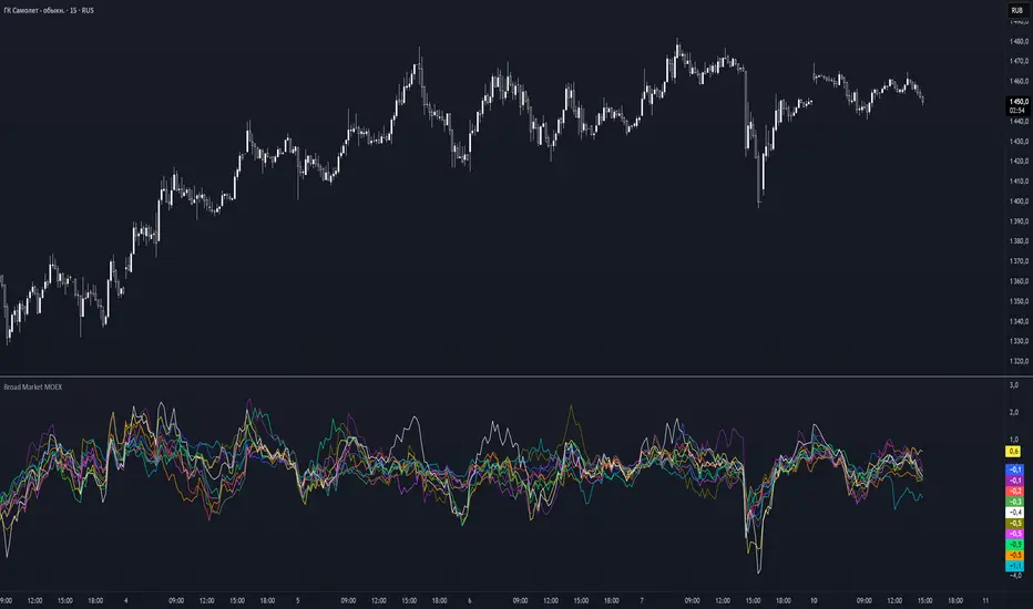
Broad Market MOEX### **Broad Market for Russia**
The **Broad Market for Russia** indicator provides a comparative analysis of the price deviation of major Russian stocks relative to their average closing price over a customizable lookback period. This tool helps traders identify market trends and detect relative strength or weakness among different assets.
### **How It Works:**
- The indicator calculates the **percentage deviation** of each stock’s current price from its **simple moving average (SMA)** over the defined **lookback period (in hours).**
- The **default lookback period is 24 hours**, but it can be adjusted based on the trader’s needs.
- It tracks major Russian assets, including **Gazprom, Sberbank, Lukoil, Rosneft, Norilsk Nickel, Yandex, and others**, alongside the currently selected instrument.
- Each stock’s deviation is plotted on a separate panel, allowing for quick visual comparison.
- **Positive deviation** indicates that the price is trading above its average, signaling potential **bullish momentum**.
- **Negative deviation** suggests the price is below its average, possibly indicating **bearish conditions**.
This indicator is particularly useful for traders in the Russian stock market who want to gauge broader market strength and detect divergence patterns across multiple assets.
---
### **Broad Market for Russia**
Индикатор **Broad Market for Russia** предоставляет сравнительный анализ отклонения цены крупнейших российских акций относительно их среднего значения за настраиваемый период. Этот инструмент помогает трейдерам выявлять рыночные тренды и определять относительную силу или слабость активов.
### **Как это работает:**
- Индикатор рассчитывает **процентное отклонение** текущей цены каждой акции от её **простого скользящего среднего (SMA)** за заданный **период анализа (в часах).**
- **Период анализа по умолчанию — 24 часа**, но его можно изменять в зависимости от предпочтений трейдера.
- В индикаторе отслеживаются **крупнейшие российские активы**, такие как **Газпром, Сбербанк, Лукойл, Роснефть, Норникель, Яндекс и другие**, а также текущий выбранный инструмент.
- Отклонение каждой акции отображается на отдельной панели, что позволяет быстро проводить визуальное сравнение.
- **Положительное отклонение** означает, что цена торгуется выше своего среднего значения, что может сигнализировать о **бычьем тренде**.
- **Отрицательное отклонение** указывает, что цена ниже своего среднего значения, что может свидетельствовать о **медвежьей тенденции**.
Этот индикатор особенно полезен для трейдеров российского фондового рынка, которые хотят оценить силу всего рынка и выявлять расхождения между различными активами.
Broad Market for Crypto**Broad Market for Crypto** indicator provides a comparative analysis of the price deviation of multiple major cryptocurrencies relative to their average closing price over a customizable lookback period. This tool helps traders identify market trends and spot relative strength or weakness among different assets.
### **How It Works:**
- The indicator calculates the percentage deviation of each cryptocurrency’s current price from its simple moving average (SMA) over the defined **lookback period (in hours).**
- The **default lookback period is 24 hours**, but it can be adjusted according to the trader's preference.
- It tracks major crypto assets, including **BTC, ETH, BNB, SOL, XRP, ADA, AVAX, LINK, DOGE, and TRX**, alongside the currently selected instrument.
- Each cryptocurrency’s deviation is plotted on a separate panel, allowing for quick visual comparison.
- Positive deviation indicates that the price is trading above its average, signaling potential bullish momentum.
- Negative deviation suggests the price is below its average, possibly indicating bearish conditions.
This indicator is particularly useful for crypto traders who want to gauge the broader market’s strength and detect divergence patterns across multiple assets.
---------------------------------------------------------------------------------
**Broad Market for Crypto - Описание индикатора**
Индикатор **Broad Market for Crypto** предоставляет сравнительный анализ отклонения цены различных крупных криптовалют относительно их среднего значения за настраиваемый период. Этот инструмент помогает трейдерам выявлять рыночные тренды и определять относительную силу или слабость активов.
### **Как это работает:**
- Индикатор рассчитывает **процентное отклонение** текущей цены каждой криптовалюты от её **простого скользящего среднего (SMA)** за заданный **период анализа (в часах)**.
- **Период анализа по умолчанию — 24 часа**, но его можно изменять в зависимости от предпочтений трейдера.
- В индикаторе отслеживаются основные криптоактивы: **BTC, ETH, BNB, SOL, XRP, ADA, AVAX, LINK, DOGE и TRX**, а также текущий выбранный инструмент.
- Отклонение каждой криптовалюты отображается на отдельной панели, что позволяет быстро проводить визуальное сравнение.
- **Положительное отклонение** означает, что цена торгуется выше своего среднего значения, что может сигнализировать о **бычьем тренде**.
- **Отрицательное отклонение** указывает, что цена ниже своего среднего значения, что может свидетельствовать о **медвежьей тенденции**.
Этот индикатор особенно полезен для криптотрейдеров, желающих оценить силу всего рынка и выявлять расхождения между различными активами.

Fibonacci-Only Strategy V2Fibonacci-Only Strategy V2
This strategy combines Fibonacci retracement levels with pattern recognition and statistical confirmation to identify high-probability trading opportunities across multiple timeframes.
Core Strategy Components:
Fibonacci Levels: Uses key Fibonacci retracement levels (19% and 82.56%) to identify potential reversal zones
Pattern Recognition: Analyzes recent price patterns to find similar historical formations
Statistical Confirmation: Incorporates statistical analysis to validate entry signals
Risk Management: Includes customizable stop loss (fixed or ATR-based) and trailing stop features
Entry Signals:
Long entries occur when price touches or breaks the 19% Fibonacci level with bullish confirmation
Short entries require Fibonacci level interaction, bearish confirmation, and statistical validation
All signals are visually displayed with color-coded markers and dashboard
Trading Method:
When a triangle signal appears, open a position on the next candle
Alternatively, after seeing a signal on a higher timeframe, you can switch to a lower timeframe to find a more precise entry point
Entry signals are clearly marked with visual indicators for easy identification
Risk Management Features:
Adjustable stop loss (percentage-based or ATR-based)
Optional trailing stops for protecting profits
Multiple take-profit levels for strategic position exit
Customization Options:
Timeframe selection (1m to Daily)
Pattern length and similarity threshold adjustment
Statistical period and weight configuration
Risk parameters including stop loss and trailing stop settings
This strategy is particularly well-suited for cryptocurrency markets due to their tendency to respect Fibonacci levels and technical patterns. Crypto's volatility is effectively managed through the customizable stop-loss and trailing-stop mechanisms, making it an ideal tool for traders in digital asset markets.
For optimal performance, this strategy works best on higher timeframes (30m, 1h and above) and is not recommended for low timeframe scalping. The Fibonacci pattern recognition requires sufficient price movement to generate reliable signals, which is more consistently available in medium to higher timeframes.
Users should avoid trading during sideways market conditions, as the strategy performs best during trending markets with clear directional movement. The statistical confirmation component helps filter out some sideways market signals, but it's recommended to manually avoid ranging markets for best results.

Round NumbersTries to only show major round numbers regardless of whether you're looking at something priced in the thousands or under a dollar.
Relative Strength RatioWhen comparing a stock’s strength against NIFTY 50, the Relative Strength (RS) is calculated to measure how the stock is performing relative to the index. This is different from the RSI but is often used alongside it.
How It Works:
Relative Strength (RS) Calculation:
𝑅
𝑆
=
Stock Price
NIFTY 50 Price
RS=
NIFTY 50 Price
Stock Price
This shows how a stock is performing relative to the NIFTY 50 index.
Relative Strength Ratio Over Time:
If the RS value is increasing, the stock is outperforming NIFTY 50.
If the RS value is decreasing, the stock is underperforming NIFTY 50.

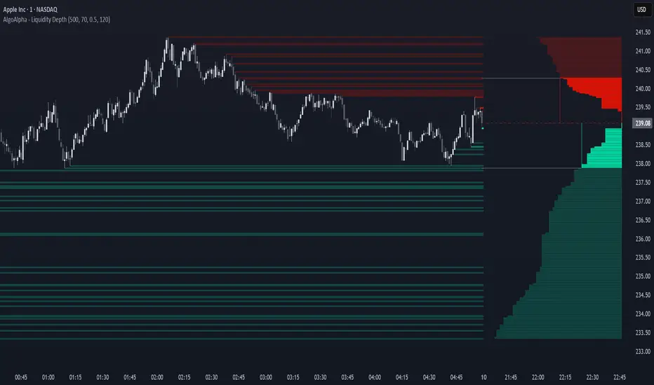
Liquidity Depth [AlgoAlpha]OVERVIEW
This script visualizes market liquidity by identifying key price levels where significant volume has transacted. It highlights zones of high buying and selling interest, helping traders understand where liquidity is accumulating and how price may respond to these areas. By dynamically tracking volume at highs and lows, the script builds a real-time liquidity profile, making it a powerful tool for identifying potential support and resistance levels.
CONCEPTS
Liquidity depth analysis helps traders determine how price interacts with supply and demand at different levels. The script processes historical volume data to distinguish between high-liquidity and low-liquidity zones. It assigns transparency levels to plotted lines , ensuring that more relevant liquidity areas stand out visually. The script adds a profile to show the depth of liquidity (derived from historical volume data) for levels above and below the current price
FEATURES
Liquidity Levels: Tracks liquidity levels based on volume concentration at price high and lows.
Volume-Based Transparency: More significant liquidity levels are displayed with higher visibility, showing their significance.
Interpolation: interpolates the bullish and bearish liquidity depth at a user defined range away from the price, helping in comparing the liquidity amounts between bullish and bearish.
Depth Profile: Allows traders to visualize depth of liquidity in a more quantitative and clearer way than the liquidity levels/list]
USAGE
This indicator is best used to track liquidity levels and potential price reaction areas. Traders can adjust the Liquidity Lookback setting to analyze past liquidity levels over different historical periods. The Profile Resolution setting controls the granularity of liquidity depth visualization, with higher values providing more detail. The script can be applied across different timeframes, from intraday scalping to swing trading analysis. The plotted liquidity zones provide traders with insights into where price may encounter strong support, resistance, or potential liquidity-driven reversals.
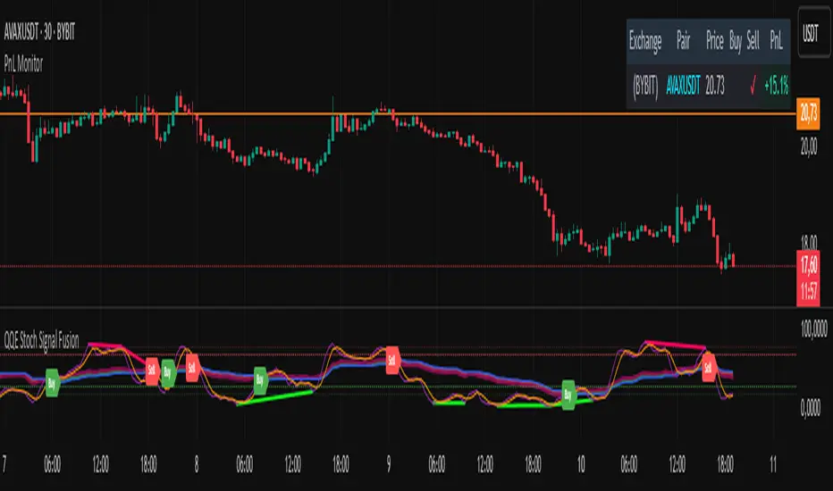
PnL MonitorThe PnL Monitor is a customizable tool designed to help traders track the Profit and Loss (PnL) of up to 20 currency pairs or assets in real-time. This script provides a clear and organized table that displays the entry price, and PnL percentage for each pair, making it an essential tool for monitoring open positions or tracking potential trades.
Key Features:
Multi-Asset Tracking:
Monitor up to 20 currency pairs or assets simultaneously. Simply input the pair symbol and your entry price, and the script will calculate the PnL in real-time.
Dynamic Table Positioning:
Choose where the table appears on your chart with the Table Position input. Options include:
Top Left
Top Right
Bottom Left
Bottom Right
Real-Time PnL Calculation:
The script fetches the current price of each pair and calculates the PnL percentage based on your entry price. Positive PnL is highlighted in green, while negative PnL is highlighted in red.
Exchange and Pair Separation:
The script automatically separates the exchange name (if provided) from the pair symbol, making it easier to identify the source of the data.
Customizable Inputs:
Add or remove pairs as needed.
Leave the price field blank for pairs you don’t want to track.
How to Use:
Input Your Pairs:
In the script settings, input the symbol of the pair (e.g., NASDAQ:AAPL or BTCUSD) and your entry price. Leave the price field blank for pairs you don’t want to track.
Choose Table Position:
Select where you want the table to appear on your chart.
Monitor PnL:
The table will automatically update with the current price and PnL percentage for each pair.
Why Use This Script?
Efficiency: Track multiple pairs in one place without switching charts.
Clarity: Easily identify profitable and losing positions at a glance.
Flexibility: Customize the table to fit your trading style and preferences.
Ideal For:
Forex, crypto, and stock traders managing multiple positions.
Divergence IQ [TradingIQ]Hello Traders!
Introducing "Divergence IQ"
Divergence IQ lets traders identify divergences between price action and almost ANY TradingView technical indicator. This tool is designed to help you spot potential trend reversals and continuation patterns with a range of configurable features.
Features
Divergence Detection
Detects both regular and hidden divergences for bullish and bearish setups by comparing price movements with changes in the indicator.
Offers two detection methods: one based on classic pivot point analysis and another that provides immediate divergence signals.
Option to use closing prices for divergence detection, allowing you to choose the data that best fits your strategy.
Normalization Options:
Includes multiple normalization techniques such as robust scaling, rolling Z-score, rolling min-max, or no normalization at all.
Adjustable normalization window lets you customize the indicator to suit various market conditions.
Option to display the normalized indicator on the chart for clearer visual comparison.
Allows traders to take indicators that aren't oscillators, and convert them into an oscillator - allowing for better divergence detection.
Simulated Trade Management:
Integrates simulated trade entries and exits based on divergence signals to demonstrate potential trading outcomes.
Customizable exit strategies with options for ATR-based or percentage-based stop loss and profit target settings.
Automatically calculates key trade metrics such as profit percentage, win rate, profit factor, and total trade count.
Visual Enhancements and On-Chart Displays:
Color-coded signals differentiate between bullish, bearish, hidden bullish, and hidden bearish divergence setups.
On-chart labels, lines, and gradient flow visualizations clearly mark divergence signals, entry points, and exit levels.
Configurable settings let you choose whether to display divergence signals on the price chart or in a separate pane.
Performance Metrics Table:
A performance table dynamically displays important statistics like profit, win rate, profit factor, and number of trades.
This feature offers an at-a-glance assessment of how the divergence-based strategy is performing.
The image above shows Divergence IQ successfully identifying and trading a bullish divergence between an indicator and price action!
The image above shows Divergence IQ successfully identifying and trading a bearish divergence between an indicator and price action!
The image above shows Divergence IQ successfully identifying and trading a hidden bullish divergence between an indicator and price action!
The image above shows Divergence IQ successfully identifying and trading a hidden bearish divergence between an indicator and price action!
The performance table is designed to provide a clear summary of simulated trade results based on divergence setups. You can easily review key metrics to assess the strategy’s effectiveness over different time periods.
Customization and Adaptability
Divergence IQ offers a wide range of configurable settings to tailor the indicator to your personal trading approach. You can adjust the lookback and lookahead periods for pivot detection, select your preferred method for normalization, and modify trade exit parameters to manage risk according to your strategy. The tool’s clear visual elements and comprehensive performance metrics make it a useful addition to your technical analysis toolbox.
The image above shows Divergence IQ identifying divergences between price action and OBV with no normalization technique applied.
While traders can look for divergences between OBV and price, OBV doesn't naturally behave like an oscillator, with no definable upper and lower threshold, OBV can infinitely increase or decrease.
With Divergence IQ's ability to normalize any indicator, traders can normalize non-oscillator technical indicators such as OBV, CVD, MACD, or even a moving average.
In the image above, the "Robust Scaling" normalization technique is selected. Consequently, the output of OBV has changed and is now behaving similar to an oscillator-like technical indicator. This makes spotting divergences between the indicator and price easier and more appropriate.
The three normalization techniques included will change the indicator's final output to be more compatible with divergence detection.
This feature can be used with almost any technical indicator.
Stop Type
Traders can select between ATR based profit targets and stop losses, or percentage based profit targets and stop losses.
The image above shows options for the feature.
Divergence Detection Method
A natural pitfall of divergence trading is that it generally takes several bars to "confirm" a divergence. This makes trading the divergence complicated, because the entry at time of the divergence might look great; however, the divergence wasn't actually signaled until several bars later.
To circumvent this issue, Divergence IQ offers two divergence detection mechanisms.
Pivot Detection
Pivot detection mode is the same as almost every divergence indicator on TradingView. The Pivots High Low indicator is used to detect market/indicator highs and lows and, consequently, divergences.
This method generally finds the "best looking" divergences, but will always take additional time to confirm the divergence.
Immediate Detection
Immediate detection mode attempts to reduce lag between the divergence and its confirmation to as little as possible while avoiding repainting.
Immediate detection mode still uses the Pivots Detection model to find the first high/low of a divergence. However, the most recent high/low does not utilize the Pivot Detection model, and instead immediately looks for a divergence between price and an indicator.
Immediate Detection Mode will always signal a divergence one bar after it's occurred, and traders can set alerts in this mode to be alerted as soon as the divergence occurs.
TradingView Backtester Integration
Divergence IQ is fully compatible with the TradingView backtester!
Divergence IQ isn’t designed to be a “profitable strategy” for users to trade. Instead, the intention of including the backtester is to let users backtest divergence-based trading strategies between the asset on their chart and almost any technical indicator, and to see if divergences have any predictive utility in that market.
So while the backtester is available in Divergence IQ, it’s for users to personally figure out if they should consider a divergence an actionable insight, and not a solicitation that Divergence IQ is a profitable trading strategy. Divergence IQ should be thought of as a Divergence backtesting toolkit, not a full-feature trading strategy.
Strategy Properties Used For Backtest
Initial Capital: $1000 - a realistic amount of starting capital that will resonate with many traders
Amount Per Trade: 5% of equity - a realistic amount of capital to invest relative to portfolio size
Commission: 0.02% - a conservative amount of commission to pay for trade that is standard in crypto trading, and very high for other markets.
Slippage: 1 tick - appropriate for liquid markets, but must be increased in markets with low activity.
Once more, the backtester is meant for traders to personally figure out if divergences are actionable trading signals on the market they wish to trade with the indicator they wish to use.
And that's all!
If you have any cool features you think can benefit Divergence IQ - please feel free to share them!
Thank you so much TradingView community!

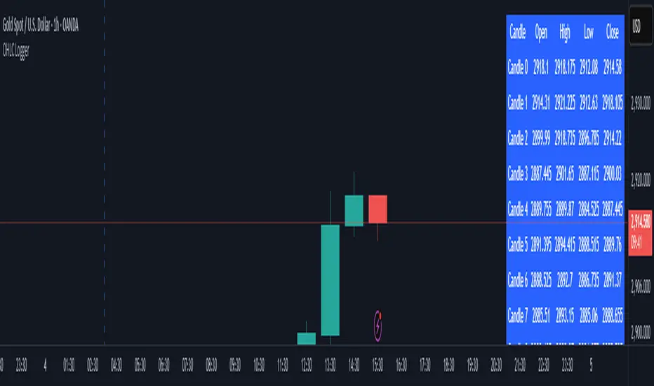
OHLC LoggerOHLC OG - 10 Candles
The OHLC OG - 10 Candles indicator provides a clear visualization of price action by analyzing the Open, High, Low, and Close (OHLC) data of the last 10 candles. Designed for traders who rely on structured price patterns, this indicator helps in identifying market trends, key support and resistance zones, and potential breakout points.
Features:
✅ Tracks the last 10 candles to highlight significant price movements.
✅ Visualizes Open, High, Low, and Close levels for improved market analysis.
✅ Customizable settings for enhanced adaptability to different strategies.
✅ Works across all timeframes and assets (forex, stocks, crypto, etc.).
✅ Ideal for price action traders looking for structured market insights.
This indicator is perfect for traders who prefer clean and reliable price action analysis without unnecessary complexity. Whether you trade breakouts, trend reversals, or continuation patterns, OHLC OG - 10 Candles helps you stay ahead of the market.
🔹 How to Use:
Apply the indicator to your chart and observe how the OHLC levels react to price movements.
Use it to confirm trends, identify potential breakout zones, or refine entry/exit points.
Combine it with other indicators or strategies for a more comprehensive trading approach.
📌 Disclaimer: This indicator is for educational purposes only. Always conduct proper risk management before trading.
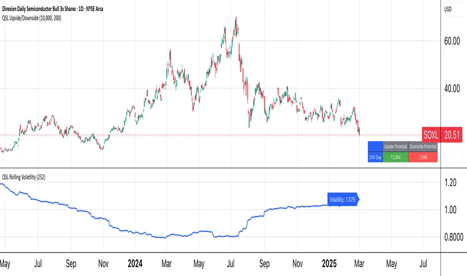
QSL Upside/DownsideThe QSL Upside/Downside Indicator helps traders estimate potential gains and losses using Conditional Value at Risk (cVaR), a statistical measure that assesses both downside risk and upside potential beyond standard volatility. Instead of fixed timeframes (daily, weekly, etc.), traders can set a custom lookback period (in days) to analyze market behavior over their preferred time frame.
How It Works
The indicator calculates cVaR over the chosen period to determine how much an investment could move up or down based on past price behavior. It does this by:
• Mean Return – The average price movement over the period.
• Standard Deviation – Measures price fluctuations from the average.
• cVaR Confidence Interval (95%) – Estimates worst-case losses, meaning the downside projection reflects the worst 5% of expected losses.
• Upside Potential (Best 5%) – Instead of only considering risk, this indicator also calculates the potential upside by measuring returns in the top 5% of past price movements.
This provides a more complete view of what traders can expect—both in terms of risk and potential reward.
Key Features
✅ Custom Lookback Period – Set any number of days to analyze.
✅ cVaR Calculation (95% Confidence Interval) – Identifies extreme downside risks.
✅ Upside Potential (Best 5%) – Estimates how much an investment could rise in a best-case scenario.
✅ Clear Table Display – Quickly see projected best and worst-case portfolio values.
Understanding Probabilities: Upside & Downside Potential
Most traders focus on risk, but it’s equally important to understand potential gains. This indicator provides a probability-based view of expected market moves:
• 95% Confidence Interval (Downside cVaR) – There’s a 5% chance that losses could exceed this level.
• 95% Confidence Interval (Upside cVaR) – There’s a 5% chance that gains could be greater than this level.
• The remaining 90% of expected returns fall between these two extremes.
By knowing both potential losses and gains, traders can make more balanced, data-driven decisions rather than only focusing on worst-case scenarios.
Why Use This Indicator?
🔹 Better Risk & Reward Assessment – Understand both downside risk and upside potential.
🔹 More Realistic Market Projections – Uses probabilities instead of simple historical averages.
🔹 Flexible & Customizable – Works with any asset and any time period.
With this tool, QSL members can strategically plan trades, knowing the expected best and worst-case outcomes with a 95% probability range. 🚀
Date Display with Bar Counter and EMA===== ENGLISH DESCRIPTION =====
OVERVIEW:
This is a multi-function indicator that combines three useful tools in one script:
1. Date Display - Shows current date and symbol information in a customizable table
2. Bar Counter - Displays sequential bar numbers at specified intervals
3. EMA (Exponential Moving Average) - Plots an EMA line with customizable settings
FEATURES:
1. DATE DISPLAY:
- Shows date in full format (e.g., "Mon ∙ January 1, 2023") or short format (e.g., "Mon ∙ 01.01.23")
- Option to show/hide day of week
- Option to show/hide symbol and timeframe information
- Customizable table position (top/middle/bottom, left/center/right)
- Automatic color adjustment based on chart background
2. BAR COUNTER:
- Displays sequential bar numbers below price bars
- Customizable display frequency (every X bars)
- Special handling for Hong Kong futures (resets at market open)
- Different reset logic based on timeframe (daily, weekly, monthly)
- Customizable text size and color
3. EMA INDICATOR:
- Customizable period length (default: 20)
- Option to use different timeframe for calculation
- Option to wait for timeframe close for more stable signals
- Customizable line color
USAGE INSTRUCTIONS:
- After adding the indicator to your chart, customize settings in the "Format" panel
- The Date Display table will appear at your chosen position on the chart
- Bar numbers will appear below price bars at your specified frequency
- The EMA line will be plotted on the chart with your chosen settings
- Colors automatically adjust to light/dark chart themes
===== 中文说明 =====
概述:
这是一个多功能指标,将三个实用工具合并为一个脚本:
1. 日期显示 - 在可自定义的表格中显示当前日期和交易品种信息
2. K线计数器 - 按指定间隔显示K线序号
3. EMA指数移动平均线 - 绘制可自定义设置的EMA线
功能特点:
1. 日期显示:
- 支持完整格式(如"Mon ∙ January 1, 2023")或简短格式(如"Mon ∙ 01.01.23")
- 可选择显示/隐藏星期几
- 可选择显示/隐藏交易品种和时间周期信息
- 可自定义表格位置(顶部/中部/底部,左侧/中间/右侧)
- 根据图表背景自动调整颜色
2. K线计数器:
- 在价格K线下方显示序号
- 可自定义显示频率(每X根K线)
- 对香港期货有特殊处理(在开市时重置)
- 根据时间周期(日线、周线、月线)使用不同的重置逻辑
- 可自定义文字大小和颜色
3. EMA指标:
- 可自定义周期长度(默认:20)
- 可选择使用不同的时间周期进行计算
- 可选择等待时间周期结束以获得更稳定的信号
- 可自定义线条颜色
使用说明:
- 将指标添加到图表后,在"格式"面板中自定义设置
- 日期显示表格将出现在您选择的图表位置
- K线序号将按您指定的频率显示在价格K线下方
- EMA线将根据您选择的设置绘制在图表上
- 颜色会根据浅色/深色图表主题自动调整
*/

Machine Learning + Geometric Moving Average 250/500Indicator Description - Machine Learning + Geometric Moving Average 250/500
This indicator combines password-protected market analysis levels with two powerful Geometric Moving Averages (GMA 250 & GMA 500).
🔒 Password-Protected Custom Levels
Access pre-defined long and short price levels for select assets (crypto, stocks, and more) by entering the correct password in the indicator settings.
Once the correct password is entered, the indicator automatically displays:
Green horizontal lines for long entry zones.
Red horizontal lines for short entry zones.
If the password is incorrect, a warning label will appear on the chart.
📈 Geometric Moving Averages (GMA)
This indicator calculates GMA 250 and GMA 500, two long-term trend-following tools.
Unlike traditional moving averages, GMAs use logarithmic smoothing to better handle exponential price growth, making them especially useful for assets with strong trends (e.g., crypto and tech stocks).
GMA 250 (white line) tracks the medium-term trend.
GMA 500 (gold line) tracks the long-term trend.
⚙️ Customizable & Flexible
Works on multiple assets, including cryptocurrencies, equities, and more.
Adaptable to different timeframes and trading styles — ideal for both swing traders and long-term investors.
This indicator is ideal for traders who want to blend custom support/resistance levels with advanced geometric trend analysis to better navigate both volatile and trending markets.

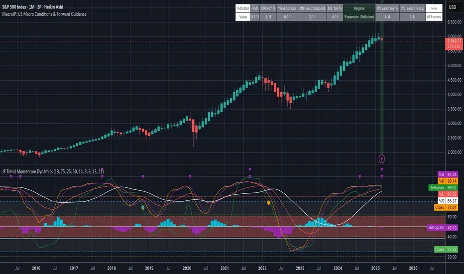
MacroJP: US Macro Conditions & Forward GuidanceMacroJP is a comprehensive, free-to-use TradingView indicator designed to provide a clear snapshot of the US macroeconomic environment. It consolidates key economic metrics into a single, interactive dashboard, allowing traders and investors to quickly assess current conditions and adjust their portfolio biases accordingly.
How It Works:
• Data Aggregation:
The indicator pulls monthly data from reputable free economic sources—specifically, ISM Manufacturing PMI, US CPI YoY, US M2 Money Supply, and US Treasury yields (10-year and 2-year). This robust dataset forms the backbone of the analysis.
• Composite Calculations:
By calculating a Composite Inflation Indicator (the average of CPI YoY and the yield spread) and evaluating the year-over-year change in M2, MacroJP gauges both the inflationary pressures and liquidity trends in the economy. These composite metrics offer a nuanced view that goes beyond single-indicator analysis.
Regime Classification:
The core strength of MacroJP lies in its quadrant classification system. It categorises the macro environment into four distinct regimes based on the direction of economic growth (derived from PMI) and inflation (from the Composite Inflation Indicator):
• Expansion (Reflation): Indicative of a recovering economy with rising production and moderate inflation—ideal for a bullish equity bias.
• Stagflation Risk: A scenario of weak growth coupled with high inflation, where a defensive posture is recommended.
• Slowdown (Deflationary): Characterised by contracting economic activity and falling prices, suggesting a move towards cash or high-quality bonds.
• Disinflationary Boom: Reflects strong growth with stable or falling inflation—an optimal environment for equities with some bond diversification.
Forward Guidance:
To enhance its predictive capability, MacroJP incorporates leading indicators by shifting key data points. For instance, it uses a forward-shifted M2 YoY value and a one-month shifted CPI proxy to offer insights into near-term trends. This approach helps in anticipating changes, providing a sort of “forward guidance” that can inform strategic asset allocation.
User Education:
The indicator features an intuitive table with on-hover tooltips that explain each metric, its relevance, and recommended investment biases. This educational layer is designed to empower users to not only monitor the economic pulse but also to understand the ‘why’ behind each reading, making it a valuable tool for both novice and experienced investors.
MacroJP brings clarity to complex macroeconomic dynamics, allowing users to make more informed decisions in volatile markets. Its seamless integration of free public data and detailed on-chart annotations makes it an indispensable tool for anyone looking to understand the broader economic context impacting their investments.
— Jaroslav
Pearson Correlation Best MA [victhoreb]Pearson Correlation Best MA is an innovative indicator designed to dynamically select the moving average that best aligns with price action based on the Pearson correlation coefficient. Here’s what it does:
- Multiple MA Evaluation: The indicator computes eight different moving averages — SMA, EMA, DEMA, TEMA, LSMA, RMA, WMA, and VWMA — using a user-defined period.
- Correlation Analysis: For each moving average, it calculates the Pearson correlation with the price (using the average of high and low) over a specified correlation length, then identifies the one with the highest correlation.
- Optional Smoothing: Users can opt to further smooth the selected best moving average for an even more refined signal.
- Visual Cues: The indicator plots the “Best MA” on the chart, colors it based on its direction (bullish or bearish), and also displays the correlation value. Additionally, it can color the price candles to reflect the trend indicated by the best moving average.
- Customizability: All key parameters such as moving average length, correlation length, smoothing options, and color settings are fully customizable.
This tool helps traders by automatically adapting to market conditions—highlighting the moving average that is most in sync with current price trends, potentially improving trade timing and decision-making.

ALN Sessions - for NQ2/24/25 - v1
This script does not calculate any stats.
It uses the sessions and stats from NQStats/ALNSessions
Option to draw boxes around the session times.
Options to adjust the table text/background colors/position.
The logic will determine how the Asia and London sessions interact.
Once the New York session starts (8am), it will then display the appropriate stats.
Script quirk...fyi. The script removes the stats table at 6PM.
That's just how it works. I used grok to assist with the code, and it got funky. It works, so I left it that way.
The appropriate stats table will then be displayed when the next New York session begins.
---
There is another table I used just for troubleshooting to show the values of the Asia/London session highs/lows. This can just be ignored.
3/3/25 - republished.
