Goal Setting Strategies Viprasol# 🎯 Goal Setting Strategies Viprasol
A powerful goal tracking tool designed for disciplined traders who want to monitor their trading objectives, milestones, and progress directly on their charts.
## ✨ KEY FEATURES
### 📊 Flexible Goal Management
- Track anywhere from 1 to 20 trading goals simultaneously
- Adjustable goal count via simple input slider
- Each goal has its own unique emoji identifier
- Real-time progress counter
### ✅ Visual Tracking System
- Interactive checkbox system for goal completion
- Clear visual indicators (✅ completed, ⬜️ pending)
- Customizable goal names and descriptions
- Dynamic progress display
### 🎨 Full Customization
- **4 Position Options**: Top Left, Top Right, Bottom Left, Bottom Right
- **5 Font Sizes**: Tiny, Small, Normal, Large, Huge (optimized for all screen sizes)
- **Custom Colors**: Header, labels, background, achievement text
- **Premium Styling**: Modern cyber-themed design with professional appearance
### 💡 Perfect For:
- Daily/Weekly trading goal tracking
- Risk management milestones
- Profit target monitoring
- Trading plan compliance
- Personal development objectives
- Learning milestones
## 🔧 HOW TO USE
1. **Set Your Primary Goal**: Enter your main objective in "Primary Goal" field
2. **Choose Goal Count**: Select how many goals you want (1-20)
3. **Name Your Goals**: Customize each goal name in the "Goal Definitions" section
4. **Track Progress**: Check off goals as you complete them
5. **Customize Display**: Adjust colors, sizes, and position to match your chart setup
## 📐 INPUT GROUPS
### 🎯 Viprasol Goal Configuration
- Primary Goal Name
- Number of Goals (1-20)
### 📋 Goal Definitions
- All 20 goals with individual names and checkboxes
- Only enabled goals (based on count) will display
### 🌈 Premium Styling
- Goal Header Color
- Label Color
- Panel Background Color
- Achievement Color
- Header Font Size
- Milestone Font Size (Tiny/Small optimized for space)
### 📍 Elite Display
- Dashboard Position selector
## 💎 UNIQUE FEATURES
- **Space Efficient**: Tiny and Small font options for compact displays
- **Scalable**: Grow from 1 goal to 20 as your needs evolve
- **Non-Intrusive**: Overlay indicator that doesn't interfere with price action
- **Professional Design**: Clean, modern interface with cyber aesthetic
## 🎓 USE CASES
**Day Traders**: Track daily profit targets, trade count limits, max loss thresholds
**Swing Traders**: Monitor weekly/monthly goals, position management rules
**New Traders**: Learning milestones, strategy development checkpoints
**Experienced Traders**: Advanced risk management, portfolio objectives
## ⚙️ TECHNICAL DETAILS
- Version: Pine Script v5
- Type: Overlay Indicator
- Max Labels: 500
- Table-based display system
- No repainting
- Lightweight performance
## 🚀 GETTING STARTED
1. Add indicator to your chart
2. Set "Number of Goals" to your desired count (start small, scale up)
3. Customize goal names
4. Check boxes as you achieve goals
5. Watch your progress build!
## 📊 DISPLAY OPTIMIZATION
- Use "Tiny" or "Small" for maximum goals on small screens
- Use "Normal" or "Large" for standard monitors
- Use "Huge" for presentation or large displays
- Adjust position to avoid chart overlap
## 🎯 TRADING DISCIPLINE
This tool helps reinforce:
- Goal-oriented trading mindset
- Progress tracking accountability
- Milestone celebration
- Structured approach to trading development
---
**© viprasol**
*Designed for traders who take their goals seriously.*
Trade!

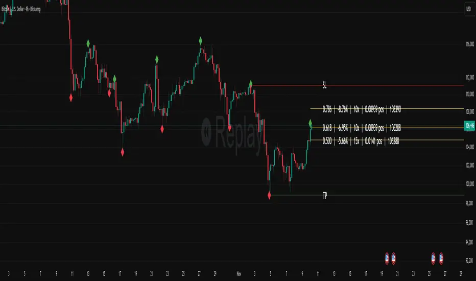
Fibonacci Set-upThe indicator plots Fibonacci retracements based on recent lows and highs.
Additionally it calculates position size, max leverage, max drawdown and pricelevels.
AG Pro Dynamic ChannelsAG Pro Dynamic Channels V2
Discover a new lens through which to view market structure with the AG Pro Dynamic Channels V2. This advanced indicator moves beyond simple trendlines, automatically identifying, classifying, and drawing eight distinct types of support and resistance channels directly on your chart.
Built on a sophisticated pivot-point detection engine, this script intelligently distinguishes between Major and Minor price structures, as well as Internal and External channels. This provides a comprehensive and multi-dimensional map of the market's flow, helping you identify trend continuations, corrections, and potential reversals.
The indicator is complete with a powerful, fully customizable alert system designed to notify you of the two most critical events: channel breakouts and price reactions.
Key Features
Fully Automatic Channels: The script automatically analyzes price action to find pivot highs and lows, using them to construct relevant channels without any manual drawing required.
8-Channel Classification: Gain deep market insight by viewing eight distinct channel types:
Major External (Up/Down)
Major Internal (Up/Down)
Minor External (Up/Down)
Minor Internal (Up/Down)
Advanced Pivot Engine: The core logic classifies pivots into categories like Higher Highs (MHH/mHH), Lower Lows (MLL/mLL), Higher Lows (MHL/mHL), and Lower Highs (MLH/mLH) to determine the precise start and end points for each channel.
Deep Customization: Take full control of your chart's appearance. You can individually toggle the visibility, color, line style (solid, dashed, dotted), and line width for all eight channel types.
Chart Clarity: A "Delete Previous" option is available for each channel type, allowing you to keep your chart clean and focused on only the most current and relevant market structures.
Comprehensive Alert System
Never miss a key price interaction. The AG Pro Dynamic Channels V2 features a robust, built-in alert module.
Dual-Alert Conditions: Get notifications for two distinct events:
Break Alert: Triggers when price confirms a close outside of a channel, signaling a potential breakout.
React Alert: Triggers when price touches or interacts with a channel line before closing back inside, signaling a test or rejection.
16 Unique Alerts: You have full control to enable or disable "Break" and "React" alerts for all 8 channel types individually, giving you 16 unique alert conditions to monitor.
Professional Alert Messages: The embedded alert sender provides detailed messages that include the asset, timeframe, and the specific event, such as "Break Major External Up Channel" or "React Minor Internal Down Channel".
Alert Configuration: Easily set your global Alert Name, Message Frequency (e.g., Once Per Bar, Once Per Bar Close), and Alert Time Zone from the script's settings.
How to Use
Trend Identification: Use the Major External Channels (drawn from MHH and MLL pivots) to identify the primary, long-term trend direction.
Pullback & Entry Zones: Use the Internal Channels (drawn from MHL and MLH pivots) to spot corrections and potential entry zones within an established trend.
Breakout Trading: Set Break Alerts on Major channels to be notified of significant, structure-shifting moves.
Short-Term & Counter-Trend: Utilize the Minor Channels to identify shorter-term price swings and potential reversal points.

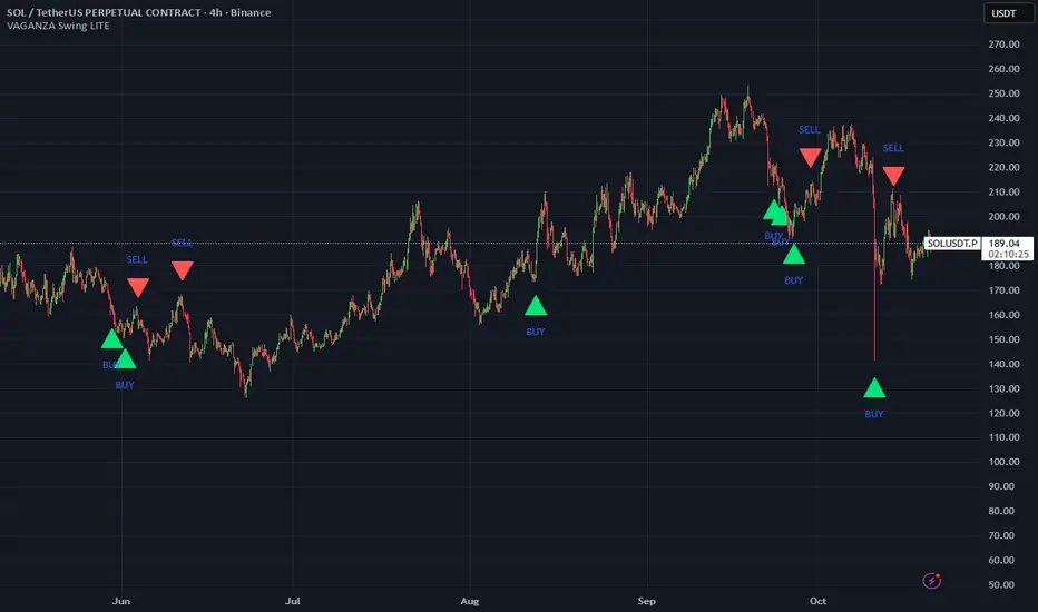
VAGANZA Swings V1 LITE1. Introduction: The Philosophy Behind VAGANZA Swings
The VAGANZA Swings V1 LITE was developed to solve a common problem faced by swing traders: getting caught in low-probability trades during choppy, sideways markets. Many indicators can identify a trend, but few can effectively measure its quality and pinpoint optimal, low-risk entry points within that trend.
This script is not merely a "mashup" of existing indicators. It is a structured, multi-layered filtering system where each component is specifically chosen to address the weaknesses of the others. The core philosophy is to trade only when there is a clear market consensus, confirmed by trend, strength, momentum, and volume. This results in fewer signals, but each signal is designed to be of significantly higher quality.
2. The VAGANZA Confirmation Engine: A Deeper Look at the Logic
A signal is only generated when four distinct market conditions align. This sequential confirmation process is what makes the script unique and robust.
Layer 1: The Trend Regime Filter
What it does: The indicator first establishes the dominant market bias using a dual-speed baseline system. A faster-reacting baseline is compared against a slower, more stable baseline to determine if the market is in a long-term bullish or bearish "regime."
Why it's important: This foundational step ensures we are never fighting the primary market current. BUY signals are disabled during a bearish regime, and SELL signals are disabled during a bullish regime, instantly eliminating 50% of potentially bad trades.
Layer 2: The Trend Strength & Conviction Qualifier
What it does: This is the script's core intelligence. After confirming the trend's direction, this layer uses a directional volatility engine to measure the trend's strength or conviction. It analyzes the expansion between bullish and bearish price movements.
Why it's important: A simple moving average crossover can occur in a weak, drifting market, leading to false signals. This filter requires the trend to be demonstrably powerful (above a predefined strength threshold of 25) before allowing the system to even look for an entry. It's the primary filter for avoiding sideways market traps.
Layer 3: The Dynamic Pullback & Entry Trigger
What it does: Instead of chasing price at its peak, the script waits for a natural "breather" or pullback. It employs a momentum cycle oscillator to identify when the price has become temporarily oversold within a strong uptrend, or overbought within a strong downtrend. The signal is triggered at the precise moment momentum appears to be rejoining the primary trend.
Why it's important: This ensures a more favorable risk-to-reward ratio. By entering on a pullback, traders can avoid buying the top or selling the bottom of a short-term swing, which is a common mistake.
Layer 4: The Volume Participation Check
What it does: As a final confirmation, the script checks the volume on the signal candle. It requires the volume to be higher than its recent average.
Why it's important: A price move without significant volume can be a trap. This final check confirms that there is genuine market participation and conviction behind the signal, suggesting that larger market players are supporting the move.
3. The Synergy of the System (Why This Combination is Original)
The originality of VAGANZA Swings lies not in its individual components, but in their synergistic interaction:
The Trend Regime Filter sets the stage.
The Trend Strength Qualifier prevents signals when the stage is poorly lit (i.e., a weak trend).
The Pullback & Entry Trigger tells the actor exactly when to enter the stage for maximum impact.
The Volume Check ensures the audience is actually watching.
Without the strength filter, the trend filter would fail in ranging markets. Without the pullback trigger, entries would have poor risk-reward. This interdependent, sequential logic provides a unique and useful tool that goes beyond what a single indicator can offer.
4. How to Use This Script
Timeframe: Optimized for the 4-Hour (H4) chart, as this provides a balance between meaningful swings and actionable signals. It can also be used on the Daily (D1) chart for longer-term analysis.
BUY Signal (Green "BUY" Arrow): Appears only when a strong, confirmed uptrend experiences a temporary, oversold pullback and volume confirms renewed buying interest. This is a high-probability signal to consider a long position.
SELL Signal (Red "SELL" Arrow): Appears only when a strong, confirmed downtrend experiences a temporary, overbought rally and volume confirms renewed selling pressure. This is a high-probability signal to consider a short position.
Risk Management: This indicator provides entry signals only. It is crucial that you apply your own risk management rules. Always use a stop-loss and have a clear take-profit strategy for every trade.
Disclaimer: This tool is for decision-support and does not constitute financial advice. All trading involves risk. Past performance is not indicative of future results. Please backtest thoroughly before using this script with real capital.
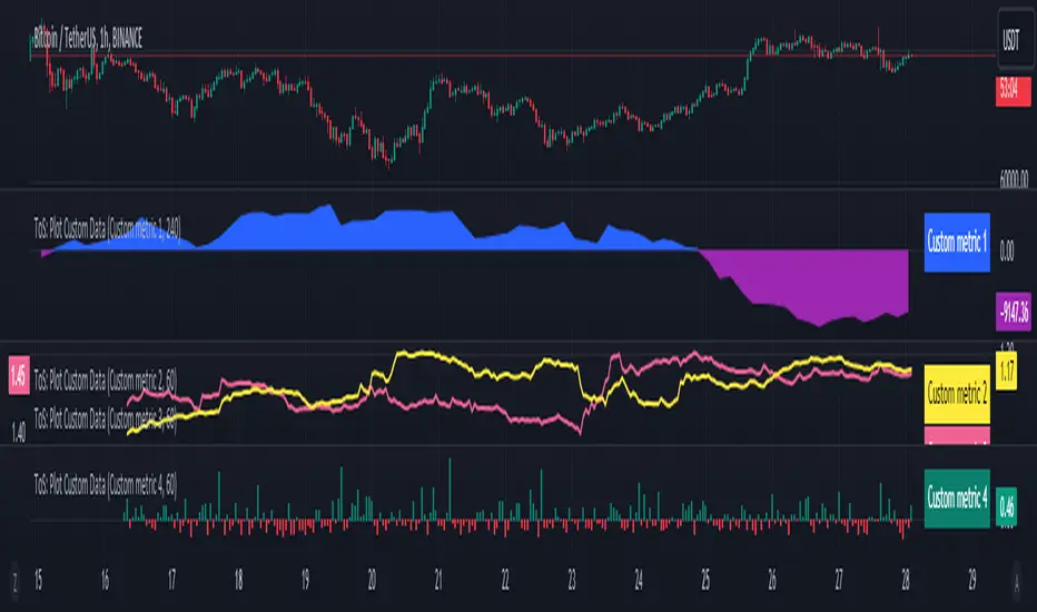
Trade-o-Scope: Plot Custom Data v2Meet — a major tool upgrade for plotting your own data on TradingView charts. Simple and intuitive input format, large volume limits, and robust plotting for your own datasets — forecasts, backtests, or external data and model outputs.
You can apply/overlay other indicators from the TradingView catalog (such as Bollinger Bands, RSI, etc.) on top of custom data charts. The indicator you want to overlay must support selecting an input data source — i.e., have a dropdown where you can choose as the source.
🧩 How to use
Simply select and copy two columns — with dates and values — from your spreadsheet (Excel, Google Sheets, etc.) and paste them into the indicator’s input field. The indicator will automatically process the input and plot your data on the chart.
Example data:
Date XYZ_value
2025-10-08 84.57
2025-10-01 80.66
2025-09-24 86.24
2025-09-17 84.76
📅 Supported date format
The indicator recognizes standard international date formats commonly used in spreadsheets and data exports.
• ISO 8601 — "YYYY-MM-DD" or "YYYY-MM-DDThh:mm:ss"
2025-10-13
2025-10-13 14:30
2025-10-13 14:30:00
2025-10-13T14:30
2025-10-13T14:30:00
• RFC 2822 — "DD MMM YYYY" or "DD MMM YYYY hh:mm:ss"
13 Oct 2025
13 Oct 2025 14:30
13 Oct 2025 14:30:00
The time part is optional — if omitted, midnight (00:00:00) is assumed.
By default, all date–time values are interpreted in the exchange timezone of the chart’s symbol, but you can select a different data timezone in the indicator settings if needed.
💡 Supported value format
Integers (e.g., 12345, -12345)
Decimals (e.g., 1234.56, -1234.56)
The decimal separator must be a dot (.)
Thousands separators are not supported
⚙️ Advanced Features
Value Multiplier — scale your values by a chosen factor.
Formatting Options — display values as price, percentage, or volume.
Conditional Coloring — automatically change plot color based on thresholds.
Plot Style Selection — choose from line, histogram, area, or column plots.
Additional Visual References — enable fixed horizontal lines for better visual interpretation.
📝 General Notes
Maximum input size: 40,960 characters (~1,500–3,000 rows depending on format). If an error occurs after pasting data, simply remove a few rows until it disappears.

ADR% / CDR% Range Analyzer - PajameinThe "ADR%/CDR% Range Analyzer" is a versatile TradingView indicator designed for traders who want to monitor and compare the "Average Daily Range (ADR%)" and "Current Daily Range (CDR%)" in real-time. ADR% represents the average percentage range (high-low relative to low) over a user-defined number of daily bars, helping you gauge a stock's typical volatility. CDR% shows the current session's range as a percentage, either intraday (customizable from start to end price) or full daily, allowing you to assess how the current bar's movement stacks up against historical norms.
Key features include:
- "Visual Comparison": Displays both values as clean labels on the chart with customizable positions (separate or combined).
- "Dynamic Background Coloring": CDR% label background changes color based on its relation to ADR%—light green for low volatility (< low threshold), light blue for neutral (between thresholds), and light red for high volatility (> high threshold). This helps quickly spot expansion or contraction in daily moves.
- "Flexibility": Works on any timeframe, with options for intraday customization and anti-clipping adjustments for multi-pane layouts.
This indicator is ideal for day traders, swing traders, or anyone tracking volatility breakouts, range-bound setups, or risk management based on expected daily moves.
Input Settings Guide
Here's a breakdown of each setting and how it enhances your trading workflow:
- "Show ADR%" (Boolean, default: true)
Toggle to display/hide the ADR% label. Use this to declutter your chart when focusing solely on current range.
- "Show CDR%" (Boolean, default: true)
Toggle to display/hide the CDR% label. Ideal for charts where you only need historical average or current metrics.
- "ADR% Length" (Integer, default: 20, min: 1)
Number of daily bars for averaging the range percentage. Shorter lengths (e.g., 10) for recent volatility; longer (e.g., 50) for broader trends.
- "CDR%: Start" (Source, default: low)
Starting price for intraday CDR% (e.g., open, previous close). Customize for specific range measurements like gap fills.
- "CDR%: End" (Source, default: high)
Ending price for intraday CDR% (e.g., low, close). Pair with Start for targeted ranges, like open-to-low for downside capture.
- "Intraday Display" (String dropdown: "Intraday CDR%", "Daily CDR%", default: "Daily CDR%")
Switch between real-time intraday calculation (dynamic updates) or fixed daily value (stable, non-repainting).
- "Low Threshold %" (Float, default: 40.0, range: 0-100)
Percentage of ADR% below which CDR% gets the low (green) background. Lower it (e.g., 30%) for stricter low-volatility alerts.
- "High Threshold %" (Float, default: 60.0, range: 0-100)
Percentage of ADR% above which CDR% gets the high (red) background. Raise it (e.g., 70%) to highlight only extreme expansions.
- "ADR% Text Color" (Color picker, default: black)
Foreground color for ADR% text. Choose contrasting colors for dark/light themes.
- "CDR% Text Color" (Color picker, default: black)
Foreground color for CDR% text. Ensures readability over dynamic backgrounds.
- "Low CDR% Background (below low threshold)" (Color picker, default: light green with 70% transparency)
Background for subdued ranges. Adjust opacity for subtlety.
- "Mid CDR% Background (between thresholds)" (Color picker, default: light blue with 70% transparency)
Neutral background for typical moves.
- "High CDR% Background (above high threshold)" (Color picker, default: light red with 70% transparency)
Alert-style background for breakouts.
- "Cell Height %" (Integer, default: 8, range: 1-20)
Vertical padding for labels as a percentage of chart height. Increase (e.g., 12) in multi-pane layouts to prevent text clipping; decrease for compact views.
- "ADR% Position" (String dropdown: Top/Bottom/Middle Left/Right/Center, default: Bottom Right)
Placement of ADR% label. Use separate positions for side-by-side comparison.
- "CDR% Position" (String dropdown: Top/Bottom/Middle Left/Right/Center, default: Bottom Right)
Placement of CDR% label. Matching positions auto-stacks them vertically.
- "Text Size" (String dropdown: Tiny/Small/Normal/Large, default: Normal)
Font size for labels. "Small" for dense charts; "Normal" for clarity.
Usage Tips
- "Volatility Trading": Set thresholds to 50%/80% for spotting range expansions during news events.
- "Multi-Timeframe": Apply on 5-min charts with daily ADR for intraday targets (e.g., aim for 80% of ADR).
- "Customization": For forex/crypto, tweak Start/End to session opens. Test in replay mode to verify non-repainting.
- "Limitations": Intraday mode updates live but may not repaint until bar close; daily mode is fixed.

HMA super trade by @arkancapMulti-HMA with five customizable moving averages: visual colors, transparency via picker, flexible line styles, and label/alert for HMA50↔HMA100 crossovers. Lightweight, readable, and ready for trading templates.
Мульти-HMA с пятью настраиваемыми скользящими: визуальные цвета, прозрачность через пикер, гибкие стили линий и метка/алерт для пересечений HMA50↔HMA100. Лёгкий, читабельный и готовый к торговым шаблонам.
Five Hull moving averages that show the trend and indicate key crossovers. Customize colors, thickness, and get accurate alerts. Suitable for scalping and multi-timeframes. Support for filling between moving averages to visually highlight areas of strength or weakness.
Пять Hull-скользящих, которые показывают тренд и подсказывают ключевые пересечения. Настраивай цвета, толщину и получай аккуратные алерты. Подходит для скальпа и мульти-таймфрейма. Поддержка заливки между скользящими для наглядного выделения зон силы или слабости.

Trade AliThe Trade Ali indicator is designed to identify the continuation of market trends after a correction or pullback. Its core logic combines multiple layers of trend analysis with noise reduction techniques to provide clearer and more reliable trading signals.
🔹 Core Mechanism
Price data is first filtered using a smoothing method that reduces short-term noise. This ensures that the main direction of the market becomes more visible and traders are not misled by minor fluctuations.
🔹 Multi-Timeframe Trend Analysis
The indicator evaluates both short-term and long-term market structures. When both perspectives align in the same direction, it increases the probability of a stronger trend continuation. This multi-layer approach helps avoid false entries.
🔹 Detection of Key Shifts
In addition to tracking the overall trend, the indicator also identifies critical changes in momentum and balance between buyers and sellers. These moments often occur right after a pullback and usually mark the start of a new wave in the dominant direction.
🔹 Entry & Exit Signals
When all necessary conditions are confirmed, the indicator plots buy or sell labels on the chart. These signals typically appear around the end of a correction and the beginning of the next impulsive move.
🔹 Overall Trend Status
Besides the individual signals, the indicator displays the general market condition (bullish, bearish, or neutral) in a visual format on the chart. This gives traders a quick overview of the bigger picture.
✅ Summary
The Trade Ali indicator is built for traders who want to capture trend continuation opportunities after corrections or pullbacks. By combining multiple confirmation layers and filtering out market noise, it focuses on providing cleaner, more meaningful signals that highlight stronger market conditions.
NPM Rsi DivergenceNPM RSI Divergence Indicator
The NPM RSI Divergence Indicator is a closed-source tool designed to help traders identify potential reversals and high-probability trade setups using divergence between price action and the Relative Strength Index (RSI). It highlights areas where momentum is weakening or strengthening, giving traders early signals of potential trend changes.
What it does
Detects divergences between RSI and price movement, indicating potential trend reversals or continuation.
Shows the strength or reliability of each divergence signal to help traders gauge probability.
Plots visual markers directly on the chart for easier recognition of potential setups.
Helps traders spot early exhaustion points in trends before price reverses or continues strongly.
How it works (concept-level)
Compares price highs/lows with RSI highs/lows to detect hidden or regular divergences.
Applies adaptive filtering to reduce false signals in choppy or low-volatility markets.
Aggregates divergence signals into clear visual markers and strength indicators.
Incorporates momentum context to highlight divergences that are more likely to produce actionable moves.
How to use it
1. Apply the indicator to your chosen symbol and timeframe.
2. Observe divergence markers and their strength indicators on the chart.
3. Confirm potential trade opportunities by considering trend direction and market context.
4. Use divergence signals to assist with trade entry, exit, or risk management decisions.
Alerts
Optionally set alerts when divergence signals appear or when the strength indicator exceeds a user-defined threshold.
Notes
Suitable for multiple markets, including forex, indices, crypto, and equities.
Can be used on intraday or swing trading timeframes depending on your trading strategy.
⚠️ Disclaimer: This script is for educational purposes only and is not financial advice. Trading involves risk, and you can lose money. Always test strategies on a demo account and practice proper risk management.

Editable Trade Checklist by Andrei Editable Trade Checklist by Andrei Indicator
This script adds a customizable trade checklist directly onto your chart, helping traders stay disciplined and consistent. It’s designed for discretionary strategies where traders want to visually confirm their rules are met before taking a position.
What It Does
• Displays a visual checklist with up to 10 custom rules
• Each rule uses a checkbox (✔ = Yes, ☐ = No)
• Supports structured decision-making before trade entries
How It Works
In the Inputs tab, you can:
• Rename each checklist item to match your trading plan
• Mark conditions as Yes (checked) or No (unchecked)
• Customize the header and table colors
• Adjust text size for easier viewing — especially useful on mobile
• The checklist appears as a fixed panel on your chart that can be moved to any corner for flexibility
How to Use It
• Add the indicator to your chart
• Open the settings to define your checklist items
• Use checkboxes to track which rules are met
• Review your checklist before taking trades to stay aligned with your strategy
This tool does not produce buy/sell signals — it's built to support manual trade planning and reinforce consistency.
Publishing Notes
This indicator works independently and is published on a clean chart as required. No other scripts or drawings are included. Custom drawings or tools may be used by the trader but are not part of this script.

Session Visualizer by Timezone (Fixed)Session Visualizer by Timezone (Asia, London, New York)
This indicator highlights the Asian, London, and New York trading sessions directly on your chart — adjusted to your local timezone (via UTC offset).
🔧 Key Features:
Session times automatically adjust based on your chosen UTC offset
Toggle each session on/off individually
Custom background colors for each session
Designed for all intraday timeframes (1m – 4H)
📍 Sessions Covered:
Asian Session – Generally lower volatility and slower price movement; ideal for range traders and pre-positioning
London Session – Marked increase in volatility as European markets open
New York Session – Highest volume and volatility, especially during the London-New York overlap
🕓 Time Offset Setting:
Input your local UTC offset (e.g., UTC+10 for Sydney, UTC+1 for Berlin, UTC-5 for New York). The indicator adjusts session display accordingly.

TradePlanner ProPlan smarter. Trade with precision.
TradePlanner Pro is a professional-grade overlay tool designed to streamline your trading decisions by visually organizing your trade plans directly on the chart. Built for traders who value preparation and clarity, this script enables precise entry planning, risk management, and target visualization—all tailored per symbol.
Core Purpose
TradePlanner Pro helps you map out potential trades using pre-defined symbol-based presets. It dynamically calculates position sizes based on your account size or fixed risk, then visualizes key trade levels (Entry, Take Profits, Stop Loss) with profit/loss metrics in both dollar and percentage terms. It's the perfect companion for traders who prepare their setups in advance and want their plans clearly represented on the chart.
Key Features
🔹 Per-Symbol Presets: Define entries, up to 3 take-profit levels, and stop-losses for each ticker.
🔹 Dynamic Risk Sizing: Choose between percentage-based risk or fixed dollar risk per trade.
🔹 Visual Trade Mapping: Automatically plots Entry, TP1–TP3, and SL lines on your chart.
🔹 Real-Time P&L Labels: Displays profit/loss amounts and percentages, with optional R/R ratios.
🔹 Custom Investment Display: Shows how much capital is allocated per trade.
🔹 Clean, Configurable UI: Adjust label positions, font sizes, opacity, and label visibility to match your style.
Whether you're swing trading or day trading, TradePlanner Pro helps you stay disciplined, organized, and confident in your execution.
How to Use TradePlanner Pro – Step-by-Step Guide
TradePlanner Pro is designed to be easy to set up while giving you full control over how your trades are visualized and calculated. Here’s how to get started:
1. Start with Default Settings
By default, the script assumes:
Account Size: $10,000
Max Money per Trade (%): 1.0%
Max Risk (USD): 0 (disabled; only percentage risk is used)
This means the script will size each trade to risk 1% of your account balance per trade unless you override it with a fixed USD risk amount.
2. Set Up Your Symbol Presets
The "Symbol Presets" input is a flexible text area where you define trade setups for each ticker.
Format (one per line):
SYMBOL:Entry,TP1 ,SL
Example:
AAPL:250,260,270,240
MSFT:100,110,90
TSLA:180,200,170
You can include 1 to 3 take-profit levels.
The script will only activate for the current chart’s symbol, matching what's listed.
3. Customize Risk Parameters
You can use:
Account % Risk – Based on account size and % risk.
Fixed USD Risk – When a dollar amount is entered (>0), it takes priority and calculates share size based on the risk per share.
There's also an option to round share quantities down to whole units, which is useful for stock or crypto trading platforms that only allow whole-number units.
4. Choose What to Display
Toggle on/off these elements as needed:
Show Entry/TP/SL Lines
Show P&L Labels – Profit/loss amounts at each target and SL.
Show Amount Invested – Includes total dollar value in the quantity label.
Show Percentages – Adds % gain/loss to each label.
Show Risk/Reward Ratios – Optionally displayed beside or below TP labels.
You can further adjust:
Font size and label opacity
Label position offset – In percent of price range, so they don’t overlap the actual levels.
5. Read the Visual Outputs
Once the preset matches the current chart symbol:
Lines will appear for Entry, TP1-TP3, and Stop Loss.
Labels will display your:
Trade quantity (and invested amount)
Dollar and % profit at each target
Total loss at stop loss
Optional R/R ratios
Everything updates dynamically and adjusts to your current chart scale and bar availabilit

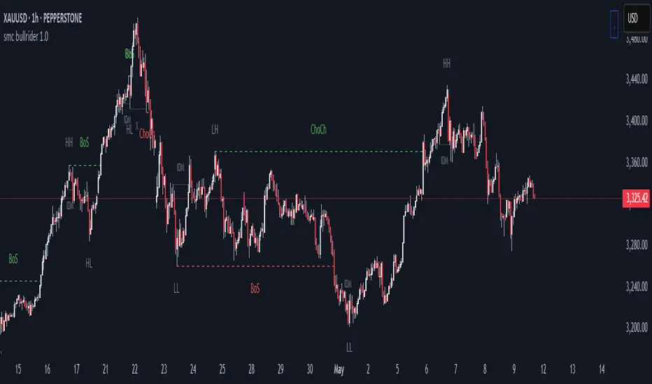
smc bullrider 1.0The smc bullrider 1.0 indicator is specifically crafted for mapping market structures. It excels in clearly recognizing type of Points Of Interest (SCOB) offering traders a straightforward and effective method to analyze market movements. It helps identify strategic entry points with precision.
🟠 Exploring Structure Mapping.
🔹This indicator presents a distinctive method for examining the market structure, emphasizing liquidity through the concept of 'Inducement'. Inducement plays a pivotal role in pinpointing essential structural indicators in the market, including Higher Highs (HH), Higher Lows (HL), Lower Lows (LL), and Lower Highs (LH).
🔹Consider Inducement as a strategically placed trap near supply or demand zones. It lures in eager buyers or sellers before the actual zone is reached, effectively creating liquidity. To validate an inducement, it must signify a legitimate pullback.
🔹A valid scenario arises when the price either sweeps or closes beyond the high or low of the preceding candle. In this context, the candle's color, whether bullish or bearish, holds no significance, and both situations are deemed valid. Inside bars are disregarded unless they meet this specific criterion. The indicator facilitates this process by automatically highlighting valid pullbacks with a distinctive gray round label.
🔹This feature serves not only as a visual guide but also as a vital tool for effortlessly comprehending market movements, offering a clear and visual representation of ongoing market trends
🟣 Understanding POI Functionality
🔹Single Candle Order Block (SCOB): Leveraging single-candle mitigation proves to be a powerful method for incorporating multiple entries into your successful trades.
🔵 How to Utilize the smc bullrider 1.0 Indicator:
🔹The smc bullrider 1.0 Indicator is crafted to elevate your trading strategy by pinpointing crucial order blocks and market signals. Below is a guide on how to make the most of the different components of the smc bullrider 1.0 Indicator:
🔹SCOB (Single Candle Order Block):
Application: SCOB is well-suited for scaling into a position. It is best utilized to increase positions when the market responds to OB or OB-EXT, signaling a potential reversal.
🟢Here's how to use it.
🔹Market Structure Drawing
This diagram depicts significant market indicators, such as instances of ascending prices (Higher Highs - HH) or descending prices (Lower Lows - LL). It serves as a valuable visual tool for comprehending the dynamics of market behavior
PICTURE (DIAGRAM)
Live Chart Example: Our indicator efficiently dissects market structure, showcasing the 'Inducement' concept with precision in real-time trends—highlighting HH, HL, LL, and LH
PICTURE (REAL CHART)
Valid Pullback ( IDM ):
Valid Pullback Example: This image illustrates a common situation where the price extends beyond the high or low of the preceding candle, signifying a valid pullback. Pay attention to the identifiable gray dotted line label marking the inducement point.
PICTURE (DRAW/REAL)
Single Candle Order Block (SCOB)
The provided chart showcases the SCOB in a real trading setting, highlighting its effectiveness in optimizing trades.
🟡 Summary
🔹smc bullrider 1.0 Indicator distinguishes itself in the realm of market analysis, with a distinct focus on structure mapping and high-probability Point of Interest (POI).
Furthermore, it provides a visual representation of three key areas for each market move: discount, premium, and the equilibrium area at 50%. Its innovative approach involves scrutinizing market structure using the 'Inducement' concept, a pivotal strategy for identifying vital structural markers and steering
Ultra Trade JournalThe Ultra Trade Journal is a powerful TradingView indicator designed to help traders meticulously document and analyze their trades. Whether you're a novice or an experienced trader, this tool offers a clear and organized way to visualize your trading strategy, monitor performance, and make informed decisions based on detailed trade metrics.
Detailed Description
The Ultra Trade Journal indicator allows users to input and visualize critical trade information directly on their TradingView charts.
.........
User Inputs
Traders can specify entry and exit prices , stop loss levels, and up to four take profit targets.
.....
Dynamic Plotting
Once the input values are set, the indicator automatically plots horizontal lines for entry, exit, stop loss, and each take profit level on the chart. These lines are visually distinct, using different colors and styles (solid, dashed, dotted) to represent each element clearly.
.....
Live Position Tracking
If enabled, the indicator can adjust the exit price in real-time based on the current market price, allowing traders to monitor live positions effectively.
.....
Tick Calculations
The script calculates the number of ticks between the entry price and each exit point (stop loss and take profits). This helps in understanding the movement required for each target and assessing the potential risk and reward.
.....
Risk-Reward Ratios
For each take profit level, the indicator computes the risk-reward (RR) ratio by comparing the ticks at each target against the stop loss ticks. This provides a quick view of the potential profitability versus the risk taken.
.....
Comprehensive Table Display
A customizable table is displayed on the chart, summarizing all key trade details. This includes the entry and exit prices, stop loss and take profit levels, tick counts, and their respective RR ratios.
Users can adjust the table's Position and text color to suit their preferences.
.....
Visual Enhancements
The indicator uses adjustable background shading between entry and stop loss/take profit lines to visually represent potential trade outcomes. This shading adjusts based on whether the trade is long or short, providing an intuitive understanding of trade performance.
.........
Overall, the Ultra Trade Journal combines visual clarity with detailed analytics, enabling traders to keep a well-organized record of their trades and enhance their trading strategies through insightful data.

Alert Kabi Family Unlimited Alarm indicator for any time frame and any type of currency, stock and index
اندییکاتور آلارم نامحدود برای هر تایم فریم و هر شاخص و ارز و سهام
Settings :
1- Before starting, clear all alarms in the trading view alarm section
2- Specify your alarm areas and currency pairs in the indicator settings section
3- Go to the trading view alarm section, click create alert, select the name of the indicator and click OK
4- Good Luck
T e L : @Ar3781
1- قبل از شروع تمام آلارم های تریدینگ ویو را پاک کنید
2- در قسمت تنظیمات اندیکاتور نواحی آلارم و جفت ارز خود را مشخص کنید
3- به قسمت الارم تریدینگ ویو رفته ایجاد هشدار را زده و اسم اندیکاتور را انتخاب کنید و اوکی کنید
4- مـــــــوفق بــــــاشـید

Confirmed market structure buy/sell indicatorOverview
The Swing Point Breakout Indicator with Multi-Timeframe Dashboard is a TradingView tool designed to identify potential buy and sell signals based on swing point breakouts on the primary chart's timeframe while simultaneously providing a snapshot of the market structure across multiple higher timeframes. This dual approach helps traders make informed decisions by aligning short-term signals with broader market trends.
Key Features
Swing Point Breakout Detection
Swing Highs and Lows: Identifies significant peaks and troughs based on a user-defined lookback period.
Breakout Signals:
Bullish Breakout (Buy Signal): Triggered when the price closes above the latest swing high.
Bearish Breakout (Sell Signal): Triggered when the price closes below the latest swing low.
Visual Indicators: Highlights breakout bars with colors (lime for bullish, red for bearish) and plots buy/sell markers on the chart.
Multi-Timeframe Dashboard
Timeframes Monitored: 1m, 5m, 15m, 1h, 4h, 1D, and 1W.
Market Structure Status:
Bullish: Indicates upward market structure.
Bearish: Indicates downward market structure.
Neutral: No clear trend.
Visual Table: Displays each timeframe with its current status, color-coded for quick reference (green for bullish, red for bearish, gray for neutral).
Operational Workflow
Initialization:
Sets up a dashboard table on the chart's top-right corner with headers "Timeframe" and "Status".
Swing Point Detection:
Continuously scans the main timeframe for swing highs and lows using the specified lookback period.
Updates the latest swing high and low levels.
Signal Generation:
Detects when the price breaks above the last swing high (bullish) or below the last swing low (bearish).
Activates potential buy/sell setups and confirms signals based on subsequent price movements.
Dashboard Update:
For each defined higher timeframe, assesses the market structure by checking for breakouts of swing points.
Updates the dashboard with the current status for each timeframe, aiding in trend confirmation.
Visualization:
Colors the bars where breakouts occur.
Plots buy and sell signals directly on the chart for easy identification.

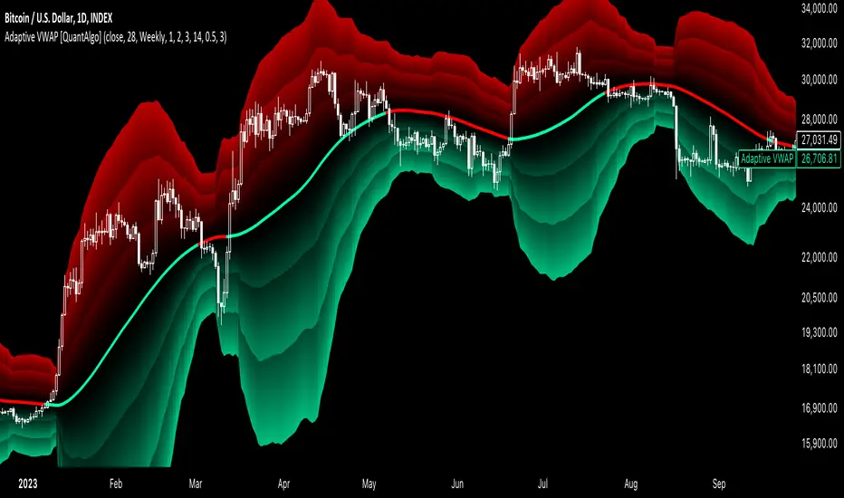
Adaptive VWAP [QuantAlgo]Introducing the Adaptive VWAP by QuantAlgo 📈🧬
Enhance your trading and investing strategies with the Adaptive VWAP , a versatile tool designed to provide dynamic insights into market trends and price behavior. This indicator offers a flexible approach to VWAP calculations by allowing users to adapt it based on lookback periods or fixed timeframes, making it suitable for a wide range of market conditions.
🌟 Key Features:
🛠 Customizable VWAP Settings: Choose between an adaptive VWAP that adjusts based on a rolling lookback period, or switch to a fixed timeframe (e.g., daily, weekly, monthly) for a more structured approach. Adjust the VWAP to suit your trading or investing style.
💫 Dynamic Bands and ATR Filter: Configurable deviation bands with multipliers allow you to visualize price movement around VWAP, while an ATR-based noise filter helps reduce false signals during periods of market fluctuation.
🎨 Trend Visualization: Color-coded trend identification helps you easily spot uptrends and downtrends based on VWAP positioning. The indicator fills the areas between the bands for clearer visual representation of price volatility and trend strength.
🔔 Custom Alerts: Set up alerts for when price crosses above or below the VWAP, signaling potential uptrend or downtrend opportunities. Stay informed without needing to monitor the charts constantly.
✍️ How to Use:
✅ Add the Indicator: Add the Adaptive VWAP to your favourites and apply to your chart. Choose between adaptive or timeframe-based VWAP calculation, adjust the lookback period, and configure the deviation bands to your preferred settings.
👀 Monitor Bands and Trends: Watch for price interaction with the VWAP and its deviation bands. The color-coded signals and band fills help identify potential trend shifts or price extremes.
🔔 Set Alerts: Configure alerts for uptrend and downtrend signals based on price crossing the VWAP, so you’re always informed of significant market movements.
⚙️ How It Works:
The Adaptive VWAP adjusts its calculation based on the user’s chosen configuration, allowing for a flexible approach to market analysis. The adaptive setting uses a rolling lookback period to continuously adjust the VWAP, while the fixed timeframe option anchors VWAP to key timeframes like daily, weekly, or monthly periods. This flexibility enables traders and investors to use the tool in various market environments.
Deviation bands, calculated with customizable multipliers, provide a clear visual of how far the price has moved from the VWAP, helping you gauge potential overbought or oversold conditions. To reduce false signals, an ATR-based filter can be applied, ensuring that only significant price movements trigger trend confirmations.
The tool also includes a fast exponential smoothing function for the VWAP, helping smooth out price fluctuations without sacrificing responsiveness. Trend confirmation is reinforced by the number of bars that price stays above or below the VWAP, ensuring a more consistent trend identification process.
Disclaimer:
The Adaptive VWAP is designed to enhance your market analysis but should not be relied upon as the sole basis for trading or investing decisions. Always combine it with other analytical tools and practices. No statements or signals from this indicator constitute financial advice. Past performance is not indicative of future results.
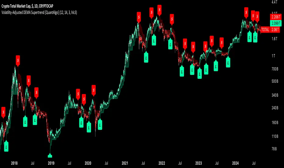
Volatility-Adjusted DEMA Supertrend [QuantAlgo]Introducing the Volatility-Adjusted DEMA Supertrend by QuantAlgo 📈💫
Take your trading and investing strategies to the next level with the Volatility-Adjusted DEMA Supertrend , a dynamic tool designed to adapt to market volatility and provide clear, actionable trend signals. This innovative indicator is ideal for both traders and investors looking for a more responsive approach to market trends, helping you capture potential shifts with greater precision.
🌟 Key Features:
🛠 Customizable Trend Settings: Adjust the period for trend calculation and fine-tune the sensitivity to price movements. This flexibility allows you to tailor the Supertrend to your unique trading or investing strategy, whether you're focusing on shorter or longer timeframes.
📊 Volatility-Responsive Multiplier: The Supertrend dynamically adjusts its sensitivity based on real-time market volatility. This could help filter out noise in calmer markets and provide more accurate signals during periods of heightened volatility.
✨ Trend-Based Color-Coding: Visualize bullish and bearish trends with ease. The indicator paints candles and plots trend lines with distinct colors based on the current market direction, offering quick, clear insights into potential opportunities.
🔔 Custom Alerts: Set up alerts for key trend shifts to ensure you're notified of significant market changes. These alerts would allow you to act swiftly, potentially capturing opportunities without needing to constantly monitor the charts.
📈 How to Use:
✅ Add the Indicator: Add the Volatility-Adjusted DEMA Supertrend to your chart. Customize the trend period, volatility settings, and price source to match your trading or investing style. This ensures the indicator aligns with your market strategy.
👀 Monitor Trend Shifts: Watch the color-coded trend lines and candles as they dynamically shift based on real-time market conditions. These visual cues help you spot potential trend reversals and confirm your entries and exits with greater confidence.
🔔 Set Alerts: Configure alerts for key trend shifts, allowing you to stay informed of potential market reversals or continuation patterns, even when you're not actively watching the market.
⚙️ How It Works:
The Volatility-Adjusted DEMA Supertrend is designed to adapt to changes in market conditions, making it highly responsive to price volatility. The indicator calculates a trend line based on price and volatility, dynamically adjusting it to reflect recent market behavior. When the market experiences higher volatility, the trend line becomes more flexible, potentially allowing for greater sensitivity to rapid price movements. Conversely, during periods of low volatility, the indicator tightens its range, helping to reduce noise and avoid false signals.
The indicator includes a volatility-responsive multiplier, which further enhances its adaptability to market conditions. This means the trend direction would always be based on the latest market data, potentially helping you stay ahead of shifts or continuation trends. The Supertrend's visual color-coding simplifies the process of identifying bullish or bearish trends, while customizable alerts ensure you can stay on top of significant changes in market direction.
This tool is versatile and could be applied across various markets and timeframes, making it a valuable addition for both traders and investors. Whether you’re trading in fast-moving markets or focusing on longer-term investments, the Volatility-Adjusted DEMA Supertrend could help you remain aligned with the current market environment.
Disclaimer:
This indicator is designed to enhance your analysis by providing trend information, but it should not be used as the sole basis for making trading or investing decisions. Always combine it with other forms of analysis and risk management practices. No statements or claims aim to be financial advice, and no signals from us or our indicators should be interpreted as such. Past performance is not indicative of future results.
Strategy CheckListStrategy CheckList
Overview
The Strategy CheckList is a customizable TradingView indicator designed to help traders maintain consistency and discipline in their trading strategies. By providing a visual checklist directly on the chart, this tool ensures that traders can quickly review and confirm their strategy criteria before making trading decisions.
Key Features
- Customizable checklist with up to 6 items
- Adjustable position on the chart (top-right or bottom-right)
- Configurable background and text colors
- Selectable font sizes for optimal visibility
- Interactive checkboxes for each list item
How It Works
1. Users can input up to 6 checklist items representing key aspects of their trading strategy.
2. Each item can be toggled on or off using a checkbox.
3. The checklist is displayed as a table overlay on the chart, allowing for quick reference without obstructing the view of price action.
4. The position, colors, and font size of the checklist can be easily customized to suit individual preferences and chart setups.
Use Cases
- Pre-trade checklist: Ensure all strategy conditions are met before entering a trade
- Risk management: Include reminders about position sizing, stop-loss placement, etc.
- Strategy adherence: Keep key rules visible to avoid impulsive decisions
- Performance improvement: Track adherence to your trading plan over time
Customization Options
- Background color
- Text color
- Font size (small, normal, large, huge)
- Position on chart (top-right, bottom-right)
- Individual checklist items and their checked/unchecked status
Benefits
- Improves trading discipline
- Reduces emotional decision-making
- Enhances strategy consistency
- Serves as a quick reference for complex strategies
- Adaptable to various trading styles and timeframes
This Strategy CheckList indicator is an invaluable tool for traders looking to enhance their decision-making process and maintain consistency in their trading approach. By keeping crucial strategy elements visible and interactive, it promotes disciplined trading and can potentially improve overall trading performance.

Trade-o-Scope: Plot Custom DataTrade-o-Scope team presents the "Plot Custom Data" indicator.
"Plot Custom Data" is designed to help you bring the custom timeseries data and plot it on the chart.
Motivation:
In the fast-evolving landscape of markets, traders often find themselves analyzing a plethora of data sources, specialized market information, various metrics, etc. While TradingView offers a rich catalog of instruments and market data, there are cases where traders rely on unique data sources, custom calculations, bespoke metrics, or refined analytics that demand visualization.
In some cases, traditional visualization approaches for custom data like plotting in Excel or other platforms may suffice for some. still, we really adore all the great features TradingView supercharts have - native scaling and scrolling, drawing, combining data, applying indicators and strategies on top of any series, etc. The ability to play with custom data on TradingView charts is just a whole new level compared to any alternatives.
With this indicator, we aim to empower traders to effortlessly bring their custom data to the familiar and friendly interface of the TradingView chart.
Basic Features:
Easy Data Input : Simply paste your numerical timeseries data, whether it's a column from Excel, Google Sheets, CSV file, or multiline text from any text editor.
Flexible Configuration : Define the order of values, starting date, and timeframe to match the specifications of your data.
Custom appearance : Personalize your chart by assigning a title to your data and selecting colors for the plot.
Advanced Features:
Value Multiplier : Set a multiplier for the provided values to adjust their scale as needed.
Formatting Options : Customize the display format of values on the chart, whether as price, percentage, or volume.
Conditional Coloring : Define conditions for changing the plot color based on a specific threshold.
Plot Style Selection : Choose from various plot styles such as line, histogram, area, columns, and more, to best visualize your data.
Additional Visual References : Enhance data analysis by activating fixed horizontal lines to aid in visual interpretation.
Leverage TradingView Capabilities : Seamlessly apply various indicators from the TradingView catalog, such as Bollinger Bands or RSI, onto your custom data chart for comprehensive analysis.
Chart Example:
On the chart above, you can observe several "Plot Custom Data" indicators added to demonstrate what your custom data can look like and how multiple indicators can be combined, as well as the indicator configuration screen.
How it works:
The "Plot Custom Data" indicator processes the list of values provided on the configuration form and converts it into data points to be plotted on the chart. To determine the timing of plotting each value, the indicator uses the configured 'starting date' and 'timeframe'. This means the indicator will always plot each subsequent value from your list at the distance of one timeframe from the previous one.
Limitations and Best Practices:
1) The way timeseries data is inputted on the "Plot Custom Data" indicator configuration page, leverages a standard input text field. This input type has a limited character capacity, approximately 4000-4400 symbols. Therefore, the timeseries data cannot exceed this limit.
Let's illustrate this with an example.
Suppose you have a column in Excel that you wish to plot using the indicator. Consider the first 5 rows of values in your column:
| -123.45
| -43.5
| 3.12
| 9.6
| 146.78
To calculate the total symbols used, we need to account for the minus sign, numbers, decimal point, and two invisible symbols at the end of each line, which helps structure the text into multiple lines. So, in total, these 5 rows will use:
row_1 + row_2 + row_3 + row_4 + row_5 = 9 + 7 + 6 + 5 + 8 = 35 symbols or 7 symbols per row on avarage.
If we assume the remaining data follows a similar format, we can estimate the number of rows that can be inputted on the indicator configuration page:
from ~4000 / 7 = 571 rows
to ~4400 / 7 = 628 rows
The right approach to overcome this limitation is to reduce the number of symbols representing each value as much as possible. In our example, consider dropping all decimals, which would lead to an average of 5.4 symbols per row and allow for up to ~800 rows to be accepted by the input field.
If your data primarily consists of large values such as thousands or millions, consider dividing it by a multiplier like x1000 and activating the same multiplier in the indicator settings.
For example, instead of storing values like 5,620,000 in your list, store the value 562 and activate an x10,000 multiplier in the configuration to display the original value on the chart.
It is also possible to combine multiple indicators on one chart and split a larger list of values between them. If you need to display significantly more custom data on charts, you may contact us in DM to find\develop a proper solution.
2) Another important consideration is to ensure that all your data aligns with the selected timeframe in the indicator configuration.
Remember, you provide only the values to the indicator without corresponding dates. Dates are calculated automatically by the indicator based on the configured starting date and chosen timeframe. This means the indicator will always plot each subsequent value from your list at the distance of one timeframe from the previous one.
Here's an example:
Suppose you have a timeseries with 'date' and 'value' columns and a timeframe of 30 minutes:
# | date | value
--|---------------------------|---------
1 | 2024-01-01 11:30:00 | -241.45
2 | 2024-01-01 12:02:13 | -11.56
3 | 2024-01-01 13:00:00 | 21.87
..
..
6 | 2024-01-01 14:30:00 | 19.6
7 | 2024-01-01 15:00:00 |
8 | 2024-01-01 15:30:00 | 46.78
Rows 1-3 represent bad practice:
Row 2 is not precisely aligned with the timeframe, as it has a time of 12:02:13 instead of the expected 12:00:00. This won't cause errors, but the plot will show this value at 12:00:00.
Row 3 has a 1-hour difference from Row 2, which poses a real problem. As the indicator doesn't know the actual dates, it expects Row 3 to be 30 minutes later than Row 2, so it will plot 21.87 at 12:30:00 instead of the actual 13:00:00. And the rest of the values from your list will have offset on the chart as well.
Rows 6-7 represent the correct approach to overcome gaps in your data:
If, for some reason, there is no value for 15:00:00 in the original dataset, adding an empty Row 7 ensures each subsequent row is located 30 minutes from the previous one. The indicator will treat the empty row correctly, not plotting anything at this date on the chart, but will plot a line connecting the value of 19.6 from Row 6 with the value of 46.78 from Row 8.
How to use:
1) Add the "Plot Custom Data" indicator to the chart.
Voila! You'll see the plot based on the default timeseries values list and settings.
2) Paste your numerical timeseries data.
Define the order of values, starting date, and timeframe.
Assign a title to your data and select colors for the plot.
Voila! You'll see the plot based on your timeseries values list and settings.
3) Customize the indicator's settings:
Set a values multiplier if needed.
Specify the appropriate format for the values (price, percentage, or volume).
Choose whether to change the plot color based on conditions.
Select the plot style.
Add horizontal lines.
4) Explore your data, apply additional indicators and strategies from the TradingView catalog, or develop your own scripts using Pine.
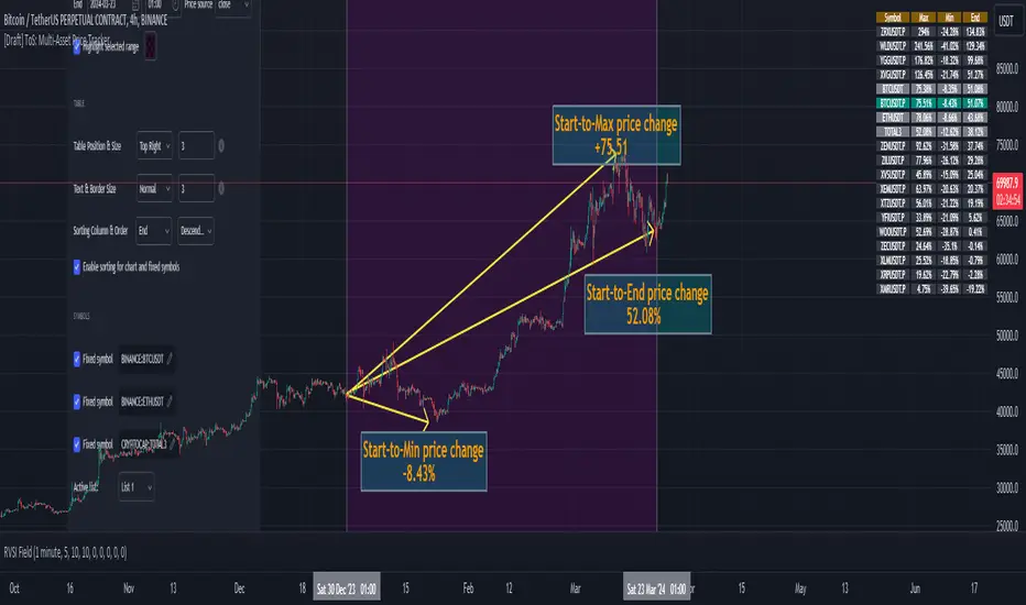
Trade-o-Scope: Multi-Asset Price TrackerTrade-o-Scope team presents the "Multi-Asset Price Tracker" indicator.
"Multi-Asset Price Tracker" is designed to help analyze price changes across multiple assets within time intervals you define.
Motivation:
Most screeners on the market track price changes over predefined periods, like 1H\4H\12H\1D\3D\7D\etc. Typically, they compare initial and current prices.
But what if you want to analyze assets' performance over arbitrary historical intervals?
Perhaps you want to spot which assets dropped most within 7 hours after a specific industry announcement? Or do you want to check which asset grew the most in January last year?
This is where the "Multi-Asset Price Tracker" shines. It lets you define arbitrary intervals and track price changes for selected assets.
Overview and functionality:
Define arbitrary time intervals in history for analyzing price changes.
Create up to 10 lists, each with up to 40 symbols to track. Populate lists with data from text files, Excel, or CSV. Lists are just multiline text strings, each line representing an individual symbol.
Switch between lists, with one active list at a time.
Specify up to 3 fixed symbols for additional analysis alongside active list symbols. You may use them as reference points to compare price changes of the symbols in the List.
Customize table appearance and position.
Set sorting criteria and direction for displayed values.
View the results in a table on the chart.
How it works:
"Multi-Asset Price Tracker" will track the symbol's price during the interval you define.
The indicator identifies each symbol's Start, Max, Min, and End prices during the interval. It then calculates relative changes: Start-to-Max, Start-to-Min, and Start-to-End.
The list of relative changes is ordered by the column chosen in settings and displayed on the chart.
List example (up to 10 Lists):
BINANCE:WLDUSDT.P
BINANCE:WOOUSDT.P
BINANCE:XEMUSDT.P
...
...
(up to 40 symbols per List)
Calculation example:
Symbol Start-price = $100
Symbol Max-price = $150
Symbol Min-price = $75
Symbol End-price = $110
Start-to-Max = 100% * (Max-price - Start-price) / Start-price = 100% * ($150 - $100) / $100 = 50%
Start-to-Min = 100% * (Min-price - Start-price) / Start-price = 100% * ($75 - $100) / $100 = -25%
Start-to-End = 100% * (End-price - Start-price) / Start-price = 100% * ($110 - $100) / $100 = 10%
Chart example:
In the provided chart, you can observe an example with a table generated by the indicator, along with manually added arrows and labels explaining the calculation process for an individual symbol from the list.
How to use:
1) Add "Multi-Asset Price Tracker" indicator to the chart
2) The indicator will ask you to define the start and the end of the interval using the mouse on the chart.
Voila! You'll see the table with sorted relative price changes based on default list values and settings.
3) Customize the indicator's settings:
Define the interval Start and End datetime.
Optionally, change the interval Start and End by clicking on the indicator name and dragging the vertical mark at the edges of the interval to a new position.
Define the Start and End price sources.
Choose a color to highlight the interval on the chart's background.
Set the table position, size, text size, and border size.
Specify the column for sorting and its direction.
Choose whether to sort chart symbols and fixed symbols together with list symbols or display them at the top of the table irrespective of their relative price change.
Enable fixed symbols if needed, and define up to 3 fixed symbols.
Define symbol lists, with up to 10 lists and 40 symbols each.
Select which List to make active - symbols from the active list will be calculated and displayed.
Trade-o-Scope: Highlight IntervalsTrade-o-Scope team presents the Highlight intervals indicator.
Highlight intervals is a simple yet powerful indicator that helps highlight adjustable time intervals on the chart.
Overview and functionality:
You can define time intervals at three different levels: Month, Day of the Week, and Day of the Month. The indicator will then highlight intervals at the intersection of these levels.
By default, the indicator will use the exchange timezone, but you can easily switch to any timezone that suits you best.
You can activate an info-panel about the type of asset displayed on the chart and the timezone used by the exchange.
You can select your preferred color for highlighting intervals.
With Highlight intervals, you're equipped to visualize and focus on the intervals that matter most to you while seeking alpha!
How it works:
You define which bars will be highlighted by configuring the indicator settings. These settings revolve around the time intervals and may combine:
Months: Jan, Feb, Mar, Apr, May, Jun, Jul, Aug, Sep, Oct, Nov, Dec
Days of Month: 1 - 31
Days of Week: Mon, Tue, Wed, Thu, Fri, Sat, Sun
Example:
In the attached chart you can see an example where the time intervals are highlighted according to such a configuration:
Months: Feb, Mar
Days of Month: 1 - 15
Days of Week: Mon - Fri

Prepare Targets, Stop Loss, Position Size and calculate PnL You are watching the price action of your favorite coin. Then the price changes quickly and you know you could start a good trade now.
But how much should you buy, where should you set your Target for Profit Taking and your Stop Loss? How much money do you want to risk, how much money would you win if the trade is succesfull?
This indicator helps you to set up your trade in a quick way, no need to do some calculations by hand.
How does it work?
Just enter the prices where you want to take Profit and where your Stopp Loss should be.
Enter the number of coins and wether you buy or sell/go long or short.
These targets are then shown in the chart, move them around to see if your stopp loss is positioned well. See directly what your profit or loss would be.
See some Screenshots with more explanations for what is possible and how to set up everything.
General Overview:
How to set up the Trade:
Formatting and Extras:
Let me know if you like it!
