QMF- Market Structure & Signal Suite [BullByte]QUANTUM MOMENTUM FUSION - Market Structure and Signal Suite
OVERVIEW
Quantum Momentum Fusion is a comprehensive market analysis framework built around a multi-dimensional momentum oscillator. This indicator was designed to give traders a complete analytical workspace in a single tool, combining momentum measurement, market structure identification, trendline analysis, divergence detection, and multi-timeframe context into one unified system.
The core philosophy behind QMF is that successful trading decisions come from understanding multiple aspects of market behavior simultaneously, not from relying on any single indicator or signal. The oscillator serves as the analytical foundation, and every other component builds upon it to create a complete picture of current market conditions.
This description will walk through each component of the indicator, explaining what it measures, why that information matters, and how to interpret what you see on the chart. Whether you are an experienced trader familiar with oscillator analysis or newer to technical indicators, each section aims to make the concepts accessible and practical.
THE QUANTUM ENGINE: UNDERSTANDING THE CORE OSCILLATOR (why its original and not a mashup)
At the heart of this indicator is the Quantum Momentum Fusion oscillator, displayed in its own pane below the price chart. Unlike traditional oscillators that measure a single aspect of price behavior, the QMF oscillator synthesizes four distinct market dimensions into one unified reading.
WHAT IS AN OSCILLATOR
For those less familiar with the term, an oscillator is a technical indicator that fluctuates between defined boundaries, typically showing whether an asset is experiencing strong buying pressure, strong selling pressure, or neutral conditions. The QMF oscillator moves between 0 and 100, with 50 representing the neutral midpoint.
When the oscillator is high (above 70), it suggests the market has experienced significant upward momentum and may be approaching exhaustion. When low (below 30), it suggests the market has experienced significant downward momentum and may be due for a bounce. The space between these extremes represents normal market fluctuation.
THE FOUR DIMENSIONS
What makes the QMF oscillator different from standard momentum indicators is that it combines four separate measurements into its calculation. Each dimension captures a different aspect of market behavior:
VELOCITY DIMENSION
This measures how quickly momentum itself is changing. Think of it like acceleration in a car. Knowing the car is moving forward (direction) is useful, but knowing whether the driver is pressing the accelerator or the brake (acceleration) tells you what is likely to happen next. The velocity dimension calculates the rate of change of the rate of change, providing early warning when momentum is about to shift direction. In practical terms, this can show momentum weakening before price actually reverses.
Why it matters: Price can continue in one direction for a while even after the underlying momentum starts to fade. By measuring acceleration, you can identify potential turning points earlier than with simple momentum indicators.
How it appears: This dimension is calculated internally and combined with the others. You do not see it separately, but its effect shows in the oscillator responding earlier to momentum shifts.
VOLUME DIMENSION
This measures price movement weighted by trading volume. A price move accompanied by high volume has different significance than the same price move on low volume. High volume suggests conviction and participation from larger traders. Low volume suggests the move may lack follow-through.
The volume dimension multiplies price change by a volume ratio (current volume compared to average volume), giving greater weight to moves that have volume confirmation behind them.
Why it matters: Volume often precedes price. Strong volume on a move suggests institutional participation and increases the probability that the move will continue. Weak volume on a move suggests it may be easily reversed.
How it appears: Moves with strong volume conviction will push the oscillator more definitively, while low-volume moves will have muted effect on the reading.
VOLATILITY DIMENSION
This normalizes price movement against the current volatility environment. Markets go through periods of high volatility (large price swings) and low volatility (small price swings). A 1% move during a low volatility period is more significant than a 1% move during a high volatility period.
The volatility dimension divides price change by Average True Range (ATR), which measures typical price range. This tells you whether current movement is significant relative to what is normal for this market right now.
Why it matters: Without volatility normalization, the oscillator would react the same way to all price moves regardless of context. By adjusting for volatility, the oscillator identifies moves that are genuinely significant versus normal noise within the current regime.
How it appears: During quiet markets, smaller price moves can still register as significant if they exceed normal volatility. During volatile markets, the oscillator will not overreact to moves that are within expected range.
SESSION DIMENSION
This tracks where price is positioned relative to the session Volume Weighted Average Price (VWAP). VWAP represents the average price at which trading has occurred during the session, weighted by volume. Institutional traders often use VWAP as a benchmark for fair value.
When price is consistently above VWAP, it suggests buyers are willing to pay above average prices, indicating accumulation. When price is consistently below VWAP, it suggests sellers are accepting below average prices, indicating distribution.
Why it matters: VWAP positioning provides insight into whether institutional traders are likely accumulating or distributing. Price repeatedly returning to and bouncing from VWAP can indicate support, while price repeatedly failing at VWAP can indicate resistance.
How it appears: The session dimension contributes bullish readings when price maintains above VWAP and bearish readings when price maintains below VWAP.
ADAPTIVE WEIGHTING
The four dimensions are combined using configurable weights, and the system can operate in Adaptive Mode. When Adaptive Mode is enabled, the indicator automatically adjusts its sensitivity based on the current volatility regime. During high volatility periods, sensitivity increases to capture larger moves. During low volatility periods, sensitivity decreases to filter out noise.
This means the oscillator adapts to changing market conditions without requiring manual adjustment.
READING THE OSCILLATOR: DISPLAY MODES AND ZONES
The QMF oscillator can be displayed in four different visual formats. Each shows the same underlying data but presents it differently based on trader preference.
ENERGY CANDLES
This mode displays the oscillator as candlestick-style candles. Just as price candles show open, high, low, and close for price, energy candles show these values for the QMF oscillator.
Green candles indicate the oscillator closed higher than it opened (bullish momentum). Red candles indicate the oscillator closed lower than it opened (bearish momentum). The body size shows how much the oscillator moved during the period. Larger bodies indicate stronger momentum conviction.
This format is useful for traders who are comfortable reading candlestick patterns and want to apply similar visual analysis to the oscillator.
QMF LINE
This mode displays the oscillator as a traditional line chart with a signal line overlay. The main QMF line shows current momentum. The signal line is a smoothed average of the QMF that helps identify direction changes.
When the QMF line is above the signal line, momentum is bullish. When below, momentum is bearish. Crossovers between the two lines can indicate momentum shifts.
This format is familiar to traders who use indicators like MACD and prefer clean line-based visualization.
IMPULSE BARS
This mode displays the oscillator as a histogram centered on the 50 midline. Bars above 50 indicate bullish momentum, bars below 50 indicate bearish momentum. Bar height shows momentum strength.
The color intensity changes based on momentum direction. Bars that are increasing in the bullish direction show brighter color. Bars that are decreasing show muted color. This makes it easy to see momentum acceleration and deceleration at a glance.
HEIKIN FLOW
This mode applies Heikin-Ashi smoothing to the energy candles. Heikin-Ashi is a Japanese technique that averages price data to create smoother trends with fewer reversals.
The result is cleaner visual trends that are easier to follow, though with slightly more lag than standard energy candles. This format is useful for identifying sustained momentum moves without getting distracted by minor fluctuations.
OSCILLATOR ZONES
Regardless of display mode, the oscillator pane includes horizontal reference lines that define important zones:
Midline at 50: The neutral point. When the oscillator is above 50, overall momentum is bullish. When below 50, overall momentum is bearish.
Overbought level at 70: When the oscillator crosses above this level, the market is showing strong bullish momentum. However, this also means prices have risen significantly and bearish reversal probability increases the longer the oscillator stays elevated.
Oversold level at 30: When the oscillator crosses below this level, the market is showing strong bearish momentum. However, this also means prices have fallen significantly and bullish reversal probability increases.
Extreme overbought at 85: Maximum bullish exhaustion. At this level, almost all short-term buying pressure has been expended. Reversal probability is high.
Extreme oversold at 15: Maximum bearish exhaustion. At this level, almost all short-term selling pressure has been expended. Reversal probability is high.
Understanding these zones helps you assess the current market condition before looking at any other indicator components.
MARKET STRUCTURE: DYNAMIC SUPPORT AND RESISTANCE
The second major component of the indicator is market structure analysis through dynamic support and resistance levels. Unlike price-based support and resistance, these levels are calculated directly on the oscillator.
WHAT ARE OSCILLATOR-BASED S/R LEVELS
When the QMF oscillator reaches a high point and then reverses lower, that high point becomes a resistance level on the oscillator. When the oscillator reaches a low point and then reverses higher, that low point becomes a support level.
These levels represent momentum thresholds that the market has previously found difficult to exceed. They answer the question: At what momentum reading has the oscillator historically reversed?
WHY THIS MATTERS
Oscillator support and resistance provides different information than price support and resistance. Price S/R tells you where buyers and sellers have previously entered the market. Oscillator S/R tells you what level of momentum the market has been able to sustain.
If the oscillator approaches its resistance level, it suggests momentum is reaching the upper bounds of what has been achievable recently. Either momentum will break through (indicating unusually strong conditions) or it will reverse (indicating normal mean reversion).
Similarly, if the oscillator approaches support, it suggests momentum is reaching exhaustion levels that have previously triggered bounces.
HOW IT APPEARS ON THE CHART
Resistance is displayed as a horizontal red line with a RES label on the oscillator pane. Support is displayed as a horizontal cyan line with a SUP label. These lines update dynamically as new pivots form.
When the oscillator breaks through these levels, markers appear:
R with up arrow: Resistance level broken, indicating unusually strong bullish momentum
S with down arrow: Support level broken, indicating unusually strong bearish momentum
R with checkmark: Resistance held, price rejected at this level
S with checkmark: Support held, price bounced from this level
The dashboard also shows current S/R status: whether the oscillator recently broke resistance, broke support, is currently at resistance, is currently at support, or is in clear space between levels.
AUTOMATED TRENDLINES: MOMENTUM TREND STRUCTURE
The third major component is automated trendline detection on the oscillator. This identifies trending behavior in momentum itself, separate from price trends.
WHAT ARE OSCILLATOR TRENDLINES
Just as you can draw trendlines on a price chart connecting swing lows (uptrend) or swing highs (downtrend), the indicator draws trendlines on the oscillator connecting pivot points.
Support trendlines connect oscillator pivot lows and project forward with a flat or rising slope. These show upward trending momentum where each pullback finds support at a higher level.
Resistance trendlines connect oscillator pivot highs and project forward with a flat or falling slope. These show downward trending momentum where each rally faces resistance at a lower level.
WHY THIS MATTERS
Price trends and momentum trends do not always align. Price can continue making higher highs while momentum makes lower highs, a condition called bearish divergence. Momentum trendlines help visualize this behavior.
When momentum is making higher lows (rising support trendline), it suggests underlying strength even if price is consolidating. When momentum is making lower highs (falling resistance trendline), it suggests underlying weakness even if price is holding.
Breaks of these trendlines often precede price moves. If a falling momentum resistance trendline breaks upward, it suggests bearish pressure is releasing and bullish momentum may follow. If a rising momentum support trendline breaks downward, it suggests bullish pressure is failing and bearish momentum may follow.
HOW IT APPEARS ON THE CHART
Support trendlines appear in blue/cyan, resistance trendlines appear in pink/magenta. Lines extend forward from the most recent pivot point to show projected levels.
Small circle markers can optionally appear at each pivot point used to construct the trendlines, helping you verify the anchor points.
When the oscillator breaks through a trendline, markers appear:
TL with up arrow: Resistance trendline broken upward (bullish breakout)
TL with down arrow: Support trendline broken downward (bearish breakdown)
Trendline strength is calculated based on three factors: how many pivot points validate the line, how recently it formed, and the angle of the slope. Stronger trendlines have more touches, formed recently, and have moderate slopes. You can filter trendlines by strength to show only the most significant ones.
Optional trendline zones can display a shaded area around each trendline rather than just a single line, showing a zone of influence rather than a precise level.
DIVERGENCE: WHEN PRICE AND MOMENTUM DISAGREE
The fourth major component is divergence detection, which identifies discrepancies between price action and oscillator behavior.
WHAT IS DIVERGENCE
Divergence occurs when price makes a new high or low, but the oscillator fails to confirm it. This disagreement between price and momentum often precedes reversals.
There are four types of divergence:
REGULAR BULLISH DIVERGENCE
Price makes a lower low (new low point below the previous low), but the oscillator makes a higher low (its low point is above its previous low). This suggests that despite price going lower, selling momentum is actually weakening. The implication is that sellers are losing conviction and a bounce or reversal may be approaching.
Visual example: Imagine price drops from 100 to 95, bounces to 97, then drops again to 93. At the same time, the oscillator drops to 25, bounces to 35, then drops only to 30. Price made a lower low (93 vs 95) but the oscillator made a higher low (30 vs 25). This is regular bullish divergence.
REGULAR BEARISH DIVERGENCE
Price makes a higher high (new high point above the previous high), but the oscillator makes a lower high (its high point is below its previous high). This suggests that despite price going higher, buying momentum is actually weakening. The implication is that buyers are losing conviction and a pullback or reversal may be approaching.
HIDDEN BULLISH DIVERGENCE
Price makes a higher low (its low point is above its previous low), but the oscillator makes a lower low (new low below its previous low). This occurs during uptrends and suggests the trend will continue. Price is holding higher but momentum briefly dipped further, indicating a temporary pullback within a larger uptrend.
HIDDEN BEARISH DIVERGENCE
Price makes a lower high (its high point is below its previous high), but the oscillator makes a higher high (new high above its previous high). This occurs during downtrends and suggests the trend will continue. Price is staying lower but momentum briefly spiked higher, indicating a temporary bounce within a larger downtrend.
Regular divergence suggests reversal. Hidden divergence suggests continuation.
HOW IT APPEARS ON THE CHART
When divergence is confirmed, labels appear on the oscillator:
BULL DIV: Regular bullish divergence confirmed
BEAR DIV: Regular bearish divergence confirmed
H-BULL: Hidden bullish divergence confirmed
H-BEAR: Hidden bearish divergence confirmed
Dotted lines connect the pivot points on the oscillator to show the divergence pattern. Regular divergence uses solid colored lines, hidden divergence uses dashed lines.
The dashboard shows divergence status in real-time:
CHECKING BULL: A potential bullish divergence pattern is forming but not yet confirmed
CHECKING BEAR: A potential bearish divergence pattern is forming but not yet confirmed
BULL CONFIRMED: Bullish divergence has been validated
BEAR CONFIRMED: Bearish divergence has been validated
NONE: No divergence currently active
Divergence strength is calculated from the magnitude of the oscillator discrepancy. Only divergences meeting the minimum strength threshold are displayed to filter out minor, less significant patterns.
FLOW RIBBONS: VISUALIZING MOMENTUM ALIGNMENT
The fifth major component is the Flow Ribbon system, which displays multiple moving averages of the QMF oscillator to visualize momentum trend and alignment.
WHAT ARE FLOW RIBBONS
Flow ribbons consist of three Exponential Moving Averages (EMAs) applied to the QMF oscillator values. Think of them as smoothed versions of the oscillator at different speeds:
Fast Ribbon : Responds quickly to momentum changes, showing recent momentum direction
Medium Ribbon: Balances responsiveness with smoothness, showing intermediate momentum
Slow Ribbon: Moves slowly and shows longer-term momentum context
When these three lines are plotted together with filled area between them, they create a visual ribbon that expands and contracts based on momentum conditions.
WHY RIBBON ALIGNMENT MATTERS
The relationship between these three averages tells you about momentum structure:
BULLISH ALIGNMENT (Fast above Medium above Slow)
When the ribbons are stacked with fast on top, medium in middle, and slow on bottom, momentum is aligned bullishly across multiple timeframes. Short-term momentum leads, with medium and long-term momentum confirming. This is the strongest bullish configuration.
BEARISH ALIGNMENT (Fast below Medium below Slow)
When the ribbons are inverted with fast on bottom, medium in middle, and slow on top, momentum is aligned bearishly across multiple timeframes. Short-term momentum leads downward, with medium and long-term momentum confirming. This is the strongest bearish configuration.
MIXED/TRANSITIONING
When the ribbons are not properly stacked, momentum is in transition. This often occurs during consolidation, trend changes, or choppy conditions. Trading during mixed ribbon states carries higher uncertainty.
RIBBON EXPANSION AND CONTRACTION
Beyond alignment, the distance between the fast and slow ribbon provides additional information:
EXPANDING RIBBON
When the gap between fast and slow ribbon is increasing, momentum is accelerating. In a bullish alignment with expansion, upward momentum is strengthening. In a bearish alignment with expansion, downward momentum is strengthening. Expansion confirms trend conviction.
CONTRACTING RIBBON
When the gap between fast and slow ribbon is decreasing, momentum is decelerating. The current trend may be losing steam. Contraction often precedes consolidation or reversal. It serves as an early warning that the current move may be exhausting.
HOW IT APPEARS ON THE CHART
The fast ribbon appears as a thicker line, the slow ribbon as a thinner line. The area between them fills with color:
Green fill: Bullish ribbon alignment
Red fill: Bearish ribbon alignment
Gray fill: Neutral or transitioning state
The dashboard shows ribbon state as BULL, BEAR, or NEUT, and indicates whether ribbons are expanding (EXP) or contracting (CON).
Ribbon crossovers occur when the fast ribbon crosses the slow ribbon, signaling potential momentum shifts. These crossovers are confirmed only after the bar closes to prevent false signals from intrabar movement.
REVERSAL CLOUDS: PROBABILITY ZONES
The sixth major component is the Reversal Cloud system, which visualizes zones where momentum reversals have elevated probability.
WHAT ARE REVERSAL CLOUDS
Reversal clouds are shaded areas around the QMF oscillator that indicate probability zones for mean reversion. They answer the question: How far from average has momentum extended, and what is the probability it will revert?
When the oscillator moves far from its normal range, it creates stretched conditions. Like a rubber band pulled to its limit, the probability increases that it will snap back toward center. Reversal clouds visualize these stretched conditions.
CLOUD CALCULATION METHODS
Five different calculation methods are available, each with different characteristics:
DYNAMIC BOLLINGER
Uses statistical standard deviation to create bands that adapt to oscillator volatility. When the oscillator is volatile, bands widen. When the oscillator is calm, bands narrow. This method identifies moves that are statistically significant relative to recent oscillator behavior.
GOLDEN RATIO
Applies Fibonacci proportions (0.214 and 0.786) to the oscillator range. These ratios appear throughout nature and markets. Some traders believe these proportions have psychological significance in market behavior.
ADAPTIVE HALO
Scales cloud width based on price ATR rather than oscillator volatility. This connects cloud width to actual price volatility, making the clouds wider during volatile price action and narrower during calm periods.
VOLATILITY SQUEEZE
Uses short-term standard deviation to create bands that contract during low volatility and expand during high volatility. This method is particularly useful for identifying potential breakout conditions when volatility is compressed.
ICHIMOKU RSI
Applies concepts from Ichimoku Kinko Hyo equilibrium theory to create balanced zones. Uses multiple lookback periods to establish equilibrium levels where the oscillator tends to find balance.
HOW TO READ THE CLOUDS
The oscillator moves through the cloud area as momentum fluctuates:
When QMF enters the upper cloud region, it indicates extended bullish momentum. The higher into the cloud, the greater the probability of bearish reversal through mean reversion.
When QMF enters the lower cloud region, it indicates extended bearish momentum. The deeper into the cloud, the greater the probability of bullish reversal through mean reversion.
Cloud opacity adjusts based on reversal probability. More opaque coloring indicates higher reversal probability. Subtle coloring indicates lower reversal probability.
IMPORTANT UNDERSTANDING
Clouds show probability zones, not certainty. Price can remain in extreme zones longer than expected, particularly during strong trends. Clouds are most useful when combined with other components like divergence, S/R breaks, and ribbon alignment rather than used in isolation.
MULTI-TIMEFRAME ANALYSIS: SEEING THE BIGGER PICTURE
The seventh major component is Multi-Timeframe (MTF) analysis, which calculates QMF values across multiple timeframes to assess momentum alignment at different time perspectives.
WHY MULTIPLE TIMEFRAMES MATTER
The timeframe you trade on shows only one perspective of market momentum. A bullish signal on a 15-minute chart may occur within a larger bearish trend on the 4-hour chart. Understanding momentum context from higher timeframes helps you assess whether you are trading with or against the larger flow.
When multiple timeframes align in the same direction, the probability of a successful trade increases. When timeframes conflict, the situation is more uncertain and requires additional caution.
HOW MTF ANALYSIS WORKS
The indicator calculates the full QMF oscillator independently on four configurable timeframes. By default, these are set to 5-minute, 15-minute, 60-minute (1 hour), and 240-minute (4 hour), but you can configure them to any timeframes that suit your trading style.
For each timeframe, the system determines the current momentum bias:
OB - Overbought: QMF above 70, indicating extended bullish momentum that may reverse
B+ - Strong Bullish: QMF above 55 and above its signal line, indicating solid bullish momentum
B - Bullish: QMF above its signal line, indicating mild bullish momentum
N - Neutral: QMF near 50 with no clear direction
S - Bearish: QMF below its signal line, indicating mild bearish momentum
S+ - Strong Bearish: QMF below 45 and below its signal line, indicating solid bearish momentum
OS - Oversold: QMF below 30, indicating extended bearish momentum that may reverse
ALIGNMENT SCORING
The dashboard displays an alignment score showing how many of the four timeframes agree with each directional bias. This appears as a fraction like 3/4 or 2/4.
4/4 Bullish: All four timeframes show bullish readings - maximum bullish alignment
3/4 Bullish: Three timeframes bullish, one diverging - strong bullish alignment
2/4: Split between bullish and bearish - no clear alignment, use caution
3/4 Bearish: Three timeframes bearish, one diverging - strong bearish alignment
4/4 Bearish: All four timeframes show bearish readings - maximum bearish alignment
Higher alignment scores indicate more reliable momentum context. Trading with 3/4 or 4/4 alignment in your favor provides better odds than trading against alignment or during mixed conditions.
NON-REPAINTING MTF DATA
The multi-timeframe data uses proper request.security settings with lookahead disabled and gaps handled correctly. This ensures the MTF readings you see in backtesting match what you would see in real-time trading, with no future data leakage that could create misleading results.
LIVE MOMENTUM SCORING: REAL-TIME MARKET ASSESSMENT
The eighth major component is the Live Momentum Scoring system, which provides continuous real-time feedback on current market conditions.
WHAT IS LIVE MOMENTUM SCORING
Unlike signals which only appear when specific patterns complete, live momentum scores update every bar to show the current balance between bullish and bearish factors. This answers the question: Right now, how do the bullish factors compare to the bearish factors?
The system evaluates six categories for each direction and adds up points:
ZONE POSITION (0-25 points)
Rewards positioning in favorable oscillator zones. Deep oversold positioning adds points to the bullish score. Deep overbought positioning adds points to the bearish score. Extreme zones receive maximum points, moderate zones receive partial points, neutral zones receive zero.
DIVERGENCE (0-20 points)
Rewards active or forming divergence patterns. Confirmed divergence receives full points. Forming (checking) divergence receives partial credit. No divergence receives zero points.
TREND ALIGNMENT (0-20 points)
Rewards proper EMA stacking and trend MA positioning. Full bullish EMA stack (fast above medium above slow above trend MA) receives maximum bullish points. Partial alignment receives partial points.
MOMENTUM DIRECTION (0-15 points)
Rewards current momentum direction and acceleration. Accelerating momentum in the favorable direction receives maximum points. Simple directional momentum receives moderate points. Histogram turning (early reversal signs) receives partial points.
RIBBON STATE (0-10 points)
Rewards proper ribbon alignment and expansion. Aligned and expanding ribbons receive maximum points. Aligned but contracting ribbons receive moderate points. Mixed ribbons receive zero points.
MULTI-TIMEFRAME (0-10 points)
Rewards higher timeframe alignment. 4/4 alignment receives maximum points, scaling down as alignment decreases.
READING THE LIVE SCORES
The dashboard displays current scores for both directions:
BULL: Shows bullish score as percentage (0-100) and letter grade (A through D)
BEAR: Shows bearish score as percentage (0-100) and letter grade (A through D)
BIAS: Shows which direction currently dominates (BULL, BEAR, or NEUTRAL if close)
Grade thresholds:
A Grade: 70% or higher - Strong momentum factors aligned
B Grade: 50-69% - Moderate momentum factors present
C Grade: 30-49% - Some momentum factors but incomplete
D Grade: Below 30% - Weak or missing momentum factors
The dominant bias shows which direction currently has stronger factors. When one side leads by more than 10 points, it shows that direction. Otherwise, it shows NEUTRAL indicating balanced or mixed conditions.
WHY LIVE SCORING MATTERS
Live scores help you understand current market conditions even when no signal has fired. You can see momentum building or fading in real-time. A rising bullish score suggests conditions are improving for potential long opportunities. A rising bearish score suggests conditions are deteriorating.
This continuous feedback helps with:
- Anticipating potential signals before they fire
- Assessing whether to act on signals that do fire
- Understanding why a signal did or did not appear
- Monitoring open positions for changing conditions
THE DASHBOARD: YOUR ANALYSIS CONTROL CENTER
The dashboard provides a comprehensive real-time summary of all indicator components in one organized table. It displays on the price chart using force overlay so it remains visible regardless of which pane you are focused on.
DASHBOARD LAYOUT
The dashboard can be configured in three detail levels:
COMPACT MODE
Shows only essential information: QMF value, zone status, S/R status, and volume. Uses minimal screen space for traders who want the indicator to remain unobtrusive.
STANDARD MODE
Shows balanced detail including QMF values, zone status, last signal information, grade statistics, divergence status, S/R and volume status, live momentum scores, and MTF panel. Suitable for most traders.
FULL MODE
Shows maximum detail including everything in Standard mode plus EMA structure, ribbon state, volatility regime, signal statistics breakdown, and trendline counts. For traders who want complete information access.
DASHBOARD ROWS EXPLAINED
Row 1 - HEADER
Shows indicator name for identification.
Row 2 - QMF VALUES
Displays three values:
- QMF with directional arrow showing current oscillator value and whether it is rising, falling, or unchanged
- SIG showing the signal line value
- Histogram value with plus or minus sign showing the difference between QMF and signal line
Row 3 - PROGRESS BAR
Visual representation of oscillator position from 0 to 100 using text characters. Provides quick visual reference without needing to look at the oscillator pane.
Row 4 - ZONE STATUS
Text classification of current zone with color coding:
- EXTREME OB (red): Oscillator at or above extreme overbought level
- OVERBOUGHT (light red): Oscillator in overbought zone
- BULLISH (light green): Oscillator above 55 but below overbought
- NEUTRAL (gray): Oscillator between 45 and 55
- BEARISH (light red): Oscillator below 45 but above oversold
- OVERSOLD (light blue): Oscillator in oversold zone
- EXTREME OS (blue): Oscillator at or below extreme oversold level
Row 5 - LAST SIGNAL (Standard and Full mode)
Shows information about the most recent signal:
- Direction and grade (LONG A, SHORT B, etc.)
- Bars ago since signal fired
- Entry price when signal fired
- Current profit/loss from that price level
This helps track performance of recent signals and manage any open positions based on them.
Row 6 - GRADE STATISTICS (Standard and Full mode)
Running count of signals generated:
- A: Count of Grade A signals
- B: Count of Grade B signals
- C: Count of Grade C signals
- T: Total signal count
This provides perspective on signal frequency and grade distribution over the visible chart period.
Row 7 - DIVERGENCE STATUS (Standard and Full mode)
Current state of divergence detection:
- CHECKING BULL: Bullish divergence pattern forming, not yet confirmed
- CHECKING BEAR: Bearish divergence pattern forming, not yet confirmed
- BULL CONFIRMED: Bullish divergence validated
- BEAR CONFIRMED: Bearish divergence validated
- NONE: No divergence currently active
Row 8 - S/R AND VOLUME
Two pieces of information:
- S/R status: Shows R BROKEN (resistance broken upward), S BROKEN (support broken downward), AT RES (testing resistance), AT SUP (testing support), or CLEAR (between levels)
- Volume status: Shows HIGH (volume 1.5x or more above average), MID (volume near average), or LOW (volume below average)
Row 9 - LIVE MOMENTUM (Standard and Full mode)
Real-time momentum scoring:
- BULL: Bullish percentage and letter grade
- BEAR: Bearish percentage and letter grade
- Dominant bias indicator
Row 10-11 - MTF PANEL (when enabled, Standard and Full mode)
Multi-timeframe status:
- Top row shows the four timeframe labels
- Bottom row shows the status code for each timeframe (OB, B+, B, N, S, S+, OS)
- Final cell shows alignment score as X/4
FULL MODE ADDITIONAL ROWS
Structure row: Shows EMA stack status (BULL STACK, BEAR STACK, or relationship between fast and slow) and trend MA position (ABOVE MA or BELOW MA)
Stats row: Shows count of long signals, short signals, and active trendlines
Ribbon row: Shows ribbon state (BULL, BEAR, NEUT), expansion status (EXP or CON), and volatility regime (H-VOL for high volatility, L-VOL for low volatility, N-VOL for normal)
DASHBOARD POSITIONING AND SIZING
Position options: Top Left, Top Center, Top Right, Middle Left, Middle Right, Bottom Left, Bottom Center, Bottom Right
Size options: Tiny (minimal space), Small (balanced), Normal (maximum readability)
Choose a position that does not obscure important price action on your chart and a size that balances readability with space efficiency.
HOW SIGNALS EMERGE FROM CONFLUENCE
After understanding all the individual components, it becomes clear how signals are generated. Signals in QMF are not arbitrary triggers based on single conditions. They emerge when multiple independent factors align to create confluence.
THE PATTERN-BASED APPROACH
The signal system uses a hierarchical pattern-based approach. Rather than calculating a score from random factors and labeling it, the system actively hunts for specific predefined pattern combinations.
The system first checks for Grade A patterns. If none are found, it checks for Grade B patterns. If none are found, it checks for Grade C patterns. Each grade represents specific combinations of factors that must be present together.
GRADE A REQUIREMENTS
Grade A patterns require multiple strong factors aligned. Examples of Grade A pattern combinations:
Pattern A1 - Perfect Storm Reversal:
- Extreme zone positioning (deeply oversold or overbought)
- Confirmed regular divergence
- Structural break (resistance broken or support broken or trendline broken)
- Strong volume conviction (1.3x or higher)
- High MTF alignment (3 or more timeframes agreeing)
Pattern A2 - Breakout Conviction:
- Resistance or support broken
- Accelerating momentum in the breakout direction
- Full EMA stack aligned
- Ribbon aligned and expanding
- Strong volume conviction (1.4x or higher)
- Good MTF alignment (2 or more timeframes)
Pattern A3 - Zone Reversal Multi-Confirmation:
- Extreme or standard zone positioning
- Regular or hidden divergence confirmed
- Active bounce from zone
- EMA crossover or MA break in reversal direction
- Good MTF alignment (2 or more timeframes)
- Volume conviction present (1.2x or higher)
All factors in the pattern must be present simultaneously. Missing any single factor disqualifies the Grade A pattern.
GRADE B REQUIREMENTS
Grade B patterns require fewer but still meaningful confirmations. These patterns fire only when no Grade A pattern is detected:
Pattern B1 - Zone with Confirmation:
- Oversold or overbought zone positioning
- Momentum in reversal direction
- Hidden divergence, EMA crossover, or trendline break present
- Minimum MTF alignment met
Pattern B2 - Divergence with Structure:
- Regular or hidden divergence confirmed
- Structural break (S/R or trendline or MA)
- Momentum confirming direction
- Volume at least average
Pattern B3 - Clean Trend Continuation:
- Above or below trend MA
- Ribbon aligned in direction
- Oscillator crossed signal line
- EMA stack complete
GRADE C REQUIREMENTS
Grade C patterns require basic confirmations. These patterns fire only when no Grade A or Grade B pattern is detected:
Pattern C1 - Early Zone Entry:
- Zone positioning or approaching zone
- Momentum in expected direction
- Oscillator or EMA crossover present
Pattern C2 - Momentum Shift:
- Histogram turning in expected direction
- Oscillator crossover confirmed
- Oscillator on expected side of midline
SIGNAL QUALITY CONTROLS
Beyond pattern detection, several quality controls must be satisfied:
COOLDOWN
A minimum number of bars must pass between any two signals. This prevents signal clustering during volatile conditions and ensures each signal represents a distinct opportunity.
DIRECTION ALTERNATION
When enabled, signals must alternate between LONG and SHORT. After a LONG signal, only SHORT signals can fire until direction changes. This prevents multiple consecutive signals in the same direction.
PULLBACK REQUIREMENT
After a signal fires, the oscillator must retrace a minimum percentage before another same-direction signal can fire. This ensures re-entry signals occur after meaningful pullbacks rather than immediately after the first signal.
VOLUME CONFIRMATION (Optional)
When enabled, volume must meet minimum threshold relative to average. This filters out signals during low-volume periods when moves may lack follow-through.
BAR CONFIRMATION
All signals require barstate.isconfirmed, meaning they only fire after the bar closes. This prevents signals from appearing and disappearing during live bar formation, ensuring backtest results match live behavior.
A comprehensive example that combines signal generation logic, grading system, with all elements clearly annotated for easy understanding.
SETTINGS REFERENCE
This section provides a reference for the main configurable settings organized by category.
QUANTUM ENGINE SETTINGS
Sensitivity (5-50): Primary lookback period for momentum calculations. Lower values respond faster but may include more noise. Higher values smooth the oscillator but increase lag. Default 14 balances responsiveness with stability.
Smoothing (1-10): Exponential smoothing applied to final QMF value. Higher values reduce noise, lower values preserve detail. Default 3 provides good noise reduction.
Adaptive Mode: When enabled, automatically adjusts sensitivity based on volatility regime. Increases sensitivity during high volatility, decreases during low volatility.
Dimension Toggles: Enable or disable each of the four dimensions (Velocity, Volume, Volatility, Session) individually. Useful for customizing the oscillator for specific instruments or conditions.
Dimension Weights: Adjust relative contribution of each dimension. Weights are normalized so they do not need to sum to 1.0. Higher weight means that dimension has more influence on the final value.
Signal Length: EMA period for the signal line. Lower values make signal line more responsive, higher values make it smoother.
DISPLAY SETTINGS
Display Mode: Choose between Energy Candles, QMF Line, Impulse Bars, or Heikin Flow visualization.
Candle Glow: Adds luminous glow effect around energy candles based on momentum strength. Visually striking but can impact performance on slower systems.
Glow Layers: Number of glow layers when candle glow is enabled. More layers create smoother gradient but use more resources.
VISUAL SETTINGS
Theme: Choose between Tokyo Night (dark blue with vibrant accents), Dracula (purple-grey with high contrast), or Nord (muted arctic tones). Each theme is designed for extended trading sessions.
Glow Intensity: Controls transparency of glow effects. Lower values create more visible glows, higher values more subtle.
Enable Glow Effects: Master toggle for all glow effects around candles and levels.
REVERSAL CLOUD SETTINGS
Enable Reversal Clouds: Toggle cloud display on or off.
Cloud Style: Choose calculation method (Dynamic Bollinger, Golden Ratio, Adaptive Halo, Volatility Squeeze, Ichimoku RSI).
Cloud Transparency: Higher values make clouds more transparent, lower values more visible.
Cloud Width: Multiplier for cloud width. Higher values create wider reversal zones.
FLOW RIBBON SETTINGS
Enable Ribbons: Toggle ribbon display.
Fast/Medium/Slow Ribbon: Period for each ribbon EMA. Faster periods respond quicker, slower periods show longer-term trend.
DIVERGENCE SETTINGS
Enable Divergence: Toggle divergence detection.
Pivot Sensitivity: Bars required on each side to confirm pivot point. Higher values detect more significant pivots but may miss shorter-term divergences.
Confirmation Bars: Bars to wait after pivot detection before confirming divergence.
Min Strength Pct: Minimum divergence strength percentage to display. Higher values filter out weaker divergences.
Show Lines: Draw connecting lines between divergence pivots.
Min/Max Distance: Range of bars between pivots for valid divergence.
SIGNAL SYSTEM SETTINGS
Enable Signals: Toggle signal generation.
Show Signals: Filter by grade (A Only, A and B, All Grades).
Cooldown Bars: Minimum bars between signals.
Pullback Required Pct: Percentage pullback needed before same-direction signal.
Require Direction Alternation: Force signals to alternate LONG and SHORT.
Fast/Slow EMA: Periods for EMA crossover analysis.
Trend MA: Period for trend-defining moving average.
Min MTF Alignment: Minimum timeframes that must align for higher grades.
Require Volume Confirmation: Make volume threshold mandatory for signals.
Min Volume Ratio: Minimum volume relative to average when required.
TRENDLINE SETTINGS
Enable Trendlines: Toggle automated trendline detection.
Pivot Left/Right: Bars for pivot detection.
Extension Bars: How far to extend lines into future.
Min Touch Points: Minimum pivots to validate line.
Enable Strength Filter: Filter by calculated strength.
Minimum Strength: Threshold for strength filter.
Show Trendline Zones: Display shaded zones around lines.
Zone Width StdDev: Standard deviation multiplier for zone width.
Line Style: Solid, Dashed, or Dotted.
Line Width: Thickness in pixels.
Show Touch Points: Display circle markers at pivots.
Show Strength Labels: Display strength percentage at line end.
SUPPORT RESISTANCE SETTINGS
Enable S/R: Toggle dynamic S/R display.
Pivot Lookback: Period for detecting S/R pivots.
DASHBOARD SETTINGS
Enable Dashboard: Toggle dashboard display.
Position: Screen position (8 options).
Size: Tiny, Small, or Normal.
Style: Compact, Standard, or Full detail level.
MTF Panel: Include or exclude multi-timeframe panel.
MTF 1-4: Timeframe selections for MTF analysis.
LEVEL SETTINGS
Overbought/Oversold: Standard zone thresholds.
Extreme OB/OS: Extreme zone thresholds.
PRACTICAL EXAMPLE: READING THE COMPLETE PICTURE
This example walks through analyzing a chart using all the indicator components together.
SCENARIO: You are analyzing a 15-minute chart looking for trading opportunities.
STEP 1: ASSESS OSCILLATOR ZONE
You look at the QMF oscillator and see it reading 24, which is in the oversold zone. The dashboard confirms this showing OVERSOLD in the zone status. The progress bar shows the oscillator is in the lower portion of its range.
Initial assessment: The market has experienced significant selling pressure and is in territory where bullish reversals have elevated probability.
STEP 2: CHECK STRUCTURE
You look at the dynamic S/R levels. The oscillator recently touched its support level at 22 and bounced. You see an S with checkmark marker indicating support held. The dashboard shows AT SUP status.
Assessment update: The oscillator found support at a level that has held before. This adds to the bullish case.
STEP 3: EXAMINE TRENDLINES
You notice a resistance trendline connecting recent oscillator highs that has been declining. The oscillator is currently approaching this trendline from below. No break has occurred yet.
Assessment update: There is overhead resistance that will need to be cleared. A break above would be significant.
STEP 4: CHECK DIVERGENCE
The dashboard shows BULL CONFIRMED in the divergence status. Looking at the oscillator, you see a BULL DIV label with a dotted line connecting two pivot lows. The oscillator made a higher low while price made a lower low.
Assessment update: Confirmed bullish divergence suggests selling momentum is weakening despite price continuing lower. This is a meaningful signal of potential reversal.
STEP 5: EVALUATE RIBBONS
The ribbons are currently mixed with fast below medium but both above slow. Ribbon fill is gray indicating transitioning state. However, you notice the fast ribbon is turning upward and approaching the medium ribbon from below.
Assessment update: Ribbons are not yet aligned bullish, but appear to be transitioning. A bullish crossover may be approaching.
STEP 6: CHECK MTF ALIGNMENT
The dashboard MTF panel shows: 5m is B+, 15m is B, 1H is N, 4H is S. The alignment shows 2/4 bullish.
Assessment update: Lower timeframes support bullish bias, but higher timeframes are neutral or bearish. This is mixed alignment, suggesting caution. Any bullish move may face resistance from higher timeframe sellers.
STEP 7: REVIEW LIVE MOMENTUM SCORES
Dashboard shows BULL at 52% Grade B, BEAR at 28% Grade D. Dominant bias shows BULL.
Assessment update: Bullish factors currently outweigh bearish factors. The score suggests moderate bullish conditions, not yet strong.
STEP 8: SYNTHESIS
Putting it together:
- Oversold zone positioning (bullish factor)
- Support held (bullish factor)
- Bullish divergence confirmed (strong bullish factor)
- Ribbons transitioning but not yet aligned (neutral)
- MTF alignment mixed at 2/4 (caution factor)
- Live score favors bullish moderately (supporting factor)
- Resistance trendline overhead (risk factor)
Conclusion: Conditions favor a bullish reversal but with caution warranted due to mixed MTF alignment and overhead resistance. This would not qualify for a Grade A signal due to insufficient MTF alignment. If a signal fires, it would likely be Grade B.
STEP 9: SIGNAL FIRES
Several bars later, the oscillator crosses above its signal line while still in oversold territory. The EMA fast crosses above EMA slow. A LONG B signal appears at 85% confluence.
The signal represents: Oversold positioning plus confirmed divergence plus momentum crossover, meeting Grade B pattern requirements.
STEP 10: MONITORING
After entry, you monitor the dashboard for changing conditions. Live momentum scores continue rising. The resistance trendline breaks (TL up arrow marker appears). Ribbons align bullish. MTF alignment improves to 3/4 as the 1H turns bullish.
The improving conditions confirm the trade thesis. You hold the position as conditions strengthen.
ALERTS AVAILABLE
28 alert conditions are available covering all major events. To set up alerts, click the alert icon in TradingView, select this indicator, and choose the desired condition.
SIGNAL ALERTS
- A-Grade LONG Signal: Highest probability bullish entry
- A-Grade SHORT Signal : Highest probability bearish entry
- B-Grade LONG Signal: Solid bullish entry
- B-Grade SHORT Signal: Solid bearish entry
- Any LONG Signal: Any bullish signal regardless of grade
- Any SHORT Signal: Any bearish signal regardless of grade
DIVERGENCE ALERTS
- Regular Bullish Divergence: Classic bullish reversal pattern
- Regular Bearish Divergence: Classic bearish reversal pattern
- Hidden Bullish Divergence: Bullish continuation pattern
- Hidden Bearish Divergence: Bearish continuation pattern
- Any Bullish Divergence: Either regular or hidden bullish
- Any Bearish Divergence: Either regular or hidden bearish
STRUCTURE ALERTS
- Trendline Break Up : Resistance trendline broken
- Trendline Break Down: Support trendline broken
- Resistance Broken: S/R resistance level broken
- Support Broken: S/R support level broken
CROSSOVER ALERTS
- EMA Cross Up : Fast EMA crossed above slow EMA
- EMA Cross Down : Fast EMA crossed below slow EMA
- Trend MA Break Up: Oscillator crossed above trend MA
- Trend MA Break Down: Oscillator crossed below trend MA
ZONE ALERTS
- Entered Overbought Zone: Oscillator entered overbought
- Entered Oversold Zone: Oscillator entered oversold
- Entered Extreme Overbought: Oscillator reached extreme overbought
- Entered Extreme Oversold: Oscillator reached extreme oversold
RIBBON ALERTS
- Ribbon Cross Up: Fast ribbon crossed above slow ribbon
- Ribbon Cross Down: Fast ribbon crossed below slow ribbon
BOUNCE ALERTS
- Bounce From Oversold: Active reversal from oversold zone
- Bounce From Overbought : Active reversal from overbought zone
NON-REPAINTING Structure
All visual elements and signals in this indicator are non-repainting:
- Signals use barstate.isconfirmed to fire only after bar close
- Divergence confirmation waits for pivot validation
- Trendline breaks confirm after bar close
- S/R breaks confirm after bar close
- MTF data uses lookahead off setting
- No future data is used in any calculation
What you see in backtesting accurately represents what would have appeared in real-time trading.
RISK DISCLAIMER
This indicator is provided for educational and informational purposes only. It does not constitute financial advice, investment advice, or trading advice.
Trading financial instruments involves substantial risk of loss and is not suitable for all investors. Past performance is not indicative of future results. The analysis provided by this indicator should not be relied upon as the sole basis for any trading decision.
Before trading:
- Understand you may lose some or all of your investment
- Never trade with money you cannot afford to lose
- Conduct your own research and due diligence
- Consider consulting with a qualified financial advisor
- Practice with paper trading before risking real capital
- Implement proper risk management with recommended maximum 1-2% risk per trade
By using this indicator, you acknowledge that you have read and understood this disclaimer and accept full responsibility for your trading decisions.
トレンドラインブレイク

Trend Break Targets [MarkitTick]Trend Break Targets
Trend Break Targets is a technical analysis tool designed to assist traders in identifying trendline breakouts and projecting potential price targets based on market geometry. Unlike fully automated indicators that guess trendlines, this tool provides you with precise control by allowing you to manually Pivot Point the trendline to specific points in time, while automating the complex math of target projection and structure mapping.
Theoretical Basis & Concepts
This indicator is grounded in classic technical analysis principles found in foundational trading literature. It automates the following methodology:
Drawing a trend line between two key points to represent dynamic support or resistance.
Identifying a breakout when the price closes above or below this line, potentially signaling a change in trend.
Calculating a price target by measuring the vertical distance between the breakout line and the last high/low (pivot), then projecting that same distance in the direction of the breakout.
This concept is based on methods and "Measured Move" theories explained in classic books such as "Technical Analysis of Stock Trends" by Edwards & Magee, "Technical Analysis of the Financial Markets" by John Murphy, and in Thomas Bulkowski's Price Pattern Studies.
How It Works
Pivot Pointed Trendline Construction The script draws a trendline between two user-defined points in time (Start Date and End Date). It calculates the slope between these points and extends the line infinitely to the right, allowing you to define the exact structure (e.g., a resistance trendline on a wedge).
Breakout Detection The script monitors the "Price Source" (High, Low, or Close) relative to the extended trendline.
A Bullish Breakout (BC) occurs when the Close crosses above a bearish trendline.
A Bearish Breakout (BC) occurs when the Close crosses below a bullish trendline.
Dynamic Target Projection (The Math) Upon a confirmed breakout, the script automatically calculates three distinct targets by identifying the most significant "Swing Point" (Pivot) prior to the breakout.
Distance (D): The vertical distance between the Trendline and the Pivot Price at the specific bar where the pivot occurred.
Target 1 (T1): The Breakout Price +/- (Distance × 1.0). This represents a classic 1:1 measured move.
Target 2 (T2): The Breakout Price +/- (Distance × 1.618). Based on the Golden Ratio extension.
Target 3 (T3): The Breakout Price +/- (Distance × 2.618).
Market Structure (CHOCH) The script includes an optional Change of Character (CHOCH) module. This runs independently of the trendline logic, identifying local Swing Highs and Swing Lows based on the "Swing Detection Length." It plots dashed lines and labels to visualize immediate shifts in market structure.
How to Use This Tool
This is an interactive tool that requires user input to define the setup.
Identify a Setup: Locate a clear trend, wedge, or flag pattern on your chart.
Set Pivot Points: Go to the Indicator Settings. Input the exact Start Date and End Date corresponding to the two main touches of your trendline.
Monitor for Breakout: The script will extend the line. Wait for a "BC" label to appear.
Trade Management: Once "BC" prints, the T1, T2, and T3 lines will instantly render. These can be used as potential take-profit zones or areas to tighten stop-losses.
Settings & Configuration
Indicator Settings
Start/End Date: The timestamp Pivot Points for your trendline.
Price Source: Determines what price (High or Low) Pivot Points the line and triggers the breakout.
Pivot Left/Right: Adjusts the sensitivity for finding the "Pivot Before Break" used for target calculations.
Extend Target Line: How far forward the target lines are drawn.
Visual Style
Colors: Fully customizable colors for the Trendline, Breakout Labels, and each Target level (T1, T2, T3).
Gold Bullish Reversal
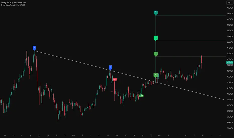
This analysis dissects a confirmed bullish reversal on Gold using a custom Trend Break system. The setup identifies a transition from a bearish corrective phase to bullish momentum, validated by a structural break and a geometric target projection.
Trend Identification (The Pivot Points) The descending white trendline serves as the primary dynamic resistance, defining the bearish correction.
Pivot Points: The line is drawn connecting two significant swing highs, marked by Label 1 and Label 2.
Logic: These points represent the "lower highs" characteristic of the previous downtrend. As long as price remained below this trajectory, the bearish bias was intact.
The Trigger: Breakout & Confirmation The transition occurs at the candle marked BC (Breakout Candle).
Breakout Criteria: The indicator logic dictates that a signal is only valid when the bar closes above the trendline. This filters out intraday wicks and ensures genuine buyer commitment.
CHOCH Confluence: Immediately following the breakout, a CHOCH (Change of Character) label appears. This signals a shift in market structure, indicating that the internal lower-high/lower-low sequence has been violated, adding probability to the reversal.
Target Projection: The Measured Move The vertical green lines (T1, T2) represent profit objectives derived from the depth of the prior move. The logic calculates the distance between the breakout line and the lowest pivot prior to the break.
T1 (Standard Target): This is a 1:1 projection of the pre-breakout volatility. We see price action initially stalling near this level, confirming it as a zone of interest.
T2 (Golden Ratio Extension): The second target is calculated as the initial distance multiplied by 1.618 (Fibonacci Golden Ratio). The chart shows the price rallying aggressively through T1 to tap the T2 zone, often considered an exhaustion or major take-profit level in harmonic extensions.
Conclusion Gold has successfully invalidated the 4-hour bearish trendline. The confluence of a confirmed close above resistance (BC) and a structural shift (CHOCH) provided a high-probability long setup. The price has now fulfilled the T2 (1.618) extension, suggesting traders should watch for consolidation or a reaction at this key Fibonacci resistance level.
Bearish Trendline Breakdown
The image displays a Bearish Trendline Breakdown on the Gold (XAUUSD) 4-hour chart. The indicator is actually functioning in "Low" mode here (connecting swing lows to form support), which triggers the bearish logic found in the code. Here is the step-by-step breakdown:
The Setup: Pivot Points & Trendline
Visual: The Blue Labels "1" and "2" connected by a white diagonal line.
Code Logic: These are the user-defined start and end points.
Pivot Point 1 (startDate): The starting pivot of the trendline.
Pivot Point 2 (endDate): The ending pivot.
Trendline: The code draws a line between these two points and extends it to the right (extend.right). In this specific image, the line acts as a Support Trendline.
The Trigger: Break Candle (BC)
Visual: The Red Label "BC" appearing just below the white trendline.
Code Logic: This is the execution signal. The code detects a "Down Break" (dnBreak) because the Price Source was likely set to "Low" and the candle's Close was lower than the Trendline Price at that specific bar (close < currLinePrice). This confirms the support level has been breached.
The Projection: Targets (T1 & T2)
Visual: The Green Labels "T1" and "T2" with dotted horizontal lines projected downward.
Code Logic: These are profit targets based on a "Measured Move."
Pivot Calculation: The script looks back for a recent "Pivot High" (the peak before the crash) to calculate the volatility/distance (dist) between that peak and the trendline.
T1 (Conservative): The price is projected downward by 1x that distance (currLinePrice - dist).
T2 (Extended): The price is projected downward by 1.618x that distance (Golden Ratio extension).
Market Context: CHOCH
Visual: The small Red/Orange "CHOCH" labels appearing above the price action.
Code Logic: This is a secondary confirmation system running independently of the trendline. It detects a Change of Character (structural shift). The red labels indicate a "Bearish CHOCH," meaning the price broke below a significant prior swing low (last_swing_low). This supports the bearish bias of the trendline break.
Disclaimer This tool is for educational and technical analysis purposes only. Breakouts can fail (fake-outs), and past geometric patterns do not guarantee future price action. Always manage risk and use this tool in conjunction with other forms of analysis.
Trend detection zero lag Trend Detection Zero-Lag (v6)
Trend Detection Zero-Lag is a high-performance trend identification indicator designed for intraday traders, scalpers, and swing traders who require fast trend recognition with minimal lag. It combines a zero-lag Hull Moving Average, slope analysis, swing structure logic, and adaptive volatility sensitivity to deliver early yet stable trend signals.
This indicator is optimized for real-time decision-making, particularly in fast markets where traditional moving averages react too slowly.
Core Features
🔹 Zero-Lag Trend Engine
Uses a Zero-Lag Hull Moving Average (HMA) to reduce lag by approximately 40–60% versus standard moving averages.
Provides earlier trend shifts while maintaining smoothness.
🔹 Multi-Factor Trend Detection
Trend direction is determined using a hybrid engine:
HMA slope (momentum direction)
Rising / falling confirmation
Swing structure detection (HH/HL vs LH/LL)
ATR-adjusted dynamic sensitivity
This approach allows fast flips when conditions change, without excessive noise.
Adaptive Volatility Sensitivity
Sensitivity dynamically adjusts based on ATR relative to price
In high volatility: faster reaction
In low volatility: smoother, more stable trend state
This ensures the indicator adapts across:
Trend days
Range days
Volatility expansion or contraction
Trend Duration Intelligence
The indicator tracks historical trend durations and maintains a rolling memory of recent bullish and bearish phases.
From this, it calculates:
Current trend duration
Average historical duration for the active trend direction
This helps traders gauge:
Whether a trend is early, mature, or extended
Probability of continuation vs exhaustion
Strength Scoring
A normalized Trend Strength Score (0–100) is calculated using:
Zero-lag slope magnitude
ATR normalization
This provides a quick read on:
Weak / choppy trends
Healthy trend continuation
Overextended momentum
Visual Design
Color-coded Zero-Lag HMA
Bullish trend → user-defined bullish color
Bearish trend → user-defined bearish color
Designed for dark mode / neon-style charts
Clean overlay with no clutter
Trend Detection Zero-Lag is built for traders who need:
Faster trend recognition
Adaptive behavior across market regimes
Structural confirmation beyond simple moving averages
Clear, actionable visual signals

VCAI Volume & Liquidity Map LiteVCAI Volume & Liquidity Map Lite visualises recent market participation using a horizontal liquidity/volume histogram plotted beside current price.
It shows where trading activity has clustered, where the chart is thin, and how much of that activity came from buying vs selling pressure.
This Lite edition keeps the tool simple and fast:
Yellow = buy-side volume (aggressive buyers / upward pressure)
Purple = sell-side volume (aggressive sellers / downward pressure)
Thicker sections = higher traded volume at that price
POC line (purple) marks the price with the highest volume concentration
Value Area lines (yellow dashed) mark where ~70% of volume has traded
Bars extend outward to the right of price for a clean, unobstructed chart
Lookback setting controls how many candles the map is built from
Use it to quickly identify:
high-interest price zones
low-liquidity areas where price can move fast
likely reaction levels
where momentum may slow, reverse, or break through
Designed as a lightweight, open-source tool for anyone wanting a clean liquidity/volume map without complex settings.
Part of the VCAI Lite Series.

TrendlinesDowntrend lines are one of the most important tools in technical analysis. A downtrend line is created by connecting a series of lower highs which forms a clear visual line where price repeatedly finds resistance. Traders use these lines to understand trend direction, time entries, plan exits, and quickly recognize when momentum is shifting.
This indicator automatically finds and maintains the strongest downtrend lines on any timeframe. It removes the guesswork and inconsistency that comes with manually drawing trendlines.
Unlike most other trendline indicators that just draw lines from swing highs to the current high, this indicator actively scans for new pivot highs, tests each potential line against live price action and only promotes a line to valid status once it has proven itself as a true trendline by price touching or respecting the line a user defined number of times, with the default set to three. This filters out noise and leaves only the most meaningful and reliable trendlines on your chart.
When price eventually breaks a respected downtrend line the indicator highlights the breakout immediately. Traders often use these moments for entries confirmation signals or to prepare for a potential shift in market behavior. The breakout alert is built directly into the indicator so you never miss an important move.
This indicator also works with the Pine Screener to find tickers with current valid trendlines.
How are trendlines determined?
The indicator begins by anchoring to the most recent pivot high. From there it draws a temporary line to the current bar and evaluates every bar between the two points.
Each time a high comes within a user selected buffer zone around that line it is counted as a touch. Once the required number of touches is confirmed and price has never exceeded the buffer to the upside the trendline becomes valid and is displayed on the chart as an active downtrend line.
Trading Session IL7 Session-Based Intraday Momentum IndicatorOverview
This indicator is designed to support discretionary traders by highlighting intraday momentum phases based on price behavior and trading session context.
It is intended as a confirmation tool and not as a standalone trading system or automated strategy.
Core Concept
The script combines multiple market observations, including:
- Directional price behavior within the current timeframe
- Structural consistency in recent price movement
- Session-based filtering to focus on periods with higher activity and liquidity
Signals are only displayed when internal conditions align, helping traders avoid low-quality setups during sideways or low-momentum market phases.
How to Use
This indicator should be used to confirm existing trade ideas rather than generate trades on its own.
It can help traders:
- Identify periods where momentum is more likely to continue
- Filter out trades during unfavorable market conditions
- Align intraday execution with higher-timeframe bias
Best results are achieved when used alongside key price levels, higher-timeframe structure and proper risk management.
Limitations
This indicator does not predict future price movements.
Signals may change during active candles.
Market conditions may reduce effectiveness during extremely low volatility periods.
Language Notice
The indicator’s user interface labels are displayed in German.
This English description is provided first to comply with TradingView community script publishing rules.

Vdubus MacD Divergence Trend Break Signal Generator Vdubus Divergence Wave Theory v1
System Type: Momentum Trendline Breakout & Continuation Model Platform:
1. Executive Summary
The Vdubus Divergence Wave Theory v1 is a sophisticated trend-following and reversal strategy developed over a 10-year period. Unlike standard indicators that rely on simple crossovers, this system applies Price Action geometry (Trendlines) directly to Momentum (MACD).
PREVIOUS DIVERGENCE PROJECTS FUTURE TREND BREAKS/ REVERSALS !
The core philosophy is that momentum breaks trendlines before price does. By identifying compression in the MACD oscillator and trading the breakout of that compression, the system identifies high-probability entries for both Reversals and Trend Continuations.
2. Core Logic & Methodology
The indicator operates on three specific layers of logic:
A. The Engine (Modified MACD)
It utilizes a custom-tuned MACD (Moving Average Convergence Divergence) to smooth out noise while retaining responsiveness.
Fast Length: 12
Slow Length: 34 (Smoother than the standard 26)
Signal Smoothing: 5
B. Dynamic Trendline Projection (The "Divergence" Aspect)
The script uses a Pivot-based algorithm to mathematically identify peaks and troughs in momentum.
Resistance Projection: It identifies lower highs in the MACD (momentum is fading) and projects a red resistance line forward.
Support Projection: It identifies higher lows in the MACD (momentum is building) and projects a blue support line forward.
The Trigger: A signal is generated only when the MACD line physically crosses these invisible projected barriers.
C. The Wave Theory (Signal Classification)
The system distinguishes between "Reversals" and "Continuations" based on the Zero Line.
Below Zero: Considered "Bearish Territory." A break upward here is a Reversal.
Above Zero: Considered "Bullish Territory." A break upward here is Momentum Continuation (Overbought).
3. Signal Types & Visual Guide
The indicator outputs four distinct signals, color-coded for instant decision-making.
🟢 1. LONG (Standard Reversal)
Condition: MACD breaks a Resistance Trendline while Below Zero.
Meaning: Momentum has finished causing the price to drop and is reversing upward. This is often a "Buy the Bottom" signal.
Visuals: Green Box, Green "LONG" Label.
🔵 2. OB-CONT (Overbought Continuation)
Condition: MACD breaks a Resistance Trendline while Above Zero.
Meaning: The trend is already bullish, but momentum consolidated briefly before exploding higher. This indicates a "Second Wave" or trend continuation.
Visuals: Blue Box (Thick Border), Bright Blue "OB-CONT" Label.
🔴 3. SHORT (Standard Reversal)
Condition: MACD breaks a Support Trendline while Above Zero.
Meaning: Momentum has exhausted to the upside and is rolling over. This is often a "Sell the Top" signal.
Visuals: Red Box, Red "SHORT" Label.
🟠 4. OS-CONT (Oversold Continuation)
Condition: MACD breaks a Support Trendline while Below Zero.
Meaning: The trend is already bearish, but price paused briefly before dropping further. This indicates a "Waterfall" or trend continuation downward.
Visuals: Orange Box (Thick Border), Bright Orange "OS-CONT" Label.
4. Technical Settings (Inputs)
Users can adjust the sensitivity of the "Wave" detection:
Pivot Lookback Left (Default: 20): How many bars to the left the script checks to confirm a major peak/valley. Higher numbers = fewer, more significant signals. Lower numbers = more signals, potentially more noise.
Pivot Lookback Right (Default: 20): The confirmation period. A value of 20 ensures that the pivot used for the trendline is a significant structural point, not just a small blip.
5. Best Practices for Trading
The Box Break: The coloured box drawn around the signal represents the "Breakout Candle." A strong close outside this box often confirms the move.
Zero Line Authority: Pay attention to where the cross happens.
Crosses occurring near the Zero Line are often the most explosive, as they represent a full momentum shift.
Deep Continuation Signals (e.g., an OB-CONT very high up) should be treated with caution as the move might be exhausted.
Divergence Context: This tool is designed to visualize the breaking of divergence. When you see a Price making higher highs but the MACD making lower highs (Divergence), wait for the Red Line Break (Short Signal) to confirm the trade.

Easy Crypto Signal FREEAs you can see, the indicator is doing well, we'll see what happens next, I invite you to the discussion

APEX TREND: Macro & Hard Stop SystemAPEX TREND: Macro & Hard Stop System
The APEX TREND System is a composite trend-following strategy engineered to solve the "Whipsaw" problem inherent in standard breakout systems. It orchestrates four distinct technical theories—Macro Trend Filtering, Volatility Squeeze, Momentum, and Volatility Stop-Loss—into a single, hierarchical decision-making engine.
This script is not merely a collection of indicators; it is a rules-based trading system designed for Swing Traders (Day/Week timeframes) who aim to capture major trend extensions while strictly managing downside risk through a "Hard Stop" mechanism.
🧠 Underlying Concepts & Originality
Many trend indicators fail because they treat all price movements equally. The APEX TREND differentiates itself by applying an "Institutional Filter" logic derived from classic Dow Theory and Modern Volatility Analysis.
1. The Macro Hard Stop (The 200 EMA Logic)
Origin: Based on the institutional mandate that “Nothing good happens below the 200-day moving average.”
Function: Unlike standard super trends that flip constantly in sideways markets, this system integrates a 200-period Exponential Moving Average (EMA) as a non-negotiable "Hard Stop."
Synergy: This acts as the primary gatekeeper. Even if the volatility engine signals a "Buy," the system suppresses the signal if the price is below the Macro Baseline, effectively filtering out counter-trend traps.
2. The Volatility Engine (Squeeze Theory)
Origin: Derived from John Carter’s TTM Squeeze concept.
Function: The script identifies periods where Bollinger Bands (Standard Deviation) contract inside Keltner Channels (ATR). This indicates a period of potential energy build-up.
Synergy: The system only triggers an entry when this energy is released (Breakout) AND coincides with Linear Regression Momentum, ensuring the breakout is genuine.
3. Anti-Chop Filter (ADX Integration)
Origin: J. Welles Wilder’s Directional Movement Theory.
Function: A common failure point for trend systems is low-volatility chop. This script utilizes the Average Directional Index (ADX).
Synergy: If the ADX is below the threshold (Default: 20), the market is deemed "Choppy." The script visually represents this by painting candles GRAY, signaling a "No-Trade Zone" regardless of price action.
4. The "Run Trend" Stop Loss (Factor 4.0 ATR)
Origin: Adapted from the Turtle Trading rules regarding volatility-based stops.
Function: Standard Trailing Stops (usually Factor 3.0) are too tight for crypto or volatile equities on daily timeframes.
Optimization: This system employs a wider ATR Multiplier of 4.0. This allows the asset to fluctuate naturally within a trend without triggering a premature exit, maximizing the "Run Trend" potential.
🛠 How It Works (The Algorithm)
The script processes data in a specific order to generate a signal:
Check Macro Trend: Is Price > EMA 200? (If No, Longs are disabled).
Check Volatility: Is ADX > 20? (If No, all signals are disabled).
Check Volume: Is Current Volume > 1.2x Average Volume? (Confirmation of institutional participation).
Trigger: Has a Volatility Breakout occurred in the direction of the Macro Trend?
Execution: If ALL above are true -> Generate Signal.
🎯 Strategy Guide
1. Long Setup (Bullish)
Signal: Look for the Green "APEX LONG" Label.
Condition: The price must be ABOVE the White Line (EMA 200).
Execution: Enter at the close of the signal candle.
Stop Loss: Initial stop at the Green Trailing Line.
2. Short Setup (Bearish)
Signal: Look for the Red "APEX SHORT" Label.
Condition: The price must be BELOW the White Line (EMA 200).
Execution: Enter at the close of the signal candle.
Stop Loss: Initial stop at the Red Trailing Line.
3. Exit Rules (Crucial)
This system employs a Dual-Exit Mechanism:
Soft Exit (Profit Taking): Close the position if the price crosses the Trailing Stop Line (Green/Red line). This locks in profits during a trend reversal.
Hard Exit (Emergency): Close the position IMMEDIATELY if the price crosses the White EMA 200 Line against your trade. This prevents holding a position during a major market regime change.
⚙️ Settings
Momentum Engine: Adjust Bollinger Band/Keltner Channel lengths to tune breakout sensitivity.
Apex Filters: Toggle the EMA 200 or ADX filters on/off to adapt to different asset classes.
Risk Management: The ATR Multiplier (Default 4.0) controls the width of the trailing stop. Lower values = Tighter stops (Scalping); Higher values = Looser stops (Swing).
Disclaimer: This script is designed for trend-following on higher timeframes (4H, 1D, 1W). Please backtest on your specific asset before live trading.

QuantMotions - TPR Sentinel LineTPR Sentinel Line is an advanced adaptive Support/Resistance system that combines multi-layered trend analysis with a directional Time-Price Ratio (TPR) engine. The indicator dynamically builds a stabilized support or resistance line that adjusts to market volatility, trend strength, ATR expansion and contraction, and real-time slope changes.
This creates a high-precision, self-adjusting trend barrier that acts as support in uptrends, resistance in downtrends, and a neutral anchor during sideways phases.
Key Features
✔ Adaptive Trend Base
- A composite trend model blending:
- Kijun-style midpoint
- Donchian midline
- SMA & EMA smoothing
This creates a stable baseline that reacts smoothly but reliably to structural trend shifts.
✔ Directional TPR Calculation
The indicator measures slope across short, medium, and long trend windows, normalizes it with ATR, and determines:
- Trend direction
- Trend strength
- Momentum quality
✔ Dynamic Support/Resistance Line
Depending on trend direction:
- In uptrends → the line becomes adaptive support
- In downtrends → the line becomes adaptive resistance
- In neutral phases → the line centers around the smoothed trend base
A built-in lag factor prevents unrealistic jumps and keeps the level stable.
✔ Automatic Support/Resistance Zones
The indicator expands the main line into upper and lower zones based on ATR and trend strength, creating a dynamic volatility envelope around the trend structure.
✔ Signals & Alerts
- Support bounce
- Resistance rejection
- Breakouts above/below the dynamic line
These events help identify high-probability continuation or reversal moments.
✔ Information Panel
A real-time status table displays:
- Trend direction
- Trend strength
- Current S/R level
🎯 Ideal For
- Precision entries on pullbacks
- Detecting trend shifts earlier
- Identifying strong or weak trend phases
- Adaptive take-profit and stop-loss zones
- Filtering false breakouts
💡 Summary
TPR Sentinel Line gives you a living, breathing support/resistance structure that evolves with the market.
Instead of relying on static levels, you get a continuously adapting trend barrier that reflects real strength, real volatility, and real momentum.
A powerful tool for traders who want structure, clarity, and trend confidence.

Scaling_mastery:Free TrendlinesScaling_mastery Trendlines is a clean, trading-ready smart trendline tool built for the Scaling_mastery community.
It automatically finds swing highs/lows and draws dynamic trendlines or channels that stay locked to price, on any symbol and any timeframe.
🔧 Modes
Trendline type
Wicks – classic trendlines anchored on candle wicks (high/low).
Bodies – trendlines anchored on candle bodies (open/close), great for closing structure.
Channel – 3-line channel:
outer lines form a band around price
middle line runs through the centre of the channel
thickness is adjustable (Small / Medium / Large).
Trend strength
Controls how strong the pivots must be to form a line.
Weak → more lines, reacts faster.
Medium → balanced, good for most pairs.
Strong → only the cleanest swings, higher-probability trendlines.
🎨 Visual controls
Max support / resistance lines – cap how many lines are kept on chart.
Show broken lines – hide broken trendlines or keep them for structure history.
Extend lines – None / Right / Both.
Support / Resistance colors – separate colors for active vs broken.
Channel thickness – Small / Medium / Large (0.5% / 1% / 2% of price).
Channel outer lines – color for channel edges.
Channel middle line – color + style (dotted / dashed / solid).
Broken lines are automatically faded + dotted, so you can instantly see what’s still respected and what’s already been taken out.
🧠 How to use
Add the indicator to any chart.
Start with:
Trendline type: Wicks
Trend strength: Strong
Max lines: 1–2 for both support & resistance
Once you like the behavior, experiment with:
Switching between Wicks / Bodies / Channel
Adjusting Channel thickness and Trend strength
Use the lines as a visual confluence tool with your own strategy:
HTF trend direction
LTF entries / retests
Liquidity grabs around broken lines
This script doesn’t generate entries or risk management – it’s designed to give you clean, reliable structure so you can execute your own edge.
⚠️ Disclaimer
This tool is for educational and visual purposes only and is not financial advice.
Always do your own research and manage risk.

Trend Line Methods (TLM)Trend Line Methods (TLM)
Overview
Trend Line Methods (TLM) is a visual study designed to help traders explore trend structure using two complementary, auto-drawn trend channels. The script focuses on how price interacts with rising or falling boundaries over time. It does not generate trade signals or manage risk; its purpose is to support discretionary chart analysis.
Method 1 – Pivot Span Trendline
The Pivot Span Trendline method builds a dynamic channel from major swing points detected by pivot highs and pivot lows.
• The script tracks a configurable number of recent pivot highs and lows.
• From the oldest and most recent stored pivot highs, it draws an upper trend line.
• From the oldest and most recent stored pivot lows, it draws a lower trend line.
• An optional filled area can be drawn between the two lines to highlight the active trend span.
As new pivots form, the lines are recalculated so that the channel evolves with market structure. This method is useful for visualising how price respects a trend corridor defined directly by swing points.
Method 2 – 5-Point Straight Channel
The 5-Point Straight Channel method approximates a straight trend channel using five key points extracted from a fixed lookback window.
Within the selected window:
• The window is divided into five segments of similar length.
• In each segment, the highest high is used as a representative high point.
• In each segment, the lowest low is used as a representative low point.
• A straight regression-style line is fitted through the five high points to form the upper boundary.
• A second straight line is fitted through the five low points to form the lower boundary.
The result is a pair of straight lines that describe the overall directional channel of price over the chosen window. Compared to Method 1, this approach is less focused on the very latest swings and more on the broader slope of the market.
Inputs & Menus
Pivot Span Trendline group (Method 1)
• Enable Pivot Span Trendline – Turns Method 1 on or off.
• High trend line color / Low trend line color – Colors of the upper and lower trend lines.
• Fill color between trend lines – Base color used to shade the area between the two lines. Transparency is controlled internally.
• Trend line thickness – Line width for both high and low trend lines.
• Trend line style – Line style (solid, dashed, or dotted).
• Pivot Left / Pivot Right – Number of bars to the left and right used to confirm pivot highs and lows. Larger values produce fewer but more significant swing points.
• Pivot Count – How many historical pivot points are kept for constructing the trend lines.
• Lookback Length – Number of bars used to keep pivots in range and to extend the trend lines across the chart.
5-Point Straight Channel group (Method 2)
• Enable 5-Point Straight Channel – Turns Method 2 on or off.
• High channel line color / Low channel line color – Colors of the upper and lower channel lines.
• Channel line thickness – Line width for both channel lines.
• Channel line style – Line style (solid, dashed, or dotted).
• Channel Length (bars) – Lookback window used to divide price into five segments and build the straight high/low channel.
Using Both Methods Together
Both methods are designed to visualise the same underlying idea: price tends to move inside rising or falling channels. Method 1 emphasises the most recent swing structure via pivot points, while Method 2 summarises the broader channel over a fixed window.
When the Pivot Span Trendline corridor and the 5-Point Straight Channel boundaries align or intersect, they can highlight zones where multiple ways of drawing trend lines point to similar support or resistance areas. Traders can use these confluence zones as a visual reference when planning their own entries, exits, or risk levels, according to their personal trading plan.
Notes
• This script is meant as an educational and analytical tool for studying trend lines and channels.
• It does not generate trading signals and does not replace independent analysis or risk management.
• The behaviour of both methods is timeframe- and symbol-agnostic; they will adapt to whichever chart you apply them to.

Slope Rank ReversalThis tool is designed to solve the fundamental problem of "buying low and selling high" by providing objective entry/exit signals based on momentum extremes and inflection points.
The System employs three core components:
Trend Detection (PSAR): The Parabolic SAR is used as a filter to confirm that a trend reversal or transition is currently underway, isolating actionable trade setups.
Dynamic Momentum Ranking: The indicator continuously measures the slope of the price action. This slope is then ranked against historical data to objectively identify when an asset is in an extreme state (overbought or oversold).
Signal Generation (Inflection Points):
Oversold/Buy: A 🟢 Green X is generated only when the slope ranking indicates the market is steeply negative (oversold), and the slope value begins to tick upwards (the inflection point), signaling potential mean reversion.
Overbought/Sell: A 🔴 Red X is generated only when the slope ranking indicates the market is steeply positive (overbought), and the slope value begins to tick downwards, signaling momentum exhaustion.
The core philosophy is simple: Enter only when the market is exhausted and has started to turn.
ORB Pro SuiteOverview
ORB Pro with Filters + Debug Overlay is an advanced Opening Range Breakout indicator designed for precision intraday trading. It defines a configurable ORB window, automatically builds the breakout range, and triggers long or short signals only when all active filters align. The script also includes a built-in debug overlay that explains why each breakout is accepted or blocked, allowing traders to fine-tune entries with transparency.
What Makes It Unique
• Modular filter stack – close-confirmation vs. instant breaks, retest confirmation with adjustable tolerance %, volume-spike and EMA-trend filters, ORB-size range, session cutoff, and cooldown logic.
• Non-blocking debug overlay – inline or corner display of the exact rejection reason (“Too late,” “Low volume,” “Trend mismatch,” etc.).
• Fully customizable visuals – choose shaded, outline, or line-only ORB styles; set opacity, border color, and right-edge offset so the box never hides current candles.
• Integrated reversal engine – detects doji, hammer, and engulfing structures within a time-filtered window and optional VWAP/EMA confluence.
How It Works
During the defined opening window (default 9:30 – 9:45 NY), the indicator records the session high and low.
After the box closes, it looks for breakouts confirmed by candle close or retest (per user settings).
Each signal passes through range, volume, trend, time-delay, and session filters before printing.
Visual stop-loss / take-profit levels appear for reference using either R:R multiples or fixed %.
The optional reversal layer marks short-term exhaustion zones for counter-scalp setups.
Usage Guidelines
• Apply to standard candlestick charts (not Heikin Ashi, Renko, or Range).
• Select your local ORB start / end time, then enable or disable filters based on your playbook.
• Use the “Outline only” or “Corner table” debug modes for a cleaner chart.
• The script provides visual and alert-based confirmations only; it does not execute orders or backtest performance.
Inputs at a Glance
– ORB window (start/end time)
– Close-confirm toggle
– Retest tolerance %
– Volume SMA length
– EMA length for trend filter
– Min/Max range % filter
– Cooldown bars and session cutoff
– Visual R:R ratio or fixed SL/TP %
– Box style, opacity, border width / color
– Debug overlay mode (inline or table) and leader lines
Notes & Disclaimers
• This script is for analysis and educational purposes only. It does not constitute financial advice or guarantee performance.
• Signals are calculated on completed bars without lookahead.
• Invite-only access ensures version integrity and controlled distribution.
© Trades with B – Original development in Pine v6. Reuse of this code requires explicit permission from the author.

Trendlines with Breaks Oscillator [LuxAlgo]The Trendlines with Breaks Oscillator is an oscillator based on the Trendlines with Breaks indicator, and tracks the maximum distance on price from bullish and bearish trendline breakouts.
The oscillator features divergences and trendline breakout detection.
🔶 USAGE
This tool is based on our Trendlines with Breaks indicator, which detects bullish and bearish trendlines and highlights the breaks on the chart. Now, we bring you this tool as an oscillator.
The oscillator calculates the maximum distance between the price and the break of each trendline, for both bullish and bearish cases, then calculates the delta between both.
When the oscillator is above 0, the market is in an uptrend; when it is below 0, it is in a downtrend. An ascending slope indicates positive momentum, and a descending slope indicates negative momentum.
Trendline breaks are displayed as green and red dots on the oscillator. A green dot corresponds to a bullish break of a descending trendline, and a red dot corresponds to a bearish break of an ascending trendline.
The oscillator calculation depends on two parameters from the settings panel: short and long alpha length. These parameters are used to calculate a synthetic EMA with a variable alpha for both bullish and bearish breaks. The final result is the difference between the two averages.
As shown in the image, using the same trend detection parameters but different alphas can produce very different results. The larger the alphas, the smoother the oscillator becomes, detecting bigger trends but making it less reactive.
This tool features the same trendline detection system as the Trendlines with Breaks indicator, which is based on three main parameters: swing length, slope, and calculation method.
As we can see in the image above, the data collected for the oscillator calculation will be different when using different parameters. A larger length detects larger trends. A larger slope or a different calculation method also impacts the final result.
🔹 Signal Line
The signal line is a smoothed version of the oscillator; traders can choose the smoothing method and length used from the settings panel.
In the image, the signal line crossings are displayed as vertical lines. As we can see, the market usually corrects downward after a bearish crossing and corrects upward after a bullish crossing.
Traders can choose among 10 different smoothing methods for the signal line. In the image, we can see how different methods and lengths give different outputs.
🔹 Divergences
The tool features a divergence detector that helps traders understand the strength behind price movements. Traders can adjust the detection length from the settings panel.
As shown in the image, a bearish divergence occurs when the price prints higher highs, but the momentum on the histogram prints lower highs. A bullish divergence occurs when the price prints lower lows, but the histogram prints higher lows.
By adjusting the length of the divergence detector, traders can filter out smaller divergences, allowing the tool to only detect more significant ones.
The image above depicts divergences detected with different lengths; the larger the length, the bigger the divergences are detected.
🔶 SETTINGS
🔹 Trendlines
Swing Detection Lookback: The size of the market structure used for trendline detection.
Slope: Slope steepness, a value of 0 gives horizontal levels, values larger than 1 give a steeper slope
Slope Calculation Method: Choose how the slope is calculated
🔹 Oscillator
Short Alpha Length: Synthetic EMA short period
Long Alpha Length: Synthetic EMA long period
Smoothing Signal: Choose the smoothing method and period
Divergences: Enable or disable divergences and select the detection length.
🔹 Style
Bullish: Select bullish color.
Bearish: Select bearish color.

AshokTrendThe AshokTrend indicator uses a combination of trendline logic and pivot high/low detection to signal possible BUY and SELL trades based on price action and structural breakouts.
### Buy/Sell Signal Logic
- **Buy Trade Signal**: It identifies local pivot lows using a lookback period, then checks multiple conditions comparing current and previous pivot values to validate a breakout. If conditions are met, triangle-up shapes are plotted below bars to indicate a possible long trade, and trendlines are drawn connecting pivots for visual confirmation.
- **Sell Trade Signal**: It locates pivot highs, applies similar multi-point checks, and confirms breakdowns in structure. Upon a valid signal, triangle-down shapes are plotted above bars to indicate a possible short trade, with corresponding trendlines marking pivot connections.
### Structural Confirmation
- Both buy and sell signals require the breakout/breakdown to be visually confirmed via the movement and steepness (slope) of custom lines that represent price momentum between pivots. Lines are updated or deleted if price fails the required strength, ensuring signals are filtered for validity.
### Alert and Analysis Details
- **Alerts**: Plotted shapes (triangle up for buy, triangle down for sell) can be used for automated alerts, integrating with platform alert conditions for strategy automation.
- **Analysis**: The indicator incorporates logic for cleaning up invalid signals and pruning trendlines when a reversal is detected, increasing reliability of entries and exits for both buy and sell trades.
### Key Settings for Customization
- Lookback period, padding, and color settings allow the user to tune signal frequency and visual appearance according to specific trading needs.
### Summary Table
| Signal Type | Visual Mark | Pivot Reference | Trendline Confirmation | Filtering Logic |
|----------------------|--------------|-----------------|-----------------------|-------------------------------|
| BUY | Triangle Up | Pivot Low | Slope & multi-point | Valid breakout only |
| SELL | Triangle Down| Pivot High | Slope & multi-point | Valid breakdown only |
This approach ensures that only structurally strong breakout-based trades are considered, pruning false signals in real-time for improved consistency in automated or manual trade analysis
Follow me for more updates...
Disclaimer - This post is created for only Learning Purpose. Every Charts, Trade Ideas, Buy & Sell Levels and Updates are Provided For Learning Purpose Only . We Do Not Provide Any Buy And Sell Signals Tips. We are Not SEBI Registered .Do Always Calculate Your risk Before Taking the Trade And consult your Financial Advisor Before taking any Trade. Thank You
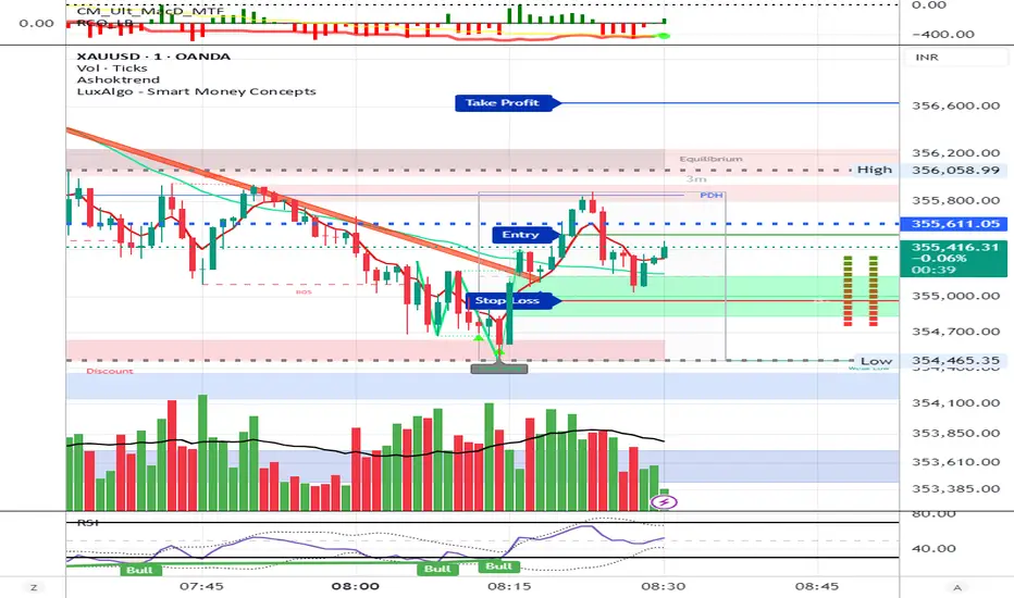
Session Breakout, Retest, Reversal + Large Move Alert# Script Description for Publication
## Script Name
**Session Breakout, Retest, Reversal + Large Move Alert**
## Short Description
A professional trading indicator that identifies session breakouts, failed retests, and large intraday price movements across any futures contract with real-time alerts and visual markers.
## Long Description
This comprehensive indicator combines session analysis with dynamic move detection, designed for active traders monitoring ES, NQ, GC, CL, and other futures contracts.
**Core Features:**
**Session Tracking:**
Automatically identifies and marks daily session breakouts and failed retests based on user-defined session times and timezones. The indicator draws visual boxes showing session highs (PH) and lows (PL), with labels marking breakout (BO) and retest failure (RF) points.
**Dynamic Large Move Detection:**
Monitors candles on any chart interval for significant price movements. The threshold is fully customizable per futures contract (default 15 points for ES/NQ/GC). When a candle closes with a move exceeding the threshold, the indicator displays a "BO" label with the exact move size and current chart timeframe.
**Real-Time Alerts:**
Triggers active alerts whenever large moves are detected, allowing traders to receive instant notifications via TradingView's alert system for timely entry or exit opportunities.
**Multi-Timeframe Compatible:**
Works seamlessly on any chart interval (1-minute through daily and beyond) without manual adjustments. The detection threshold automatically applies to the current chart's candles, with labels displaying the active timeframe.
**Universal Futures Support:**
Configurable for any futures contract by adjusting the point threshold input parameter based on each contract's typical volatility.
## Key Inputs
| Input | Default | Purpose |
|-------|---------|---------|
| Session Time | 0400-0930 | Defines trading session hours (pre-market session) |
| Session Timezone | America/New_York | Sets timezone for session detection |
| Point Move Threshold | 15.0 | Minimum point move to trigger alert (adjust per futures: ES=15, GC=15, CL=1.5) |
## How to Use
1. **Add to Chart:** Search for this indicator in TradingView and add it to your futures chart (ES, NQ, GC, CL, etc.)
2. **Configure Inputs:**
- Set session start/end times for your preferred trading session
- Adjust point threshold based on your futures contract
- Verify timezone matches your trading location
3. **Create Alerts:**
- Click "Create Alert" on the chart
- Select "Large Move Alert" from the condition dropdown
- Choose notification method (push, email, or SMS)
- Set desired frequency
4. **Monitor Moves:**
- Watch for "BO" labels appearing on confirmed candles
- Each label shows the threshold value and actual move size
- Combine with your existing trading strategy for confirmation
## Visual Elements
- **Session Box:** Blue shaded area showing session high/low range
- **PH Label:** Green label marking session high (pivot high)
- **PL Label:** Red label marking session low (pivot low)
- **BO ↑/↓ Labels:** Lime/red labels marking session breakouts
- **RF Labels:** Yellow/orange labels marking failed retests
- **Large Move Labels:** Green (bullish) or red (bearish) labels showing threshold breaches with move size
## Ideal For
- Scalpers monitoring quick intraday moves
- Day traders tracking pre-market breakouts
- Futures traders on ES, NQ, GC, CL, and other contracts
- Multi-timeframe traders watching various chart intervals simultaneously
- Alert-based automated trading systems
## Technical Details
- **Pine Script Version:** 5
- **Overlay:** Yes (displays on price chart)
- **Historical Buffer:** 5000 bars (supports 1-minute and lower timeframes)
- **Compatibility:** All futures contracts and chart intervals
## Disclaimer
This indicator is provided for educational and informational purposes only. It is not financial advice. Users should conduct their own research and consult with financial professionals before making trading decisions. Past performance does not guarantee future results.
---
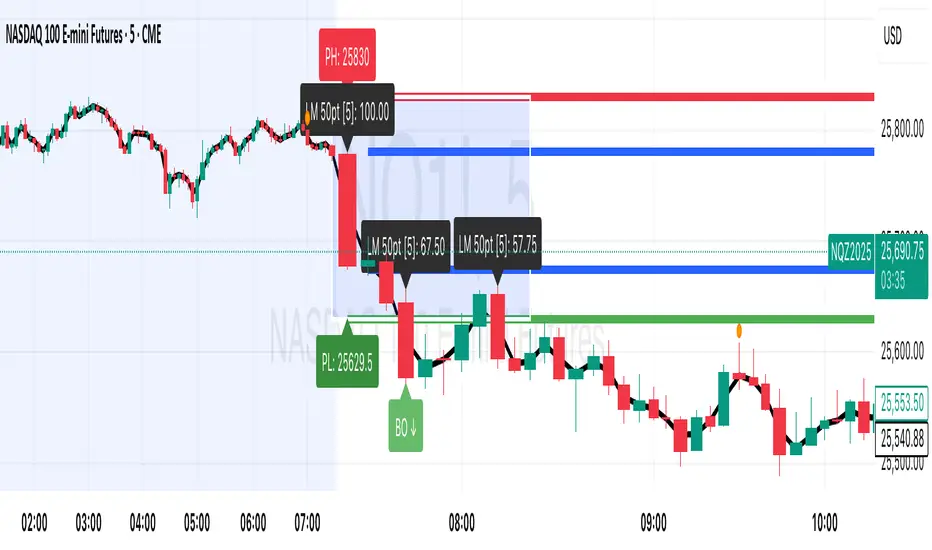
Adaptive Trend Breaks Adaptive Trend Breaks
## WHAT IT DOES
This script is a modified and enhanced version of "Trendline Breakouts With Targets" concept by ChartPrime.
Adaptive Trend Breaks (ATB) is a trendline breakout system optimized for scalping liquid futures contracts. The indicator automatically draws dynamic support and resistance trendlines based on pivot points, then generates trade signals when price breaks through these levels with confirmation filters. It includes automated target and stop-loss placement with real-time P&L tracking in dollars.
## HOW IT WORKS
**Trendline Detection Method:**
The indicator uses pivot high/low detection to identify significant price turning points. When a new pivot forms, it calculates the slope between consecutive pivots to draw dynamic trendlines. These lines extend forward based on the established trend angle, creating actionable support and resistance zones.
**Band System:**
Around each trendline, the script creates a "band" using a volatility-adjusted calculation: `ATR(14) * 0.2 * bandwidth multiplier / 2`. This adaptive band accounts for current market conditions - wider during volatile periods, tighter during quiet markets.
**Breakout Logic:**
A breakout signal triggers when:
1. Price closes beyond the trendline + band zone
2. Volume exceeds the 20-period moving average by your set multiplier (default 1.2x)
3. Price is within Regular Trading Hours (9:30-16:00 EST) if session filter enabled
4. Current ATR meets minimum volatility threshold (prevents trading dead markets)
**Target & Stop Calculation:**
Upon breakout confirmation:
- **Entry**: Trendline breach point
- **Target**: Entry ± (bandwidth × target multiplier) - default 8x for quick scalps
- **Stop**: Entry ± (bandwidth × stop multiplier) - default 8x for 1:1 risk/reward
- Multipliers adjust automatically to market volatility through the ATR-based band
**P&L Conversion:**
The script converts point movements to dollars using:
```
Dollar P&L = (Price Points × Contract Point Value × Quantity)
```
For example, a 10-point NQ move with 2 contracts = 10 × $20 × 2 = $400
## HOW TO USE IT
**Setup:**
1. Select your instrument (NQ/ES/YM/RTY) - point values auto-configure
2. Set contract quantity for accurate dollar P&L
3. Choose pivot period (lower = more signals but more noise, default 5 for scalping)
4. Adjust bandwidth multiplier if trendlines are too tight/loose (1-5 range)
**Filters Configuration:**
- **Volume Filter**: Requires breakout volume > moving average × multiplier. Increase multiplier (1.5-2.0) for higher conviction trades
- **Session Filter**: Enable to trade only RTH. Disable for 24-hour trading
- **ATR Filter**: Prevents signals during low volatility. Increase minimum % for more active markets only
**Risk Management:**
- Set target/stop multipliers based on your risk tolerance
- 8x bandwidth = approximately 1:1 risk/reward for most liquid futures
- Enable trailing stops for trend-following approach (moves stop to protect profits)
- Adjust line length to see targets further into the future
**Statistics Table:**
- Choose timeframe to analyze: all-time, today, this week, custom days
- Monitor win rate, profit factor, and net P&L in dollars
- Track long vs short performance separately
- See real-time unrealized P&L on active trades
**Reading Signals:**
- **Green triangle below bar** = Long breakout (resistance broken)
- **Red triangle above bar** = Short breakout (support broken)
- **White dashed line** = Entry price
- **Orange line** = Take profit target with dollar value
- **Red line** = Stop loss with dollar value
- **Green checkmark (✓)** = Target hit, winning trade
- **Red X (✗)** = Stop hit, losing trade
## WHAT IT DOES NOT DO
**Limitations to Understand:**
- Does not predict future trendline formations - it reacts to breakouts after they occur
- Historical trendlines disappear after breakout (not kept on chart for clarity)
- Requires sufficient volatility - may not signal in extremely quiet markets
- Volume filter requires exchange volume data (not available on all symbols)
- Statistics are indicator-based simulations, not actual trading results
- Does not account for slippage, commissions, or order fills
## BEST PRACTICES
**Recommended Settings by Market:**
- **NQ (Nasdaq)**: Default settings work well, consider volume multiplier 1.3-1.5
- **ES (S&P 500)**: Slightly slower, try period 7-8, volume 1.2
- **YM (Dow)**: Lower volatility, reduce bandwidth to 1.5-2
- **RTY (Russell)**: Higher volatility, increase bandwidth to 3-4
**Risk Management:**
- Never risk more than 2-3% of account per trade
- Use contract quantity calculator: Max Risk $ ÷ (Stop Distance × Point Value)
- Start with 1 contract while learning the system
- Backtest your specific timeframe and instrument before live trading
**Optimization Tips:**
- Increase pivot period (7-10) for fewer but higher-quality signals
- Raise volume multiplier (1.5-2.0) in choppy markets
- Lower target/stop multipliers (5-6x) for tighter profit taking
- Use trailing stops in strong trending conditions
- Disable session filter for overnight gaps and Asia session moves
## TECHNICAL DETAILS
**Key Calculations:**
- Pivot Detection: `ta.pivothigh(high, period, period/2)` and `ta.pivotlow(low, period, period/2)`
- Slope Calculation: `(newPivot - oldPivot) / (newTime - oldTime)`
- Adaptive Band: `min(ATR(14) * 0.2, close * 0.002) * multiplier / 2`
- Breakout Confirmation: Price crosses trendline + 10% of band threshold
**Data Requirements:**
- Minimum bars in view: 500 for proper pivot calculation
- Volume data required for volume filter accuracy
- Intraday timeframes recommended (1min - 15min) for scalping
- Works on any timeframe but optimized for fast execution
**Performance Metrics:**
All statistics calculate based on indicator signals:
- Tracks every signal as a trade from entry to TP/SL
- P&L in actual contract dollar values
- Win rate = (Winning trades / Total trades) × 100
- Profit factor = Gross profit / Gross loss
- Separates long/short performance for bias analysis
## IDEAL FOR
- Futures scalpers and day traders
- Traders who prefer visual trendline breakouts
- Those wanting automated TP/SL placement
- Traders tracking performance in dollar terms
- Multiple timeframe analysis (compare 1min vs 5min signals)
## NOT SUITABLE FOR
- Swing trading (targets too close)
- Stocks/forex without modifying point values
- Extremely low timeframes (<30 seconds) - too much noise
- Markets without volume data if using volume filter
- Illiquid contracts (signals may not execute at shown prices)
---
**Settings Summary:**
- Core: Period, bandwidth, extension, trendline style
- Filters: Volume, RTH session, ATR volatility
- Risk: R:R ratio, target/stop multipliers, trailing stop
- Display: Stats table position, size, colors
- Stats: Timeframe selection (all-time to custom days)
**License:** This indicator is published open-source under Mozilla Public License 2.0. You may use and modify the code with proper attribution.
**Disclaimer:** This indicator is for educational purposes. Past performance does not guarantee future results. Always practice proper risk management and test thoroughly before live trading.
---
## CREDITS & ATTRIBUTION
This script builds upon the "Trendline Breakouts With Targets" concept by ChartPrime with significant enhancements:
**Major Improvements Added:**
- **Futures-Specific Calculations**: Automated dollar P&L conversion using actual contract point values (NQ=$20, ES=$50, YM=$5, RTY=$50)
- **Advanced Statistics Engine**: Comprehensive performance tracking with customizable timeframe analysis (today, week, month, custom ranges)
- **Multi-Layer Filtering System**: Volume confirmation, RTH session filter, and ATR volatility filter to reduce false signals
- **Professional Trade Management**: Enhanced visual trade tracking with separate TP/SL lines, dollar value labels, and optional trailing stops
- **Optimized for Scalping**: Faster pivot periods (5 vs 10), tighter bands, and reduced extension bars for quick entries
Original trendline detection methodology by ChartPrime - used with modification under Mozilla Public License 2.0.
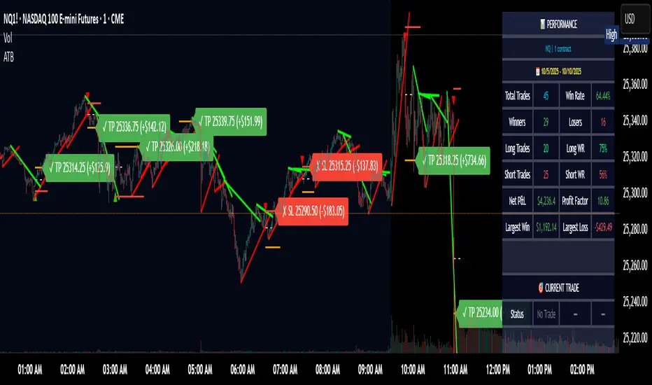
Smart Breakout Detector: Trendline Retest & Angle FilteringDetect trendline breakouts with two important filtering controls: retest validation and angle filtering. Require multiple price retests (2-4 touches) before a trendline is considered valid, eliminating weak single-touch lines. Set precise angle limits to filter out unreliable steep or shallow trendlines. Three independent timeframe sets (fast/medium/slow) with customizable pivot lengths allow you to get low risk entry point for both short-term and major trend continuations/reversals.
═══════════════════════════════════════════
CORE METHODOLOGY
═══════════════════════════════════════════
This indicator identifies trendline breakouts using two configurable filtering parameters that are uncommon in publicly available indicators:
1. RETEST VALIDATION
Requires a specified number of price touches (2-4) before considering a trendline valid. This reduces false signals from randomly aligned single-touch lines. Higher thresholds decrease signal frequency while increasing reliability.
2. ANGLE FILTERING
Applies maximum angle constraints (0-20) to trendlines independently for resistance and support, both upward and downward slopes. This filters trendlines with extreme angles that typically lack predictive value.
═══════════════════════════════════════════
TECHNICAL IMPLEMENTATION
═══════════════════════════════════════════
DETECTION ALGORITHM:
1. Identifies pivot highs/lows using configurable lookback periods
2. Connects pivots within ATR-based proximity threshold
3. Validates trendlines only after minimum retest requirement is met
4. Applies angle constraints using arctangent calculations
5. Verifies no price penetration occurred between pivot points
6. Triggers breakout signals when price breaches validated lines
THREE INDEPENDENT TREND LINE BANKS:
The indicator operates three parallel detection systems with separate parameters:
- Level Set A: Short pivot periods (default 5 bars)
- Level Set B: Medium pivot periods (default 10 bars)
- Level Set C: Long pivot periods (default 6 bars)
Each system maintains independent arrays of resistance and support lines.
ADAPTIVE COMPONENTS:
- Proximity tolerance scales with ATR(40) to accommodate volatility
- Angle thresholds adjust using combined absolute and percentage ATR factors
- Line lifespan configurable by bar count (default 180/200/300 bars per set)
══════════════════════════════════════════
USE CASES
══════════════════════════════════════════
Appropriate for:
- Filtering breakout candidates by reliability metrics
- Multi-timeframe trendline analysis
- Automated breakout monitoring
- Reducing chart noise from weak trendlines
Not appropriate for:
- Range-bound or highly choppy markets
- Instruments with insufficient historical data
- Strategies requiring predictive (non-historical) trendlines

Hybrid Trend Line-J-AlgoOverview
The Hybrid Trend Line-J-Algo is an advanced multi-layered trendline detection system that identifies market trends across three distinct timeframes simultaneously. This indicator combines confirmed, developing, and real-time trend analysis to provide traders with a comprehensive view of market structure and momentum shifts.
Key Features
[✅ Three-Tier Trend Detection System:
Confirmed Trendlines (⚡T💧/⚡T🩸) - High-probability, established trends with 20-period confirmation
Developing Trendlines (⚡D💧/⚡D🩸) - Emerging trends with 8-period detection for early entries
Real-Time Trendlines (⚡R💧/⚡R🩸) - Immediate trend identification with minimal lag (10-period lookback)
✅ Visual Channel System:
Gradient-filled channels between trendlines and parallel support/resistance zones
Adjustable channel padding for volatility-based spacing
Color-coded bullish (blue/teal/lime) and bearish (gray/red/orange) trends
✅ Customizable Display:
Toggle each trendline type independently
Adjustable detection lengths for all three systems
Custom colors and label sizes
Optional gradient fills or solid colors
✅ Smart Trendline Management:
Automatic trendline extension to current price
Pivot-based detection for accurate swing points
Dynamic slope calculations
Labeled indicators for easy trend identification
How It Works
Confirmed Trendlines use pivot highs/lows with a 20-bar lookback to identify well-established trends. These represent the most reliable trend structure and are ideal for position trading and trend confirmation.
Developing Trendlines employ an 8-bar detection period to catch trends as they form. These provide earlier signals than confirmed lines, making them suitable for swing trading and anticipating trend continuations.
Real-Time Trendlines track the most recent price action with minimal lag, connecting recent highs and lows to identify immediate momentum shifts. Perfect for intraday trading and quick reversals.
Best Use Cases
📈 Trend Following - Align trades with confirmed trendlines for high-probability setups
📉 Early Entry Detection - Use developing trendlines to enter before the crowd
⚡ Scalping & Day Trading - Real-time trendlines provide instant trend direction
🎯 Multi-Timeframe Analysis - View all three trend layers simultaneously for confluence
Settings Guide
Confirmed Trend Lines:
Detection Length: 20 (default) - Higher = fewer, stronger signals
Colors: Customizable bullish/bearish
Developing Trend Lines:
Detection Length: 8 (default) - Lower = more responsive
Dashed style for visual distinction
Real-Time Trend Lines:
Lookback: 10 (default) - Minimal lag for immediate feedback
Dotted style for differentiation
Visual Settings:
Gradient Fills: Toggle smooth color transitions
Channel Padding: Adjust spacing (2.0 default)
Label Size: Choose from Tiny to Huge
Trading Tips
💡 Look for confluence when multiple trendline types align in the same direction
💡 Watch for breaks of confirmed trendlines as potential reversal signals
💡 Use developing trendlines to anticipate confirmed trend formations
💡 Combine with volume and momentum indicators for enhanced accuracy
💡 Respect the channel boundaries as dynamic support/resistance zones
Unique Advantages
✨ No Repainting - All trendlines are based on confirmed pivots and historical data
✨ Clean Visual Design - Emoji labels and gradient fills for intuitive interpretation
✨ Fully Customizable - Adapt to any trading style or timeframe
✨ Multiple Confirmation Levels - Reduces false signals through multi-tier analysis
✨ Beginner Friendly - Clear visual cues with labeled trend indicators
Disclaimer
This indicator is for educational and informational purposes only. It does not constitute financial advice. Always conduct your own analysis and risk management before making trading decisions.
Version: 6
Type: Overlay Indicator
Max Lines/Labels: 500
Perfect for: Trend traders, swing traders, day traders, and multi-timeframe analysts

Rsi TrendLines with Breakouts [KoTa]### RSI TrendLines with Breakouts Indicator: Detailed User Guide
The "RSI TrendLines with Breakouts " indicator is a custom Pine Script tool designed for TradingView. It builds on the standard Relative Strength Index (RSI) by adding dynamic trendlines based on RSI pivots (highs and lows) across multiple user-defined periods. These trendlines act as support and resistance levels on the RSI chart, and the indicator detects breakouts when the RSI crosses these lines, generating potential buy (long) or sell (short) signals. It also includes overbought/oversold thresholds and optional breakout labels. Below, I'll provide a detailed explanation in English, covering how to use it, its purpose, advantages and disadvantages, example strategies, and ways to enhance strategies with other indicators.
How to Use the Indicator
- The indicator uses `max_lines_count=500` to handle a large number of lines without performance issues, but on very long charts, you may need to zoom in for clarity.
1. **Customizing Settings**:
The indicator has several input groups for flexibility. Access them via the gear icon next to the indicator's name on the chart.
- **RSI Settings**:
- RSI Length: Default 14. This is the period for calculating the RSI. Shorter lengths (e.g., 7-10) make it more sensitive to recent price changes; longer (e.g., 20+) smooth it out for trends.
- RSI Source: Default is close price. You can change to open, high, low, or other sources like volume-weighted for different assets.
- Overbought Level: Default 70. RSI above this suggests potential overbuying.
- Oversold Level: Default 30. RSI below this suggests potential overselling.
- **Trend Periods**:
- You can enable/disable up to 5 periods (defaults: Period 1=3, Period 2=5, Period 3=10, Period 4=20, Period 5=50). Only enabled periods will draw trendlines.
- Each period detects pivots (highs/lows) in RSI using `ta.pivothigh` and `ta.pivotlow`. Shorter periods (e.g., 3-10) capture short-term trends; longer ones (20-50) show medium-to-long-term momentum.
- Inline checkboxes allow you to toggle display for each (e.g., display_p3=true by default).
- **Color Settings**:
- Resistance/Support Color: Defaults to red for resistance (up-trendlines from RSI highs) and green for support (down-trendlines from RSI lows).
- Labels for breakouts use green for "B" (buy/long) and red for "S" (sell/short).
- **Breakout Settings**:
- Show Prev. Breakouts: If true, displays previous breakout labels (up to "Max Prev. Breakouts Label" +1, default 2+1=3).
- Show Breakouts: Separate toggles for each period (e.g., show_breakouts3). When enabled, dotted extension lines project the trendline forward, and crossovers/crossunders trigger labels like "B3" (breakout above resistance for Period 3) or "S3" (break below support).
- Note: Divergence detection is commented out in the code. If you want to enable it, uncomment the relevant sections (e.g., show_divergence input) and adjust the lookback (default 5 bars) for spotting bullish/bearish divergences between price and RSI.
2. **Interpreting the Visuals**:
- **RSI Plot**: A blue line showing the RSI value (0-100). Horizontal dashed lines at 70 (red, overbought), 30 (green, oversold), and 50 (gray, midline).
- **Trendlines**: Solid lines connecting recent RSI pivots. Green lines (support) connect lows; red lines (resistance) connect highs. Only the most recent line per direction is shown per period to avoid clutter.
- **Breakout Projections**: Dotted lines extend the current trendline forward. When RSI crosses above a red dotted resistance, a "B" label (e.g., "B1") appears above, indicating a potential bullish breakout. Crossing below a green dotted support shows an "S" label below, indicating bearish.
- **Labels**: Current breakouts are bright (green/red); previous ones fade to gray. Use these as signal alerts.
- **Alerts**: The code includes commented-out alert conditions (e.g., for breakouts or RSI crossing levels). Uncomment and set them up in TradingView's alert menu for notifications.
3. **Best Practices**:
- Use on RSI-compatible timeframes (e.g., 1H, 4H, daily) for stocks, forex, or crypto.
- Combine with price chart: Trendlines are on RSI, so check if RSI breakouts align with price action (e.g., breaking a price resistance).
- Test on historical data: Backtest signals using TradingView's replay feature.
- Avoid over-customization initially—start with defaults (Periods 3 and 5 enabled) to understand behavior.
What It Is Used For
This indicator is primarily used for **momentum-based trend analysis and breakout trading on the RSI oscillator**. Traditional RSI identifies overbought/oversold conditions, but this enhances it by drawing dynamic trendlines on RSI itself, treating RSI as a "price-like" chart for trend detection.
- **Key Purposes**:
- **Identifying Momentum Trends**: RSI trendlines show if momentum is strengthening (upward-sloping support) or weakening (downward-sloping resistance), even if price is ranging.
- **Spotting Breakouts**: Detects when RSI breaks its own support/resistance, signaling potential price reversals or continuations. For example, an RSI breakout above resistance in an oversold zone might indicate a bullish price reversal.
- **Multi-Period Analysis**: By using multiple pivot periods, it acts like a multi-timeframe tool within RSI, helping confirm short-term signals with longer-term trends.
- **Signal Generation**: Breakout labels provide entry/exit points, especially in trending markets. It's useful for swing trading, scalping, or confirming trends in larger strategies.
- **Divergence (Optional)**: If enabled, it highlights mismatches between price highs/lows and RSI, which can predict reversals (e.g., bullish divergence: price lower low, RSI higher low).
Overall, it's ideal for traders who rely on oscillators but want more visual structure, like trendline traders applying price concepts to RSI.
Advantages and Disadvantages
**Advantages**:
- **Visual Clarity**: Trendlines make RSI easier to interpret than raw numbers, helping spot support/resistance in momentum without manual drawing.
- **Multi-Period Flexibility**: Multiple periods allow analyzing short- and long-term momentum simultaneously, reducing noise from single-period RSI.
- **Breakout Signals**: Automated detection of breakouts provides timely alerts, with labels and projections for proactive trading. This can improve entry timing in volatile markets.
- **Customization**: Extensive inputs (periods, colors, breakouts) make it adaptable to different assets/timeframes. The stateful management of lines/labels prevents chart clutter.
- **Complementary to Price Action**: Enhances standard RSI by adding trend context, useful for confirming divergences or overbought/oversold trades.
- **Efficiency**: Uses efficient arrays and line management, supporting up to 500 lines for long charts without lagging TradingView.
**Disadvantages**:
- **Lagging Nature**: Based on historical pivots, signals may lag in fast-moving markets, leading to late entries. Shorter periods help but increase whipsaws.
- **False Signals**: In ranging or sideways markets, RSI trendlines can produce frequent false breakouts. It performs better in trending conditions but may underperform without filters.
- **Over-Reliance on RSI**: Ignores volume, fundamentals, or price structure—breakouts might not translate to price moves if momentum decouples from price.
- **Complexity for Beginners**: Multiple periods and settings can overwhelm new users; misconfiguration (e.g., too many periods) leads to noisy charts.
- **No Built-in Risk Management**: Signals lack stop-loss/take-profit logic; users must add these manually.
- **Divergence Limitations**: The basic (commented) divergence detection is simplistic and may miss hidden divergences or require tuning.
In summary, it's powerful for momentum traders but should be used with confirmation tools to mitigate false positives.
Example Strategies
Here are one LONG (buy) and one SHORT (sell) strategy example using the indicator. These are basic; always backtest and use risk management (e.g., 1-2% risk per trade, stop-loss at recent lows/highs).
**LONG Strategy Example: Oversold RSI Support Breakout**
- **Setup**: Use on a daily chart for stocks or crypto. Enable Periods 3 and 5 (short- and medium-term). Set oversold level to 30.
- **Entry**: Wait for RSI to be in oversold (<30). Look for a "B" breakout label (e.g., "B3" or "B5") when RSI crosses above a red resistance trendline projection. Confirm with price forming a higher low or candlestick reversal (e.g., hammer).
- **Stop-Loss**: Place below the recent price low or the RSI support level equivalent in price terms (e.g., 5-10% below entry).
- **Take-Profit**: Target RSI reaching overbought (70) or a 2:1 risk-reward ratio. Exit on a bearish RSI crossunder midline (50).
- **Example Scenario**: In a downtrending stock, RSI hits 25 and forms a support trendline. On a "B5" breakout, enter long. This captures momentum reversals after overselling.
- **Rationale**: Breakout above RSI resistance in oversold signals fading selling pressure, potential for price uptrend.
**SHORT Strategy Example: Overbought RSI Resistance Breakout**
- **Setup**: Use on a 4H chart for forex pairs. Enable Periods 10 and 20. Set overbought level to 70.
- **Entry**: Wait for RSI in overbought (>70). Enter on an "S" breakout label (e.g., "S3" or "S4") when RSI crosses below a green support trendline projection. Confirm with price showing a lower high or bearish candlestick (e.g., shooting star).
- **Stop-Loss**: Above the recent price high or RSI resistance level (e.g., 5-10% above entry).
- **Take-Profit**: Target RSI hitting oversold (30) or a 2:1 risk-reward. Exit on bullish RSI crossover midline (50).
- **Example Scenario**: In an uptrending pair, RSI peaks at 75 with a resistance trendline. On "S4" breakout, enter short. This targets momentum exhaustion after overbuying.
- **Rationale**: Break below RSI support in overbought indicates weakening buying momentum, likely price downturn.
Enhancing Strategy Validity with Other Indicators
To increase the reliability of strategies based on this indicator, combine it with complementary tools for confirmation, filtering false signals, and adding context. This creates multi-indicator strategies that reduce whipsaws and improve win rates. Focus on indicators that address RSI's weaknesses (e.g., lagging, momentum-only). Below are examples of different indicators, how to integrate them, and sample strategies.
1. **Moving Averages (e.g., SMA/EMA)**:
- **How to Use**: Overlay 50/200-period EMAs on the price chart. Use RSI breakouts only in the direction of the trend (e.g., long only if price > 200 EMA).
- **Strategy Example**: Trend-Following Long – Enter on "B" RSI breakout if price is above 200 EMA and RSI > 50. This filters reversals in uptrends. Add MACD crossover for entry timing. Advantage: Aligns momentum with price trend, reducing counter-trend trades.
2. **Volume Indicators (e.g., Volume Oscillator or OBV)**:
- **How to Use**: Require increasing volume on RSI breakouts (e.g., OBV making higher highs on bullish breakouts).
- **Strategy Example**: Volume-Confirmed Short – On "S" breakout, check if volume is rising and OBV breaks its own trendline downward. Enter short only if confirmed. This validates breakouts with real market participation, avoiding low-volume traps.
3. **Other Oscillators (e.g., MACD or Stochastic)**:
- **How to Use**: Use for divergence confirmation or overbought/oversold alignment. For instance, require Stochastic (14,3,3) to also breakout from its levels.
- **Strategy Example**: Dual-Oscillator Reversal Long – Enable divergence in the indicator. Enter on bullish RSI divergence + "B" breakout if MACD histogram flips positive. Exit on MACD bearish crossover. This strengthens reversal signals by cross-verifying momentum.
4. **Price Action Tools (e.g., Support/Resistance or Candlestick Patterns)**:
- **How to Use**: Map RSI trendlines to price levels (e.g., if RSI resistance breaks, check if price breaks a key resistance).
- **Strategy Example**: Price-Aligned Breakout Short – On "S" RSI breakout in overbought, confirm with price breaking below a drawn support line or forming a bearish engulfing candle. Use Fibonacci retracements for targets. This ensures momentum translates to price movement.
5. **Volatility Indicators (e.g., Bollinger Bands or ATR)**:
- **How to Use**: Avoid trades during low volatility (e.g., Bollinger Band squeeze) to filter ranging markets. Use ATR for dynamic stops.
- **Strategy Example**: Volatility-Filtered Long – Enter "B" breakout only if Bollinger Bands are expanding (increasing volatility) and RSI is oversold. Set stop-loss at 1.5x ATR below entry. This targets high-momentum breakouts while skipping choppy periods.
**General Tips for Building Enhanced Strategies**:
- **Layering**: Start with RSI breakout as the primary signal, add 1-2 confirmations (e.g., EMA trend + volume).
- **Backtesting**: Use TradingView's strategy tester to quantify win rates with/without additions.
- **Risk Filters**: Incorporate overall market sentiment (e.g., via VIX) or avoid trading near news events.
- **Timeframe Alignment**: Use higher timeframes for trend (e.g., daily EMA) and lower for entries (e.g., 1H RSI breakout).
- **Avoid Overloading**: Too many indicators cause paralysis; aim for synergy (e.g., trend + momentum + volume).
This indicator is a versatile tool, but success depends on context and discipline. If you need code modifications or specific backtests, provide more details!

Trend lines indicator by ForexBeeEnhanced 3-Swing Trendline Zones - Complete Feature Guide
WHAT THIS INDICATOR DOES
This indicator automatically draws trendline zones on your chart using a 3-point validation system. Instead of just connecting any two price points like basic trendline tools, it waits for three swing points to confirm the trendline is valid before drawing it.
FEATURE 1: SWING POINT DETECTION
What it detects:
Swing highs: Price points where the high is higher than surrounding candles
Swing lows: Price points where the low is lower than surrounding candles
These show up as small arrows on your chart labeled "SH" (swing high) and "SL" (swing low)
Settings that control this:
Swing Length : Default is 6, range 1-20
Higher numbers = fewer, more significant swing points
Lower numbers = more swing points, including minor ones
Example: Setting 5 means each swing point must be higher/lower than 5 candles on each side
How to use this setting:
On 1-minute charts: Use 5-10 to filter out noise
On daily charts: Use 2-3 for more sensitivity
Volatile markets: Increase the number
Quiet markets: Decrease the number
Please See the Below Images To See the difference of swing length of 6 and 8
Display control:
Show Swing Points : Turn the arrows on/off
Default: ON (you'll see the arrows)
Turn OFF if arrows clutter your chart
FEATURE 2: RETRACEMENT VALIDATION SYSTEM
What this does:
After finding two swing points, the system checks if the second swing represents a proper market retracement, not just random price movement.
How it works:
Finds the highest point between two swing lows (or lowest point between two swing highs)
Calculates how much the second swing retraced from this extreme point
Only accepts swings that retrace between your set percentages
Settings that control this:
Lower Limit % : Default 50%, range 0-100%
Upper Limit % : Default 90%, range 0-100%
These create a "valid retracement zone"
Why this matters:
Eliminates random trendlines that don't follow market structure
Ensures trendlines represent actual retracement patterns
Based on Elliott Wave and Fibonacci principles
FEATURE 3: ATR-BASED ZONE WIDTH
What ATR means:
Average True Range measures how much price typically moves in a given period. Instead of fixed-width trendlines, this creates zones that adapt to market volatility.
Settings that control this:
Zone Width (ATR Multiple) : Default 0.3, range 0.1-1.0
ATR Length : Default 14, range 1-50 periods
How zone width works:
Multiplier 0.1 = Very narrow zones (tight around trendline)
Multiplier 0.5 = Medium zones
Multiplier 1.0 = Wide zones (accommodates more price movement)
ATR Length explained:
14 periods = Uses last 14 candles to calculate average volatility
Shorter periods (7) = More sensitive to recent volatility changes
Longer periods (21) = Smoother, less sensitive to volatility spikes
Practical impact:
During high volatility: Zones automatically become wider
During low volatility: Zones automatically become narrower
Prevents false breakouts during normal market noise
Creates realistic support/resistance areas instead of precise lines
FEATURE 4: VISUAL ZONE SYSTEM
Active Uptrend Zones:
Green upper boundary line (solid, thick)
Lime green lower boundary line (solid, thick)
Green fill between lines (80% transparency)
These represent dynamic support levels
Active Downtrend Zones:
Blue upper boundary line (solid, thick)
Navy blue lower boundary line (solid, thick)
Red fill between lines (80% transparency)
These represent dynamic resistance levels
Broken/Expired Zones:
Gray/silver boundary lines (dashed, thick)
Original fill color maintained (green for uptrend zones, red for downtrend zones)
Shows historical trendlines that are no longer active
FEATURE 5: BREAK DETECTION SYSTEM
How breaks are detected:
The system monitors when price violates the zone boundaries, indicating the trendline structure has failed.
Settings that control this:
Use Wick Break : True/False toggle
TRUE: Break occurs when candle high/low touches zone boundary
FALSE: Break occurs when candle close price crosses zone boundary
Conservative vs Aggressive approach:
Wick Break = TRUE (Aggressive) :
- More sensitive, earlier signals
- May produce more false breaks during volatile periods
- Good for scalping and short-term trading
Wick Break = FALSE (Conservative) :
- Requires candle to close beyond zone
- Fewer false signals, more reliable breaks
- Better for swing trading and position trading
What happens when zone breaks:
Zone lines change from solid to dashed
Zone lines change color to gray/silver
Fill color remains original (green/red) for identification
Zone stops extending forward
Zone is removed from active monitoring
FEATURE 6: ZONE EXPIRATION SYSTEM
What expiration does:
Allows trendlines to automatically become inactive after a set number of bars, even if they haven't been broken.
Settings that control this:
Use Zone Expiration : True/False toggle
Zone Expiration (Bars) : Default 500, range 1-1000
FALSE: Zones run indefinitely until broken
TRUE: Zones expire after specified number of bars
Visual result:
Expired zones look identical to broken zones
Lines become dashed and gray/silver
Fill colors remain original (green/red)
FEATURE 7: MULTI-TIMEFRAME TREND ANALYSIS TABLE
What the table shows:
A small table on your chart that monitors trend conditions across four different timeframes simultaneously.
Settings that control this:
TF1, TF2, TF3, TF4 : Four customizable timeframes
Default: 4H, 8H, 1D, 1W
Table Position : 9 positions (top/middle/bottom + left/center/right)
Text Size : Tiny, Small, Normal, Large, Huge
How trend detection works:
Uptrend Pattern : Current candle's high AND low are both higher than previous candle's high AND low on specified timeframes
This creates higher highs and higher lows
Shows consistent buying pressure
Table displays green background with upward arrow (▲)
Downtrend Pattern : Current candle's high AND low are both lower than previous candle's high AND low on specified timeframes
This creates lower highs and lower lows
Shows consistent selling pressure
Table displays red background with downward arrow (▼)
Range/Sideways Pattern : Current candle creates either inside bar or outside bar
Inside bar: Current range smaller than previous candle
Outside bar: Current range larger than previous candle
Shows market indecision or consolidation
Table displays orange background with diamond symbol (◆)
No Clear Pattern : None of the above conditions are met
Table displays gray background with horizontal line (⎯)
How to interpret the table:
All timeframes green (uptrend): Strong bullish alignment
All timeframes red (downtrend): Strong bearish alignment
Mixed colors: Conflicting timeframes, exercise caution
Mostly orange: Market in consolidation phase
Tooltip explanations: Hover over each cell for detailed description
FEATURE 8: BACKGROUND COLOR SYSTEM
What background colors show:
Optional feature that colors your chart background based on the current timeframe's trend condition.
Settings that control this:
Show Background Colors : True/False toggle
Background Transparency : 80-98% range
Default: OFF (no background colors)
Color scheme:
Green background: Current timeframe showing uptrend
Red background: Current timeframe showing downtrend
Orange background: Current timeframe showing range/consolidation
No background: No clear trend pattern
Transparency levels:
80%: More visible background color
95%: Subtle background hint
98%: Very subtle background tint

Sigma Reversal Print [FxScripts]Indicator Overview
The Sigma Reversal Print is a powerful tool designed for traders who like to trade reversal strategies plus trend traders looking to enter on strong pullbacks. It integrates advanced price action with volume analysis, highlighting areas where a trend reversal or pullback may be in progress, providing insights into where markets may be exhausted or about to surge.
Key Features and Functionality
Reversal Trading: Tailored primarily for reversal traders, the Sigma Reversal Print highlights zones where the market is likely to change direction. While this approach offers significant potential, it inherently carries a degree of risk due to the precision required in predicting market turning points. The Sigma Reversal Print uses advanced methodology to forecast such reversals with a high degree of accuracy.
Signal Generation Based on Reversal and Pullback Zones: The Reversal Print generates signals when price enters specific conditions, representing exhaustion followed by a change in order flow. These conditions allow the indicator to filter out low-probability signals and focus on those with higher potential for a trend change.
Settings
Sensitivity Control: The sensitivity setting allows traders to adjust the strength of the pattern required for a signal to be generated. The scale ranges from 2-10 with higher sensitivity demanding more confirmation, leading to fewer, generally more reliable, signals however backtesting is highly recommended. Adjusting the sensitivity enables traders to balance early entries with signal accuracy, accommodating both aggressive and more conservative strategies.
Customizable Length: The length setting allows users to fine-tune the calculation period, adjusting the indicator’s responsiveness to overall market conditions. Adjusting length allows the Reversal Print to adapt to the user’s trading style and timeframe of choice. Similar to the sensitivity control, the scale ranges from 2-10 with a higher length demanding more confirmation. This can lead to fewer, often more reliable, signals however, once again, backtesting is highly recommended.
Advanced Filters
Opening Gap Filter: Turning this on allows the system to avoid painting false signals that can be triggered by the daily or weekly opening gap at market open. This setting is toggled on by default.
Price Filter: This filter applies an additional weighted price action algorithm to the signal being painted thus further filtering out weaker signals. Warning dots will still paint however the larger break arrow will no longer paint if the filter is triggered. This setting is toggled on by default.
Volume Filter: This filters out low volume entries which have a lower probability of turning into successful trades. Variable from 1-10 with 1 being the most lenient and 10 the most stringent. Warning dots will still paint however the larger break arrow will no longer paint if the filter is triggered. This setting is toggled on by default.
Alerts
Configure alerts and receive notifications when the first warning dot in a sequence appears (the series of dots seen on the chart) and again when a breakpoint is triggered (the larger arrow on the chart). This feature is particularly beneficial for traders who like to monitor multiple instruments or prefer not to stare at a screen all day.
Performance and Optimization
Backtesting Results: The Reversal Print has undergone extensive backtesting across various instruments, timeframes and market conditions, demonstrating strong performance in identifying reversal points, particularly during volatile or overextended price movements. User backtesting is strongly encouraged as it allows traders to optimize settings for their preferred instruments and timeframes.
Optimization for Diverse Markets: The Reversal Print can be used on crypto, forex, indices, commodities or stocks. The Reversal Print's algorithmic foundation ensures consistent performance across a variety of instruments. Key settings such as Sensitivity and Length will require adjustment based on the volatility and characteristics of each market.
Educational Resources and Support
Users of the Sigma Reversal Print benefit from comprehensive educational resources and full access to FxScripts Support. This ensures traders can maximize the potential of the Reversal Print and other tools in the Sigma Indicator Suite by learning best practices and gaining insights from an experienced team of traders.
Summary
The Reversal Print is a powerful and adaptable tool for reversal and pullback traders, combining statistical analysis and price action to identify high-probability turning points. Its advanced customization options, flexible controls and integration with the Sigma Indicator Suite offer significant advantages over standard indicators. By pinpointing precise entry points, the Reversal Print enables traders to make informed trading decisions with confidence.