OPEN-SOURCE SCRIPT
Volume Flares
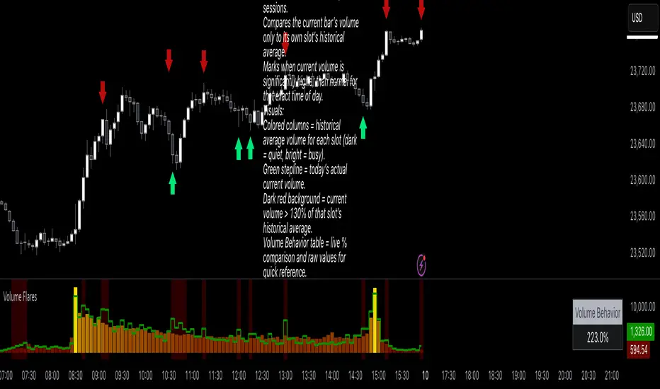
Volume Flares – Spotting Abnormal Volume by Time of Day
Most volume tools compare current volume to a moving average of the last X bars. That’s fine for seeing short-term changes, but it ignores how volume naturally ebbs and flows throughout the day.
Volume at 9:35 is not the same as volume at 1:15.
A standard MA will treat them the same.
What Volume Flares does differently:
Breaks the day into exact time slots (based on your chosen timeframe).
Calculates the historical average volume for each slot across past sessions.
Compares the current bar’s volume only to its own slot’s historical average.
Marks when current volume is significantly higher than normal for that exact time of day.
Visuals:
Colored columns = historical average volume for each slot (dark = quiet, bright = busy).
Green stepline = today’s actual current volume.
Dark red background = current volume > 130% of that slot’s historical average.
Volume Behavior table = live % comparison and raw values for quick reference.
How I use it:
Red and green arrows on the price chart are manually drawn where the background turns red in the volume panel.
These often align with liquidity grabs, institutional entries, or areas where the market is “louder” than it should be for that moment in the day.
Helps filter out false urgency — high volume at the open isn’t the same as high volume in the lunch lull.
Key takeaway:
This is not a buy/sell signal.
It’s context.
It’s about spotting when the market is behaving out of character for that specific moment, and using that to read intent behind the move.
オープンソーススクリプト
TradingViewの精神に則り、このスクリプトの作者はコードをオープンソースとして公開してくれました。トレーダーが内容を確認・検証できるようにという配慮です。作者に拍手を送りましょう!無料で利用できますが、コードの再公開はハウスルールに従う必要があります。
免責事項
この情報および投稿は、TradingViewが提供または推奨する金融、投資、トレード、その他のアドバイスや推奨を意図するものではなく、それらを構成するものでもありません。詳細は利用規約をご覧ください。
オープンソーススクリプト
TradingViewの精神に則り、このスクリプトの作者はコードをオープンソースとして公開してくれました。トレーダーが内容を確認・検証できるようにという配慮です。作者に拍手を送りましょう!無料で利用できますが、コードの再公開はハウスルールに従う必要があります。
免責事項
この情報および投稿は、TradingViewが提供または推奨する金融、投資、トレード、その他のアドバイスや推奨を意図するものではなく、それらを構成するものでもありません。詳細は利用規約をご覧ください。