US Market Long Horizon Momentum Summary in one paragraph
US Market Long Horizon Momentum is a trend following strategy for US index ETFs and futures built around a single eighteen month time series momentum measure. It helps you stay long during persistent bull regimes and step aside or flip short when long term momentum turns negative.
Scope and intent
• Markets. Large cap US equity indices, liquid US index ETFs, index futures
• Timeframes. 4h/ Daily charts
• Default demo used in the publication. SPY on 4h timeframe chart
• Purpose. Provide a minimal long bias index timing model that can reduce deep drawdowns and capture major cycles without parameter mining
• Limits. This is a strategy. Orders are simulated on standard candles only
Originality and usefulness
• Unique concept or fusion. One unscaled multiple month log return of an external benchmark symbol drives all entries and exits, with optional volatility targeting as a single risk control switch.
• Failure mode addressed. Fully passive buy and hold ignores the sign of long horizon momentum and can sit through multi year drawdowns. This script offers a way to step down risk in prolonged negative momentum without chasing short term noise.
• Testability. All parameters are visible in Inputs and the momentum series is plotted so users can verify every regime change in the Tester and on price history.
• Portable yardstick. The log return over a fixed window is a unit that can be applied to any liquid symbol with daily data.
Method overview in plain language
The method looks at how far the benchmark symbol has moved in log return terms over an eighteen month window in our example. If that long horizon return is positive the strategy allows a long stance on the traded symbol. If it is negative and shorts are enabled the strategy can flip short, otherwise it goes flat. There is an optional realised volatility estimate on the traded symbol that can scale position size toward a target annual volatility, but in the default configuration the model uses unit leverage and only the sign of momentum matters.
Base measures
Return basis. The core yardstick is the natural log of close divided by the close eighteen months ago on the benchmark symbol. Daily log returns of the traded symbol feed the realised volatility estimate when volatility targeting is enabled.
Components
• Component one Momentum eighteen months. Log of benchmark close divided by its close mom_lookback bars ago. Its sign defines the trend regime. No extra smoothing is applied beyond the long window itself.
• Component two Realised volatility optional. Standard deviation of daily log returns on the traded symbol over sixty three days. Annualised by the square root of 252. Used only when volatility targeting is enabled.
• Optional component Volatility targeting. Converts target annual volatility and realised volatility into a leverage factor clipped by a maximum leverage setting.
Fusion rule
The model uses a simple gate. First compute the sign of eighteen month log momentum on the benchmark symbol. Optionally compute leverage from volatility. The sign decides whether the strategy wants to be long, short, or flat. Leverage only rescales position size when enabled and does not change direction.
Signal rule
• Long suggestion. When eighteen month log momentum on the benchmark symbol is greater than zero, the strategy wants to be long.
• Short suggestion. When that log momentum is less than zero and shorts are allowed, the strategy wants to be short. If shorts are disabled it stays flat instead.
• Wait state. When the log momentum is exactly zero or history is not long enough the strategy stays flat.
• In position. In practice the strategy sits IN LONG while the sign stays positive and flips to IN SHORT or flat only when the sign changes.
Inputs with guidance
Setup
• Momentum Lookback (months). Controls the horizon of the log return on the benchmark symbol. Typical range 6 to 24 months. Raising it makes the model slower and more selective. Lowering it makes it more reactive and sensitive to medium term noise.
• Symbol. External symbol used for the momentum calculation, SPY by default. Changing it lets you time other indices or run signals from a benchmark while trading a correlated instrument.
Logic
• Allow Shorts. When true the strategy will open short positions during negative momentum regimes. When false it will stay flat whenever momentum is negative. Practical setting is tied to whether you use a margin account or an ETF that supports shorting.
Internal risk parameters (not exposed as inputs in this version) are:
• Target Vol (annual). Target annual volatility for volatility targeting, default 0.2.
• Vol Lookback (days). Window for realised volatility, default 63 trading days.
• Max Leverage. Cap on leverage when volatility targeting is enabled, default 2.
Usage recipes
Swing continuation
• Signal timeframe. Use the daily chart.
• Benchmark symbol. Leave at SPY for US equity index exposure.
• Momentum lookback. Eighteen months as a default, with twelve months as an alternative preset for a faster swing bias.
Properties visible in this publication
• Initial capital. 100000
• Base currency. USD
• Default order size method. 5% of the total capital in this example
• Pyramiding. 0
• Commission. 0.03 percent
• Slippage. 3 ticks
• Process orders on close. On
• Bar magnifier. Off
• Recalculate after order is filled. Off
• Calc on every tick. Off
• All request.security calls use lookahead = barmerge.lookahead_off
Realism and responsible publication
The strategy is for education and research only. It does not claim any guaranteed edge or future performance. All results in Strategy Tester are hypothetical and depend on the data vendor, costs, and slippage assumptions. Intrabar motion is not modeled inside daily bars so extreme moves and gaps can lead to fills that differ from live trading. The logic is built for standard candles and should not be used on synthetic chart types for execution decisions.
Performance is sensitive to regime structure in the US equity market, which may change over time. The strategy does not protect against single day crash risk inside bars and does not model gap risk explicitly. Past behavior of SPY and the momentum effect does not guarantee future persistence.
Honest limitations and failure modes
• Long sideways regimes with small net change over eighteen months can lead to whipsaw around the zero line.
• Very sharp V shaped reversals after deep declines will often be missed because the model waits for momentum to turn positive again.
• The sample size in a full SPY history is small because regime changes are infrequent, so any test must be interpreted as indicative rather than statistically precise.
• The model is highly dependent on the chosen lookback. Users should test nearby values and validate that behavior is qualitatively stable.
Legal
Education and research only. Not investment advice. You are responsible for your own decisions. Always test on historical data and in simulation with realistic costs before any live use.
Investing

Adaptive Volume Trend - [RZ]Adaptive Volume Trend
Introduction
The Adaptive Volume Trend is a dynamic, volume-weighted trend detection indicator designed to identify significant directional shifts in market momentum. By integrating price and volume data into a single adaptive framework, it helps traders visualize when market participation supports upward or downward trends.
The indicator adapts to volatility conditions through statistical measures, offering a refined approach to trend confirmation beyond traditional moving averages.
Key Features
Dynamic Volume-Weighted Analysis : Utilizes a Volume-Weighted Moving Average (VWMA) combined with exponential smoothing to account for both price movement and traded volume.
Adaptive Thresholding : Implements a rolling standard deviation-based system that automatically adjusts sensitivity to volatility and market conditions.
Color-Coded Trend Visualization : Optional bar and line coloring dynamically represent bullish and bearish market states for intuitive chart interpretation.
Alert Conditions : Built-in alerts notify users when bullish or bearish thresholds are breached, enabling timely trading decisions.
Customizable Parameters : Users can modify VWMA length, smoothing period, threshold sensitivity, and color settings to align with their preferred trading style or asset characteristics.
How It Works
The indicator calculates a smoothed VWMA of the closing price weighted by trading volume, then compares the logarithmic deviation of price from this adaptive average. A dynamic standard deviation is applied over a defined period to establish upper and lower threshold bands that represent statistically significant price deviations.
When the oscillator crosses above the upper threshold, it signals potential bullish strength supported by rising volume.
When it falls below the lower threshold, it indicates bearish dominance or weakening momentum.
A scoring mechanism assigns values (+1 for bullish, –1 for bearish) which drive both bar and line color changes, providing immediate visual feedback.
The EMA overlay line, color-shifted by signal strength, further emphasizes ongoing directional trends.
This adaptive mechanism ensures responsiveness during high-volatility markets while filtering noise during consolidation phases.
ES
NVIDIA
GOLD
Conclusion
The Adaptive Volume Trend indicator offers traders a balanced, adaptive framework to analyze volume-backed price movements. By dynamically adjusting to volatility and market participation, it enhances the reliability of trend detection and visual clarity on charts. It serves as a valuable addition for traders seeking volume-informed trend confirmation and dynamic market structure insights.
Disclaimer
This indicator is provided for educational and analytical purposes only. It does not constitute financial advice or a recommendation to buy or sell any asset. Past performance is not indicative of future results. Users should conduct their own analysis and manage risk appropriately before making any trading decisions.

Multi-Mode Seasonality Map [BackQuant]Multi-Mode Seasonality Map
A fast, visual way to expose repeatable calendar patterns in returns, volatility, volume, and range across multiple granularities (Day of Week, Day of Month, Hour of Day, Week of Month). Built for idea generation, regime context, and execution timing.
What is “seasonality” in markets?
Seasonality refers to statistically repeatable patterns tied to the calendar or clock, rather than to price levels. Examples include specific weekdays tending to be stronger, certain hours showing higher realized volatility, or month-end flow boosting volumes. This tool measures those effects directly on your charted symbol.
Why seasonality matters
It’s orthogonal alpha: timing edges independent of price structure that can complement trend, mean reversion, or flow-based setups.
It frames expectations: when a session typically runs hot or cold, you size and pace risk accordingly.
It improves execution: entering during historically favorable windows, avoiding historically noisy windows.
It clarifies context: separating normal “calendar noise” from true anomaly helps avoid overreacting to routine moves.
How traders use seasonality in practice
Timing entries/exits : If Tuesday morning is historically weak for this asset, a mean-reversion buyer may wait for that drift to complete before entering.
Sizing & stops : If 13:00–15:00 shows elevated volatility, widen stops or reduce size to maintain constant risk.
Session playbooks : Build repeatable routines around the hours/days that consistently drive PnL.
Portfolio rotation : Compare seasonal edges across assets to schedule focus and deploy attention where the calendar favors you.
Why Day-of-Week (DOW) can be especially helpful
Flows cluster by weekday (ETF creations/redemptions, options hedging cadence, futures roll patterns, macro data releases), so DOW often encodes a stable micro-structure signal.
Desk behavior and liquidity provision differ by weekday, impacting realized range and slippage.
DOW is simple to operationalize: easy rules like “fade Monday afternoon chop” or “press Thursday trend extension” can be tested and enforced.
What this indicator does
Multi-mode heatmaps : Switch between Day of Week, Day of Month, Hour of Day, Week of Month .
Metric selection : Analyze Returns , Volatility ((high-low)/open), Volume (vs 20-bar average), or Range (vs 20-bar average).
Confidence intervals : Per cell, compute mean, standard deviation, and a z-based CI at your chosen confidence level.
Sample guards : Enforce a minimum sample size so thin data doesn’t mislead.
Readable map : Color palettes, value labels, sample size, and an optional legend for fast interpretation.
Scoreboard : Optional table highlights best/worst DOW and today’s seasonality with CI and a simple “edge” tag.
How it’s calculated (under the hood)
Per bar, compute the chosen metric (return, vol, volume %, or range %) over your lookback window.
Bucket that metric into the active calendar bin (e.g., Tuesday, the 15th, 10:00 hour, or Week-2 of month).
For each bin, accumulate sum , sum of squares , and count , then at render compute mean , std dev , and confidence interval .
Color scale normalizes to the observed min/max of eligible bins (those meeting the minimum sample size).
How to read the heatmap
Color : Greener/warmer typically implies higher mean value for the chosen metric; cooler implies lower.
Value label : The center number is the bin’s mean (e.g., average % return for Tuesdays).
Confidence bracket : Optional “ ” shows the CI for the mean, helping you gauge stability.
n = sample size : More samples = more reliability. Treat small-n bins with skepticism.
Suggested workflows
Pick the lens : Start with Analysis Type = Returns , Heatmap View = Day of Week , lookback ≈ 252 trading days . Note the best/worst weekdays and their CI width.
Sanity-check volatility : Switch to Volatility to see which bins carry the most realized range. Use that to plan stop width and trade pacing.
Check liquidity proxy : Flip to Volume , identify thin vs thick windows. Execute risk in thicker windows to reduce slippage.
Drill to intraday : Use Hour of Day to reveal opening bursts, lunchtime lulls, and closing ramps. Combine with your main strategy to schedule entries.
Calendar nuance : Inspect Week of Month and Day of Month for end-of-month, options-cycle, or data-release effects.
Codify rules : Translate stable edges into rules like “no fresh risk during bottom-quartile hours” or “scale entries during top-quartile hours.”
Parameter guidance
Analysis Period (Days) : 252 for a one-year view. Shorten (100–150) to emphasize the current regime; lengthen (500+) for long-memory effects.
Heatmap View : Start with DOW for robustness, then refine with Hour-of-Day for your execution window.
Confidence Level : 95% is standard; use 90% if you want wider coverage with fewer false “insufficient data” bins.
Min Sample Size : 10–20 helps filter noise. For Hour-of-Day on higher timeframes, consider lowering if your dataset is small.
Color Scheme : Choose a palette with good mid-tone contrast (e.g., Red-Green or Viridis) for quick thresholding.
Interpreting common patterns
Return-positive but low-vol bins : Favorable drift windows for passive adds or tight-stop trend continuation.
Return-flat but high-vol bins : Opportunity for mean reversion or breakout scalping, but manage risk accordingly.
High-volume bins : Better expected execution quality; schedule size here if slippage matters.
Wide CI : Edge is unstable or sample is thin; treat as exploratory until more data accumulates.
Best practices
Revalidate after regime shifts (new macro cycle, liquidity regime change, major exchange microstructure updates).
Use multiple lenses: DOW to find the day, then Hour-of-Day to refine the entry window.
Combine with your core setup signals; treat seasonality as a filter or weight, not a standalone trigger.
Test across assets/timeframes—edges are instrument-specific and may not transfer 1:1.
Limitations & notes
History-dependent: short histories or sparse intraday data reduce reliability.
Not causal: a hot Tuesday doesn’t guarantee future Tuesday strength; treat as probabilistic bias.
Aggregation bias: changing session hours or symbol migrations can distort older samples.
CI is z-approximate: good for fast triage, not a substitute for full hypothesis testing.
Quick setup
Use Returns + Day of Week + 252d to get a clean yearly map of weekday edge.
Flip to Hour of Day on intraday charts to schedule precise entries/exits.
Keep Show Values and Confidence Intervals on while you calibrate; hide later for a clean visual.
The Multi-Mode Seasonality Map helps you convert the calendar from an afterthought into a quantitative edge, surfacing when an asset tends to move, expand, or stay quiet—so you can plan, size, and execute with intent.
Kalman Exponentialy Weighted Moving Average | MisinkoMasterThe Kalman Exponentialy Weighted Moving Average is a technical analysis tool providing users with more responsive and smoother signals, providing crystal-clear signals and giving investors valuable insights on market trends, however it could be used in many cases.
A deeper dive into the indicator:
When going through my creation of strategies, I had stumbled on an indicator called "EWMA", which worked decently, but it was far too simple in my opinion so I decided to combine the EMA & WMA, but with a little more complexity, and it has worked .
I began by learning how both MAs work, I already knew how WMA works, but EMA I did not.
After learning both I found out they were quite simple in principle and that there was a way to combine them in such way that you would get really good signals, however it was way too noisy.
While it could avoid major dumps that were not avoided by most indicators, it would lose that edge because of being too noisy.
After testing out many conditions, combinations & more, the best working one was this one:
WMA > KEWMA = long
WMA < KEWMA = short
I will explain this later, but this gave fast signals, and while it still was noisy it was better then before.
To smooth it out, I started testing price filters => Gaussian Filter and many more were tested out, but they either slowed it down to the point it was no longer of much use, or did not smooth it at all.
After testing the Kalman filter on this thing, I was shocked.
It was just right and made the indicator a lot better, smoothed it and kept most of the responsivness it had.
Now to the big question: "How is it calculated?"
Now first it needs to calculate the Kalman source, which smooths the source which will be used.
After that, we calculate the Weighted Moving Average for " n " period on the Kalman source.
Now that we have our WMA values, we need to calculate " a ".
a is calculated in the following formula:
a = 2/(1+ n )
where n is the user defined length
Now for the last part:
KEWMA = WMAyesterday * (1-a) + WMAtoday * a
This creates a very accurate and reactive indicator, that can prove useful in many uses, beyond those I will and did talk about.
For the trend logic as mentioned before:
Long = WMA > KEWMA
Short = WMA < KEWMA
This worked best, but you might find better ways of using it.
I think that is all I have to say about it, I left it open source so you can all code it in your strategies and play around with it.
Enjoy Gs!

Long-Term Trend & Valuation Model [Backquant]Long-Term Trend & Valuation Model
Invite-only. A universal long-term valuation strategy and trend model built to work across markets, with an emphasis on crypto where cycles and volatility are large. Intended primarily for the 1D timeframe. Inputs should be adjusted per asset to reflect its structure and volatility.
If you would like to checkout the simplified and open source valuation, check out:
What this is
A two-layer framework that answers two different questions.
• The Valuation Engine asks “how extended is price relative to its own long-term regime” and outputs a centered oscillator that moves positive in supportive conditions and negative in deteriorating conditions.
• The Trend Model asks “is the market actually trending in a sustained direction” and converts several independent subsystems into a single composite score.
The combination lets you separate “where we are in the cycle” from “what to do about it” so allocation and timing can be handled with fewer conflicts.
Design philosophy
Crypto and many risk assets move in multi-month expansions and contractions. Short tools flip often and can be misleading near regime boundaries. This model favors slower, high-confidence information, then summarizes it in simple visuals and alerts. It is not trying to catch every swing. It is built to help you participate in the meat of long uptrends, de-risk during deteriorations, and identify stretched conditions that deserve caution or patience.
Valuation Engine, high level
The Valuation Engine blends several slow signals into one measure. Exact transforms, windows, and weights are private, but the categories below describe the intent. Each input is standardized so unlike units can be combined without one dominating.
Momentum quality — favors persistent, orderly advances over erratic spikes. Helps distinguish trend continuation from noise.
Mean-reversion pressure — detects when price is far from a long anchor or when oscillators are pulling back toward equilibrium.
Risk-adjusted return — long-window reward to variability. Encourages time in market when advances are efficient rather than merely fast.
Volume imbalance — summarizes whether activity is expanding with advances or with declines, using a slow envelope to avoid day-to-day churn.
Trend distance — expresses how stretched price is from a structural baseline rather than from a short moving average.
Price normalization — a long z-score of price to keep extremes comparable across cycles and symbols.
How the Valuation Engine is shaped
Standardization — components are put on comparable scales over long windows.
Composite blend — standardized parts are combined into one reading with protective weighting. No single family can override the rest on its own.
Smoothing — optional moving average smoothing to reduce whipsaw around zero or around the bands.
Bounded scaling — the composite is compressed into a stable, interpretable range so the mid zone and extremes are visually consistent. This reduces the effect of outliers without hiding genuine stress.
Volatility-aware re-expansion — after compression, the series is allowed to swing wider in high-volatility regimes so “overbought” and “oversold” remain meaningful when conditions change.
Thresholds — fixed OB/OS levels or dynamic bands that float with recent dispersion. Dynamic bands use k times a rolling standard deviation. Fixed bands are simple and comparable across charts.
How to read the Valuation Oscillator
Above zero suggests a supportive backdrop. Rising and positive often aligns with uptrends that are gaining participation.
Below zero suggests deterioration or risk aversion. Falling and negative often aligns with distribution or with trend exhaustion.
Touches of the upper band show stretch on the optimistic side. Repeated tags without breakdown often occur late in cycles, especially in crypto.
Touches of the lower band show stretch on the pessimistic side. They are common in washouts and early bases.
Visual elements
Valuation Oscillator — colored by sign for instant context.
OB/OS guides — fixed or dynamic bands.
Background and bar colors — optional, tied to the sign of valuation for quick scans.
Summary table — optional, shows the standardized contribution of the major categories and the final composite score with a simple status icon.
Trend Model, composite scoring
The trend side aggregates several independent subsystems. Each subsystem issues a vote: long, short, or neutral. Votes are averaged into a composite score. The exact logic of each subsystem is intentionally abstracted. The families below describe roles, not formulas.
Long-horizon price state — checks where price sits relative to multiple structural baselines and whether those baselines are aligned.
Macro regime checks — favors sustained risk-on behavior and penalizes persistent deterioration in breadth or volatility structure.
Ultimate confirmation — a conservative filter that only votes when directional evidence is persistent.
Minimalist sanity checks — keep the model responsive to obvious extremes and prevent “stuck neutral” states.
Higher timeframe or overlay inputs — optional votes that consider slower contexts or relative strength to stabilize borderline periods.
You define two cutoffs for the composite: above the long threshold the state is Long , below the short threshold the state is Short , in between is Cash/Neutral . The script paints a signal line on price for an at-a-glance view and provides alerts when the composite crosses your thresholds.
How it can be used
Cycle framing in crypto — use deep negative valuation as accumulation context, then look for the composite trend to move through your long threshold. Late in cycles, extended positive valuation with weakening composite votes is a caution cue for de-risking or tighter management.
Regime-based allocation — increase risk or loosen take-profits when the composite is firmly Long and valuation is rising. Decrease risk or rotate to stable holdings when the composite is Short and valuation is falling.
Signal gating — run shorter-term entry systems only in the direction of the composite. This reduces counter-trend trades and improves holding discipline during strong uptrends.
Sizing overlay — scale position sizes by the magnitude of the valuation reading. Smaller sizes near the upper band during aging advances, larger sizes near zero after strong resets.
DCA context — for long-only accumulation, schedule heavier adds when valuation is negative and stabilizing, then lighten or pause adds when valuation is very positive and flattening.
Cross-asset rotation — compare symbols on 1D with the same fixed bands. Favor assets with positive valuation that are also in a Long composite state.
Interpreting common patterns
Early build-out — valuation rises from below zero, but the composite is still neutral. This is often the base-building phase. Patience and staged entries can make sense.
Healthy advance — valuation positive and trending up, composite firmly Long. Pullbacks that keep valuation above zero are usually opportunities rather than trend breaks.
Late-cycle stretch — valuation pinned near the upper band while the composite starts to weaken toward neutral. Consider trimming, tightening risk, or shifting to a “let the market prove it” stance.
Distribution and unwind — valuation negative and falling, composite Short. Rallies are treated as counter-trend until both turn.
Settings that matter
Timeframe
This model is intended for 1D as the primary view. It can be inspected on higher or lower frames, but the design choices assume daily bars for crypto and other risk assets.
Asset-specific tuning
Inputs should be adjusted per asset. Coins with high variability benefit from longer lookbacks and slightly wider dynamic bands. Lower-volatility instruments can use shorter windows and tighter bands.
Valuation side
Lookback lengths — longer values make the oscillator steadier and more cycle-aware. Shorter values increase sensitivity but create more mid-zone noise.
Smoothing — enable to reduce flicker around zero and around the bands. Disable if you want faster warnings of regime change.
Dynamic vs fixed thresholds — dynamic bands float with recent dispersion and keep OB/OS comparable across regimes. Fixed bands are simple and make inter-asset comparison easy.
Scaling and re-expansion — keep this enabled if you want extremes to remain interpretable when volatility rises.
Trend side
Composite thresholds — widen the neutral zone if you want fewer flips. Tighten thresholds if you want earlier signals at the cost of more transitions.
Visibility — use the price-pane signal line and bar coloring to keep the regime in view while you focus on structure.
Alerts
Valuation OB/OS enter and exit — the oscillator entering or leaving stretched zones.
Zero-line crosses — valuation turning positive or negative.
Trend flips — composite crossing your long or short threshold.
Strengths
Separates “valuation context” from “trend state,” which improves decisions about when to add, reduce, or stand aside.
Composite voting reduces reliance on any single indicator family and improves robustness across regimes.
Volatility-aware scaling keeps signals interpretable during quiet and wild markets.
Clear, configurable visuals and alerts that support long-horizon discipline rather than frequent toggling.
Final thoughts
This is a universal long-term valuation strategy and trend model that aims to keep you aligned with the dominant regime while giving transparent context for stretch and risk. For crypto on 1D, it helps map accumulation, expansion, distribution, and unwind phases with a single, consistent language. Tune lookbacks, smoothing, and thresholds to the asset you trade, let the valuation side tell you where you are in the cycle, and let the composite trend side tell you what stance to hold until the market meaningfully changes.

Universal Trend+ [BackQuant]Universal Trend+
This indicator blends several well-known technical ideas into a single composite trend and momentum model. It can be show primarily as an overlay or a oscillator:
In which it produces two things:
a composite oscillator that summarizes multiple signals into one normalized score
a regime signal rendered on the chart as a colored ribbon with optional 𝕃 and 𝕊 markers
The goal is to simplify decision-making by having multiple, diverse measurements vote in a consistent framework, rather than relying on any single indicator in isolation.
What it does
Computes five independent components, each reading a different aspect of price behavior
Converts each component into a standardized bullish / neutral / bearish vote
Averages the available votes to a composite score
Compares that score to user thresholds to label the environment bullish, neutral, or bearish
Colors a fast/slow moving-average ribbon by the current regime, optionally paints candles, and can plot the composite oscillator in a lower pane
The five components (conceptual)
1)RSI Momentum Bias
A classic momentum gauge on a selectable source and lookback. The component emphasizes whether conditions are persistently strong or weak and applies a neutral buffer to avoid reacting to trivial moves. Output is expressed as a vote: bullish, neutral, or bearish.
2) Rate-of-Change Impulse
A smoothed rate-of-change that focuses on short bursts in acceleration. It is used to detect impulsive pushes rather than slow drift. Extreme readings cast a directional vote, mid-range readings abstain.
3) EMA Oscillator
A slope-style trend gauge formed by contrasting a fast and a slow EMA on a chosen source, normalized so that the sign and relative magnitude matter more than absolute price. A small dead-zone reduces whipsaws.
4) T3-Based Normalized Oscillator
A T3 smoother is transformed into a bounded oscillator via rolling normalization, then optionally smoothed by a user-selectable MA. This highlights directional drift while keeping scale consistent across symbols and regimes.
5) DEMA + ATR Bands State
A double-EMA core is wrapped in adaptive ATR bands to create a stepping state that reacts when pressure exceeds a volatility envelope. The component contributes an event-style vote on meaningful shifts.
Each component is designed to measure something different: trend slope, momentum impulse, normalized drift, and volatility-aware pressure. Their diversity is the point.
Composite scoring model
Standardization: Each component is mapped to -1 (bearish), 0 (neutral), or +1 (bullish) using bands and guards to cut noise.
Aggregation: The composite score is the average of the available votes. If a component is inactive on a bar, the composite uses the votes that are present.
Decision layer: Two user thresholds define your action bands.
Above the upper band → bullish regime
Below the lower band → bearish regime
Between the bands → neutral
This separation between measurement, aggregation, and decision avoids over-fitting any single threshold and makes the tool adaptable across assets and timeframes.
Plots and UI
Composite oscillator (optional lower pane): A normalized line that trends between bearish and bullish zones with user thresholds drawn for context.
Signal ribbon (on price): A fast/slow MA pair tinted by the current regime to give an at-a-glance market state.
Markers: Optional 𝕃 and 𝕊 labels when the regime flips.
Candle painting and background tint: Optional visual reinforcement of state.
Color and style controls: User inputs for long/short colors, threshold line color, and visibility toggles.
How it can be used
1) Regime filter
Use the composite regime to define bias. Trade only long in a bullish regime, only short in a bearish regime, and stand aside or scale down in neutral. This simple filter often reduces whipsaw.
2) Confirmation layer
Keep your entry method the same (breaks, pullbacks, liquidity sweeps, order-flow cues) but require agreement from the composite regime or a fresh flip in the 𝕃/𝕊 markers.
3) Momentum breakouts
Look for the composite oscillator to leave neutrality while the EMA oscillator is already positive and the ATR-band state has flipped. Confluence across components is the intent.
4) Pullback entries within trend
In a bullish regime, consider entries on shallow composite dips that recover before breaching the lower band. Reverse the logic in a bearish regime.
5) Exits and risk
Common choices are:
reduce on a return to neutral,
exit on an opposite regime flip, or
trail behind your own stop model (ATR, structure, session levels) while using the ribbon for context.
6) Multi-timeframe workflow
Select a higher timeframe for bias with this indicator, and time executions on a lower timeframe. The indicator itself stays on a single chart; you can load a second chart or pane if you prefer a strict top-down process.
Strengths
Diversified evidence: Five independent perspectives keep the model from hinging on one idea.
Noise control: Neutral buffers and a composite layer reduce reaction to minor wiggles.
Clarity: A single oscillator and a clearly colored ribbon present a complex assessment in a simple form.
Adaptable: Thresholds and lookbacks let you tune for faster or slower markets.
Practical tuning
Thresholds: Wider bands produce fewer regime flips and longer holds. Narrower bands increase sensitivity.
Lookbacks: Shorter lookbacks emphasize recent action; longer lookbacks emphasize stability.
T3 normalization window and volume factor: Increase the window to suppress noise on choppy symbols; tweak the factor to adjust the smoother’s response.
ATR factor for the band state: Raise it to demand more decisive pressure before registering a shift; lower it to respond earlier.
Alerts
Built-in alerts trigger when the regime flips long or short. If you prefer confirmed signals, set your alerts to bar close on your timeframe. Intrabar the composite can move with price; bar-close confirmation stabilizes behavior.
Limitations
Sideways markets: Even with buffers, any trend model can chop in range-bound conditions.
Lag vs sensitivity trade-off: Tighter thresholds react faster but flip more often; wider thresholds are steadier but later.
Asset specificity: Volatility regimes differ. Expect to retune ATR and normalization settings when switching symbols or timeframes.
Final Remarks
Universal Trend+ is meant to act like a disciplined voting committee. Each component contributes a different angle on the same underlying question: is the market pressing up, pressing down, or doing neither with conviction. By standardizing and aggregating those views, you get a single regime read that plays well with many entry styles and risk frameworks, while keeping the heavy math under the hood.

Economic Profit (Fixed & Labeled) — Rated + PeersFRAC (Fundamental-Rated-Asset-Calculate)
FRAC is a fundamentals-driven tool designed to measure whether a company is creating or destroying shareholder value. Unlike surface ratios, FRAC uses Economic Profit (ROIC – WACC) as its engine, showing whether a business truly outperforms its cost of capital.
🔹 What FRAC Does
Calculates ROIC (Return on Invested Capital) vs. WACC (Weighted Average Cost of Capital).
Shows whether a company is creating or destroying shareholder value.
Uses tiered color coding for clarity:
🔵 Superior (Aqua Blue) → Top tier; best of the best.
🟣 Elite (Purple) → Strong value creation.
🟢 Positive (Green) → Solid, creating shareholder value.
🟡 Marginal (Yellow) → Barely covering cost of capital.
🔴 Negative (Red) → Value destruction.
🔹 Composite Ranking System (1–4)
FRAC also assigns each company a Composite Rank so you can compare multiple names side by side. The rank works like this:
Rank 1 → Superior (🔵 Aqua Blue)
Best possible rating; wide gap between ROIC and WACC.
Rank 2 → Elite (🟣 Purple)
Strongly positive; above-average capital efficiency.
Rank 3 → Positive (🟢 Green)
Creating value but only moderately; not a top compounder.
Rank 4 → Marginal/Negative (🟡/🔴)
Weak or destructive; either barely covering WACC or losing money on capital.
✅ How to Use the Ranks
When comparing a set of peers (e.g., NVDA, AMD, INTC):
FRAC will display each company’s color rating + composite rank (1–4).
You can instantly see who is strongest vs. weakest in the group.
Best decisions = overweight Rank 1 & 2 companies, avoid Rank 4 names.
🔹 Key Inputs Explained
Risk-Free Asset → Typically the 10-Year US Treasury yield (US10Y).
Corporate Tax Rate → Effective tax rate for the company’s country (e.g., USCTR).
Expected Market Return → Historical average ~8–10%, adjustable.
Beta Lookback Period → Controls how far back Beta is calculated (longer = more stable, shorter = more reactive).
👉 These must be set correctly for FRAC to calculate WACC accurately.
🔹 Example Comparison
NVDA: ROIC 25% – WACC 7% = +18% → 🔵 Superior → Rank 1
AMD: ROIC 17% – WACC 8% = +9% → 🟣 Elite → Rank 2
INTC: ROIC 11% – WACC 9% = +2% → 🟢 Positive → Rank 3
FSLY: ROIC 5% – WACC 10% = –5% → 🔴 Negative → Rank 4
🔹 Why It Matters
Buffett said: “The best businesses are those that can consistently generate returns on capital above their cost of capital.”
FRAC turns that into a visual + numeric rating system (1–4), making comparisons across peers simple and actionable.
🔹 Credit
FRAC was created by Hunter Hammond (Elite x FineFir), inspired by corporate finance models of Economic Profit and Economic Value Added (EVA).
⚠️ Disclaimer: FRAC is a research framework, not financial advice. Always pair with full due diligence.

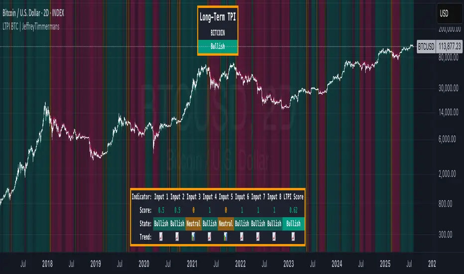
LTPI BTC | JeffreyTimmermansLong-Term Trend Probability Indicator
The "Long-Term Trend Probability Indicator" on BTC is a custom-built tool designed to analyze BTC from a long-term perspective. Unlike short-term indicators that react to price volatility, LTPI focuses on major trend shifts on BTC, and therefore across the entire crypto market, helping to identify major trend shifts early.
This version of the LTPI is applied to BTC, making it a BTC specific trend following tool, but very broad (crypto wise), because BTC is the biggest asset.
Key Features
Long-Term Focus:
Designed for macro market analysis with less sensitivity to short-term noise.
8 Input Signals:
Combines 8 carefully selected inputs (trend following indicators) into a single score that reflects the overall market condition.
Market Regimes:
Classifies the BTC trend into:
Bullish: Strong uptrend, expansion phase
Bearish: Strong downtrend, contraction phase
Neutral: Transitional or uncertain
Visual Background:
Background colors clearly display which regime is active.
Comprehensive Dashboard:
The panel at the bottom shows each input’s state, the composite LTPI score, and the resulting market trend.
How It Works
Inputs Analysis:
Each of the 8 inputs outputs one of three states:
+1 (Bullish)
-1 (Bearish)
0 (Neutral)
Score Calculation:
The total score is the sum of all 8 input signals divided by 8.
Score > 0.1 = Bullish
Score < -0.1 = Bearish
Between -0.1 and 0.1 = Neutral
Background Coloring:
Background colors dynamically adjust to reflect the long-term market regime.
Use Cases
Long-Term Positioning:
Identify periods of global expansion or contraction to position yourself accordingly.
Macro Confirmation:
Use LTPI in combination with medium-term (MTPI) and short-term tools for multi-timeframe confirmation.
Market Timing:
Alerts when LTPI crosses key thresholds help highlight the start of major bullish or bearish phases.
Dynamic Alerts:
Bullish Entry: LTPI score crosses above 0.1
Bearish Entry: LTPI score crosses below -0.1
Neutral Zone: Score moves back between -0.1 and 0.1
Conclusion
The Long-Term Trend Probability Indicator (LTPI – BTC) is a powerful tool for identifying long-term market phases across the entire crypto ecosystem. By focusing on long term trends and combining 8 inputs into a single probability score, it provides a clear macro trend perspective for strategic decision-making.
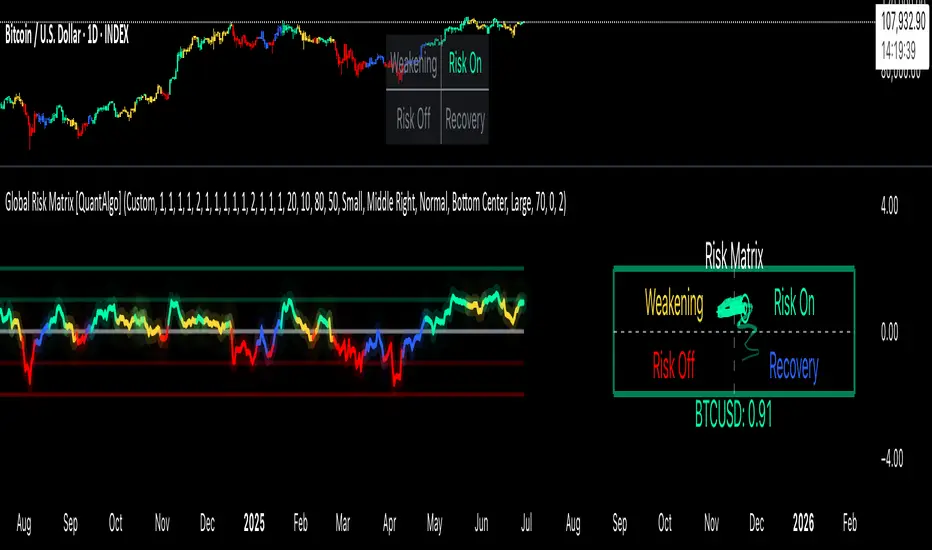
Global Risk Matrix [QuantAlgo]🟢 Overview
The Global Risk Matrix is a comprehensive macro risk assessment tool that aggregates multiple global financial indicators into a unified risk sentiment framework. It transforms diverse economic data streams (from currency strength and liquidity measures to volatility indices and commodity prices) into standardized Z-Score readings to identify market regime shifts across risk-on and risk-off conditions.
The indicator displays both a risk oscillator showing weighted average sentiment and a dynamic 2D matrix visualization that plots signal strength against momentum to reveal current market phase and historical evolution. This helps traders and investors understand broad market conditions, identify regime transitions, and align their strategies with prevailing macro risk environments across all asset classes.
🟢 How It Works
The indicator employs Z-Score normalization across various global macro components, each representing distinct aspects of market liquidity, sentiment, and economic health. Raw data from sources like DXY, S&P 500, Fed liquidity, global M2 money supply, VIX, and commodities undergoes statistical standardization. Several components are inverted (USDT.D, DXY, VIX, credit spreads, treasury bonds, gold) to align with risk-on interpretation, where positive values indicate bullish conditions.
This unique system applies configurable weights to each component based on selected asset class presets (Crypto Investor/Trader, Stock Trader, Commodity Trader, Forex Trader, Risk Parity, or Custom), creating a weighted average Z-Score. It then analyzes both signal strength and momentum direction to classify market conditions into four distinct phases: Risk-On (positive signal, rising momentum), Risk-Off (negative signal, falling momentum), Recovery (negative signal, rising momentum), and Weakening (positive signal, falling momentum). The 2D matrix visualization plots these dimensions with historical trail tracking to show regime evolution over time.
🟢 How to Use
1. Risk Oscillator Interpretation and Phase Analysis
Positive Territory (Above Zero) : Indicates risk-on conditions with capital flowing toward growth assets and higher risk tolerance
Negative Territory (Below Zero) : Signals risk-off sentiment with capital seeking safety and defensive positioning
Extreme Levels (±2.0) : Represent statistically significant deviations that often precede regime reversals or trend exhaustion
Zero Line Crosses : Mark critical transitions between risk regimes, providing early signals for portfolio rebalancing
Phase Color Coding : Green (Risk-On), Red (Risk-Off), Blue (Recovery), Yellow (Weakening) for immediate regime identification
2. Risk Matrix Visualization and Trail Analysis
Current Position Marker (⌾) : Shows real-time location in the risk/momentum space for immediate situational awareness
Historical Trail : Connected path showing recent market evolution and regime transition patterns
Quadrant Analysis : Risk-On (upper right), Risk-Off (lower left), Recovery (lower right), Weakening (upper left)
Trail Patterns : Clockwise rotation typically indicates healthy regime cycles, while erratic movement suggests uncertainty
3. Pro Tips for Trading and Investing
→ Portfolio Allocation Filter : Use Risk-On phases to increase exposure to growth assets, small caps, and emerging markets while reducing defensive positions during confirmed green phases
→ Entry Timing Enhancement : Combine Recovery phase signals with your technical analysis for optimal long entry points when macro headwinds are clearing but prices haven't fully recovered
→ Risk Management Overlay : Treat Weakening phase transitions as early warning systems to tighten stop losses, reduce position sizes, or hedge existing positions before full Risk-Off conditions develop
→ Sector Rotation Strategy : During Risk-On periods, favor cyclical sectors (technology, consumer discretionary, financials) while Risk-Off phases favor defensive sectors (utilities, consumer staples, healthcare)
→ Multi-Timeframe Confluence : Use daily matrix readings for strategic positioning while applying your regular technical analysis on lower timeframes for precise entry and exit execution
→ Divergence Detection : Watch for situations where your asset shows bullish technical patterns while the matrix shows Risk-Off conditions—these often provide the highest probability short opportunities and vice versa
Arnaud Legoux Trend Aggregator | Lyro RSArnaud Legoux Trend Aggregator
Introduction
Arnaud Legoux Trend Aggregator is a custom-built trend analysis tool that blends classic market oscillators with advanced normalization, advanced math functions and Arnaud Legoux smoothing. Unlike conventional indicators, 𝓐𝓛𝓣𝓐 aggregates market momentum, volatility and trend strength.
Signal Insight
The 𝓐𝓛𝓣𝓐 line visually reflects the aggregated directional bias. A rise above the middle line threshold signals bullish strength, while a drop below the middle line indicates bearish momentum.
Another way to interpret the 𝓐𝓛𝓣𝓐 is through overbought and oversold conditions. When the 𝓐𝓛𝓣𝓐 rises above the +0.7 threshold, it suggests an overbought market and signals a strong uptrend. Conversely, a drop below the -0.7 level indicates an oversold condition and a strong downtrend.
When the oscillator hovers near the zero line, especially within the neutral ±0.3 band, it suggests that no single directional force is dominating—common during consolidation phases or pre-breakout compression.
Real-World Example
Usually 𝓐𝓛𝓣𝓐 is used by following the bar color for simple signals; however, like most indicators there are unique ways to use an indicator. Let’s dive deep into such ways.
The market begins with a green bar color, raising awareness for a potential long setup—but not a direct entry. In this methodology, bar coloring serves as an alert mechanism rather than a strict entry trigger.
The first long position was initiated when the 𝓐𝓛𝓣𝓐 signal line crossed above the +0.3 threshold, suggesting a shift in directional acceleration. This entry coincided with a rising price movement, validating the trade.
As price advanced, the position was exited into cash—not reversed into a short—because the short criteria for this use case are distinct. The exit was prompted by 𝓐𝓛𝓣𝓐 crossing back below the +0.3 level, signaling the potential weakening of the long trend.
Later, as 𝓐𝓛𝓣𝓐 crossed below 0, attention shifted toward short opportunities. A short entry was confirmed when 𝓐𝓛𝓣𝓐 dipped below -0.3, indicating growing downside momentum. The position was eventually closed when 𝓐𝓛𝓣𝓐 crossed back above the -0.3 boundary—signaling a possible deceleration of the bearish move.
This logic was consistently applied in subsequent setups, emphasizing the role of 𝓐𝓛𝓣𝓐’s thresholds in guiding both entries and exits.
Framework
The Arnaud Legoux Trend Aggregator (ALTA) combines multiple technical indicators into a single smoothed signal. It uses RSI, MACD, Bollinger Bands, Stochastic Momentum Index, and ATR.
Each indicator's output is normalized to a common scale to eliminate bias and ensure consistency. These normalized values are then transformed using a hyperbolic tangent function (Tanh).
The final score is refined with a custom Arnaud Legoux Moving Average (ALMA) function, which offers responsive smoothing that adapts quickly to price changes. This results in a clear signal that reacts efficiently to shifting market conditions.
⚠️ WARNING ⚠️: THIS INDICATOR, OR ANY OTHER WE (LYRO RS) PUBLISH, IS NOT FINANCIAL OR INVESTMENT ADVICE. EVERY INDICATOR SHOULD BE COMBINED WITH PRICE ACTION, FUNDAMENTALS, OTHER TECHNICAL ANALYSIS TOOLS & PROPER RISK. MANAGEMENT.

Aurora Flow Oscillator [QuantAlgo]The Aurora Flow Oscillator is an advanced momentum-based technical indicator designed to identify market direction, momentum shifts, and potential reversal zones using adaptive filtering techniques. It visualizes price momentum through a dynamic oscillator that quantifies trend strength and direction, helping traders and investors recognize momentum shifts and trading opportunities across various timeframes and asset class.
🟢 Technical Foundation
The Aurora Flow Oscillator employs a sophisticated mathematical approach with adaptive momentum filtering to analyze market conditions, including:
Price-Based Momentum Calculation: Calculates logarithmic price changes to measure the rate and magnitude of market movement
Adaptive Momentum Filtering: Applies an advanced filtering algorithm to smooth momentum calculations while preserving important signals
Acceleration Analysis: Incorporates momentum acceleration to identify shifts in market direction before they become obvious
Signal Normalization: Automatically scales the oscillator output to a range between -100 and 100 for consistent interpretation across different market conditions
The indicator processes price data through multiple filtering stages, applying mathematical principles including exponential smoothing with adaptive coefficients. This creates an oscillator that dynamically adjusts to market volatility while maintaining responsiveness to genuine trend changes.
🟢 Key Features & Signals
1. Momentum Flow and Extreme Zone Identification
The oscillator presents market momentum through an intuitive visual display that clearly indicates both direction and strength:
Above Zero: Indicates positive momentum and potential bullish conditions
Below Zero: Indicates negative momentum and potential bearish conditions
Slope Direction: The angle and direction of the oscillator provide immediate insight into momentum strength
Zero Line Crossings: Signal potential trend changes and new directional momentum
The indicator also identifies potential overbought and oversold market conditions through extreme zone markings:
Upper Zone (>50): Indicates strong bullish momentum that may be approaching exhaustion
Lower Zone (<-50): Indicates strong bearish momentum that may be approaching exhaustion
Extreme Boundaries (±95): Mark potentially unsustainable momentum levels where reversals become increasingly likely
These zones are displayed with gradient intensity that increases as the oscillator moves toward extremes, helping traders and investors:
→ Identify potential reversal zones
→ Determine appropriate entry and exit points
→ Gauge overall market sentiment strength
2. Customizable Trading Style Presets
The Aurora Flow Oscillator offers pre-configured settings for different trading approaches:
Default (80,150): Balanced configuration suitable for most trading and investing situations.
Scalping (5,80): Highly responsive settings for ultra-short-term trades. Generates frequent signals and catches quick price movements. Best for 1-15min charts when making many trades per day.
Day Trading (8,120): Optimized for intraday movements with faster response than default settings while maintaining reasonable signal quality. Ideal for 5-60min or 4h-12h timeframes.
Swing Trading (10,200): Designed for multi-day positions with stronger noise filtering. Focuses on capturing larger price swings while avoiding minor fluctuations. Works best on 1-4h and daily charts.
Position Trading (14,250): For longer-term position traders/investors seeking significant market trends. Reduces false signals by heavily filtering market noise. Ideal for daily or even weekly charts.
Trend Following (16,300): Maximum smoothing that prioritizes established directional movements over short-term fluctuations. Best used on daily and weekly charts, but can also be used for lower timeframe trading.
Countertrend (7,100): Tuned to detect potential reversals and exhaustion points in trends. More sensitive to momentum shifts than other presets. Effective on 15min-4h charts, as well as daily and weekly charts.
Each preset automatically adjusts internal parameters for optimal performance in the selected trading context, providing flexibility across different market approaches without requiring complex manual configuration.
🟢 Practical Usage Tips
1/ Trend Analysis and Interpretation
→ Direction Assessment: Evaluate the oscillator's position relative to zero to determine underlying momentum bias
→ Momentum Strength: Measure the oscillator's distance from zero within the -100 to +100 range to quantify momentum magnitude
→ Trend Consistency: Monitor the oscillator's path for sustained directional movement without frequent zero-line crossings
→ Reversal Detection: Watch for oscillator divergence from price and deceleration of movement when approaching extreme zones
2/ Signal Generation Strategies
Depending on your trading approach, multiple signal strategies can be employed:
Trend Following Signals:
Enter long positions when the oscillator crosses above zero
Enter short positions when the oscillator crosses below zero
Add to positions on pullbacks while maintaining the overall trend direction
Countertrend Signals:
Look for potential reversals when the oscillator reaches extreme zones (±95)
Enter contrary positions when momentum shows signs of exhaustion
Use oscillator divergence with price as additional confirmation
Momentum Shift Signals:
Enter positions when oscillator changes direction after establishing a trend
Exit positions when oscillator direction reverses against your position
Scale position size based on oscillator strength percentage
3/ Timeframe Optimization
The indicator can be effectively applied across different timeframes with these considerations:
Lower Timeframes (1-15min):
Use Scalping or Day Trading presets
Focus on quick momentum shifts and zero-line crossings
Be cautious of noise in extreme market conditions
Medium Timeframes (30min-4h):
Use Default or Swing Trading presets
Look for established trends and potential reversal zones
Combine with support/resistance analysis for entry/exit precision
Higher Timeframes (Daily+):
Use Position Trading or Trend Following presets
Focus on major trend identification and long-term positioning
Use extreme zones for position management rather than immediate reversals
🟢 Pro Tips
Price Momentum Period:
→ Lower values (5-7) increase sensitivity to minor price fluctuations but capture more market noise
→ Higher values (10-16) emphasize sustained momentum shifts at the cost of delayed response
→ Adjust based on your timeframe (lower for shorter timeframes, higher for longer timeframes)
Oscillator Filter Period:
→ Lower values (80-120) produce more frequent directional changes and earlier response to momentum shifts
→ Higher values (200-300) filter out shorter-term fluctuations to highlight dominant market cycles
→ Match to your typical holding period (shorter holding time = lower filter values)
Multi-Timeframe Analysis:
→ Compare oscillator readings across different timeframes for confluence
→ Look for alignment between higher and lower timeframe signals
→ Use higher timeframe for trend direction, lower for earlier entries
Volatility-Adaptive Trading:
→ Use oscillator strength to adjust position sizing (stronger = larger)
→ Consider reducing exposure when oscillator reaches extreme zones
→ Implement tighter stops during periods of oscillator acceleration
Combination Strategies:
→ Pair with volume indicators for confirmation of momentum shifts
→ Use with support/resistance levels for strategic entry and exit points
→ Combine with volatility indicators for comprehensive market context

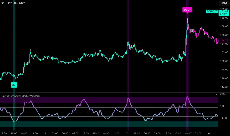
Uptrick: Universal Market ValuationIntroduction
Uptrick: Universal Market Valuation is created for traders who seek an analytical tool that brings together multiple signals in one place. Whether you focus on intraday scalping or long-term portfolio management, the indicator merges various well-known technical indicators to help gauge potential overvaluation, undervaluation, and trend direction. It is engineered to highlight different market dimensions, from immediate price momentum to extended cyclical trends.
Overview
The indicator categorizes market conditions into short-term, long-term, or a classic Z-Score style reading. Additionally, it draws on a unified trend line for directional bias. By fusing elements from traditionally separate indicators, the indicator aims to reduce “false positives” while giving a multidimensional view of price behavior. The indicator works best on cryptocurrency markets while remaining a universal valuation indicator that performs well across all timeframes. However, on lower timeframes, the Long-Term Combo input may be too long-term, so it's recommended to select the Short-Term Combo in the inputs for better adaptability.
Originality and Value
The Uptrick: Universal Market Valuation indicator is not just a simple combination of existing technical indicators—it introduces a multi-layered, adaptive valuation model that enhances signal clarity, reduces false positives, and provides traders with a more refined assessment of market conditions.
Rather than treating each included indicator as an independent signal, this script normalizes and synthesizes multiple indicators into a unified composite score, ensuring that short-term and long-term momentum, mean reversion, and trend strength are all dynamically weighted based on market behavior. It employs a proprietary weighting system that adjusts how each component contributes to the final valuation output. Instead of static threshold-based signals, the indicator integrates adaptive filtering mechanisms that account for volatility fluctuations, drawdowns, and momentum shifts, ensuring more reliable overbought/oversold readings.
Additionally, the script applies Z-Score-based deviation modeling, which refines price valuation by filtering out extreme readings that are statistically insignificant. This enhances the detection of true overvaluation and undervaluation points by comparing price behavior against a dynamically calculated standard deviation threshold rather than relying solely on traditional fixed oscillator bands. The MVRV-inspired ratio provides a unique valuation layer by incorporating historical fair-value estimations, offering deeper insight into market overextension.
The Universal Trend Line within the indicator is designed to smooth trend direction while maintaining responsiveness to market shifts. Unlike conventional trend indicators that may lag significantly or produce excessive false signals, this trend-following mechanism dynamically adjusts to changing price structures, helping traders confirm directional bias with reduced noise. This approach enables clearer trend recognition and assists in distinguishing between short-lived pullbacks and sustained market movements.
By merging momentum oscillators, trend strength indicators, volume-driven metrics, statistical deviation models, and long-term valuation principles into a single framework, this indicator eliminates the need for juggling multiple individual indicators, helping traders achieve a holistic market perspective while maintaining customization flexibility. The combination of real-time alerts, dynamic color-based valuation visualization, and customizable trend-following modes further enhances usability, making it a comprehensive tool for traders across different timeframes and asset classes.
Inputs and Features
• Calculation Window (Short-Term and Long-Term)
Defines how much historical data the indicator uses to evaluate the market. A smaller window makes the indicator more reactive, benefiting high-frequency traders. A larger window provides a steadier perspective for longer-term holders.
• Smoothing Period (Short-Term and Long-Term)
Controls how much the raw indicator outputs are “smoothed out.” Lower values reveal subtle intraday fluctuations, while higher values aim to present more robust, stable signals.
• Valuation Mechanism (Short Term Combo, Long Term Combo, Classic Z-Score)
Allows you to pick how the indicator evaluates overvaluation or undervaluation. Short Term Combo focuses on rapid oscillations, Long Term Combo assesses market health over more extended periods, and the Classic Z-Score approach highlights statistically unusual price levels.
Short-Term
• Determination Mechanism (Strict or Loose)
Governs the tolerance for labeling a market as overvalued or undervalued. Strict requires stronger confirmation; Loose begins labeling sooner, potentially catching moves earlier but risking more false signals.
Strict
Loose
• Select Color Scheme
Lets you choose the aesthetic style for your charts. Visual clarity can significantly improve reaction time, especially when multiple indicators are combined.
• Z-Score Coloring Mode (Heat or Slope)
Determines how the Classic Z-Score line and bars are colored. In Heat mode, the indicator intensifies color as readings move further from a baseline average. Slope mode changes color based on the direction of movement, making turning points more evident.
Classic Z-Score - Heat
Classic Z-Score - Slope
• Trend Following Mode (Short, Long, Extra Long, Filtered Long)
Offers various ways to compute and smooth the universal trend line. Short is more sensitive, Long and Extra Long are meant for extended time horizons, and Filtered Long applies an extra smoothing layer to help you see overarching trends rather than smaller fluctuations.
Short Term
Long Term
Extra Long Term
Filtered Long Term
• Table Display
An optional feature that places a concise summary table on the chart. It shows valuation states, trend direction, volatility condition, and other metrics, letting you observe multi-angle readings at a glance.
• Alerts
Multiple alert triggers can be set up—for crossing into overvaluation zones, for abrupt changes in trend, or for high volatility detection. Traders can stay informed without needing to watch charts continuously.
Why These Indicators Were Merged
• RSI (Relative Strength Index)
RSI is a cornerstone momentum oscillator that interprets speed and change of price movements. It has widespread recognition among traders for detecting potential overbought or oversold conditions. Including RSI provides a tried-and-tested layer of momentum insight.
• Stochastic Oscillator
This oscillator evaluates the closing price relative to its recent price range. Its responsiveness makes it valuable for pinpointing near-term price fluctuations. Where RSI offers a broader momentum picture, Stochastic adds fine-tuned detection of short-lived rallies or pullbacks.
• MFI (Money Flow Index)
MFI assesses buying and selling pressure by incorporating volume data. Many technical tools are purely price-based, but MFI’s volume component helps address questions of liquidity and actual money flow, offering a glimpse of how robust or weak a current move might be.
• CCI (Commodity Channel Index)
CCI shows how far price lies from its statistically “typical” trend. It can spot emerging trends or warn of overextension. Using CCI alongside RSI and Stochastic further refines the valuation layer by capturing price deviation from its underlying trajectory.
• ADX (Average Directional Index)
ADX reveals the strength of a trend but does not specify its direction. This is especially useful in combination with other oscillators that focus on bullish or bearish momentum. ADX can clarify whether a market is truly trending or just moving sideways, lending deeper context to the indicator's broader signals.
• MACD (Moving Average Convergence Divergence)
MACD is known for detecting momentum shifts via the interaction of two moving averages. Its inclusion ensures the indicator can capture transitional phases in market momentum. Where RSI and Stochastic concentrate on shorter-term changes, MACD has a slightly longer horizon for identifying robust directional changes.
• Momentum and ROC (Rate of Change)
Momentum and ROC specifically measure the velocity of price moves. By indicating how quickly (or slowly) price is changing compared to previous bars, they help confirm whether a trend is gathering steam, losing it, or is in a transitional stage.
• MVRV-Inspired Ratio
Drawn loosely from the concept of comparing market value to some underlying historical or fair-value metric, an MVRV-style ratio can help identify if an asset is trading above or below a considered norm. This additional viewpoint on valuation goes beyond simple price-based oscillations.
• Z-Score
Z-Score interprets how many standard deviations current prices deviate from a central mean. This statistical measure is often used to identify extreme conditions—either overly high or abnormally low. Z-Score helps highlight potential mean reversion setups by showing when price strays far from typical levels.
By merging these distinct viewpoints—momentum oscillators, trend strength gauges, volume flow, standard deviation extremes, and fundamental-style valuation measures—the indicator aims to create a well-rounded, carefully balanced final readout. Each component serves a specialized function, and together they can mitigate the weaknesses of a single metric acting alone.
Summary
This indicator simplifies multi-indicator analysis by fusing numerous popular technical signals into one tool. You can switch between short-term and long-term valuation perspectives or adopt a classic Z-Score approach for spotting price extremes. The universal trend line clarifies direction, while user-friendly color schemes, optional tabular summaries, and customizable alerts empower traders to maintain awareness without constantly monitoring every market tick.
Disclaimer
The indicator is made for educational and informational use only, with no claims of guaranteed profitability. Past data patterns, regardless of the indicators used, never ensure future results. Always maintain diligent risk management and consider the broader market context when making trading decisions. This indicator is not personal financial advice, and Uptrick disclaims responsibility for any trading outcomes arising from its use.
US10Y Yield Range Percentile | JeffreyTimmermansUS10Y Yield Range Percentile
The "US10Y Yield Range Percentile" Indicator provides insights into the relative positioning of the U.S. 10-Year Treasury Yield (US10Y) within a specified lookback period. It highlights key valuation style conditions, helping traders assess market sentiment based on yield movements.
Why is the US 10-Year Treasury Yield Important?
The U.S. 10-Year Treasury Yield (US10Y) is one of the most critical benchmarks in global finance. It reflects the cost of borrowing for the U.S. government and serves as a risk-free rate that influences interest rates across the economy.
Macroeconomic Indicator:
Rising yields suggest strong economic growth or inflationary pressures, often leading to tighter monetary policy.
Falling yields indicate economic slowdown, deflationary risks, or increased demand for safe-haven assets.
Impact on Financial Markets:
Stock Market: Higher yields reduce the attractiveness of equities, while lower yields support risk assets.
Credit Markets: A rising 10-year yield increases borrowing costs, impacting corporate debt and mortgage rates.
Global Capital Flows: US10Y is a key driver of capital allocation worldwide, affecting currency valuations and capital flows into emerging markets.
Correlation with Risk Assets (Especially Crypto):
Crypto markets, particularly Bitcoin and Ethereum, have shown a strong inverse correlation with US10Y yields.
When yields rise, risk assets tend to sell off due to tighter financial conditions.
When yields decline, liquidity flows into speculative assets, boosting stocks, crypto, and growth sectors.
Key Functions of the Indicator
Range Calculation:
Computes the highest high and lowest low over a user-defined period (default: 63 days).
Measures the current yield’s position within this range.
Range Percentile Calculation:
Determines the percentile rank of the current yield within its range.
A higher percentile indicates higher yields, often associated with Risk OFF conditions.
A lower percentile suggests lower yields, signaling Risk ON sentiment.
Optional Smoothing:
Enable/Disable: Users can enable Simple Moving Average (SMA) smoothing to reduce noise.
Default smoothing length : 10 periods (can be customized).
Threshold Levels & Background Coloring:
The background color represents the current market regime (valuation based), based on the US10Y yield percentile:
Risk ON (Bullish): When the percentile falls below the lower threshold (default: 20).
Neutrally Positive Zone (also Risk ON): Between 20 and 80 percentile.
Risk OFF (Bearish): When the percentile rises above the upper threshold (default: 80).
Important : Background Coloring is NOT a Leading Signal.
The background color provides a visual representation of valuation periods, but it is not a leading indicator for price movements. Instead, traders should focus on the orange US10Y Range Percentile line, which is the key signal within this indicator. The colors behind the line below the chart are leading. The background colors behind the price chart are more of a valuation style indications.
When the orange line enters the Danger Zone (above 80 percentile), it signals that yields are elevated, and risk assets (such as stocks and crypto) are at increased risk of reversing downward.
While the background coloring helps to visualize market conditions, price reversals tend to occur when the percentile line is in extreme zones rather than when the background color changes.
Traders should monitor the percentile line closely, as it provides a clearer signal of potential shifts in market sentiment.
Visual Elements
Range Percentile Plot:
Displays the smoothed or raw percentile value over time.
Helps identify shifts in yield positioning.
Threshold Markers & Fill Zones:
Key percentile thresholds (0, 20, 80, 100) are marked with horizontal lines.
The area between 20-80 percentile is filled to indicate the neutral zone.
Extreme zones are highlighted to emphasize significant shifts in risk sentiment.
Dynamic Labeling:
A real-time percentile label appears next to the latest data point.
Alerts & Notifications
Risk OFF to Risk ON Transition:
Alert triggers when the percentile falls below the lower threshold (yields decreasing).
Risk ON to Risk OFF Transition:
Alert triggers when the percentile rises above the upper threshold (yields increasing).
Conclusion
The crypto market is highly sensitive to macroeconomic conditions, with Bitcoin often behaving like a high-beta tech stock.
A declining US10Y yield signals looser financial conditions, increasing demand for risk assets like crypto.
A rising US10Y yield tightens liquidity, leading to sell-offs in Bitcoin, Ethereum, and altcoins.
Tracking the US10Y percentile position helps traders anticipate market shifts before they occur.
This indicator serves as a leading signal for understanding market risk appetite by tracking Treasury yield movements. A decline in yields typically favors equities and risk assets, while rising yields indicate a shift toward safety and risk aversion.
Credits
This indicator was inspired by and builds upon the work of TomasOnMarkets . While incorporating significant enhancements, it acknowledges the foundational concepts provided by this original source. Thank you for sharing your input on this important indicator. We are honored to use it and to further improve upon it.
-Jeffrey

Dynamic Weighted Price Flow [QuantAlgo]Experience a brand new way of analyzing price movement with Dynamic Weighted Price Flow , an advanced technical tool that utilizes the uniqueness of weighted price and dynamic momentum analysis to evaluate trends and deliver high-probability signals. Whether you're a long-term investor seeking major trend confirmation or an active trader looking for precise entries and exits, this indicator's sophisticated and innovative approach to price flow analysis offers invaluable market insights you can only find at QuantAlgo !
🟢 Core Architecture
The Dynamic Weighted Price Flow's foundation rests on its innovative weighted price calculation and momentum-based trend scoring system. By implementing a unique price weighting algorithm alongside Hull Moving Average smoothing, each market move is evaluated within a dynamic context while maintaining exceptional responsiveness to price action. This refined approach helps identify genuine trend transitions while filtering out market noise across multiple timeframes and instruments.
🟢 Technical Foundation
Three key components of this indicator are:
Weighted Price Analysis: Utilizes a sophisticated weighting system that prioritizes recent price action
Momentum Range Processing: A comprehensive scoring system that evaluates price momentum across multiple periods
Dynamic Trend State Management: A normalized system that tracks and validates trend transitions
🟢 Practical Usage Tips
Here's how to maximize your use of the Dynamic Weighted Price Flow :
1/ Setup:
Add the indicator to your favorites ⭐️
Start with the default baseline period for balanced analysis
Use the recommended momentum range for optimal signal generation
Keep signal markers enabled for clear trend transitions
Customize accent colors to match your preferences
Enable dynamic price bars for complete visual feedback
2/ Reading Signals:
Monitor for triangle markers indicating trend transitions
Watch the main trend line color for direction confirmation
Observe the gradient fills for trend strength visualization
Use the built-in alert system to catch potential setups
🟢 Pro Tips
Adjust Baseline Period based on your trading style:
→ Lower values (1-5) for more responsive signals
→ Higher values (5-10) for more stable trend identification
Fine-tune Momentum Range based on market conditions:
→ Lower values (20-35) for shorter-term signals
→ Higher values (35-50) for longer-term trend following
Optimize Visual Settings for your strategy:
→ Enable signal markers for clear entry/exit points
→ Use dynamic price bars for enhanced trend visualization
Combine with:
→ Volume indicators for trade confirmation
→ Support/resistance levels for entry refinement
→ Multiple timeframe analysis for strategic context

Normalized Jurik Moving Average [QuantAlgo]Upgrade your investing and trading strategy with the Normalized Jurik Moving Average (JMA) , a sophisticated oscillator that combines adaptive smoothing with statistical normalization to deliver high-quality signals! Whether you're a swing trader looking for momentum shifts or a medium- to long-term investor focusing on trend validation, this indicator's statistical approach offers valuable analytical advantages that can enhance your trading and investing decisions!
🟢 Core Architecture
The foundation of this indicator lies in its unique dual-layer calculation system. The first layer implements the Jurik Moving Average, known for its superior noise reduction and responsiveness, while the second layer applies statistical normalization (Z-Score) to create standardized readings. This sophisticated approach helps identify significant price movements while filtering out market noise across various timeframes and instruments.
🟢 Technical Foundation
Three key components power this indicator are:
Jurik Moving Average (JMA): An advanced moving average calculation that provides superior smoothing with minimal lag
Statistical Normalization: Z-Score based scaling that creates consistent, comparable readings across different market conditions
Dynamic Zone Detection: Automatically identifies overbought and oversold conditions based on statistical deviations
🟢 Key Features & Signals
The Normalized JMA delivers market insights through:
Color-adaptive oscillator line that reflects momentum strength and direction
Statistically significant overbought/oversold zones for trade validation
Smart gradient fills between signal line and zero level for enhanced visualization
Clear long (L) and short (S) markers for validated momentum shifts
Intelligent bar coloring that highlights the current market state
Customizable alert system for both bullish and bearish setups
🟢 Practical Usage Tips
Here's how to maximize your use of the Normalized JMA:
1/ Setup:
Add the indicator to your favorites, then apply it to your chart ⭐️
Begin with the default smoothing period for balanced analysis
Use the default normalization period for optimal signal generation
Start with standard visualization settings
Customize colors to match your chart preferences
Enable both bar coloring and signal markers for complete visual feedback
2/ Reading Signals:
Watch for L/S markers - they indicate validated momentum shifts
Monitor oscillator line color changes for direction confirmation
Use the built-in alert system to stay informed of potential trend changes
🟢 Pro Tips
Adjust Smoothing Period based on your trading style:
→ Lower values (8-12) for more responsive signals
→ Higher values (20-30) for more stable trend identification
Fine-tune Normalization Period based on market conditions:
→ Shorter periods (20-25) for more dynamic markets
→ Longer periods (40-50) for more stable markets
Optimize your analysis by:
→ Using +2/-2 zones for primary trade signals
→ Using +3/-3 zones for extreme market conditions
→ Combining with volume analysis for trade confirmation
→ Using multiple timeframe analysis for strategic context
Combine with:
→ Volume indicators for trade validation
→ Price action for entry timing
→ Support/resistance levels for profit targets
→ Trend-following indicators for directional bias
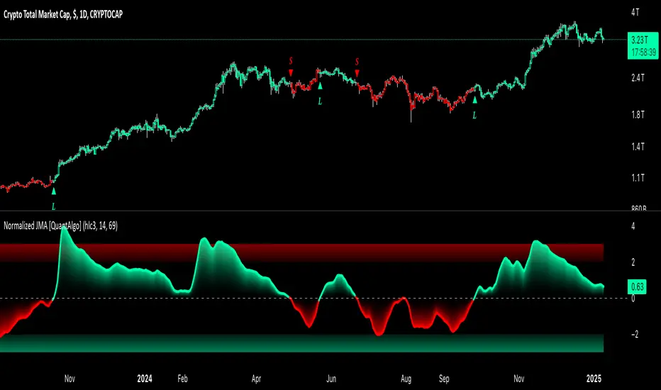
Relative Trend Navigator Pro [QuantAlgo]Upgrade your trend-following investing and trading strategy with Relative Trend Navigator Pro by QuantAlgo , a sophisticated technical indicator that combines adaptive trend recognition with dynamic momentum analysis to deliver high quality market insights. Whether you're a medium- to long-term investor focusing on sustained moves or an active trader seeking high-probability entries, this indicator's multi-layered approach offers valuable strategic advantages that you don't want to miss out on!
🟢 Core Architecture
The foundation of this indicator lies in its innovative Relative Trend Index (RTI) calculation and dynamic state management system. By implementing a unique array-based analysis alongside statistical volatility measures, each price movement is evaluated against its historical context while maintaining responsiveness to current market conditions. This sophisticated approach helps distinguish genuine trend developments from market noise across various timeframes and instruments.
🟢 Technical Foundation
Three key components power this indicator are:
Dynamic Trend Boundaries: Utilizes standard deviation-based channels to establish adaptive price ranges
Array-Based Historical Analysis: A comprehensive dynamic momentum system that processes and sorts historical data for trend context
Relative Trend Index (RTI): A normalized calculation that measures current price position relative to historical boundaries
🟢 Key Features & Signals
The Relative Trend Navigator Pro delivers market insights through:
Color-adaptive RTI line that reflects trend strength and direction
Dynamic threshold levels for bull and bear signal generation
Smart fill coloring between RTI and zero line for enhanced visualization
Clear entry and exit markers for validated trend changes
Intelligent bar coloring that highlights current trend state
Customizable alert system for both bullish and bearish setups
🟢 Practical Usage Tips
Here's how to maximize your use of the Relative Trend Navigator Pro :
1/ Setup:
Add the indicator to your favorites ⭐️
Begin with the default historical lookback for balanced analysis
Use the default sensitivity setting for optimal signal generation
Start with standard threshold levels
Customize visualization colors to match your chart preferences
Enable both bar coloring and signal markers for complete visual feedback
2/ Reading Signals:
Watch for signal markers - they indicate validated trend transitions
Monitor RTI line color changes for trend direction confirmation
Observe the fill color between RTI and zero line for trend strength
Use the built-in alert system to stay informed of potential trend changes
🟢 Pro Tips
Adjust Historical Lookback Period based on your preferred timeframe:
→ Lower values (20-50) for more responsive signals
→ Higher values (100-200) for more stable trend identification
Fine-tune Sensitivity based on market conditions:
→ Higher values (95-100) for choppy markets
→ Lower values (85-95) for trending markets
Optimize Threshold Levels for your strategy:
→ Increase thresholds for stronger trend confirmation
→ Decrease thresholds for earlier entries
Combine with:
→ Volume analysis for trade confirmation
→ Multiple timeframe analysis for strategic context
→ Support/resistance levels for entry/exit refinement
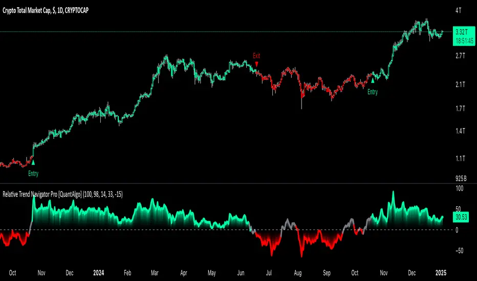
Zero Lag Signals For Loop [QuantAlgo]Elevate your trend-following investing and trading strategy with Zero Lag Signals For Loop by QuantAlgo , a simple yet effective technical indicator that merges advanced zero-lag mechanism with adaptive trend analysis to bring you a fresh take on market momentum tracking. Its aim is to support both medium- to long-term investors monitoring broader market shifts and precision-focused traders seeking quality entries through its dual-focused analysis approach!
🟢 Core Architecture
The foundation of this indicator rests on its zero-lag implementation and dynamic trend assessment. By utilizing a loop-driven scoring system alongside volatility-based filtering, each market movement is evaluated through multiple historical lenses while accounting for current market conditions. This multi-layered approach helps differentiate between genuine trend movements and market noise across timeframe and asset classes.
🟢 Technical Foundation
Three distinct components of this indicator are:
Zero Lag EMA : An enhanced moving average calculation designed to minimize traditional lag effects
For Loop Scoring System : A comprehensive scoring mechanism that weighs current price action against historical contexts
Dynamic Volatility Analysis : A sophisticated ATR-based filter that adjusts signal sensitivity to market conditions
🟢 Key Features & Signals
The Zero Lag Signals For Loop provides market insights through:
Color-coded Zero Lag line that adapts to trend direction
Dynamic fills between price and Zero Lag basis for enhanced visualization
Trend change markers (L/S) that highlight potential reversal points
Smart bar coloring that helps visualize market momentum
Background color changes with vertical lines at significant trend shifts
Customizable alerts for both bullish and bearish reversals
🟢 Practical Usage Tips
Here's how you can get the most out of the Zero Lag Signals For Loop :
1/ Setup:
Add the indicator to your TradingView chart by clicking on the star icon to add it to your favorites ⭐️
Start with the default Zero Lag length for balanced sensitivity
Use the standard volatility multiplier for proper filtering
Keep the default loop range for comprehensive trend analysis
Adjust threshold levels based on your investing and/or trading style
2/ Reading Signals:
Watch for L/S markers - they indicate validated trend reversals
Pay attention to Zero Lag line color changes - they confirm trend direction
Monitor bar colors for additional trend confirmation
Configure alerts for trend changes in both bullish and bearish directions, ensuring you can act on significant technical developments promptly.
🟢 Pro Tips
Fine-tune the Zero Lag length based on your timeframe:
→ Lower values (20-40) for more responsive signals
→ Higher values (60-100) for stronger trend confirmation
Adjust volatility multiplier based on market conditions:
→ Increase multiplier in volatile markets
→ Decrease multiplier in stable trending markets
Combine with:
→ Volume analysis for trade validation
→ Multiple timeframe analysis for broader context
→ Other technical tools for comprehensive analysis
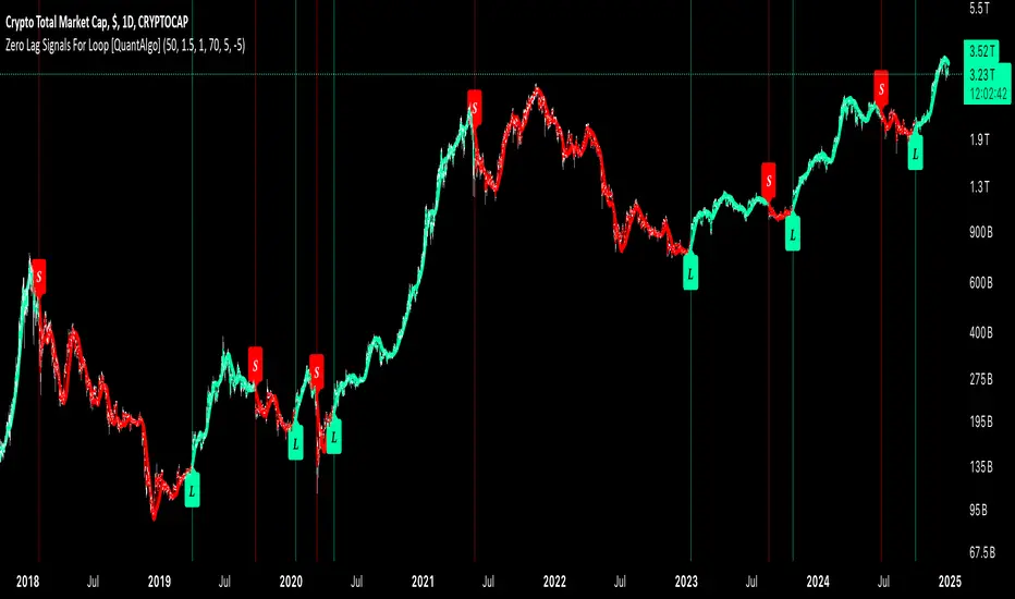
Relative Moving Average (RMA) For Loop [QuantAlgo]Introducing the Relative Moving Averages (RMA) For Loop by QuantAlgo , an innovative technical indicator that combines the smoothness of RMA with an advanced loop-based trend scoring system. Whether you're a day trader looking for high-probability entries or a medium- to long-term investor seeking trend confirmations, this indicator offers a fresh perspective and high-quality signals on market momentum!
💫 Core Architecture
At its heart, the RMA For Loop uses a unique approach to trend detection. Unlike traditional moving average systems that only look at current price relationships, this indicator employs a loop-based scoring mechanism that analyzes historical RMA relationships. Think of it as having multiple trend-confirmation checkpoints - each bar is evaluated against its predecessors to build a comprehensive trend score. This smart scoring system helps filter out market noise while catching meaningful trend reversals.
📊 Technical Foundation
The indicator combines two powerful components:
1/ Relative Moving Average (RMA): A sophisticated moving average that provides smoother price action interpretation than simple or exponential moving averages
2/ For Loop Analysis: A dynamic scoring system that evaluates how current RMA values stack up against historical levels, creating a momentum-based trend score
The magic happens when these components work together:
→ The RMA smooths out price action, reducing false signals
→ The For Loop system analyzes multiple historical points to validate trend strength
→ Crossover confirmations add an extra layer of validation
→ Visual cues provide instant feedback on trend direction and changes
📈 Key Features & Signals
The RMA For Loop provides clear, actionable signals through:
Color-coded RMA line that adapts to trend direction
Dynamic fills between price and RMA for enhanced visualization
Trend change markers (⌽) that pinpoint potential reversal points
Smart bar coloring that helps you "feel" the market's pulse
Customizable alerts for both bullish and bearish reversals
🎯 Practical Usage Tips
Here's how to get the most out of the RMA For Loop:
1/ Initial Setup:
Add the indicator to your TradingView chart by clicking on the star icon to add it to your favorites ⭐️
Start with the default RMA length of 55 for balanced sensitivity
Use the standard loop range (1-70) for comprehensive trend analysis
Adjust threshold levels based on your trading style (higher for fewer but stronger signals)
2/ Reading Signals:
Watch for trend change markers (⌽) - they indicate validated trend reversals
Pay attention to RMA line color changes - they confirm trend direction
Monitor bar colors for additional trend confirmation
Configure alerts for trend changes in both bullish and bearish directions, ensuring you never miss significant technical developments.
⚡️ Pro Tips
Fine-tune the RMA length based on your timeframe:
→ Lower values (20-40) for more responsive signals
→ Higher values (60-100) for stronger trend confirmation
Adjust threshold levels based on market volatility:
→ Increase thresholds in choppy markets
→ Standard settings work well in trending markets
Combine with volume analysis and/or other system(s) for additional confirmation
Use multiple timeframes for a complete market picture

Advanced Trend Navigator Suite [QuantAlgo]Elevate your investing and trading with Advanced Trend Navigator Suite by QuantAlgo! 💫📈
The Advanced Trend Navigator Suite is a versatile technical indicator designed to empower investors and traders across all experience levels with clear, actionable market insights. Built on the proven Hull Moving Average framework and enhanced with proprietary trend scoring technology, this premium tool offers flexible integration with existing strategies while maintaining effectiveness as a standalone system. By combining reduced-lag HMA mechanics with dynamic state management, it provides investors and traders the ability to identify and capitalize on trending opportunities while maintaining robust protection against market noise. Whether your focus is on position trading, swing trading, or long term investing, the Advanced Trend Navigator Suite adapts to various market conditions and asset classes through its customizable parameters and intuitive visual feedback system.
🏛️ Indicator Architecture
The Advanced Trend Navigator Suite provides a sophisticated framework for assessing market trends through a harmonious blend of HMA dynamics and state-based calculations. Unlike traditional moving average systems that use fixed parameters, this indicator incorporates smart trend scoring measurements to automatically adjust its sensitivity to market conditions. The core algorithm employs an optimized HMA system combined with multi-window trend evaluation, creating a self-adjusting mechanism that adapts based on market momentum. This adaptive approach allows the indicator to maintain its effectiveness across different market phases - from ranging to trending conditions. The trend scoring system acts as dynamic confirmation levels, while the gradient fills between HMA and price provide instant visual feedback on trend direction and strength.
📊 Technical Composition and Calculation
The Advanced Trend Navigator Suite is composed of several technical components that create a dynamic trending system:
Hull Moving Average System: Utilizes weighted calculations for primary trend detection
Trend Score Integration: Computes and evaluates momentum across multiple time windows
Dynamic State Management: Creates adaptive boundaries for trend validation
Gradient Visualization: Provides progressive visual feedback on trend strength
📈 Key Indicators and Features
The Advanced Trend Navigator Suite utilizes customizable length parameters for both HMA and trend calculations to adapt to different investing and trading styles. The trend detection component evaluates price action relative to the dynamic state system to validate signals and identify potential reversals.
The indicator incorporates multi-layered visualization with:
Color-coded HMA lines adapting to trend direction
Dynamic gradient fills between HMA and price
State-based candle coloring system
Clear trend reversal signals (▲/▼)
Precise entry/exit point markers
Programmable alerts for trend changes
⚡️ Practical Applications and Examples
✅ Add the Indicator: Add the indicator to your TradingView chart by clicking on the star icon to add it to your favorites ⭐️
👀 Monitor Trends: Watch the HMA line and gradient fills to identify trend direction and strength. The dynamic color transitions and candle coloring provide immediate visual feedback on market conditions.
🎯 Track Signals: Pay attention to the trend reversal markers that appear on the chart:
→ Long signals (▲) appear when price action confirms a bullish trend reversal
→ Short signals (▼) indicate validated bearish trend reversals
🔔 Set Alerts: Configure alerts for trend changes in both bullish and bearish directions, ensuring you never miss significant technical developments.
🌟 Summary and Tips
The Advanced Trend Navigator Suite by QuantAlgo is a sophisticated technical tool designed to support trend-following strategies across different market environments and asset classes. By combining HMA analysis with dynamic trend scoring, it helps traders and investors identify significant trend changes while filtering out market noise, providing validated signals. The tool's adaptability through customizable HMA lengths, trend scoring, and threshold settings makes it suitable for various trading/investing timeframes and styles, allowing users to capture trending opportunities while maintaining protection against false signals.
Key parameters to optimize for your investing and/or trading style:
HMA Length: Adjust for more or less sensitivity to trend changes
Analysis Period: Fine-tune trend calculations for signal stability
Window Range: Balance between quick signals and stability
Threshold Values: Customize trend validation levels
Visual Settings: Customize appearance with color and display options
The Advanced Trend Navigator Suite by QuantAlgo is particularly effective for:
Identifying sustained market trends
Detecting trend reversals with confirmation
Measuring trend strength and duration
Filtering out market noise and false signals
Remember to:
Allow the indicator to validate trend changes before taking action
Combine with volume and other form of analysis and/or system for additional confirmation
Consider multiple timeframes for a complete market view
Adjust thresholds based on market volatility conditions

Adaptive Trend Flow [QuantAlgo]Adaptive Trend Flow 📈🌊
The Adaptive Trend Flow by QuantAlgo is a sophisticated technical indicator that harnesses the power of volatility-adjusted EMAs to navigate market trends with precision. By seamlessly integrating a dynamic dual-EMA system with adaptive volatility bands, this premium tool enables traders and investors to identify and capitalize on sustained market moves while effectively filtering out noise. The indicator's unique approach to trend detection combines classical technical analysis with modern adaptive techniques, providing traders and investors with clear, actionable signals across various market conditions and asset class.
💫 Indicator Architecture
The Adaptive Trend Flow provides a sophisticated framework for assessing market trends through a harmonious blend of EMA dynamics and volatility-based boundary calculations. Unlike traditional moving average systems that use fixed parameters, this indicator incorporates smart volatility measurements to automatically adjust its sensitivity to market conditions. The core algorithm employs a dual EMA system combined with standard deviation-based volatility bands, creating a self-adjusting mechanism that expands and contracts based on market volatility. This adaptive approach allows the indicator to maintain its effectiveness across different market phases - from ranging to trending conditions. The volatility-adjusted bands act as dynamic support and resistance levels, while the gradient visualization system provides instant visual feedback on trend strength and duration.
📊 Technical Composition and Calculation
The Adaptive Trend Flow is composed of several technical components that create a dynamic trending system:
Dual EMA System: Utilizes fast and slow EMAs for primary trend detection
Volatility Integration: Computes and smooths volatility for adaptive band calculation
Dynamic Band Generation: Creates volatility-adjusted boundaries for trend validation
Gradient Visualization: Provides progressive visual feedback on trend strength
📈 Key Indicators and Features
The Adaptive Trend Flow utilizes customizable length parameters for both EMAs and volatility calculations to adapt to different trading styles. The trend detection component evaluates price action relative to the dynamic bands to validate signals and identify potential reversals.
The indicator incorporates multi-layered visualization with:
Color-coded basis and trend lines (bullish/bearish)
Adaptive volatility-based bands
Progressive gradient background for trend duration
Clear trend reversal signals (𝑳/𝑺)
Smooth fills between key levels
Programmable alerts for trend changes
⚡️ Practical Applications and Examples
✅ Add the Indicator: Add the indicator to your TradingView chart by clicking on the star icon to add it to your favorites ⭐️
👀 Monitor Trends: Watch the basis line and trend band interactions to identify trend direction and strength. The gradient background intensity indicates trend duration and conviction.
🎯 Track Signals: Pay attention to the trend reversal markers that appear on the chart:
→ Long signals (𝑳) appear when price action confirms a bullish trend reversal
→ Short signals (𝑺) indicate validated bearish trend reversals
🔔 Set Alerts: Configure alerts for trend changes in both bullish and bearish directions, ensuring you never miss significant technical developments.
🌟 Summary and Tips
The Adaptive Trend Flow by QuantAlgo is a sophisticated technical tool designed to support trend-following strategies across different market environments and asset class. By combining dual EMA analysis with volatility-adjusted bands, it helps traders and investors identify significant trend changes while filtering out market noise, providing validated signals. The tool's adaptability through customizable EMA lengths, volatility smoothing, and sensitivity settings makes it suitable for various trading timeframes and styles, allowing users to capture trending opportunities while maintaining protection against false signals.
Key parameters to optimize for your trading and/or investing style:
Main Length: Adjust for more or less sensitivity to trend changes (default: 10)
Smoothing Length: Fine-tune volatility calculations for signal stability (default: 14)
Sensitivity: Balance band width for trend validation (default: 2.0)
Visual Settings: Customize appearance with color and display options
The Adaptive Trend Flow is particularly effective for:
Identifying sustained market trends
Detecting trend reversals with confirmation
Measuring trend strength and duration
Filtering out market noise and false signals
Remember to:
Allow the indicator to validate trend changes before taking action
Use the gradient background to gauge trend strength
Combine with volume analysis for additional confirmation
Consider multiple timeframes for a complete market view
Adjust sensitivity based on market volatility conditions
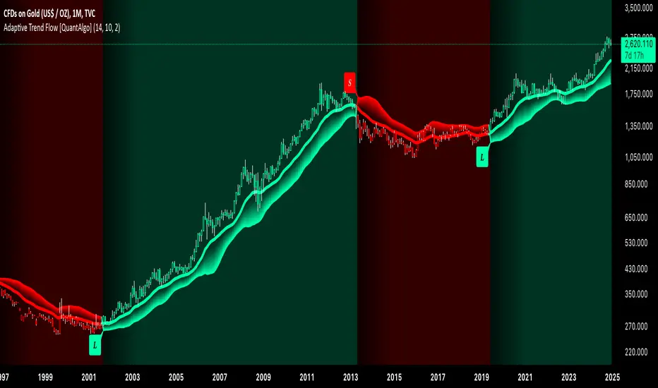
Quantum RSI Signals Suite [QuantAlgo]Introducing Quantum RSI Signals Suite 🎯💫
The Quantum RSI Signals Suite by QuantAlgo is a sophisticated technical indicator that combines statistical z-score analysis with enhanced trend following to identify market trends and reversals. This premium system integrates normalized RSI readings with multi-timeframe statistical measurements to help traders and investors identify trend direction and potential reversals. By evaluating both RSI dynamics and directional trend analysis together, this tool enables users to make data-driven trading decisions with statistical validation.
🌊 Indicator Architecture
The Quantum RSI Signals Suite provides a unique framework for assessing market trends through a blend of normalized RSI and dynamic trend-weighted z-score calculations. Unlike traditional RSI indicators that use fixed overbought/oversold levels, this system incorporates statistical measurements and directional trend analysis to adjust sensitivity automatically. By combining normalized RSI values with adaptive z-score zones and trend following analysis, it evaluates both current market conditions and historical context, while the statistical parameters ensure stable yet responsive signals. This quantum approach allows users to identify trending conditions while remaining aware of statistical extremes, enhancing both trend-following and mean-reversion strategies.
📊 Technical Composition and Calculation
The Quantum RSI Signals Suite is composed of several technical components that create a dynamic trending system:
RSI Normalization: Utilizes scaled RSI values (-1 to 1) for balanced momentum representation
Z-Score Analysis: Computes statistical significance of RSI movements to determine dynamic zones
Trend Following Analysis: Analyzes historical z-score movements to identify persistent trends
Signal Amplification: Combines z-score with trend analysis for enhanced signal generation
📈 Key Indicators and Features
The Quantum RSI Signals Suite utilizes normalized RSI with customizable length and z-score parameters to adapt to different trading styles. Advanced calculations are applied to determine statistical significance levels, providing context-aware boundaries for trend identification. The trend following component evaluates historical z-score movements to validate signals and identify potential reversals.
The indicator incorporates multi-layered visualization with:
Color-coded histogram and trend representation (bullish/bearish)
Combined statistical and trend-based signals
Dynamic trend-weighted scoring system
Mean reversion signals with distinct markers (⤻/↷)
Gradient fills for better visual clarity
Programmable alerts for trend changes
⚡️ Practical Applications and Examples
✅ Add the Indicator: Add the indicator to your TradingView chart by clicking on the star icon to add it to your favorites ⭐️
👀 Monitor Signals: Watch the final score's position relative to the zero line to identify trend direction and potential reversals. The combined histogram and line visualization makes trend changes clearly visible.
🎯 Track Signals: Pay attention to the mean reversion markers that appear above and below the price chart:
→ Upward triangles (⤻) signal potential bullish reversals when final score crosses above zero
→ X crosses (↷) indicate potential bearish reversals when final score crosses below zero
🔔 Set Alerts: Configure alerts for trend changes in both bullish and bearish directions, ensuring you can act on significant technical developments promptly.
🌟 Summary and Tips
The Quantum RSI Signals Suite by QuantAlgo is a sophisticated technical tool, designed to support both trend following and mean reversion strategies across different market environments. By combining normalized RSI analysis with statistical z-score measurements and trend following analysis, it helps traders and investors identify significant trend changes while measuring statistical extremes, providing validated signals. The tool's adaptability through customizable RSI length, z-score parameters, and trend analysis settings makes it suitable for various trading timeframes and styles, allowing users to capture opportunities while maintaining awareness of statistical market conditions.
Key parameters to optimize for your trading or investing style:
RSI Length: Adjust for more or less sensitivity to price changes (default: 14)
Z-Score Length: Fine-tune the statistical window for signal stability (default: 20)
Trend Analysis Range: Balance historical context with current market conditions
Source Data: Customize price input for specialized strategies

DCA Fundamentals 1.0DCA Fundamentals 1.0
Description:
DCA Fundamentals 1.0 is an invite-only indicator designed to help traders and investors make informed decisions by analyzing key fundamental metrics of a company. It aggregates essential financial data—such as book value, earnings per share, total equity, total debt, net income, and total revenue—to provide a comprehensive overview of the stock’s intrinsic value and risk profile. By examining factors like the debt-to-equity ratio and dynamically computing Buffet’s Limit, this tool assists in identifying whether a stock may be undervalued, fairly valued, or overvalued.
Key Features:
Intrinsic Value Calculation: Estimates a stock’s intrinsic worth using a weighted combination of book value per share and EPS.
Buffet’s Limit & Margin of Safety: Adjusts intrinsic value based on the company’s debt-to-equity ratio, providing a margin of safety percentage to gauge potential investment risk.
Debt Warning: Highlights when the debt-to-equity ratio exceeds 2, signaling possible financial instability.
Data Visualization: Displays equity, debt, net income, and revenue as area plots or histograms, helping users quickly assess financial health.
Investment Status: Classifies the stock as undervalued, fairly valued, or overvalued based on current price relative to intrinsic value and Buffet’s Limit.
Dividend-to-ROE Ratio: Offers insight into dividend payout sustainability relative to the company’s return on equity.
Instructions
Fallback Data Handling:
If any financial data is unavailable, fallback values are automatically used to ensure that key calculations remain meaningful and uninterrupted.
Intrinsics & Risk Assessment:
Intrinsic Value: Computed using book value and EPS to understand the stock’s core worth.
Buffet’s Limit: Adjusted from the intrinsic value based on the debt-to-equity ratio. The resulting margin of safety helps gauge the current price’s risk level.
Debt Warning:
Debt-to-Equity Ratio > 2: Triggers a red warning, advising caution due to potentially excessive debt.
Visual Indicators:
Intrinsically Undervalued (Green Area): When price is below intrinsic value, a green shaded area suggests the stock may be undervalued, potentially presenting a buying opportunity.
Debt vs. Equity (Area Plots):
Red Area: Represents debt. A larger red area signals relatively high debt levels.
Green Area: Represents equity. A larger green area suggests stronger financial health.
Revenue & Net Income (Histograms):
Green Bars: Positive or improving fundamentals.
Red Bars: Negative or declining performance.
Investment Status:
Undervalued (Green): Price below intrinsic value.
Fairly Valued (Yellow): Price between intrinsic value and Buffet’s Limit.
Overvalued (Red): Price above intrinsic value, implying increased downside risk.
Table Display:
A convenient table summarizes key metrics at a glance, including P/E ratio, Debt-to-Equity ratio, intrinsic value, margin of safety, net income, total revenue, and the Dividend-to-ROE Ratio.
Dividend-to-ROE Ratio:
This metric provides additional context on the company’s dividend policy relative to its return on equity, aiding in evaluating dividend sustainability.
Disclaimer
Important Disclaimer:
The DCA Fundamentals 1.0 indicator is provided solely for educational and informational purposes. It is not investment advice, a recommendation, or an endorsement of any security or strategy. All calculations are based on data provided by third parties, and their accuracy or completeness is not guaranteed.
Investing and trading involve significant risks. You may lose more than your initial investment. Historical performance or indicators cannot guarantee future results. Before making any investment decisions, you should conduct thorough research, consider consulting a qualified financial professional, and implement robust risk management strategies.
By using DCA Fundamentals 1.0, you acknowledge these risks and agree that neither the creator nor any affiliated parties are responsible for any losses incurred. Use this tool at your own discretion and risk.

EMA Volatility Channel [QuantAlgo]EMA Volatility Channel 🌊📈
The EMA Volatility Channel by QuantAlgo is an advanced technical indicator designed to capture price volatility and trend dynamics through adaptive channels based on exponential moving averages. This sophisticated system combines EMA-based trend analysis with dynamic volatility-adjusted bands to help traders and investors identify trend direction, potential reversals, and market volatility conditions. By evaluating both price momentum and volatility together, this tool enables users to make informed trading decisions while adapting to changing market conditions.
💫 Dynamic Channel Architecture
The EMA Volatility Channel provides a unique framework for assessing market trends through a blend of exponential moving averages and volatility-based channel calculations. Unlike traditional channel indicators that use fixed-width bands, this system incorporates dynamic volatility measurements to adjust channel width automatically, helping users determine whether price movements are significant relative to current market conditions. By combining smooth EMA trends with adaptive volatility bands, it evaluates both directional movement and market volatility, while the smoothing parameters ensure stable yet responsive channel adjustments. This adaptive approach allows users to identify trending conditions while remaining aware of volatility expansions and contractions, enhancing both trend-following and reversal strategies.
📊 Indicator Components & Mechanics
The EMA Volatility Channel is composed of several technical components that create a dynamic channel system:
EMA Midline: Calculates a smoothed exponential moving average that serves as the channel's centerline, providing a clear reference for trend direction.
Volatility Measurement: Computes average price movement to determine dynamic channel width, adapting to changing market conditions automatically.
Smooth Band Calculation: Applies additional smoothing to the channel bands, reducing noise while maintaining responsiveness to significant price movements.
📈 Key Indicators and Features
The EMA Volatility Channel combines various technical tools to deliver a comprehensive analysis of market conditions.
The indicator utilizes exponential moving averages with customizable length and smoothing parameters to adapt to different trading styles. Volatility calculations are applied to determine channel width, providing context-aware boundaries for price movement. The trend detection component evaluates price action relative to the channel bands, helping validate trends and identify potential reversals.
The indicator incorporates multi-layered visualization with color-coded channels and bars to signal both trend direction and market position. These adaptive visual cues, combined with programmable alerts for channel breakouts, help traders and investors track both trend changes and volatility conditions, supporting both trend-following and mean-reversion strategies.
⚡️ Practical Applications and Examples
✅ Add the Indicator: Add the indicator to your TradingView chart by clicking on the star icon to add it to your favorites ⭐️
👀 Monitor Channel Position: Watch the price position relative to the channel bands to identify trend direction and potential reversals. When price moves outside the channel, consider potential trend changes or extreme conditions.
🔔 Set Alerts: Configure alerts for channel breakouts and trend changes, ensuring you can act on significant technical developments promptly.
🌟 Summary and Tips
The EMA Volatility Channel by QuantAlgo is a versatile technical tool, designed to support both trend following and volatility analysis across different market environments. By combining smooth EMA trends with dynamic volatility-based channels, it helps traders and investors identify significant price movements while measuring market volatility, providing reliable technical signals. The tool's adaptability across timeframes makes it suitable for both trend-following and reversal strategies, allowing users to capture opportunities while maintaining awareness of changing market conditions.