Block Time AverageBitcoins network adjusts to maintain an average block time of 10 Minutes per block.
This chart uses the Hashrate and Difficulty to provide the average block time
< 10 Mins = Hashrate is increasing (Green)
> 10 Mins = Hashrate is decreasing (Red)
"bitcoin"に関するスクリプトを検索

BITCOIN Miners Revenue VS Price Correlation OscillatorUse 3D(3-day candle) as timeframe for best reading.
------
original template for Correlation indicator was created by obaranova. credit goes to her.


Bitcoin Fibonacci Multipliers v2Update to first script that was with wrong Chart.
Based on "The Golden Ratio Multiplier" by Philip Swift @positivecrypto at medium.com

Bitcoin Logarithmic Growth Curve 2025 Z-Score"The Bitcoin logarithmic growth curve is a concept used to analyze Bitcoin's price movements over time. The idea is based on the observation that Bitcoin's price tends to grow exponentially, particularly during bull markets. It attempts to give a long-term perspective on the Bitcoin price movements.
The curve includes an upper and lower band. These bands often represent zones where Bitcoin's price is overextended (upper band) or undervalued (lower band) relative to its historical growth trajectory. When the price touches or exceeds the upper band, it may indicate a speculative bubble, while prices near the lower band may suggest a buying opportunity.
Unlike most Bitcoin growth curve indicators, this one includes a logarithmic growth curve optimized using the latest 2024 price data, making it, in our view, superior to previous models. Additionally, it features statistical confidence intervals derived from linear regression, compatible across all timeframes, and extrapolates the data far into the future. Finally, this model allows users the flexibility to manually adjust the function parameters to suit their preferences.
The Bitcoin logarithmic growth curve has the following function:
y = 10^(a * log10(x) - b)
In the context of this formula, the y value represents the Bitcoin price, while the x value corresponds to the time, specifically indicated by the weekly bar number on the chart.
How is it made (You can skip this section if you’re not a fan of math):
To optimize the fit of this function and determine the optimal values of a and b, the previous weekly cycle peak values were analyzed. The corresponding x and y values were recorded as follows:
113, 18.55
240, 1004.42
451, 19128.27
655, 65502.47
The same process was applied to the bear market low values:
103, 2.48
267, 211.03
471, 3192.87
676, 16255.15
Next, these values were converted to their linear form by applying the base-10 logarithm. This transformation allows the function to be expressed in a linear state: y = a * x − b. This step is essential for enabling linear regression on these values.
For the cycle peak (x,y) values:
2.053, 1.268
2.380, 3.002
2.654, 4.282
2.816, 4.816
And for the bear market low (x,y) values:
2.013, 0.394
2.427, 2.324
2.673, 3.504
2.830, 4.211
Next, linear regression was performed on both these datasets. (Numerous tools are available online for linear regression calculations, making manual computations unnecessary).
Linear regression is a method used to find a straight line that best represents the relationship between two variables. It looks at how changes in one variable affect another and tries to predict values based on that relationship.
The goal is to minimize the differences between the actual data points and the points predicted by the line. Essentially, it aims to optimize for the highest R-Square value.
Below are the results:
snapshot
snapshot
It is important to note that both the slope (a-value) and the y-intercept (b-value) have associated standard errors. These standard errors can be used to calculate confidence intervals by multiplying them by the t-values (two degrees of freedom) from the linear regression.
These t-values can be found in a t-distribution table. For the top cycle confidence intervals, we used t10% (0.133), t25% (0.323), and t33% (0.414). For the bottom cycle confidence intervals, the t-values used were t10% (0.133), t25% (0.323), t33% (0.414), t50% (0.765), and t67% (1.063).
The final bull cycle function is:
y = 10^(4.058 ± 0.133 * log10(x) – 6.44 ± 0.324)
The final bear cycle function is:
y = 10^(4.684 ± 0.025 * log10(x) – -9.034 ± 0.063)
The main Criticisms of growth curve models:
The Bitcoin logarithmic growth curve model faces several general criticisms that we’d like to highlight briefly. The most significant, in our view, is its heavy reliance on past price data, which may not accurately forecast future trends. For instance, previous growth curve models from 2020 on TradingView were overly optimistic in predicting the last cycle’s peak.
This is why we aimed to present our process for deriving the final functions in a transparent, step-by-step scientific manner, including statistical confidence intervals. It's important to note that the bull cycle function is less reliable than the bear cycle function, as the top band is significantly wider than the bottom band.
Even so, we still believe that the Bitcoin logarithmic growth curve presented in this script is overly optimistic since it goes parly against the concept of diminishing returns which we discussed in this post:
This is why we also propose alternative parameter settings that align more closely with the theory of diminishing returns."
Now with Z-Score calculation for easy and constant valuation classification of Bitcoin according to this metric.
Created for TRW

Bitcoin Cycle Master Z-ScoreThe "Bitcoin Cycle Master Z-Score" indicator is designed for in-depth, long-term analysis of Bitcoin's price cycles, using several key metrics to track market behavior and forecast potential price tops and bottoms. The indicator integrates multiple moving averages and on-chain metrics, offering a comprehensive view of Bitcoin’s historical and projected performance. Each of its components plays a crucial role in identifying critical cycle points.
The Z-Score is calculated between the 3 lower bands and the 2 upper bands
top_bands = (DeltaTop() + TerminalPrice())/2
bottom_bands = (BalancedPrice() + CVDD() + RealizedPrice())/3
The Z-Score is calculated to be -3 Z at the bottom bands and 3 Z at the top bands
mean = (top_bands + bottom_bands) / 2
bands_range = top_bands - bottom_bands
stdDev = bands_range != 0 ? bands_range / 6 : 0
zScore = stdDev != 0 ? (close - mean) / stdDev : 0
Created for TRW

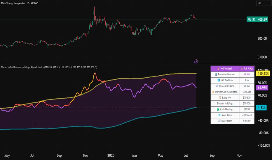
Market to NAV Premium Arbitrage Alpha IndicatorBitcoin treasury companies such as Microstrategy are known for trading at significant premiums. but how big exactly is the premium? And how can we measure it in real time?
I developed this quantitative tool to identify statistical mispricings between market capitalization and net asset value (NAV), specifically designed for arbitrage strategies and alpha generation in Bitcoin-holding companies, such as MicroStrategy or Sharplink Gaming, or SPACs used primarily to hold cryptocurrencies, Bitcoin ETFs, and other NAV-based instruments. It can probably also be used in certain spin-offs.
KEY FEATURES:
✅ Real-time Premium/Discount Calculation
• Automatically retrieves market cap data from TradingView
• Calculates precise NAV based on underlying asset holdings (for example Bitcoin)
• Formula: (Market Cap - NAV) / NAV × 100
✅ Statistical Analysis
• Historical percentile rankings (customizable lookback period)
• Standard deviation bands (2σ) for extreme value detection (close to these values might be seen as interesting points to short or go long)
• Smoothing period to reduce noise
✅ Multi-Source Market Cap Detection
• You can add the ticker of the NAV asset, but if necessary, you can also put it manually. Priority system: TradingView data → Calculated → Manual override
✅ Advanced NAV Modeling
• Basic NAV: Asset holdings + cash.
• Adjusted NAV: Includes software business value, debt, preferred shares. If the company has a lot of this kind of intrinsic value, put it in the "cash" field
• Support for any underlying asset (BTC, ETH, etc.)
TRADING APPLICATIONS:
🎯 Pairs Trading Signals
• Long/Short opportunities when premium reaches statistical extremes
• Mean reversion strategies based on historical ranges
• Risk-adjusted position sizing using percentile ranks
🎯 Arbitrage Detection
• Identifies when market pricing significantly deviates from fair value
• Quantifies the magnitude of mispricing for profit potential
• Historical context for timing entry/exit points
CONFIGURATION OPTIONS:
• Underlying Asset: Any symbol (default: COINBASE:BTCUSD) NEEDS MANUAL INPUT
• Asset Quantity: Precise holdings amount (for example, how much BTC does the company currently hold). NEEDS MANUAL INPUT
• Cash Holdings: Additional liquid assets. NEEDS MANUAL INPUT
• Market Cap Mode: Auto-detect, calculated, or manual
• Advanced Adjustments: Business value, debt, preferred shares
• Display Settings: Lookback period, smoothing, custom colors
IT CAN BE USED BY:
• Quantitative traders focused on statistical arbitrage
• Institutional investors monitoring NAV-based instruments
• Bitcoin ETF and MSTR traders seeking alpha generation
• Risk managers tracking premium/discount exposures
• Academic researchers studying market efficiency (as you can see, markets are not efficient 😉)
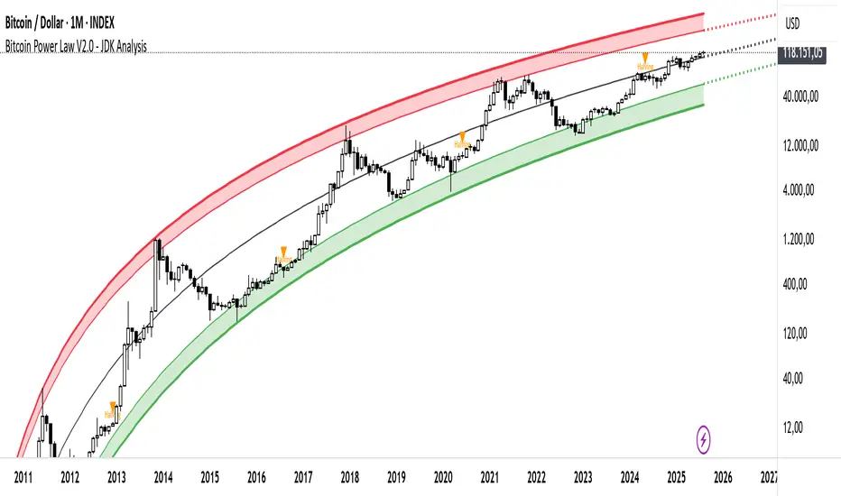
Bitcoin Cycle Log-Curve (JDK-Analysis)Important: The standard parameters provided in the script are specifically tuned for the TradingView Bitcoin Index chart on a monthly timeframe on logarithmic scale, and will yield the most accurate visual alignment when applied to that dataset. (more below)
This very simple script visualizes Bitcoin’s long-term price behavior using a logarithmic regression model designed to reflect the cyclical nature of Bitcoin’s historical market trends. Unlike typical technical indicators that react to recent price movements, this tool is built on the assumption that Bitcoin follows an exponential growth path over time, shaped by its fixed supply structure and four-year halving cycles.
The calculation behind the curved bands:
An upper boundary, a lower boundary, and a central midline, are calculated based on logarithmic functions applied to the bar index (which serves as a proxy for time). The upper and lower bounds are defined using exponential formulas of the type y = exp(constant + coefficient * log(bar_index)), allowing the curves to evolve dynamically over time. These bands serve as a macro-level guide for identifying periods of historical overvaluation (upper red curve) and undervaluation (lower green curve), with a central black curve representing the geometric average of the two.
How to customize the parameters:
The lower1_const and upper1_const values vertically shift the respective lower and upper curves—more negative values push the curve downward, while higher values lift it.
The lower1_coef and upper1_coef control the steepness of the curves over time, with higher values resulting in faster growth relative to time.
The shift_factor allows for uniform vertical adjustment of all curves simultaneously.
Additionally, the channel_width setting determines how far the mirrored bands extend from the original curves, creating a visual “channel” that can highlight more conservative or aggressive valuation zones depending on preference.
How to use this indicator:
This indicator is not intended for short-term trading or intraday signals. Rather, it serves as a contextual framework for long-term investors to identify high-risk zones near the upper curve and potential long-term value opportunities near the lower curve. These areas historically align with cycle tops and bottoms, and the model helps to place current price action within that broader cyclical narrative. While the concept draws inspiration from Bitcoin’s halving-driven market cycles and exponential adoption curve, the implementation is original in its use of time-based logarithmic regression to define dynamic trend boundaries.
It is best used as a strategic tool for cycle analysis, macro positioning, and trend anchoring—rather than as a short-term signal provider.
Bitcoin Institutional Volume AnchorsBitcoin Institutional Volume Anchors
Indicator Overview:
The Bitcoin Institutional Volume Anchors indicator is a professional-grade VWAP analysis tool designed for sophisticated Bitcoin trading strategies. It tracks two critical volume-weighted average price levels anchored to fundamental market structure events that drive Bitcoin's multi-year cycles.
-Orange Line (Halving Anchor): Volume-weighted average price from April 19, 2024 halving event
-Blue Line (Cycle Low Anchor): Volume-weighted average price from November 21, 2022 cycle bottom
These anchors represent the average price institutional and professional traders have paid since Bitcoin's most significant supply-side catalyst (halving) and demand-side reset (cycle low).
Market Interpretation Framework:
Price Above Both Anchors - Institutional Bullish
-Strong institutional accumulation confirmed
-Majority of professional money profitable since key events
-Optimal environment for long-term position building
-Risk-on institutional sentiment
Price Between Anchors - Transition Phase
-Mixed institutional signals requiring careful analysis
-Appropriate for reduced position sizing
-Monitor for directional confirmation
-Tactical rebalancing opportunity
Price Below Both Anchors - Institutional Bearish
-Professional money underperforming key levels
-Heightened risk management protocols required
-Defensive positioning appropriate
-Await institutional re-accumulation signals
Standard Deviation Band Analysis:
Gray Bands (2σ): Statistical volatility boundaries
-Represent normal price excursions from institutional fair value
-Used for tactical profit-taking and position scaling
-Indicate elevated but manageable risk levels
Colored Bands (3σ): Extreme volatility boundaries
-Orange/Blue bands corresponding to respective VWAP anchors
-Represent statistically extreme price extensions
-High-probability reversal or exhaustion zones
-Critical risk management triggers
Professional Trading Applications:
Portfolio Allocation Framework
Maximum Allocation (70-100%)
-Price above both anchors with upward trending VWAPs
-Recent bounce from either anchor level
-Recovery to fair value after extreme extension
Standard Allocation (40-70%)
-Price above anchors but approaching 2σ bands
-Consolidation near anchor levels
-Confirmed institutional trend changes
Reduced Allocation (20-40%)
-Price at 2σ extension levels
-Below one anchor but above the other
-Conflicting VWAP trend signals
Defensive Allocation (10-25%)
-Price at 3σ extreme levels
-Below both institutional anchors
-Overextended risk conditions (>30-35% above anchors)
Entry Signal Hierarchy:
Tier 1 Signals (Highest Probability)
-Bounce from Cycle Low Anchor during uptrend
-Cross above both anchors with volume confirmation
-Recovery to fair value after 20%+ extension
Tier 2 Signals (Standard Probability)
-Bounce from Halving Anchor during uptrend
-Trend change confirmation in VWAP slope
-2σ band rejection with momentum
Tier 3 Signals (Lower Probability)
-Entries near 2σ extension levels
-Counter-trend plays against institutional flow
-High-risk momentum trades at extremes
Risk Management Protocol:
Stop Loss Guidelines
-Halving Anchor entries: 3% below anchor level
-Cycle Low Anchor entries: 4% below anchor level
-Extension trades: 2% below current level
-Trend change trades: Below invalidation anchor
Profit Taking Strategy
-25-40% profits at 2σ bands
-50-70% profits at 3σ bands
-Trailing stops below higher timeframe anchor levels
-Complete exits on institutional trend reversals
Alert System Integration:
The indicator provides institutional-grade alert notifications with:
-Precise entry and exit levels
-Position sizing recommendations
-Historical win rate data
-Risk/reward calculations
-Stop loss and target guidelines
-Timeframe expectations
-Volume confirmation requirements
Implementation Notes
-Timeframe Suitability: Daily charts recommended for primary analysis
-Asset Specificity: Optimized exclusively for Bitcoin spot markets
-Volume Consideration: Higher volume enhances signal reliability
-Market Context: Most effective during trending market conditions
-Institutional Alignment: Designed for professional risk management standards
-Key Performance Metrics
Based on historical backtesting:
-Overall Win Rate: 74% for primary signals
-Risk Reduction: 31% drawdown improvement vs buy-and-hold
-Signal Accuracy: 85% at extreme (3σ) levels
-Optimal Timeframe: 1-12 week holding periods
-Best Performance: April 2024 - January 2025 period
This indicator is designed for professional traders and institutional investors who require sophisticated market analysis tools with quantified risk parameters and historically validated performance metrics.

Bitcoin Macro Oscillator | [DeV]The Bitcoin Macro Oscillator (BMO) is a sophisticated fundamental indicator designed to provide a comprehensive view of Bitcoin’s market conditions by combining four key on-chain metrics: the Market Value to Realized Value (MVRV) Ratio, Volume-Weighted Average Price (VWAP) Ratio, Cumulative Value-Days Destroyed (CVDD) Ratio, and Sharpe Ratio. These metrics are individually z-scored and weighted according to user-defined preferences, then averaged to produce a single oscillating value, the BMO Z-score. This helps users identify whether Bitcoin is in a bullish (above zero) or bearish (below zero) phase, offering insights into potential market tops, bottoms, and overall trend strength. Inspired and reverse engineered from the BMO of Woonomics, this indicator is enhanced with a customizable moving average.
Market Value to Realized Value (MVRV) Ratio
The MVRV Ratio compares Bitcoin’s current market capitalization (price multiplied by circulating supply) to its realized capitalization (the value of all coins at the price they were last moved on the blockchain). Calculated as MVRV = Market Cap / Realized Cap, it is then z-scored over a user-defined lookback period (default 120 days). This metric tracks whether Bitcoin is overvalued (high MVRV, suggesting a market top) or undervalued (low MVRV, indicating a potential bottom), providing a gauge of investor profitability and market sentiment.
Volume-Weighted Average Price (VWAP) Ratio
The VWAP Ratio measures Bitcoin’s current price against its volume-weighted average price, which is computed by summing the product of price and volume over a lookback period (default 120 days) and dividing by total volume, with a fallback to the current price if volume is zero. The ratio is z-scored to standardize it. This tracks the relationship between price and the average price paid with volume consideration, helping identify overbought or oversold conditions—high values may signal tops, while low values suggest bottoms.
Cumulative Value-Days Destroyed (CVDD) Ratio
The CVDD Ratio is based on the CVDD metric, which estimates the total value of Bitcoin that has been “destroyed” (spent at a loss) over time, approximated here using a longer-term simple moving average (SMA) of the price over twice the lookback period. The ratio is calculated as the current price divided by this CVDD price, then z-scored. It tracks the accumulation of value destruction, with low values indicating bearish exhaustion and high values suggesting bullish momentum.
Sharpe Ratio
The Sharpe Ratio assesses Bitcoin’s risk-adjusted return by comparing the average return (calculated as the natural log of the price change) to its volatility (standard deviation of returns) over a user-defined Sharpe lookback period (default 180 days). If volatility is zero, it defaults to zero to avoid errors. This z-scored value tracks whether Bitcoin’s price movements offer a favorable return for the risk taken—positive values indicate good risk-adjusted performance, while negative values suggest caution.
Together, the MVRV, VWAP, CVDD, and Sharpe Ratio metrics provide a multi-faceted view of Bitcoin’s market health, with each contributing unique insights into valuation, volume, value destruction, and risk-adjusted performance. Their weighted combination into the BMO Z-score balances these inputs to offer a unified signal, enhanced by a customizable moving average (default 90-period EMA) that smooths the Z-score for trend confirmation—rising when bullish, falling when bearish. Credit to Woonomics for inspiring this robust framework, which adapts their BMO concept into a flexible, user-tailored tool.

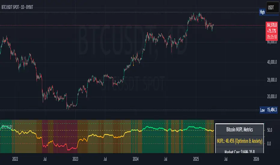
Bitcoin NUPL IndicatorThe Bitcoin NUPL (Net Unrealized Profit/Loss) Indicator is a powerful metric that shows the difference between Bitcoin's market cap and realized cap as a percentage of market cap. This indicator helps identify different market cycle phases, from capitulation to euphoria.
// How It Works
NUPL measures the aggregate profit or loss held by Bitcoin investors, calculated as:
```
NUPL = ((Market Cap - Realized Cap) / Market Cap) * 100
```
// Market Cycle Phases
The indicator automatically color-codes different market phases:
• **Deep Red (< 0%)**: Capitulation Phase - Most coins held at a loss, historically excellent buying opportunities
• **Orange (0-25%)**: Hope & Fear Phase - Early accumulation, price uncertainty and consolidation
• **Yellow (25-50%)**: Optimism & Anxiety Phase - Emerging bull market, increasing confidence
• **Light Green (50-75%)**: Belief & Denial Phase - Strong bull market, high conviction
• **Bright Green (> 75%)**: Euphoria & Greed Phase - Potential market top, historically good profit-taking zone
// Features
• Real-time NUPL calculation with customizable smoothing
• RSI indicator for additional momentum confirmation
• Color-coded background reflecting current market phase
• Reference lines marking key transition zones
• Detailed metrics table showing NUPL value, market sentiment, market cap, realized cap, and RSI
// Strategy Applications
• **Long-term investors**: Use extreme negative NUPL values (deep red) to identify potential bottoms for accumulation
• **Swing traders**: Look for transitions between phases for potential trend changes
• **Risk management**: Consider taking profits when entering the "Euphoria & Greed" phase (bright green)
• **Mean reversion**: Watch for overbought/oversold conditions when NUPL reaches historical extremes
// Settings
• **RSI Length**: Adjusts the period for RSI calculation
• **NUPL Smoothing Length**: Applies moving average smoothing to reduce noise
// Notes
• Premium TradingView subscription required for Glassnode and Coin Metrics data
• Best viewed on daily timeframes for macro analysis
• Historical NUPL extremes have often marked cycle bottoms and tops
• Use in conjunction with other indicators for confirmation
Bitcoin MVRV Z-Score Indicator### **What This Script Does (In Plain English)**
Imagine Bitcoin has a "fair price" based on what people *actually paid* for it (called the **Realized Value**). This script tells you if Bitcoin is currently **overpriced** or **underpriced** compared to that fair price, using math.
---
### **How It Works (Like a Car Dashboard)**
1. **The Speedometer (Z-Score Line)**
- The blue line (**Z-Score**) acts like a speedometer for Bitcoin’s price:
- **Above Red Line** → Bitcoin is "speeding" (overpriced).
- **Below Green Line** → Bitcoin is "parked" (underpriced).
2. **The Warning Lights (Colors)**
- **Red Background**: "Slow down!" – Bitcoin might be too expensive.
- **Green Background**: "Time to fuel up!" – Bitcoin might be a bargain.
3. **The Alarms (Alerts)**
- Your phone buzzes when:
- Green light turns on → "Buy opportunity!"
- Red light turns on → "Be careful – might be time to sell!"
---
### **Real-Life Example**
- **2021 Bitcoin Crash**:
- The red light turned on when Bitcoin hit $60,000+ (Z-Score >7).
- A few months later, Bitcoin crashed to $30,000.
- **2023 Rally**:
- The green light turned on when Bitcoin was around $20,000 (Z-Score <0.1).
- Bitcoin later rallied to $35,000.
---
### **How to Use It (3 Simple Steps)**
1. **Look at the Blue Line**:
- If it’s **rising toward the red zone**, Bitcoin is getting expensive.
- If it’s **falling toward the green zone**, Bitcoin is getting cheap.
2. **Check the Colors**:
- Trade carefully when the background is **red**.
- Look for buying chances when it’s **green**.
3. **Set Alerts**:
- Get notified when Bitcoin enters "cheap" or "expensive" zones.
---
### **Important Notes**
- **Not Magic**: This tool helps spot trends but isn’t perfect. Always combine it with other indicators.
- **Best for Bitcoin**: Works great for Bitcoin, not as well for altcoins.
- **Long-Term Focus**: Signals work best over months/years, not hours.
---
Think of it as a **thermometer for Bitcoin’s price fever** – it tells you when the market is "hot" or "cold." 🔥❄️
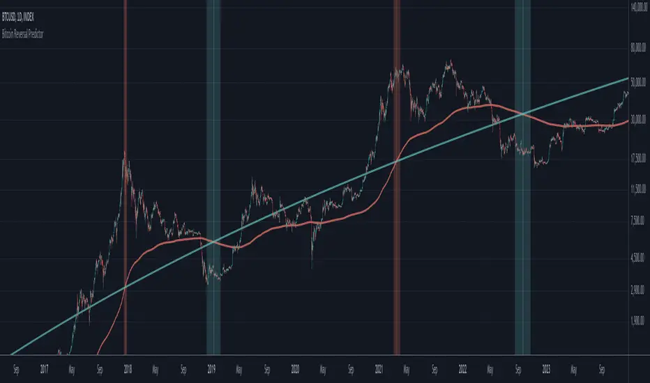
Bitcoin Reversal PredictorOverview
This indicator displays two lines that, when they cross, signal a potential reversal in Bitcoin's price trend. Historically, the high or low of a bull market cycle often occurs near the moment these lines intersect. The lines consist of an Exponential Moving Average (EMA) and a logarithmic regression line fitted to all of Bitcoin's historical data.
Inspiration
The inspiration for this indicator came from the PI Cycle Top indicator, which has accurately predicted past bull market peaks. However, I believe the PI Cycle Top indicator may not be as effective in the future. In that indicator, two lines cross to mark the top, but the extent of the cross has been diminishing over time. This was especially noticeable in the 2021 cycle, where the lines barely crossed. Because of this, I created a new indicator that I think will continue to provide reliable reversal signals in the future.
How It Works
The logarithmic regression line is fitted to the Bitcoin (BTCUSD) chart using two key factors: the 'a' factor (slope) and the 'b' factor (intercept). This results in a steadily decreasing line. The EMA oscillates above and below this regression line. Each time the two lines cross, a vertical colored bar appears, indicating that Bitcoin's price momentum is likely to reverse.
Use Cases
- Price Bottoming:
Bitcoin often bottoms out when the EMA crosses below the logarithmic regression line.
- Price Topping:
In contrast, Bitcoin often peaks when the EMA crosses above the logarithmic regression line.
- Profitable Strategy:
Trading at the crossovers of these lines can be a profitable strategy, as these moments often signal significant price reversals.
Bitcoin Pi Cycle TrackerThe Bitcoin Pi Cycle Tracker is based on the widely recognized Pi Cycle Top Indicator, a concept used to identify potential market cycle tops in Bitcoin's price. This implementation combines the 111-day Simple Moving Average (SMA) and the 350-day SMA (multiplied by 2) to detect key crossover points. When the 111-day SMA crosses above the 350-day SMA x2, it signals a potential market peak.
Key Features:
Plots the 111-day SMA (blue) and the 350-day SMA x2 (red) for clear visualization.
Displays visual markers and vertical lines at crossover points to highlight key moments.
Sends alerts for crossovers, helping traders stay ahead of market movements.
This tool is an implementation of the Pi Cycle concept originally popularized by Bitcoin market analysts. Use it to analyze historical price cycles and prepare for significant market events. Please note that while the Pi Cycle Indicator has been historically effective, it should be used alongside other tools for a comprehensive trading strategy.

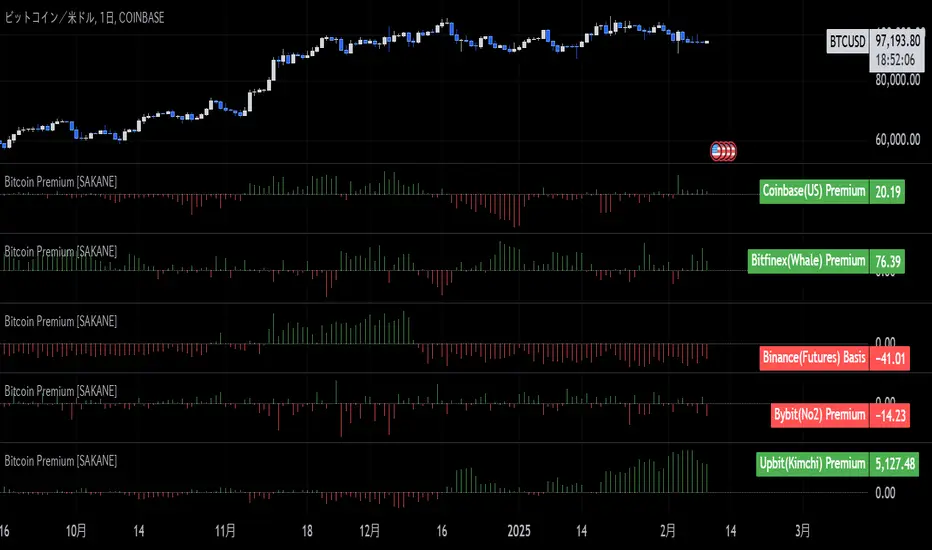
Bitcoin Premium [SAKANE]Overview
"Bitcoin Premium " is an indicator designed to analyze the price differences (premiums) of Bitcoin between major exchanges. By using this tool, you can visualize these differences and trends across exchanges, helping you make more informed trading decisions.
Features
1. Premium Calculation and Display
- Calculates and visualizes the price differences between major exchanges like Coinbase, Bitfinex, Upbit, and Binance.
- Premiums are displayed in a histogram format for intuitive analysis.
2. Forex Rate Adjustment
- Prices quoted in KRW (e.g., from Upbit) are converted to USD using real-time KRW/USD forex rates.
3. Moving Average Option
- Displays moving averages (SMA or EMA) of premiums for a clearer view of long-term trends.
4. Customizable Settings
- Toggle the premium display for each exchange on or off.
- Includes label displays to support visual analysis.
What Can It Do for You?
1. Identify Arbitrage Opportunities
By observing price differences (premiums) between exchanges, you can identify arbitrage opportunities.
Example: If Bitcoin is cheaper on Binance and more expensive on Coinbase, you could buy on Binance and sell on Coinbase to capture the price difference.
2. Understand Regional Supply and Demand Trends
Each exchange's premium reflects the supply and demand dynamics of its respective region.
Example: A high premium on Upbit may indicate excess demand or regulatory impacts in the South Korean market.
3. Analyze Liquidity
Price differences often highlight liquidity disparities between exchanges. Markets with lower trading volumes tend to have larger premiums due to price distortions.
4. Evaluate Macroeconomic Impacts
Premium movements may reflect changes in macroeconomic factors, such as exchange rates, regulations, or financial conditions specific to each region.
5. Analyze Trends and Market Sentiment
By tracking premium trends, you can gauge market sentiment and understand regional or exchange-specific behaviors to inform your investment decisions.
6. Support Strategic Trading
This tool is useful for short-term arbitrage strategies as well as long-term evaluations of market health.
Exchange Characteristics and Premium Implications
The meaning of premiums varies by exchange.
- Coinbase (US Market)
Primarily used by investors buying directly with fiat currency (USD). A higher premium often signals bullish sentiment among institutional and retail investors.
- Bitfinex (Global Market)
A trader-focused exchange with active large-scale and leveraged trading. Premiums may reflect liquidity and risk appetite.
- Upbit (South Korean Market)
Priced in KRW, making it subject to forex rates and local market dynamics. High premiums may indicate strong demand or regulatory influences in South Korea.
- Binance (Global Market)
The largest exchange by trading volume. Premiums here are often a reflection of the overall market balance.
Notes
- This indicator is for reference only and does not guarantee trading decisions.
- Please consider the characteristics and conditions of each exchange when using this tool.
Bitcoin COT [SAKANE]#Overview
Bitcoin COT is an indicator that visualizes Bitcoin futures market positions based on the Commitment of Traders (COT) report provided by the CFTC (Commodity Futures Trading Commission).
This indicator stands out from similar tools with the following features:
- Flexible Data Switching: Supports multiple COT report types, including "Financial," "Legacy," "OpenInterest," and "Force All."
- Position Direction Selection: Easily switch between long, short, and net positions. Net positions are automatically calculated.
- Open Interest Integration: View the overall trading volume in the market at a glance.
- Comparison and Customization: Toggle individual trader types (Dealer, Asset Manager, Commercials, etc.) on and off, with visually distinct color-coded graphs.
- Force All Mode: Simultaneously display data from different report types, enabling comprehensive market analysis.
These features make it a powerful tool for both beginners and advanced traders to deeply analyze the Bitcoin futures market.
#Use Cases
1. Analyzing Trader Sentiment
- Compare net positions of various trader types (Dealer, Asset Manager, Commercials, etc.) to understand market sentiment.
2. Identifying Trend Reversals
- Detect early signs of trend reversals from sudden increases or decreases in long and short positions.
3. Utilizing Open Interest
- Monitor the overall trading volume represented by open interest to evaluate entry points or changes in volatility.
4. Tracking Position Structures
- Compare positions of leveraged funds and asset managers to analyze risk-on or risk-off environments.
#Key Features
1. Report Type Selection
- Financial (Financial Traders)
- Legacy (Legacy Report)
- Open Interest
- Force All (Display all data)
2. Position Direction Selection
- Long
- Short
- Net
3. Visualization of Major Trader Types
- Financial Traders: Dealer, Asset Manager, Leveraged Funds, Other Reportable
- Legacy: Commercials, Non-Commercials, Small Speculators
4. Open Interest Visualization
- Monitor the total open positions in the market.
5. Flexible Customization
- Toggle individual trader types on and off.
- Intuitive settings with tooltips for better usability.
#How to Use
1. Add the indicator to your chart and click the settings icon in the top-right corner.
2. Select the desired report type in the "Report Type" field.
3. Choose the position direction (Long/Short/Net) in the "Direction" field.
4. Toggle the visibility of trader types as needed.
#Notes
- Data is provided by the CFTC and is updated weekly. It is not real-time.
- Changes to the settings may take a few seconds to reflect.

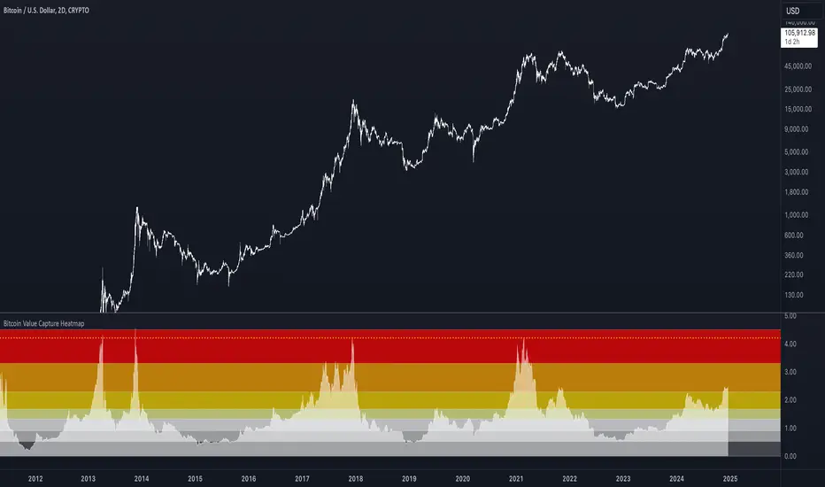
Bitcoin Value Capture HeatmapBTC Value Capture Heatmap answers a question originally posed by Willy Woo:
"How much pressure on Bitcoin's market cap does one dollar of purchasing power exert?"
The higher the print, the more market cap grows per dollar invested -- adjusted for global M2 growth.
Bitcoin Value Capture Heatmap = ( market cap / global M2 ) / realized cap
A NOVEL INGREDIENT REVEALS A UNIQUE USE CASE
Adjusting bitcoin's market cap for global M2 growth sharpens a legacy metric with a normalizing factor that 'stabilizes' its view across cycles.
The metric peaked at identical levels (4.2), three bitcoin bull markets in a row. On the same day bitcoin price volatility peaked for the cycle, every time.
One might naturally expect this to coincide with cycle tops. But it doesn't.
It precede's cycle's tops: in a consistent, very specific way, that predisposing a unique use case.
BITCOIN'S VOLATILTY TOP
The metric's true use case only comes into clear focus when paired with an unrelated insight:
Whether in distribution (in Spring 2021) or a parabolic blow off top (2017 & 2013), each of the last 3 bitcoin cycle tops shows tight consistent adherence to the Wykoff Distribution Schematic.
"But Wykoff schematics apply to distribution tops, not to blow off tops."
A closer look at the last 15-20 years of parabolic blow off tops, across all asset classes , viewed through a Wykoff lens, reveals recurring tight adherence to Wykoff's Distribution Schematic.
Including (and especially) BTC's parabolic top in Dec 2017; BTC's parabolic top in 2013; and ETH's blow off top in Jan 2018.
In our age of automation, this makes sense. Wykoff's schematics mirror the timeless archetypal goal of his 'Composite Operator': max pain for all other market participants.
A process that lends itself to automation, optimized a bit more each passing year.
Peak cycle volatility maps directly to the Wykoff Distribution Schematic's 'Buying Climax'.
An event that preceded parabolic cycle tops, by about 2 weeks.
Future BTC parabolas (should they recur) would come at exponentially higher market caps, so they may take longer to unfold -- I don't take the 2 week pattern too seriously.
But Parabolic Distribution as an emergent archetypal market structure is likely encoded.
PUTTING IT ALL TOGETHER
Bitcoin Value Capture Heatmap signals peak cycle volatility, on a daily close of 4.2 on the metric's Y axis. It has never reached that level twice in the same cycle.
Awareness that:
(a) peak volatility for the cycle has likely been reached, and
(b) peak volatility has a history of tightly preceding bitcoin cycle tops, can
(c) empowers traders with a data-driven 'guide post' to their likely exactly location in an increasingly archetypal topping process.
SPECIFIC USES IN AN EXIT STRATEGY
When the Heatmap's signal level is reached, one might (for instance):
* Hedge, since bitcoin is likely closing in on its cycle top, OR
* Start to DCA out, over a pre-planned time period OR
* Rotate up the risk curve, since BTC probably doesn't have much upside left, OR
* Wait for acceptance one leg higher, which (consistent with Wykoff logic) is the likeliest place to expect an actual cycle top.
Though the ratio (in the past) touched 4.2 each cycle, a closer look shows subtly lower peaks per cycle, like most other on-chain cycle oscillators.
Extrapolating out, one might expect bitcoin's next top on volatility to print on any touch of 4.0 or higher.
Or one might give it more room to run, consistent with record institutiional flows this cycle.
Alerts are enabled for both options.
The metric works on any timeframe, but should only be used on the 1D chart.
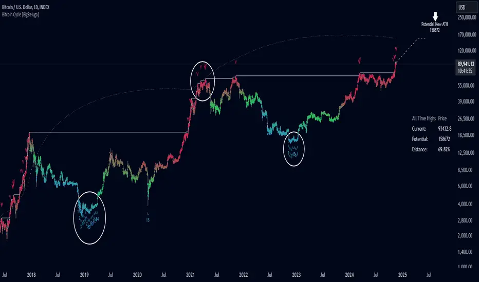
Bitcoin Cycle [BigBeluga]Bitcoin Cycle Indicator is designed exclusively for analyzing Bitcoin’s long-term market cycles, working only on the 1D BTC chart . This indicator provides an in-depth view of potential cycle tops and bottoms, assisting traders in identifying key phases in Bitcoin’s market evolution.
🔵 Key Features:
Heatmap Cycle Phases: The indicator colors each cycle from blue to red , reflecting Bitcoin’s market cycle progression. Cooler colors (blue/green) signal potential accumulation or early growth phases, while warmer colors (yellow/red) indicate maturation and potential top regions.
All-Time High (ATH) and Future ATH Projection: Tracks the current ATH in real-time, while applying a linear regression model to project a possible new ATH in the future. This projection aims to provide insights into the next major cycle peak for long-term strategy.
Dashboard Overview: Displays the current ATH, potential new ATH, and the percentage distance between them. This helps users assess how far the current price is from the projected target.
Top & Bottom Cycle Signals: Red down arrows mark significant price peaks, potentially indicating cycle tops. Up arrows, numbered sequentially (inside each cycle), denote possible bottom signals for strategic DCA (Dollar Cost Averaging) entries.
1D BTC Chart Only: Built solely for the 1D BTC timeframe. Switching to any other timeframe or asset will trigger a warning message: " BTC 1D Only ." This ensures accuracy in analyzing Bitcoin’s unique cyclical behavior.
🔵 When to Use:
Ideal for long-term Bitcoin investors and cycle analysts, the Bitcoin Cycle Indicator empowers users to:
Identify key accumulation and distribution phases.
Track Bitcoin’s cyclical highs and lows with visual heatmap cues.
Estimate future potential highs based on historical patterns.
Strategize long-term positions by monitoring cycle tops and possible accumulation zones.
By visualizing Bitcoin’s cycles with color-coded clarity and top/bottom markers, this indicator is an essential tool for any BTC analyst aiming to navigate market cycles effectively.
Bitcoin Thermocap [InvestorUnknown]The Bitcoin Thermocap indicator is designed to analyze Bitcoin's market data using a variant of the "Thermocap Multiple" concept from BitBo. This indicator offers several modes for interpreting Bitcoin's historical block and price data, aiding investors and analysts in understanding long-term market dynamics and generating potential investing signals.
Key Features:
1. Thermocap Calculation
The core of the indicator is based on the Thermocap Multiple, which evaluates Bitcoin's value relative to its cumulative historical blocks mined.
Thermocap Formula:
Source: Bitbo
btc_price = request.security("INDEX:BTCUSD", "1D", close)
BTC_BLOCKSMINED = request.security("BTC_BLOCKSMINED", "D", close)
// Variable to store the cumulative historical blocks
var float historical_blocks = na
// Initialize historical blocks on the first bar
if (na(historical_blocks))
historical_blocks := 0.0
// Update the cumulative blocks for each day
historical_blocks += BTC_BLOCKSMINED * btc_price
// Calculate the Thermocap
float thermocap = ((btc_price / historical_blocks) * 1000000) // the multiplication is just for better visualization
2. Multiple Display Modes:
The indicator can display data in four different modes, offering flexibility in interpretation:
RAW: Displays the raw Thermocap value.
LOG: Applies the logarithm of the Thermocap to visualize long-term trends more effectively, especially for large-value fluctuations.
MA Oscillator: Shows the ratio between the Thermocap and its moving average (MA). Users can choose between Simple Moving Average (SMA) or Exponential Moving Average (EMA) for smoothing.
Normalized MA Oscillator: Provides a normalized version of the MA Oscillator using a dynamic min-max rescaling technique.
3. Normalization and Rescaling
The indicator normalizes the Thermocap Oscillator values between user-defined limits, allowing for easier interpretation. The normalization process decays over time, with values shrinking towards zero, providing more relevance to recent data.
Negative values can be allowed or restricted based on user preferences.
f_rescale(float value, float min, float max, float limit, bool negatives) =>
((limit * (negatives ? 2 : 1)) * (value - min) / (max - min)) - (negatives ? limit : 0)
f_max_min_normalized_oscillator(float x) =>
float oscillator = x
var float min = na
var float max = na
if (oscillator > max or na(max)) and time >= normalization_start_date
max := oscillator
if (min > oscillator or na(min)) and time >= normalization_start_date
min := oscillator
if time >= normalization_start_date
max := max * decay
min := min * decay
normalized_oscillator = f_rescale(x, min, max, lim, neg)
Usage
The Bitcoin Thermocap indicator is ideal for long-term market analysis, particularly for investors seeking to assess Bitcoin's relative value based on mining activity and price dynamics. The different display modes and customization options make it versatile for a variety of market conditions, helping users to:
Identify periods of overvaluation or undervaluation.
Generate potential buy/sell signals based on the MA Oscillator and its normalized version.
By leveraging this Thermocap-based analysis, users can gain a deeper understanding of Bitcoin's historical and current market position, helping to inform investment strategies.

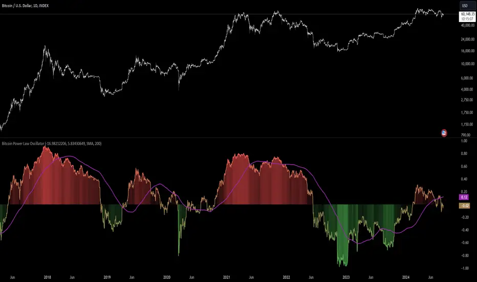
Bitcoin Power Law Oscillator [InvestorUnknown]The Bitcoin Power Law Oscillator is a specialized tool designed for long-term mean-reversion analysis of Bitcoin's price relative to a theoretical midline derived from the Bitcoin Power Law model (made by capriole_charles). This oscillator helps investors identify whether Bitcoin is currently overbought, oversold, or near its fair value according to this mathematical model.
Key Features:
Power Law Model Integration: The oscillator is based on the midline of the Bitcoin Power Law, which is calculated using regression coefficients (A and B) applied to the logarithm of the number of days since Bitcoin’s inception. This midline represents a theoretical fair value for Bitcoin over time.
Midline Distance Calculation: The distance between Bitcoin’s current price and the Power Law midline is computed as a percentage, indicating how far above or below the price is from this theoretical value.
float a = input.float (-16.98212206, 'Regression Coef. A', group = "Power Law Settings")
float b = input.float (5.83430649, 'Regression Coef. B', group = "Power Law Settings")
normalization_start_date = timestamp(2011,1,1)
calculation_start_date = time == timestamp(2010, 7, 19, 0, 0) // First BLX Bitcoin Date
int days_since = request.security('BNC:BLX', 'D', ta.barssince(calculation_start_date))
bar() =>
= request.security('BNC:BLX', 'D', bar())
int offset = 564 // days between 2009/1/1 and "calculation_start_date"
int days = days_since + offset
float e = a + b * math.log10(days)
float y = math.pow(10, e)
float midline_distance = math.round((y / btc_close - 1.0) * 100)
Oscillator Normalization: The raw distance is converted into a normalized oscillator, which fluctuates between -1 and 1. This normalization adjusts the oscillator to account for historical extremes, making it easier to compare current conditions with past market behavior.
float oscillator = -midline_distance
var float min = na
var float max = na
if (oscillator > max or na(max)) and time >= normalization_start_date
max := oscillator
if (min > oscillator or na(min)) and time >= normalization_start_date
min := oscillator
rescale(float value, float min, float max) =>
(2 * (value - min) / (max - min)) - 1
normalized_oscillator = rescale(oscillator, min, max)
Overbought/Oversold Identification: The oscillator provides a clear visual representation, where values near 1 suggest Bitcoin is overbought, and values near -1 indicate it is oversold. This can help identify potential reversal points or areas of significant market imbalance.
Optional Moving Average: Users can overlay a moving average (either SMA or EMA) on the oscillator to smooth out short-term fluctuations and focus on longer-term trends. This is particularly useful for confirming trend reversals or persistent overbought/oversold conditions.
This indicator is particularly useful for long-term Bitcoin investors who wish to gauge the market's mean-reversion tendencies based on a well-established theoretical model. By focusing on the Power Law’s midline, users can gain insights into whether Bitcoin’s current price deviates significantly from what historical trends would suggest as a fair value.
Bitcoin Power Law Global Liqudity Model by G. SantostasiIn recent studies, we've observed a notable correlation between Bitcoin's price and global liquidity metrics. This relationship reveals significant insights into Bitcoin's price movements and offers a new perspective on using macroeconomic indicators to understand and predict Bitcoin's market trends.
Our analysis shows that Bitcoin's price exhibits periodic bubbles, which seem closely associated with oscillations in global liquidity. Notably, the overall price path of Bitcoin appears to be a complex function of global liquidity. This relationship is not as simple as the Bitcoin Power Law in time that can be described with a simple equation, Price ∼ time⁶.
Instead, we have developed a polynomial model to describe this complex relationship between liquidity and Bitcoin price. With a 4-degree polynomial (with 5 different parameters needed to fit the data), we can get a decent fit to the data.
The fit is obtained using 500 data points by polynomial regression. The vector coefficients of the polynomial are obtained such that the sum of squared error between the observations and theoretical polynomial model is minimized.
This model needs to be taken with a grain of salt given the warning by famous mathematician Von Neumann: "With four parameters I can fit an elephant, and with five I can make him wiggle his trunk." discussing a model created by Italian Physicist Fermi. By this he meant that the Fermi simulations relied on too many input parameters, presupposing an overfitting phenomenon.
We can still gain some insights into the relationship between Global Liquidity and the price evolution of Bitcoin using this complex model.
When the price of Bitcoin is plotted against our global liquidity index, we observe a polynomial relationship. This model allows us to see when Bitcoin's price deviates significantly from the predicted value based on global liquidity:
Above the Model: When Bitcoin's price is above the polynomial fit, it indicates a potential lack of sufficient liquidity to support the current price level, suggesting a likely correction.
Below the Model: Conversely, when the price is below the fit, it implies that liquidity might be higher than what is reflected in the price, indicating potential upward movement.
Our global liquidity index comprises several key macroeconomic metrics from major financial institutions worldwide. Here are some of the major components:
RRP (Reverse Repurchase Agreements): This metric indicates the level of liquidity in the financial system through temporary sales of securities with an agreement to repurchase them.
FED (Federal Reserve System): Represents the balance sheet of the US central bank, reflecting its monetary policy actions.
TGA (Treasury General Account): Reflects the US Treasury’s cash balance, impacting the liquidity in the banking system.
PBC (People's Bank of China): Shows the monetary policy actions and liquidity management by China’s central bank.
ECB (European Central Bank): Represents the balance sheet and liquidity management actions of the Eurozone's central bank.
BOJ (Bank of Japan): Reflects Japan's central bank's monetary policy and liquidity measures.
Other Central Banks: Includes metrics from various other central banks like the Bank of England, Bank of Canada, Reserve Bank of Australia, etc.
M2 Money Supply: This includes money supply metrics from various countries like the USA, Europe, China, Japan, and other significant economies.
These components collectively provide a comprehensive view of global liquidity, which is crucial for understanding its impact on Bitcoin's price.
Using the polynomial model and the author's Bitcoin power law model we can create 2 oscillators, one that shows deviations from the trend (normalized to the price to make the peaks more uniform) and the other showing deviations of the polynomial liquidity model from the power law trend.
The oscillators show the difference between the price and the power law model relative to the price, Orange Line. The Blue Line is instead the difference between the Global Liquidity Model of the price and the power law model relative to the model itself. The two oscillators can be overlayed to show their differences and similarities.
Analysis: In addition to similar observations from the discussion above we can see that most Bitcoin bottoms are not directly associated with bottoms in the liquidity model indicating a different mechanism at play that determines Bitcoin bottoms (probably due to miners' capitulation).
Using the new force_overlay function we plot the polynomial liquidity model directly over the Bitcoin price chart while we display the 2 oscillators in a separate panel.

Bitcoin Production CostFirst inspired by the amazing @capriole_charles, I decided to create my own version of calculating the Bitcoin production cost and to share it with you guys.
One of the main difference is the electricity cost calculation. I used a country-specific input system that calculates the weighted electricity cost leveraged by the distribution of the Bitcoin network hashrate. I like the fact that it requires little updating although it is less realistic for past calculations (further in the past production costs seems too low).
How to use:
- Add the indicator to your chart.
- Adjust the inputs if needed. Update the percentage of Bitcoin network Hashrate or electricity Cost per countries. Update the mining hardware stats to the most recent hardware. For example I used a Bitcoin Miner S21 Pro stats.
- Check the multiple variables in the data window.
- Turn on/off the halving event in the style tab

(mab) Dynamic Bitcoin NVT SignalBitcoin`s NVT is calculated by dividing the Network Value (market cap) by the USD volume transmitted through the blockchain daily. Note this equivalent of the bitcoin token supply divided by the daily BTC value transmitted through the blockchain, NVT is technically inverse monetary velocity.
Credits go to Willy Woo for creating the Network Value Transaction Ratio (NVT). Credits go also to Dimitry Kalichkin improving NVT and creating the NVT Signal (NVTS).
According to its creator, the NVT Ratio is somewhat similar to the PE Ratio used in equity markets. When Bitcoin`s NVT is high, it indicates that its network valuation is outstripping the value being transmitted on its payment network, this can happen when the network is in high growth and investors are valuing it as a high return investment, or alternatively when the price is in an unsustainable bubble.
I created this indicator because the NVT indicator I was using suddenly stopped working. I tried a number of other NVT indicators, but all of them seem to have the same problem and stopped updating after a certain date. The cause is that the data feed from 'Quandl' that is used by most NVT indicators is no longer updated through the previous API.
Instead TradingView created a special API to access 'Quandl" data. This indicator not only uses the new API for 'Quandl', it can also access data from other providers like 'Glassnode', 'CoinMetrics' and 'IntoTheBlock'. However, the 'Quandl' data feed seems to produce the best results with this indicator.
The indicator provides dynamically adjusting overbought and oversold thresholds based on a two year moving average and standard devition with adjustable multipliers. It also implements alerts for NVT going into overbought, oversold or crossing the moving average.
Version 1.0
--
Version history
0.1 Beta
- Initial version
1.0
- First release
