Session Highs and Lows IndicatorThis indicator marks the high and low levels for key trading sessions, allowing traders to identify significant price zones across different markets. The default session times are defined in UTC and will automatically adjust to your local timezone:
- **London Session (07:00-09:00 UTC)**: Tracks intraday liquidity zones for potential highs/lows.
- **New York Session (12:00-14:00 UTC)**: Highlights volatility during market overlaps with Europe.
- **Asia Session (23:00-01:00 UTC)**: Confirms trend continuation and retracement opportunities.
- **New York Close Session (19:00-21:00 UTC)**: Focuses on reversals and breakout tests during global transitions.
The script dynamically updates session highs and lows with clear labels and dashed horizontal lines for better visualization. **Time ranges can be adjusted to suit your trading preferences.** This makes the indicator flexible and effective for liquidity hunting, trend trading, and breakout strategies.
"美联储议息会议12月时间"に関するスクリプトを検索

Four Supertrend By Baljit AujlaThis Pine Script is an implementation of a "Four Supertrend" indicator by Baljit Aujla. It calculates and plots four Supertrend indicators based on the Average True Range (ATR) method, allowing for different ATR periods and multipliers for each line.
Here is an explanation of the key components:
Inputs
1:- ATR Periods: Four different periods for ATR, adjustable by the user (defaults: 10, 11, 12, 13).
2:- ATR Multipliers: Four different multipliers for the ATR, adjustable by the user (defaults: 1.0, 2.0, 3.0, 4.0).
3:- Source: The data source used for calculation, default is the average of high and low prices (hl2).
4:- Change ATR Calculation Method: Option to switch between the traditional ATR and a simple moving average of true range (SMA of TR).
5:- Signal Display- Options to show buy/sell signals and highlight trends.
Logic:
The script computes four separate Supertrend lines using the ATR method for each line. For each of the four lines, it calculates an uptrend and downtrend threshold, and the trend direction changes when the close price crosses these thresholds.
For each trend line:
1. Uptrend and Downtrend Calculation: The script uses ATR-based bands above and below the price. The uptrend line is calculated by subtracting the ATR multiplied by a given multiplier from the source price, and the downtrend line is calculated by adding the ATR multiplied by a multiplier to the source price.
2. Trend Reversal Logic: The trend switches based on the price action relative to the uptrend and downtrend lines. If the price moves above the downtrend, it signals a switch to an uptrend, and vice versa for a downtrend.
3. Signal Generation: Buy signals occur when the trend changes from negative to positive (down to up), and sell signals occur when the trend changes from positive to negative (up to down).
Plots:
The script plots:
Uptrend and Downtrend Lines: These are visualized as green and red lines for each trend.
Buy/Sell Signals: Small circles are drawn on the chart when a trend change occurs (buy and sell signals).
Trend Highlighting: Background highlighting is applied to show when the market is in an uptrend (green) or downtrend (red).
Alerts:
The script has commented-out alert conditions (alertcondition), which can be enabled to send notifications when a buy or sell signal occurs, or when a trend change happens.
Enhancements:
1. Background Highlighting: This is an option to visually emphasize uptrends and downtrends by filling the background with respective colors.
2. Signal Visibility: You can toggle whether to show the buy/sell signals on the chart.
3. ATR Calculation Method: Option to change the ATR calculation method (using SMA of TR vs the default ATR).
The script is useful for identifying multi-timeframe trends with adjustable parameters and provides both signals and visual markers on the chart to aid in trading decisions.
Issues and Improvements:
The code seems to be truncated, specifically for the last Supertrend line (Line 4). To fully complete the functionality for the fourth line, the logic for up4, down4 and tread4 needs to be finished, similar to the other three lines.
Would you like help finishing the script for the fourth line or improving specific parts of it?

Indicator DashboardThis script creates an 'Indicator Dashboard' designed to assist you in analyzing financial markets and making informed decisions. The indicator provides a summary of current market conditions by presenting various technical analysis indicators in a table format. The dashboard evaluates popular indicators such as Moving Averages, RSI, MACD, and Stochastic RSI. Below, we'll explain each part of this script in detail and its purpose:
### Overview of Indicators
1. **Moving Averages (MA)**:
- This indicator calculates Simple Moving Averages (“SMA”) for 5, 14, 20, 50, 100, and 200 periods. These averages provide a visual summary of price movements. Depending on whether the price is above or below the moving average, it determines the market direction as either “Bullish” or “Bearish.”
2. **RSI (Relative Strength Index)**:
- The RSI helps identify overbought or oversold market conditions. Here, the RSI is calculated for a 14-period window, and this value is displayed in the table. Additionally, the 14-period moving average of the RSI is also included.
3. **MACD (Moving Average Convergence Divergence)**:
- The MACD indicator is used to determine trend strength and potential reversals. This script calculates the MACD line, signal line, and histogram. The MACD condition (“Bullish,” “Bearish,” or “Neutral”) is displayed alongside the MACD and signal line values.
4. **Stochastic RSI**:
- Stochastic RSI is used to identify momentum changes in the market. The %K and %D lines are calculated to determine the market condition (“Bullish” or “Bearish”), which is displayed along with the calculated values for %K and %D.
### Table Layout and Presentation
The dashboard is presented in a vertical table format in the top-right corner of the chart. The table contains two columns: “Indicator” and “Status,” summarizing the condition of each technical indicator.
- **Indicator Column**: Lists each of the indicators being tracked, such as SMA values, RSI, MACD, etc.
- **Status Column**: Displays the current status of each indicator, such as “Bullish,” “Bearish,” or specific values like the RSI or MACD.
The table also includes rounded indicator values for easier interpretation. This helps traders quickly assess market conditions and make informed decisions based on multiple indicators presented in a single location.
### Detailed Indicator Status Calculations
1. **SMA Status**: For each moving average (5, 14, 20, 50, 100, 200), the script checks if the current price is above or below the SMA. The status is determined as “Bullish” if the price is above the SMA and “Bearish” if below, with the value of the SMA also displayed.
2. **RSI and RSI Average**: The RSI value for a 14-period is displayed along with its 14-period SMA, which provides an average reading of the RSI to smooth out volatility.
3. **MACD Indicator**: The MACD line, signal line, and histogram are calculated using standard parameters (12, 26, 9). The status is shown as “Bullish” when the MACD line is above the signal line, and “Bearish” when it is below. The exact values for the MACD line, signal line, and histogram are also included.
4. **Stochastic RSI**: The %K and %D lines of the Stochastic RSI are used to determine the trend condition. If %K is greater than %D, the condition is “Bullish,” otherwise it is “Bearish.” The actual values of %K and %D are also displayed.
### Conclusion
The 'Indicator Dashboard' provides a comprehensive overview of multiple technical indicators in a single, easy-to-read table. This allows traders to quickly gauge market conditions and make more informed decisions. By consolidating key indicators like Moving Averages, RSI, MACD, and Stochastic RSI into one dashboard, it saves time and enhances the efficiency of technical analysis.
This script is particularly useful for traders who prefer a clean and organized overview of their favorite indicators without needing to plot each one individually on the chart. Instead, all the crucial information is available at a glance in a consolidated format.

Price Action Dynamics Oscillator (PADO)1 minute ago
Price Action Dynamics Oscillator (PADO)
Indicator Overview and Technical Deep Dive
Concept and Philosophy
The Price Action Dynamics Oscillator (PADO) is a sophisticated technical analysis tool designed to provide multi-dimensional insights into market behavior by decomposing price action into manipulation and distribution metrics. The indicator goes beyond traditional momentum or trend indicators by introducing a nuanced approach to understanding market microstructure.
Key Architectural Components
1. Timeframe and Depth Selection
Pivot Depth Options:
Short Term (Length: 12 periods)
Intermediate Term (Length: 20 periods)
Long Term (Length: 100 periods)
This flexible configuration allows traders to adapt the indicator's sensitivity to different market conditions and trading styles.
2. Core Calculation Methodology
Manipulation Metrics
Calculates manipulation differently for green (bullish) and red (bearish) candles
Normalized against Average True Range (ATR) for consistent comparison across different volatility environments
Green Candle Manipulation: (Open - Low) / ATR
Red Candle Manipulation: (High - Open) / ATR
Distribution Metrics
Measures the directional strength and potential momentum shift
Green Candle Distribution: (Close - Open)
Red Candle Distribution: (Open - Close)
3. Normalization and Smoothing
Uses Simple Moving Average (SMA) for smoothing
Dynamic length calculation based on price range distance
Ensures minimum SMA length of 2 to prevent calculation errors
Unique Features
Visualization Toggles
Traders can selectively display:
Manipulation data
Distribution data
Long-term reference lines
Valuation metrics
Strategy signals
Valuation Comparative Analysis
Compares current manipulation and distribution metrics to 1000-bar long-term averages
Color-coded visualization for quick interpretation
Blue: Manipulation above average
Purple: Manipulation below average
Orange: Distribution above average
Yellow: Distribution below average
Strategy Deployment
Generates a composite strategy signal by comparing manipulation and distribution valuations
Uses Exponential Moving Average (EMA) for smoother signal generation
Incorporates volatility bands for context-aware signal interpretation
Quadrant Analysis
Classifies market state into four quadrants based on manipulation and distribution valuations:
Q1: Low Manipulation, High Distribution
Q2: High Manipulation, High Distribution
Q3: Low Manipulation, Low Distribution
Q4: High Manipulation, Low Distribution
Each quadrant is color-coded to provide visual market state representation.
Warning Signals
Manipulation Warning: When strategy crosses below low volatility band
Distribution Warning: When strategy crosses above high volatility band
Visual Indicators
Bar coloration based on strategy momentum
Multiple color states representing different market dynamics
Recommended Use Cases
Intraday and swing trading
Multi-timeframe market analysis
Volatility and momentum assessment
Trend reversal and continuation identification
Potential Limitations
Complexity might require significant trader education
Performance can vary across different market conditions
Requires careful parameter optimization
Recommended Settings
Best used on liquid markets with clear price action
Ideal for:
Forex
Futures
Large-cap stocks
Cryptocurrency pairs
Customization and Optimization
Traders should:
Backtest across multiple assets
Adjust timeframe settings
Calibrate visualization toggles
Use in conjunction with other technical indicators
Licensing
Mozilla Public License 2.0
Open-source and modification-friendly
Conclusion
The PADO represents an advanced approach to market analysis, blending traditional technical analysis with innovative metrics for deeper market understanding.
PADO Quadrant Color Analysis: Deep Dive
Quadrant Color Scheme Breakdown
Quadrant 1: Lime Green Background (RGB: 0, 255, 21, 90)
Condition: val_manip < 1 AND val_distr > 1
Market Interpretation:
Low Manipulation Pressure
High Distribution Activity
Potential Scenario:
Smart money might be gradually distributing positions
Trading Implications:
Caution for current trend followers
Potential preparation for trend change
Increased probability of consolidation or reversal
Quadrant 2: Bright Blue Background (RGB: 0, 191, 255, 90)
Condition: val_manip > 1 AND val_distr > 1
Market Interpretation:
High Manipulation Pressure
High Distribution Activity
Potential Scenario:
Strong institutional involvement
Potential market transition phase
Significant volume and momentum
Trading Implications:
High volatility expected
Increased market uncertainty
Potential for sharp price movements
Requires careful risk management
Quadrant 3: Light Gray Background (RGB: 252, 252, 252, 90)
Condition: val_manip < 1 AND val_distr < 1
Market Interpretation:
Low Manipulation Pressure
Low Distribution Activity
Potential Scenario:
Market consolidation
Reduced institutional activity
Potential low-volatility period
Trading Implications:
Range-bound market
Reduced trading opportunities
Potential setup for future breakout
Ideal for mean reversion strategies
Quadrant 4: Light Yellow Background (Hex: #f6ff0019)
Condition: val_manip > 1 AND val_distr < 1
Market Interpretation:
High Manipulation Pressure
Low Distribution Activity
Potential Scenario:
Accumulation of positions
Trading Implications:
Increased probability of directional move soon
Color Psychology and Technical Significance
Color Selection Rationale
Lime Green (Q1): Represents potential growth and transition
Bright Blue (Q2): Signifies high energy and institutional activity
Light Gray (Q3): Indicates neutrality and consolidation
Transparent Green (Q4): Suggests emerging trend potential
Advanced Interpretation Guidelines
Color Transition Analysis
Observe how the quadrant colors change
Rapid color shifts might indicate:
Market regime changes
Shifts in institutional sentiment
Potential trend acceleration or reversal
Technical Implementation Notes
Calculation Snippet
pinescriptCopyq1 = (val_manip < 1) and (val_distr > 1)
q2 = (val_manip > 1) and (val_distr > 1)
q3 = (val_manip < 1) and (val_distr < 1)
q4 = (val_manip > 1) and (val_distr < 1)
bgcolor(q1 ? color.rgb(0, 255, 21, 90):
q2 ? color.rgb(0, 191, 255, 90):
q3 ? color.rgb(252, 252, 252, 90):
q4 ? #f6ff0019:na)
Alpha Channel (Transparency)
90 and 0x19 values ensure background color doesn't overwhelm chart
Allows underlying price action to remain visible
Subtle visual cue without significant chart obstruction
Practical Trading Recommendations
Never Trade Solely on Quadrant Colors
Use as a complementary analysis tool
Combine with other technical and fundamental indicators
Timeframe Considerations
Validate quadrant signals across multiple timeframes
Longer timeframes provide more reliable signals
Risk Management
Set appropriate stop-loss levels
Use position sizing strategies
Be prepared for false signals
Recommended Workflow
Identify current quadrant
Assess overall market context
Confirm with other indicators
Execute with proper risk management

MACD, ADX & RSI -> for altcoins# MACD + ADX + RSI Combined Indicator
## Overview
This advanced technical analysis tool combines three powerful indicators (MACD, ADX, and RSI) into a single view, providing a comprehensive analysis of trend, momentum, and divergence signals. The indicator is designed to help traders identify potential trading opportunities by analyzing multiple aspects of price action simultaneously.
## Components
### 1. MACD (Moving Average Convergence Divergence)
- **Purpose**: Identifies trend direction and momentum
- **Components**:
- Fast EMA (default: 12 periods)
- Slow EMA (default: 26 periods)
- Signal Line (default: 9 periods)
- Histogram showing the difference between MACD and Signal line
- **Visual**:
- Blue line: MACD line
- Orange line: Signal line
- Green/Red histogram: MACD histogram
- **Interpretation**:
- Histogram color changes indicate potential trend shifts
- Crossovers between MACD and Signal lines suggest entry/exit points
### 2. ADX (Average Directional Index)
- **Purpose**: Measures trend strength and direction
- **Components**:
- ADX line (default threshold: 20)
- DI+ (Positive Directional Indicator)
- DI- (Negative Directional Indicator)
- **Visual**:
- Navy blue line: ADX
- Green line: DI+
- Red line: DI-
- **Interpretation**:
- ADX > 20 indicates a strong trend
- DI+ crossing above DI- suggests bullish momentum
- DI- crossing above DI+ suggests bearish momentum
### 3. RSI (Relative Strength Index)
- **Purpose**: Identifies overbought/oversold conditions and divergences
- **Components**:
- RSI line (default: 14 periods)
- Divergence detection
- **Visual**:
- Purple line: RSI
- Horizontal lines at 70 (overbought) and 30 (oversold)
- Divergence labels ("Bull" and "Bear")
- **Interpretation**:
- RSI > 70: Potentially overbought
- RSI < 30: Potentially oversold
- Bullish/Bearish divergences indicate potential trend reversals
## Alert System
The indicator includes several automated alerts:
1. **MACD Alerts**:
- Rising to falling histogram transitions
- Falling to rising histogram transitions
2. **RSI Divergence Alerts**:
- Bullish divergence formations
- Bearish divergence formations
3. **ADX Trend Alerts**:
- Strong trend development (ADX crossing threshold)
- DI+ crossing above DI- (bullish)
- DI- crossing above DI+ (bearish)
## Settings Customization
All components can be fine-tuned through the settings panel:
### MACD Settings
- Fast Length
- Slow Length
- Signal Smoothing
- Source
- MA Type options (SMA/EMA)
### ADX Settings
- Length
- Threshold level
### RSI Settings
- RSI Length
- Source
- Divergence calculation toggle
## Usage Guidelines
### Entry Signals
Strong entry signals typically occur when multiple components align:
1. MACD histogram color change
2. ADX showing strong trend (>20)
3. RSI showing divergence or leaving oversold/overbought zones
### Exit Signals
Consider exits when:
1. MACD crosses signal line in opposite direction
2. ADX shows weakening trend
3. RSI reaches extreme levels with divergence
### Risk Management
- Use the indicator as part of a complete trading strategy
- Combine with price action and support/resistance levels
- Consider multiple timeframe analysis for confirmation
- Don't rely solely on any single component
## Technical Notes
- Built for TradingView using Pine Script v5
- Compatible with all timeframes
- Optimized for real-time calculation
- Includes proper error handling and NA value management
- Memory-efficient calculations for smooth performance
## Installation
1. Copy the provided Pine Script code
2. Open TradingView Chart
3. Create New Indicator -> Pine Editor
4. Paste the code and click "Add to Chart"
5. Adjust settings as needed through the indicator settings panel
## Version Information
- Version: 2.0
- Last Updated: November 2024
- Platform: TradingView
- Language: Pine Script v5

TASC 2024.12 Dynamic ADX Histogram█ OVERVIEW
This script introduces a new version of the ADX oscillator, designed by Neil Jon Harrington and featured in the "Revisualizing The ADX Oscillator" article from the December 2024 edition of TASC's Traders' Tips .
█ CONCEPTS
The directional movement index (DMI+ and DMI−) and average directional index (ADX) indicators have long been popular with technical analysts. Developed by J. Welles Wilder in the 1970s, these indicators provide information about the direction and strength of price movements across bars. The DMI+ measures positive price movement, the DMI- measures negative price movement, and the ADX gauges the average strength of price trends. Although these indicators can provide helpful insights into price action and momentum, Neil Jon Harrington argues they are often misunderstood or misapplied.
Harrington's indicator, the Dynamic ADX Histogram (DADX), applies directional information to the ADX based on DMI+ and DMI- values to create a single oscillator centered around 0. The indicator displays the oscillator as a histogram with dynamic colors based on ADX movements and user-defined strength thresholds. The author believes this modification of the ADX and DMI data offers a more intuitive visualization of the information provided by Wilder's calculations.
An additional feature of the DADX is the option to use average (smooth) DMI+ and DMI- values in the oscillator's calculation, which reduces noise and choppiness at the cost of added lag.
█ USAGE
The "ADX Length" input determines the number of bars in the DMI and ADX calculation. The "DMI Smoothing Length" input controls the number of bars in the DMI smoothing calculation. Use a value of 1 for non-smoothed DMI data.
The sign of the DADX indicates the direction of price movements based on the difference between the smoothed DMI+ and DMI- values. The absolute value of the oscillator corresponds to the ADX, representing the trend strength.
The "Low Threshold" and "High Threshold" inputs define the ADX thresholds for categorizing trending, non-trending, and exhaustion states. The low threshold specifies the minimum absolute oscillator value required to indicate a trend, and the high threshold marks the absolute value where trend strength is excessive, possibly suggesting an upcoming consolidation or reversal. The indicator colors the histogram based on these thresholds and changes in the ADX, with brighter colors denoting a strengthening trend and darker colors signaling a weakening trend.

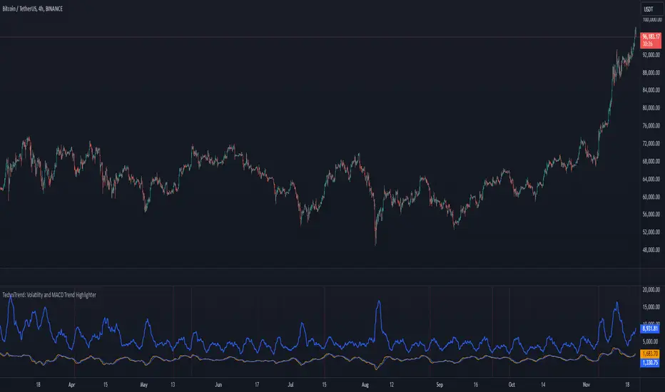
TechniTrend: Volatility and MACD Trend Highlighter🟦 Overview
The "Candle Volatility with Trend Prediction" indicator is a powerful tool designed to identify market volatility based on candle movement relative to average volume while also incorporating trend predictions using the MACD. This indicator is ideal for traders who want to detect volatile market conditions and anticipate potential price movements, leveraging both price changes and volume dynamics.
It not only highlights candles with significant price movements but also integrates a trend analysis based on the MACD (Moving Average Convergence Divergence), allowing traders to gauge whether the market momentum aligns with or diverges from the detected volatility.
🟦 Key Features
🔸Volatility Detection: Identifies candles that exceed normal price fluctuations based on average volume and recent price volatility.
🔸Trend Prediction: Uses the MACD indicator to overlay trend analysis, signaling potential market direction shifts.
🔸Volume-Based Analysis: Integrates customizable moving averages (SMA, EMA, WMA, etc.) of volume, providing a clear visualization of volume trends.
🔸Alert System: Automatically notifies traders of high-volatility situations, aiding in timely decision-making.
🔸Customizability: Includes multiple settings to tailor the indicator to different market conditions and timeframes.
🟦 How It Works
The indicator operates by evaluating the price volatility in relation to average volume and identifying when a candle's volatility surpasses a threshold defined by the user. The key calculations include:
🔸Average Volume Calculation: The user selects the type of moving average (SMA, EMA, etc.) to calculate the average volume over a set period.
🔸Volatility Measurement: The indicator measures the body change (difference between open and close) and the high-low range of each candle. It then calculates recent price volatility using a standard deviation over a user-defined length.
🔸Weighted Index: A unique index is created by dividing price change by average volume and recent volatility.
🔸Highlighting Volatility: If the weighted index exceeds a customizable threshold, the candle is highlighted, indicating potential trading opportunities.
🔸Trend Analysis with MACD: The MACD line and signal line are plotted and adjusted with a user-defined multiplier to visualize trends alongside the volatility signals.
🟦 Recommended Settings
🔸Volume MA Length: A default of 14 periods for the average volume calculation is recommended. Adjust to higher periods for long-term trends and shorter periods for quick trades.
🔸Volatility Threshold Multiplier: Set at 1.2 by default to capture moderately significant movements. Increase for fewer but stronger signals or decrease for more frequent signals.
🔸MACD Settings: Default MACD parameters (12, 26, 9) are suggested. Tweak based on your trading strategy and asset volatility.
🔸MACD Multiplier: Adjust based on how the MACD should visually compare to the average volume. A multiplier of 1 works well for most cases.
🟦 How to Use
🔸Volatile Market Detection:
Look for highlighted candles that suggest a deviation from typical price behavior. These candles often signify an entry point for short-term trades.
🔸Trend Confirmation:
Use the MACD trend analysis to verify if the highlighted volatile candles align with a bullish or bearish trend.
For example, a bullish MACD crossover combined with a highlighted candle suggests a potential uptrend, while a bearish crossover with volatility signals may indicate a downtrend.
🔸Volume-Driven Strategy:
Observe how volume changes impact candle volatility. When volume rises significantly and candles are highlighted, it can suggest strong market moves influenced by big players.
🟦 Best Use Cases
🔸Trend Reversals: Detect potential trend reversals early by spotting divergences between price and MACD within volatile conditions.
🔸Breakout Strategies: Use the indicator to confirm price breakouts with significant volume changes.
🔸Scalping or Day Trading: Customize the indicator for shorter timeframes to capture rapid market movements based on volatility spikes.
🔸Swing Trading: Combine volatility and trend insights to optimize entry and exit points over longer periods.
🟦 Customization Options
🔸Volume-Based Inputs: Choose from SMA, EMA, WMA, and more to define how average volume is calculated.
🔸Threshold Adjustments: Modify the volatility threshold multiplier to increase or decrease sensitivity based on your trading style.
🔸MACD Tuning: Adjust MACD settings and the multiplier for trend visualization tailored to different asset classes and market conditions.
🟦 Indicator Alerts
🔸High Volatility Alerts: Automatically triggered when candles exceed user-defined volatility levels.
🔸Bullish/Bearish Trend Alerts: Alerts are activated when highlighted volatile candles align with bullish or bearish MACD crossovers, making it easier to spot opportunities without constantly monitoring the chart.
🟦 Examples of Use
To better understand how this indicator works, consider the following scenarios:
🔸Example 1: In a strong uptrend, observe how volume surges and volatility highlight candles right before price consolidations, indicating optimal exit points.
🔸Example 2: During a downtrend, see how the MACD aligns with volume-driven volatility, signaling potential short-selling opportunities.
Multiple RSITitle: MultiRSI: A Versatile Multi-Timeframe RSI Indicator
Short Description:
A powerful RSI-based indicator that incorporates three RSI lengths (Fast, Medium, and Slow) to help traders analyze trends, momentum, and potential reversals with clear visual signals.
Full Description:
Overview:
The MultiRSI script provides traders with a dynamic tool to assess market conditions across multiple RSI timeframes. It calculates Fast, Medium, and Slow RSI values, assigns meaningful colors based on trend analysis, and highlights key crossover points for actionable insights.
Key Features:
Triple RSI Display:
Fast RSI (default: 8): Ideal for capturing short-term momentum.
Medium RSI (default: 12): Provides a balanced perspective.
Slow RSI (default: 16): Helps identify longer-term trends.
Trend Analysis:
Color-coded RSI lines:
Green, blue, and aqua for uptrends.
Yellow, orange, and red for potential downtrends.
Visual differentiation for easy interpretation.
Crossover Signals:
Upward Cross (triangle up): Indicates potential bullish momentum.
Downward Cross (triangle down): Suggests possible bearish momentum.
Marked directly on the chart for clarity.
Customizable Inputs:
Adjust RSI lengths to suit your trading strategy.
Grouped input settings for a seamless configuration experience.
Usage Scenarios:
Identify trend strength and reversals in different timeframes.
Spot key momentum shifts with crossover signals.
Combine with other indicators for a comprehensive trading strategy.
How It Works:
The script compares the Fast RSI against the Medium RSI and the Medium RSI against the Slow RSI to determine short-, medium-, and long-term trends. Crossovers between Medium and Slow RSI values signal potential momentum shifts.
Visualization:
Clear, color-coded plots for the three RSI levels.
Highlighted crossovers for quick decision-making.
License:
This script is open-source under the Mozilla Public License 2.0. Feel free to use, modify, and share!

Multi-Timeframe MACD, Signal & Histogram TableThis Pine Script is designed for the TradingView platform to create a multi-timeframe MACD (Moving Average Convergence Divergence), Signal, and Histogram table that displays values for different timeframes. The script uses the MACD indicator to assess market trends across various timeframes and display the results in a table format on the chart. Here's a breakdown of its components and functionality:
1. User Inputs for Timeframes:
The script allows the user to input five different timeframes for the analysis. These are configured using input.string, which enables the user to select from a list of timeframes (from seconds to months).
tf1 to tf5 represent the different timeframes (for example, 5 minutes, 15 minutes, 60 minutes, 240 minutes, and daily).
2. MACD Settings:
The script provides adjustable settings for the MACD calculation:
macdShortLength (default 12): The length of the short-term moving average for the MACD.
macdLongLength (default 26): The length of the long-term moving average for the MACD.
macdSignalLength (default 9): The length of the signal line, which is an EMA (Exponential Moving Average) of the MACD line.
3. MACD Calculation Function (calc_macd):
This function calculates the MACD, Signal, and Histogram values:
MACD Line: Difference between the fast and slow exponential moving averages.
Signal Line: EMA of the MACD line.
Histogram: Difference between the MACD line and Signal line.
4. Requesting Multi-Timeframe Data:
The script calculates the MACD, Signal, and Histogram for the selected timeframes (tf1 to tf5) using request.security, which retrieves data for those timeframes:
macd_tf1, signal_tf1, hist_tf1 for Timeframe 1 (and similar variables for the other timeframes).
5. Rounding Values:
A helper function roundDecimal is used to round MACD, Signal, and Histogram values to two decimal places for readability.
6. Color Assignment Based on Value:
The colors of the values in the table cells are dynamically set based on whether the value is positive or negative:
MACD, Signal, and Histogram: The script uses conditional color assignments (green for positive values, red for negative values).
For example, if the MACD value is greater than or equal to 0, it is colored green, otherwise red. The same logic applies to the Signal and Histogram values.
7. Populating the Table:
For each timeframe (tf1 to tf5), the script populates the table with the following data:
Timeframe (e.g., "5 min")
Rounded MACD value
Rounded Signal value
Rounded Histogram value
The respective color is applied to each value based on whether it is positive or negative.
8. Table Update:
The table is updated dynamically with new data on each new bar. Each timeframe’s values are populated into the table starting from row 1 through row 5.

[Stuppieeeeeee] - Multiple vertical timeframes linesEnhance your trading experience with this intuitive indicator that displays vertical lines on your chart to mark the start of new bars in higher timeframes. Whether you're analyzing on a 5-minute chart or any other lower timeframe, this tool helps you visualize when significant periods begin on larger scales like hourly, daily, or even monthly charts.
Key Features:
Multiple Timeframes Supported: Choose from 5 minutes, 15 minutes, 1 hour, 4 hours, 12 hours, daily, weekly, and monthly timeframes to display vertical lines.
Customizable Appearance: Personalize each set of lines by adjusting their colors, including transparency levels, line styles (solid, dashed, dotted), and widths to suit your preferences and enhance visibility.
Automatic Visibility Management: The indicator intelligently hides lines for timeframes that are equal to or lower than your current chart timeframe, keeping your chart clean and focused.
Future Projection: Not only does it mark the start of current higher timeframe bars, but it also projects lines into the near future. This feature allows you to anticipate upcoming significant time intervals, aiding in better planning and decision-making.
Layer Control: You have the ability to control which lines appear above others. By adjusting the drawing order and using transparency settings, you ensure that all important lines are visible without cluttering your chart.
Benefits:
Enhanced Multi-Timeframe Analysis: Quickly identify when higher timeframe bars start while analyzing lower timeframe charts, helping you align your trades with significant market movements.
Improved Market Structure Understanding: Visual cues from the vertical lines aid in recognizing patterns and trends that span across different timeframes.
Strategic Planning: Anticipate key time intervals with future projection lines, allowing you to prepare for potential market shifts.
How to Use:
Apply the Indicator:
Add the indicator to your TradingView chart as you would with any other tool.
It's most effective when used on lower timeframe charts (like 5-minute or 15-minute charts) to display lines from higher timeframes.
Customize Settings:
Open the indicator's settings panel.
For each timeframe, adjust the line color, style, width, and transparency to your liking.
Set the transparency to allow underlying lines to show through if desired.
Interpret the Lines:
Vertical lines will appear at the start of new bars for the higher timeframes you've selected.
Use these visual markers to inform your entry and exit points, aligning them with larger market movements.
Pay attention to future lines to anticipate upcoming periods of interest.
Notes:
Performance Considerations: Displaying a large number of lines may impact chart performance. If you notice any lag, consider reducing the number of active timeframes or increasing line transparency.
TradingView Limitations: Be aware that TradingView limits the number of drawing objects on a chart. The indicator is designed to manage this, but extremely long timeframes or high bar counts might affect its operation.

BoS yellow candleThe "BoS Yellow Candle" indicator identifies and highlights the first candle that breaks a Break of Structure (BoS) in a given look-back period. A BoS occurs when the price either breaks above the highest high or below the lowest low within a user-defined look-back range (default set between 7 and 12 candles).
Bullish Break of Structure: The first candle to break above the previous high is marked with a yellow body.
Bearish Break of Structure: The first candle to break below the previous low is also marked with a yellow body.
This visual aid helps traders quickly identify potential structural breakouts for further analysis or strategy development.

Galagtic Radar Grid - AYNETFeatures:
Concentric Circles:
Drawn using points (•) placed around a center.
The number of circles and their spacing are customizable.
Radial Lines:
Straight lines radiate outward from the center.
You can customize the number of lines (e.g., 12 for 30° intervals).
Highlight Marker:
An orange marker is placed at a specific angle (customizable) on the outermost circle.
Key Customization Inputs:
Circle Count: Number of concentric circles.
Circle Spacing: Distance between circles.
Line Count: Number of radial lines.
Highlight Angle: Position of the orange marker in degrees.
Colors: Customize grid and marker colors.
Core Logic:
Circles and radial lines are calculated using trigonometric functions (math.cos and math.sin).
The x-coordinates are tied to bar_index (integer), ensuring compatibility with TradingView's requirements.
This script is ideal for creating a visual radar-like grid on TradingView charts. Let me know if you'd like further enhancements! 😊

Last Freemans Ver1This script is a technical indicator for TradingView that combines three popular tools for analyzing price movements:
Relative Strength Index (RSI): This measures the momentum of recent price changes and indicates potential overbought or oversold conditions. The script allows you to adjust the RSI length (default 14) and define overbought (default 70) and oversold (default 30) levels.
Moving Average Convergence Divergence (MACD): This indicator helps identify trend direction and potential turning points. It uses two moving averages (fast and slow) and a signal line. The script lets you customize the lengths of the MACD lines (fast: 12, slow: 26, signal: 9).
Exponential Moving Average (EMA): This is a smoothing indicator used to identify the underlying trend by filtering out price noise. You can adjust the EMA length (default 200) in the script.
Additionally, the script generates Buy/Sell signals based on the following conditions:
Buy Signal:
MACD line crosses above the signal line (indicating a potential uptrend).
RSI is below the oversold level (suggesting room for price increase).
Closing price is below the EMA (potentially indicating a price pullback before an upswing).
Sell Signal:
MACD line crosses below the signal line (indicating a potential downtrend).
RSI is above the overbought level (suggesting potential for a price decrease).
Closing price is above the EMA (potentially indicating a price breakout before a decline).
Visualization:
The script plots the following on the chart:
RSI line (blue) with overbought and oversold levels as dashed lines (red and green, respectively).
MACD line (red) and signal line (blue).
EMA line (orange).
Green triangle up (below the bar) for Buy signals.
Red triangle down (above the bar) for Sell signals.
Important Note:
This script provides trading signals based on technical indicators, but keep in mind that these are not guaranteed predictions of future price movements. Always conduct your own research and consider other factors before making trading decisions.
Key Prices & LevelsThis indicator is designed to visualize key price levels & areas for NY trading sessions based on the price action from previous day, pre-market activity and key areas from NY session itself. The purpose is to unify all key levels into a single indicator, while allowing a user to control which levels they want to visualize and how.
The indicator identifies the following:
Asia Range High/Lows, along with ability to visualize with a box
London Range High/Lows, along with ability to visualize with a box
Previous Day PM Session High/Lows
Current Day Lunch Session High/Lows, starts appearing after 12pm EST once the lunch session starts
New York Open (8:30am EST) price
9:53 Open (root candle) price
New York Midnight (12:00am EST) price
Previous Day High/Lows
First 1m FVG after NY Session Start (after 9:30am), with the ability to configure minimum FVG size.
Opening Range Gap, showing regular market hours close price (previous day 16:15pm EST close), new session open price (9:30am EST open) and optionally the mid-point between the two
Asia Range 50% along with 2, 2.5, 4 and 4.5 deviations of the Asia range in both directions
Configurability:
Each price level can be turned off
Styles in terms of line type, color
Ability to turn on/off labels for price levels and highlighting of prices on price scale
Ability to control label text for price levels
How is it different:
Identifies novel concepts such as 9:53 open, root candle that can be used as a bounce/resistance area during AM/PM sessions as well as confirmation of direction once closed over/under to indicate price's willingness to continue moving in the same direction.
It also shows 1st 1m FVG after New York Session open, that can be used to determine direction of the price action depending on PA's reaction to that area. While both 9:53 and 1m FVG are 1m based markers, these levels are visualized by the indicator on all timeframes from 15s to 1h.
Additionally the indicator is able to both highlight key prices in the price scale pane as well as combine labels to minimize clutter when multiple levels have the same price.
Lastly for in-session ranges such as Lunch High/Low the indicator updates the range in real-time as opposed to waiting for the lunch session to be over.
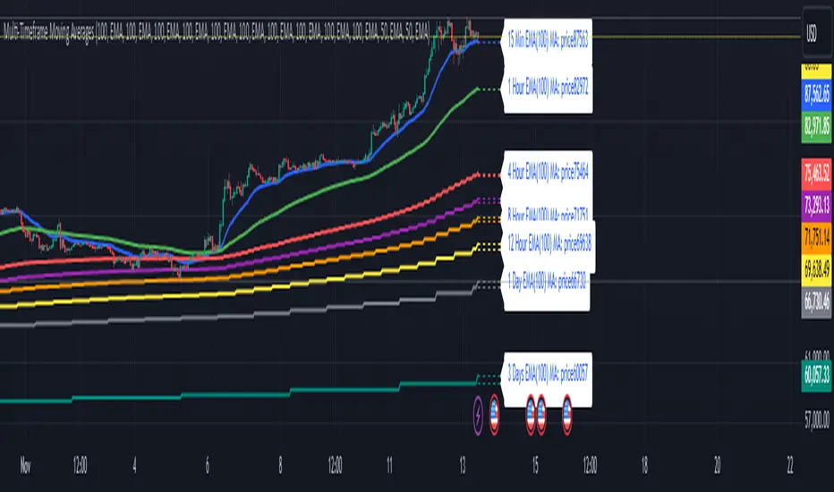
Multi-Timeframe Moving Averages by Skyito"Hope everyone likes this and finds it useful! This multi-timeframe moving average indicator provides a comprehensive view of moving averages from various timeframes directly on one chart. It’s designed to help traders analyze market trends and levels more effectively without constantly switching between charts.
Script Explanation: This indicator supports a range of moving average types, including SMA, EMA, HMA, WMA, VWMA, RMA, SSMA, and DEMA, allowing for flexibility in analysis. Each moving average is fully customizable by length and type for each timeframe, giving you control over how trends are represented.
The indicator includes timeframes such as 15 minutes, 1 hour, 4 hours, 6 hours, 8 hours, 12 hours, 1 day, 3 days, 5 days, 1 week, 3 weeks, and 1 month. Each moving average is displayed as a line with a small dashed extension, showing a label that contains the moving average’s timeframe, type, and current price level. The dark blue labels are slightly enlarged to enhance readability on the chart, making it easier to track important levels at a glance.
Use Case: This tool is ideal for traders looking to stay aware of trend levels across multiple timeframes on one chart. Adjusting the moving averages’ lengths and types enables customization for any strategy, while the label information provides an immediate understanding of the timeframe and trend context.
Enjoy the streamlined view and the added insights from multi-timeframe analysis!"
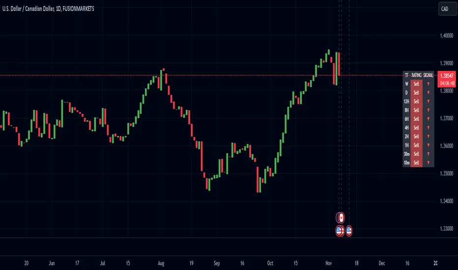
Enhanced Pressure MTF ScreenerEnhanced Pressure Multi-Timeframe (MTF) Screener Indicator
Overview
The Enhanced Pressure MTF Screener is an add-on that extends the capabilities of the Enhanced Buy/Sell Pressure, Volume, and Trend Bar Analysis . It provides a clear and consolidated view of buy/sell pressure across multiple timeframes. This indicator allows traders to determine when different timeframes are synchronized in the same trend direction, which is particularly useful for making high-confidence trading decisions.
Image below: is the Enhanced Buy/Sell Pressure, Volume, and Trend Bar Analysis with the Enhanced Pressure MTF Screener indicator both active together.
Key Features
1.Multi-Timeframe Analysis
The indicator screens various predefined timeframes (from 1 week down to 10 minutes).
It offers a table view that shows buy or sell ratings for each timeframe, making it easy to see which timeframes are aligned.
Traders can choose which timeframes to include based on their trading strategies (e.g., higher timeframes for position trading, lower timeframes for scalping).
2.Pressure and Trend Calculation
Uses Buy and Sell Pressure calculations from the Enhanced Buy/Sell Pressure indicator to determine whether buying or selling is dominant in each timeframe.
By analyzing pressures on multiple timeframes, the indicator gives a comprehensive perspective of the current market sentiment.
The indicator calculates whether a move is strong based on user-defined thresholds, which are displayed in the form of additional signals.
3.Heikin Ashi Option
The Heikin Ashi candle type can be toggled on or off. Using Heikin Ashi helps smooth out market noise and provides a clearer indication of trend direction.
This is particularly helpful for traders who want to filter out market noise and focus on the primary trend.
4.Table Customization
Table Positioning: The table showing timeframe data can be positioned at different locations on the chart—top, middle, or bottom.
Text and Alignment: The alignment and text size of the table can be customized for better visual clarity.
Color Settings: Users can choose specific colors to indicate buying and selling pressure across timeframes, making it easy to interpret.
5.Strong Movement Indicators
The screener provides an additional visual cue (🔥) for timeframes where the movement is deemed strong, based on a user-defined threshold.
This helps highlight timeframes where significant buying or selling pressure is present, which could signal potential trading opportunities.
How the Screener Works
1.Pressure Calculation
For each selected timeframe, the indicator retrieves the Open, High, Low, and Close (OHLC) values.
It calculates buy pressure (the range between high and low when the closing price is higher than the opening) and sell pressure (the range between high and low when the closing price is equal to or lower than the opening).
The screener computes the pressure ratio, which represents the difference between buying and selling pressure, to determine which side is dominant.
2.Trend Rating and Signal Generation
Based on the calculated pressure, the screener determines a trend rating for each timeframe: "Buy," "Sell," or "Neutral." (▲ ,▼ or •)
Additionally, it generates a signal (▲ or ▼) to indicate the current trend direction and whether the move is strong (based on the user-defined threshold).
If the movement is strong, a fire icon (🔥) is added to indicate that there is significant pressure on that timeframe, signaling a higher confidence in the trend.
3.Customizable Strong Move Thresholds
Strong Move Threshold: The screener uses this value to decide whether a trend is significantly strong. A higher value makes it more selective in determining strong moves.
Strong Movement Threshold: Helps determine when an additional strong signal should be displayed, offering further insight into the strength of market movement.
Inputs and Customization
The Enhanced Pressure MTF Screener is highly customizable to fit the needs of individual traders:
General Settings:
Use Heikin Ashi: Toggle this setting to use Heikin Ashi for a smoother trend representation.
Strong Move Threshold: Defines how strong a move should be to be considered significant.
Strong Movement Threshold: Specifies the level of pressure required to highlight a move with the fire icon.
Table Settings:
Position: Choose the vertical position of the screener table (top, middle, or bottom of the chart).
Alignment: Align the table (left, center, or right) to best suit your chart layout.
Text Size: Adjust the text size in the table for better readability.
Table Color Settings:
Users can set different colors to represent buying and selling signals for better visual clarity, particularly when scanning multiple timeframes.
Timeframe Settings:
The screener provides options to include up to ten different timeframes. Traders can select and customize each timeframe to match their strategy.
Examples of available timeframes include 1 Week, 1 Day, 12 Hours, down to 10 Minutes, allowing for both broad and detailed analysis.
Practical Use Case
Identifying Trend Alignment Across Timeframes:
Imagine you are about to take a long trade but want to make sure that the trend direction is aligned across multiple timeframes.
The screener displays "Buy" ratings across the 4H, 1H, 30M, and 10M timeframes, while higher timeframes (like 1W and 1D) also show "Buy" with strong signals (🔥). This indicates that buying pressure is strong across the board, adding confidence to your trade.
Spotting Reversal Opportunities:
If a downtrend is evident across most timeframes but suddenly a higher timeframe, such as 12H, changes to "Buy" while showing a strong move (🔥), this could indicate a potential reversal.
The screener allows you to spot these discrepancies and consider taking early action.
Benefits for Traders
1.Synchronization Across Timeframes:
One of the main strengths of this screener is its ability to show synchronized buy/sell signals across different timeframes. This makes it easy to confirm the strength and consistency of a trend.
For example, if you see that all the selected timeframes display "Buy," this implies that both short-term and long-term traders are favoring the upside, giving additional confidence to go long.
2.Quick and Visual Trend Overview:
The table offers an at-a-glance summary, reducing the time required to manually inspect each timeframe.
This makes it particularly useful for traders who want to make quick decisions, such as day traders or scalpers.
3.Strong Move Indicator:
The use of fire icons (🔥) provides an easy way to identify significant movements. This is particularly helpful for traders looking for breakouts or strong market conditions that could lead to high probability trades.
To put it short or to summarize
The Enhanced Pressure MTF Screener is a powerful add-on for traders looking to understand how buy and sell pressure aligns across multiple timeframes. It offers:
A clear summary of buying or selling pressure across different timeframes.
Heikin Ashi smoothing, providing an option to reduce market noise.
Strong movement signals to highlight significant trading opportunities.
Customizable settings to fit any trading strategy or style.
The screener and the main indicator are best used together, as the screener provides the multi-timeframe overview, while the main indicator provides an in-depth look at each individual bar and trend.
I hope my indicator helps with your trading, if you guys have any ideas or questions there is the comment section :D
Dynamic Market Correlation Analyzer (DMCA) v1.0Description
The Dynamic Market Correlation Analyzer (DMCA) is an advanced TradingView indicator designed to provide real-time correlation analysis between multiple assets. It offers a comprehensive view of market relationships through correlation coefficients, technical indicators, and visual representations.
Key Features
- Multi-asset correlation tracking (up to 5 symbols)
- Dynamic correlation strength categorization
- Integrated technical indicators (RSI, MACD, DX)
- Customizable visualization options
- Real-time price change monitoring
- Flexible timeframe selection
## Use Cases
1. **Portfolio Diversification**
- Identify highly correlated assets to avoid concentration risk
- Find negatively correlated assets for hedging strategies
- Monitor correlation changes during market events
2. Pairs Trading
- Detect correlation breakdowns for potential trading opportunities
- Track correlation strength for pair selection
- Monitor technical indicators for trade timing
3. Risk Management
- Assess portfolio correlation risk in real-time
- Monitor correlation shifts during market stress
- Identify potential portfolio vulnerabilities
4. **Market Analysis**
- Study sector relationships and rotations
- Analyze cross-asset correlations (e.g., stocks vs. commodities)
- Track market regime changes through correlation patterns
Components
Input Parameters
- **Timeframe**: Custom timeframe selection for analysis
- **Length**: Correlation calculation period (default: 20)
- **Source**: Price data source selection
- **Symbol Selection**: Up to 5 customizable symbols
- **Display Options**: Table position, text color, and size settings
Technical Indicators
1. **Correlation Coefficient**
- Range: -1 to +1
- Strength categories: Strong/Moderate/Weak (Positive/Negative)
2. **RSI (Relative Strength Index)**
- 14-period default setting
- Momentum comparison across assets
3. **MACD (Moving Average Convergence Divergence)**
- Standard settings (12, 26, 9)
- Trend direction indicator
4. **DX (Directional Index)**
- Trend strength measurement
- Based on DMI calculations
Visual Components
1. **Correlation Table**
- Symbol identifiers
- Correlation coefficients
- Correlation strength descriptions
- Price change percentages
- Technical indicator values
2. **Correlation Plot**
- Real-time correlation visualization
- Multiple correlation lines
- Reference levels at -1, 0, and +1
- Color-coded for easy identification
Installation and Setup
1. Load the indicator on TradingView
2. Configure desired symbols (up to 5)
3. Adjust timeframe and calculation length
4. Customize display settings
5. Enable/disable desired components (table, plot, RSI)
Best Practices
1. **Symbol Selection**
- Choose related but distinct assets
- Include a mix of asset classes
- Consider market cap and liquidity
2. **Timeframe Selection**
- Match timeframe to trading strategy
- Consider longer timeframes for strategic analysis
- Use shorter timeframes for tactical decisions
3. **Interpretation**
- Monitor correlation changes over time
- Consider multiple timeframes
- Combine with other technical analysis tools
- Account for market conditions and volatility
Performance Notes
- Calculations update in real-time
- Resource usage scales with number of active symbols
- Historical data availability may affect initial calculations
Version History
- v1.0: Initial release with core functionality
- Multi-symbol correlation analysis
- Technical indicator integration
- Customizable display options
Future Enhancements (Planned)
- Additional technical indicators
- Advanced correlation algorithms
- Enhanced visualization options
- Custom alert conditions
- Statistical significance testing

Dual Momentum StrategyThis Pine Script™ strategy implements the "Dual Momentum" approach developed by Gary Antonacci, as presented in his book Dual Momentum Investing: An Innovative Strategy for Higher Returns with Lower Risk (McGraw Hill Professional, 2014). Dual momentum investing combines relative momentum and absolute momentum to maximize returns while minimizing risk. Relative momentum involves selecting the asset with the highest recent performance between two options (a risky asset and a safe asset), while absolute momentum considers whether the chosen asset has a positive return over a specified lookback period.
In this strategy:
Risky Asset (SPY): Represents a stock index fund, typically more volatile but with higher potential returns.
Safe Asset (TLT): Represents a bond index fund, which generally has lower volatility and acts as a hedge during market downturns.
Monthly Momentum Calculation: The momentum for each asset is calculated based on its price change over the last 12 months. Only assets with a positive momentum (absolute momentum) are considered for investment.
Decision Rules:
Invest in the risky asset if its momentum is positive and greater than that of the safe asset.
If the risky asset’s momentum is negative or lower than the safe asset's, the strategy shifts the allocation to the safe asset.
Scientific Reference
Antonacci's work on dual momentum investing has shown the strategy's ability to outperform traditional buy-and-hold methods while reducing downside risk. This approach has been reviewed and discussed in both academic and investment publications, highlighting its strong risk-adjusted returns (Antonacci, 2014).
Reference: Antonacci, G. (2014). Dual Momentum Investing: An Innovative Strategy for Higher Returns with Lower Risk. McGraw Hill Professional.

Trend Momentum Indicator with MACD ConfirmationTrend Momentum Indicator with MACD Confirmation
Overview: The Trend Momentum Indicator with MACD Confirmation is a versatile trading tool designed to help traders identify potential buy and sell signals in the market based on the interaction between price action, a Simple Moving Average (SMA), and the Moving Average Convergence Divergence (MACD) indicator. This strategy aims to enhance trading decisions by waiting for MACD confirmation before executing trades, thereby reducing false signals.
Components:
Simple Moving Average (SMA):
The SMA is calculated over a user-defined period (default: 20 bars) and serves as a trend indicator. It provides a smoothed representation of price action and helps traders identify the overall market direction.
MACD:
The MACD is calculated using standard parameters (12 for fast length, 26 for slow length, and 9 for signal length) but can be adjusted to suit individual trading preferences. The MACD consists of two lines:
MACD Line: The difference between the fast and slow EMAs.
Signal Line: An EMA of the MACD Line, which helps indicate buy and sell conditions.
Buy and Sell Signals:
Buy Signal: A buy signal is triggered when the price crosses above the SMA, coupled with the MACD line crossing above the signal line, indicating a bullish momentum.
Sell Signal: A sell signal occurs when the price crosses below the SMA, alongside the MACD line crossing below the signal line, indicating a bearish momentum.
Visual Features:
The SMA is plotted on the main price chart, allowing traders to easily visualize trend direction.
Buy signals are indicated by green triangle shapes below the price bars, while sell signals are shown by red triangle shapes above the price bars.
Optionally, a MACD histogram can be plotted to visualize the difference between the MACD line and the signal line, helping to confirm trade signals visually.
Usage:
This indicator is suitable for various trading styles, including day trading, swing trading, and trend-following strategies. It can be applied to any financial instrument, including stocks, forex, and cryptocurrencies.
Traders should consider combining this indicator with additional tools and analysis to enhance decision-making and manage risk effectively.

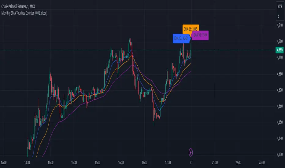
Monthly EMA Touches CounterKey Features of This Script:
Touch Threshold: The script checks if the price is within a specified percentage of each EMA.
Monthly Touch Counters: Separate counters (touchCountEMA12, touchCountEMA26, touchCountEMA50) are used to count touches for each EMA.
Reset Logic: All counters reset at the start of a new month using if ta.change(time("M")).
Increment Logic: Each counter increments whenever the corresponding EMA is touched during a bar.
Label Management: Labels are created to display each count above the bars at the end of each month.
Alert Conditions: Alerts are set up for when the price touches any of the EMAs.
Usage:
Copy and paste this script into TradingView's Pine Script editor.
Add it to your chart to see how many times the price has touched each of the EMAs (12, 26, and 50) on a monthly basis.
Adjust the Touch Threshold (%) input as needed for sensitivity.
This implementation will allow you to effectively track and visualize how often price touches each of these EMAs on a monthly basis. If you have further modifications or additional features you'd like to explore, feel free to ask
S&P 100 Option Expiration Week StrategyThe Option Expiration Week Strategy aims to capitalize on increased volatility and trading volume that often occur during the week leading up to the expiration of options on stocks in the S&P 100 index. This period, known as the option expiration week, culminates on the third Friday of each month when stock options typically expire in the U.S. During this week, investors in this strategy take a long position in S&P 100 stocks or an equivalent ETF from the Monday preceding the third Friday, holding until Friday. The strategy capitalizes on potential upward price pressures caused by increased option-related trading activity, rebalancing, and hedging practices.
The phenomenon leveraged by this strategy is well-documented in finance literature. Studies demonstrate that options expiration dates have a significant impact on stock returns, trading volume, and volatility. This effect is driven by various market dynamics, including portfolio rebalancing, delta hedging by option market makers, and the unwinding of positions by institutional investors (Stoll & Whaley, 1987; Ni, Pearson, & Poteshman, 2005). These market activities intensify near option expiration, causing price adjustments that may create short-term profitable opportunities for those aware of these patterns (Roll, Schwartz, & Subrahmanyam, 2009).
The paper by Johnson and So (2013), Returns and Option Activity over the Option-Expiration Week for S&P 100 Stocks, provides empirical evidence supporting this strategy. The study analyzes the impact of option expiration on S&P 100 stocks, showing that these stocks tend to exhibit abnormal returns and increased volume during the expiration week. The authors attribute these patterns to intensified option trading activity, where demand for hedging and arbitrage around options expiration causes temporary price adjustments.
Scientific Explanation
Research has found that option expiration weeks are marked by predictable increases in stock returns and volatility, largely due to the role of options market makers and institutional investors. Option market makers often use delta hedging to manage exposure, which requires frequent buying or selling of the underlying stock to maintain a hedged position. As expiration approaches, their activity can amplify price fluctuations. Additionally, institutional investors often roll over or unwind positions during expiration weeks, creating further demand for underlying stocks (Stoll & Whaley, 1987). This increased demand around expiration week typically leads to temporary stock price increases, offering profitable opportunities for short-term strategies.
Key Research and Bibliography
Johnson, T. C., & So, E. C. (2013). Returns and Option Activity over the Option-Expiration Week for S&P 100 Stocks. Journal of Banking and Finance, 37(11), 4226-4240.
This study specifically examines the S&P 100 stocks and demonstrates that option expiration weeks are associated with abnormal returns and trading volume due to increased activity in the options market.
Stoll, H. R., & Whaley, R. E. (1987). Program Trading and Expiration-Day Effects. Financial Analysts Journal, 43(2), 16-28.
Stoll and Whaley analyze how program trading and portfolio insurance strategies around expiration days impact stock prices, leading to temporary volatility and increased trading volume.
Ni, S. X., Pearson, N. D., & Poteshman, A. M. (2005). Stock Price Clustering on Option Expiration Dates. Journal of Financial Economics, 78(1), 49-87.
This paper investigates how option expiration dates affect stock price clustering and volume, driven by delta hedging and other option-related trading activities.
Roll, R., Schwartz, E., & Subrahmanyam, A. (2009). Options Trading Activity and Firm Valuation. Journal of Financial Markets, 12(3), 519-534.
The authors explore how options trading activity influences firm valuation, finding that higher options volume around expiration dates can lead to temporary price movements in underlying stocks.
Cao, C., & Wei, J. (2010). Option Market Liquidity and Stock Return Volatility. Journal of Financial and Quantitative Analysis, 45(2), 481-507.
This study examines the relationship between options market liquidity and stock return volatility, finding that increased liquidity needs during expiration weeks can heighten volatility, impacting stock returns.
Summary
The Option Expiration Week Strategy utilizes well-researched financial market phenomena related to option expiration. By positioning long in S&P 100 stocks or ETFs during this period, traders can potentially capture abnormal returns driven by option market dynamics. The literature suggests that options-related activities—such as delta hedging, position rollovers, and portfolio adjustments—intensify demand for underlying assets, creating short-term profit opportunities around these key dates.

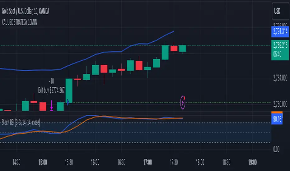
XAUUSD 10-Minute StrategyThis XAUUSD 10-Minute Strategy is designed for trading Gold vs. USD on a 10-minute timeframe. By combining multiple technical indicators (MACD, RSI, Bollinger Bands, and ATR), the strategy effectively captures both trend-following and reversal opportunities, with adaptive risk management for varying market volatility. This approach balances high-probability entries with robust volatility management, making it suitable for traders seeking to optimise entries during significant price movements and reversals.
Key Components and Logic:
MACD (12, 26, 9):
Generates buy signals on MACD Line crossovers above the Signal Line and sell signals on crossovers below the Signal Line, helping to capture momentum shifts.
RSI (14):
Utilizes oversold (below 35) and overbought (above 65) levels as a secondary filter to validate entries and avoid overextended price zones.
Bollinger Bands (20, 2):
Uses upper and lower Bollinger Bands to identify potential overbought and oversold conditions, aiming to enter long trades near the lower band and short trades near the upper band.
ATR-Based Stop Loss and Take Profit:
Stop Loss and Take Profit levels are dynamically set as multiples of ATR (3x for stop loss, 5x for take profit), ensuring flexibility with market volatility to optimise exit points.
Entry & Exit Conditions:
Buy Entry: T riggered when any of the following conditions are met:
MACD Line crosses above the Signal Line
RSI is oversold
Price drops below the lower Bollinger Band
Sell Entry: Triggered when any of the following conditions are met:
MACD Line crosses below the Signal Line
RSI is overbought
Price moves above the upper Bollinger Band
Exit Strategy: Trades are closed based on opposing entry signals, with adaptive spread adjustments for realistic exit points.
Backtesting Configuration & Results:
Backtesting Period: July 21, 2024, to October 30, 2024
Symbol Info: XAUUSD, 10-minute timeframe, OANDA data source
Backtesting Capital: Initial capital of $700, with each trade set to 10 contracts (equivalent to approximately 0.1 lots based on the broker’s contract size for gold).
Users should confirm their broker's contract size for gold, as this may differ. This script uses 10 contracts for backtesting purposes, aligned with 0.1 lots on brokers offering a 100-contract specification.
Key Backtesting Performance Metrics:
Net Profit: $4,733.90 USD (676.27% increase)
Total Closed Trades: 526
Win Rate: 53.99%
Profit Factor: 1.44 (1.96 for Long trades, 1.14 for Short trades)
Max Drawdown: $819.75 USD (56.33% of equity)
Sharpe Ratio: 1.726
Average Trade: $9.00 USD (0.04% of equity per trade)
This backtest reflects realistic conditions, with a spread adjustment of 38 points and no slippage or commission applied. The settings aim to simulate typical retail trading conditions. However, please adjust the initial capital, contract size, and other settings based on your account specifics for best results.
Usage:
This strategy is tuned specifically for XAUUSD on a 10-minute timeframe, ideal for both trend-following and reversal trades. The ATR-based stop loss and take profit levels adapt dynamically to market volatility, optimising entries and exits in varied conditions. To backtest this script accurately, ensure your broker’s contract specifications for gold align with the parameters used in this strategy.
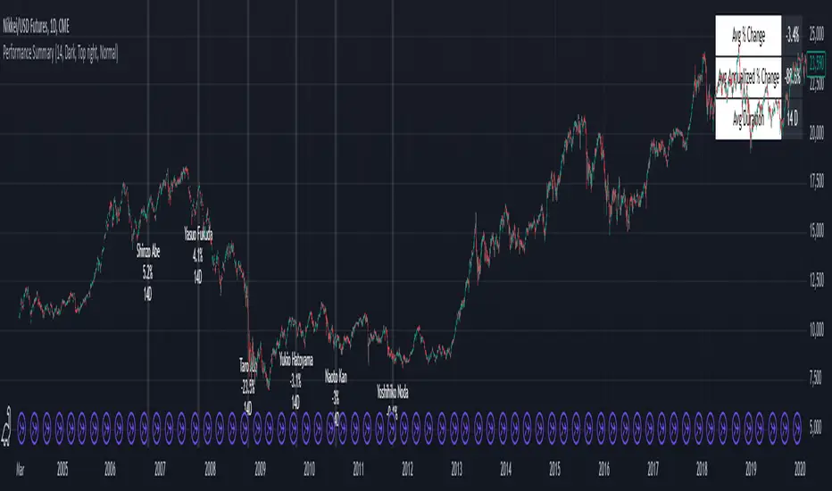
Performance Summary and Shading (Offset Version)Modified "Recession and Crisis Shading" Indicator by @haribotagada (Original Link: )
The updated indicator accepts a days offset (positive or negative) to calculate performance between the offset date and the input date.
Potential uses include identifying performance one week after company earnings or an FOMC meeting.
This feature simplifies input by enabling standardized offset dates, while still allowing flexibility to adjust ranges by overriding inputs as needed.
Summary of added features and indicator notes:
Inputs both positive and negative offset.
By default, the script calculates performance from the close of the input date to the close of the date at (input date + offset) for positive offsets, and from the close of (input date - offset) to the close of the input date for negative offsets. For example, with an input date of November 1, 2024, an offset of 7 calculates performance from the close on November 1 to the close on November 8, while an offset of -7 calculates from the close on October 25 to the close on November 1.
Allows user to perform the calculation using the open price on the input date instead of close price
The input format has been modified to allow overrides for the default duration, while retaining the original capabilities of the indicator.
The calculation shows both the average change and the average annualized change. For bar-wise calculations, annualization assumes 252 trading days per year. For date-wise calculations, it assumes 365 days for annualization.
Carries over all previous inputs to retain functionality of the previous script. Changes a few small settings:
Calculates start to end date performance by default instead of peak to trough performance.
Updates visuals of label text to make it easier to read and less transparent.
Changed stat box color scheme to make the text easier to read
Updated default input data to new format of input with offsets
Changed default duration statistic to number of days instead of number of bars with an option to select number of bars.
Potential Features to Add:
Import dataset from CSV files or by plugging into TradingView calendar
Example Input Datasets:
Recessions:
2020-02-01,COVID-19,59
2007-12-01,Subprime mortgages,547
2001-03-01,Dot-com,243
1990-07-01,Oil shock,243
1981-07-01,US unemployment,788
1980-01-01,Volker,182
1973-11-01,OPEC,485
Japan Revolving Door Elections
2006-09-26, Shinzo Abe
2007-09-26, Yasuo Fukuda
2008-09-24, Taro Aso
2009-09-16, Yukio Hatoyama
2010-07-08, Naoto Kan
2011-09-02, Yoshihiko Noda
Hope you find the modified indicator useful and let me know if you would like any features to be added!