S9 ToolkitGENERAL OVERVIEW:
The S9 Toolkit is a multi-layered market structure and volume analysis indicator. It combines volumetric support and resistance, trendlines, engulfing candlesticks & zones, session volume profile, swing highs/lows, moving averages, and a checklist dashboard into one framework. Each component works independently while staying aligned with the others.
This indicator was developed by Flux Charts in collaboration with S9 Trades.
WHAT IS THE THEORY BEHIND THIS INDICATOR?:
The core idea is that price movement encodes behavior, not just direction. Candles show where price traded, but they don’t reveal how committed buyers or sellers were or whether a move was truly accepted or rejected. The S9 Toolkit exposes these behaviors by watching how price reacts at structurally important areas and by analyzing volume during those interactions.
Structure defines where the market is operating. Highs, lows, zones, and trends mark areas where the market has responded before. Volume adds context by showing the level of participation at those locations. Strong reactions, weak follow-through, repeated tests, and clean breaks each convey different information.
Market structure also changes over time. A zone that holds multiple tests may remain important, while one that breaks cleanly may lose relevance. The toolkit tracks these interactions so traders can see how structure evolves rather than treating levels as fixed. Sessions matter too. Markets behave differently across trading windows, and volume distribution shifts throughout the day. By incorporating session-based profiling and higher-timeframe alignment, the toolkit accounts for these differences.
The purpose of the S9 Toolkit is to clarify what the market is doing now and how that relates to earlier structure. It organizes price, volume, and structural change into a clear framework, helping traders make decisions with better context.
S9 TOOLKIT FEATURES:
The S9 Toolkit indicator includes 8 main features:
Volumetric Support & Resistance Zones
Trendlines Structure
Engulfing Candlesticks & Zones
Swing Highs/Lows
Session Volume Profile
EMAs & Directional Bias Dashboard
Checklist Dashboard
Alerts
Each component operates independently while sharing the same underlying market structure and confirmation logic. Detailed explanations for each component are provided in the sections that follow.
VOLUMETRIC SUPPORT AND RESISTANCE ZONES:
🔹 What is Support & Resistance?
Support and resistance are areas on the chart where price previously showed a meaningful reaction. Support is a price area where buying activity was sufficient to slow down or reverse a decline and is displayed in the lower portion of price movement, while resistance is a price area where selling activity was sufficient to slow down or reverse an advance, and is shown in the upper portion of price movement. These zones represent areas where bullish and bearish pressure accumulated and where price is more likely to react again when revisited.
The S9 Toolkit treats support and resistance as price zones. Price does not interact with one exact level but with a range where previous reactions occurred. These zones make it easier to observe whether price reacts, pauses, or moves through the same range when revisited.
(Screenshot: only Support Resistance Zones Enabled)
🔹 How the Indicator Identifies Support & Resistance
The S9 Toolkit identifies support and resistance using confirmed market structure.
◇ Step 1: Confirmed Swing Detection
The indicator first detects confirmed swing highs and swing lows using a user-defined pivot length. A swing is only confirmed after price has completed the required number of bars on both sides, ensuring that structure does not repaint.
Confirmed swing lows are used to identify support
Confirmed swing highs are used to identify resistance
(Screenshot: Pivot swing detection)
◇ Step 2: Zone Construction
Once a swing is confirmed, the indicator constructs a price zone.
The zone is created around the confirmed swing pivot
The zone boundaries are offset above and below the pivot using a fixed Daily Average True Range (ATR) value
The ATR value is used only to define the initial zone size and does not change after the zone is created
Each zone is plotted forward in time so future price interaction can be observed.
(Screenshot: Zones instead of Lines - based on ATR)
◇ Step 3: Overlap Filtering
To reduce clutter and redundant structure, newly detected zones are compared against existing zones of the same type. If a new zone overlaps too closely with an existing active zone, it is not created
(Screenshot: Ignoring overlapping zones)
🔹 Volumetric Information
Each zone displays the volume information accumulated during its formation. This includes total volume and the percentage breakdown between bullish and bearish activity. By embedding this information directly within the zone, the indicator allows traders to evaluate the character of the trading activity that created the structure.
◇ How volume is calculated
During zone formation, volume is accumulated using lower-timeframe data. Volume is classified as bullish when a bar closes at or above its open, and bearish when a bar closes below its open. This provides a consistent approximation of buying versus selling volume without requiring bid/ask data.
(Screenshot: Bullish Volume vs Bearish Volume)
◇ How volume is displayed
Each zone displays:
The total volume traded during zone formation
A percentage value indicating which side was dominant
For support zones, the percentage represents bullish volume
For resistance zones, the percentage represents bearish volume
◇ Imbalance Zones
In some cases, a zone may show volume dominance that does not align with its type. For example, a resistance zone may display a higher bullish volume percentage, or a support zone may display a higher bearish volume percentage. This indicates that price reversed despite greater activity from the opposing side during formation. These imbalanced zones are displayed the same way as other zones and provide additional information about how price reacted within that range.
(Screenshot: Imbalance Zones)
🔹 Breaks & Retests
After a zone is created, the S9 Toolkit tracks how price interacts with it over time.
◇ Retests
A retest occurs when price returns to a zone after moving away, trades into its price range, and reacts without breaking through the zone boundaries. The retest is only counted after the bar closes, ensuring that transient intrabar touches are not treated as valid retests.
(Screenshot: Retests)
◇ Breaks
A break occurs when price moves beyond a zone’s boundary according to the selected invalidation method.
(Screenshot: Zone breaks)
Breaks are evaluated only on confirmed bars. Intrabar price movement does not trigger break conditions, ensuring that only completed price action updates the zone state.
Once a break is confirmed, the zone is marked as broken and its internal state is updated. The zone no longer qualifies as active support or resistance and can optionally remain on the chart in a visually muted form.
🔹Settings
◇ Volumetric Info
Enables or disables the display of volumetric information inside support and resistance zones. When enabled, each zone shows the total volume traded during its formation along with the bullish and bearish volume distribution. When disabled, zones are displayed without any volume data.
◇ Pivot Length
The Pivot Length setting controls how many bars on each side of a price point are required to confirm a swing high or swing low, used to create support and resistance zones. A zone is only formed after the swing is fully confirmed. Higher Pivot Length values require more confirmation bars, resulting in fewer support and resistance zones based on larger, more established price moves. Lower values confirm swings more quickly, creating more frequent zones that reflect finer structural detail. Pivot Length only affects how support and resistance zones are identified and does not change the zone size or behavior after creation.
(Pivot Length: 5 Detects more zones)
(Pivot Length: 20 Detects fewer zones)
◇ Strength
The strength value represents the number of confirmed retests a support or resistance zone has received. Strength increases only when a valid retest occurs and is capped at a maximum of three. Zones are displayed only when their strength meets or exceeds the user-defined Strength setting. This value does not change after a zone is broken.
(Screenshot: Strength 1, 2 ,3 zones displayed)
◇ Higher-Timeframe Zones
The S9 Toolkit allows support and resistance zones to be calculated on a higher timeframe and projected onto the active chart. When a higher timeframe is selected, zone creation, retests, and breaks are all evaluated using that timeframe's data, while the zones themselves are displayed on lower timeframes without recalculation. This allows traders to observe how lower-timeframe price interacts with zones that were formed using higher-timeframe price action and a wider price range.
(Screenshot: Higher Timeframe Zones)
◇ Invalidation method
The S9 Toolkit allows users to control how a break is confirmed by selecting an invalidation method.
Close-based Invalidation: A break is confirmed only when price closes beyond the zone boundary. Wick penetration alone is ignored. This method requires price to fully accept beyond the zone before it is marked as broken.
Wick-based Invalidation: A break is confirmed when price wicks beyond the zone boundary, even if the candle closes back inside the zone. This method is more sensitive and captures early or aggressive break attempts.
(Screenshot: Zone Breaks with Close)
(Screenshot: Zone Breaks with Wick)
◇ Display Nearest
The Display Nearest setting controls how many of the closest support and resistance zones are shown on the chart relative to the current price. Only the nearest active zones above and below price are displayed, while older or more distant zones are hidden. This helps reduce visual clutter and keeps the focus on the most immediately relevant support and resistance areas without removing or recalculating any underlying zones.
(Screenshot: Display nearest 2 zones)
◇ Breaks & Retests
These settings control the visibility and appearance of break and retest markers on support and resistance zones. Users can independently enable or disable break markers and retest markers. Color settings allow customization of how bullish and bearish retests and zone breaks are displayed on the chart, making it easier to distinguish different types of interactions. Turning these options off hides the markers without affecting how zones are calculated.
◇ Show invalidation Zones
The Show Invalidated Zones setting controls whether support and resistance zones remain visible after they are broken. When enabled, zones that have been invalidated are kept on the chart in a visually muted form. This allows users to see where zones were previously active without treating them as current support or resistance. When disabled, invalidated zones are removed from the chart once a break is confirmed, keeping the display focused only on active zones.
(Screenshot: Historical Zones are muted)
TRENDLINES:
🔹 What is a Trendline
A bullish trendline is a line drawn by connecting higher swing lows, showing that price is making progressively higher lows over time. As long as price continues to respect this line, upward movement remains intact. A bullish trendline is typically tested from above, and a break occurs when price closes below the line.
(Screenshot: Bullish Trendline)
A bearish trendline is a line drawn by connecting lower swing highs, showing that price is making progressively lower highs over time. As long as price respects this line, the downward movement remains intact. A bearish trendline is typically tested from below, and a break occurs when price closes above the line.
(Screenshot: Bearish Trendline)
🔹How it works
In the S9 Toolkit, trendlines are constructed using confirmed swing points. Each trendline is created only after a valid sequence of pivots is identified, ensuring that lines are based on completed price movement rather than interim fluctuations. Once drawn, a trendline extends forward and is continuously evaluated as new price data forms. Trendlines and volumetric zones work together in the S9 Toolkit. Zones highlight areas where price interacts and trades, while trendlines show the overall directional structure. When viewed together, they help traders see whether price is moving in line with the current structure or beginning to move away from it.
🔹How the indicator detects trendlines
◇ Step 1: Detect confirmed swing pivots
The S9 Toolkit identifies confirmed swing highs and swing lows using the selected Swing Length setting. A pivot is only confirmed after the required number of bars have formed on both sides, ensuring completed structure and non-repainting behavior.
(Screenshot: Confirmed swing pivots)
◇ Step 2: Form and validate a candidate trendline
When a new pivot is confirmed, the indicator attempts to connect it with the previous pivot of the same type. For bearish trendlines, the new swing high must be lower than the previous swing high. For bullish trendlines, the new swing low must be higher than the previous swing low.
(Screenshot: New Lower High)
◇ Step 3: Apply strength filtering
Each valid candidate trendline is evaluated using a slope-based strength calculation derived from the relative size of the swing legs between the pivots, rather than a simple angle measurement. If the calculated strength does not meet the user-defined Strength threshold, the trendline is filtered out and not displayed.
(Screenshot: Strength Calculation)
◇ Step 4: Extend the trendline and draw the zone
Validated trendlines are extended forward by the number of bars defined in the Extend By setting. A shaded zone is drawn around the line using ATR-based padding so price interaction is observed as an area rather than a single line.
(Screenshot: S9 Toolkit’s Trendlines)
🔹 Swing Length
The Swing Length setting controls how swing points are identified for trendline construction. A swing point is confirmed only after the specified number of bars has formed on both sides of the pivot. A higher swing length requires more bars to confirm each pivot, resulting in fewer swing points and trendlines that reflect longer-term price movement. A lower swing length confirms pivots more frequently, producing more swing points and shorter-term trendlines that react more quickly to price changes.
(Screenshot: Trendlines with Smaller Swing Length)
(Screenshot: Trendlines with Higher Swing Length)
🔹Strength filtering
The strength setting controls how selective the trendline detection is. Higher strength values require more pronounced directional moves between swing points, filtering out flatter or weaker trendlines. Lower values allow more trendlines to appear, including those with gentler slopes. This allows traders to adjust sensitivity based on their preferred level of structural detail.
(Screenshot: Low strength zones, Flatter Slope)
(Screenshot, High Strength Zones, Weaker Filtered out)
🔹Trendline extension and lifecycle
Once established, trendlines extend forward by a user-inputted number of bars and remain active until invalidated by confirmed price behavior. A trendline does not disappear simply because the price moves away from it. Its relevance is reassessed only when the price decisively breaks through it.
(Screenshot: Trendlines Keep Extending Until Invalidation)
🔹Extend By
The Extend By setting controls how far a trendline is extended forward after its last confirmed pivot or break. The value defines the number of bars the trendline continues beyond that point for ongoing reference.
(Screenshot: Extend by Example)
🔹Show Last
The Show Last setting limits the number of most recent trendlines displayed on the chart. Older trendlines beyond this limit are hidden to reduce visual clutter.
(Screenshot: Show Last Settings)
🔹 Regular Breaks
A regular break occurs when price closes beyond the trendline on a confirmed bar. Intrabar movement is ignored, ensuring that only completed candles can invalidate a trendline. Regular breaks are evaluated using the same confirmed-bar logic as support and resistance zones.
(Screenshot: Regular Breaks)
🔹 Engulfing Breaks
An engulfing break occurs when a valid engulfing candle forms at the trendline. Instead of requiring a close beyond the line, the engulfing pattern itself is used as the break condition. Engulfing breaks are also evaluated only on confirmed bars and can be enabled independently of regular breaks.
(Screenshot: Engulfing Breaks)
The engulfing candlesticks used for trendline break detection follow the same criteria described later in this write-up in the Engulfing Candlesticks section below, where the pattern is explained in detail.
After a break, the trendline stops extending and is marked with a break label.
🔹Hide Invalidated Trendlines
When enabled, trendlines are removed from the chart after a confirmed break to reduce chart clutter and keep the focus on active directional structure. When disabled, broken trendlines remain visible for reference, allowing users to see where previous directional boundaries existed without treating them as valid trendlines.
(Screenshot: Only Valid Trendlines displayed)
🔹How to interpret trendline breaks and continuation
Trendlines should be viewed for directional reference, not as buy or sell signals. When price respects a trendline, it suggests the market is continuing in the same direction, and structure remains aligned. When reactions become weaker or price starts overlapping the line, it may indicate that directional strength is fading.
Clear breaks, especially when they occur near zones or alongside volume changes, often show that the market is re-evaluating its direction. When trendlines align with volumetric zones, price reactions tend to be more meaningful. When they do not align, the mismatch itself becomes useful information.
The S9 Toolkit highlights these relationships so traders can observe whether direction and structure remain aligned or begin to separate.
ENGULFING CANDLE BEHAVIOR AND ZONES:
🔹What is an engulfing candlestick
An engulfing candlestick occurs when a candle completely overtakes the body of the previous candle in the opposite direction. The current candle closes beyond the prior candle’s range, showing that price moved decisively during that bar rather than continuing the previous movement. This type of candlestick highlights a clear shift in short-term price direction compared to the preceding candle and marks areas where price momentum changes abruptly.
A bullish engulfing candlestick forms when a bearish candle is followed by a larger bullish candle that fully engulfs the previous candle’s body and closes above its high.
(Screenshot: Bullish Engulfing)
A bearish engulfing candlestick forms when a bullish candle is followed by a larger bearish candle that fully engulfs the previous candle’s body and closes below its low.
(Screenshot: Bearish Engulfing)
🔹 How the indicator detects engulfing candlesticks
◇ Step 1: Compare candle direction
The indicator first checks whether the previous candle and the current candle are in opposite directions. A bullish engulfing requires the previous candle to be bearish and the current candle to be bullish. A bearish engulfing requires the previous candle to be bullish and the current candle to be bearish.
(Screenshot: Bullish Candle/ Bearish Candle)
◇ Step 2: Apply body-size requirement
The indicator then checks that the current candle’s body is significantly larger than the previous candle’s body. This requirement filters out weak or marginal engulfing candles and focuses only on more decisive price movement.
(Screenshot: Weak Body vs Strong Body)
◇ Step 3: Confirm range takeover with a close beyond the prior bar
After the size condition is met, the indicator requires the current candle to close beyond the previous candle’s range:
Bullish engulfing candles must close above the previous candle’s high.
Bearish engulfing candles must close below the previous candle’s low.
(Screenshot: Closing above previous high)
◇ Step 4: Highlight the engulfing candle on the chart
When an engulfing candlestick is detected, the indicator highlights the candle using direction-specific colors. Bullish engulfing candles and bearish engulfing candles are colored separately based on the user’s Engulfing Candlesticks color settings, allowing quick visual identification on the chart.
(Screenshot: Highlighting the Engulfing Candle)
🔹Engulfing Zones
When a valid engulfing candlestick is detected, the toolkit constructs an engulfing zone based on the price range of the engulfing candlestick. For bullish engulfing, the zone spans from the current bar's high down to its open. For bearish engulfing, the zone spans from the current bar's open down to its low. These zones persist forward in time and can be revisited, tested, or invalidated like other structural elements. The toolkit tracks whether price later returns to mitigate (trade through) these zones.
(Screenshot: Engulfing Zones)
🔹Show Last
This setting limits the number of engulfing zones displayed on the chart. When set to a value such as 5, only the five most recent engulfing zones that have not yet been mitigated are shown, while all others are hidden to reduce chart clutter.
(Screenshot: Last 2 Engulfing Zones)
🔹How to interpret engulfing behavior
Engulfing behavior should be read as a sign of decisive price movement. A bullish engulfing event shows that buying pressure was strong enough to overcome the prior bar's range and close higher. A bearish engulfing event shows the same for selling pressure.
The most important information comes from what happens next. Continued movement in the same direction suggests follow-through, while overlap or hesitation suggests the move may be temporary.
Engulfing behavior becomes more contextually significant when it aligns with other toolkit components. An engulfing event that forms near a volumetric support zone, along a trendline, or close to a session POC may carry more weight than one that appears in open space. The toolkit presents these events as points of interest, allowing traders to evaluate context without treating them as automatic trade signals.
🔹Zone mitigation logic
When price revisits an engulfing zone after its creation, the toolkit tracks whether the zone is mitigated. A zone is marked as mitigated when price trades through it (closes beyond its boundary). Mitigated zones stop displaying, keeping the chart focused on active, unmitigated structure.
By highlighting engulfing behavior and optionally tracking the resulting zones, the S9 Toolkit turns candle patterns into observable reference points. Traders can see where decisive price moves occurred and whether those areas continue to influence later price behavior.
HIGHS AND LOWS STRUCTURAL MARKERS:
🔹How it works
The toolkit marks swing highs and lows as horizontal reference lines on the chart. These represent confirmed pivot points where price changed direction. When price later breaks through a prior swing level, it's marked with a "B" label.
🔹Swing detection
Swing sensitivity is configurable. Lower values detect more swings with finer detail. Higher values detect fewer, more significant pivots. Swings are only marked after confirmation, so they don't repaint.
🔹How to interpret
Swing highs and lows show where price previously reversed. Breaks show where price has moved beyond prior structure. Sequences of higher highs/lows or lower highs/lows help assess directional context.
SESSION VOLUME PROFILE:
🔹How it works
The Session Volume Profile component of the S9 Toolkit organizes traded volume across price for a defined trading session. Volume is arranged vertically across price levels, showing where activity concentrated and where trading interest was limited during that session. This helps identify the price areas where the market spent time trading and building activity. Sessions can be defined explicitly to reflect distinct trading environments, such as regional market opens or custom intraday windows. Each session profile resets independently, allowing traders to observe how value develops and shifts from one session to the next without cumulative distortion.
🔹How volume is distributed across price
Volume is aggregated across all bars within the active session and mapped to price levels using a configurable number of rows. The toolkit divides the session's price range into equal segments and distributes each bar's volume across the rows that the bar's range touches. Volume distribution uses a proportional calculation method where each bar's volume is allocated based on how much of the bar's range falls within each price row. This creates a distribution that highlights high-activity price levels and low-activity gaps. Volume is classified as up or down based on candle direction, providing a consistent way to separate buying and selling activity across the profile.
🔹Point of Control (POC)
The Point of Control represents the price level where the highest amount of volume was traded during the session. It marks the area of greatest trading activity and often acts as a gravitational reference point for price. The POC highlights where the market showed the strongest willingness to transact during that session.
Repeated interaction with a session POC suggests continued interest around that price level, while clean movement away from it can indicate that trading activity is shifting elsewhere.
🔹Value Area High and Low (VAH / VAL)
The Value Area defines the range of prices where the majority of session volume was exchanged. VAH marks the upper boundary of this range, while VAL marks the lower boundary. Together, they frame the area where the market considered prices fair during that session.
Price behavior around VAH and VAL often provides context. Continued trading within the value area reflects concentrated activity, while sustained trade outside of it often coincides with expansion or transition in price behavior.
🔹How to interpret session-based volume structure
Session Volume Profile should be interpreted in conjunction with structure and direction. A session that develops value above prior structure may indicate continuation, while value developing below may suggest reassessment. Sessions with narrow value and low activity often precede expansion, while sessions with wide, overlapping value often reflect consolidation.
By resetting profiles each session, the S9 Toolkit helps traders observe how value shifts over time and how activity changes across different trading environments. Session Volume Profile highlights where trading activity is concentrated and where it is limited, providing a clear context for how price movement develops afterward.
EMA BIAS:
🔹How it works
The toolkit allows users to display up to three exponential moving averages, each with a user-defined length. These EMA lengths can be configured independently, allowing short-, medium-, and longer-term averages to be viewed together on the chart. Each EMA updates continuously as new bars form.
🔹 Price Above the EMAs
When price trades consistently above one or more EMAs, bias relative to those EMAs is considered positive. This indicates that price is accepting higher levels and that upward movement is being maintained. When multiple EMAs are stacked below price and begin to spread apart, it often reflects bullish price discovery, where price is moving higher with momentum.
(Screenshot: Price above ema, Emas spread apart)
🔹Price Below the EMAs
When price trades consistently below one or more EMAs, bias relative to those EMAs is considered negative. This indicates that lower prices are being accepted and downward movement is being maintained. When multiple EMAs are stacked above price and spread apart, it often reflects bearish price discovery, where price is moving lower with strong directional pressure.
(Screenshot: Bearish EMA Direction)
🔹Frequent EMA Crossings and Compression
When price crosses back and forth through the EMAs and the EMAs remain close together, directional bias is unclear. This behavior typically indicates consolidation or range-bound conditions, where price lacks sustained directional movement and reactions at support or resistance are more likely to be rotational rather than trending.
(Screenshot: Frequent Crossing, Range-Bound)
CHECKLIST DASHBOARD:
🔹How it works
The Checklist Dashboard is a context reference tool designed to present selected market conditions in a compact, easy-to-read format. It brings together key observations from the S9 Toolkit and displays them in one place, allowing traders to review structure, direction, and interaction without scanning the entire chart.
Most checklist items are manually assessed and toggled by the trader based on their own reading of the chart. This allows the checklist to function as a disciplined review framework rather than an automated signal generator. The EMA-related item is the only condition that updates automatically based on live price behavior.
🔹How checklist conditions are handled
Each checklist item represents a specific consideration, such as structural alignment, directional bias, or interaction with key zones. Except for EMA, checklist states are user-controlled and reflect the trader's interpretation of current conditions using the toolkit's visual components.
Conditions are presented in a simple binary format to reduce cognitive load. The checklist does not rank, weight, or score conditions. Its purpose is to organize thought, not to make decisions.
🔹How to use the checklist
The Checklist Dashboard is best used as a discipline and a confluence aid. A checklist showing broad alignment can indicate a cleaner market environment, while mixed states can highlight uncertainty, compression, or transition.
Because the checklist is configurable and largely manual, traders can adapt it to different workflows, higher-timeframe analysis, intraday execution, or post-analysis review. Used properly, it helps maintain consistency and situational awareness without introducing mechanical bias or automated decision-making.
INPUTS:
🔹Volumetric Support & Resistance
◇ Enable
Turns volumetric support and resistance zones on or off entirely.
◇ Pivot Length
Defines how many bars on each side are required to confirm a swing pivot.
Higher values produce fewer, more stable zones based on higher-level structure. Lower values produce more frequent zones with finer structural detail.
◇ Strength
Sets the minimum number of valid retests required for a zone to remain active. Strength increases only when price revisits the zone without breaking it. The maximum strength is capped at three.
◇ Timeframe
Allows zones to be sourced from a higher timeframe and projected onto the active chart. When set, all zone logic (creation, retests, breaks) is evaluated on the selected timeframe while remaining historically aligned.
◇ Invalidation Method
Controls how zone invalidation is confirmed:
Close: A zone is invalidated only when the price closes beyond its boundary.
Wick: A zone is invalidated when the price wicks beyond its boundary.
Close-based invalidation is more conservative; wick-based invalidation is more sensitive.
◇ Display Nearest
Limits how many of the closest active zones are displayed.
◇ Volumetric Info
Displays internal volume information inside each zone, including total volume and bullish/bearish percentage split based on candle direction during zone formation.
◇ Retests
Displays retest markers when price revisits a zone and reacts without invalidation.
◇ Breaks
Displays visual markers when a zone is invalidated according to the selected invalidation method.
◇ Show Invalidated Zones
Keeps invalidated zones on the chart in a visually muted state. This preserves historical structure and allows observation of how price behaves around former areas of interest.
🔹Trendlines
Trendline inputs control directional structure derived from confirmed swings.
◇ Enable
Enables or disables all trendline calculations and rendering.
◇ Swing Length
Defines how many bars are required to confirm swing highs and lows used for trendline construction. Higher values emphasize broader directional structure; lower values increase sensitivity.
◇ Strength
Sets the minimum slope strength required for a trendline to be considered valid. Higher values filter out flatter or weaker trendlines.
◇ Extend By
Controls how many bars a trendline extends forward beyond its last confirmed point or break.
◇ Show Last
Limits the number of most recent trendlines displayed to reduce clutter.
◇ Regular Breaks
Marks a trendline break when price closes beyond the trendline.
◇ Engulfing Breaks
Marks a trendline break when a valid engulfing candle occurs at the trendline.
◇ Hide Invalidated Trendlines
Removes broken trendlines from the chart after confirmation.
🔹Engulfing Candlesticks
◇ Bullish Engulfing / Bearish Engulfing
Enables detection of bullish or bearish engulfing candles based on body size and directional criteria.
◇ Engulfing Zones
Creates zones from engulfing candles that can be revisited, tested, or invalidated like other structural elements.
◇ Show Last
Limits how many recent engulfing events or zones remain visible.
🔹Session Volume Profile
◇ Session Volume Profile
Enables session-based volume profiling.
◇ Session
Defines the active session window used to build each profile. Profiles reset automatically at session boundaries.
◇ Volume Mode
Controls how volume is displayed:
Up / Down: Separates volume based on candle direction.
Total: Displays total volume per price row.
Delta: Displays directional imbalance.
◇ Value Area Volume (%)
Defines the percentage of total session volume used to calculate the Value Area.
◇ Row Size
Defines how the session’s price range is divided when constructing the volume profile. Each row represents a discrete price band where volume is aggregated.
◇ Profile Placement
Anchors the volume profile to the left or right of the session range.
◇ Point of Control (POC)
Displays the price level with the highest traded volume for the session.
◇ Value Area High / Low (VAH / VAL)
Displays the upper and lower boundaries of the value area.
◇ Only Show Current Session
Hides historical session profiles and displays only the active session.
🔹Highs & Lows
◇ Highs/Lows
Enables swing high and swing low detection.
◇ Swing Length
Defines how many bars are required to confirm a swing pivot.
◇ Display Nearest
Limits how many recent swing levels are displayed.
◇ Show Breaks
Marks when price breaks beyond a prior swing high or low using confirmed bars.
🔹EMAs
◇ EMA Visibility and Lengths
Controls which EMAs are displayed and their respective lengths.
🔹Checklist Dashboard
◇ Enabled
Shows or hides the checklist dashboard.
◇ Checklist Items (1–5)
Each checklist item consists of:
A manual true/false toggle
A custom label
These reflect the trader’s interpretation of current conditions using the toolkit’s visual components.
◇ EMA Checklist
Automatically displays EMA alignment status. This is the only dynamic checklist item.
◇ Position
Controls where the checklist appears on the chart.
◇ Size
Controls dashboard text and spacing.
ALERTS:
🔹How alerts are triggered
Alerts in the S9 Toolkit notify traders when important structural or behavioral events occur. Each alert is linked to confirmed conditions, so notifications reflect completed market behavior. Alerts trigger only after the condition is confirmed on a closed bar.
Alert logic mirrors the same confirmation rules used throughout the toolkit. If a zone is invalidated, a trendline is broken, or a structural condition changes, the alert fires only once the event is confirmed. This prevents duplicate or misleading alerts caused by intrabar fluctuations or temporary probes.
🔹Available alert types
The S9 Toolkit supports alerts for the following events:
◇ Trendlines:
Bullish Trendline Detection
Bearish Trendline Detection
Bullish Trendline Break
Bearish Trendline Break
◇ Support/Resistance Zones:
Support Zone Detected
Resistance Zone Detected
Support Zone Retest
Resistance Zone Retest
Support Zone Break
Resistance Zone Break
◇ Engulfing Patterns:
Bullish Engulfing Candlestick
Bearish Engulfing Candlestick
◇ Swing Structure:
Swing High Break
Swing Low Break
◇ Moving Averages:
EMA Direction Change (price crosses above or below EMA)
Each alert type can be individually enabled or disabled in the indicator settings.
🔹How to set up alerts
To create alerts, add the S9 Toolkit indicator to your chart and configure which alert types you want to receive in the indicator settings. Then create a TradingView alert on the chart, select the S9 Toolkit indicator, and choose "Any alert() function call" as the condition. This will trigger an alert whenever any of your enabled alert types fires.
PERFORMANCE AND DESIGN CONSIDERATIONS:
🔹Lower-timeframe data handling
Some components of the S9 Toolkit rely on lower-timeframe data to provide more granular volume and structural insight. These requests are handled explicitly and conservatively to avoid excessive data usage or performance degradation. Lower-timeframe logic is applied only where it meaningfully enhances analysis, and safeguards are in place to prevent unnecessary recalculation.
🔹Object limits and performance safeguards
The toolkit actively manages drawing objects such as zones, lines, and profiles to remain within TradingView’s object limits. Older or less relevant objects can be pruned, merged, or visually downgraded to preserve chart performance. This ensures stability even when multiple components are enabled simultaneously.
🔹Non-repainting and confirmation logic
All calculations in the S9 Toolkit are based on confirmed historical data. No component relies on future bars or retroactive adjustment. Structural elements update only when confirmation conditions are met, ensuring that historical analysis remains consistent with real-time behavior. This design principle allows traders to trust that what they see on the chart reflects what was available at the time.
UNIQUENESS:
The S9 Toolkit focuses on contextual analysis by organizing price, volume, and structure into layered components that operate together rather than as isolated signals. It combines volumetric support and resistance zones with internal volume breakdowns, trendline structure, engulfing candlestick detection, session-based volume profiling, and swing structure tracking in a single visual layout. Unlike indicators that focus on one technique at a time, each component in the S9 Toolkit is designed to coexist without overriding the others, allowing traders to observe alignment, disagreement, and transitions in market conditions within the same chart view.
Swinghighlow

Market Structure Pro + (@JP7FX)Market Structure Pro Plus (JP7FX)
Market Structure Pro Plus identifies swing highs and swing lows using a three candle confirmation method. It highlights liquidity behaviour and market structure shifts without manual marking.
Swing Point Detection
The indicator marks swing highs and lows when the middle candle in a three candle sequence forms the highest high or lowest low.
This approach reacts to local price behaviour and does not rely on a large lookback period.
Liquidity Grab Signals
The indicator highlights when price trades beyond a previous swing high or swing low and then returns.
These events help users review how liquidity is taken around prior highs and lows.
Break of Structure Signals
The indicator marks a break of structure when a candle closes beyond a previous swing point.
Bullish structure change signals occur when price closes above a prior swing high.
Bearish structure change signals occur when price closes below a prior swing low.
Deviation Stats and Projections
The script tracks how far price extends beyond the last confirmed swing high or swing low, in pips, after liquidity is taken.
It keeps a rolling history of these extensions and calculates an average combined extension for recent moves.
This average is shown in a small stats table as “Avg SD High/Low”.
Using this value, the indicator projects two reference levels from the latest confirmed swing:
• a “Deviation High” line projected from the last swing high
• a “Deviation Low” line projected from the last swing low
These projection lines are drawn as dotted levels with labels and can be used as reference zones based on recent extension behaviour.
Features
• Automatic swing high and swing low detection
• Liquidity grab marking
• Break of structure marking
• Deviation stats table with average extension value
• Projection lines for Deviation High and Deviation Low
• Alerts for liquidity grabs and structure changes
• Market type setting for forex, stock, crypto, commodity and futures
• Customisable colours, line styles and visibility options
• Works across all timeframes and assets
Use Cases
Useful for traders who study market structure, track trend shifts, or review liquidity and extension behaviour around highs and lows.
The indicator reduces manual chart work by highlighting swing points, structure changes and typical extension zones in real time.

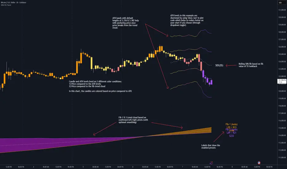
50% Fib Trend Cloud + ATR BandsThis indicator plots two structural 50% fibonacci midpoints from recent confirmed 'left/right' swings that form a *cloud* of equilibrium, then adds a rolling 50% fibonacci range midpoint based on a lookback window that's wrapped in ATR bands. Importantly, it solves a specific trading problem:
Structural midpoints (macro context) are powerful but can lag when price escapes prior ranges. Enter rolling 50% fib + ATR ➡️ which restores real-time balance & tolerance (micro context). Together they show where price is balanced structurally, where it’s balanced right now, and how much volatility to tolerate before acting.
➖➖➖
🔑 Why this is different
Most tools either draw a single midpoint (ex., daily 50%) or ATR bands around a moving average. This script fuses dual swing-based 50% midpoints (structure) + a rolling 50% with ATR (flow), so you don’t lose context when price escapes prior ranges. The cloud tells you who’s in control (fast vs. slow structure). The rolling 50% + ATR tells you how far is “too far” now.
➖➖➖
🧠 What it does (at a glance)
🔸Structural Equilibrium × 2 (Fib1/Fib2)
Two independent 50% midpoints formed from swing pivots (configurable Left/Right bars + optional smoothing). Their gap is the Midpoint Cloud = structural “fair value” zone.
🔸Rolling 50% + ATR Bands
A rolling highest/lowest window computes an always-current 50% rolling midpoint plot; ±ATR × length envelopes define a soft value area and over-stretch boundaries.
🔸Actionable Visuals
Optional fill between Fib1/Fib2, labels, and candle-overlay modes to instantly read regime (above both / below both / between).
🔸Smart Defaults
Timeframe-aware presets for L/R pivots & smoothing; full manual overrides available.
➖➖➖
⚙️ Calculations (plain-English)
🔸Pivot midpoints (Fib1 & Fib2):
1) Detect a swing using `Left/Right` bars
2) Take the swing’s high/low → compute 50%
3) (Optional) Smooth the line (SMA) to stabilize on noisy TFs
4) Repeat with a different sensitivity to get two distinct midpoints
🔸Rolling midpoint:
Highest High / Lowest Low over the last *N* bars → (HH + LL) / 2
🔸ATR levels:
`Upper = Rolling50 + ATR × Mult`, `Lower = Rolling50 − ATR × Mult`
(Typical: ATR length 14–21; Multipliers 2.236 for L1, 5.382 for L2)
➖➖➖
🤖 Auto-Configured Presets (with Manual Override)
💡Goal: make the midpoints “just work” on common timeframes while still letting you dial them in.
💡How Auto Presets work
When Auto Presets = ON, the script picks sensible L/R/S (Left bars / Right bars / Smoothing) for Fib Trend 1 and Fib Trend 2 based on chart timeframe.
🔸Fib 1 (fast) emphasizes *micro-structure* for quicker bias shifts.
🔸Fib 2 (slow) emphasizes *macro-structure* for anchor/bias context.
These defaults keep Fib 1 responsive without jitter and Fib 2 stable without lag.
➡️ Turn Auto Presets = OFF to take full control with the manual inputs described below.
➖➖➖
🛠 Manual Fib Midpoint Settings (when Auto = OFF)
💡Each midpoint uses three knobs:
🔸Pivot Left (L): bars to the left that must be lower/higher to qualify a swing
🔸Pivot Right (R): bars to the right that must be lower/higher to confirm the swing
🔸Smoothing (S): SMA period applied to the raw 50% midpoint (stabilizes noise)
5-Minute optimized defaults
🔸Fib Trend 1: `L21 / R5 / S55` → responsive local structure (entries/exits, re-balancing zones)
🔸Fib Trend 2: `L55 / R13 / S89` → broader structure (trend context, anchors/stops)
Timeframe guidance
🔸1m–3m: may feel a touch laggy → consider ~`L13 / R3 / S34`
🔸15m–1h: defaults remain strong → optionally ~`L34 / R8 / S89`
🔸4h+ : increase span for stability → `L89–144 / R13–21 / S144–233`
➡️ Rule of thumb: shorter L/R = faster detection, longer S = smoother line. Tune until Fib 1 captures the “active swing” and Fib 2 captures the “dominant swing” without whipsaw.
➖➖➖
🎛 Inputs (quick reference)
🔸Fib Trend 1/2: Source (High/Low/Close), Left/Right bars, Smoothing length, Show/Hide, Cloud fill toggle
🔸Rolling 50%: Lookback length, Price basis (Wicks/Close/HLC3/OHLC4), Plot scope (Full / Last N / None)
🔸ATR Bands: ATR length, Multipliers (L1/L2), Plot scope, Line width/colors
🔸Overlay & Labels: Candle overlay mode, Label padding/size, 50% centerline toggle, Plot widths
➖➖➖
🖍️ Candle Coloring & Overlay Modes
💡Purpose: make trend instantly visible on the candles and ATR levels.
1) Color Logic (dropdown)
🔸 Fib Midpoints — Colors by position of price vs. Fib 1 & Fib 2
🔸ATR Zones — Colors by which ATR zone price is in relative to the Rolling 50%
➡️ Price Reference: Choose the input used for the decision (Close, HL2, OHLC3, OHLC4).
➡️Tip: Close is crisp; HL2/OHLC variants are smoother.
2) Overlay Style (dropdown)
🔸 None — No visual change to candles
🔸 Bar Color — Uses `barcolor()` to tint built-in candles (this takes into account your Trading View settings, for instance if you have wicks set to white, they will show up as white with this setting)
🔸 PlotCandles — Draws unified custom candles (body, wick, border) with the same color for maximum clarity
💡Practical use
🔸 Pick Fib Midpoints to read structural bias at a glance (above/below/between the cloud).
🔸 Pick ATR Zones to read value vs. stretch around the Rolling 50% (mean-reversion vs. trend extension).
➖➖➖
📘 How to use
A) Trend confirmation
- Strong bullish bias when price holds above both structural mids; strong bearish when below both.
- Use the Rolling 50% + ATR as a dynamic re-entry zone: pullbacks that respect ATR(L1) often continue the prevailing trend.
B) Transition / mean reversion
- Inside the Cloud (between Fib1 & Fib2) treat behavior as neutralization/re-balancing; range tactics tend to outperform momentum plays.
- In ranges, fades near ±ATR around the rolling 50% can mark short-term edges.
C) Breakout context
- When price leaves the Cloud, the Rolling 50% keeps you anchored so price never feels “floating.” A clean hold outside ATR(L1/L2) suggests regime strength; quick re-entries hint at traps.
➖➖➖
🖼 Chart examples
➡️ Each snapshot shows how the Cloud (structure) and the Rolling 50% + ATR (flow) work together.
1) 1-Minute Downtrend – Cloud as Dynamic Ceiling
- The Cloud slopes down; pullbacks repeatedly fail under the Cloud’s underside.
- Rolling 50% (dashed mid) + ATR(L1) act as a reversion band: rallies stall near upper ATR and rotate lower.
2) 15-Minute Persistent Drift – Structure Guides, Flow Times Entries
- Long drift lower with Cloud overhead.
- Consolidations near the rolling mid resolve in the trend direction; ATR bands frame risk on each attempt.
3) 15-Minute Uptrend (BTC) – From Cloud Escape to Value Stair-Step
- After escaping the prior Cloud, rolling 50% + ATR establish a new higher value area.
- Pullbacks into ATR(L1) produce orderly stair-steps; Cloud remains supportive on deeper dips
4) 5-Minute BTC – Pullback to Value then Rotate
- Strong leg up; retrace tags lower ATR band and rotates back toward the rolling mid.
- Labels (Fib1/Fib2) make the structural context explicit for decision-making.
➖➖➖
🧪 Starter presets
- Intraday (5–15m): Fib1 ~ L21/R5 (smooth 5), Fib2 ~ L55/R13 (smooth 9) • Rolling = 55 • ATR = 14 • L1 = 2.5x, L2 = 5.0x
- Scalping: Shorten lookbacks & smoothing; keep ATR multipliers similar, or tighten L1.
- Swing: Lengthen all lookbacks; consider ATR length 21–28.
➖➖➖
🏁Final Word
This script is not just a visual tool, it’s a complete trend and structure framework. Whether you're looking for clean trend alignment, dynamic support/resistance, or early warning signs of a reversal, this system is tuned to help you react with confidence — not hindsight.
Rembember, no single indicator should be used in isolation. For best results, combine it with price action analysis, higher-timeframe context, and complementary tools like trendlines, moving averages etc Use it as part of a well-rounded trading approach to confirm setups — not to define them alone.
---
💡Turn logic into clarity. Structure into trades. And uncertainty into confidence.
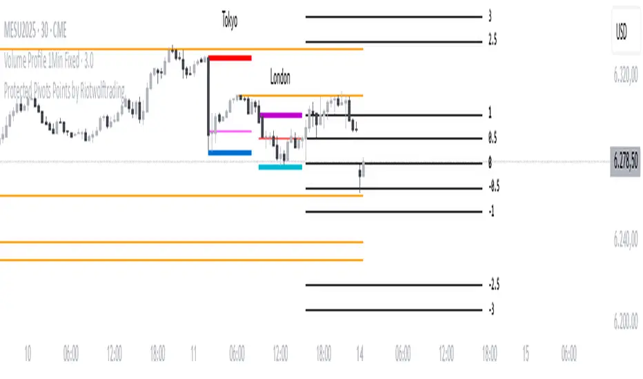
Protected Pivots Points by RiotwolftradingProtected Pivots Points by Riotwolftrading
---
You have an advanced visual tool designed for traders who want to identify and manage key price levels with maximum precision.
This script detects protected pivots (significant highs and lows) and marks them with horizontal lines on the chart. These lines automatically extend for a fixed number of bars or until price invalidates the level with a closing break.
---
🚀 What makes this indicator special?
---
✅ Protected pivot detection:
The indicator identifies protected highs and lows using a fixed pivot strength
✅ Wick break detection (liquidity sweep visualization):
When a wick crosses the pivot level **without the candle closing beyond the level, the indicator automatically changes the line’s color and style.
👉 This immediately shows the trader that the level was tested but remains structurally valid.
✅ Highly customizable visuals:
* Choose whether to show color for protected highs, lows, or wick break levels.
* Set your own colors, line styles (solid, dashed, dotted), and line widths.
---
### 🌟 Why is wick break detection so valuable?
---
💡 Instant context on price action:
No need to manually check every candle to see if a level was barely tested. The indicator changes the line’s appearance automatically, so you can focus on decisions.
💡 Clear distinction between untouched levels and tested levels:
* A level with no wick test is pristine support/resistance.
* A level tested by a wick but not invalidated is still valid — but may have been swept for liquidity.
💡 Crucial for precision trading strategies:
This is particularly important for strategies that rely on:
✅ Liquidity sweeps / stop hunts.
✅ Reversals from tested zones.
✅ Smart Money Concepts (SMC).
✅ ICT concepts, breakers, Quasimodo, BOS/MSS.
The wick break visualization helps filter false breakouts and highlights areas where institutional players may have stepped in.
💡 Avoid premature exits or entries:**
The color/style change tells you a level was tested but not broken, so you avoid overreacting to wick activity.
---
### ⚡ Example use case**
Imagine a protected low line:
🔹 Price dips and its wick touches the level — the line changes color (e.g. violet solid line).
🔹 The level is still valid because the close didn’t break it.
🔹 This could signal a stop hunt or liquidity grab, with a possible reversal opportunity right at that level.
---
### 🧭 **Why most pivot indicators don’t offer this**
Most pivot indicators:
❌ Simply mark the level and remove it after a close break.
❌ Don’t distinguish between a wick test and a true break.
🌟 **This indicator does — giving traders an extra layer of market insight.**
---
### ⚠ **Disclaimer**
This indicator is a visual aid to help identify key levels and price reactions. It does **not** generate buy or sell signals and should be used alongside your trading analysis and strategy.
---
Swing High Low Detector by RV5📄 Description
The Swing High Low Detector is a visual indicator that automatically detects and displays swing highs and swing lows on the chart. Swings are determined based on configurable strength parameters (number of bars before and after a high/low), allowing users to fine-tune the sensitivity of the swing points.
🔹 Current swing levels are shown as solid (or user-defined) lines that dynamically extend until broken.
🔹 Past swing levels are preserved as dashed/dotted lines once broken, allowing traders to see previous support/resistance zones.
🔹 Customizable line colors, styles, and thickness for both current and past levels.
This indicator is useful for:
Identifying key market structure turning points
Building breakout strategies
Spotting trend reversals and swing zones
⚙️ How to Use
1. Add the indicator to any chart on any timeframe.
2. Adjust the Swing Strength inputs to change how sensitive the detector is:
A higher value will filter out smaller moves.
A lower value will capture more frequent swing points.
3. Customize the line styles for visual preference.
Choose different colors, line styles (solid/dashed/dotted), and thickness for:
Current Swing Highs (SH)
Past Swing Highs
Current Swing Lows (SL)
Past Swing Lows
4. Observe:
As new swing highs/lows are detected, the indicator draws a new current level.
Once price breaks that level, the line is archived as a past level and a new current swing is drawn.
✅ Features
Fully customizable styling for all lines
Real-time updates and automatic level tracking
Supports all chart types and instruments
👨💻 Credits
Script logic and implementation by RV5. This script was developed as a tool to improve price action visualization and trading structure clarity. Not affiliated with any financial institution. Use responsibly.

TR FVG & Swing High Low FinderTR FVG & Swing Level Finder
Overview:
The TR FVG & Swing Level Finder is a powerful Pine Script indicator designed for traders who want to identify Fair Value Gaps (FVGs) and Swing Highs/Lows on their charts. This indicator combines two essential technical analysis tools into one, helping traders spot potential areas of support, resistance, and trend reversals. FVGs are price gaps that often act as areas of interest for price to return to, while swing highs and lows help identify key turning points in the market. The indicator is highly customizable, allowing users to adjust colors, limits, and display options to suit their trading style.
Key Features:
1: Fair Value Gap (FVG) Detection:
- Identifies Bullish FVGs: Occur when the high of two candles ago is lower than the low of the current candle, indicating a potential upward price movement.
- Identifies Bearish FVGs: Occur when the low of two candles ago is higher than the high of the current candle, indicating a potential downward price movement.
- Displays FVGs as colored boxes on the chart, with customizable border and fill colors based on the timeframe.
- Labels each FVG box with the corresponding timeframe (e.g., "1m FVG", "1h FVG", "Daily FVG").
2: Swing High and Swing Low Detection:
- Detects Swing Highs: A 3-candle pattern where the middle candle's high is higher than the highs of the candles on either side.
- Detects Swing Lows: A 3-candle pattern where the middle candle's low is lower than the lows of the candles on either side.
- Draws a solid black line with 50% opacity at each swing high and low, extending 5 bars to the right for better visibility.
- Adds a small Swing High or Swing Low label at the right end of each line, colored according to user-defined settings.
3: Timeframe-Specific FVG Visualization:
- FVGs are color-coded based on the chart's timeframe, making it easy to distinguish between FVGs on different timeframes.
- Each timeframe has its own fill color for bullish and bearish FVGs, with adjustable transparency for better chart clarity.
- A dashed black line is drawn in the middle of each FVG box to highlight the midpoint of the gap.
4: Customizable Display Options:
- FVG Limit: Control the maximum number of FVGs displayed on the chart (from 1 to 20).
- Extend Options for FVG Boxes:
- "None": FVG boxes extend only 2 bars to the right.
- "Limited": FVG boxes extend a user-defined number of candles to the right (1 to 100 candles).
- "Default": FVG boxes extend 3 bars to the right of the current bar.
- Color Customization:
- Set border colors for bullish and bearish FVGs.
- Adjust fill colors for FVGs on different timeframes (1m, 5m, 15m, 30m, 1h, 4h, Daily, Weekly, Monthly).
- Customize the colors of swing high and swing low labels.
5: Performance Optimization:
- The indicator only plots FVGs and swings on the last confirmed bar (barstate.islastconfirmedhistory), ensuring efficient performance and reducing chart clutter.
- Limits the number of displayed FVGs and swings to the user-defined fvgLimit, keeping the chart clean and focused on the most recent price action.
6: Inputs and Customization:
- Number of FVGs to Show (fvgLimit): Set the maximum number of FVGs and swings to display (default: 3, range: 1 to 20).
- Bullish FVG Border Color (bullishColor): Choose the border color for bullish FVGs (default: green).
- Bearish FVG Border Color (bearishColor): Choose the border color for bearish FVGs (default: red).
- Swing High Color (swingHighColor): Set the color for swing high labels (default: blue).
- Swing Low Color (swingLowColor): Set the color for swing low labels (default: purple).
- Extend Options:
- Extend Option (extendOption): Choose how far FVG boxes extend to the right ("None", "Limited", or "Default"; default: "Default").
- Extend Candles (extendCandles): If "Limited" is selected, specify the number of candles to extend FVG boxes (default: 8, range: 1 to 100).
- Timeframe-Specific Fill Colors:
- Customize fill colors for bullish and bearish FVGs on various timeframes (1m, 5m, 15m, 30m, 1h, 4h, Daily, Weekly, Monthly).
- Each fill color has a default transparency (e.g., 93% for most timeframes, 90% for 30m), which can be adjusted as needed.
How to Use:
1: Add the Indicator to Your Chart:
- Open TradingView, go to the Pine Editor, and paste the script.
- Click "Add to Chart" to apply the indicator to your current chart.
2: Adjust Settings:
- Open the indicator settings by clicking the gear icon next to the indicator name on your chart.
- Modify the inputs to suit your preferences:
- Set the number of FVGs and swings to display.
- Choose your preferred colors for FVGs and swings.
- Adjust the extend options for FVG boxes.
3: Interpret the Indicator:
- FVG Boxes: Look for colored boxes on the chart, which represent Fair Value Gaps. Bullish FVGs (green borders by default) suggest potential buying opportunities, while bearish FVGs (red borders by default) suggest potential selling opportunities. The label inside each box indicates the timeframe of the FVG.
- Swing Highs and Lows: Identify key turning points with solid black lines (50% opacity) at swing highs and lows. Each line extends 5 bars to the right, with an "SH" (Swing High) or "SL" (Swing Low) label at the end. Swing highs can act as resistance levels, while swing lows can act as support levels.
4: Combine with Your Strategy:
- Use FVGs to identify areas where price might return to fill the gap, often acting as support or resistance.
- Use swing highs and lows to spot potential trend reversals or to set stop-loss and take-profit levels.
- Combine the indicator with other tools (e.g., trendlines, moving averages) for a more comprehensive trading strategy.
Notes:
- The indicator works on all timeframes, but the appearance of FVGs and swings will vary depending on the chart's timeframe.
- For best results, use the indicator on a clean chart to avoid visual clutter, especially if you increase the fvgLimit.
- The swing high/low lines are drawn with 50% opacity to ensure they don’t overpower other chart elements, but they are still clearly visible.
Author’s Note:
This script was developed to help traders identify key price levels with ease. I hope it adds value to your trading! If you have any feedback or suggestions for improvement, feel free to leave a comment. Happy trading!

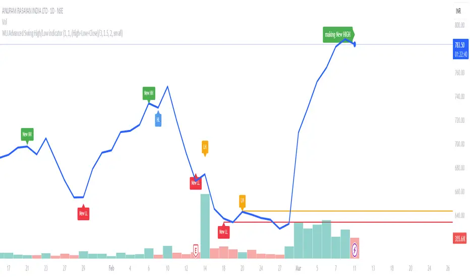
WLI Swing High/Low advnc indicatorfor Class members
else
label.set_xy(lowMsg, bar_index, close)
label.set_text(lowMsg, "making New Low")
label.set_color(lowMsg, newSwingLowColor)
label.set_textcolor(lowMsg, color.white)
else
if not na(lowMsg)
label.delete(lowMsg)
lowMsg := na
Smallest Swing [Truth Indie]This indicator is designed to test the smallest swing draw using the swing capture concept of the Pivot Points High Low indicator, setting the length to 1 for all periods, and combining it with price action that I think makes sense.
Example of a valid swing high.
Example of a valid swing low.

Liquidity PoolsThis indicator displays liquidity based on swing highs and swing lows.
Since large liquidity rests above swing highs and below swing lows, the indicator can show swing highs and lows as well so that you can easily find where liquidity stays.
To determine swing high/low, left bars and right bars can be specified on inputs.
How to use this indicator?
You can use this indicator to;
observe how liquidity is used as the market moves.
watch which liquidity will be taken before the market moves and which liquidity will be targeted as the market progresses.
--------------------------------------
リクイディティ(Liquidity)を表示するインジケーターです。
リクイディティとはマネー、注文を指します。
わかりやすくするために、敢えて損切り注文と書いてみましょう。
大きなリクイディティ(損切り注文)はスイングハイの直上(買いのストップオーダー)、スイングローの直下(売りのストップオーダー)に控えています。インジケーターはスイングハイ・ローも同時に表示することができるため、リクイディティ(損切り注文)を容易に特定することが可能です。
使い方
・リクイディティ(損切り注文)が相場が動く中でどのように使われているのかを観察
・マーケットが動く前にどのリクイディ(損切り注文)を取り、トレンドが進展するにつれどのリクイディティ(損切り注文)をターゲットとするかを観察

Simple Market StructureThis indicator is meant for education and experimental purposes only.
Many Market Structure Script out there isn't open-sourced and some could be complicated to understand to modify the code. Hence, I published this code to make life easier for beginner programmer like me to modify the code to fit their custom indicator.
As I am not a expert or pro in coding it might not be as accurate as other reputable author.
Any experts or pros that is willing to contribute this code in the comment section below would be appreciated, I will modify and update the script accordingly as part of my learning journey.
It is useful to a certain extend to detect Market Structure using Swing High/Low in all market condition.
Here are some points that I am looking to improve / fix:
To fix certain horizontal lines that does not paint up to the point where it breaks through.
To add in labels when a market structure is broken.
Allow alerts to be sent when market structure is broken (Probably be done in the last few updates after knowing it is stable and as accurate as possible)
Any suggested improvement, please do let me know in the comment section below and I will try my best to implement it into the script.
PA Swings [TTA]Hello traders!
This script helps identify swing high levels of resistance and swing low levels of support via price action.
The indicator is designed to help identify support and resistance by measuring retracements. When the retracement has reached the threshold, the indicator identifies the high or low with a horizontal, solid line.
This line will continue until it is violated. Once it is violated it will adjust to a dashed line and continue until it is violated again (retested).
Therefore, a solid line resembles an unviolated swing level; a dashed line resembles a violated swing level that has yet to be retested.
Ideally, this script will filter some movements by identifying impulses in the market. Knowing that price is in a trending move rather than bouncing around in a range can help traders in their analysis. In range bound conditions the indicator will show small impulses, sometimes trapped by a support and/or resistance line. In trending markets there will be separation between the support and resistance lines.
Retests are also identified by the indicator.
Retests of swing highs and lows may induce precise, repeatable price moves - something a trader might find advantageous. A log is included to help identify potential price levels based on historical actions when an impulse or a retest occurs.
Consequently, this may help traders identify take-profit targets and avoid stop losses that are too close to the entry point.
The indicator has a color identity panel to help you get familiar with the colored lines, line types, and what they mean. The color panel is concealable. Additional customization options are available, such as toggling the chart labels. These labels distinguish impulses up and down, retests, and the distance price has traveled since breaking or creating a support or resistance level.
This can be toggled off. A High-Volume Swings only option is available for those that wish to filter out low volume movements (such as extended market hours).
You also have the option of hiding far away lines and can define what is “far away” for them % wise. It is defaulted to 15% which may need to be adjusted on lower timeframes.
Inactive lines can be shown or they can be removed in the settings as well. While this indicator can find some great levels of support or resistance it is important to remember that, should you find this script helpful, it is a tool in your toolbox!! (:
Hope you enjoy and thank you for checking this out!
Swing PointsEnglish:
The indicator shows the fractals where stop-losses may be located and can be used to trade from their taking.
You can adjust the length of the fractal (the number of bars with which it is surrounded on both sides, to confirm the validity).
You can also display lines from fractal points for clarity.
To keep the chart clean, you can enable deletion of already taken fractals.
Example of use with deleted fractals and without lines:
Русский:
Индикатор показывает фракталы где могут находиться стоп-лоссы и его можно использовать для торговли от их снятия.
Можно настраивать длину фрактала (количество баров, которыми он окружен с обеих сторон, для подтверждения валидности).
Так же можно выводить линии от фрактальных точек для наглядности.
Для сохранения чистоты графика можно включить удаление уже снятых фракталов.
Пример использования с удалением снятых фракталов и без линий:
Support and Resistance Multiperiod (Zig Zag Based)Support and Resistance Multiperiod (Zig Zag Based)
What is the indicator?
• The indicator is a multi period (up to 5 lengths) Support and Resistance indicator calculated based on Zig Zag.
Who can use?
Scalpers to Long term investors
What timeframe to use?
• Any timeframe
What are the lines?
• Green lines are Support levels.
• Orange lines are Resistance levels.
How to use?
• Buy Low and Sell High.
• Brighter zones means strong Support or Resistance.
• Weaker zones appear lighter.
• Brighter zones are formed by overlapping of lines from multiple levels of support or resistance.
Indicator Menu
• The indicator can input 5 different Lengths.
• The default settings uses 13, 21, 52, 100 & 200.
• Every option are customizable.

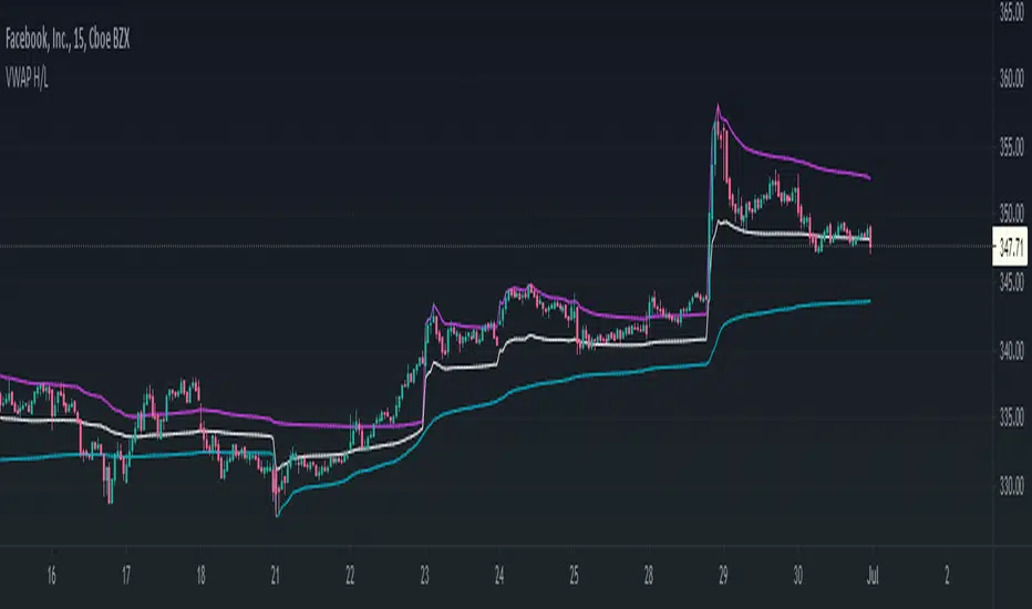
VWAP High/Low ChannelIn short, the VWAP High/Low Channel is based on VWAP "newsession" on swing high/low, with a basis of the two.
The VWAP High/Low channel seems to act like Bollinger bands or Donchain Channels when squeezing for a breakout, while also acting as a pivot after a breakout.
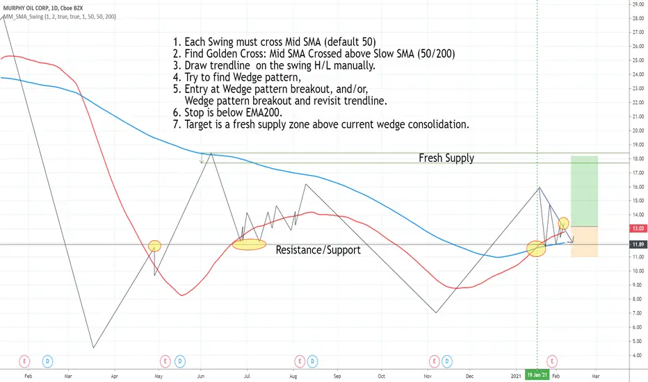
Draw swing Lines based on SMA// Draw swing Lines based on SMA
// Each swing line must cross SMA
// ---------------------------------------------------
// Input:
// sma(Number): Default 50;
// showSMA: Default 'true'; if showSMA ='false', do not show SMA line;
// Deviation(%): Default "1"; To draw a new swing line, Price must cross SMA more than (n% of SMA)
// In weekly chart, better use "2" or more to avoid small ZigZag;
// ---------------------------------------------------
// This swing Lines could be used:
// 1. Verify reversal pattern, such as, double tops;
// 2. Help to draw accurate trend line, avoid noice; Set showSMA=false, to see trend line clearly;
// 3. Use two of this study together with different SMA, Set showSMA=false,
// Such as, SMA20 and SMA200, to see small waves in bigger wave
// ---------------------------------------------------
// In this sample Chart -- AMD 1h (Feb to Jun 2020)
// Added this study with SMA(50),
// Hide price chart and SMA line, to show the Swing line only,
// I drew some sample trend lines, and identified one Double top;

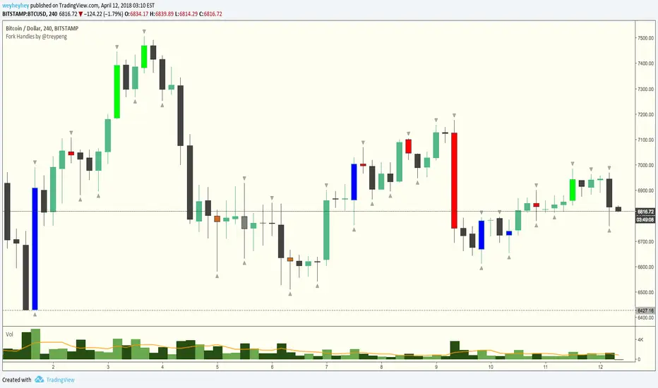
Fork Handles by @treypeng
Candle based indicator that shows swing highs and lows (pivots).
It draws an up or down arrow for simple three candle 'single' swings.
For stronger five candle 'double' swings, it colours the candle. Good for highlighting stronger reversals.
Both of these stylings can be toggled on/off individually.
Default colours
Swing HIGH on an UP candle: bright green
Swing HIGH on an DOWN candle: bright red
Swing LOW on an UP candle: blue
Swing LOW on an DOWN candle: brown
Double swings are grey or white.
Regular candles are just kept to your own default colours as specified in the chart settings.
👏 for anyone who gets the 'fork handles' joke reference.