Saw a bearish tweet comparing the two assets decided to show my perspective of why they are different. let me know your thoughts.
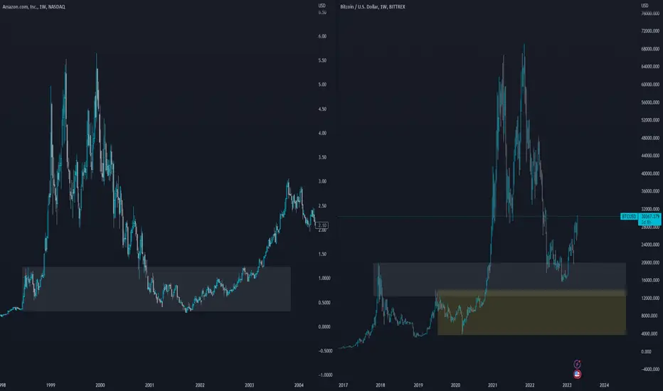
This one is a bit different but fundamentally the wrong area is being highlighted. its tempting to draw the box in yellow on the btc chart however, the amazon chart is highlighting an area where an ATH was formed at the time, to accurately compare this you would draw the same area on BTC using the prev ath at 19k when doing so, you can see the current btc does infect tag the area.
This one is a bit different but fundamentally the wrong area is being highlighted. its tempting to draw the box in yellow on the btc chart however, the amazon chart is highlighting an area where an ATH was formed at the time, to accurately compare this you would draw the same area on BTC using the prev ath at 19k when doing so, you can see the current btc does infect tag the area.
免責事項
これらの情報および投稿は、TradingViewが提供または保証する金融、投資、取引、またはその他の種類のアドバイスや推奨を意図したものではなく、またそのようなものでもありません。詳しくは利用規約をご覧ください。
免責事項
これらの情報および投稿は、TradingViewが提供または保証する金融、投資、取引、またはその他の種類のアドバイスや推奨を意図したものではなく、またそのようなものでもありません。詳しくは利用規約をご覧ください。