Smart Flow Imbalance [StrixEDGE]TRADINGVIEW CATEGORIES
1. Volume
2. Trend Analysis
3. Oscillators
SEARCH TAGS (9)
smart-flow-imbalance, overlay-signals, order-flow, volume, relative-volume, buying-selling-pressure, accumulation-distribution, momentum, market-structure
DESCRIPTION
StrixEDGE Smart Flow Imbalance is Engine #06 in the StrixEDGE indicator framework. It is a flow-focused market-state tool designed to identify changes in directional quality, liquidity behavior, volatility structure and confirmation strength without relying on a single conventional oscillator.
WHAT THIS INDICATOR IS DESIGNED TO DO
Blends persistent flow, displacement and range structure into a directional participation score.
Rather than treating one input as a complete signal, StrixEDGE combines the engine's dedicated core logic with an optional DNA layer. The final result is normalized into a 0–100 Strix Score so the same framework can be read consistently across different symbols and timeframes.
HOW TO READ THE STRIX SCORE
• Above 72: bullish state / long-side trigger zone.
• Below 28: bearish state / short-side trigger zone.
• Around 50: balanced or neutral state.
• A signal is generated on a transition into a trigger zone, not on every bar that remains inside it.
SIGNAL & POSITION FRAMEWORK
When a valid state transition is detected, the overlay version can create a structured trade plan containing:
• Entry
• DCA level
• TP1
• TP2
• TP3
• Stop Loss
Each projected level includes its percentage distance from Entry. When a level is reached, the same chart label is updated with a ✓ marker. TP and SL outcome tracking is mutually controlled so the dashboard does not report contradictory terminal results for the same setup.
PROFESSIONAL DASHBOARD
The built-in StrixEDGE dashboard summarizes the active market state in a compact TradingView table, including:
• Engine and category
• Strix Score and directional bias
• Signal / market regime
• Flow pressure and trend quality
• Relative volume and ATR volatility
• Structure / VWAP context
• Active position and signal age
• Entry, DCA, TP1, TP2, TP3 and SL
• Hit status for each projected level
COMBINATION PROFILE
• CORE BALANCE
• Active DNA modules: 3
• Lookback: 24
• Smoothing: 5
• Signal threshold: 72
ENGINE DNA
• Displacement Efficiency — Directional body displacement normalized by ATR and relative volume.
• Range Structure Balance — Maps close location inside rolling high/low structure to a signed state.
• Normalized Flow Acceleration — Smooths ATR-normalized return × relative volume to estimate directional flow.
MARKET / STYLE PROFILE
• Market focus: Crypto
• Intended style: Swing
• Core engine: #06 Smart Flow Imbalance
• Category: Flow
NON-REPAINT / DATA HANDLING
By default, signals require a confirmed chart-bar close. This reduces intrabar signal fluctuation and makes historical signal placement more stable.
ALERTS
The generated script includes alert conditions for:
• Long state shift
• Short state shift
• DCA reached
• TP1 reached
• TP2 reached
• TP3 reached
• Stop Loss reached
HOW I USE IT
StrixEDGE is designed as a market-state and trade-structure tool rather than a standalone prediction system. Stronger setups generally occur when the Strix Score, market regime, flow pressure, structure and volatility context agree instead of relying on the trigger alone.
LIMITATIONS
No indicator can predict future price movement with certainty. Signals can fail during sudden news events, illiquid conditions, gaps, abnormal volatility, regime transitions or unreliable volume. DCA, TP and SL levels are systematic projections derived from the active setup and should not be interpreted as guaranteed outcomes.
Users should validate the indicator on the symbol, exchange and timeframe they trade, and should apply independent position sizing and risk management. Historical behavior does not guarantee future performance.
ORIGINALITY
StrixEDGE Engine #06 is built from generic price, volume, volatility, structure and confirmed-context primitives arranged in a dedicated engine formula and optional DNA layer. It is not intended to reproduce or rename a specific community indicator.
DISCLAIMER
For research and educational purposes only. This indicator is not financial advice and does not guarantee profitability. インジケーター

Absorption Range Ledger [JOAT]Absorption Range Ledger
Introduction
Absorption Range Ledger is an open-source range and participation overlay built to detect high-participation ranges, estimate internal bull-vs-bear ownership, track weighted equilibrium, and monitor whether the market is being absorbed, contained, reclaimed, or broken. It is designed for traders who want richer range context than a basic support/resistance box.
The script identifies high-participation candles, merges overlapping activity into persistent range zones, tracks a weighted equilibrium line inside the zone, and then highlights whether that zone is acting as supportive absorption, resistant absorption, or a two-way transfer area. Optional TP/SL rails are created when weighted reclaims or range breaks occur on confirmed bars.
Core Concepts
1. High Participation Detection
The script compares current volume to a baseline moving average. When participation exceeds the threshold, the candle is eligible to build or extend an absorption range.
2. Range Merging
New high-participation candles are merged into existing ranges when overlap conditions are satisfied. This creates broader institutional-style transfer zones rather than isolated candle markers.
3. Ownership Split
Each active range tracks approximate bullish and bearish ownership internally. This is displayed visually using sub-boxes and summarized numerically in the dashboard.
4. Weighted Equilibrium
A weighted equilibrium line is maintained inside the dominant active range. This level serves as a practical internal reference for reclaim and failure behavior.
5. Range Events
The script distinguishes containment, weighted-line reclaims, and outright range breaks. These states are used for dashboard context and optional TP/SL scaffolding.
Features
High-participation range detection: Builds active ranges when volume exceeds the baseline threshold
Range merging: Overlapping participation bars are combined into richer zones
Bull/bear ownership split: Internal sub-boxes show approximate participation balance
Weighted equilibrium line: A central reference inside the active range
Dominant active range logic: Tracks the most relevant current range for context
Range reclaim and break states: Distinguishes contained trade from directional escape
Optional TP/SL ladder: Builds informational risk rails on confirmed reclaims and breaks
Top-right dashboard: Shows state, active count, weighted level, balance, range width, and event condition
How to Use This Indicator
Step 1: Identify whether a dominant active range exists.
Step 2: Check the ownership balance. Strong positive balance suggests bid-side absorption. Strong negative balance suggests offer-side absorption.
Step 3: Watch how price behaves around the weighted equilibrium line. Reclaims and failures often provide better context than touching the raw box boundary alone.
Step 4: Use confirmed breaks of the dominant range as state changes, not as guaranteed trend starts.
Indicator Limitations
Ownership balance is an internal estimate, not a true order-flow measurement
Range merging depends on the chosen volume threshold and can be too broad or too narrow if poorly configured
Old ranges expire by design and will not remain indefinitely on the chart
The TP/SL ladder is informational and not an execution engine
Originality Statement
Absorption Range Ledger is original in the way it combines participation-based zone merging, internal ownership splitting, weighted equilibrium governance, and event-driven scaffolding into one open-source range tool. It is published as a contextual market-transfer indicator rather than a simple breakout box.
Disclaimer
This indicator is provided for educational and informational purposes only. It is not financial advice. Participation, ownership, and absorption states are inferred from historical price and volume behavior and may not reflect future outcomes. Use independent analysis and risk management.
-Made with passion by jackofalltrades
インジケーター

Wyckoff Distribution Phase Map [AGPro Series]Wyckoff Distribution Phase Map
🔹 OVERVIEW
Wyckoff Distribution Phase Map is a retrospective structural mapping tool built on the classic Wyckoff distribution schematic. It locates and labels the six core distribution events — Preliminary Supply (PSY), Buying Climax (BC), Automatic Reaction (AR), Upthrust (UT), Sign of Weakness (SOW) and Last Point of Supply (LPSY) — only after a bearish Change of Character (CHoCH) confirms that the prior uptrend has structurally broken. The indicator frames the active trading range as a shaded zone, plots BC and AR horizontal references, and tracks the phase state (A, B, C, D, E) in a dedicated info panel with a forming-candidate watchlist before confirmation.
🔹 WHAT MAKES IT DIFFERENT
Most Wyckoff scripts on TradingView label events reactively on every elevated swing, producing dense, often contradictory signals during ranging or trending markets. This indicator takes the opposite approach. During an uptrend, the chart remains completely clean. Rolling trackers silently maintain candidate values for BC, PSY and AR in memory, while a live watchlist row in the panel shows the forming distribution candidate in real time. Events are only drawn on the chart after CHoCH locks the schematic, at which point PSY, BC and AR appear together as a confirmed retrospective bundle. UT, SOW and LPSY then populate as the post-CHoCH structure unfolds. A two-tier expiry system closes both incomplete and fully-played-out distributions, ensuring the active schematic on screen always reflects current market structure — not stale history.
🔹 METHODOLOGY
The engine runs in two coordinated layers. The first layer tracks higher-high and higher-low sequences to qualify an uptrend and rolls candidate values for the Buying Climax (running maximum swing high), Preliminary Supply (last pre-BC elevated swing high) and Automatic Reaction (running minimum after BC). The second layer watches for a structural break below the last confirmed higher-low, which defines the CHoCH. On CHoCH confirmation, the candidate values are snapshotted as BC, PSY and AR labels, the trading range zone is drawn, and the state machine advances to the forward-detection phase. Upthrust, Sign of Weakness and Last Point of Supply are then detected in strict sequence using a combination of price-to-BC, price-to-AR and volume-to-average filters. Volume context is computed against a 20-period moving average baseline with separate climactic, elevated and weak thresholds tuned for crypto and equities alike.
🔹 SIGNALS AND ALERTS
The indicator fires two categories of alerts. The CHoCH Confirmation alert triggers the moment the structural break locks in, including the resolved BC and AR levels. Event alerts fire for each subsequent UT, SOW and LPSY detection. No alert is fired during the forming phase — alerts are reserved for confirmed structural events, keeping notification noise low. A projected markdown line is drawn forward from LPSY using the trading range height as a symmetrical target, purely as a visual reference point rather than a trade signal.
🔹 KEY INPUTS
Core Engine inputs control swing lookback sensitivity, candidate maximum age and the post-CHoCH timeout window. Volume Analysis exposes the moving average length and three multipliers for climactic, elevated and weak volume classification. Visual inputs toggle the trading range zone, BC and AR horizontal levels, the CHoCH dashed break line, the markdown projection, the confidence halo and the floating distribution summary label, with full control over font size, line widths and zone transparency. The info panel can be repositioned to six anchor points and switched between dark and light themes. A Keep Historical Events toggle allows old schematics to remain on the chart after reset, off by default for a clean view.
🔹 HOW TO USE
Apply the indicator to any liquid instrument and any timeframe. During uptrends, observe the Watching row in the panel to monitor the forming BC candidate. When CHoCH prints, the full PSY, BC, AR bundle appears with the trading range shaded. From that point, use the Next Expected row to track what the engine is waiting for. The confidence score progresses from 70 at CHoCH to 97 at LPSY. The floating summary label on the right edge of the chart provides an at-a-glance status even when the primary event labels are scrolled off to the left. The indicator works standalone but is designed to complement any market structure, order flow or supply-and-demand workflow.
🔹 LIMITATIONS AND TRANSPARENCY
This tool is a pattern-recognition and labeling engine, not a strategy or trading signal generator. All events are detected retrospectively after their confirming bar has closed plus the swing lookback period — this is by design to eliminate redrawing. The Wyckoff schematic is a framework, not a deterministic forecast; not every distribution completes the full six-event sequence, and markets frequently fail schematics entirely and resume the prior trend. The volume analysis assumes reliable reported volume, so thin or fragmented markets may produce weaker classification. Confidence scores are internal heuristics tied to event progression, not statistical probabilities. Past schematic completions do not predict future market behavior.
🔹 RISK DISCLOSURE
This indicator is published for educational and analytical purposes only. It does not constitute financial advice, a trading recommendation or an investment solicitation. Trading any financial instrument involves substantial risk, including the potential loss of principal. Past performance does not guarantee future results. Users are solely responsible for their own trading decisions, risk management and independent research. Always backtest thoroughly and trade within a risk framework you understand. インジケーター

インジケーター

インジケーター

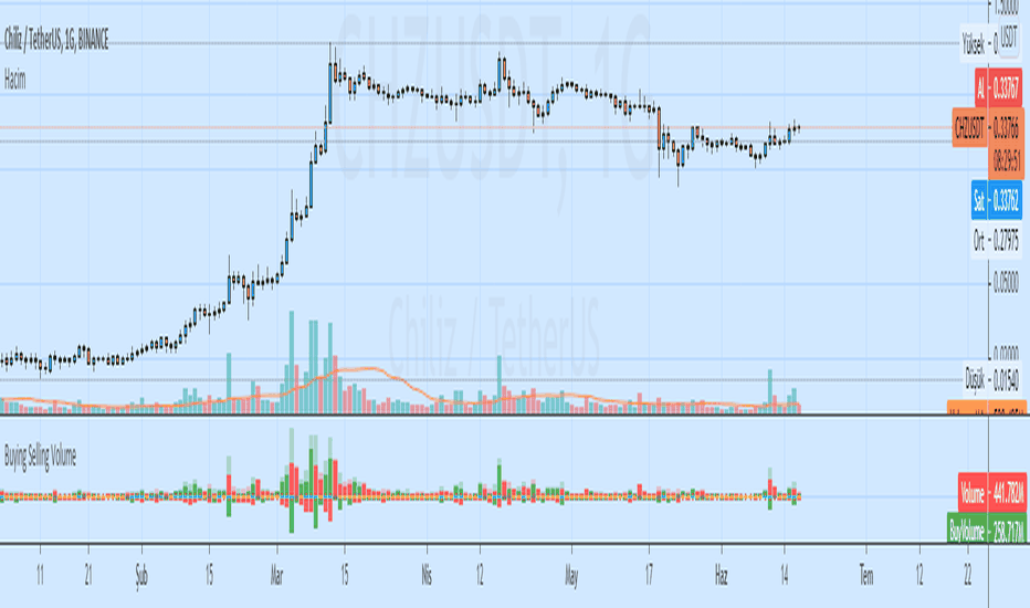
Buying and Selling Pressure Raw Multi (TG Fork)Visualize raw buying and selling pressure via 3 different calculation methods, all superimposed with dynamic rescaling.
Buying and selling pressure is the concept of quantifying the disproportion between buying and selling. In practice, there is no single definitive way to calculate it.
This indicator is a merge to display three different methods to calculate buying and selling pressure, with automatic visual rescaling to superimpose the three simultaneously, updated to PineScript v5, and with some additional improvements for speed and calculation precisions, and instead of the EMA, other types of moving averages can be used.
I primarily made it for my own needs, but as always, I like sharing with the community, as maybe others may find this useful too.
How to use:
* As often, the goal is to get as many of the 3 signals concur together to get a stronger aggregated signal.
* First signal: If the green bars on the histogram are bigger than the red ones, then there is more buying pressure, and vice versa.
* Second signal: If the background is green, there is more buying pressure, and vice versa if the background is orange. The yellow and green lines define the background color, but they are by default hidden for a less cluttered visual experience.
* Third signal: If the cloud is blue, there is more buying pressure, and the bigger the cloud, the more momentum there is for it to stay (and more difficult it is to reverse to selling pressure). If the cloud is red, there is more selling pressure.
If you like this indicator, please don't give me any credit, instead please show some love to the original authors (in no particular order):
ceyhun:
daytraderph (I could not find the link to the original script, the page is inaccessible?):
www.tradingview.com
fract:
インジケーター

インジケーター

インジケーター

ストラテジー

インジケーター

インジケーター

インジケーター

インジケーター

インジケーター

インジケーター