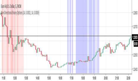
Directional Strength OscillatorDirectional Strength Oscillator
A signed trend-strength oscillator that reads the tug-of-war between upward and downward movement and prints one line — positive in uptrends, negative in downtrends, crossing zero at trend changes. Unlike a plain directional reading, it dims itself when price is only chopping, flags weakening trends through divergence, and scores its own signals forward on your chart in plain language.
Why these parts are combined (not a mashup for show). Each part answers what the previous one leaves open. Up-movement vs down-movement relative to true range gives a clean, bounded read of who's winning and by how much — but it can read "strong" inside noisy, non-trending chop. A trend-efficiency filter (net travel over total path) measures whether price is actually going somewhere; folding it into the line removes the false-strong chop. A divergence check (price makes a new extreme while strength does not) flags weakening trends the raw line would miss. Together they form one directional-strength tool.
How it works. Up-movement = |high − prior low|, down-movement = |low − prior high|; each is summed over the length and divided by summed true range to get the up and down lines. Their difference is the raw strength; it's standardized, soft-bounded to ±100, then scaled by a 0–1 trend-efficiency factor. Signals are zero-crosses gated by a minimum quality, plus divergence against price (measured on the undimmed strength). Each signal is then labelled by a triple barrier — a profit target and equal stop in ATR units plus a time limit — so a "win" means the target hit before the stop. Results split into in-sample and recent out-of-sample, with a confidence interval and a multiple-testing check.
How to use. Read the Verdict row (Long/Short signal, Watch, or Wait) and the Conviction row, which reads "High" only when that signal type shows a positive edge that survives the test on this symbol. Green line above zero = uptrend in control, red below = downtrend; shaded bands = strong trend; the trend-quality % tells you how clean the move is. Best used with your own entry and risk plan, not alone.
What's original. The trend-quality gate that removes false-strong chop, integrated divergence on the undimmed line, the forward triple-barrier calibration with an out-of-sample split, and a conviction read that openly admits when there's no proven edge.
Inputs. High/Low sources (change them for any market), reading mode (Simple/Pro), engine, quality-gate, divergence and full calibration settings, and an auto-adapting dashboard legible on dark or light charts. Defaults are tuned for NSE:NIFTY1! intraday.
Honesty & limitations. Edge figures are computed on this chart's own history with overlapping windows and no costs — context, not a guaranteed backtest; past behaviour doesn't predict the future.
Disclaimer: for research and education only. Not financial advice. Trading carries risk of loss; manage your own positions. インジケーター

Vortex Signals [Gabremoku]Vortex Signals is a reworked version of the classic Vortex Indicator designed to make directional shifts easier to read and less reactive than raw crossover-based interpretations.
Instead of treating every VI+ / VI- crossover as a direct trading signal, this script uses the Vortex lines as a regime detector first, then looks for signal quality through spread expansion and re-activation after a pullback. The goal is to reduce the noisy sequence of repeated entries and exits that often appears when the standard Vortex is used on its own.
What the script does:
Plots the classic Vortex components, VI+ and VI-.
Fills the space between the two lines with a dynamic gradient that reflects which side is dominant and how strong the current spread is.
Detects bullish and bearish dominance regimes.
Uses a signal engine based on regime change, spread expansion, and first valid continuation after weakening.
Prints compact chart markers for LONG, SHORT, and CLOSE events.
Includes a dashboard to show current state, sequence status, setup condition, spread, slope, and directional bias.
How it works:
Regime: the script first determines whether VI+ is above VI- or VI- is above VI+.
Spread: it measures the distance between the two Vortex lines to evaluate whether dominance is meaningful or weak.
Expansion: a regime becomes more relevant when the spread rises above its short baseline and continues widening.
Trigger logic: instead of firing on every crossover, the script waits for either an early valid impulse after regime change or the first useful re-expansion after a pullback inside the same regime.
Why this is different from the classic Vortex:
The built-in Vortex is often read through raw line crossovers.
This script reframes the indicator as a dominance and continuation tool rather than a pure crossover trigger.
The signal engine is designed to capture cleaner transitions and continuation phases while avoiding part of the back-and-forth noise that often occurs in choppy conditions.
How to use it:
In Long mode, focus on bullish dominance and the appearance of a LONG marker after spread expansion or re-expansion.
In Short mode, focus on bearish dominance and the appearance of a SHORT marker after the same logic on the opposite side.
CLOSE markers appear when the opposite Vortex condition breaks the active sequence.
Suggested use:
This script is generally better suited to trending or directional environments than to highly compressed sideways markets.
In my testing and chart observation, the signals can appear cleaner on the 1H timeframe, where short-term noise is often reduced compared with very low timeframes, but users should still adapt settings to the instrument and market structure they trade.
Notes:
This indicator is not predictive and does not guarantee profitable signals.
It should be used as a decision-support tool together with price structure, risk management, and broader market context.
As with any directional model, false signals can still occur during whipsaw or transition phases. インジケーター

Directional Flow Signals
Directional Flow Signals is a DMI-based trend direction indicator designed to highlight shifts in directional pressure directly on the price chart.
The indicator uses the Directional Movement Index system, comparing DI+ and DI- to determine which side of the market is currently dominant.
When DI+ is above DI-, candles are colored bullish.
When DI- is above DI+, candles are colored bearish.
A Long signal appears when directional control shifts from bearish to bullish.
A Short signal appears when directional control shifts from bullish to bearish.
This allows traders to quickly visualize changes in directional bias without needing to keep a separate DMI/ADX panel open.
Key features:
- Bullish and bearish candle coloring
- Long and Short signal labels
- DI+ / DI- crossover-based trend shifts
- Built-in alert conditions
- Adjustable DMI length and smoothing
- Custom candle colors
This tool can be useful for identifying directional transitions, trend bias changes, and possible momentum shifts when combined with support/resistance, volume, VWAP, market structure, or higher timeframe confirmation.
Important:
This indicator does not predict price movement and should not be used as a standalone trading system. Since the signals are based on DI+ and DI- crossovers, they may produce false signals during sideways or low-volatility market conditions.
Inputs:
Show BUY/SELL Signals:
Allows users to enable or disable Long and Short labels on the chart.
ADX Length:
Controls the lookback period used for the Directional Movement Index calculation.
ADX Smoothing:
Controls the smoothing applied to the ADX/DMI calculation.
Up Candle Color:
Sets the candle color when DI+ is stronger than DI-.
Down Candle Color:
Sets the candle color when DI- is stronger than DI+.
Directional Flow Signals is a visual trend-bias indicator based on the Directional Movement Index.
The script compares DI+ and DI- to determine whether bullish or bearish directional pressure is dominant. Candles are colored according to the active directional bias, and signal labels are displayed when the dominant side changes.
Signal logic:
Long Signal:
A Long signal is generated when DI+ becomes stronger than DI- after previously being below it.
Short Signal:
A Short signal is generated when DI- becomes stronger than DI+ after previously being below DI+.
The goal of this indicator is not to predict reversals, but to provide a clear visual representation of directional pressure shifts.
It is best used as a confirmation layer together with price structure, volume, VWAP, support/resistance, or higher timeframe trend analysis.
Limitations:
- Signals are based only on DI+ and DI- dominance.
- The ADX value is calculated but not used as a strength filter.
- False signals may occur in ranging or choppy markets.
- The indicator does not provide stop loss, take profit, or risk management levels.
- It should be used as a confirmation or visual bias tool, not as a complete trading system.
インジケーター

Covenant Regime Atlas [JOAT]Covenant Regime Atlas
Introduction
Covenant Regime Atlas is an open-source Pine Script v6 market-regime indicator built to classify directional state through trend, expansion, persistence, and retest quality. Its purpose is not to predict the next trade by itself, but to create a durable bias layer that tells the trader whether the market is developing a bullish regime, a bearish regime, or a maturing directional environment worth respecting.
The problem this script solves is context instability. Many traders can spot a moving-average crossover or a burst in ATR, but that alone does not answer whether the regime is actually mature, whether momentum has real separation, or whether recent retests are behaving consistently with the dominant trend. Covenant Regime Atlas addresses this by blending multiple regime components into one overlay and dashboard.
The script uses a dual-mid framework derived from EMA and HMA references, ATR-scaled cloud and envelope bands, persistence measurement, heat normalization, slope impulse, and retest memory. This lets it move beyond a simple bullish-versus-bearish cross and instead describe whether the regime is developing, mature, expanding efficiently, or internally cooling.
The result is an indicator for traders who want a cleaner read of bias before interpreting any trigger tool. It is especially useful as a regime filter for execution indicators and strategies that should behave differently in mature directional flow versus unstable transition periods.
Core Concepts
1. Directional Mid Versus Structural Mid
The script creates a fast directional midpoint and a slower structural midpoint using blended EMA and HMA references. The spread between those two curves forms the backbone of regime direction.
float directionalMid = math.avg(emaFast, hmaFast)
float structuralMid = math.avg(emaSlow, hmaSlow)
bool trendBull = directionalMid > structuralMid
This gives the regime engine more shape than a single moving average crossover. The directional mid measures active flow. The structural mid measures slower context.
2. Regime Strength Through Separation And Heat
Regime strength is calculated from ATR-normalized spread plus the distance of normalized heat from its midpoint. In other words, the regime is strongest when the fast and slow structures are well separated and price is also positioned decisively within its recent range.
This helps avoid overvaluing tiny directional crosses that occur with little actual separation or energy.
3. Persistence And Maturity
Every regime needs time to prove itself. The script counts how long the current directional condition has been intact and compares that against a user-defined persistence floor. Once the threshold is met, the regime is treated as mature rather than merely developing.
This matters because a fresh directional flip is different from a directional condition that has held for many bars and survived multiple retest opportunities.
4. Retest Memory
After a mature regime forms, the indicator watches for controlled retests of the directional midpoint. Bull retests occur when price revisits the midline from above and closes back above it. Bear retests use the opposite condition. The last retest is stored as a dotted line and extended forward until it becomes irrelevant.
This gives the trader a simple memory of where the market most recently confirmed trend participation.
5. Pulse, Expansion, And Efficiency
The script also measures volatility expansion, slope impulse, heat drift, trend separation percentage, and directional travel efficiency. These metrics allow the dashboard to distinguish between a mature regime that is expanding forcefully and one that is mature but internally cooling or grinding.
Features
Bull and bear regime classification: Uses fast-versus-slow blended midpoints to define directional control
Maturity logic: Distinguishes developing regimes from mature ones using persistence counting
ATR-scaled cloud and envelope: Frames the current directional corridor directly on the chart
Retest memory engine: Stores the latest mature-regime retest level for forward reference
Initiation band: Preserves the regime start envelope so traders can judge distance from the original launch zone
Pulse ribbon: Adds a compact visual band around price to reflect internal heat conditions
Regime backdrop shading: Tints the chart according to the active directional state
Detailed dashboard: Displays strength, heat, persistence, expansion, slope pulse, retest distance, maturity, efficiency, and more
Confirmed-bar alerts: Includes mature bias, retest, expansion, continuation, efficient trend, and heat-reset conditions
Data-window outputs: Exposes regime internals for systematic reading or comparison
Visual Elements
Directional cloud: The gap between the fast and slow regime mids shows whether the market is operating with clean separation
Envelope bands: ATR-based boundaries help frame the active directional corridor around price
Initiation band: The regime launch area stays visible so users can measure how far the trend has traveled from origin
Retest line memory: The latest confirmed retest is preserved as a direct chart reference
Backdrop and pulse ribbon: Context shading and the pulse band make regime character readable without overloading the chart
Best Practices
Treat mature regimes differently from developing ones because the same trigger can behave very differently in each state
Watch heat drift when a regime remains mature but starts losing internal energy
Use retest memory to frame participation zones rather than chasing every extension away from the midline
Give more weight to regimes that show both persistence and expansion instead of one without the other
Use the atlas as a context engine first and an alert source second
Input Parameters
Trend Engine:
Fast Length: Sets the faster directional reference
Slow Length: Sets the slower structural reference
Heat Window: Defines the range-normalization window for heat calculations
ATR Length: Controls volatility normalization
Cloud Width Factor: Sets the width of the directional cloud and envelope
Retest Engine:
Show Retest Memory: Toggles retest storage and line rendering
Retest Cooldown Bars: Prevents retests from firing too frequently
Persistence Floor: Sets how many bars are required before a regime is considered mature
Show Initiation Band: Displays the preserved start range of the current regime
Maturity Window: Controls maturity scaling and travel-efficiency measurements
Display:
Show Dashboard toggle
Show Regime Backdrop toggle
Show Pulse Ribbon toggle
Independent bull, bear, neutral, and panel colors
How to Use This Indicator
Step 1: Read Regime Tag And Strength
Begin with the dashboard’s regime tag. It tells you whether the market is bullish or bearish and whether that state is still developing or already mature. Pair that with the strength reading to avoid confusing a weak directional bias with a strong one.
Step 2: Check Persistence And Expansion
Persistence tells you how long the regime has survived. Expansion tells you whether volatility is supporting the move. A mature regime with positive expansion usually deserves more respect than a new regime with weak expansion.
Step 3: Use Retest Memory As A Structural Anchor
When the retest line is present, it marks the last meaningful participation check inside the trend. That line can help frame whether the current move is still building from a healthy base or drifting too far away from supportive structure.
Step 4: Watch Heat Drift And Efficiency
Heat drift helps show whether the regime is internally warming or cooling. Efficiency tells you whether directional travel has been orderly. These readings are helpful when deciding whether the trend still looks clean or is becoming unstable.
Step 5: Use It As The Bias Layer For Other Tools
Covenant Regime Atlas is best used as a bias filter. It helps define whether you should be thinking continuation, pullback participation, or caution. Pair it with your own trigger logic rather than using the regime alone as a full trading plan.
Indicator Limitations
A developing regime can fail before reaching maturity, especially in choppy markets
Retest memory is useful for context, but the stored retest level is not guaranteed to hold on future tests
Efficiency and heat drift are descriptive metrics, not predictive guarantees of continuation
The indicator can still classify a directional state during periods where execution conditions are poor for actual trading
Originality Statement
Covenant Regime Atlas is original in the way it blends trend separation, maturity, retest memory, expansion, and efficiency into a unified regime overlay. It is not just a moving-average cloud with added cosmetics:
It separates directional identity from maturity, allowing the user to distinguish developing and established regimes
It stores retest memory as a living structural feature instead of relying only on static crossover logic
It combines heat, slope, expansion, and efficiency into one dashboard so regime quality can be judged from multiple dimensions
It preserves the initiation band of the current regime, which gives context that typical trend overlays do not maintain
Disclaimer
This indicator is provided for educational and informational purposes only. It is not financial advice or a recommendation to buy or sell any financial instrument. Regime readings describe current market structure and internal state based on historical prices. They do not guarantee future movement or profitable trading decisions. Always use independent judgment and proper risk management.
-Made with passion by jackofalltrades
インジケーター

Market Pressure Route [AGPro Series]Market Pressure Route
🌊 Overview
─────────────────────────────────────────────────
Market Pressure Route visualizes the directional buying/selling pressure of a market as a flowing route that tracks price from above or below, and classifies the texture of that flow in real time as Clean, Stalling, Exhausted, or Broken. It is a visualization and classification tool built around two original analytics: the Directional Pressure Score (DPS) and the Route Continuity Index (RCI). The route does not predict price — it describes how clean, consistent, and energetic the current pressure is, so you can read the order-flow texture at a glance.
🔹 Unique Edge
─────────────────────────────────────────────────
Most pressure, flow, or delta-style indicators collapse to a single oscillator or histogram and leave the trader to interpret the number. Market Pressure Route takes a different route.
• Dual-layer engine — DPS measures how directional pressure is; RCI measures how consistent that pressure has been over a lookback window. Pressure without continuity is noise; continuity without pressure is drift. Only the combination qualifies as a Clean route.
• Route, not oscillator — the analytic flows as a colored band above or below price. You read the texture of the market in the same place you read price, not in a separate pane.
• Four-state classification — Clean, Stalling, Exhausted, Broken. Every bar lands in exactly one state, driven by a deterministic decision tree. No grey zones, no ambiguous signals.
• Magnitude-gated break detection — a sign flip in pressure only counts as a Broken route when the flip happens with enough energy. This suppresses the low-amplitude zero-line noise that plagues most flow tools.
• Institutional-grade presentation — compact AGPro panel with live state, direction, DPS bar widget, RCI, and a continuity Flow bar. Badges only mark the transitions that change the market story; Stall and Exhaust transitions are conveyed by route color alone.
🔹 Methodology
─────────────────────────────────────────────────
Directional Pressure Score (DPS) — a composite bounded in blending four bar-level microstructure components:
• Body (45%): closing conviction within the bar range
• Close Location (25%): close position relative to the bar midpoint
• Volume (20%): clamped z-score of volume vs a 50-bar baseline
• Gap (10%): open-to-prior-close gap, ATR-scaled
The raw score is clamped to and then EMA-smoothed with the Pressure Length.
Route Continuity Index (RCI) — a score combining:
• Persistence (65%): fraction of bars in the lookback whose DPS sign matches the current sign
• Stability (35%): one minus the normalized dispersion of DPS across the window
Stability is calibrated for the bounded range of DPS so that RCI remains resolute and does not saturate near 1.0 on quiet markets.
State Classification — a deterministic ternary decision tree:
• Broken — the pressure sign has just flipped with magnitude above the Broken Minimum DPS. Held for up to five bars as a cooldown so the transition is visible.
• Clean — qualifies via either a magnitude path (|DPS| above Clean DPS threshold and RCI above Clean RCI threshold) or a continuity path (RCI above 0.75 with minimum pressure above the Stalling DPS threshold). The dual path handles rally/selloff asymmetry.
• Stalling — pressure still present (|DPS| above Stalling threshold) but continuity has weakened (RCI below Clean levels).
• Exhausted — pressure has faded below the Stalling threshold or is losing magnitude.
🔹 Signals & Alerts
─────────────────────────────────────────────────
State transitions are exposed in two places:
On-chart badges:
• CLEAN UP — bullish Clean route has just formed
• CLEAN DOWN — bearish Clean route has just formed
• BROKEN — pressure direction has just flipped with magnitude
Intermediate Stall and Exhaust transitions are conveyed by route color change only, keeping the chart uncluttered. A price-clustering filter suppresses repeated same-type badges in the same zone so sideways markets stay institutional.
Alerts (both alert() calls and alertcondition() entries):
• Clean Bullish Route
• Clean Bearish Route
• Route Stalling
• Route Exhausted
• Route Broken
🔹 Key Inputs
─────────────────────────────────────────────────
Core Analytics:
• Pressure Length — EMA length applied to DPS (default 14)
• Route Smoothing — visual smoothing for the route band only (default 3)
• Route Continuity Lookback — bars used to compute RCI (default 10)
• Strict Route Filter — raises Clean thresholds by 0.10 for higher timeframes
Classification Thresholds:
• Clean DPS / Clean RCI — magnitude-path qualification levels
• Stalling DPS — minimum pressure to stay out of Exhausted
• Broken Minimum DPS — magnitude gate for break detection
Visual:
• Show Route Band, Minimal Mode, Price Tint
• Route Band Offset in ATR units
• Show State Badges toggle
Panel:
• Show Panel, Location (five positions), Font Size (Tiny to Large)
• Label Font Size
🔹 How to Use
─────────────────────────────────────────────────
• Context reading — the route color tells you what kind of flow you are in before you take any decision. A bright green or pink route with a strong Flow bar is a clean regime; a grey route is an exhausted regime.
• Transition awareness — BROKEN badges mark moments where the pressure narrative has changed with energy. Use them as context signals, not as entries.
• Higher-timeframe bias — many users enable Strict Route Filter on the daily and weekly to isolate only the strongest Clean routes, then drop to intraday for execution.
• Works on any liquid market with reliable volume: crypto, majors in FX, indices, and large-cap equities. Low-volume pairs dilute the volume component of DPS.
🔹 Limitations & Transparency
─────────────────────────────────────────────────
• This is a classification and visualization tool. It does not forecast price, it does not generate buy or sell orders, and it is not a strategy.
• DPS relies on a reliable volume series. Instruments with synthetic or missing volume will weight the volume component poorly.
• Route color and state describe the current bar's classification and update in real time. Final state for any bar is determined at bar close.
• No indicator identifies every turn in the market. Clean routes can exhaust without breaking; Broken routes do not guarantee a reversal of price.
🔹 Risk Disclosure
─────────────────────────────────────────────────
This script is provided for educational and analytical purposes only. It is not financial advice, not a trading recommendation, and not a solicitation to buy or sell any asset. Trading involves significant risk, including the possible loss of principal. Past performance and historical signal behavior do not guarantee future results. Always perform your own research and risk management, and size your positions according to your own risk tolerance. インジケーター

Delivery Regime Map [AGPro Series]Delivery Regime Map
🔹 Overview
Delivery Regime Map classifies the market's delivery character into four distinct regimes — Balanced, Directional, Fragmented, and Exhausted — giving traders instant context on whether the tape is trending with conviction, consolidating, breaking into volatile chop, or fading after an extended move. Rather than asking "is this bullish or bearish?", DRM answers a more useful question: "what kind of market am I in, and what kind of setup is appropriate here?"
The indicator overlays a soft state ribbon across the chart, prints confirmed regime shift labels at the moment of transition, and maintains a compact status panel with the active regime, a composite conviction score, regime duration, and time since the last shift. All outputs are confirmed on bar close with dwell-based hysteresis to suppress noise.
🎯 Unique Edge
Most regime or trend-strength tools collapse the market into a single linear axis (strong ↔ weak, bullish ↔ bearish). Delivery Regime Map is categorical, not linear — it identifies the qualitative character of price delivery by fusing four independent dimensions:
• Displacement quality (how much of each bar's range is body vs. wick)
• Directional persistence (close-to-close consistency + EMA slope alignment)
• Continuity (same-side runs penalized by gap noise)
• Range expansion (current range normalized by ATR baseline)
These dimensions combine into a composite score, but the regime classification uses banded thresholds with hysteresis — meaning a Directional tape must decisively lose its edge before flipping to Fragmented or Exhausted. This produces sparse, high-conviction transitions rather than the constant flipping typical of single-value strength meters.
⚙️ Methodology
The engine computes five rolling metrics across a user-defined window (default 20 bars):
1. Displacement Quality — |close − open| / range, smoothed. High values mean strong, decisive bars with minimal wick rejection.
2. Directional Persistence — average signed close direction plus an EMA slope-alignment check. Rewards tapes that move one way without reversing.
3. Continuity — the proportion of consecutive same-side candles, penalized by an average gap-size term (opens far from prior closes indicate fractured delivery).
4. Range Expansion — current range vs. ATR baseline, clipped to . High expansion combined with low continuity flags Fragmented tapes.
5. Exhaustion Proxy — the decay rate of displacement quality after a period of high persistence. Triggers near trend terminations where bars shrink while direction lingers.
A classifier selects the active regime by priority (Directional → Exhausted → Fragmented → Balanced), and a dwell-bar confirmation (default 5 bars, or 8 under Strict mode) plus a minimum-gap filter (default 10 bars) prevent whipsaw transitions.
🚦 Signals & Alerts
Four alert conditions are built in, each firing only on a confirmed regime shift:
• Regime shifted to Directional — conviction is rising; the tape is trending
• Regime shifted to Fragmented — wide, disconnected bars; chop risk elevated
• Regime shifted to Exhausted — prior trend is losing steam; mean-reversion risk
• Regime shifted to Balanced — low-conviction state; breakout potential building
All alerts include the ticker and interval in the message payload.
🎛️ Key Inputs
• Regime Window (8–60) — length of the measurement window
• Regime Sensitivity (Low / Normal / High) — hysteresis band width
• Strict Classifier — extends dwell requirement from 5 to 8 bars
• Minimum Bars Between Shifts — anti-chop spacing filter
• Show State Ribbon / Regime Shift Labels — visual toggles
• Panel Position + Font Size — 6 anchor positions, 5 size options
• Label Font Size — matches user's chart density preference
Every input carries an inline tooltip explaining its behavior and tradeoffs.
📚 How to Use
• Use Directional regimes to favor trend-following entries and trailing stops
• Use Balanced regimes to prepare for breakouts; volatility compression often precedes expansion
• Use Fragmented regimes as a caution flag — reduce size, widen stops, or stand aside
• Use Exhausted regimes to tighten trailing stops on open trend positions; the edge may be fading
DRM is designed to be asset-agnostic and timeframe-agnostic. On lower timeframes (1m–15m), consider Strict mode and a larger minimum-gap value. On daily charts, defaults typically work well. Combine with any entry framework — order blocks, breakout levels, VWAP reclaims — as a regime filter that answers "should I even be looking for a setup here?"
⚠️ Limitations & Transparency
• The classifier is reactive, not predictive — it confirms regime changes on close, so a Directional label appears a few bars after the trend has begun. This is by design: dwell confirmation is the primary noise filter.
• Regime definitions are categorical interpretations of price statistics. They are not forecasts.
• The composite score reflects regime conviction, not directional bias. A high score in Fragmented means "confidently choppy", not "confidently bullish".
• This indicator is not a strategy. It produces no entry signals, no take-profit targets, and no stop-loss levels. It is a market-context tool intended to be combined with a trader's existing framework.
• Past regime behavior does not guarantee future regime behavior. Market character can change abruptly on news or macro events.
📜 Risk Disclosure
This indicator is published for educational and analytical purposes only. It does not constitute financial advice, a trading recommendation, or an offer to buy or sell any instrument. Trading and investing carry risk of loss, and past performance does not guarantee future results. Users are solely responsible for their own decisions and should consult qualified professionals before committing capital. インジケーター

ES Breakout Toolkit ADX Regime Filter Free=== PART OF THE ES BREAKOUT TOOLKIT ===
This is one of several free, standalone indicators that make up the ES Breakout Toolkit series. Each indicator isolates a single component used in the full ES London Breakout Pro strategy. They are designed to be useful on their own and educational for traders looking to filter trades by market regime using ADX.
=== WHAT THIS INDICATOR DOES ===
The ADX Regime Filter classifies the current market environment into three states: Flat/Choppy, Trending, and Overextended. It does this using the Average Directional Index (ADX) with configurable minimum and maximum thresholds that define a "sweet spot" where the market is trending enough to produce clean breakouts but not so extended that it is likely to reverse or stall.
The indicator plots ADX alongside DI+ and DI- lines, highlights the sweet spot zone between your min and max ADX values, and provides visual markers when ADX enters or exits each regime. DI crossovers are also marked to help identify directional shifts.
=== HOW TO USE IT ===
Apply this indicator to a separate pane below your chart. The shaded zone between the min and max ADX lines represents the regime where trend-following and breakout strategies tend to perform best. When ADX is below the minimum, the market is likely choppy and breakout signals are less reliable. When ADX is above the maximum, the trend may be overextended and new entries carry higher reversal risk.
The dashboard shows the current ADX value, regime classification, DI direction, DI spread, ADX slope, and an overall trade readiness assessment. The DI spread reading helps confirm whether the directional move has conviction — a narrow spread suggests indecision even if ADX is technically in range.
=== KEY FEATURES ===
- Three-state regime classification (Flat, Trending, Overextended)
- Configurable ADX sweet spot zone with visual fill
- DI+/DI- directional lines with crossover markers
- ADX slope tracking (rising vs falling momentum)
- Optional bar coloring by regime and direction
- Background shading by current state
- Dashboard with ADX, regime, direction, DI spread, slope, and trade readiness
- Alerts for regime transitions and DI crossovers
=== WHY ADX BOUNDARIES MATTER ===
Most traders using ADX only set a minimum threshold. However, extremely high ADX readings often indicate that a trend is mature and vulnerable to exhaustion. By defining both a floor and a ceiling, you can focus on the portion of the trend cycle where momentum is building rather than peaking. This indicator makes that concept visual and actionable.
=== ABOUT THE ES BREAKOUT TOOLKIT ===
This indicator is part of a free series that breaks down the building blocks of a London session ES futures breakout strategy. Other free indicators in the series cover session highlighting, consolidation range detection, breakout candle scanning, and momentum close analysis. Each is published separately on my profile.
The full ES London Breakout Pro indicator combines all of these components into a unified strategy with additional proprietary features including advanced risk management, trade qualification, and data tracking. It is available as an invite-only script on my profile. Use the access request instructions on that script's page if you are interested.
=== DISCLAIMER ===
This indicator is provided for educational and informational purposes only. It is NOT financial advice. It does not constitute a recommendation to buy, sell, or hold any financial instrument. Trading futures involves substantial risk of loss and is not suitable for all investors. Past performance of any indicator or strategy is not indicative of future results. Always conduct your own research and consult a qualified financial advisor before making any trading decisions. You are solely responsible for your own trading activity. インジケーター

Crucible Convergence Engine [JOAT]Crucible Convergence Engine
Introduction
The Crucible Convergence Engine is an open-source multi-module convergence strategy that requires alignment across five independent analytical engines before entering a trade. It fuses a Regime Arbiter (market state classification), Directional Helix (trend direction), Pressure Reactor (volume-weighted momentum), Deviation Lattice (statistical band filter), and Fortress Grid (dynamic S/R levels) into a unified convergence scoring system. Entries only fire when all required modules agree — regime confirms a trending state, trend direction aligns, momentum confirms, price is not at a statistical extreme, and volume exceeds its gate threshold. Exits are managed through ATR-based stops and targets, an optional trailing shield, regime flip detection, lattice extreme reversal, and rail interaction exits.
This strategy exists because most trading systems rely on one or two confirmation layers. A moving average crossover with an RSI filter, for example, still enters trades in ranging markets, against macro trends, or at statistical extremes. CCE addresses this by requiring convergence across five fundamentally different analytical dimensions before committing capital. The trade-off is fewer trades — but each trade has multi-dimensional confirmation behind it.
Module Architecture
Module 1: Regime Arbiter
The Regime Arbiter classifies the market into four states using ATR percentile ranking, custom directional movement scoring, and EMA trend alignment:
Kinetic Ascent: ATR percentile above the kinetic threshold, positive directional bias, fast EMA above slow EMA
Kinetic Descent: Same volatility conditions but with negative directional bias
Turbulence: ATR percentile above the turbulence threshold — high volatility without clear direction
Equilibrium: Low volatility, no strong directional bias — ranging market
A two-bar confirmation filter prevents single-bar regime flicker. When the Regime Gate is active (default), the strategy only enters trades during Kinetic Ascent or Kinetic Descent — it sits out during Turbulence and Equilibrium, avoiding the choppy conditions that destroy most trend-following systems.
Module 2: Directional Helix
A fast and slow moving average (EMA or SMA, configurable) determine trend direction. The strategy requires the helix to agree with the regime — a long entry needs both the regime in Kinetic Ascent AND the fast MA above the slow MA.
Module 3: Pressure Reactor
Volume-weighted momentum is calculated using the same logarithmic volume impact function found in the Ferrum Pressure Gauge indicator:
float vwM = pChg * math.log(1 + vR * momVolSens)
float mF = ta.ema(vwM, momFast)
float mS = ta.ema(vwM, momSlow)
float mIdx = ta.ema(mF - mS, 5)
The Pressure Reactor must confirm the trade direction — bullish momentum for longs, bearish momentum for shorts. This ensures that volume-weighted price action supports the entry, not just trend direction.
Module 4: Deviation Lattice
A statistical band system (mean +/- standard deviation * multiplier) acts as an extreme filter. The strategy will NOT enter a long if price is already at or above the upper band (overbought), and will NOT enter a short if price is at or below the lower band (oversold). This prevents chasing extended moves that are statistically likely to revert.
Module 5: Volume Gate
A simple but effective filter requiring short-term volume to exceed a configurable multiple of average volume (default 1.1x). This ensures entries occur during periods of meaningful market participation, not during thin, unreliable conditions.
Convergence Scoring
Each module contributes a weighted score to the overall convergence percentage:
Regime Arbiter: 25 points (trending state confirmed)
Directional Helix: 25 points (trend direction aligned)
Pressure Reactor: 25 points (momentum confirmed)
Deviation Lattice: 15 points (not at statistical extreme)
Volume Gate: 10 points (sufficient market participation)
The convergence score is classified as FULL LOCK (90%+), STRONG (70%+), PARTIAL (50%+), or WEAK (below 50%). The dashboard displays this score in real-time so you can see how close the market is to triggering an entry even before it fires.
Entry conditions require ALL modules to align simultaneously. Entries are edge-triggered — they fire only on the transition from non-convergent to convergent, preventing re-entry on the same signal.
Risk Architecture
ATR Shield (Stop Loss): Initial stop placed at entry price minus ATR * Shield Multiple (default 2.0x ATR). This adapts stop distance to current volatility.
ATR Objective (Take Profit): Target placed at entry price plus ATR * Objective Multiple (default 3.0x ATR). The default 1:1.5 risk-reward ratio (2.0 stop vs 3.0 target) provides positive expectancy even with moderate win rates.
Trailing Shield: When enabled, an ATR-based trailing stop ratchets in the direction of the trade. For longs, the trail is set at close minus ATR * Trail Multiple, and it only moves up, never down. This locks in profits during extended moves.
Regime Flip Exit: If the Regime Arbiter flips to the opposite state (e.g., from Kinetic Ascent to Kinetic Descent while in a long), the position is closed immediately. This is a structural exit — the market environment that justified the entry no longer exists.
Lattice Extreme Exit: If price reaches the opposite statistical extreme (upper band for longs, lower band for shorts), the position is closed. This captures profits at statistically extended levels.
Rail Interaction Exit: If price enters the proximity zone of the opposing Fortress Grid rail (ceiling for longs, floor for shorts), the position is closed. This respects dynamic support/resistance levels.
Strategy Default Properties
These are the default settings used in the strategy's Properties dialog:
Initial Capital: TradingView default
Order Size: 10% of equity per trade (percent_of_equity)
Pyramiding: 0 (no stacking — one position at a time)
Commission: Not set by default — users should configure realistic commission for their instrument
Slippage: Not set by default — users should add realistic slippage for their instrument
Margin: margin_long=0, margin_short=0 (v5-equivalent behavior)
Calc on Every Tick: false (confirmed bars only)
Process Orders on Close: true
Important: Users should set realistic commission AND slippage values in the strategy Properties before evaluating backtest results. The default results without commission/slippage will overstate performance. A commission of 0.04-0.1% per side and 1-3 ticks of slippage is reasonable for most liquid instruments.
Command Panel (Dashboard)
A 13-row monospace dashboard displays the complete strategy state:
SCORE: Convergence classification with percentage (FULL LOCK / STRONG / PARTIAL / WEAK)
REGIME: Current market state (Kinetic Ascent, Kinetic Descent, Turbulence, Equilibrium)
HELIX: Trend direction (Ascent / Descent)
PRESSURE: Momentum direction (Ascent / Descent)
LATTICE: Band filter state (Clear / Ceiling Hit / Floor Hit)
Z-SCORE: Current statistical deviation from mean
VOL GATE: Volume gate status with current ratio (Open / Closed)
POSITION: Current trade status (Long / Short / Flat)
AGE: Bars since entry
SHIELD: Current ATR-based stop distance
TRAIL: Current trailing stop price (if active)
DIR BIAS: Raw directional movement bias score
Input Parameters
Regime Arbiter:
Dispersion Epoch / Rank Horizon / Kinetic Threshold / Turbulence Threshold / Regime Gate Active
Directional Helix:
Lead Filament / Anchor Filament / Filament Type (EMA or SMA)
Pressure Reactor:
Ignition Cycle / Sustain Cycle / Flux Epoch / Flux Amplifier
Deviation Lattice:
Lattice Depth / Sigma Aperture / Lattice Extreme Exit toggle
Fortress Grid:
Grid Anchor / Grid Increment / Proximity Radius / Rail Interaction Exit toggle
Risk Architecture:
Shield Multiple (stop) / Objective Multiple (target) / Risk Epoch (ATR period) / Trailing Shield toggle / Trail Multiple
Volume Gate:
Require Volume Confirmation / Volume Gate Threshold
How to Use This Strategy
Start by setting realistic commission and slippage in the strategy Properties before evaluating any backtest results.
Adjust the Grid Increment in the Fortress Grid module to match your instrument (500-1000 for BTC, 50-100 for stocks, etc.).
Monitor the Convergence Score in the dashboard — it shows how close the market is to triggering an entry. STRONG readings (70%+) that haven't yet reached FULL LOCK often precede entries by a few bars.
The Regime Gate is the most impactful filter. Disabling it will produce more trades but in lower-quality market conditions. Keep it enabled unless you have a specific reason to trade ranging/volatile markets.
Experiment with the Shield and Objective multiples to find the risk-reward ratio that matches your trading style. Higher Objective multiples produce fewer but larger winners; lower multiples produce more frequent but smaller wins.
The Trailing Shield is most valuable in trending markets where moves extend beyond the initial target. In choppy markets, it may give back profits. Consider disabling it if the instrument tends to mean-revert quickly.
Limitations and Honest Assessment
Multi-module convergence produces fewer trades. On some instruments and timeframes, the strategy may go extended periods without a signal. This is by design — it prioritizes quality over quantity.
Backtest results are hypothetical and do not account for real-world execution challenges including partial fills, requotes, and market impact.
The strategy uses process_orders_on_close=true, which means orders execute at the close of the signal bar. In live trading, you would need to enter at the open of the next bar, which introduces slippage.
Past performance shown in backtests does not guarantee future results. Market conditions change, and strategies that worked historically may underperform in different regimes.
The default settings are not optimized for any specific instrument or timeframe. Users should test across multiple datasets and adjust parameters to their specific use case.
The Regime Arbiter and all other modules use lagging indicators. Entries will always occur after a trend has begun, not at the exact bottom or top.
No strategy works in all market conditions. CCE is designed for trending markets and will underperform during extended ranging or highly volatile periods.
Originality Statement
This strategy is original in its five-module convergence architecture. While individual components (ATR regime classification, MA crossovers, volume-weighted momentum, statistical bands, EMA-derived levels) are established concepts, CCE is justified because:
The five-module convergence scoring system requires alignment across fundamentally different analytical dimensions (volatility regime, trend, momentum, statistics, structure) before entering — a more rigorous entry filter than typical dual-confirmation systems.
The weighted convergence score provides a quantified readiness metric that communicates how close the market is to a valid entry, even when not all conditions are met.
Four distinct exit mechanisms (ATR stop/target, trailing shield, regime flip, lattice extreme, rail interaction) provide layered risk management that adapts to different exit scenarios.
The Regime Arbiter gate prevents trading during Turbulence and Equilibrium states, addressing the primary failure mode of trend-following strategies.
Edge-triggered entries with two-bar regime confirmation prevent re-entry on the same signal and eliminate single-bar flicker.
The comprehensive 13-row dashboard provides full transparency into every module's state, the convergence score, and the current risk parameters.
Disclaimer
This strategy is provided for educational and informational purposes only. It is not financial advice or a recommendation to buy or sell any financial instrument. Trading involves substantial risk of loss and is not suitable for all investors. Backtest results are hypothetical, do not represent actual trading, and do not guarantee future performance. Past results in no way guarantee future results. Commission, slippage, and other real-world costs will reduce actual performance below what backtests show. Always use proper risk management, including position sizing appropriate for your account and risk tolerance. Never risk more than you can afford to lose. The author is not responsible for any losses incurred from using this strategy.
-Made with passion by officialjackofalltrades
ストラテジー

AG Pro DMI Rotation Pressure [AGPro Series]AG Pro DMI Rotation Pressure
Overview / What it does
AG Pro DMI Rotation Pressure is designed to track directional leadership shifts between +DI and -DI rather than treating DMI as a simple trend-strength confirmation tool. The script focuses on which side is gaining control, how decisively that control is expanding, and whether the current condition reflects rotation, compression, drift, or established directional pressure.
The indicator is plotted in a separate pane so the rotational structure can be read clearly without interfering with price structure on the main chart. It combines a net pressure histogram, a pressure signal line, DI spread behavior, rotation bursts, and compression tension into one framework intended to make directional handoffs easier to interpret.
This script is intentionally different from strength-oriented DMI or ADX studies. In many DMI-based tools, ADX becomes the main story. Here, ADX is only a supporting context value. The primary objective is to monitor the push-and-pull between +DI and -DI, especially when leadership is unstable, when pressure begins to build after compression, or when one side starts to hold directional control more consistently.
For traders who want to study internal directional pressure before or during trend development, this script is built to highlight control transitions rather than just reporting whether a trend is already strong.
Unique Edge
The distinctive feature of this script is its emphasis on rotational pressure instead of trend-strength ranking. Rather than asking only whether the market is strong, it asks which side is taking control, whether that control is improving or fading, and whether a transition is underway.
This produces a different read from a standard ADX workflow. A market can have moderate ADX and still show meaningful bullish or bearish pressure transfer through the behavior of +DI and -DI. Conversely, a market may print elevated ADX while the directional leadership structure is already weakening or becoming unstable. By separating directional leadership from raw strength, the script aims to expose the internal character of the move more clearly.
The script also classifies the environment into readable states such as Bull Rotation, Bear Rotation, Bull Control, Bear Control, Bull Expansion, Bear Expansion, Bull Drift, Bear Drift, and Compression Battle. That state engine is meant to reduce ambiguity and make the pane easier to interpret quickly across multiple symbols and timeframes.
Methodology
The script begins with the DMI framework: +DI, -DI, and ADX. From there, it derives a rotational model built around DI spread and spread behavior over time.
1. DI leadership
The core directional read is the spread between +DI and -DI. Positive spread means bullish directional leadership. Negative spread means bearish directional leadership. The magnitude of that spread is used as one layer of directional pressure assessment.
2. Rotational slope behavior
The script evaluates how +DI and -DI are changing, not only their absolute values. This helps estimate whether one side is accelerating relative to the other. Slope behavior is important because leadership transitions often begin before a large DI spread is fully established.
3. Pressure scoring
Bullish and bearish pressure are scored separately using DI spread, relative slope behavior, and spread momentum. This creates the Bull / Bear pressure readings shown in the panel, as well as the Net Pressure histogram in the pane.
4. Signal smoothing
A pressure signal line is applied to the net pressure series to make pressure drift and bias easier to read. This is not intended as a prediction line. It is a smoothing layer that helps frame whether the dominant side is strengthening, fading, or remaining relatively stable.
5. Rotation bursts
Crossovers between +DI and -DI are treated as potential rotational events. The script scores those events so that rotation markers are tied to directional handoff rather than appearing as purely cosmetic crossover labels.
6. Compression and tension
When DI spread contracts below the compression threshold, the script evaluates internal tension. This is useful because some of the most meaningful directional expansions begin after a compressed and contested leadership state. Compression Battle is meant to identify that contested environment, not to forecast direction by itself.
7. State engine
The script assigns a readable state based on pressure, spread, crossover status, and compression context. This is what allows the study to describe the environment as rotation, control, expansion, drift, or compression instead of leaving the user to infer all conditions from raw lines alone.
Signals & Alerts
The script includes deterministic alert conditions for the following events:
Bull Rotation
Triggered when +DI crosses above -DI and bullish directional rotation takes control.
Bear Rotation
Triggered when +DI crosses below -DI and bearish directional rotation takes control.
Bull Control
Triggered when bullish pressure is in control territory.
Bear Control
Triggered when bearish pressure is in control territory.
Compression Battle
Triggered when DI spread is compressed while internal tension is elevated.
These conditions are designed to describe state changes inside the DMI structure. They should be used as analytical events, not as automatic trade instructions.
Key Inputs
DI Length
Controls the base DMI sensitivity.
ADX Smoothing
Adjusts the ADX smoothing component used for contextual strength reading.
Rotation Slope Smoothing
Changes how quickly slope-based rotational behavior reacts.
Pressure Signal Length
Controls smoothing of the net pressure signal.
Compression Threshold
Defines when DI spread is considered compressed.
Expansion Threshold
Defines when directional pressure begins to qualify as expansion.
Control Threshold
Defines when directional pressure is strong enough to be treated as control.
Visual controls
Backgrounds, spread fill, rotation markers, panel theme, panel position, and panel font size can all be adjusted depending on the chart style and workspace preference.
Limitations & Transparency
This script is not a forecasting model. It does not know future direction and it does not attempt to predict exact reversal points. It is a structural pressure tool built from DMI behavior.
Like all DMI-based studies, it can become noisy in highly erratic or mean-reverting conditions. Repeated +DI and -DI handoffs may appear during choppy phases, especially on lower timeframes or during indecisive sessions.
Compression readings should not be interpreted as guaranteed breakout setups. Compression only describes a tight directional contest inside the DI structure. Direction still needs confirmation from price behavior, market structure, volatility regime, or other contextual tools.
Bullish or bearish control states do not guarantee continuation. They only indicate that the directional pressure model currently favors one side. Users should evaluate the output alongside price structure, support/resistance, volume behavior, and timeframe context.
This study is best treated as a directional pressure map, not as a standalone trading system.
Risk Disclosure
This script is for chart analysis and research purposes only. It does not provide financial, investment, or trading advice. Markets involve risk, and indicator-based decisions can result in losses. Always use independent judgment, confirm with broader market context, and apply appropriate risk management.
インジケーター

AG Pro Volume Delta Imbalance Map [AGPro Series]AG Pro Volume Delta Imbalance Map
OVERVIEW / WHAT IT DOES
AG Pro Volume Delta Imbalance Map is an overlay-style volume pressure tool designed to visualize directional participation asymmetry directly on the price chart. Instead of presenting volume as a standalone histogram or reducing the analysis to a single cumulative line, this script maps estimated directional imbalance into a chart-native structure built around a basis line, a flow spine, and an adaptive ribbon. The result is a cleaner view of whether recent participation is leaning bullish, bearish, or balanced, while keeping the analysis anchored to actual price movement.
The script is built for traders who want a more visual interpretation of directional volume pressure without relying on a separate lower-pane oscillator. The main purpose is not to predict tops, bottoms, or reversals in isolation. Its role is to help users read where directional pressure is expanding, where it is fading, and where the current state remains neutral or low-conviction. By placing the analysis directly on the chart, the script aims to make flow conditions easier to compare with market structure, pullbacks, trend continuation attempts, and local regime shifts.
A key design objective of this script is practical readability. Many volume-based tools either become too abstract for quick chart work or too visually dense to remain useful during live decision-making. Here, the imbalance model is translated into a compact overlay with a smoothed directional spine, a ribbon that adapts to pressure intensity, optional burst labels, optional zone-start labels, and a summary panel that reports the current state, bias, strength, persistence, label mode, and exhaustion condition. This keeps the output interpretable across multiple markets and timeframes without forcing the user to decode a complicated dashboard.
This script should be understood as a directional-volume map, not as a trade automation engine. It is intended to support chart reading, context building, and workflow discipline. It can help highlight when directional participation is broadening, when pressure alignment is improving, or when a previously strong move begins to lose quality. Those observations can then be combined with price structure, support and resistance, volatility context, and the user’s own execution framework.
UNIQUE EDGE
The main differentiator of this script is that it does not approach volume pressure in the same way as classic cumulative-flow or oscillator-style tools. Traditional cumulative tools such as OBV compress volume behavior into a running line, while money-flow oscillators often frame the analysis around momentum-style expansion and contraction in a lower pane. AG Pro Volume Delta Imbalance Map takes a different route: it transforms estimated directional pressure into an on-chart flow structure that is designed to be read alongside candles, pullbacks, transitions, and continuation attempts.
Another differentiating element is the emphasis on flow state rather than raw volume magnitude alone. The script is not simply asking whether volume is high or low. It is asking whether directional participation is leaning to one side strongly enough to create an interpretable imbalance state, whether that pressure is stabilizing or intensifying, and whether that condition is durable enough to remain relevant across several bars. This creates a more structural view of participation rather than a purely reactive one.
The visual architecture is also intentionally distinct. The flow ribbon is not only cosmetic. It is designed to express directional pressure breadth around the spine, while the spine itself provides a simpler anchor for the prevailing flow direction. Optional labels then mark either stronger burst moments or the beginning of a new directional zone, depending on user preference. This allows the script to serve different chart-reading styles without changing the core methodology.
Finally, transparency matters. This script does not claim to be a true bid/ask footprint, a tape-reading engine, or an exact institutional order-flow detector. It uses an estimated directional-volume proxy derived from price-location and candle-structure behavior. That distinction is important. The objective is to provide a disciplined, readable directional-pressure framework within the constraints of standard chart data, not to imply access to information the script does not use.
METHODOLOGY
The model begins with a directional-pressure proxy built from three components: close location within the bar, candle body dominance relative to the full range, and directional sign reinforcement from candle structure. These inputs are blended into a bounded hybrid bias value intended to estimate whether recent volume participation was more likely to have leaned bullish or bearish within the bar. That estimate is then scaled by the bar’s volume to produce directional volume estimates and a delta-style imbalance reading.
The raw imbalance is normalized using a volume baseline so that the output remains more comparable across changing participation environments. The normalized value is then smoothed to reduce excessive noise and to create a more usable state engine. From there, bullish, bearish, and balanced conditions are determined through explicit thresholds. This means the displayed state is not arbitrary. It is driven by a consistent threshold structure that helps separate neutral conditions from more meaningful directional pressure.
The chart overlay is built around three visual elements. First, a basis line offers a stable reference. Second, the flow spine tracks the smoothed imbalance state translated onto price space. Third, an adaptive ribbon expands or contracts around the spine based on imbalance strength, which helps communicate whether directional participation is broadening or losing intensity. Together, these components aim to make flow conditions visible without overwhelming the chart.
The script also tracks persistence and a simplified exhaustion heuristic. Persistence reflects how long the current directional state has remained in force, while exhaustion attempts to highlight cases where imbalance remains strong but starts to weaken while price response underperforms. This is not a reversal guarantee. It is a contextual warning that a previously forceful participation state may be losing efficiency.
SIGNALS & ALERTS
The script can label directional events in two different styles. In Burst Labels mode, labels are reserved for stronger acceleration moments inside an existing directional condition. In Zone Start Labels mode, labels are printed when a new directional zone begins. This distinction matters because some traders prefer confirmation after pressure expansion, while others prefer earlier visual markers at the start of a state change.
Bullish and bearish imbalance burst alerts are available for users who want notification when directional pressure expands beyond the relevant threshold. These alerts are best interpreted as flow acceleration events, not standalone entry signals. In practice, many users will prefer to combine them with local structure, pullback quality, reclaim behavior, or continuation context.
The script also includes bias reversal alerts and imbalance strength expansion alerts. These are useful for monitoring whether a previously balanced or opposing environment is transitioning into a new directional condition, or whether an already active imbalance is strengthening enough to deserve attention. The summary panel helps reinforce these changes by showing state, bias, strength, persistence, label mode, and exhaustion status in a compact format.
A separate exhaustion-risk alert is provided for conditions where the model detects that a strong imbalance may be fading in quality. This should be interpreted as a caution flag, not as a direct call to reverse or exit automatically. In many workflows, it is more useful as a prompt to reassess the context, tighten risk discipline, or watch for weakening continuation quality.
KEY INPUTS
Normalization Lookback controls the volume baseline used in the imbalance normalization process. Larger values can stabilize the model, while smaller values can make the output more reactive. Imbalance Smoothing influences how quickly the directional state responds to changing pressure. Shorter smoothing reacts faster but may increase noise, while longer smoothing can improve stability at the cost of responsiveness.
Map Basis EMA Length affects the visual anchor used for the overlay. ATR Length and Spine ATR Multiplier influence how the spine is translated into price space and how the ribbon behaves around it. Flow Ribbon Width controls the breadth of the visible pressure corridor, while Bull Flow Width Boost allows the bullish side to be widened slightly for visual emphasis when appropriate.
Bullish and Bearish Imbalance Thresholds define when the script considers directional pressure strong enough to move out of the balanced state. Burst Threshold determines when the model treats a move as a more meaningful acceleration event. Extreme Threshold contributes to the exhaustion logic and strength classification. Users can also choose whether labels represent burst moments or zone starts, depending on how early or selective they want the chart annotations to be.
Visual controls allow users to show or hide the basis line, flow ribbon, spine glow, backdrop, burst labels, exhaustion labels, spine tag, and panel. Panel position, panel theme, text sizing, label sizing, and offset controls are included so that the script can be adapted to different chart layouts and personal reading preferences without changing the underlying methodology.
LIMITATIONS & TRANSPARENCY
This script uses an estimated directional-volume model. It does not use order-book data, footprint data, bid/ask tape data, or exchange-level aggressor classification. As a result, the displayed imbalance should be understood as a chart-based directional proxy, not as an exact measurement of true traded delta.
Because the model relies on price-location and candle-structure inputs, the output can behave differently across instruments with different volatility profiles, gap behavior, liquidity conditions, and session structures. It is normal for a setting that looks well balanced on one asset or timeframe to require refinement on another. Users should expect to tune thresholds and visual parameters when moving between markets.
Signals and labels are contextual. A bullish label inside a weak range environment does not carry the same meaning as a bullish label that appears after a reclaim, a pullback stabilization, or a clean continuation structure. Likewise, a bearish label during highly erratic volatility may be less reliable than a similar reading inside a smoother directional sequence. The script is designed to assist interpretation, not to replace it.
No single output from this script should be treated as a guaranteed trade trigger, reversal call, or risk-management rule. The panel, ribbon, spine, and labels are tools for reading participation conditions. They are most useful when integrated with broader chart context, including trend structure, invalidation logic, nearby levels, liquidity conditions, and the user’s own process.
RISK DISCLOSURE
This script is for chart analysis and educational use. It does not provide financial advice, portfolio advice, or guaranteed trade outcomes. All trading and investing involve risk, including the risk of loss. Past market behavior and prior indicator responses do not guarantee future results.
Users remain fully responsible for how they interpret and apply the script. Any signal, label, or state reading should be evaluated within a complete decision process that includes market context, risk definition, and position management. This script should not be used as the sole basis for entering, exiting, or sizing a trade.
If you use this tool in live market conditions, it is sensible to test it across different assets and timeframes and to confirm that its behavior matches your own execution logic before relying on it in a real-money workflow. インジケーター

AG Pro ADX Trend Pressure [AGPro Series]AG Pro ADX Trend Pressure
Overview / What it does
AG Pro ADX Trend Pressure is an overlay indicator that reframes ADX from a simple trend-strength reading into a pressure-state model. Instead of asking only whether ADX is high or low, the script evaluates how directional pressure is building, persisting, fading, or transitioning. The goal is to make ADX-based information easier to interpret directly on the price chart.
This script is designed for traders who want more structure than a standard ADX line, but without turning the chart into a fully automated signal engine. It combines ADX behavior, DI dominance, persistence, and cooling behavior into a state-driven visual framework. The result is a chart-first tool that emphasizes current pressure conditions rather than isolated threshold events.
The indicator uses a compact pressure ribbon, state labels, background zones, and a summary panel to show whether the market is in Compression, Early Expansion, Bull Pressure, Bear Pressure, Exhaustion, or Transition. These states are not predictions. They are structured interpretations of directional pressure conditions based on the current and recent bar sequence.
Because the script is plotted directly on the chart, it is intended to help with visual context, workflow organization, and directional reading. It can be used as a companion layer for discretionary analysis, structure work, trend continuation review, or pressure-fading observation.
Unique Edge
The main distinction of this script is that it does not present ADX as a standalone oscillator. Instead, it treats ADX as one component inside a broader pressure-state engine.
Its core difference is the shift from:
- “ADX is high or low”
to:
- “directional pressure is building”
- “directional pressure is confirmed”
- “pressure is cooling”
- “dominance is fading”
- “state transition risk is rising”
That distinction matters because many ADX-based tools stop at strength confirmation. This script tries to describe the condition around that strength: whether it is forming, maturing, weakening, or rotating.
Methodology
The script is built around a composite pressure score derived from several internal components:
1) ADX level
The script evaluates the current ADX value as a measure of directional strength participation.
2) ADX slope
It also measures whether ADX is accelerating or decelerating. This helps distinguish between pressure expansion and pressure cooling.
3) DI dominance
The spread between +DI and -DI is used to determine whether one side is meaningfully dominant, rather than merely fluctuating.
4) Persistence
Directional pressure becomes more meaningful when dominance remains intact across multiple bars. The script therefore normalizes persistence and includes it in the state logic.
5) Cooling behavior
The model penalizes conditions where momentum of pressure is fading, DI separation is shrinking, or a prior strong phase is losing quality.
These components are blended into a normalized pressure score and then interpreted through rule-based state conditions.
Pressure States
Compression
Used when ADX is relatively weak, DI separation is limited, and the directional structure is not sufficiently active.
Early Expansion
Used when pressure begins to build but has not yet qualified as confirmed directional pressure.
Bull Pressure
Used when bullish directional dominance is active and the pressure score is strong enough to confirm a bullish pressure phase.
Bear Pressure
Used when bearish directional dominance is active and the pressure score is strong enough to confirm a bearish pressure phase.
Exhaustion
Used when a previously strong pressure phase begins to cool materially and loses quality without yet becoming a clean opposite pressure phase.
Transition
Used when dominance quality deteriorates, directional structure rotates, or the market appears to be moving between pressure states.
Visual Structure
The script uses several chart elements to organize the pressure reading:
Pressure Ribbon
A compact ribbon below price summarizes the active pressure state without requiring a separate pane.
Pressure Curve
The center curve makes the pressure structure easier to read visually and helps distinguish calm phases from active directional phases.
State Labels
Labels appear only on state changes, helping reduce repeated label noise while still marking meaningful transitions.
Background Zones
Optional background zones provide broader regime context for stronger phases.
Summary Panel
The panel reports:
- State
- Pressure Score
- Directional Bias
- Pressure Phase
- Persistence
- Cooling Risk
These fields are intended to help the user interpret the current environment quickly without depending on a single line crossing or a single fixed threshold.
How to use it
This indicator is best used as a contextual tool rather than a standalone trade trigger.
Examples of practical use:
- Identify when a directional move is only beginning to organize
- Separate confirmed pressure from weak expansion
- Observe when a mature pressure phase begins to cool
- Spot when directional quality is fading into transition
- Add structure to trend-following or pullback workflows
Some users may prefer to read Bull Pressure and Bear Pressure as confirmation states, while using Early Expansion and Transition as cautionary context. Others may use Exhaustion to review whether a strong move is beginning to lose internal quality. The script does not enforce a single interpretation model.
Signals & Alerts
The script includes deterministic alert conditions for:
- Bullish Pressure Building
- Bearish Pressure Building
- Pressure State Shift
- Pressure Cooling
- Transition Risk Rising
These alerts are state-based notifications. They are not promises of continuation, reversal, or outcome. Their purpose is to notify the user that the internal pressure regime has changed according to the script’s rules.
Key Inputs
ADX Length
Controls the primary ADX and DMI calculation length.
DI Smoothing
Applies smoothing to directional movement components before pressure analysis.
Pressure Threshold
Sets the score level required before directional pressure can be confirmed.
Neutral ADX Threshold
Defines the area where the script becomes more willing to classify conditions as compression instead of directional pressure.
Cooling Sensitivity
Controls how quickly the script responds to deteriorating pressure structure.
Transition Sensitivity
Controls how readily the script recognizes potential regime rotation or dominance loss.
Persistence Length
Defines how persistence is normalized in the internal score model.
Minimum DI Gap
Sets the minimum meaningful separation between +DI and -DI.
Curve Smooth Length
Adjusts how smooth or reactive the pressure drawing appears on the chart.
Visual Controls
The script also includes display settings for:
- Pressure Ribbon
- Pressure Curve
- Active Pressure Spotlight
- Background Zones
- State Labels
- Label Size
- Panel Theme
- Panel Font Size
- Panel Position
Limitations & Transparency
This script is not a prediction model.
It does not forecast future price direction.
It does not guarantee trend continuation.
It does not guarantee reversal timing.
It does not replace risk management.
Like all state-based indicators, it can respond differently depending on volatility regime, market structure, timeframe, and instrument behavior. Strong trends, choppy ranges, and abrupt news-driven moves may produce very different state sequences.
The pressure score is an internal composite reading. It should not be interpreted as a universal probability measure. A score of 70 does not mean a 70 percent chance of success. It only means the current internal pressure components are stronger than they were in lower-score conditions.
Users should also be aware that background context and label placement are visual aids. The most important output is not the label itself, but the broader relationship between state, pressure score, bias, and how the curve behaves through time.
Who this script may be useful for
This script may be useful for traders who:
- already use ADX or DMI and want more chart context
- want a state-based trend pressure overlay
- prefer workflow tools over one-click signal tools
- want a compact visual reading of directional pressure behavior
It may be less suitable for users looking for a pure oscillator pane, a fully automated strategy, or a single-entry single-exit signal framework.
Risk Disclosure
This indicator is for chart analysis and workflow support only.
It is not financial advice.
It should not be treated as a standalone trade instruction.
Markets are risky, and no indicator can eliminate uncertainty.
Use independent judgment, confirm with your own process, and apply risk management appropriate to your market and timeframe.
インジケーター

Geass SRV - Support Resistance VolumeGeass SRV - Support Resistance Volume
by MasterTony
Volume profile engine adapted from Zeiirman's work — used with respect and full credit.
Most indicators tell you where price is. This one tells you where the market lives. The Support Band + Volume Profile is built around a single idea: price gravitates toward zones where real participation has happened, and it respects dynamic boundaries defined by the market's own momentum structure. This indicator surfaces both at once — a trend-adaptive zone on price and the volume history behind it.
How It's Calculated
Trend Direction (ADX + 200 SMA)
Market direction is read continuously using the DMI system — DI+ vs DI− for directional dominance, with the 200 SMA as a tiebreaker when they are equal. There is no neutral state. The indicator always commits to bull or bear, and all colors and zone behavior follow from that.
The Support Band (SMA 20 / EMA 21)
The innermost layer is a filled zone between the 20-period SMA and the 21-period EMA. These two averages are nearly identical in length but calculated differently, so the gap between them stays tight — producing a precise dynamic level rather than a wide smear. This is the mean of the recent trend. In a bull market it is the floor price returns to on pullbacks. In a bear market it is the ceiling price fails at on rallies. Green in a bull trend, red in a bear trend.
The Kijun Band — Main Trend Support and Resistance
The outer layer is the primary structural boundary of the indicator. The Kijun-Sen and Tenkan-Sen form a filled zone that acts as the main dynamic support in uptrends and the main dynamic resistance in downtrends, derived from Ichimoku Cloud. When price holds above this band the trend is intact. When price breaks through it and cannot reclaim it, the trend is in trouble.
Both lines adapt their lengths based on market conditions — compressing when momentum is strong and price is trending cleanly, expanding when conditions are weak or choppy. This means the boundary zone tightens in fast trends and widens when the market is uncertain, automatically adjusting to the environment. The lines are colored cyan in a bull regime and magenta in a bear regime, keeping them distinct from the inner band at all times.
The Kijun line within that band is the single most important level to watch. It is the baseline the trend must hold. Everything else in the indicator gives context to what happens at the Kijun.
Volume Profile — Reading the Zones
Volume profile engine adapted from Zeiirman's original work.
The volume profile is drawn to the right of price covering the last 240 bars. It answers the question the bands cannot: how much real participation has happened at each price level. A band sitting on a high-volume node is structurally different from a band sitting in empty space.
Point of Control (POC): The price level with the highest total volume — the market's center of gravity. When the POC aligns with the Kijun or the support band, that level is not just a moving average. It is a price the market has repeatedly chosen, making it the highest-conviction read the indicator can produce.
Value Area: The central 68% of all volume, shown as the brightest bars on the profile. The edges of the Value Area are high-probability reaction levels. Price approaching from outside tends to stall at the boundary or accelerate into the core. When the band zone overlaps a Value Area edge, dynamic structure and volume history are stacked at the same level.
Buy/Sell Split: Every row is divided between buying volume (green) and selling volume (red). When one side exceeds 60% it renders as a strong single color. This shows not just where volume was high — it shows who was in control. A dominant green node below price is demand. A dominant red node above is supply.
Low Volume Gaps: Rows with very little volume are structural gaps. Price moves through them quickly with little friction and accelerates until it hits the next meaningful cluster. When the band sits at the edge of a gap, a break can be fast and directional.
Freshness Fade: Recent volume glows brighter. Older volume fades. This prevents the profile from treating a level from 200 bars ago the same as one from yesterday.
Price Pivot S/R Lines
The last three swing highs and swing lows drawn as horizontal dashed lines — red for resistance, green for support. These are price memory. The exact levels where the market has previously reversed.
Bollingerbands
Custom Bollinger bands that can be toggled on to see outer lines of directional trend
How to Read It
The zone between the support band and the Kijun boundary is the core read. Green means the corridor is support — healthy pullbacks happen here. Red means it is resistance — rallies fail here. A tight narrow zone signals strong trend momentum. A wide zone signals a slower or more uncertain market.
The Kijun line is the level that matters most. A pullback that holds above it and bounces is trend continuation. A close below it is a warning. A reclaim from below is the first sign of a potential reversal. Every trade setup built with this indicator lives or dies at the Kijun.
The volume profile tells you whether the Kijun level carries real weight. A Kijun sitting on a large green volume node has been defended by buyers repeatedly — it has structural backing. A Kijun sitting in thin faded volume is unproven. When the POC and the Kijun are at the same price, that is the strongest signal this indicator can produce.
Value Area edges add a second volume-based reference layer. Watch for the band or Kijun to overlap with the top or bottom of the Value Area — that is confluence of two independent structural forces at the same level.
Pivot lines show the nearest price structure above and below. A green pivot just below the Kijun in a bull trend means two separate historical references are stacked — structural and volume-based support reinforce each other.
How to Trade With It
Bull Trend Pullback
Band is green. Price pulls back into the support band or toward the Kijun. Check the volume profile — is there a high-volume green node or the POC near that level? If yes, the zone has volume backing. Wait for a reversal signal inside the zone. Enter long with a stop below the Kijun. The nearest green pivot below is your hard invalidation.
Bear Trend Rally
Band is red. Price rallies into the band or toward the Kijun. Check the volume profile — is there a high-volume red node or the POC near the Kijun? If yes, the resistance is volume-confirmed. Wait for rejection inside the zone. Enter short with a stop above the Kijun. The nearest red pivot above is your invalidation.
Volume Gap Move
When price breaks out of the band and enters a low-volume section of the profile, expect the move to accelerate. There is no structural resistance in that gap. Price will run until it hits the next meaningful volume cluster. Use the profile to identify where that cluster is and target it.
Trend Change Warning
When the band flips color, stop trading the previous direction. Wait for price to pull back and hold the newly-colored zone on a retest before entering the new direction. Check the POC — if it is already on the new direction's side of price, the flip has volume support and is more likely to hold.
Confluence Filter
The cleanest setups occur when everything agrees: band color matches the trade direction, price is testing the Kijun, the POC or a high-volume node is at or near that level, and a pivot line adds nearby structure. When all of that stacks at one price, the zone is as high-conviction as this indicator gets.
Credits
Volume profile engine — Gaussian volume distribution, buy/sell split, POC calculation, Value Area logic, and freshness fade — adapted from Zeiirman's original work. Full credit to Zeiirman for the foundation that powers the volume layer of this indicator. インジケーター

Velocity Acceleration Momentum [VAM]Velocity Acceleration Momentum
Overview
VAM is a multi-layered momentum indicator that measures how fast price is moving (Velocity), whether that speed is increasing or decreasing (Acceleration), and how strong the underlying trend is (ADX). Rather than just telling you the direction of price, VAM tells you the quality and phase of the move you're in.
How It's Calculated
Velocity measures the percentage rate of change of price over a lookback period (default: 14 bars), then smooths it with a 3-period EMA. It answers: "How fast is price moving relative to where it was?"
Acceleration is the change in Velocity over a secondary smoothing window (default: 5 bars), also EMA-smoothed. It answers: "Is momentum speeding up or slowing down?"
Signal Line is an EMA of Velocity (default: 9 bars) — similar in concept to the MACD signal line. When Velocity crosses above/below the Signal Line, it can indicate momentum shifts.
ADX Histogram uses Pine's built-in DMI/ADX calculation. When DI+ > DI−, bars plot positively (green); when DI− > DI+, bars plot negatively (red). The color opacity is gradient-mapped to ADX strength — vivid bars mean a strong trend, faded bars mean a weak/ranging market.
Reading the Velocity Line Colors (Regime Detection)
The Velocity line changes color based on the combination of Velocity and Acceleration:
ColorConditionMeaning🟢 LimeVelocity > 0, Acceleration > 0Rocket — momentum is up and accelerating🟡 YellowVelocity > 0, Acceleration < 0Topping — still positive but losing steam🔴 RedVelocity < 0, Acceleration < 0Freefall — momentum is down and worsening🟠 OrangeVelocity < 0, Acceleration > 0Bottoming — still negative but recovering
How to Trade With It
High level Buy when Velocity Line Green 🟢sell when Velocity drops hard and is Red 🔴
+
ADX BARS TELL YOU THE TREND AND THE TREND STRENTH (COMBINE THIS AND THE VELOCITY LINE)
+
ACCELERATION PUROPLE AND YELLOW WAVE TELLS YOU SHARP DROPS OR ADVANCES IN ACCELERATION
Trend Entries: Look for the Velocity line turning Lime (🟢) with the ADX histogram printing vivid green bars above the +25 line. This is the highest-confidence long setup — price is accelerating upward with confirmed trend strength.
Caution / Exit Signals: When Velocity turns Yellow (🟡) and sharply drops, momentum is fading even if price is still rising. Consider tightening stops or taking partial profits.
Short / Bearish Bias🔴 : Red Velocity + vivid red ADX bars below −25 signal a strong downtrend in Freefall. Avoid longs; look for short setups.
Potential Reversals: Orange Velocity (Bottoming) combined with ADX bars beginning to fade and shift green can be an early signal that a bottom is forming — useful for scaling into longs cautiously.
Signal Line Crosses: When the Velocity line crosses above the white Signal Line, momentum is picking up. Crosses below suggest weakening. Best used as a confirmation filter, not a standalone trigger.
The ±25 Reference Lines mark the ADX threshold commonly used to separate trending (above) from ranging (below) markets. ADX histogram bars inside the ±25 zone suggest low trend conviction — reduce position sizing or wait for confirmation.
Inputs
Source — Price input (default: Close)
Velocity Length — Lookback period for rate-of-change calculation (default: 14)
Acceleration Smooth — Smoothing window for acceleration (default: 5)
Signal Line Length — EMA period for the signal line (default: 9)
ADX Length — Period for DMI/ADX calculation (default: 14)
Show Signal Line — Toggle the white signal line on/off
Show Zone Backgrounds — Toggle ADX-strength background shading
Show ADX Histogram — Toggle the ADX directional histogram インジケーター

Directional Volume Pressure (DVP) Directional Volume Pressure (DVP)
Directional Volume Pressure (DVP) is a volume-based oscillator that estimates who is “winning” inside each candle (buyers or sellers), then smooths and optionally normalizes that estimate into a clean signal you can use for trend confirmation, momentum shifts, absorption spotting, and divergence.
Unlike many “up volume vs down volume” tools that only look at whether the candle closed green/red, DVP also considers how much of the candle was real body vs wick. That matters, because a big wick often represents rejection, while a big body often represents acceptance/commitment.
DVP outputs a histogram that oscillates around 0:
Above 0 = net buying pressure (bulls dominating)
Below 0 = net selling pressure (bears dominating)
Crossing 0 = potential regime shift / momentum flip
You can optionally add:
Fast/Slow moving averages of the pressure (for regime + cross signals)
Absorption detection (high volume, low real movement = likely large passive liquidity)
Divergence detection (price makes new extreme, pressure fails to confirm)
±1 “zone” lines (when normalized) to highlight stronger-than-normal pressure
1) What the indicator is measuring (plain English)
Every candle has:
Range = high - low
Body = abs(close - open)
Body ratio = body / range (how much of the candle is “real move” vs wicks)
DVP uses body ratio as a proxy for conviction:
Large body / small wicks → stronger directional intent
Small body / large wicks → more indecision / rejection
Then it allocates the candle’s volume into two buckets:
Bull volume
Bear volume
Finally it computes:
Net Pressure = bull_volume - bear_volume
Smooth it over time
Normalize (optional) so it’s easier to compare across assets/timeframes
This gives you a single line/histogram that answers:
“Is volume pressure currently more bullish or bearish—and how unusually strong is it compared to recent history?”
2) How DVP splits volume into bullish vs bearish (how it works)
A) If the candle closes green (close > open)
The candle is treated as bull-dominant, and the body ratio decides how dominant:
bull_volume = volume * body_ratio
bear_volume = volume * (1 - body_ratio)
So:
Big green body → bull volume gets most of the volume
Green candle with long wicks → bull volume gets less (because conviction is weaker)
B) If the candle closes red (close < open)
Mirror logic:
bull_volume = volume * (1 - body_ratio)
bear_volume = volume * body_ratio
So:
Big red body → bear volume gets most of the volume
Red candle with long wicks → bear volume gets less
C) If the candle is a doji (close == open)
It uses a simple heuristic:
Find the candle midpoint (high + low)/2
If the close is above the midpoint, it leans bullish; otherwise bearish
It assigns 60/40 instead of 50/50 to avoid flatlining
This prevents doji candles from always being “neutral” (because in real trading they often aren’t).
3) The smoothing pipeline (why it’s there)
Raw volume pressure is noisy. So DVP smooths in two stages:
Pressure sum
pressure_sum = EMA(net_pressure, period)
Final smoothing
pressure_smooth = EMA(pressure_sum, smooth)
What these do:
Period controls the “memory” of pressure (how many bars matter).
Smoothing is a final noise filter so the histogram isn’t jittery.
Typical use:
Lower timeframes (1m–15m): increase smoothing a bit
Higher timeframes (4H–1D): you can reduce smoothing
4) Normalization options (how to choose)
DVP offers 4 normalization modes. This is important because raw volume values are not comparable across markets (BTC vs a low-cap alt, or NY session vs Asia session, etc.).
4.1 Raw
Shows the smoothed net pressure in absolute units.
Best if you only trade one instrument and want pure, unscaled behavior.
Downside: A volume regime change can distort interpretation.
4.2 Percent
pressure_smooth / EMA(volume, period)
Converts pressure into a relative fraction of recent volume
Good for comparing across instruments a bit more fairly than Raw.
Downside: Still not “statistically standardized.”
4.3 Z-Score (recommended)
It computes a Z-score of pressure vs its recent history:
mean = SMA(pressure_smooth, stat_period)
std = StDev(pressure_smooth, stat_period)
z = (pressure - mean) / std
Then it clamps to avoid extreme outliers and rescales:
clamp z to
divide by 2 → roughly maps into about
Why it’s powerful:
Z-score tells you when pressure is unusually strong relative to the last stat_period bars.
This is the best mode if you want:
consistent “strong/weak” thresholds
zone lines (±1) to mean something
4.4 Adaptive
Scales pressure to a rolling min/max range:
norm_adaptive = 2*(pressure - low)/(high-low) - 1
This forces output into based on recent extremes.
Use it when:
You want clean bounded visuals
You trade assets with wildly changing volatility/volume
Downside: It’s relative to the window, so extreme prints can “compress” everything else until they roll off.
5) Reading the histogram (the core skill)
5.1 Basic interpretation
Green bars above 0: bullish pressure dominance
Red bars below 0: bearish pressure dominance
5.2 Strength and “trend quality”
In Z-score or Adaptive, the height of the bars matters a lot.
Taller bars = stronger imbalance between bull vs bear volume allocation.
A healthy trend often shows:
bullish trend → consistent positive bars, pullbacks don’t push deeply negative
bearish trend → consistent negative bars, bounces don’t push deeply positive
5.3 The “tell”
One of the strongest tells is price moving up while DVP falls, or price moving down while DVP rises. That’s where absorption/divergence logic becomes useful.
6) Moving averages, regimes, and crosses (optional overlays)
DVP can plot:
Fast MA (default 9)
Slow MA (default 21)
MA type: SMA / EMA / WMA / VWMA
6.1 Regime definition
Bullish regime: ma_fast > ma_slow
Bearish regime: ma_fast < ma_slow
The histogram color intensity changes depending on regime:
When pressure aligns with regime, colors are “stronger”
When pressure contradicts regime, colors are “faded”
6.2 Cross signals
Bullish cross: fast MA crosses above slow MA
Bearish cross: fast MA crosses below slow MA
These are best used as:
confirmation after a structure break
early warning when pressure trend flips before price
Tip: Crosses are more meaningful when:
they occur near the zero line, or
they occur alongside a strong Z-score push
7) Absorption detection (optional)
Idea: Sometimes volume explodes, but price barely moves. That often implies absorption:
large passive limit orders absorbing aggressive market orders
“someone big” taking the other side without allowing progress
How DVP flags absorption
It checks two things:
Volume Z-score is high
Computes Z-score of volume over stat_period
Triggers when it exceeds absorption_threshold (default 2.0 sigma)
Price movement is small (relative to ATR)
Measures body size vs ATR(14)
Triggers if body/ATR is small (< 0.5)
Then it classifies:
If absorption happens while DVP is positive → bullish absorption marker
If absorption happens while DVP is negative → bearish absorption marker
How to use it
Absorption is not automatically bullish or bearish. It’s more like:
Bullish absorption can indicate “sellers got absorbed” and a base is forming
Bearish absorption can indicate “buyers got absorbed” near tops/distribution
Best practice:
Use absorption at key levels (prior highs/lows, VWAP bands, value areas, trendlines)
Combine with follow-through: the next few candles should confirm direction
8) Divergence detection (optional)
DVP can look for simple divergence patterns over div_lookback bars:
Bullish divergence (the concept)
Price prints a lower low
DVP prints a higher low
And DVP is below 0 (selling pressure context)
This often means:
“Price pushed lower, but the selling pressure did not expand—downside may be weakening.”
Bearish divergence (the concept)
Price prints a higher high
DVP prints a lower high
And DVP is above 0 (buying pressure context)
This often means:
“Price pushed higher, but the buying pressure did not expand—upside may be weakening.”
Important: Divergence works best when:
it appears after an extended move
it forms at prior liquidity (previous highs/lows)
it’s followed by a clear structure break or zero-line shift in DVP
9) The ±1 zone lines (optional)
If you enable Show ±1 Zones and you are not in Raw mode, the script plots:
+1 zone
−1 zone
In Z-score mode, those zones are especially useful because they represent “unusually strong” pressure relative to recent history.
Simple rule of thumb:
Sustained bars beyond +1 → strong bullish control
Sustained bars beyond −1 → strong bearish control
Failure to reach zones during trend continuation attempts → weakening trend
10) Practical setups (copy/paste playbooks)
Setup A — Clean trend confirmation (recommended)
Normalization: Z-Score
Period: 14
Smoothing: 3–5
Show MAs: ON (9/21 EMA)
Show Crosses: optional
How to trade it:
Bias long when DVP > 0 and fast MA > slow MA
Bias short when DVP < 0 and fast MA < slow MA
Reduce risk when DVP starts contradicting regime repeatedly
Setup B — Momentum shift + entries
Z-Score
Show Crosses: ON
Watch for:
pressure crossing 0
MA cross
bar height expansion (strong push)
Use it to confirm a breakout:
Breakout candle + DVP expansion + bullish regime = higher quality breakout
Setup C — Reversal hunting (advanced)
Show Absorption: ON
Show Divergence: ON
Use Z-score zones
Reversal checklist:
Divergence near a key level
Absorption print occurs around the same zone
DVP crosses 0 or MA cross confirms
Price breaks minor structure (swing high/low)
11) Common mistakes
Treating DVP as a standalone entry signal. It’s strongest as a confirmation tool.
Using Raw mode across multiple assets/timeframes and expecting consistent thresholds.
Over-trusting divergence in choppy ranges without structure confirmation.
Ignoring session effects (volume regimes change dramatically in some markets).
12) What each setting does (quick reference)
Core Settings
Period: lookback for pressure EMA (bigger = smoother/laggier)
Smoothing: extra EMA smoothing on top (bigger = less noise)
Normalization
Raw: absolute pressure
Percent: pressure relative to volume
Z-Score: statistically standardized pressure (best for thresholds)
Adaptive: min/max scaled to
Statistical Period: lookback for Z-score + adaptive range
Moving Averages
Show MAs: plots fast/slow MA on pressure
Show Crosses: plots ▲/▼ when fast crosses slow
Fast / Slow MA: sensitivity vs stability
MA Type: smoothing style
Signals
Show Absorption: highlights absorption bars + A markers
Absorption Threshold: how extreme volume must be (sigma)
Show Divergence: plots D markers
Divergence Lookback: scan window for extremes
Show ±1 Zones: plots zone lines when normalized
13) Short “store page” style summary (if you need it)
Directional Volume Pressure (DVP) estimates buyer vs seller dominance by allocating each candle’s volume based on body-to-range structure, then smoothing and normalizing it into an oscillator around zero. Use it to confirm trends (pressure above/below zero), identify regime shifts (MA crosses and zero-line flips), spot absorption (high volume with low real movement), and detect divergences when price extremes are not confirmed by volume pressure. Z-score normalization is recommended for consistent thresholds and zone-based interpretation across markets and timeframes. インジケーター

インジケーター

インジケーター

Liquidity Break Probability [PhenLabs]📊 Liquidity Break Probability
Version: PineScript™ v6
The Liquidity Break Probability indicator revolutionizes how traders approach liquidity levels by providing real-time probability calculations for level breaks. This advanced indicator combines sophisticated market analysis with machine learning inspired probability models to predict the likelihood of high/low breaks before they happen.
Unlike traditional liquidity indicators that simply draw lines, LBP analyzes market structure, volume profiles, momentum, volatility, and sentiment to generate dynamic break probabilities ranging from 5% to 95%. This gives traders unprecedented insight into which levels are most likely to hold or break, enabling more confident trading decisions.
🚀 Points of Innovation
Advanced 6-factor probability model weighing market structure, volatility, volume, momentum, patterns, and sentiment
Real-time probability updates that adjust as market conditions change
Intelligent trading style presets (Scalping, Day Trading, Swing Trading) with optimized parameters
Dynamic color-coded probability labels showing break likelihood percentages
Professional tiered input system - from quick setup to expert-level customization
Smart volume filtering that only highlights levels with significant institutional interest
🔧 Core Components
Market Structure Analysis: Evaluates trend alignment, level strength, and momentum buildup using EMA crossovers and price action
Volatility Engine: Incorporates ATR expansion, Bollinger Band positioning, and price distance calculations
Volume Profile System: Analyzes current volume strength, smart money proxies, and level creation volume ratios
Momentum Calculator: Combines RSI positioning, MACD strength, and momentum divergence detection
Pattern Recognition: Identifies reversal patterns (doji, hammer, engulfing) near key levels
Sentiment Analysis: Processes fear/greed indicators and market breadth measurements
🔥 Key Features
Dynamic Probability Labels: Real-time percentage displays showing break probability with color coding (red >70%, orange >50%, white <50%)
Trading Style Optimization: One-click presets automatically configure sensitivity and parameters for your trading timeframe
Professional Dashboard: Live market state monitoring with nearest level tracking and active level counts
Smart Alert System: Customizable proximity alerts and high-probability break notifications
Advanced Level Management: Intelligent line cleanup and historical analysis options
Volume-Validated Levels: Only displays levels backed by significant volume for institutional-grade analysis
🎨 Visualization
Recent Low Lines: Red lines marking validated support levels with probability percentages
Recent High Lines: Blue lines showing resistance zones with break likelihood indicators
Probability Labels: Color-coded percentage labels that update in real-time
Professional Dashboard: Customizable panel showing market state, active levels, and current price
Clean Display Modes: Toggle between active-only view for clean charts or historical view for analysis
📖 Usage Guidelines
Quick Setup
Trading Style Preset
Default: Day Trading
Options: Scalping, Day Trading, Swing Trading, Custom
Description: Automatically optimizes all parameters for your preferred trading timeframe and style
Show Break Probability %
Default: True
Description: Displays percentage labels next to each level showing break probability
Line Display
Default: Active Only
Options: Active Only, All Levels
Description: Choose between clean active-only view or comprehensive historical analysis
Level Detection Settings
Level Sensitivity
Default: 5
Range: 1-20
Description: Lower values show more levels (sensitive), higher values show fewer levels (selective)
Volume Filter Strength
Default: 2.0
Range: 0.5-5.0
Description: Controls minimum volume threshold for level validation
Advanced Probability Model
Market Trend Influence
Default: 25%
Range: 0-50%
Description: Weight given to overall market trend in probability calculations
Volume Influence
Default: 20%
Range: 0-50%
Description: Impact of volume analysis on break probability
✅ Best Use Cases
Identifying high-probability breakout setups before they occur
Determining optimal entry and exit points near key levels
Risk management through probability-based position sizing
Confluence trading when multiple high-probability levels align
Scalping opportunities at levels with low break probability
Swing trading setups using high-probability level breaks
⚠️ Limitations
Probability calculations are estimations based on historical patterns and current market conditions
High-probability setups do not guarantee successful trades - risk management is essential
Performance may vary significantly across different market conditions and asset classes
Requires understanding of support/resistance concepts and probability-based trading
Best used in conjunction with other analysis methods and proper risk management
💡 What Makes This Unique
Probability-Based Approach: First indicator to provide quantitative break probabilities rather than simple S/R lines
Multi-Factor Analysis: Combines 6 different market factors into a comprehensive probability model
Adaptive Intelligence: Probabilities update in real-time as market conditions change
Professional Interface: Tiered input system from beginner-friendly to expert-level customization
Institutional-Grade Filtering: Volume validation ensures only significant levels are displayed
🔬 How It Works
1. Level Detection:
Identifies pivot highs and lows using configurable sensitivity settings
Validates levels with volume analysis to ensure institutional significance
2. Probability Calculation:
Analyzes 6 key market factors: structure, volatility, volume, momentum, patterns, sentiment
Applies weighted scoring system based on user-defined factor importance
Generates probability score from 5% to 95% for each level
3. Real-Time Updates:
Continuously monitors price action and market conditions
Updates probability calculations as new data becomes available
Adjusts for level touches and changing market dynamics
💡 Note: This indicator works best on timeframes from 1-minute to 4-hour charts. For optimal results, combine with proper risk management and consider multiple timeframe analysis. The probability calculations are most accurate in trending markets with normal to high volatility conditions. インジケーター

ライブラリ

Six PillarsGeneral Overview
The "Six Pillars" indicator is a comprehensive trading tool that combines six different technical analysis methods to provide a holistic view of market conditions.
These six pillars are:
Trend
Momentum
Directional Movement (DM)
Stochastic
Fractal
On-Balance Volume (OBV)
The indicator calculates the state of each pillar and presents them in an easy-to-read table format. It also compares the current timeframe with a user-defined comparison timeframe to offer a multi-timeframe analysis.
A key feature of this indicator is the Confluence Strength meter. This unique metric quantifies the overall agreement between the six pillars across both timeframes, providing a score out of 100. A higher score indicates stronger agreement among the pillars, suggesting a more reliable trading signal.
I also included a visual cue in the form of candle coloring. When all six pillars agree on a bullish or bearish direction, the candle is colored green or red, respectively. This feature allows traders to quickly identify potential high-probability trade setups.
The Six Pillars indicator is designed to work across multiple timeframes, offering a comparison between the current timeframe and a user-defined comparison timeframe. This multi-timeframe analysis provides traders with a more comprehensive understanding of market dynamics.
Origin and Inspiration
The Six Pillars indicator was inspired by the work of Dr. Barry Burns, author of "Trend Trading for Dummies" and his concept of "5 energies." (Trend, Momentum, Cycle, Support/Resistance, Scale) I was intrigued by Dr. Burns' approach to analyzing market dynamics and decided to put my own twist upon his ideas.
Comparing the Six Pillars to Dr. Burns' 5 energies, you'll notice I kept Trend and Momentum, but I swapped out Cycle, Support/Resistance, and Scale for Directional Movement, Stochastic, Fractal, and On-Balance Volume. These changes give you a more dynamic view of market strength, potential reversals, and volume confirmation all in one package.
What Makes This Indicator Unique
The standout feature of the Six Pillars indicator is its Confluence Strength meter. This feature calculates the overall agreement between the six pillars, providing traders with a clear, numerical representation of signal strength.
The strength is calculated by considering the state of each pillar in both the current and comparison timeframes, resulting in a score out of 100.
Here's how it calculates the strength:
It considers the state of each pillar in both the current timeframe and the comparison timeframe.
For each pillar, the absolute value of its state is taken. This means that both strongly bullish (2) and strongly bearish (-2) states contribute equally to the strength.
The absolute values for all six pillars are summed up for both timeframes, resulting in two sums: current_sum and alternate_sum.
These sums are then added together to get a total_sum.
The total_sum is divided by 24 (the maximum possible sum if all pillars were at their strongest states in both timeframes) and multiplied by 100 to get a percentage.
The result is rounded to the nearest integer and capped at a minimum of 1.
This calculation method ensures that the Confluence Strength meter takes into account not only the current timeframe but also the comparison timeframe, providing a more robust measure of overall market sentiment. The resulting score, ranging from 1 to 100, gives traders a clear and intuitive measure of how strongly the pillars agree, with higher scores indicating stronger potential signals.
This approach to measuring signal strength is unique in that it doesn't just rely on a single aspect of price action or volume. Instead, it takes into account multiple factors, providing a more robust and reliable indication of potential market moves. The higher the Confluence Strength score, the more confident traders can be in the signal.
The Confluence Strength meter helps traders in several ways:
It provides a quick and easy way to gauge the overall market sentiment.
It helps prioritize potential trades by identifying the strongest signals.
It can be used as a filter to avoid weaker setups and focus on high-probability trades.
It offers an additional layer of confirmation for other trading strategies or indicators.
By combining the Six Pillars analysis with the Confluence Strength meter, I've created a powerful tool that not only identifies potential trading opportunities but also quantifies their strength, giving traders a significant edge in their decision-making process.
How the Pillars Work (What Determines Bullish or Bearish)
While developing this indicator, I selected and configured six key components that work together to provide a comprehensive view of market conditions. Each pillar is set up to complement the others, creating a synergistic effect that offers traders a more nuanced understanding of price action and volume.
Trend Pillar: Based on two Exponential Moving Averages (EMAs) - a fast EMA (8 period) and a slow EMA (21 period). It determines the trend by comparing these EMAs, with stronger trends indicated when the fast EMA is significantly above or below the slow EMA.
Directional Movement (DM) Pillar: Utilizes the Average Directional Index (ADX) with a default period of 14. It measures trend strength, with values above 25 indicating a strong trend. It also considers the Positive and Negative Directional Indicators (DI+ and DI-) to determine trend direction.
Momentum Pillar: Uses the Moving Average Convergence Divergence (MACD) with customizable fast (12), slow (26), and signal (9) lengths. It compares the MACD line to the signal line to determine momentum strength and direction.
Stochastic Pillar: Employs the Stochastic oscillator with a default period of 13. It identifies overbought conditions (above 80) and oversold conditions (below 20), with intermediate zones between 60-80 and 20-40.
Fractal Pillar: Uses Williams' Fractal indicator with a default period of 3. It identifies potential reversal points by looking for specific high and low patterns over the given period.
On-Balance Volume (OBV) Pillar: Incorporates On-Balance Volume with three EMAs - short (3), medium (13), and long (21) periods. It assesses volume trends by comparing these EMAs.
Each pillar outputs a state ranging from -2 (strongly bearish) to 2 (strongly bullish), with 0 indicating a neutral state. This standardized output allows for easy comparison and aggregation of signals across all pillars.
Users can customize various parameters for each pillar, allowing them to fine-tune the indicator to their specific trading style and market conditions. The multi-timeframe comparison feature also allows users to compare pillar states between the current timeframe and a user-defined comparison timeframe, providing additional context for decision-making.
Design
From a design standpoint, I've put considerable effort into making the Six Pillars indicator visually appealing and user-friendly. The clean and minimalistic design is a key feature that sets this indicator apart.
I've implemented a sleek table layout that displays all the essential information in a compact and organized manner. The use of a dark background (#030712) for the table creates a sleek look that's easy on the eyes, especially during extended trading sessions.
The overall design philosophy focuses on presenting complex information in a simple, intuitive format, allowing traders to make informed decisions quickly and efficiently.
The color scheme is carefully chosen to provide clear visual cues:
White text for headers ensures readability
Green (#22C55E) for bullish signals
Blue (#3B82F6) for neutral states
Red (#EF4444) for bearish signals
This color coding extends to the candle coloring, making it easy to spot when all pillars agree on a bullish or bearish outlook.
I've also incorporated intuitive symbols (↑↑, ↑, →, ↓, ↓↓) to represent the different states of each pillar, allowing for quick interpretation at a glance.
The table layout is thoughtfully organized, with clear sections for the current and comparison timeframes. The Confluence Strength meter is prominently displayed, providing traders with an immediate sense of signal strength.
To enhance usability, I've added tooltips to various elements, offering additional information and explanations when users hover over different parts of the indicator.
How to Use This Indicator
The Six Pillars indicator is a versatile tool that can be used for various trading strategies. Here are some general usage guidelines and specific scenarios:
General Usage Guidelines:
Pay attention to the Confluence Strength meter. Higher values indicate stronger agreement among the pillars and potentially more reliable signals.
Use the multi-timeframe comparison to confirm signals across different time horizons.
Look for alignment between the current timeframe and comparison timeframe pillars for stronger signals.
One of the strengths of this indicator is it can let you know when markets are sideways – so in general you can know to avoid entering when the Confluence Strength is low, indicating disagreement among the pillars.
Customization Options
The Six Pillars indicator offers a wide range of customization options, allowing traders to tailor the tool to their specific needs and trading style. Here are the key customizable elements:
Comparison Timeframe:
Users can select any timeframe for comparison with the current timeframe, providing flexibility in multi-timeframe analysis.
Trend Pillar:
Fast EMA Period: Adjustable for quicker or slower trend identification
Slow EMA Period: Can be modified to capture longer-term trends
Momentum Pillar:
MACD Fast Length
MACD Slow Length
MACD Signal Length These can be adjusted to fine-tune momentum sensitivity
DM Pillar:
ADX Period: Customizable to change the lookback period for trend strength measurement
ADX Threshold: Adjustable to define what constitutes a strong trend
Stochastic Pillar:
Stochastic Period: Can be modified to change the sensitivity of overbought/oversold readings
Fractal Pillar:
Fractal Period: Adjustable to identify potential reversal points over different timeframes
OBV Pillar:
Short OBV EMA
Medium OBV EMA
Long OBV EMA These periods can be customized to analyze volume trends over different timeframes
These customization options allow traders to experiment with different settings to find the optimal configuration for their trading strategy and market conditions. The flexibility of the Six Pillars indicator makes it adaptable to various trading styles and market environments. インジケーター

インジケーター

Market Bias (CEREBR)Hello Everyone. I hope you are all doing great. It's been a long time since I posted my first script here, and I got a lot of response from that.
So, I thought I should share this script also to everyone, and anyone that may find it useful. Personally, I use it to tell the general market conditions.
Here's how I works : The script tries to determine the overall direction of the market, using smoothed Heiken Ashi candles. The coloring system (using bright and dark colors) is an attempt to detect strong market and weak market conditions. There's also an oscillator within the script, but for now it isn't plotted. Credits to @jackvmk, I used part of his open-script code in this indicator.\
I have considered using the slope of the indicator plot as a filter for ranging market conditions. The plot goes relatively flat in 'flat' markets. However, I have not done anything about that yet. Maybe some other time.
I hope you find this useful. If you find a way to use this, please share it with the community in the comment section.
NOTE: THIS IS BY NO MEANS FINANCIAL ADVICE. You'll have to make your studies and come up with a way to apply this indicator to your trading style and strategy.
By the way, I would be going with the name 'CEREBR' for any subsequent scripts I release from now on.
Happy Trading, guys. インジケーター

インジケーター

インジケーター