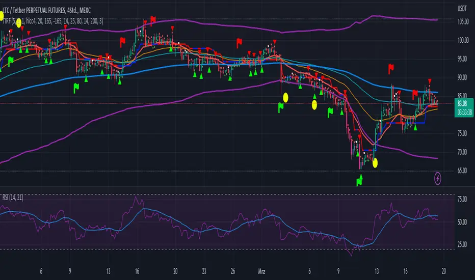
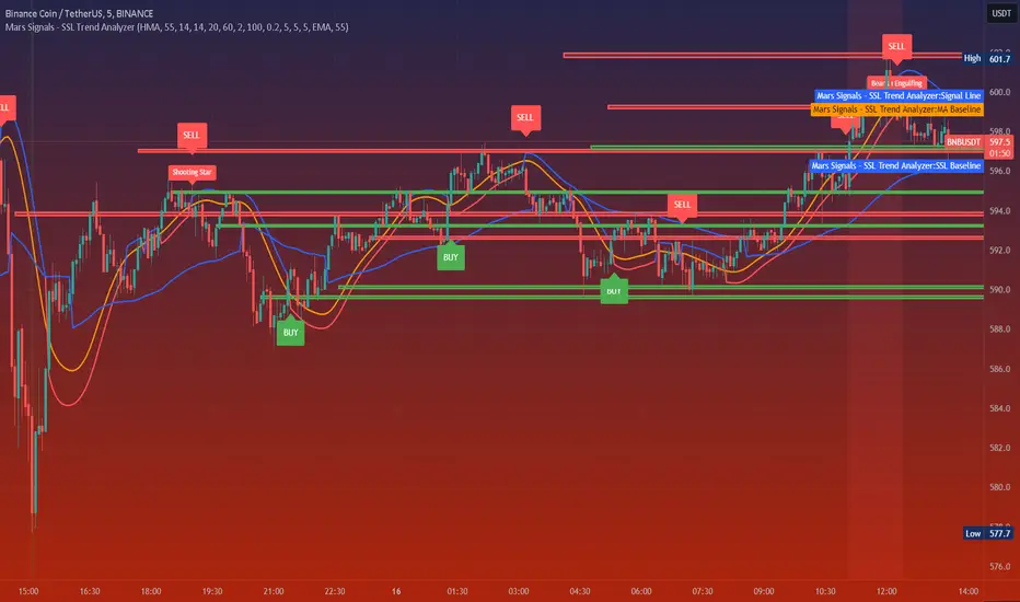
Mars Signals - SSL Trend AnalyzerIntroduction
The "Mars Signals - Precision Trend Analyzer with SSL Baseline & Price Action Zones" is a comprehensive technical analysis tool designed for traders seeking to enhance their market analysis and trading strategies. This indicator integrates multiple advanced trading concepts, including dynamic moving averages, trend detection algorithms, momentum indicators, volume analysis, higher timeframe confirmation, candlestick pattern recognition, and precise price action zones. By combining these elements, the indicator aims to provide clear and actionable buy and sell signals, helping traders to make informed decisions in various market conditions.
Core Components and Functionality
1.Dynamic Baseline Calculation
Moving Average Types: The indicator allows users to select from a variety of moving average types for the baseline calculation, including Simple Moving Average (SMA), Exponential Moving Average (EMA), Hull Moving Average (HMA), Weighted Moving Average (WMA), Double EMA (DEMA), Triple EMA (TEMA), Least Squares Moving Average (LSMA), Triangular Moving Average (TMA), Kijun (from Ichimoku Kinko Hyo), and McGinley's Dynamic.
Baseline Length: Users can customize the length of the moving average, providing flexibility to adjust the sensitivity of the baseline to market movements.
Signal Line Generation: The indicator computes a dynamic signal line based on the relationship between the close price and the moving averages of the high and low prices. This signal line adapts to market volatility and trend changes.
2.SSL Baseline Integration
SSL Baseline: In addition to the primary baseline, the indicator incorporates an SSL (Semaphore Signal Level) Baseline, which further refines trend detection by considering the highs and lows over a specified period.
Dual Confirmation: The combination of the primary baseline and the SSL baseline enhances the reliability of the trend signals by requiring agreement between both baselines before generating a signal.
3.Momentum and Trend Filters
Relative Strength Index (RSI): The indicator uses the RSI to assess the momentum of price movements, filtering out signals that occur during overbought or oversold conditions.
Moving Average Convergence Divergence (MACD): The MACD is employed to identify the direction and strength of the trend, adding another layer of confirmation to the signals.
Average Directional Index (ADX): The ADX measures the strength of the trend, ensuring that signals are generated only when the market shows significant directional movement.
4.Volume Analysis
Volume Filter: An optional volume filter compares the current volume to its moving average, allowing traders to focus on signals that occur during periods of higher market activity.
5.Higher Timeframe Confirmation
Multi-Timeframe Analysis: The indicator can incorporate data from a higher timeframe, comparing the current price to the higher timeframe's baseline and signal line. This feature helps traders align their trades with the broader market trend.
6.Candlestick Pattern Recognition
Bullish Patterns: The indicator detects bullish patterns such as Bullish Engulfing, Piercing Line, Hammer, and Doji.
Bearish Patterns: It also identifies bearish patterns like Bearish Engulfing, Dark Cloud Cover, Shooting Star, and Doji.
Pattern Prioritization: The patterns are prioritized to highlight the most significant formations, which can serve as additional confirmation for trade entries and exits.
7.Price Action Zones
Support and Resistance Levels: The indicator automatically identifies pivot highs and lows to establish dynamic support and resistance levels.
Zone Visualization: It draws shaded rectangles on the chart to represent these zones, providing a clear visual aid for potential reversal or breakout areas.
ATR-Based Zone Width: The zones' thickness is dynamically calculated using the Average True Range (ATR), adjusting to the current market volatility.
Background Coloring: The chart background changes color when the price is above the maximum resistance or below the minimum support, alerting traders to significant price movements.
Interpreting the Signals
1.Buy Signals
Conditions:
Price crosses above the signal line.
RSI is below 70 (not overbought).
MACD line is above the signal line (indicating bullish momentum).
ADX is above the user-defined threshold (default is 20), confirming a strong trend.
(Optional) Volume is above its moving average if the volume filter is enabled.
(Optional) Price is above the higher timeframe baseline and signal line if the higher timeframe filter is enabled.
(Optional) A bullish candlestick pattern is detected if the candlestick pattern filter is enabled.
Visual Indicators:
An upward-pointing label with the text "BUY" appears below the price bar.
The baseline and SSL baseline lines turn to colors indicating bullish conditions.
2.Sell Signals
Conditions:
Price crosses below the signal line.
RSI is above 30 (not oversold).
MACD line is below the signal line (indicating bearish momentum).
ADX is above the user-defined threshold, confirming a strong trend.
(Optional) Volume is above its moving average if the volume filter is enabled.
(Optional) Price is below the higher timeframe baseline and signal line if the higher timeframe filter is enabled.
(Optional) A bearish candlestick pattern is detected if the candlestick pattern filter is enabled.
Visual Indicators:
A downward-pointing label with the text "SELL" appears above the price bar.
The baseline and SSL baseline lines turn to colors indicating bearish conditions.
3.Support and Resistance Zones
Interpretation:
Resistance Zones: Represent areas where the price may face selling pressure. A break above these zones can signal a strong bullish move.
Support Zones: Represent areas where the price may find buying interest. A break below these zones can signal a strong bearish move.
Background Color:
The background turns red when the price is above the maximum resistance, indicating potential overextension.
The background turns green when the price is below the minimum support, indicating potential undervaluation.
Effective Usage Strategies
1.Customization
Adjusting Baseline and SSL Settings: Traders should experiment with different moving average types and lengths to match their trading style and the specific characteristics of the asset being analyzed.
Filtering Parameters: Modify RSI, MACD, and ADX settings to fine-tune the sensitivity of the signals.
Volume and Higher Timeframe Filters: Enable these filters to add robustness to the signals, especially in volatile markets or when trading higher timeframes.
2.Combining with Other Analysis
Fundamental Analysis: Use the indicator in conjunction with fundamental insights to validate technical signals.
Risk Management: Always apply proper risk management techniques, such as setting stop-loss and take-profit levels based on the support and resistance zones provided by the indicator.
3.Backtesting
Historical Analysis: Utilize the indicator's settings to backtest trading strategies on historical data, helping to identify the most effective configurations before applying them in live trading.
4.Monitoring Market Conditions
Volatility Awareness: Pay attention to the ATR and ADX readings to understand market volatility and trend strength, adjusting strategies accordingly.
Event Considerations: Be cautious around major economic announcements or events that may impact market behavior beyond technical indications.
Indicator Inputs and Customization Options
Baseline Type and Length: Select from multiple moving average types and specify the period length.
ADX Settings: Adjust the length, smoothing, and threshold for trend strength confirmation.
Volume Filter: Enable or disable the volume confirmation filter.
Higher Timeframe Filter: Choose to incorporate higher timeframe analysis and specify the desired timeframe.
Candlestick Patterns: Enable or disable the detection of candlestick patterns for additional signal confirmation.
SSL Baseline Type and Length: Customize the SSL baseline settings separately from the primary baseline.
Price Action Zones Settings:
Zone Thickness: Adjust the visual thickness of the support and resistance zones.
Lookback Period: Define how far back the indicator looks for pivot points.
ATR Multiplier for Zone Width: Set the multiplier for ATR to determine the dynamic width of the zones.
Maximum Number of Zones: Limit the number of support and resistance zones displayed.
Pivot Bars: Customize the number of bars to the left and right used for identifying pivot highs and lows.
Conclusion
The "Mars Signals - Precision Trend Analyzer with SSL Baseline & Price Action Zones" is a versatile and powerful tool that amalgamates essential technical analysis techniques into a single, user-friendly indicator. By providing clear visual signals and incorporating multiple layers of confirmation, it assists traders in identifying high-probability trading opportunities. Whether you are a day trader, swing trader, or long-term investor, this indicator can be tailored to suit your trading style and enhance your decision-making process.
To maximize the benefits of this indicator:
Understand Each Component: Familiarize yourself with how each part of the indicator contributes to the overall signal generation.
Customize Thoughtfully: Adjust the settings based on the asset class, market conditions, and your risk tolerance.
Practice Diligently: Use demo accounts or paper trading to practice and refine your strategy before deploying it in live markets.
Stay Informed: Continuously educate yourself on technical analysis and market dynamics to make the most informed decisions.
Disclaimer
Trading financial markets involves risk, and past performance is not indicative of future results. This indicator is a tool to aid in analysis and should not be the sole basis for any trading decision. Always conduct your own research and consider consulting with a licensed financial advisor.
"trend"に関するスクリプトを検索
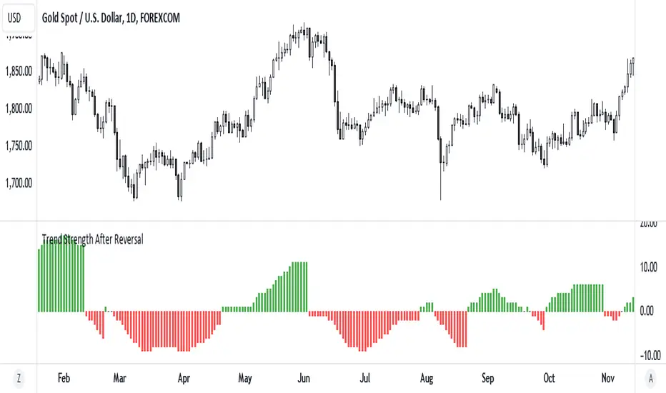
Trend Strength After Reversal
This indicator measures trend strength after the reversal.
It can catch early reversal based on engulfing candlestick pattern or just the regular reversal.
Every reversal have to be confirmed by a close above reversal pattern.
Trend strength is measured by counting subsequent closing confirming the reversal
Multi-Sector Trend AnalysisThis script, titled "Multi-Sector Trend Analysis: Track Sector Momentum and Trends," is designed to assist traders and investors in monitoring multiple sectors of the stock market simultaneously. It leverages technical analysis by incorporating trend detection and momentum indicators like moving averages and the Relative Strength Index (RSI) to offer insights into the price action of various market sectors.
Core Features:
1. Sector-Based Analysis: The script covers 20 major sectors from the NSE (National Stock Exchange) such as Auto, Banking, Energy, FMCG, IT, Pharma, and others. Users can customize which sectors they wish to analyze using the available input fields.
Technical Indicators: The script uses two core technical indicators to detect trends and momentum:
2. Moving Averages: The script calculates both fast and slow exponential moving averages (EMAs). These are critical for identifying short- and long-term price trends and crossovers, helping detect shifts in momentum.
3. Relative Strength Index (RSI): A well-known momentum indicator that shows whether a stock is overbought or oversold. This script uses a 14-period RSI to gauge the strength of each sector.
4. Trend Detection: The script identifies whether the current market trend is "Up" or "Down" based on the relationship between the fast and slow EMAs (i.e., whether the fast EMA is above or below the slow EMA). It highlights this trend visually in a table format, allowing quick and easy trend recognition.
5. Gain/Loss Tracking: This feature calculates the percentage gain or loss since the last EMA crossover (a key point in trend change), giving users a sense of how much the price has moved since the trend shifted.
6. Customizable Table for Display: The script displays the analyzed data in a table format, where users can view each sector's:
Symbol
Trend (Up or Down)
RSI Value
Gain/Loss Since the Last EMA Crossover
This table is customizable in terms of size and color theme (dark or light), providing flexibility in presentation for different charting styles.
How It Works:
Sector Selection: Users can input up to 20 different sector symbols for analysis.
Moving Averages: Users can define the period lengths for both the fast and slow EMAs to suit their trading strategies.
Table Options: Choose between different table sizes and opt for a dark theme to enhance the visual appearance on charts.
How to Use:
Select the symbols (sectors) that you want to track. The script includes pre-configured symbols for major sectors on the NSE, but you can modify these to suit your needs.
Adjust the fast and slow EMA lengths to your preference. A common setting would be 3 for the fast EMA and 4 for the slow EMA, but more conservative traders might opt for higher values.
Customize the table size and theme based on your preference, whether you want a compact table or a larger one for easier readability.
Why Use This Script:
This script is ideal for traders looking to:
Monitor multiple market sectors simultaneously.
Identify key trends across sectors quickly.
Understand momentum and detect potential reversals through RSI and EMA crossovers.
Stay informed on sector performance using a clear visual table that tracks gains or losses.
By using this script, traders can gain better insights into sector-based trading strategies, improve their sector rotation tactics, and stay informed about the broader market environment. It provides a powerful yet easy-to-use tool for both beginner and advanced traders.

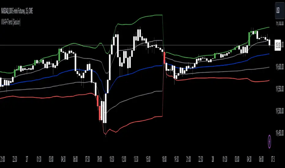
VWAP with Trend Alerts [CrossTrade]The VWAP with Trend Alerts indicator is designed to provide a comprehensive visual and analytical tool for traders using the Volume Weighted Average Price (VWAP) along with additional features like custom bar coloring and trend-based signal alerts.
Key Components and Functionalities:
1. VWAP Calculation: The core of this indicator is the VWAP, which represents the average price of an asset, weighted by volume. It's a popular tool among traders to identify the general direction and strength of a trend, and for assessing entry and exit points.
2. Standard Deviation Bands: Surrounding the VWAP are multiple bands calculated based on standard deviation values. These bands serve as dynamic support and resistance levels. The script allows up to three bands, each with customizable multipliers, giving insights into price volatility and potential breakout or reversal points.
3. Bar Coloring Options:
- Color All Bars: When enabled, all bars on the chart are colored based on whether they close above (green) or below (red) the VWAP.
- Trend Bars Only: This option, when selected, colors only the bars that close beyond the second standard deviation band. It helps in identifying stronger trends and significant market movements.
4. Buy and Sell Signal Conditions: The script includes conditions for buy and sell signals specifically tailored for trend bars. A buy signal is generated when a bar closes above both the VWAP and the upper second standard deviation band, indicating a potential strong uptrend. Conversely, a sell signal is triggered when a bar closes below both the VWAP and the lower second standard deviation band, suggesting a strong downtrend.
5. Alert Conditions: To aid in timely decision-making, the script features alert conditions corresponding to the buy and sell signals.
Usage and Application:
- For Trend Identification: The VWAP and its bands can help identify the prevailing market trend. Bars closing consistently above the VWAP suggest an uptrend, while those closing below indicate a downtrend.
- Volatility Assessment: The standard deviation bands provide a visual representation of market volatility. Narrower bands suggest low volatility, while wider bands indicate high volatility.
- Signal Alerts for Trading: The buy and sell signals, especially those filtered by the trend bars condition, can be valuable for traders looking for strong movement confirmations.
Flexibility and Customization:
This indicator is highly customizable and builds off of the core logic found in standard VWAP indicators. By allowing traders to adjust the standard deviation multipliers and choose their preferred bar coloring strategy. It caters to various trading styles, whether focusing on the broader market trend or pinpointing significant trend-based movements.
TASC 2024.09 Precision Trend Analysis█ OVERVIEW
This script introduces an approach for detecting and confirming trends in price series based on digital signal processing principles, as presented by John Ehlers in the "Precision Trend Analysis" article from the September 2024 edition of TASC's Traders' Tips .
█ CONCEPTS
Traditional trend-following indicators, such as moving averages , are lowpass filters that pass low-frequency components in a series and remove high-frequency components. Because lowpass filters preserve lengthy cycles in the data while attenuating shorter cycles, such filters have unavoidable lag that impacts the timeliness of trading signals.
In his article, John Ehlers presents an alternative approach that combines two highpass filters with different lengths to remove undesired high-frequency content via cancellation . Highpass filters have nearly zero lag. As such, the resulting trend indicator from this approach is very responsive to changes in the price series, with peaks and valleys that closely align with those of the price data. The indicator signifies an uptrend when its value is positive (i.e., above the balance point) and a downtrend when it is negative.
Subsequently, John Ehlers demonstrates that one can use the trend indicator's rate of change (ROC) to determine the onset of new trend movements. The ROC is zero at peaks and valleys in the trend indicator. Therefore, when the ROC crosses above zero, it signifies the onset or continuation of an uptrend. Likewise, the ROC crossing below zero indicates the onset or continuation of a downtrend. Note, however, that because the ROC does not preserve lower-frequency information, it can produce whipsaw trading signals in sideways or continuously trending price series.
This script implements both the trend indicator and its ROC along with the following on-chart signals:
• Green and red arrows that indicate the possible onset or continuation of an uptrend and downtrend, respectively
• Bar and plot colors that signify the sign (direction) of the trend indicator
█ CALCULATIONS
The math behind the trend indicator comes from digital filter design principles. The first step applies a digital highpass filter that attenuates long cycles with periods above the user-specified critical period. The default value is 250 bars, representing roughly one year for instruments such as stocks on the daily timeframe. The next step applies a highpass filter with a shorter period (40 bars by default). The difference between these filters determines the trend indicator, which preserves cyclic components between 40 and 250 bars by default while attenuating and eliminating others. The ROC represents the scaled one-bar difference in the trend indicator.

Linear Regression Trend ChannelThe "Linear Regression Trend Channel" is a technical indicator designed to illustrate price trends and their volatility using linear regression. This indicator calculates the main linear regression line based on the user-defined period length and computes the standard deviation to form a trend channel.
Key Features:
- Linear Regression Calculation: Computes the linear regression line based on the selected price data source and the defined period length.
- Slope and Intercept Calculation: Calculates the slope and intercept of the linear regression line using the calcSlopeIntercept function.
- Deviation Channels: Adds standard deviation channels to the linear regression line to highlight potential support and resistance areas.
Settings
- Linear Regression Length: Specifies the length of the period for the linear regression calculation (default: 100).
- Linear Regression Source: Defines the data source for the linear regression calculation, such as close price, open price, etc. (default: close).
- Linear Regression Color: Sets the color of the linear regression line (default: gray).
- Show Price Labels: Option to display price labels on the horizontal lines (default: true).
How to Use
- Set the Linear Regression Length to define the period for regression calculation.
- Choose the Linear Regression Source to specify the price data (e.g., close, open).
- Enable or disable Show Price Labels based on whether you want to see price labels on the horizontal lines.
This Indicator helps identify dynamic support and resistance levels and potential market turning points.

Multi-Timeframe Trend TableThe "Multi-Timeframe Trend Table" indicator is a tool that consolidates a variety of critical trading metrics into a single, easy-to-read table format. This indicator is especially useful for traders who need to analyze multiple timeframes and indicators simultaneously to make informed trading decisions. By displaying a broad spectrum of data including trend information, rangebound status, volatility levels, VWAP (Volume Weighted Average Price), and specific candlestick patterns, the indicator provides a comprehensive overview of market conditions across different timeframes.
Functionality and Components
At its core, the indicator provides real-time insights into market trends by showing whether each timeframe is experiencing an upward, downward, or neutral trend based on simple moving averages. This is complemented by the "Rangebound" status, which indicates whether the price is trading within a defined range, giving insights into market consolidation periods. This can be critical for identifying breakouts or breakdowns from established ranges.
Volatility Measurement
Another key feature of the indicator is the "Volatility" column, which rates the market's volatility on a scale from 1 to 10. This feature uses the Average True Range (ATR) to assess how drastically prices are changing within a given timeframe, providing a numerical value that helps traders understand the intensity of price movements. High volatility levels (scores above 6) are highlighted, which can be crucial for strategies that prefer high volatility.
VWAP and Candlestick Patterns
The indicator also displays the VWAP, which is essential for traders who focus on volume as it shows the average price a security has traded at throughout the day, based on both volume and price. It is especially useful for traders looking to confirm trend directions or catch potential reversals. Additionally, the "Candle" column enhances the indicator's utility by identifying specific candlestick patterns like Doji, Hammer, Inverted Hammer, Bullish Engulfing, and Bearish Engulfing, which are pivotal for pinpointing momentum changes and potential entry or exit points.
Usage Strategy
Traders can utilize this indicator by setting up specific rules based on the information provided. For instance, a possible strategy could involve entering a trade when a Bullish Engulfing pattern appears in a low-volatility environment as indicated by a volatility score under 6, suggesting a potential uptrend start with limited downside risk. Similarly, a trader might consider exiting a position or taking a short position when a Bearish Engulfing pattern is identified during high volatility periods, signaling possible sharp price declines.
Adaptability and Customization
An added advantage is the indicator’s adaptability; traders can customize which columns to display based on their trading preferences and strategies. Whether focusing on trends, volatility, or candlestick patterns, users can configure the table to match their specific needs. This makes it a versatile tool suited for various trading styles and objectives, from day trading to swing trading.
Overall Utility
Overall, the "Multi-Timeframe Trend Table" indicator is an invaluable asset for traders who manage multiple instruments across different timeframes, offering a bird's-eye view of the markets in one concise table. It aids in quick decision-making by providing all necessary data points at a glance, reducing the need to switch between multiple charts and potentially missing critical market movements. By integrating trend analysis with volatility and candlestick patterns, it equips traders with a powerful synthesis of technical analysis tools to enhance their trading strategies and improve market timing.

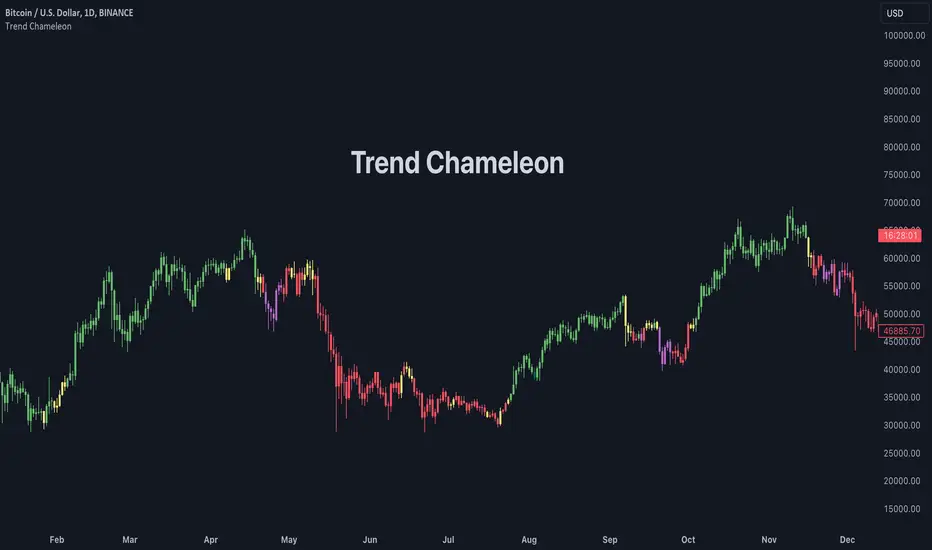
Trend ChameleonThe Trend Chameleon, originally developed by Alex Cole for the Bloomberg Terminal, is a powerful tool designed to simplify trend identification and illuminate potential trading opportunities. It leverages a clear visual display to decode market movements, making it useful for traders of all experience levels.
🟠 Overview
Here's an illustration of how the indicator performs for ES (S&P 500 E-mini Future) on the daily chart:
Trend Chameleon employs a color-coded candle scheme, with each color corresponding to a specific level of trend strength. Purple candles represent the strongest bearish trends, while teal candles signal the most potent bullish momentum. Between these extremes lie red, yellow, and green candles, providing a spectrum of trend direction. This intuitive color coding allows you to quickly grasp the prevailing market sentiment and identify potential entry and exit points for your trades.
🟠 Algorithm
Under the hood, Trend Chameleon evaluates four conditions to provide a directional strength score:
1. Whether the MACD value is positive.
2. Whether the SMA 50 of open prices is above the SMA 50 of the close prices.
3. Whether the ROC indicator value is positive.
4. Whether the current close price is above the SMA 50.
The total number of fulfilled conditions (0 to 4) determines the trend strength, with 0 indicating the most bearish and 4 signifying the strongest bullish trend. This score is then visually represented by coloring the bars on the chart.
🟠 Note
If you don't see the bars being properly colored after adding this indicator, please ensure Trend Chameleon is positioned on top of all other indicators in your chart. This can be easily achieved by hovering over the indicator's name, clicking the three dots, selecting "Visual Order," and then choosing "Bring to front."
Trend Analysis with Standard Deviation by zdmre This script analyzes trends in financial markets using standard deviation.
The script works by first calculating the standard deviation of a security's price over a specified period of time. The script then uses this standard deviation to identify potential trend reversals.
For example, if the standard deviation of a security's price is high, this could indicate that the security is overvalued and due for a correction. Conversely, if the standard deviation of a security's price is low, this could indicate that the security is undervalued and due for a rally.
The script can be used to analyze any security, including stocks, bonds, and currencies. It can also be used to analyze different time frames, such as daily, weekly, and monthly.
How to Use the Script
To use the script, you will need to specify the following parameters:
Time frame: The time frame you want to analyze.
Standard deviation: The standard deviation you want to use.
Once you have specified these parameters, the script will calculate the standard deviation of the security's price over the specified time frame. The script will then use this standard deviation to identify potential trend reversals.
#DYOR

Trend Shift ProThe indicator is designed to identify shifts or changes in trends as blocks, the indicator's focus on analyzing the Median of Means, Interquartile Range, and Practical Significance for potential trend changes in the market using non parametric Cohen's D. The script is designed to operate on blocks of 21 bars. The key parts of the script related to this are the conditions inside the "if" statements: The bar_index % 21 == 0 condition checks if the current bar index is divisible by 21, meaning it's the beginning of a new block of 21 bars. This condition is used to reset and calculate new values at the start of each block.
Therefore, signals or calculations related to the median of means (MoM), interquartile range (IQR), and Cohen's D are updated and calculated once every 21 bars. What this means is the frequency of signals is shown once every 21 bars.
Price Movements of Blocks:
Block-Based Analysis: This approach divides the price data into blocks or segments, often a fixed number of bars or candles. Each block represents a specific interval of time or price action. It involves No Smoothing: Unlike moving averages, block-based analysis does not apply any smoothing to the price data within each block. It directly examines the raw prices within each block.
Let's break down the key concepts and how they are used for trading:
Median of Means (MoM):
The script calculates the median of the means of seven subgroups, each consisting of three bars in shuffled order.
Each subgroup's mean is calculated based on the typical price (hlc3) of the bars within that subgroup.
The median is then computed from these seven means, representing a central tendency measure.
Note: The Median of Means provides a robust measure of central tendency, especially in situations where the dataset may have outliers or exhibit non-normal distribution characteristics. By calculating means within smaller subgroups, the method is less sensitive to extreme values that might unduly influence the overall average. This can make the Median of Means more robust than a simple mean or median when dealing with datasets that have heterogeneity or skewed distributions.
Interquartile Range (IQR):
The script calculates the IQR for each block of 21 bars.
The IQR is a measure of statistical dispersion, representing the range between the first quartile (Q1) and the third quartile (Q3) of the data.
Q1 and Q3 are calculated from the sorted array of closing prices of the 21 bars.
Non-Parametric Cohen's D Calculation:
Cohen's D is a measure of effect size, indicating the standardized difference between two means.
In this script, a non-parametric version of Cohen's D is calculated, comparing the MoM values of the current block with the MoM values of the previous block.
The calculation involves the MoM difference divided by the square root of the average squared IQR values.
Practical Significance Threshold:
The user can set a threshold for practical significance using the Threshold input.
The script determines practical significance by comparing the calculated Cohen's D with this threshold.
Plotting:
The script plots the MoM values using both straight lines and circles, with the color of the circles indicating the direction of the MoM change (green for upward, red for downward, and blue for no change).
Triangular shapes are plotted when the absolute value of Cohen's D is less than the practical significance threshold.
Overall Purpose for Trading:
The indicator is designed to help traders identify potential turning points or shifts in market sentiment. and use it as levels which needs to be crossed to have a new trend.
Changes in MoM, especially when accompanied by practical significance as determined by Cohen's D, may signal the start of a new trend or a significant move in the market.
Traders using this indicator would typically look for instances where the MoM values and associated practical significance suggest a high probability of a trend change, providing them with potential entry or exit signals. It's important for users to backtest and validate the indicator's effectiveness in different market conditions before relying on it for trading decisions.

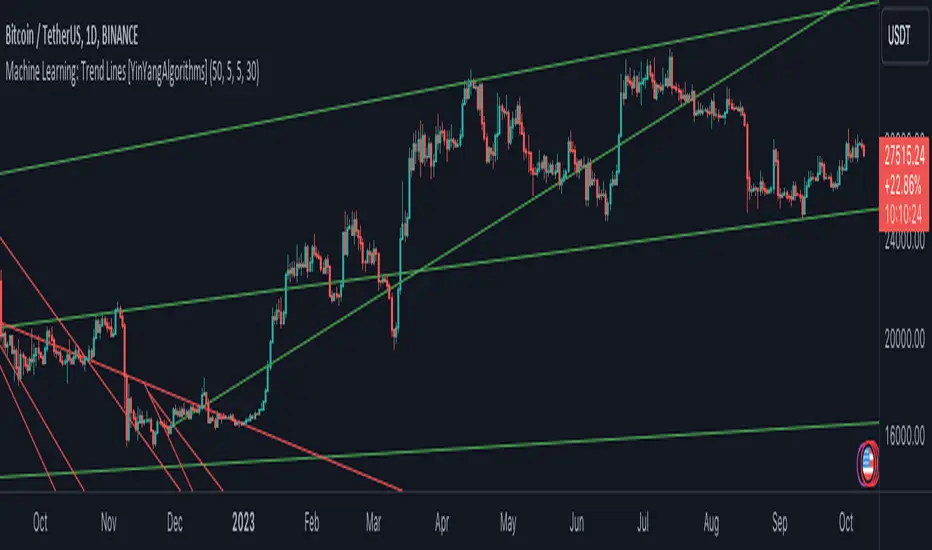
Machine Learning: Trend Lines [YinYangAlgorithms]Trend lines have always been a key indicator that may help predict many different types of price movements. They have been well known to create different types of formations such as: Pennants, Channels, Flags and Wedges. The type of formation they create is based on how the formation was created and the angle it was created. For instance, if there was a strong price increase and then there is a Wedge where both end points meet, this is considered a Bull Pennant. The formations Trend Lines create may be powerful tools that can help predict current Support and Resistance and also Future Momentum changes. However, not all Trend Lines will create formations, and alone they may stand as strong Support and Resistance locations on the Vertical.
The purpose of this Indicator is to apply Machine Learning logic to a Traditional Trend Line Calculation, and therefore allowing a new approach to a modern indicator of high usage. The results of such are quite interesting and goes to show the impacts a simple KNN Machine Learning model can have on Traditional Indicators.
Tutorial:
There are a few different settings within this Indicator. Many will greatly impact the results and if any are changed, lots will need ‘Fine Tuning’. So let's discuss the main toggles that have great effects and what they do before discussing the lengths. Currently in this example above we have the Indicator at its Default Settings. In this example, you can see how the Trend Lines act as key Support and Resistance locations. Due note, Support and Resistance are a relative term, as is their color. What starts off as Support or Resistance may change when the price crosses over / under them.
In the example above we have zoomed in and circled locations that exhibited markers of Support and Resistance along the Trend Lines. These Trend Lines are all created using the Default Settings. As you can see from the example above; just because it is a Green Upwards Trend Line, doesn’t mean it’s a Support Line. Support and Resistance is always shifting on Trend Lines based on the prices location relative to them.
We won’t go through all the Formations Trend Lines make, but the example above, we can see the Trend Lines formed a Downward Channel. Channels are when there are two parallel downwards Trend Lines that are at a relatively similar angle. This means that they won’t ever meet. What may happen when the price is within these channels, is it may bounce between the upper and lower bounds. These Channels may drive the price upwards or downwards, depending on if it is in an Upwards or Downwards Channel.
If you refer to the example above, you’ll notice that the Trend Lines are formed like traditional Trend Lines. They don’t stem from current Highs and Lows but rather Machine Learning Highs and Lows. More often than not, the Machine Learning approach to Trend Lines cause their start point and angle to be quite different than a Traditional Trend Line. Due to this, it may help predict Support and Resistance locations at are more uncommon and therefore can be quite useful.
In the example above we have turned off the toggle in Settings ‘Use Exponential Data Average’. This Settings uses a custom Exponential Data Average of the KNN rather than simply averaging the KNN. By Default it is enabled, but as you can see when it is disabled it may create some pretty strong lasting Trend Lines. This is why we advise you ZOOM OUT AS FAR AS YOU CAN. Trend Lines are only displayed when you’ve zoomed out far enough that their Start Point is visible.
As you can see in this example above, there were 3 major Upward Trend Lines created in 2020 that have had a major impact on Support and Resistance Locations within the last year. Lets zoom in and get a closer look.
We have zoomed in for this example above, and circled some of the major Support and Resistance locations that these Upward Trend Lines may have had a major impact on.
Please note, these Machine Learning Trend Lines aren’t a ‘One Size Fits All’ kind of thing. They are completely customizable within the Settings, so that you can get a tailored experience based on what Pair and Time Frame you are trading on.
When any values are changed within the Settings, you’ll likely need to ‘Fine Tune’ the rest of the settings until your desired result is met. By default the modifiable lengths within the Settings are:
Machine Learning Length: 50
KNN Length:5
Fast ML Data Length: 5
Slow ML Data Length: 30
For example, let's toggle ‘Use Exponential Data Averages’ back on and change ‘Fast ML Data Length’ from 5 to 20 and ‘Slow ML Data Length’ from 30 to 50.
As you can in the example above, all of the lines have changed. Although there are still some strong Support Locations created by the Upwards Trend Lines.
We will conclude our Tutorial here. Hopefully you’ve learned how to use Machine Learning Trend Lines and will be able to now see some more unorthodox Support and Resistance locations on the Vertical.
Settings:
Use Machine Learning Sources: If disabled Traditional Trend line sources (High and Low) will be used rather than Rational Quadratics.
Use KNN Distance Sorting: You can disable this if you wish to not have the Machine Learning Data sorted using KNN. If disabled trend line logic will be Traditional.
Use Exponential Data Average: This Settings uses a custom Exponential Data Average of the KNN rather than simply averaging the KNN.
Machine Learning Length: How strong is our Machine Learning Memory? Please note, when this value is too high the data is almost 'too' much and can lead to poor results.
K-Nearest Neighbour (KNN) Length: How many K-Nearest Neighbours are allowed with our Distance Clustering? Please note, too high or too low may lead to poor results.
Fast ML Data Length: Fast and Slow speed needs to be adjusted properly to see results. 3/5/7 all seem to work well for Fast.
Slow ML Data Length: Fast and Slow speed needs to be adjusted properly to see results. 20 - 50 all seem to work well for Slow.
If you have any questions, comments, ideas or concerns please don't hesitate to contact us.
HAPPY TRADING!
Trend Change DetectorThe trend change detector oscillator is a tool designed to help traders identify the current trend direction paired with the potential reversal zones.
The oscillator is made of multiple parts:
- The colored histogram, that displays the current long-term trend direction (long if above 0, short if below)
- The trend line, which shows the price in relation to the fair value of the current trend
- The reversal zones, which are the area that alarms the traders that the price might reverse soon after having touched them
The indicator can work with three different inputs. In the Source panel, you can choose between "Price", "Price and Volume" and "Ponderated Volume". The price input uses only the price, the price and volume use the average between the price and the ponderated volume, and the ponderated volume shows the indicator working with volume data, with formulas such as the On Balance Volume and the Accumulation-Distribution line.
This indicator can be used both for trend following technique, using the cross of the trend line with the 0-line as signals in conjunction with the bias given by the histogram, and for mean reversal technique thanks to the reversal zones that allow traders to identify potential tops and bottoms.

Trend Analyser by Abdul KhaderThis indicator is designed to provide buy and sell signals based on a combination of technical analysis methods. It uses the Relative Strength Index (RSI), Moving Average Convergence Divergence (MACD), and Exponential Moving Averages (EMA) to generate signals. It also calculates Stop Loss (SL) and Take Profit (TP) levels based on the Average True Range (ATR).
Components:
RSI: An oscillator that measures the speed and change of price movements. RSI is used to identify overbought and oversold conditions. In this indicator, an RSI below 30 is considered oversold and an RSI above 70 is considered overbought.
MACD: A trend-following momentum indicator that shows the relationship between two moving averages of a security’s price. The MACD triggers technical signals when it crosses above (to buy) or below (to sell) its signal line.
EMA: These moving averages give more weight to recent prices and are used to identify short-term price trends. A crossover of a shorter period EMA (9 periods in this case) above a longer period EMA (21 periods in this case) generates a buy signal. Conversely, a crossover of the shorter EMA below the longer EMA generates a sell signal.
ATR: This is a market volatility indicator. The ATR is used to calculate Stop Loss and Take Profit levels. These levels are set at a distance from the entry price, equal to a certain multiplier (1.5 in this case) of the ATR.
How to Use:
Buy Signal: A green triangle below the price bar indicates a buy signal. This is generated when the following conditions are met:
The short-term EMA crosses above the long-term EMA
The RSI is below 30 (oversold condition)
The MACD line crosses above the signal line and is above zero
Sell Signal: A red triangle above the price bar indicates a sell signal. This is generated when the following conditions are met:
The short-term EMA crosses below the long-term EMA
The RSI is above 70 (overbought condition)
The MACD line crosses below the signal line and is below zero
Stop Loss and Take Profit: These levels are indicated by dashed lines. The stop loss for a long position is set below the entry price, while the take profit is set above. For a short position, the stop loss is set above the entry price and the take profit is set below.
Important Notes:
This indicator is designed for intraday trading and may not be suitable for longer-term trades.
Always use this indicator in conjunction with other aspects of technical and fundamental analysis. No indicator can provide accurate signals 100% of the time.
Always backtest this indicator with historical data before using it in live trading.
Risk management is crucial in trading. Never risk more than a small percentage of your trading capital on a single trade.
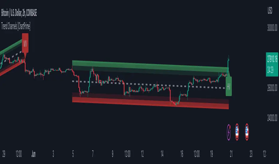
Trend Channels With Liquidity Breaks [ChartPrime]Trend Channels
This simple trading indicator is designed to quickly identify and visualize support and resistance channels in any market. The primary purpose of the Trend Channels with Liquidity Breaks indicator is to recognize and visualize the dominant trend in a more intuitive and user-friendly manner.
Main Features
Automatically identifies and plots channels based on pivot highs and lows
Option to extend the channel lines
Display breaks of the channels where liquidity is deemed high
Inclusion of volume data within the channel bands (optional)
Market-friendly and customizable colors and settings for easy visual identification
Settings
Length: Adjust the length and lookback of the channels
Show Last Channel: Only shows the last channel
Volume BG: Shade the zones according to the volume detected
How to Interpret
Trend Channels with Liquidity Breaks indicator uses a combination of pivot highs and pivot lows to create support and resistance zones, helping traders to identify potential breakouts, reversals or continuations of a trend.
These support and resistance zones are visualized as upper and lower channel lines, with a dashed center line representing the midpoint of the channel. The indicator also allows you to see the volume data within the channel bands if you choose to enable this functionality. High volume zones can potentially signal strong buying or selling pressure, which may lead to potential breakouts or trend confirmations.
To make the channels more market-friendly and visually appealing, Trend Channels indicator also offers customizable colors for upper and lower lines, as well as the possibility to extend the line lengths for further analysis.
The indicator displays breaks of key levels in the market with higher volume.
TASC 2023.07 Keeping With The Larger Trend█ OVERVIEW
TASC's July 2023 edition of Traders' Tips features an article by Barbara Star titled "Stay On Track With The Supertrend Indicator". The article explores how the supertrend indicator , whether used as a standalone tool or in conjunction with other indicators, can assist traders in aligning with the larger trend. Drawing inspiration from the article, this script enhances the supertrend indicator with additional visual and analytical features, making it easier to analyze the readings and make informed trading decisions.
█ CONCEPTS
Over the past few years, the supertrend indicator has gained significant popularity among traders. Unlike moving averages, it incorporates both price and volatility information, enabling traders to navigate upward or downward trends despite occasional price disruptions.
When using the supertrend indicator, a trader may consider entering a long position when the price surpasses the supertrend line or retraces to it after the initial crossover. Similarly, for short positions, a trader could enter when the price drops below the supertrend line or retests it. Exiting these positions can be triggered by the opposite scenario, such as a price drop below the supertrend line for long positions or a price rise above the supertrend line for short positions. To assist in monitoring the distance between the price and the indicator line, this script introduces the following display features:
Breach levels, representing fractions of the most recent maximum distance.
On-chart signals indicating crossings of the highest and lowest breach levels.
An infobox displaying the average value of the maximum distance.
█ CALCULATIONS
For calculating the supertrend line, this script uses the built-in function ta.supertrend() . Additionally, the script showcases the use of state-of-the-art PineScript® functionality, including methods and tables .
Trend Reversal Indicator (Bull/Bear)Simple indicator utilising time series momentum to identify secular/cyclical trends in asset classes. Default setting is weekly timeframe - yearly/quarterly. The indicator helps define when in bull/bear market, and corrections/rebounds within larger trends.
Trend Angle Candle ColorIntroduction:
As a trader, understanding the trend of the market is crucial for making informed decisions. One way to gain insight into the market trend is by using technical indicators, which are mathematical calculations that provide traders with valuable information about price action. In this post, we will explore a unique indicator called the "Trend Angle Candle Color" that not only identifies the trend but also visualizes it using color-coded candlesticks. We'll dive into the script, discuss its key components, and explain how you can benefit from using it in your trading strategy.
Script Overview:
The Trend Angle Candle Color Indicator is written in the Pine Script language for the TradingView platform. The indicator utilizes a combination of Exponential Moving Average (EMA), Average True Range (ATR), and Epanechnikov Kernel function to calculate the trend angle, which is then represented by color-coded candlesticks. The script offers several customizable inputs, such as the length of the lookback period, the scale (sensitivity), and the smoothing factor.
Key Components of the Script:
Inputs:
Length: Determines the lookback period for calculating the trend.
Scale: Adjusts the sensitivity of the indicator.
Smoothing: Controls the degree of smoothing applied to the angle calculation.
Smoothing Factor: Adjusts the weight of the Epanechnikov Kernel function.
Functions:
grad(src): A function that takes an input value and returns a corresponding color from a predefined gradient.
ema(source): An Exponential Moving Average function that smoothens the price data.
atan2(y, x) and degrees(float source): Functions that convert the slope into an angle in radians and then into degrees.
epanechnikov_kernel(_src, _size, _h, _r): A function that applies the Epanechnikov Kernel smoothing method to the angle data.
Calculations:
ATR: Calculates the Average True Range using the EMA function.
Slope: Determines the slope of the price change over the specified lookback period.
Angle_rad: Converts the slope into an angle in radians.
Degrees: Applies the Epanechnikov Kernel smoothing function to the angle data and scales it to a range between 0 to 100.
Visualization:
Colour: Assigns a color to each candlestick based on the calculated degree value using the grad() function.
Barcolor(colour) and plotcandle(): Functions that display the color-coded candlesticks on the chart.
Benefits of Using the Trend Angle Candle Color Indicator:
Easy Visualization: The color-coded candlesticks provide a simple and intuitive way to understand the market trend direction and strength at a glance.
Customizable Parameters: The customizable inputs allow traders to fine-tune the indicator to their preferred settings, suiting their trading style and strategy.
Versatility: The Trend Angle Candle Color Indicator can be used across various timeframes and financial instruments, making it a valuable addition to any trader's toolkit.
Conclusion:
The Trend Angle Candle Color Indicator is a powerful tool that can enhance your trading strategy by providing a visual representation of the market trend. The unique combination of EMA, ATR, and Epanechnikov Kernel smoothing helps create a more accurate and easy-to-understand trend angle calculation. By incorporating this indicator into your trading analysis, you can gain better insight into market dynamics and make more informed trading decisions.

Trend AngleIntroduction:
In today's post, we'll dive deep into the source code of a unique trading tool, the Trend Angle Indicator. The script is an indicator that calculates the trend angle for a given financial instrument. This powerful tool can help traders identify the strength and direction of a trend, allowing them to make informed decisions.
Overview of the Trend Angle Indicator:
The Trend Angle Indicator calculates the trend angle based on the slope of the price movement over a specified period. It uses an Exponential Moving Average (EMA) to smooth the data and an Epanechnikov kernel function for additional smoothing. The indicator provides a visual representation of the trend angle, making it easy to interpret for traders of all skill levels.
Let's break down the key components of the script:
Inputs:
Length: The number of periods to calculate the trend angle (default: 8)
Scale: A scaling factor for the ATR (Average True Range) calculation (default: 2)
Smoothing: The smoothing parameter for the Epanechnikov kernel function (default: 2)
Smoothing Factor: The radius of the Epanechnikov kernel function (default: 1)
Functions:
ema(): Exponential Moving Average calculation
atan2(): Arctangent function
degrees(): Conversion of radians to degrees
epanechnikov_kernel(): Epanechnikov kernel function for additional smoothing
Calculations:
atr: The EMA of the True Range
slope: The slope of the price movement over the given length
angle_rad: The angle of the slope in radians
degrees: The smoothed angle in degrees
Plotting:
Trend Angle: The trend angle, plotted as a line on the chart
Horizontal lines: 0, 90, and -90 degrees as reference points
How the Trend Angle Indicator Works:
The Trend Angle Indicator begins by calculating the Exponential Moving Average (EMA) of the True Range (TR) for a given financial instrument. This smooths the price data and provides a more accurate representation of the instrument's price movement.
Next, the indicator calculates the slope of the price movement over the specified length. This slope is then divided by the scaled ATR to normalize the trend angle based on the instrument's volatility. The angle is calculated using the atan2() function, which computes the arctangent of the slope.
The final step in the process is to smooth the trend angle using the Epanechnikov kernel function. This function provides additional smoothing to the trend angle, making it easier to interpret and reducing the impact of short-term price fluctuations.
Conclusion:
The Trend Angle Indicator is a powerful trading tool that allows traders to quickly and easily determine the strength and direction of a trend. By combining the Exponential Moving Average, ATR, and Epanechnikov kernel function, this indicator provides an accurate and easily interpretable representation of the trend angle. Whether you're an experienced trader or just starting, the Trend Angle Indicator can provide valuable insights into the market and help improve your trading decisions.

Angle-based Trend IndicatorI couldn't find this anywhere else, at least not in the simple way I wanted it.
1. choose a source
2. choose a look-back period
3. choose an angle
The indicator will show you the degree of the trend of the look-back period, and color the line according to bearish or bullish. Also, this is my first script, please be kind.

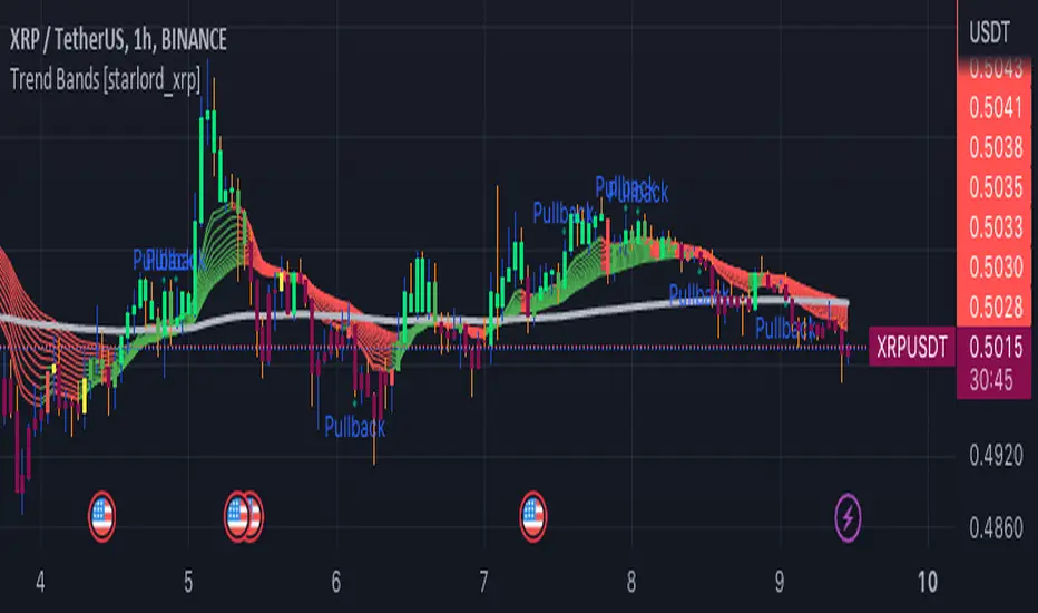
Trend Bands [starlord_xrp]This indicator uses multiple trendlines to determine the overall trend and trend changes. It also highlights areas of potential pullbacks to entry.
Trendlines HTF [theEccentricTrader]█ OVERVIEW
This indicator automatically draws dynamic higher timeframe support and resistance lines from preceding peak to current peak and from preceding trough to current trough. In the example above I have applied the indicator three times; one for the 1D trendlines (red), one for the 4H trendlines (orange) and one for the 2H trendlines (green).
█ CONCEPTS
Green and Red Candles
• A green candle is one that closes with a high price equal to or above the price it opened.
• A red candle is one that closes with a low price that is lower than the price it opened.
Swing Highs and Swing Lows
• A swing high is a green candle or series of consecutive green candles followed by a single red candle to complete the swing and form the peak.
• A swing low is a red candle or series of consecutive red candles followed by a single green candle to complete the swing and form the trough.
Peak and Trough Prices (Basic)
• The peak price of a complete swing high is the high price of either the red candle that completes the swing high or the high price of the preceding green candle, depending on which is higher.
• The trough price of a complete swing low is the low price of either the green candle that completes the swing low or the low price of the preceding red candle, depending on which is lower.
Historic Peaks and Troughs
The current, or most recent, peak and trough occurrences are referred to as occurrence zero. Previous peak and trough occurrences are referred to as historic and ordered numerically from right to left, with the most recent historic peak and trough occurrences being occurrence one.
Support and Resistance
• Support refers to a price level where the demand for an asset is strong enough to prevent the price from falling further.
• Resistance refers to a price level where the supply of an asset is strong enough to prevent the price from rising further.
Support and resistance levels are important because they can help traders identify where the price of an asset might pause or reverse its direction, offering potential entry and exit points. For example, a trader might look to buy an asset when it approaches a support level, with the expectation that the price will bounce back up. Alternatively, a trader might look to sell an asset when it approaches a resistance level, with the expectation that the price will drop back down.
It's important to note that support and resistance levels are not always relevant, and the price of an asset can also break through these levels and continue moving in the same direction.
Trendlines
Trendlines are straight lines that are drawn between two or more points on a price chart. These lines are used as dynamic support and resistance levels for making strategic decisions and predictions about future price movements. For example traders will look for price movements along, and reactions to, trendlines in the form of rejections or breakouts/downs.
█ FEATURES
Inputs
• HTF Resolution
• Resistance Line Color
• Support Line Color
█ LIMITATIONS
All green and red candle calculations are based on differences between open and close prices, as such I have made no attempt to account for green candles that gap lower and close below the close price of the preceding candle, or red candles that gap higher and close above the close price of the preceding candle. This may cause some unexpected behaviour on some markets and timeframes. I can only recommend using 24-hour markets, if and where possible, as there are far fewer gaps and, generally, more data to work with.
Similarly, if the current timeframe is not a factor of the higher timeframe there will be occasions when the left hand offset is out by a couple of bars. This is because the calculations are ultimately based on how many lower timeframe bars there are inside a sequence of higher timeframe bars. The lines will also behave unexpectedly if the higher timeframe resolution is lower than the current timeframe, but that should be expected.
If the lines do not draw or you see a study error saying that the script references too many candles in history, this is most likely because the higher timeframe anchor point is not present on the current timeframe. This problem usually occurs when referencing a higher timeframe, such as the 1-month, from a much lower timeframe, such as the 1-minute. How far you can lookback for higher timeframe anchor points on the current timeframe will also be limited by your Trading View subscription plan. Premium users get 20,000 candles worth of data, pro+ and pro users get 10,000, and basic users get 5,000.

Trendlines [theEccentricTrader]█ OVERVIEW
This indicator automatically draws dynamic support and resistance lines from preceding peak to current peak and from preceding trough to current trough.
█ CONCEPTS
Green and Red Candles
• A green candle is one that closes with a high price equal to or above the price it opened.
• A red candle is one that closes with a low price that is lower than the price it opened.
Swing Highs and Swing Lows
• A swing high is a green candle or series of consecutive green candles followed by a single red candle to complete the swing and form the peak.
• A swing low is a red candle or series of consecutive red candles followed by a single green candle to complete the swing and form the trough.
Peak and Trough Prices (Basic)
• The peak price of a complete swing high is the high price of either the red candle that completes the swing high or the high price of the preceding green candle, depending on which is higher.
• The trough price of a complete swing low is the low price of either the green candle that completes the swing low or the low price of the preceding red candle, depending on which is lower.
Historic Peaks and Troughs
The current, or most recent, peak and trough occurrences are referred to as occurrence zero. Previous peak and trough occurrences are referred to as historic and ordered numerically from right to left, with the most recent historic peak and trough occurrences being occurrence one.
Support and Resistance
• Support refers to a price level where the demand for an asset is strong enough to prevent the price from falling further.
• Resistance refers to a price level where the supply of an asset is strong enough to prevent the price from rising further.
Support and resistance levels are important because they can help traders identify where the price of an asset might pause or reverse its direction, offering potential entry and exit points. For example, a trader might look to buy an asset when it approaches a support level, with the expectation that the price will bounce back up. Alternatively, a trader might look to sell an asset when it approaches a resistance level, with the expectation that the price will drop back down.
It's important to note that support and resistance levels are not always relevant, and the price of an asset can also break through these levels and continue moving in the same direction.
Trendlines
Trendlines are straight lines that are drawn between two or more points on a price chart. These lines are used as dynamic support and resistance levels for making strategic decisions and predictions about future price movements. For example traders will look for price movements along, and reactions to, trendlines in the form of rejections or breakouts/downs.
█ FEATURES
Inputs
• Resistance Line Color
• Support Line Color
█ LIMITATIONS
All green and red candle calculations are based on differences between open and close prices, as such I have made no attempt to account for green candles that gap lower and close below the close price of the preceding candle, or red candles that gap higher and close above the close price of the preceding candle. This may cause some unexpected behaviour on some markets and timeframes. I can only recommend using 24-hour markets, if and where possible, as there are far fewer gaps and, generally, more data to work with.
Trend Indicator with RSI and Fibbonacci Band 0.702 crossingsToday we have a new Indicator set, which I created using inspiration from the Trend Magic Indicator from KivancOzbilgic and adding several new aspects to it and a slightly modified calculation of the trend indicator itself.
You can change the inputs by changing the pre set values in the settings, but I found the current settings quite accurate. Feel free to experiment to fine tune the indicators.
Here are the details of the script:
Trend indicated within candles and as a line
- bullish and bearish trends are now also indicated within the candle based on the CCI calculation.
- Bullish is indicated by a green circle below the candle or as one may call it a "dot"
- bearish trend is indicated by a red circle above the candle
Entry Signal based on RSI crossing its EMA
- my motivation was to have a clearer entry signal besides highlighting a trend, which can not really be used to identify a good entry but to give confidence or when loosing trend to give an exit signal.
- after studiying the RSI and how it works together with its EMA it looks quite interesting as an entry or exit signal. But be cautios if the EMA and RSI values are moving in a narrow area we get a lot of crosses and therefore signals which should rather be ignored rather to be act on. So the the range where the cross happens is also quite important. But this aspect is not yet reflected as a rule/ logic.
But I am thinking of adding something.. or alternativly best to switch to another timeframe to get some better data
RSI overbought and oversold as Diamonds
- I also added key indications of oversold or overbought as Blue and Pink diamonds, can be considered as additional information to maybe identify a short term top or bottom.. but its not very accurate.
Entry signal based on crossing Fibbonachi Band 0.702
- So far the 0.702 seems to be quite an interesting retracement level which seems to be met a lot of times
- based on the assumption the price will evantually hit the 0.702 either direction I wanted to get a signal when this happens
- BUT! a big but, unfortunalty the Fibbonachi bands tend to bloat up in case of high volatility so it is not easy to find the crossing on higher timeframes
Here are the standard value which I found quite accurate for the assets I use this indicator set:
CCI Period = 5
ATR Multiplier = 1
ATR Period = 1
Source = High Low Close (hlc3 average value of the candle
Here the inputs used for the RSI Crossing signal (here you should play around a little to see which entry would have been best..)
RSI Length = 14
RSI Oversold = 25 (to be used for the "golden" entry signal based on the FBB crossing)
RSI Overbought = 80 (to be used for the "golden" entry signal based on the FBB crossing)
RSI Moving Average Length
In future versions I will add options to activate or deactive some of the plotting and espacially this golden dot when the fibbonachi band is being crossed needs some fine tuning..
And lets see if there is a way to fix the bloating of those bands..