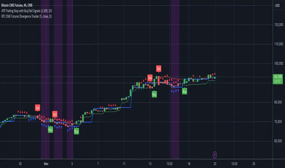
BTC CME Futures Divergence TrackerThis script tracks divergences between price action and open interest for the BTC CME Futures contract (symbol "BTC1!") using the following components:
Key Features:
1. Price Analysis: Identifies lower highs in the price over a specified lookback period. Marks these points with red upward-facing triangles above the bars.
2. Open Interest Analysis: Retrieves open interest (OI) data for the BTC CME Futures contract via request.security. Detects lower highs in open interest over the same lookback period. Highlights these points with blue downward-facing triangles below the bars.
3. Divergence Detection: A divergence is identified when both price and open interest form lower highs simultaneously. Highlights such occurrences with a purple background, indicating potential bearish sentiment or weakening momentum.
4. Alerts: If divergences are detected, an alert is triggered (if enabled), notifying the trader to take action.
5. Visualization: Open interest is plotted as a blue line in a separate pane for added context. Red and blue markers highlight significant points in price and open interest trends.
Use Cases:
- Spot Weakening Trends: Divergences between price and open interest may indicate a loss of momentum or bearish sentiment, allowing traders to preemptively adjust their strategies.
- Monitor Institutional Activity: Open interest changes reflect shifts in market participation, especially in derivative markets like CME Futures.
- Set Alerts for Key Signals: With automated alerts, traders can stay informed of potential divergence signals without constant monitoring.
Customization Options:
- Lookback Period: Adjust the number of bars used to detect lower highs.
- Timeframe: Choose the timeframe for fetching open interest data (e.g., daily, hourly).
- Alert Activation: Enable or disable alerts for divergences.
This tool combines price action with open interest dynamics to provide a robust method for identifying market trends and potential reversals in BTC CME Futures.
Sentiment
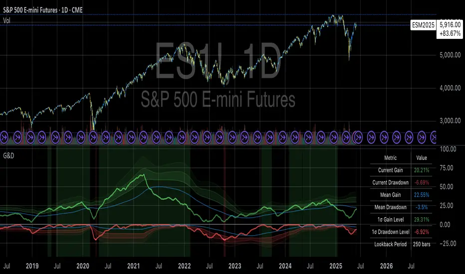
Gains and Drawdowns with Standard DeviationsThis “Gains and Drawdowns with Standard Deviations” indicator helps in analyzing and visualizing the percentage gains and drawdown phases of a market or asset relative to its historical range. By calculating gains from the lowest low and drawdowns from the highest high over a specified lookback period, this indicator provides deeper insights into price movements and risk.
Key Features and Applications:
1. Gain and Drawdown Calculation:
• Gains: The indicator calculates the percentage gain from the lowest price point within a specific lookback period (e.g., 250 days).
• Drawdowns: Drawdowns are calculated as the percentage change from the highest point in the same period. This helps in identifying the maximum loss phases.
2. Standard Deviation:
• The indicator computes the standard deviation of both gains and drawdowns over a specified period (e.g., 250 days), allowing you to quantify volatility.
• Three bands (1st, 2nd, and 3rd standard deviations) are plotted for both gains and drawdowns, representing the frequency and magnitude of price movements within the normal volatility range.
3. Extreme Movements Highlighting:
• The indicator highlights extreme gains and drawdowns when they exceed user-defined thresholds. This helps in identifying significant market events or turning points.
4. Customizable Thresholds:
• Users can adjust the thresholds for extreme gains and drawdowns, as well as the lookback period for calculating gains, drawdowns, and standard deviations, making the indicator highly adaptable to specific needs.
Application in Portfolio Management:
The use of standard deviation in portfolio management is essential for assessing the risk and volatility of a portfolio. According to Modern Portfolio Theory (MPT) by Harry Markowitz, diversification of assets in a portfolio helps to minimize overall risk (especially the standard deviation), while maximizing returns. The standard deviation of a portfolio measures the volatility of its returns, with higher standard deviation indicating higher risk.
Scientific Source: Markowitz, H. M. (1952). Portfolio Selection. The Journal of Finance, 7(1), 77-91.
Markowitz’s theory suggests that an optimized portfolio, by minimizing the standard deviation of returns and combining a diversified asset allocation, can achieve better risk-adjusted returns.
Conclusion:
This indicator is particularly useful for traders and portfolio managers who want to understand and visualize market risk and extreme events. By using gains, drawdowns, and volatility metrics, it allows for systematic monitoring and evaluation of price movements, leading to more informed decisions in trading or portfolio management. A comprehensive understanding of price behavior and volatility helps in optimizing risk management and making strategic market entries.
Key Features:
• Visualization of Gains and Drawdowns with color-coded highlights for extreme movements.
• Standard Deviation Calculations for detailed volatility analysis.
• Customizable Thresholds for identifying extreme market events.
This indicator is a valuable tool for analyzing market data from a scientific standpoint, improving risk management, and making data-driven decisions based on historical performance.
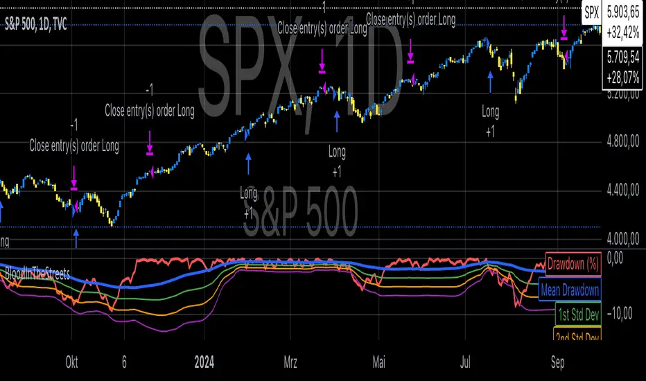
Buy When There's Blood in the Streets StrategyStatistical Analysis of Drawdowns in Stock Markets
Drawdowns, defined as the decline from a peak to a trough in asset prices, are an essential measure of risk and market dynamics. Their statistical properties provide insights into market behavior during extreme stress periods.
Distribution of Drawdowns: Research suggests that drawdowns follow a power-law distribution, implying that large drawdowns, while rare, are more frequent than expected under normal distributions (Sornette et al., 2003).
Impacts of Extreme Drawdowns: During significant drawdowns (e.g., financial crises), the average recovery time is significantly longer, highlighting market inefficiencies and behavioral biases. For example, the 2008 financial crisis led to a 57% drawdown in the S&P 500, requiring years to recover (Cont, 2001).
Using Standard Deviations: Drawdowns exceeding two or three standard deviations from their historical mean are often indicative of market overreaction or capitulation, creating contrarian investment opportunities (Taleb, 2007).
Behavioral Finance Perspective: Investors often exhibit panic-selling during drawdowns, leading to oversold conditions that can be exploited using statistical thresholds like standard deviations (Kahneman, 2011).
Practical Implications: Studies on mean reversion show that extreme drawdowns are frequently followed by periods of recovery, especially in equity markets. This underpins strategies that "buy the dip" under specific, statistically derived conditions (Jegadeesh & Titman, 1993).
References:
Sornette, D., & Johansen, A. (2003). Stock market crashes and endogenous dynamics.
Cont, R. (2001). Empirical properties of asset returns: stylized facts and statistical issues. Quantitative Finance.
Taleb, N. N. (2007). The Black Swan: The Impact of the Highly Improbable.
Kahneman, D. (2011). Thinking, Fast and Slow.
Jegadeesh, N., & Titman, S. (1993). Returns to Buying Winners and Selling Losers: Implications for Stock Market Efficiency.
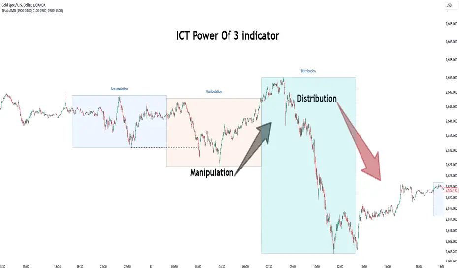
Power Of 3 ICT 01 [TradingFinder] AMD ICT & SMC Accumulations🔵 Introduction
The ICT Power of 3 (PO3) strategy, developed by Michael J. Huddleston, known as the Inner Circle Trader, is a structured approach to analyzing daily market activity. This strategy divides the trading day into three distinct phases: Accumulation, Manipulation, and Distribution.
Each phase represents a unique market behavior influenced by institutional traders, offering a clear framework for retail traders to align their strategies with market movements.
Accumulation (19:00 - 01:00 EST) takes place during low-volatility hours, as institutional traders accumulate orders. Manipulation (01:00 - 07:00 EST) involves false breakouts and liquidity traps designed to mislead retail traders. Finally, Distribution (07:00 - 13:00 EST) represents the active phase where significant market movements occur as institutions distribute their positions in line with the broader trend.
This indicator is built upon the Power of 3 principles to provide traders with a practical and visual tool for identifying these key phases. By using clear color coding and precise time zones, the indicator highlights critical price levels, such as highs and lows, helping traders to better understand market dynamics and make more informed trading decisions.
Incorporating the ICT AMD setup into daily analysis enables traders to anticipate market behavior, spot high-probability trade setups, and gain deeper insights into institutional trading strategies. With its focus on time-based price action, this indicator simplifies complex market structures, offering an effective tool for traders of all levels.
🔵 How to Use
The ICT Power of 3 (PO3) indicator is designed to help traders analyze daily market movements by visually identifying the three key phases: Accumulation, Manipulation, and Distribution.
Here's how traders can effectively use the indicator :
🟣 Accumulation Phase (19:00 - 01:00 EST)
Purpose : Identify the range-bound activity where institutional players accumulate orders.
Trading Insight : Avoid placing trades during this phase, as price movements are typically limited. Instead, use this time to prepare for the potential direction of the market in the next phases.
🟣 Manipulation Phase (01:00 - 07:00 EST)
Purpose : Spot false breakouts and liquidity traps that mislead retail traders.
Trading Insight : Observe the market for price spikes beyond key support or resistance levels. These moves often reverse quickly, offering high-probability entry points in the opposite direction of the initial breakout.
🟣 Distribution Phase (07:00 - 13:00 EST)
Purpose : Detect the main price movement of the day, driven by institutional distribution.
Trading Insight : Enter trades in the direction of the trend established during this phase. Look for confirmations such as breakouts or strong directional moves that align with broader market sentiment
🔵 Settings
Show or Hide Phases :mDecide whether to display Accumulation, Manipulation, or Distribution.
Adjust the session times for each phase :
Accumulation: 1900-0100 EST
Manipulation: 0100-0700 EST
Distribution: 0700-1300 EST
Modify Visualization : Customize how the indicator looks by changing settings like colors and transparency.
🔵 Conclusion
The ICT Power of 3 (PO3) indicator is a powerful tool for traders seeking to understand and leverage market structure based on time and price dynamics. By visually highlighting the three key phases—Accumulation, Manipulation, and Distribution—this indicator simplifies the complex movements of institutional trading strategies.
With its customizable settings and clear representation of market behavior, the indicator is suitable for traders at all levels, helping them anticipate market trends and make more informed decisions.
Whether you're identifying entry points in the Accumulation phase, navigating false moves during Manipulation, or capitalizing on trends in the Distribution phase, this tool provides valuable insights to enhance your trading performance.
By integrating this indicator into your analysis, you can better align your strategies with institutional movements and improve your overall trading outcomes.
USDEGP Rate MultipleIndicator shows the ratio between USDEGP rate calculated using CIB GDR and the official rate. In no stress, value should be stable.

Tims Smart Money COT-IndexThe **Tims Smart Money COT Index** analyzes the positions of different groups of market participants from the COT report (Commercials, Large Specs, Small Specs). It calculates their net positions and scales them relative to extremes of the last 24 weeks. It indicates bullish and bearish zones to identify market sentiments.
- Commercials (Smart Money)**: Often act against the trend, bullish from 80+.
- Large Specs (Retail Money)**: Trend-following, bullish from 80+.
- Small Specs**: Mostly impulsive, bullish from 80+.
The indicator helps to identify turning points in the market based on the behavior of the players.

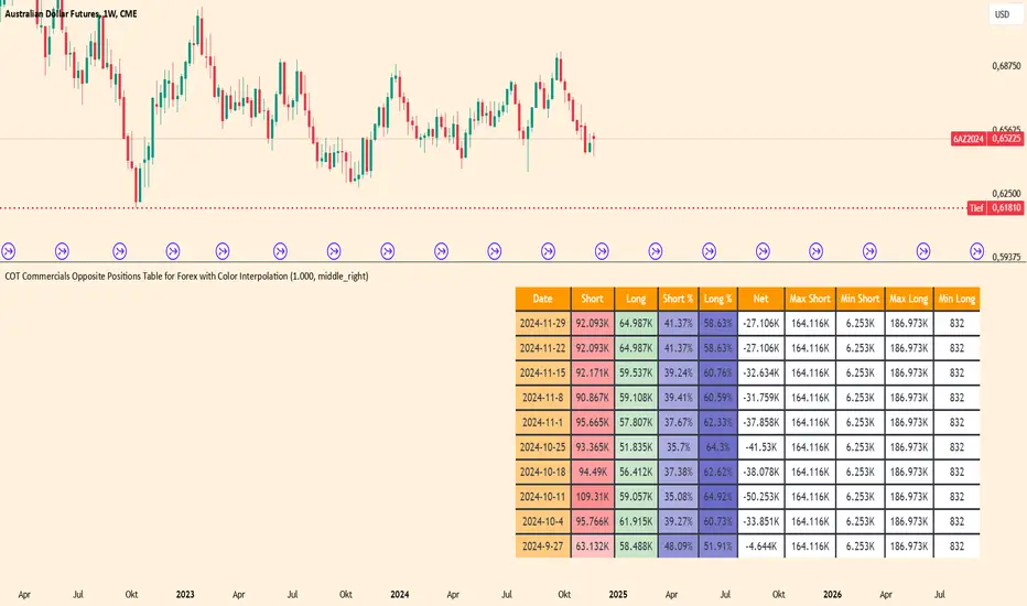
COT Commercials Positions Table Der COT Commercials Opposite Positions Table for Forex ist ein umfangreicher TradingView-Indikator, der die Positionen der kommerziellen Marktteilnehmer (Commercials) im Rahmen des Commitments of Traders (COT)-Berichts darstellt. Er zeigt Long-, Short-, und Netto-Positionen sowie deren prozentuale Anteile für ausgewählte Märkte an.
Hauptmerkmale:
Datenquellenwahl: Unterstützt "Futures Only" und "Futures and Options".
Marktabdeckung: Umfasst Währungen, Rohstoffe, Indizes und Kryptowährungen.
Farbkodierung: Dynamische Farbverläufe zur Hervorhebung von Extremen bei Long-/Short-Positionen und Prozentsätzen.
Historische Daten: Zeigt Positionsdaten der letzten 10 Wochen an.
Anpassbare Tabelle: Klar strukturiert mit wichtigen Kennzahlen wie max./min. Positionen und Netto-Positionen.
Der Indikator ist besonders für Trader nützlich, die Marktstimmungen analysieren und Positionierungen großer Marktteilnehmer in ihre Handelsentscheidungen einbeziehen möchten.
Der Indikator ist hauptsächlich für Futures gedacht und funktioniert nur im 1 Woche Chart.
Elite Trading Network | HQ: Quantum Edge V2Elite Trading Network HQ: Quantum Edge V2 is a sophisticated market structure analysis tool designed to help traders make informed decisions based on a deep understanding of market conditions. This script blends structural trend analysis with AI-based predictive models to provide dynamic, real-time insights into market behavior. Here is what makes Quantum Edge V2 unique:
Key Features:
Adaptive Market Structure Analysis:
The script uses a multi-level algorithm to identify key market structures, such as swing highs and swing lows, to help traders understand the underlying strength or weakness of the current market trend. It dynamically tracks critical market boundaries using historical price action and recalculates trend levels as new data emerges.
Range and Trend Condition Detection:
Quantum Edge V2 detects whether the market is trending or ranging by analyzing historical structure breaks. This detection helps identify moments of consolidation (yellow zones) or periods of trend continuation. By calculating average structural break durations, the indicator alerts users to conditions that may require caution, such as ranging markets.
Predictive AI Analysis for Entry Optimization:
An AI-powered module evaluates volume thresholds and ATR (Average True Range) to provide users with an understanding of the current market risk. The ATR is calculated based on a user-defined timeframe, giving flexibility in how users approach different market conditions. This feature also determines the risk per trade and calculates the optimal position size, ensuring that users can tailor their risk according to their trading plan.
Real-Time Alerts and Visual Indicators:
The indicator includes alerts for key conditions:
Green Condition: Signals optimal market entry conditions.
Yellow Condition: Indicates a cautionary ranging market, alerting traders to the potential lack of strong trends.
Red Condition: Identifies unsuitable market conditions for entry due to insufficient volume or unfavorable metrics.
Color-coded background visuals provide instant clarity regarding market conditions—red, yellow, or green—allowing traders to make quick, informed decisions.
Dynamic Multi-Timeframe Analysis:
The user can select a custom entry timeframe, while the script internally calculates and adapts to a higher timeframe for deep trend analysis. This approach gives traders a complete view of both the short-term (entry) and higher timeframe (overall trend) dynamics.
How to Use:
Identify Trend Conditions: The indicator visually plots key market structures (green and red structural lines) to help users determine where the market may find support or resistance. The background changes color to indicate trending (green), ranging (yellow), or high-risk (red) conditions.
Make Informed Entries: Use the real-time alerts and label information to get insights into current market conditions. If the background is green and metrics align, the indicator suggests an optimal time for entry.
Position Sizing and Risk Management: The calculated risk per trade and position size (displayed on-screen) assist users in managing risk effectively. Users can utilize this data to adjust trade sizes and maximize profit potential while adhering to their risk tolerance.
What Sets Quantum Edge V2 Apart:
Unlike other indicators that solely provide trend direction, Quantum Edge V2 offers an integrated understanding of market structure, volume analysis, and predictive AI models.
The ranging market detection (yellow zones) is particularly valuable for traders looking to avoid low-probability trades during periods of market indecision.
The use of ATR-based risk calculation ensures the position sizing is always aligned with market volatility, adding an extra layer of protection for capital.
Important Notes:
Educational Value: This script does not just tell you when to enter or exit. It provides deep insights into market dynamics, giving traders a tool to learn and improve their market understanding. The ability to view market structure across different timeframes and visualize areas of caution is crucial for long-term growth as a trader.
No Guaranteed Results: This indicator is a powerful tool for analysis, but like all trading strategies, it does not guarantee profits. Always practice proper risk management.
Why It's Worth Using: This indicator combines multi-timeframe structure analysis, volume metrics, and predictive AI modeling—an approach typically reserved for professional trading systems. Traders looking to incorporate a systematic approach to risk, ranging markets, and trend detection will find Quantum Edge V2 invaluable.
Closed-source Explanation: The script uses proprietary algorithms and unique concepts for trend detection and volume-based analysis that ensure high levels of accuracy in defining market structure and determining entry signals. Because of its complexity and the unique blend of tools, it remains closed-source.
Feedback and Support:
If you have questions or suggestions about this script, feel free to comment or reach out. We value your input as we strive to improve and provide traders with cutting-edge tools.

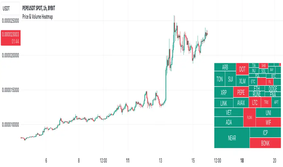
Price & Volume HeatmapDescription:
Displays a heatmap (like TV's Stock Heatmap) for up to 40 symbols (either from 3 presets, or custom). It can show Price Change, Volume Change and Volume (in $). The text size for each symbol can auto-change based on whether it fits into the cell. Each cell shows the name of the symbol, and when hovered - it shows the value.
Inputs:
- Symbols -> which symbols to use (Custom, or predefined list of Stocks/Crypto/Forex)
- Data -> show Price Change (%), Volume Change (%) or Volume ($)
- Custom -> put your custom list of symbols here (comma separated without spaces, up to 40 symbols)
- Position -> heatmap position
- Height / Width -> height / width of the heatmap (% of indicator's space)
- Text Size -> can be constant (Tiny/Normal/etc) or automatically change based on the text of each cell (Auto/Auto (Smaller))
- Color -> text color
Notes:
It is not recommended to use the script on timeframes below 30 seconds, because it may be too slow there (since it's based on a table object, it might be slow).
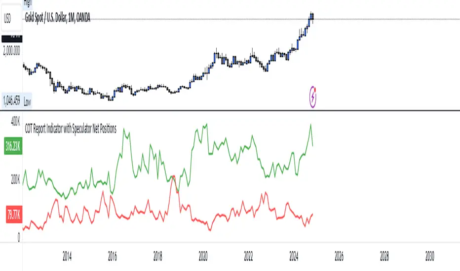
COT Report Indicator with Speculator Net PositionsThe COT Report Indicator with Speculator Net Positions is designed to give traders insights into the behavior of large market participants, particularly speculators, based on the Commitment of Traders (COT) report data. This indicator visualizes the long and short positions of non-commercial traders, allowing users to gauge the sentiment and positioning of large speculators in key markets, such as Gold, Silver, Crude Oil, S&P 500, and currency pairs like EURUSD, GBPUSD, and others.
The indicator provides three essential components:
Net Long Position (Green) - Displays the total long positions held by speculators.
Net Short Position (Purple) - Shows the total short positions held by speculators.
Net Difference (Long - Short) (Yellow) - Illustrates the difference between long and short positions, helping users identify whether speculators are more bullish or bearish on the asset.
Recommended Timeframes:
Best Timeframes: Weekly and Monthly
The COT report data is released on a weekly basis, making higher timeframes like the Weekly and Monthly charts ideal for this indicator. These timeframes provide a more accurate reflection of the underlying trends in speculator positioning, avoiding the noise present in lower timeframes.
How to Use:
Market Sentiment: Use this indicator to gauge the sentiment of large speculators, who often drive market trends. A strong net long position can indicate bullish sentiment, while a high net short position might suggest bearish sentiment.
Trend Reversal Signals: Sudden changes in the net difference between long and short positions may indicate potential trend reversals.
Confirmation Tool: Pair this indicator with your existing analysis to confirm the strength of a trend or identify overbought/oversold conditions based on speculator activity.
Supported Symbols:
This indicator currently supports a range of commodities and currency pairs, including:
Gold ( OANDA:XAUUSD )
Silver ( OANDA:XAGUSD )
Crude Oil ( TVC:USOIL )
Natural Gas ( NYMEX:NG1! )
S&P 500 ( SP:SPX )
Dollar Index ( TVC:DXY )
EURUSD ( FX:EURUSD )
GBPUSD ( FX:GBPUSD )
GBPJPY( FX:GBPJPY )
By providing clear insight into the positions of large speculators, this indicator is a powerful tool for traders looking to align with institutional sentiment and enhance their trading strategy.
TimeFlow Momentum IndicatorThe “TimeFlow Momentum Indicator” is a thoughtfully crafted tool that integrates multiple analytical components to deliver a unique perspective on market momentum. It is not a mere combination of existing indicators, but rather a purposeful integration where each element plays a specific role, enhancing the overall functionality and reliability of the script. The primary aim is to provide traders with a more comprehensive and accurate analysis by leveraging time-based divergence, volume validation, and trend filtering.
1. Time-Based Momentum Divergence: The Core Innovation
• The heart of the indicator is the Time Divergence Line, which introduces a unique approach to analyzing momentum by focusing on the time spent in uptrends versus downtrends. Unlike traditional momentum indicators that rely purely on price movements (e.g., RSI, MACD), the Time Divergence Line captures the duration of market trends, offering a different perspective on momentum shifts.
• This method counts consecutive bars where the price closes higher (uptrend) or lower (downtrend) and calculates the difference between these counts. By measuring the time spent in different trend directions, the indicator can detect early signs of trend exhaustion or potential reversals, which are often missed by price-based indicators.
2. EMA Smoothing: Enhancing Signal Clarity
• The raw time divergence data is smoothed using an Exponential Moving Average (EMA) to filter out noise and provide a clearer, more reliable signal. The EMA helps to capture the underlying trend in the divergence data, making it easier for traders to identify meaningful shifts in momentum without being misled by short-term price fluctuations.
• This smoothing technique is crucial because it reduces false signals, ensuring that the divergence line reflects the true momentum of the market.
3. Overlay Plotting for Better Visualization
• The smoothed Time Divergence Line is directly plotted on the main price chart, offering traders a visual overlay that correlates directly with price action. This design choice enhances the usability of the indicator by allowing traders to see the divergence line’s relationship with the price in real-time, making it easier to spot potential buy and sell signals.
• By overlaying the divergence line on the main chart, the indicator provides a visual representation of momentum divergence, which is more intuitive and actionable compared to separate oscillators.
4. Trend Confirmation Using VWAP and EMA
• To increase the reliability of signals, the indicator incorporates a trend filter using both VWAP (Volume Weighted Average Price) and EMA (50-period). This filter ensures that signals are generated only when they align with the prevailing market trend:
• The VWAP is used to gauge the average price considering the volume, acting as a dynamic support/resistance level. It helps to confirm whether the market sentiment is bullish or bearish.
• The EMA (50-period) acts as a trend-following indicator, smoothing out price action and providing a clear signal of the overall trend direction.
• This dual-filter approach helps to eliminate false signals that may occur during choppy or sideways market conditions, ensuring that the generated signals are more aligned with the broader market trend.
5. Volume Correlation for Signal Validation
• The indicator integrates a volume filter to confirm the validity of momentum signals. It checks whether the current volume exceeds a threshold based on the average volume, ensuring that signals are only generated when there is strong market participation.
• This volume correlation check is vital because it validates price movements by confirming that they are backed by significant trading activity, reducing the likelihood of false signals in low-volume conditions.
6. Cooldown Mechanism: Controlling Signal Frequency
• To prevent excessive signals, especially during volatile or sideways market conditions, the indicator implements a cooldown period. This feature enforces a minimum number of bars between consecutive signals, reducing noise and preventing traders from being overwhelmed by frequent alerts.
• The cooldown mechanism enhances the signal quality, ensuring that each buy or sell signal is meaningful and not just a result of short-term fluctuations.
How the Components Work Together
The TimeFlow Momentum Indicator is a cohesive tool where each component plays a specific and complementary role:
1. Time Divergence Line identifies shifts in market momentum by analyzing the duration of trends.
2. EMA Smoothing refines the divergence data, providing a clearer signal by filtering out noise.
3. Trend Filter (VWAP + EMA) ensures that signals are generated in alignment with the prevailing market trend, reducing the risk of false signals.
4. Volume Filter validates signals based on trading activity, confirming that price movements are backed by strong volume.
5. Cooldown Mechanism controls the frequency of signals, preventing overtrading and reducing noise.
Conclusion
The “TimeFlow Momentum Indicator” is an innovative tool that offers a new way of analyzing market momentum by focusing on time-based divergence. It combines this original approach with trend and volume filters to create a reliable, user-friendly indicator that can help traders identify high-probability entry and exit points. This is not a simple mashup of existing indicators but a well-designed integration where each component enhances the overall functionality, providing traders with a unique edge in market analysis.
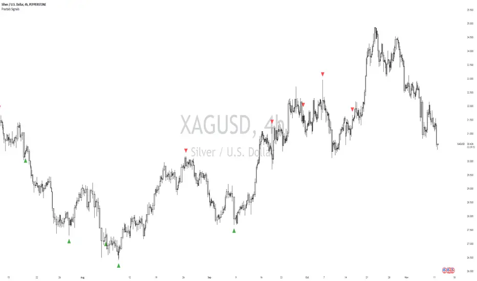
William Fractals + SignalsWilliams Fractals + Trading Signals
This indicator identifies Williams Fractals and generates trading signals based on price sweeps of these fractal levels.
Williams Fractals are specific candlestick patterns that identify potential market turning points. Each fractal requires a minimum of 5 bars (2 before, 1 center, 2 after), though this indicator allows you to customize the number of bars checked.
Up Fractal (High Point) forms when you have a center bar whose HIGH is higher than the highs of 'n' bars before and after it. For example, with n=2, you'd see a pattern where the center bar's high is higher than 2 bars before and 2 bars after it. The indicator also recognizes patterns where up to 4 bars after the center can have equal highs before requiring a lower high.
Down Fractal (Low Point) forms when you have a center bar whose LOW is lower than the lows of 'n' bars before and after it. For example, with n=2, you'd see a pattern where the center bar's low is lower than 2 bars before and 2 bars after it. The indicator also recognizes patterns where up to 4 bars after the center can have equal lows before requiring a higher low.
Trading Signals:
The indicator generates signals when price "sweeps" these fractal levels:
Buy Signal (Green Triangle) triggers when price sweeps a down fractal. This requires price to go BELOW the down fractal's low level and then CLOSE ABOVE it . This pattern often indicates a failed breakdown and potential reversal upward.
Sell Signal (Red Triangle) triggers when price sweeps an up fractal. This requires price to go ABOVE the up fractal's high level and then CLOSE BELOW it. This pattern often indicates a failed breakout and potential reversal downward.
Customizable Settings:
1. Periods (default: 10) - How many bars to check before and after the center bar (minimum value: 2)
2. Maximum Stored Fractals (default: 1) - How many fractal levels to keep in memory. Older levels are removed when this limit is reached to prevent excessive signals and maintain indicator performance.
Important Notes:
• The indicator checks the actual HIGH and LOW prices of each bar, not just closing prices
• Fractal levels are automatically removed after generating a signal to prevent repeated triggers
• Signals are only generated on bar close to avoid false triggers
• Alerts include the ticker symbol and the exact price level where the sweep occurred
Common Use Cases:
• Identifying potential reversal points
• Finding stop-hunt levels where price might reverse
• Setting stop-loss levels above up fractals or below down fractals
• Trading failed breakouts/breakdowns at fractal levels
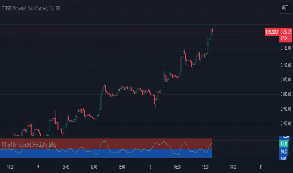
RSI and Dev Advanced Volatility IndexEnglish Explanation of the "RSI and Dev Advanced Volatility Index" Pine Script Code
Understanding the Code
Purpose:
This Pine Script code creates a custom indicator that combines the Relative Strength Index (RSI) and Deviation (DEV) to provide insights into market volatility.
Key Components:
* Deviation (DEV): Calculates the difference between the closing price and the 10-period simple moving average. This measures the extent to which the price deviates from its recent average, indicating volatility.
* RSI: The traditional RSI is then applied to the calculated deviations. This helps to smooth the data and identify overbought or oversold conditions in terms of volatility.
Calculation Steps:
* Deviation Calculation: The difference between the closing price and its 10-period simple moving average is calculated.
* RSI Calculation: The RSI is calculated on the deviations, providing a measure of the speed and change of volatility relative to recent volatility changes.
* Plotting:
* The RSI of the deviations is plotted on the chart.
* Horizontal lines are plotted at 50, 0, and 110 to visually represent different volatility zones.
* The area between the lines is filled with color to highlight low and high volatility regions.
Interpretation and Usage
* Volatility Analysis:
* High Volatility: When the RSI is above 50, it indicates high volatility, suggesting the market might be in a consolidation or trend reversal phase.
* Low Volatility: When the RSI is below 50, it indicates low volatility, suggesting a relatively calm market.
* Trading Signals:
* Buy Signal: When the RSI crosses above 50 from below, it might signal increasing volatility, which could be a buying opportunity.
* Sell Signal: When the RSI crosses below 50 from above, it might signal decreasing volatility, which could be a selling opportunity.
* Risk Management:
* By monitoring volatility, traders can better manage their risk. During periods of high volatility, traders might reduce their position size or adopt more conservative strategies.
Advantages
* Comprehensive: Combines RSI and DEV for a more holistic view of volatility.
* Sensitivity: Quickly responds to changes in market volatility.
* Visual Clarity: Color-coded zones provide a clear visual representation of different volatility levels.
Limitations
* Parameter Sensitivity: The indicator's performance is sensitive to parameter changes, such as the lookback period for the moving average.
* Lag: Like most technical indicators, it has some lag and might not capture every market movement.
* Not Predictive: It can only indicate current and past volatility, not future movements.
Summary
This custom indicator offers a valuable tool for analyzing market volatility. By combining RSI and DEV, it provides a more nuanced perspective on price fluctuations. However, it should be used in conjunction with other technical indicators and fundamental analysis for more robust trading decisions.
Key points to remember:
* Higher RSI values indicate higher volatility.
* Lower RSI values indicate lower volatility.
* Crossovers of the RSI line above or below 50 can provide potential trading signals.
* The indicator should be used in conjunction with other analysis tools for a more complete picture of the market.
Option Delta CandlesDescription:
The Option Delta Candles with EMA indicator is designed to help traders visualize option delta values as candlesticks, calculated using the Black-Scholes model. It provides a unique way to view the cumulative delta changes in a normalized format, making it easier to identify trends and reversals. The addition of an EMA (Exponential Moving Average) overlay helps smooth out the data for better trend analysis.
Features:
Customizable Inputs:
Risk-Free Interest Rate: Adjust the risk-free rate for more precise option calculations.
Volatility: Input the volatility of the underlying asset to reflect current market conditions.
Strike Price: Enter the desired strike price of the option.
Days to Expiration: Specify the days until the option's expiration.
EMA Length: Modify the length of the EMA to suit different time frames and trading styles.
Visual Styles:
Customizable candle colors for bullish and bearish candles.
Configurable border and wick colors for personalized chart aesthetics.
How It Works:
The indicator uses the Black-Scholes model to calculate the delta of a European call option. Delta measures the sensitivity of the option's price to changes in the price of the underlying asset.
A cumulative delta is calculated and normalized to create candlestick representations, providing a visual cue of how the option delta changes over time.
The scaled delta values are normalized between 0 and 1, allowing for a consistent view of relative strength and weakness.
The EMA overlay helps identify smoothed trends and potential reversals within the delta data.
Applications:
Trend Identification: The indicator helps spot trends and potential reversals in option delta movements.
Volatility Analysis: By visualizing option delta, traders can gain insight into how changes in volatility impact options pricing.
Advanced Analysis: This tool is ideal for options traders and analysts looking to integrate delta analysis into their strategies.
Use Cases:
Traders can use the candlestick view to understand shifts in market sentiment through delta changes.
Options Analysts can visualize delta fluctuations over time, aiding in complex options trading strategies.
Technical Analysts may combine this indicator with other tools to confirm signals and enhance trading decisions.
Indicator Configuration:
Input Settings:
Risk-free interest rate (as a percentage).
Volatility (standard deviation) in percentage.
Strike price of the option.
Days remaining until expiration.
EMA length for trend analysis.
Style Customization:
Select colors for bullish and bearish candles, border, and wicks.
Change the color of the EMA line to distinguish it on the chart.
Release Notes:
Initial Version: Includes full implementation of the Black-Scholes delta calculation with customizable EMA and normalized candlestick view.
Future Updates: Potential additions may include enhancements for put options and integrated alerts.

Forex Heatmap█ OVERVIEW
This indicator creates a dynamic grid display of currency pair cross rates (exchange rates) and percentage changes, emulating the Cross Rates and Heat Map widgets available on our Forex page. It provides a view of realtime exchange rates for all possible pairs derived from a user-specified list of currencies, allowing users to monitor the relative performance of several currencies directly on a TradingView chart.
█ CONCEPTS
Foreign exchange
The Foreign Exchange (Forex/FX) market is the largest, most liquid financial market globally, with an average daily trading volume of over 5 trillion USD. Open 24 hours a day, five days a week, it operates through a decentralized network of financial hubs in various major cities worldwide. In this market, participants trade currencies in pairs , where the listed price of a currency pair represents the exchange rate from a given base currency to a specific quote currency . For example, the "EURUSD" pair's price represents the amount of USD (quote currency) that equals one unit of EUR (base currency). Globally, the most traded currencies include the U.S. dollar (USD), Euro (EUR), Japanese yen (JPY), British pound (GBP), and Australian dollar (AUD), with USD involved in over 87% of all trades.
Understanding the Forex market is essential for traders and investors, even those who do not trade currency pairs directly, because exchange rates profoundly affect global markets. For instance, fluctuations in the value of USD can impact the demand for U.S. exports or the earnings of companies that handle multinational transactions, either of which can affect the prices of stocks, indices, and commodities. Additionally, since many factors influence exchange rates, including economic policies and interest rate changes, analyzing the exchange rates across currencies can provide insight into global economic health.
█ FEATURES
Requesting a list of currencies
This indicator requests data for every valid currency pair combination from the list of currencies defined by the "Currency list" input in the "Settings/Inputs" tab. The list can contain up to six unique currency codes separated by commas, resulting in a maximum of 30 requested currency pairs.
For example, if the specified "Currency list" input is "CAD, USD, EUR", the indicator requests and displays relevant data for six currency pair combinations: "CADUSD", "USDCAD", "CADEUR", "EURCAD", "USDEUR", "EURUSD". See the "Grid display" section below to understand how the script organizes the requested information.
Each item in the comma-separated list must represent a valid currency code. If the "Currency list" input contains an invalid currency code, the corresponding cells for that currency in the "Cross rates" or "Heat map" grid show "NaN" values. If the list contains empty items, e.g., "CAD, ,EUR, ", the indicator ignores them in its data requests and calculations.
NOTE: Some uncommon currency pair combinations might not have data feeds available. If no available symbols provide the exchange rates between two specified currencies, the corresponding table cells show "NaN" results.
Realtime data
The indicator retrieves realtime market prices, daily price changes, and minimum tick sizes for all the currency pairs derived from the "Currency list" input. It updates the retrieved information shown in its grid display after new ticks become available to reflect the latest known values.
NOTE: Pine scripts execute on realtime bars only when new ticks are available in the chart's data feed. If no new updates are available from the chart's realtime feed, it may cause a delay in the data the indicator receives.
Grid display
This indicator displays the requested data for each currency pair in a table with cells organized as a grid. Each row name corresponds to a pair's base currency , and each column name corresponds to a quote currency . The cell at the intersection of a specific row and column shows the value requested from the corresponding currency pair.
For example, the cell at the intersection of a "EUR" row and "USD" column shows the data retrieved for the "EURUSD" currency pair, and the cell at the "USD" row and "EUR" column shows data for the inverse pair ("USDEUR").
Note that the main diagonal cells in the table, where rows and columns with the same names intersect, are blank. The exchange rate from one currency to itself is always 1, and no Forex symbols such as "EUREUR" exist.
The dropdown input at the top of the "Settings/Inputs" tab determines the type of information displayed in the table. Two options are available: "Cross rates" and "Heat map" . Both modes color their cells for light and dark themes separately based on the inputs in the "Colors" section.
Cross rates
When a user selects the "Cross rates" display mode, the table's cells show the latest available exchange rate for each currency pair, emulating the behavior of the Cross Rates widget. Each cell's value represents the amount of the quote currency (column name) that equals one unit of the base currency (row name). This display allows users to compare cross rates across currency pairs, and their inverses.
The background color of each cell changes based on the most recent update to the exchange rate, allowing users to monitor the direction of short-term fluctuations as they occur. By default, the background turns green (positive cell color) when the cross rate increases from the last recorded update and red (negative cell color) when the rate decreases. The cell's color reverts to the chart's background color after no new updates are available for 200 milliseconds.
Heat map
When a user selects the "Heat map" display mode, the table's cells show the latest daily percentage change of each currency pair, emulating the behavior of the Heat Map widget.
In this mode, the background color of each cell depends on the corresponding currency pair's daily performance. Heat maps typically use colors that vary in intensity based on the calculated values. This indicator uses the following color coding by default:
• Green (Positive cell color): Percentage change > +0.1%
• No color: Percentage change between 0.0% and +0.1%
• Bright red (Negative cell color): Percentage change < -0.1%
• Lighter/darker red (Minor negative cell color): Percentage change between 0.0% and -0.1%
█ FOR Pine Script™ CODERS
• This script utilizes dynamic requests to iteratively fetch information from multiple contexts using a single request.security() instance in the code. Previously, `request.*()` functions were not allowed within the local scopes of loops or conditional structures, and most `request.*()` function parameters, excluding `expression`, required arguments of a simple or weaker qualified type. The new `dynamic_requests` parameter in script declaration statements enables more flexibility in how scripts can use `request.*()` calls. When its value is `true`, all `request.*()` functions can accept series arguments for the parameters that define their requested contexts, and `request.*()` functions can execute within local scopes. See the Dynamic requests section of the Pine Script™ User Manual to learn more.
• Scripts can execute up to 40 unique `request.*()` function calls. A `request.*()` call is unique only if the script does not already call the same function with the same arguments. See this section of the User Manual's Limitations page for more information.
• Typically, when requesting higher-timeframe data with request.security() using barmerge.lookahead_on as the `lookahead` argument, the `expression` argument should use the history-referencing operator to offset the series, preventing lookahead bias on historical bars. However, the request.security() call in this script uses barmerge.lookahead_on without offsetting the `expression` because the script only displays results for the latest historical bar and all realtime bars, where there is no future information to leak into the past. Instead, using this call on those bars ensures each request fetches the most recent data available from each context.
• The request.security() instance in this script includes a `calc_bars_count` argument to specify that each request retrieves only a minimal number of bars from the end of each symbol's historical data feed. The script does not need to request all the historical data for each symbol because it only shows results on the last chart bar that do not depend on the entire time series. In this case, reducing the retrieved bars in each request helps minimize resource usage without impacting the calculated results.
Look first. Then leap.

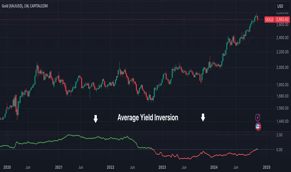
Average Yield InversionDescription:
This script calculates and visualizes the average yield curve spread to identify whether the yield curve is inverted or normal. It takes into account short-term yields (1M, 3M, 6M, 2Y) and long-term yields (10Y, 30Y).
Positive values: The curve is normal, indicating long-term yields are higher than short-term yields. This often reflects economic growth expectations.
Negative values: The curve is inverted, meaning short-term yields are higher than long-term yields, a potential signal of economic slowdown or recession.
Key Features:
Calculates the average spread between long-term and short-term yields.
Displays a clear graph with a zero-line reference for quick interpretation.
Useful for tracking macroeconomic trends and potential market turning points.
This tool is perfect for investors, analysts, and economists who need to monitor yield curve dynamics at a glance.